---
title: "Session 4: Data Visualization"
subtitle: "R for Data Analysis"
author: "DIME Analytics"
date: "The World Bank | [WB Github](https://github.com/worldbank)
April 2025"
output:
xaringan::moon_reader:
css: ["libs/remark-css/default.css",
"libs/remark-css/metropolis.css",
"libs/remark-css/metropolis-fonts.css",
"libs/remark-css/custom.css"]
lib_dir: libs
nature:
countIncrementalSlides: FALSE
ratio: "16:9"
highlightStyle: github
highlightLines: TRUE
---
```{r setup, include = FALSE}
# Load packages
if(!require(pacman)) install.packages("pacman")
pacman::p_load(
knitr, tidyverse, hrbrthemes, fontawesome, here, xaringanExtra, countdown, ggpubr
)
if(!require(flair)) devtools::install_github("r-for-educators/flair")
library(flair)
here::i_am("Presentations/04-data-visualization.Rmd")
options(htmltools.dir.version = FALSE)
opts_chunk$set(
fig.align = "center",
fig.height = 4,
dpi = 300,
cache = T
)
xaringanExtra::use_panelset()
xaringanExtra::use_webcam()
xaringanExtra::use_clipboard()
htmltools::tagList(
xaringanExtra::use_clipboard(
success_text = "",
error_text = ""
),
rmarkdown::html_dependency_font_awesome()
)
xaringanExtra::use_logo(
image_url = here("Presentations",
"img",
"lightbulb.png"),
exclude_class = c("inverse",
"hide_logo"),
width = "50px"
)
```
class: inverse, center, middle
name: intro
# Introduction
---
# Introduction
### Initial Setup
.panelset[
.panel[.panel-name[If You Attended Session 2]
1. Go to the `dime-r-training-main` folder that you created yesterday, and open the `dime-r-training-main` R project that you created there.
]
.panel[.panel-name[If You Did Not Attend Session 2]
1. Copy/paste the following code into a new RStudio script:
```{r, eval = FALSE}
install.packages("usethis")
library(usethis)
usethis::use_zip(
"https://github.com/worldbank/dime-r-training/archive/main.zip",
cleanup = TRUE
)
```
2. A new RStudio environment will open. Use this for the session today.
]
]
---
# **Today's session**
.box-7.large.sp-after-half[Exploratory Analysis v. Publication/Reporting]
--
.box-5.large.sp-after-half[Data, aesthetics, & the grammar of graphics]
--
.box-3.large.sp-after-half[Aesthetics in extra dimensions, themes, and saving plots]
--
.notes[
.large[
For this session, you’ll use the `ggplot2` package from the `tidyverse` meta-package.
Similarly to previous sessions, you can find some references at the end of this presentation that include a more comprehensive discussion on data visualization.
]
]
---
# Introduction
### Before we start
* Make sure the packages `ggplot2` are installed and loaded. You can load it directly using `library(tidyverse)` or `library(ggplot2)`
* Load the `whr_panel` data set we created last week.(Remember to use the `here` package)
```{r, warnings = F}
# Packages
library(tidyverse)
library(here)
whr_panel <- read_csv(
here(
"DataWork", "DataSets", "Final", "whr_panel.csv"
)
)
```
---
# Introduction
In our workflow there are usually two distinct uses for plots:
1. **Exploratory analysis**: Quickly visualize your data in an insightful way.
* Base R can be used to quickly create basic figures
* We will also use `ggplot2` to quickly create basic figures as well.
2. **Publication/Reporting**: Make pretty graphs for a presentation, a project report, or papers:
* We’ll do this using `ggplot2` with more customization. The idea is to create beautiful graphs.
---
class: inverse, center, top
name: ea
# Exploratory Analysis
```{r, echo = FALSE, out.width="80%"}
knitr::include_graphics("img/ggplot2_img.png")
```
---
# Plot with Base R
First, we’re going to use base plot, i.e., using Base R default libraries. It is easy to use and can produce useful graphs with very few lines of code.
.exercise[**Exercise 1:** Exploratory Analysis.
**(1)** Create a vector called `vars` with the strings: `"economy_gdp_per_capita"`, `"happiness_score"`, `"health_life_expectancy"`, and `"freedom"`.
**(2)** Select all the variables from the vector `vars` in the `whr_panel` dataset and assign to the object `whr_plot`. Hint: use `select(all_of(vars))` for this.
**(3)** Use the `plot()` function: `plot(whr_plot)`
]
`r countdown(minutes = 1, seconds = 0, left = 0, font_size = "2em")`
--
```{r}
# Vector of variables
vars <- c("economy_gdp_per_capita", "happiness_score", "health_life_expectancy", "freedom")
# Create a subset with only those variables, let's call this subset whr_plot
whr_plot <- whr_panel %>%
select(all_of(vars))
```
---
# Base Plot
```{r, out.width = "70%"}
plot(whr_plot)
```
---
# The beauty of ggplot2
.large[
1. Consistency with the [**Grammar of Graphics**](https://www.springer.com/gp/book/9780387245447)
* This book is the foundation of several data viz applications: `ggplot2`, `polaris-tableau`, `vega-lite`
2. Flexibility
3. Layering and theme customization
4. Community
It is a powerful and easy to use tool (once you understand its logic) that produces complex and multifaceted plots.
]
---
# The grammar of graphics
## The Structure of ggplot2
Creating a plot with ggplot2 requires **three basic components**:
1. **Data**: The dataset you want to visualize.
2. **Aesthetics (aes)**: How you map your data to visual elements (e.g., x-axis, y-axis, color).
3. **Geometry (geom)**: The type of plot you want (e.g., bar graph, scatter plot).
(and many more, we will see some examples at the end of the presentation)
---
# 📊 ggplot2: Basic Structure (Template)
.large[The basic ggplot structure is:]
```{r ggplot-template, tidy=FALSE, eval=FALSE}
ggplot(data = DATA) #<<
GEOM_FUNCTION(mapping = aes(AESTHETIC MAPPINGS)) #<<
```
.large[Mapping data to aesthetics]
.box-7.medium[Think about colors, sizes, x and y references]
--
.center.medium[We are going to learn how we connect our data to the components of a ggplot]
---
# 📊 ggplot2: Full Structure
.large[The full structure of a `ggplot2` visualization follows a logical sequence.]
.pull-left[
```{r, eval=FALSE}
ggplot(data = ) +
(
mapping = aes(),
stat = ,
position =
) +
() + # Adjust coordinate system
() + # Create small multiples
() + # Adjust scales (colors, axes, etc.)
() # Customize overall appearance
```
]
.pull-right[
### 🧩 **Key Components**
1️⃣ **Data (`data = `)** → The dataset you want to visualize
2️⃣ **Layers (`geom_`, `stat_`)** → Shapes and statistical summaries
3️⃣ **Aesthetics (`aes()`)** → Maps data to visual properties
4️⃣ **Scales (`scale_`)** → Defines color, size, axes, etc.
5️⃣ **Coordinate System (`coord_`)** → Maps data to a 2D plane
6️⃣ **Facets (`facet_`)** → Splits data into small multiples
7️⃣ **Themes (`theme()`, `theme_`)** → Customizes visual appearance
]
---
# ggplot2: decomposition
.pull-left[
.center[
.vlarge[**There are multiple ways to structure plots with ggplot**]
.medium[For this presentation, I will stick to Thomas Lin Pedersen's decomposition who is one of most prominent developers of the ggplot and gganimate package.
These components can be seen as layers, this is why we use the `+` sign in our ggplot syntax.]
]
]
.pull-right[
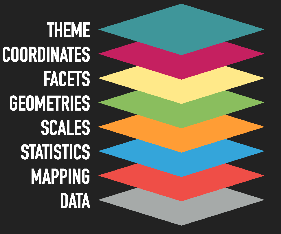
]
---
# Exploratory Analysis
#### Let's start making some plots.
```{r, out.width = "65%"}
ggplot(data = whr_panel) + #data #<<
geom_point(mapping = aes(x = happiness_score, y = economy_gdp_per_capita))
```
---
# Exploratory Analysis
#### We can also set up our mapping in the `ggplot()` function.
```{r, out.width = "65%"}
ggplot(data = whr_panel, aes(x = happiness_score, y = economy_gdp_per_capita)) + #<<
geom_point()
```
---
# Exploratory Analysis
#### We can also set up the data outside the `ggplot()` function as follows:
```{r, out.width = "65%"}
whr_panel %>% #<<
ggplot(aes(x = happiness_score, y = economy_gdp_per_capita)) +
geom_point()
```
---
# Exploratory Analysis
.large[I prefer to use the last way of structuring our ggplot.
1. First, setting our data;
2. pipe it;
3. then aesthetics;
4. and finally the geometries.
Both structures will work but this will make a difference if you want to load more datasets at the same time, and whether you would like to combine more geoms in the same ggplot. More on this in the following slides.
]
---
# Exploratory Analysis
.exercise[
**Exercise 2:** Create a scatter plot with `x = freedom` and `y = economy_gdp_per_capita`.
]
`r countdown(minutes = 1, seconds = 0, left = 0, font_size = "2em")`
--
.solution[
**Solution:**
```{r, out.width = "45%"}
whr_panel %>%
ggplot() +
geom_point(aes(x = freedom, y = economy_gdp_per_capita))
```
]
---
# Exploratory Analysis
.large[
The most common `geoms` are:
* `geom_bar()`, `geom_col()`: bar charts.
* `geom_boxplot()`: box and whiskers plots.
* `geom_density()`: density estimates.
* `geom_jitter()`: jittered points.
* `geom_line()`: line plots.
* `geom_point()`: scatter plots.
> If you want to know more about layers, you can refer to [this](https://ggplot2.tidyverse.org/reference/).
]
---
# Exploratory Analysis
In summary, our basic plots should have the following:
.pull-left[
```{r eval = FALSE}
whr_panel %>% #<<
ggplot(
aes(
x = happiness_score,
y = economy_gdp_per_capita
)
) +
geom_point()
```
]
.pull-right[
The data we want to plot.
]
---
# Exploratory Analysis
In summary, our basic plots should have the following:
.pull-left[
```{r eval = FALSE}
whr_panel %>%
ggplot(
aes( #<<
x = happiness_score, #<<
y = economy_gdp_per_capita #<<
) #<<
) +
geom_point()
```
]
.pull-right[
Columns (variables) to use for `x` and `y`
]
---
# Exploratory Analysis
In summary, our basic plots should have the following:
.pull-left[
```{r eval = FALSE}
whr_panel %>%
ggplot(
aes(
x = happiness_score,
y = economy_gdp_per_capita
)
) +
geom_point() #<<
```
]
.pull-right[
How the plot is going to be drawn.
]
---
# Exploratory Analysis
.medium[We can also **map** colors.]
.pull-left[
```{r, out.width = "50%", eval=FALSE}
whr_panel %>%
ggplot(
aes(
x = happiness_score,
y = economy_gdp_per_capita,
color = region #<<
)
) +
geom_point() #<<
```
]
.pull-right[
```{r, out.width = "100%", echo = FALSE}
whr_panel %>%
ggplot(
aes(x = happiness_score, y = economy_gdp_per_capita, color = region)
) + #<<
geom_point()
```
]
---
# Exploratory Analysis
Let's try to do something different, try, instead of `region`, adding `color = "blue"` inside `aes()`.
* What do you think is the problem with this code?
--
.pull-left[
```{r, eval = FALSE}
whr_panel %>%
ggplot(
aes(
x = happiness_score,
y = economy_gdp_per_capita,
color = "blue" #<<
)
) +
geom_point()
```
]
.pull-right[
```{r, out.width = "100%", echo = FALSE}
ggplot(
data = whr_panel,
aes(
x = happiness_score,
y = economy_gdp_per_capita,
color = "blue" #<<
)
) +
geom_point()
```
]
---
# Exploratory Analysis
In `ggplot2`, these settings are called **aesthetics**.
> "Aesthetics of the geometric and statistical objects".
We can set up:
* `position`: x, y, xmin, xmax, ymin, ymax, etc.
* `colors`: color and fill.
* `transparency`: alpha.
* `sizes`: size and width.
* `shapes`: shape and linetype.
Notice that it is important to know where we are setting our aesthetics. For example:
* `geom_point(aes(color = region))` to color points based on the variable `region`
* `geom_point(color = "red")` to color all points in the same color.
---
# Exploratory Analysis
Let's modify our last plot. Let's add `color = "blue"` inside `geom_point()`.
--
.pull-left[
```{r, eval = FALSE}
whr_panel %>%
ggplot(
aes(
x = happiness_score,
y = economy_gdp_per_capita
)
) +
geom_point(color = "blue") #<<
```
]
.pull-right[
```{r, out.width = "100%", echo = FALSE}
ggplot(data = whr_panel,
aes(x = happiness_score,
y = economy_gdp_per_capita)) +
geom_point(color = "blue") #<<
```
]
---
# Exploratory Analysis
.exercise[
**Exercise 3:** Map colors per year for the freedom and gdp plot we did before. Keep in mind the type of the variable `year`.
]
`r countdown(minutes = 1, seconds = 0, bottom = 0, font_size = "2em")`
--
.pull-left[
.solution[
**Solution:**
```{r, eval=FALSE}
whr_panel %>%
ggplot(
aes(
x = freedom,
y = economy_gdp_per_capita,
color = year #<<
)
) +
geom_point()
```
]
]
.pull-right[
```{r, out.width = "100%", echo = FALSE}
ggplot(data = whr_panel,
aes(x = freedom, y = economy_gdp_per_capita, color = year)) +
geom_point()
```
]
---
# Exploratory Analysis
### How do you think we could solve it?
* Change the variable `year`as: `as.factor(year)`.
--
.pull-left[
```{r, out.width = "45%", eval=FALSE}
whr_panel %>%
ggplot(
aes(
x = freedom,
y = economy_gdp_per_capita,
color = as.factor(year) #<<
)
) +
geom_point()
```
]
.pull-right[
```{r, out.width = "100%", echo = FALSE}
ggplot(data = whr_panel,
aes(x = freedom, y = economy_gdp_per_capita, color = as.factor(year))) +
geom_point()
```
]
---
class: inverse, center, top
name: ggplot
# ggplot2: settings
```{r echo = FALSE, out.width="70%"}
knitr::include_graphics("img/ggplot2_dib.png")
```
---
# ggplot2: settings
.large[
Now, let's try to modify our plots. In the following slides, we are going to:
1. Change shapes.
1. Include more geoms.
1. Separate by regions.
1. Pipe and mutate before plotting.
1. Change scales.
1. Modify our theme.
]
---
# ggplot2: shapes
```{r, out.width = "65%"}
whr_panel %>%
ggplot(aes(x = happiness_score, y = economy_gdp_per_capita)) +
geom_point(shape = 5) #<<
```
---
# ggplot2: shapes
```{r echo = FALSE, eval = TRUE, out.width = "75%", message = FALSE}
library(ggpubr)
show_point_shapes()+
theme_minimal()
```
---
# ggplot2: including more geoms
```{r, out.width = "60%"}
whr_panel %>%
ggplot(aes(x = happiness_score, y = economy_gdp_per_capita)) +
geom_point() +
geom_smooth() #<<
```
---
# ggplot2: Facets
```{r, out.width = "55%"}
whr_panel %>%
ggplot(aes(x = happiness_score, y = economy_gdp_per_capita)) +
geom_point() +
facet_wrap(~ region) #<<
```
---
# ggplot2: Colors and facets
.exercise[
**Exercise 4**: Use the last plot and add a color aesthetic per region.
]
`r countdown(minutes = 1, seconds = 0, left = 0, font_size = "2em")`
--
.pull-left[
.solution[
**Solution:**
```{r, eval = FALSE}
whr_panel %>%
ggplot(
aes(
x = happiness_score,
y = economy_gdp_per_capita,
color = region #<<
)
) +
geom_point() +
facet_wrap(~ region) #<<
```
]
]
.pull-left[
```{r, echo = FALSE, out.width = "100%"}
ggplot(
data = whr_panel,
aes(
x = happiness_score,
y = economy_gdp_per_capita,
color = region #<<
)
) + #<<
geom_point() +
facet_wrap(~ region)
```
]
---
# ggplot2: Colors and facets
Another type of facet is `facet_grid()`, which arranges plots by one or more variables while keeping a consistent y-axis across all panels. This is useful when comparing trends over time or across categories.
Here we facet the plot by `year`, so we can visually compare patterns in happiness and GDP over different years.
.pull-left[
```{r, eval=FALSE}
whr_panel %>%
ggplot(
aes(
x = happiness_score,
y = economy_gdp_per_capita,
color = region
)
) +
geom_point() +
facet_grid(~year)
```
]
.pull-right[
```{r, echo=FALSE}
whr_panel %>%
ggplot(
aes(
x = happiness_score,
y = economy_gdp_per_capita,
color = region
)
) +
geom_point() +
facet_grid(~year)
```
]
---
# ggplot2: Pipe and mutate before plotting
Let's imagine now, that we would like to transform a variable before plotting.
.panelset[
.panel[.panel-name[R Code]
```{r, out.width = "55%", eval = FALSE}
whr_panel <- whr_panel %>%
mutate( #<<
latam = region == "Latin America and Caribbean" #<<
) #<<
whr_panel %>%
filter(
!is.na(latam) # Make sure that we don't include missing values in our graph
) %>%
ggplot(
aes(
x = happiness_score, y = economy_gdp_per_capita,
color = latam) #<<
) +
geom_point()
```
]
.panel[.panel-name[Plot]
```{r, out.width = "55%", echo = FALSE}
whr_panel <- whr_panel %>%
mutate(
latam = region == "Latin America and Caribbean" #<<
)
whr_panel %>%
filter(
!is.na(latam)
) %>%
ggplot(
aes(
x = happiness_score, y = economy_gdp_per_capita,
color = latam)
) +
geom_point()
```
]
]
---
# ggplot2: geom's sizes
.large[We can also specify the size of a geom, either by a variable or just a number.]
```{r, out.width = "50%"}
whr_panel %>%
filter(year == 2017) %>%
ggplot(aes(x = happiness_score, y = economy_gdp_per_capita)) +
geom_point(aes(size = economy_gdp_per_capita)) #<<
```
---
# ggplot2: Changing scales
.panelset[
.panel[.panel-name[Unscaled]
```{r, out.width = "50%"}
ggplot(data = whr_panel,
aes(x = happiness_score,
y = economy_gdp_per_capita)) +
geom_point()
```
]
.panel[.panel-name[Scaled]
```{r, out.width = "45%"}
ggplot(data = whr_panel,
aes(x = happiness_score,
y = economy_gdp_per_capita)) +
geom_point() +
scale_x_continuous(limits = c(0, 10), #<<
breaks = c(0, 2, 4, 6, 8, 10)) #<<
```
]
]
---
# ggplot2: Themes
.large[
Let's go back to our plot with the `latam` dummy.
We are going to do the following to this plot:
1. Filter only for the year 2015.
2. Change our theme.
3. Add correct labels.
4. Add some annotations.
5. Modify our legends.
]
---
# ggplot2: Labels
.panelset[
.panel[.panel-name[R Code]
```{r, out.width = "40%", eval = FALSE}
whr_panel %>%
filter(
!is.na(latam) # Make sure that we don't include missing values in our graph
) %>%
filter(year == 2015) %>% #<<
ggplot(aes(x = happiness_score, y = economy_gdp_per_capita,
color = latam)) +
geom_point() +
labs(#<<
x = "Happiness Score", #<<
y = "GDP per Capita", #<<
title = "Happiness Score vs GDP per Capita, 2015" #<<
) #<<
```
]
.panel[.panel-name[Plot]
```{r, out.width = "60%", echo = FALSE}
whr_panel %>%
filter(
!is.na(latam) # Make sure that we don't include missing values in our graph
) %>%
filter(year == 2015) %>%
ggplot(aes(x = happiness_score, y = economy_gdp_per_capita,
color = latam)) +
geom_point() +
labs(
x = "Happiness Score",
y = "GDP per Capita",
title = "Happiness Score vs GDP per Capita, 2015"
)
```
]
]
---
# ggplot2: Legends
.panelset[
.panel[.panel-name[R Code]
```{r, out.width = "40%", eval = FALSE}
whr_panel %>%
filter(
!is.na(latam) # Make sure that we don't include missing values in our graph
) %>%
filter(year == 2015) %>%
ggplot(aes(x = happiness_score, y = economy_gdp_per_capita,
color = latam)) +
geom_point() +
scale_color_discrete(labels = c("No", "Yes")) + #<<
labs(
x = "Happiness Score",
y = "GDP per Capita",
color = "Country in Latin America\nand the Caribbean", #<<
title = "Happiness Score vs GDP per Capita, 2015"
)
```
]
.panel[.panel-name[Plot]
```{r, out.width = "70%", echo = FALSE}
whr_panel %>%
filter(
!is.na(latam) # Make sure that we don't include missing values in our graph
) %>%
filter(year == 2015) %>%
ggplot(aes(x = happiness_score, y = economy_gdp_per_capita,
color = latam)) +
geom_point() +
scale_color_discrete(labels = c("No", "Yes")) +
labs(
x = "Happiness Score",
y = "GDP per Capita",
color = "Country in Latin America\nand the Caribbean",
title = "Happiness Score vs GDP per Capita, 2015"
)
```
]
]
---
# ggplot2: Themes
.panelset[
.panel[.panel-name[R Code]
```{r, out.width = "60%", eval = FALSE}
whr_panel %>%
filter(
!is.na(latam) # Make sure that we don't include missing values in our graph
) %>%
filter(year == 2015) %>%
ggplot(aes(x = happiness_score, y = economy_gdp_per_capita,
color = latam)) +
geom_point() +
scale_color_discrete(labels = c("No", "Yes")) +
labs(
x = "Happiness Score",
y = "GDP per Capita",
color = "Country in Latin America\nand the Caribbean",
title = "Happiness Score vs GDP per Capita, 2015"
) +
theme_minimal() #<<
```
]
.panel[.panel-name[Plot]
```{r, out.width = "70%", echo = FALSE}
whr_panel %>%
filter(
!is.na(latam) # Make sure that we don't include missing values in our graph
) %>%
filter(year == 2015) %>%
ggplot(aes(x = happiness_score, y = economy_gdp_per_capita,
color = latam)) +
geom_point() +
scale_color_discrete(labels = c("No", "Yes")) +
labs(
x = "Happiness Score",
y = "GDP per Capita",
color = "Country in Latin America\nand the Caribbean",
title = "Happiness Score vs GDP per Capita, 2015"
) +
theme_minimal()
```
]
]
---
# ggplot2: Themes
The `theme()` function allows you to modify each aspect of your plot. Some arguments are:
```{r eval = FALSE}
theme(
# Title and text labels
plot.title = element_text(color, size, face),
# Title font color size and face
legend.title = element_text(color, size, face),
# Title alignment. Number from 0 (left) to 1 (right)
legend.title.align = NULL,
# Text label font color size and face
legend.text = element_text(color, size, face),
# Text label alignment. Number from 0 (left) to 1 (right)
legend.text.align = NULL,
)
```
More about these modification can be found [here](https://ggplot2.tidyverse.org/reference/theme.html)
---
# ggplot2: Color palettes
.large[
We can also add color palettes using other packages such as: `RColorBrewer, viridis` or funny ones like the `wesanderson` package. So, let's add new colors.
* First, install the `RColorBrewer` package.
]
```{r}
# install.packages("RColorBrewer")
library(RColorBrewer)
```
.large[
* Let's add `scale_color_brewer(palette = "Dark2")` to our ggplot.
]
---
# ggplot2: Color palettes
.panelset[
.panel[.panel-name[R Code]
```{r, out.width = "60%", eval = FALSE}
whr_panel %>%
filter(
!is.na(latam) # Make sure that we don't include missing values in our graph
) %>%
filter(year == 2015) %>%
ggplot(aes(x = happiness_score, y = economy_gdp_per_capita,
color = latam)) +
geom_point() +
scale_color_brewer(palette = "Dark2", labels = c("No", "Yes")) + #<<
labs(
x = "Happiness Score",
y = "GDP per Capita",
color = "Country in Latin America\nand the Caribbean",
title = "Happiness Score vs GDP per Capita, 2015"
) +
theme_minimal()
```
]
.panel[.panel-name[Plot]
```{r, out.width = "70%", echo = FALSE}
whr_panel %>%
filter(
!is.na(latam) # Make sure that we don't include missing values in our graph
) %>%
filter(year == 2015) %>%
ggplot(aes(x = happiness_score, y = economy_gdp_per_capita,
color = latam)) +
geom_point() +
scale_color_brewer(palette = "Dark2", labels = c("No", "Yes")) +
labs(
x = "Happiness Score",
y = "GDP per Capita",
color = "Country in Latin America\nand the Caribbean",
title = "Happiness Score vs GDP per Capita, 2015"
) +
theme_minimal()
```
]
]
---
# ggplot2: Color palettes
.vlarge[
My favorite color palettes packages:
1. [ghibli](https://github.com/ewenme/ghibli)
2. [LaCroixColoR](https://github.com/johannesbjork/LaCroixColoR)
3. [NineteenEightyR](https://github.com/m-clark/NineteenEightyR)
4. [nord](https://github.com/jkaupp/nord)
5. [palettetown](https://github.com/timcdlucas/palettetown)
6. [quickpalette](https://github.com/EmilHvitfeldt/quickpalette)
7. [wesanderson](https://github.com/karthik/wesanderson)
]
---
class: inverse, center, middle
name: saving
# Saving a plot
---
# Saving a plot
Remember that in R we can always assign our functions to an object. In this case, we can assign our `ggplot2` code to an object called fig as follows.
```{r, eval = FALSE}
fig <- whr_panel %>%
filter(
!is.na(latam) # Make sure that we don't include missing values in our graph
) %>%
filter(year == 2015) %>%
ggplot(aes(x = happiness_score, y = economy_gdp_per_capita,
color = latam)) +
geom_point() +
scale_color_discrete(labels = c("No", "Yes")) +
labs(
x = "Happiness Score",
y = "GDP per Capita",
color = "Country in Latin America\nand the Caribbean",
title = "Happiness Score vs GDP per Capita, 2015"
) +
theme_minimal()
```
Therefore, if you want to plot it again, you can just type `fig` in the console.
---
# Saving a plot
.exercise[**Exercise 5**: Save a ggplot under the name `fig_*YOUR INITIALS*`. Use the `ggsave()` function. You can either include the function after your plot or, save the ggplot first as an object and then save the plot.
The syntax is `ggsave(OBJECT, filename = FILEPATH, heigth = ..., width = ..., dpi = ...)`.
]
`r countdown(minutes = 1, seconds = 0, left = 0, font_size = "2em")`
--
.notes[
**Solution**:
```{r, echo = FALSE}
fig <- whr_panel %>%
filter(
!is.na(latam) # Make sure that we don't include missing values in our graph
) %>%
filter(year == 2015) %>%
ggplot(aes(x = happiness_score, y = economy_gdp_per_capita,
color = latam)) +
geom_point() +
scale_color_discrete(labels = c("No", "Yes")) +
labs(
x = "Happiness Score",
y = "GDP per Capita",
color = "Country in Latin America\nand the Caribbean",
title = "Happiness Score vs GDP per Capita, 2015"
) +
theme_minimal()
```
```{r}
ggsave(
fig,
filename = here("DataWork","Output","Raw","fig_MA.png"),
dpi = 750,
scale = 0.8,
height = 8,
width = 12
)
```
]
---
class: inverse, center, top
# And that's it for this session. Join us tomorrow for data analysis. Remember to submit your feedback!
```{r, echo = FALSE, out.width="80%"}
knitr::include_graphics("img/r_learners.png")
```
---
class: inverse, center, middle
name: references
# References and recommendations
---
# References and recommendations
* **ggplot tricks**:
* Tricks and Secrets for Beautiful Plots in R by Cédric Scherer: https://github.com/z3tt/outlierconf2021
* **Websites**:
* Interactive stuff : http://www.htmlwidgets.org/
* The R Graph Gallery: https://www.r-graph-gallery.com/
* Gpplot official site: http://ggplot2.tidyverse.org/
* **Online courses**:
* Johns Hopkins Exploratory Data Analysis at Coursera:
https://www.coursera.org/learn/exploratory-data-analysis
* **Books**:
* The grammar of graphics by Leland Wilkinson.
* Beautiful Evidence by Edward Tufte.
* R Graphics cook book by Winston Chang
* R for Data Science by Hadley Wickham andGarrett Grolemund
---
class: inverse, center, middle
name: appendix
# Appendix: interactive graphs
---
# Interactive graphs
There are several packages to create interactive or dynamic data vizualizations with R. Here are a few:
* `leaflet` - R integration tp one of the most popular open-source libraries for interactive maps.
* `highcharter` - cool interactive graphs.
* `plotly` - interactive graphs with integration to ggplot.
* `gganimate` - ggplot GIFs.
* `DT` - Interactive table
These are generally, html widgets that can be incorporated in to an html document and websites.
---
# Interactive graphs
Now we’ll use the ggplotly() function from the plotly package to create an interactive graph!
### Extra exercise: Interactive graphs.
* Load the plotly package
* Pass that object with the last plot you created to the ggplotly() function
---
# Interactive graphs
.panelset[
.panel[.panel-name[R Code]
```{r, message=FALSE, warning=FALSE, out.width = "70%", out.height="70%", out.extra = 'style="display:block; margin:auto;"', eval = FALSE}
# Load package
library(plotly)
# Use ggplotly to create an interactive plot
ggplotly(fig) %>%
layout(legend = list(orientation = "h", x = 0.4, y = -0.2))
```
]
.panel[.panel-name[Plot]
```{r, message=FALSE, warning=FALSE, out.width = "70%", out.height="70%", out.extra = 'style="display:block; margin:auto;"', echo = FALSE}
# Load package
library(plotly)
# Use ggplotly to create an interactive plot
ggplotly(fig) %>%
layout(legend = list(orientation = "h", x = 0.4, y = -0.2))
```
]
]
---
exclude: true
```{R, pdfs, include = F, eval = F}
pagedown::chrome_print("04-data-visualization.html", output = "04-data-visualization.pdf")
# or
source("https://git.io/xaringan2pdf")
xaringan_to_pdf("Presentations/04-data-visualization.html")
```