Creating a focus indicator within the component

Metadata

CSS

When to Use

All technologies that support CSS.

Description

The objective of this technique is to create a highly visible focus indicator that has sufficient contrast against the internal background color of a component.

Examples

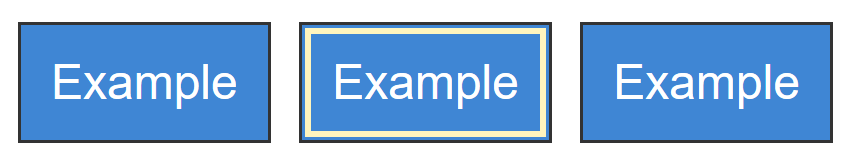
The examples demonstrate a simple implementation where a focus styles is applied to blue background. As the indicator is contained inside the component, you can be sure it maintains contrast whatever background the component is placed on

Inner border

HTML

<button>Example button</button>

CSS to provide the indicator. It narrows the scope to buttons within the main element.

button { 
    background-color: #3f86d4 /* medium blue */
    color: white;
    padding: 10px;
    border: 1px #333 solid;
}
main button:focus { 
    outline: 2px #fff5be solid; /* light yellow */
    outline-offset: -4px;
}
Three blue buttons with a dark border, the middle button showing a bright yellow outline inside the button.
The default and focused states of the button.

Tests

Procedure

For each focusable user interface element:

  1. Place keyboard focus on each focusable user interface element on the page using the keyboard.
  2. Check that the focus indicator area is at least the size of a 2 CSS px line along the longest edge of the component.
  3. Check that the change of contrast of the indicator between focused and unfocused states has a ratio of 3:1 for the minimum focus indicator area.
  4. If the focus indicator does not have 3:1 contrast ratio with its adjacent colors, check that it is at least 2px thick.

Expected Results

Resources