Intent of Focus Appearance (Minimum)
The purpose of this Success Criterion is to ensure a keyboard focus indicator is clearly visible and discernible. This criterion is closely related to 2.4.7 Focus Visible and 1.4.11 Non-text Contrast. Where Focus Visible merely requires a visible focus indicator, 2.4.11 defines a minimum level of visibility. Where Non-text Contrast requires a component to have adequate contrast against the background in each of its states, 2.4.11 requires sufficient contrast between the focused and unfocused states.
For sighted people with mobility impairments who use a keyboard-like device (e.g., a switch, voice input), knowing the current point of focus is very important. Visible focus must also meet the needs of low-vision users, who may also be keyboard-only users.
A keyboard focus indicator can take different forms; this Success Criterion sets a requirement to make it clearly distinguishable. For example, using a thick outline that contrasts with the background would pass this criterion.
Keyboard focus
The keyboard focus is the point of interaction for someone using a keyboard. For environments with a keyboard-operable interface, the keyboard focus can be moved around the interface in order to interact with different elements. Whichever element is being interacted with has focus.
Some components have sub-components that can take focus, such as the menu items on a menu. The item considered to be focused is whichever is being interacted with. For example, if you tab to a menu and arrow down to a menu item, it is the menu item that is in focus; pressing Enter would activate the menu item.
Some non-operable elements can take focus (such as when a heading is the target of a skip link); however, it is only when the element with focus is operable by keyboard that this Success Criterion applies.
Minimum area
The bigger the visible change when an item receives focus, the easier it is for someone to see. Authors are encouraged to make the change as significant as possible, for example, by designing a thick border around the element.
The Success Criterion defines a minimum area using a calculation for perimeter. It also provides an alternative way of meeting a minimum area for focus indicators where the design relies on a smaller but very thick indicator.
The minimum area of the focus indicator must be at least as large as the area of a 1 CSS pixel thick perimeter (border) of the control with focus. The indicator does not have to be a border, but the indicator's area must be at least as large. For example, if a control is a rectangle of 90px wide and 30px tall, the size of the outer border is 90 + 90 + 30 + 30 = 240 CSS pixels.
A CSS pixel is what developers use in CSS declarations like “width: 200px”, it is device-independent and not to be confused with device pixels which vary depending on the physical pixel density.
The rest of this document notates CSS pixels as "px".
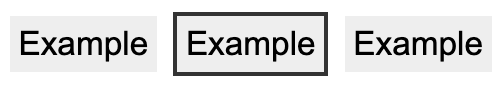
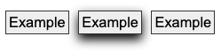
The following 3 examples use a 90px wide by 30px tall button, therefore the surface area requirement is 240px. The middle button is focused in each example.
If controls change size across different variations of a page (e.g., in a responsive design), it helps to use a proportionally sized indicator such as an outline or background change. In that way you can be sure of meeting the size requirement.
The Success Criterion includes an alternative size measure of "a thickness of at least 8 CSS pixels along the shortest side of the element". Smaller but very thick indicators can be very visible.
Typical focus indicators:
- A solid outline around the whole component would pass the size requirement;
- A 1 CSS pixel dotted outline around the whole component would not pass the size requirement, as it is roughly 50% of the surface area of a solid line.
- Changing the background of a control would pass the size requirement;
- A 1px wide vertical line (such as a blinking cursor) would not pass the size requirement, a text input would need a larger or separate focus indicator.
If you need to use complex mathematics to work out if a focus indicator is large enough, it is probably a sign that you should use a larger and proportional indicator that will provide a more visible indicator.
Where a focus indicator is defined in code as a certain size, e.g. 2px thickness, anti-aliasing can be ignored for the purposes of calculation. Dotted or dashed outlines have various levels of gaps depending on the browser, screen density, and thickness. For example, in most browsers a "dotted" line will have roughly half the number of pixels due to gaps. However, in some sizes or browsers it might be slightly less than half, so increasing the thickness may be required.
Unusual shapes and gradients
If you have an unusual shape, some mathematics may be required if the focus indicator is on the edge of the size requirement. For example, if the focusable control is a circle with a diameter of 100px, the circumference would be 314 pixels. A 1px (or greater) outline would meet the size criterion.

If a focus indicator is an irregular shape, such as a drop-shadow under a star icon, it obviously helps if the contrasting area is quite large.

What is the contrasting area of the drop shadow? The quick method is:
- Look at the size of the component, how long is it around the edges?
- Look at the (contrasting) area of the focus indicator.
- Mentally compare the focus indicator to the border of the component.
If it is too close to call, you could extract the contrasting area of the focus indicator and evaluate the surface area.
If a focus indicator has a gradient, the principle is to measure the contrast of the changed area, and ignore the change that does not meet 3:1.
If you take some spot-checks on the gradient area and establish what area meets the contrast, it is straightforward to work out if that area is sufficient.

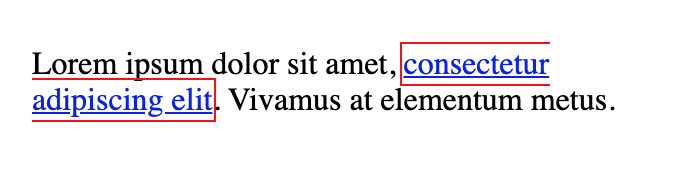
If an inline link is broken over two or more lines the indicator can be split between them. In this case the link element is still treated as a single control.
Change of contrast
The greater the change of contrast between states the easier it is for users to see it. Authors are encouraged to make the change of color contrast as great as possible.
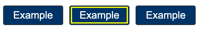
When a component changes to include a focus indicator, that change can always be measured as a change of color contrast. For example, if a yellow outline is added to a button on a blue background, the change of color is from blue to yellow.
Color contrast measurements in WCAG are based on luminance (brightness) regardless of the hue.
Text and non-text contrast measures use adjacent colors; this Success Criterion measures the change in color between non-focused and focused states.
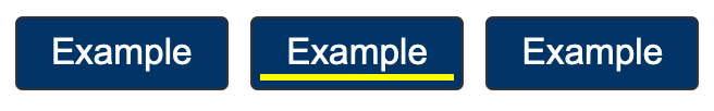
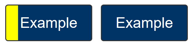
It is possible to use visual patterns such as strips switching places to disguise a change of focus indicator. This is not considered a visible indicator.
Adjacent contrast
Where a control is a solid color, and you add a border or outline of a very similar color, it is difficult to perceive the change to the control.

The requirement is to have an indicator that has a 3:1 contrast ratio with the adjacent colors of the component, or to be separated from the component, or to be at least 2px thick.

If the focus indicator uses several colors, any color which does not interfere with identifying the indicator can be ignored for the purpose of measuring contrast ratio. For example, a 3D drop-shadow on a focus indicator is considered to be subsumed into the color closest in brightness (perceived luminance). If the size is uncertain, calculate the minimum size based on the area which meets the contrast change requirement.
Not fully obscured
Where other content can overlap with a focused item, the focused element should not be hidden. Typical types of content that can overlap focused items are sticky footers, sticky headers, or non-modal dialogues. As a user tabs through the page, these layers of content can obscure the focused item, including the focus indicator. If the interface is configurable so that the user can move toolbars and non-modal dialogs around, then only the initial positions of user-movable content would be considered for testing and conformance of the Unobscured bullet.
The criterion specifies the "focused item" in the 'Not fully obscured' bullet rather than the "focus indicator". The requirements for the indicator are set in the previous bullets; the last bullet applies to the item as a whole.
Relationship to Non-text Contrast
Success Criterion 1.4.11 Non-text Contrast requires that a UI component maintains contrast against the adjacent background for each of its states. When it has does not have focus, it must be visible against the background. When it receives focus, it still must be visible. However, Non-text Contrast does not equire contrast between the UI component's focused and non-focused states. Merely that in each state it contrasts against the adjacent background.
Focus Appearance (Minimum) requires that the focused and unfocused states can be distinguishable from each other. It does this by requiring sufficient differences in contrast between the appearance of a component when focused and when not focused.

In the example above:
- The dark square outline of the checkbox has sufficient contrast with its adjacent light background in the default state (meeting 1.4.11 Non-text Contrast).
- When the checkbox receives focus in the second image, a grey ring appears around it. The ring contrasts against the light page background sufficiently (still meeting 1.4.11). The size of the ring's dark outline is large enough to meet the Minimum area bullet of 2.4.11 Focus Appearance. The color of the pixels making up the ring's outline versus the same pixels in the unfocused state meets the 2.4.11 Change of contrast bullet. The ring's outline also contrasts against the inside shading (another more subtle indicator of focus), so both the inner and outer edges of the ring's outline meet 2.4.11's Adjacent contrast bullet.
- In the third image, the checked state is indicated by two visual changes. The checkbox changes color from gray to a greenish teal, and the checkbox is entirely filled in except the outline of a white tick mark. The contrast between the white tick mark and the teal color of the checkbox is sufficient to pass the 1.4.11 Non-text Contrast requirement to identify its (checked) state.
- The fourth image shows the checkmark both checked and focused. The component still uses a ring to indicate focus. The ring's color has changed, but it still contrasts against the light page background and, on its adjacent inner edge, against the shading. (The color difference between the grey of the unchecked box and the teal of the checked version is irrelevant to the assessment. Since the tick mark indicates the checked state, the color change is just a secondary visual effect.)
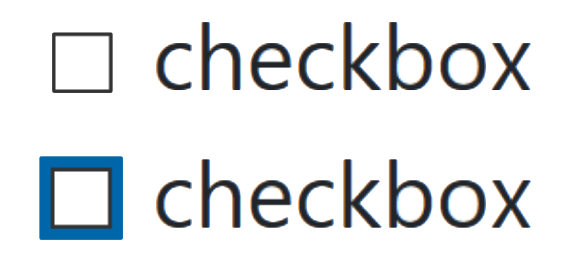
The contrast of the default checkbox passes 1.4.11 because the black border and white background have a contrast ratio greater than 3:1. When the checkbox recieves focus, the dark blue focus indicator passes Focus Appearance (Minimum) because:
- its thick blue border has a sufficient Minimum area.
- the pixels making up the blue focus indicator have a sufficient Change of contrast from their white color in the unfocused state
- the blue focus indicator, although not contrasting with the black checkbox border, has a thickness of 2 CSS pixels and so meets Adjacent contrast.