Making Content Usable - v2 structure subgroup prototype for TR note layout

W3C Group Draft Note

More details about this document
This version:
https://www.w3.org/TR/2024/DNOTE-coga-usable-20240822/
Latest published version:
https://www.w3.org/TR/coga-usable/
Latest editor's draft:
https://w3c.github.io/coga/
History:
https://www.w3.org/standards/history/coga-usable/
Commit history
Editor:
Feedback:
GitHub w3c/coga (pull requests, new issue, open issues)

Jump to:

Abstract

(Introduction)

This document explains how to make content usable for individuals with cognitive and learning disabilities and differences. The web is becoming increasingly essential for daily living, self care, safety, and independence. At the same time, approximately 20% of people in the world experience major cognitive or learning accessibility barriers online. This document is a working group note from the W3C, and provides supplemental guidance, beyond the Web Content Accessibility Guidelines (WCAG).

This document has content about:


Jump to:

Status of This Document

This section describes the status of this document at the time of its publication. A list of current W3C publications and the latest revision of this technical report can be found in the W3C technical reports index at https://www.w3.org/TR/.

This is a prototype for testing only. Please reference https://www.w3.org/TR/coga-usable/ for the published note.

This document was published by the Accessible Platform Architectures Working Group and the Accessibility Guidelines Working Group as a Group Draft Note using the Note track.

Group Draft Notes are not endorsed by W3C nor its Members.

This is a draft document and may be updated, replaced or obsoleted by other documents at any time. It is inappropriate to cite this document as other than work in progress.

The W3C Patent Policy does not carry any licensing requirements or commitments on this document.

This document is governed by the 03 November 2023 W3C Process Document.


Jump to:

1. How to use this document

“Making content usable” is intended for anyone involved in the creation, curation, design, or development of digital technology and content. Depending on your specific role, here are potential paths you might take through this document. Each role listed below has a chip associated with it, that also includes visual indicators such as a specific icon and color. These are regularly used throughout the document to identify content that might be of particular interest to individuals in those roles.

1.1 Product ownership

Includes product and program managers, stakeholders, and clients.

  1. Start by understanding the user, which will clarify why this work is critical, how it impacts your potential reach
  2. Include the user in your market research
  3. Review the cognitive accessibility design principles to make sure you know what to include in product requirements, and request that those working on design and implementation use this document and refer to the design and build section

1.2 Tech implementation

Includes engineer/developer, tech lead, coder, etc.

Placeholder for content, not yet written for prototype

1.3 Research

Includes UXR, competitive analyst.

Placeholder for content, not yet written for prototype

1.4 UX & info architecture

Includes UX & Interaction designers, and content strategists.

Placeholder for content, not yet written for prototype

1.5 Visual design

Includes artist and graphic designer.

Placeholder for content, not yet written for prototype

1.6 Content creation

Includes writers, video and music creators, and sound designers.

Placeholder for content, not yet written for prototype

1.7 Testing

Includes QA, test engineers, and auditors.

Placeholder for content, not yet written for prototype


Jump to:

2. Know the user

2.1 About people with cognitive and learning disabilities

People with cognitive and learning disabilities may experience difficulties with many of the cognitive activities often required to interact with technology and understand content. This can create accessibility barriers with many tasks, including:

This is not exhaustive. For a more in-depth understanding of the experiences of individuals with cognitive and learning disabilities, read the companion document to this guidance:

About People with Cognitive and Learning Disabilities 🔗

2.2 Personas

2.2.1 Amy: an autistic computer scientist

Support with logical information architecture, reduced visual stimulation, and clear language

Amy loved her computer science course and now programs in several languages. She has discovered she can visualize the outcome of her coding and is quick to find any errors even if they are not highlighted. Writing documentation is less fun and she is too concise. This means some users do not receive enough help using her applications.Some of the scenarios in which Amy experiences accessibility barriers:

  • Coping with ambiguous or dense layouts and illogical navigation
  • Changing color schemes, automatic blinking, flashing, and autoplay on video or music
  • Designs that make use of abstract imagery and metaphors

Learn more about Amy and how to design accessible experiences for her 🔗


2.2.2 Persona 2 Name

Byline for the persona that sets them up as a person, not a diagnosis

Placeholder for content, not yet written for prototype

2.2.3 Persona n Name

Byline for the persona that sets them up as a person, not a diagnosis

Placeholder for content, not yet written for prototype

2.3 Stories, use cases, and functional needs

For people with cognitive and learning disabilities, meeting the design objectives in this document and addressing the specific functional needs of these individual can be the difference between being able to use the site or not being able to use it at all. This may also be true for people with mental health issues or under temporary stress.

User needs for people with cognitive and learning disabilities often help other users, although they can usually manage to use the site without these user needs being met.

The stories, use cases, and functional needs that will provide a solid foundation for making content usable for individuals with cognitive and learning disabilities detailed in the companion document to this guidance, About people with cognitive and learning disabilities.

2.4 Build the user into the process

A thoughtful user-centered design process will result in more accessible and usable products for individuals with cognitive and learning disabilities, and will likely lead to easier to use products for everyone, overall. Key parts of this process for people with cognitive and learning disabilities should be:

For resources to help you make these processes achievable for you, no matter the size of your organization, read our companion document:

Building for people with cognitive and learning disabilities into the process 🔗

Jump to:

3. Design and build

TThis guide provides assistance making web sites and applications friendly for people with cognitive and learning disabilities. The patterns in this guide provide practical guidance to improve the accessibility of designs and the design process. The objectives and patterns presented here provide supplemental guidance beyond the requirements of The Web Content Accessibility Guidelines WCAG [WCAG22]. They are intended to address barriers that could not be included in the normative WCAG [WCAG22] specification and may not otherwise be addressed.

Each objective contains a number of practical patterns (repeated designs for controls and other elements) that describe what to do to address user needs. Implementing these patterns is essential for some people with cognitive and learning disabilities to be able to use content independently.

  1. Design is clear and helpful
  2. Interactions are clear and straightforward
  3. Functionality is supportive
  4. Content is understandable
  5. Help is available and usable

3.1 Objective 1: Design is clear and helpful

The visual, aural, and media design supports the user to easily understand the purpose and meaning of components, the hierarchy of the page and site, and how to navigate the layouts.

  1. Which roles typically do this? Designers and information architects.
  2. When is this typically done? During the design phase and in the creation of content and visual assets.
  3. Which part of the process can break this? Implementation, especially when 3P tooling or resources are introduced.

Patterns for achieving a helpful design:

3.1.1 Recognizable purpose

Make the purpose of your page clear

Prototype - content not yet added

Use clear visible labels

Prototype - content not yet added

Use familiar and consistent design patterns

Prototype - content not yet added

Clearly identify controls, their use, and their relationship to the content they affect

Prototype - content not yet added

3.1.2 Distinguishable

Make it easy to find the most important features and tasks on the site

Prototype - content not yet added

Make it easy to find the most important actions and information on the page

Prototype - content not yet added

Ensure foreground content is not obscured by background

Prototype - content not yet added

Use white spacing

Prototype - content not yet added

3.1.3 Consistent

Ensure controls and content do not move unexpectedly

Prototype - content not yet added

Use a consistent visual design

Prototype - content not yet added

Use a predictable hierarchy

Prototype - content not yet added


Jump to objective:   Design   Interactions   Functionality   Content   Help

3.2 Objective 2: Interactions are clear and straightforward

The flows, tasks, and events provide clarity for the user to understand how to interact with the system, and what will and has happened based on how they interact with the interface.

  1. Which roles typically do this? User experience and interaction designers, content strategists, and technical leads.
  2. When is this typically done? During both the interaction design and engineering design phases.
  3. Which part of the process can break this? Implementation, especially when 3P tooling or resources are introduced.

Patterns for achieving clear and straightforward interactions:

3.2.1 Informative

Clearly state the results and disadvantages of actions, options, and selections

Prototype - content not yet added

Do not rely on the user performing calculations

Prototype - content not yet added

Do not rely on the user memorizing information

Prototype - content not yet added

Notify users of fees and changes at the start of a task

Prototype - content not yet added

Provide information so a user can prepare for a task

Prototype - content not yet added

Provide feedback based on user action

Prototype - content not yet added

User knows if they are on a new URL/domain/space

Prototype - content not yet added

3.2.2 Logical

Make short critical paths

Prototype - content not yet added

Make each step clear

Prototype - content not yet added

Provide step by step guidance

Prototype - content not yet added

Separate each instruction

Prototype - content not yet added

Provide guidance for forms and non-standard controls

Prototype - content not yet added

3.2.3 Safe and reliable

Design and build forms to prevent mistakes

Prototype - content not yet added

Make it easy to recover from errors and undo actions

Prototype - content not yet added

Enable users to go back

Prototype - content not yet added

Help users restore focus and understand context

Prototype - content not yet added

Limit interruptions

Prototype - content not yet added


Jump to objective:   Design   Interactions   Functionality   Content   Help

3.3 Objective 3: Functionality is supportive

Functionality is incorporated to proactively help the user “behind the scenes,” and/or provides the user with customization / personalization options.

  1. Which roles typically do this? Engineers, coders, often with design considerations.
  2. When is this typically done? Implementation (Eng), including selection of 3P tooling.
  3. Which part of the process can break this? UX design, UX writing, content strategy.

Patterns for supportive functionality:

3.3.1 Supportive

Avoid data loss

Prototype - content not yet added

Avoid or support the user through timeouts or timed tasks

Prototype - content not yet added

Provide a login that is clear, single step, and does not rely on cognitive skills

Prototype - content not yet added

Provide reminders

Prototype - content not yet added

Provide help with geographic directions

Prototype - content not yet added

Inform returning users of user interface changes

Prototype - content not yet added

3.3.2 Flexible

Prototype - content not yet added

Accept different input formats

Prototype - content not yet added

Allow misspelling and imprecise formatting in text entry fields (including search)

Prototype - content not yet added

3.3.3 Customizable

Let user control when the content moves or changes

Prototype - content not yet added

Support the use of APIs, extensions, and assistive technology

Prototype - content not yet added

Support user interface (UI) simplification

Prototype - content not yet added

Support a personalized interface

Prototype - content not yet added


Jump to objective:   Design   Interactions   Functionality   Content   Help

3.4 Objective 4: Content is understandable

The language, imagery, media, and other content is easy to understand, and/or provides other ways to be understood by those who are better supported with other formats.

  1. Which roles typically do this? Content folks, visual designers, media creators.
  2. When is this typically done? Content creation, entry, edits.
  3. Which part of the process can break this? Any.

Patterns for understandable content:

3.4.1 Concise

Keep the content concise

Prototype - content not yet added

Break the content into chunks

Prototype - content not yet added

Include only one idea per block (sentence, paragraph, page)

Prototype - content not yet added

3.4.2 Direct meaning

Use clear words

Prototype - content not yet added

Use literal language

Prototype - content not yet added

Use a simple tense and voice

Prototype - content not yet added

Avoid double negatives or nested clauses

Prototype - content not yet added

Explain implied content

Prototype - content not yet added

Use clear, unambiguous formatting and punctuation

Prototype - content not yet added

3.4.3 Scaffolded

Provide alternate content for complex information and tasks

Prototype - content not yet added

Provide alternatives for numerical concepts

Prototype - content not yet added

Use icons that help the user

📖 A user story

As a user with complex communication needs that may include a mild language impairment, I want symbols that help me understand the content.

More stories and user needs around icon support for the user 🔗

✅ What to do

Add familiar icons, images, and symbols to important content such as controls and section headings. Each icon or symbol should convey a single meaning and be next to the content it relates to.

✓ Use common icons that the user is likely to understand.

A universal footer on a website contains three sections, speak to a representative, which has a headset icon, email us with an envelop icon, and mailing address with a stamp icon

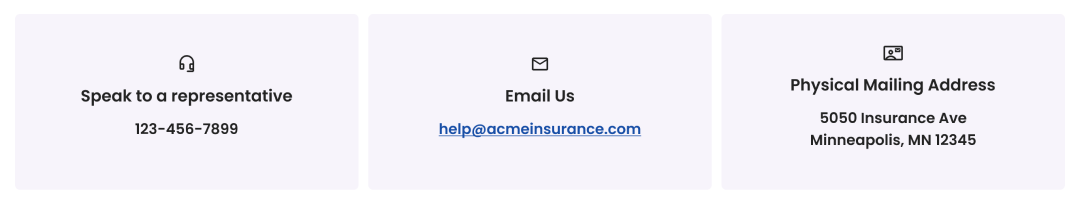
Icons can be especially helpful next to contact, help, and search content, and in callout boxes.

✓ Provide common icons next to key texts, headings, media sections, “contact us” buttons, and "help" buttons.Use clear and unambiguous icons or symbols that are easy to see and enlarge.

⭐ Helpful

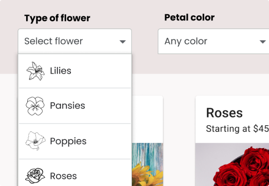
Start each item in a list (such as a select list as in this example, or instructions in a recipe) with an icon that relates to it.

ℹ️ Caution

Not including icons in this select list may create a barrier for people who have difficulty reading or understanding flower names.

✓ Be aware of cultural differences.

For example, a shopping cart icon ( 🛒 ) may not be helpful in locations where people typically use baskets ( 🧺 ).

✓ In left-to-right languages, when adding a few icons or symbols to a page place the image to the left of the text.

In left-to-right languages, the icon would be on the left of the text, at the beginning of the word. In right-to-left languages, the icon would ideally be on the right, also at the beginning of the word. In vertical languages, the icon may be most effective at the top.

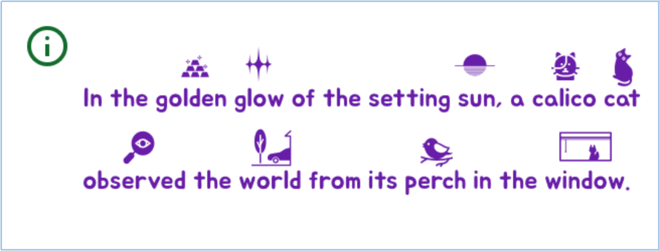
✓ When adding multiple symbols to a paragraph or section of text, place the symbols above the text.

⭐ Helpful

For someone who benefits from the icons, they can help to tell the story along with the words.

ℹ️ Caution

Too many icons can easily become overwhelming even for those they help.

✓ Use personalization semantics such as [personalization-semantics-1.0] to help the user load familiar symbols.

🎯 How it helps

People who have language comprehension, learning, or reading difficulties may rely on symbols to understand content and navigate to content they need. Symbols also help people who struggle with language and attention to navigate content, including media. Clear symbols, icons, and images can also act as signposts to help individuals find what they need.

More on how symbols can help individuals with content understanding and navigation 🔗

Avoid all caps in written content

Prototype - content not yet added

Avoid centering or full justifying text that runs more than 2 lines

Prototype - content not yet added

Include symbols and letters necessary to decipher the words

Prototype - content not yet added

Use familiar metrics and units

Prototype - content not yet added


Jump to objective:   Design   Interactions   Functionality   Content   Help

3.5 Objective 5: Help is available and usable

The user is able to complete their journey in an alternate way - including potentially outside of the system - if they choose to.

  1. Which roles typically do this? Product, though this also has to be designed and implemented.
  2. When is this typically done? Early in project planning, as a user journey.
  3. Which part of the process can break this? Any, especially launch.

Patterns for achieving available and usable help:

3.5.1 Available

Make it easy to find help

Prototype - content not yet added

Provide human help that can be found in context

Prototype - content not yet added

3.5.2 Alternative paths

Let users avoid navigating voice menus

Prototype - content not yet added

Provide alternative content formats such as easy read

Prototype - content not yet added

Provide summary of long documents and media

[Prototype - content not yet added

3.5.3 Accept user feedback and thoughts

Make it easy to give feedback

Prototype - content not yet added


Jump to:

A. Appendix

This is just a prototype for user testing! The current document is available at w3.org/TR/coga-usable. In the real document, the appendix will also direct the reader to non-normative resources, details about authorship, etc.