GameNative Theme Documentation
Welcome to the GameNative theme system documentation. Themes allow you to completely customize the appearance of your game library, from simple color changes to entirely new layouts with carousels, grids, and custom UI elements.
Quick Start
To create a minimal theme, you need three files in a folder:
MyTheme/
├── manifest.xml       ← Theme metadata (required)
├── theme.xml          ← Layout definition (name configurable in manifest)
├── variables.xml      ← Reusable values (optional)
└── assets/
    ├── theme.png        ← Preview image (recommended)
    └── ...              ← Images, videos, icons, etc.
Installation
To install a custom theme:
- Copy your theme folder to your device (e.g., Downloads or any accessible location)
- In GameNative, go to Settings → Themes
- Tap Add External Theme
- Navigate to and select your theme folder
[SD Card]/GameNative/Themes/ will be automatically detected.
Helpful Resources
As you build your theme, these sections will be particularly useful:
- Quick Reference — All elements and bindings at a glance
- Common Patterns — Copy-paste snippets for common features
- FAQ — Answers to "How do I...?" questions
- Troubleshooting — Solutions to common problems
- Best Practices — Tips for performance and polish
- Complete Examples — Full theme code to learn from
- Built-in Themes — Reference implementations to study
File Structure
A complete theme can include the following files:
| File | Required | Description |
|---|---|---|
manifest.xml | Yes | Theme identity, version, and compatibility info |
*.xml (theme) | Yes | Cards and layout definitions (filename set in manifest) |
*.xml (variables) | No | Reusable variables with breakpoint support (filename set in manifest) |
assets/theme.png | No* | Preview image shown in theme selector |
assets/* | No | Custom images, videos, icons, and other media |
locales/default.xml | No | Localized strings |
* Highly recommended for better user experience in the theme selector
<theme source="..." variables="..." /> element in manifest.xml. You can name them anything you like.
Manifest
The manifest.xml file defines your theme's identity and compatibility requirements.
<manifest>
    <id>my-custom-theme</id>
    <title>My Custom Theme</title>
    <version>1.0.0</version>
    <engineVersion>1.0.0</engineVersion>
    <minAppVersion>0.0.0</minAppVersion>
    <description>A beautiful custom theme for GameNative</description>
    <author>
        <name>Your Name</name>
        <github>https://github.com/yourusername</github>
    </author>
    <preview src="/assets/theme.png" />
    <theme source="/theme.xml" variables="/variables.xml" />
</manifest>
Manifest Fields
| Field | Required | Description |
|---|---|---|
id | Yes | Unique identifier (lowercase alpha-numeric, no spaces, hyphens allowed) |
title | Yes | Display name shown to users |
version | Yes | Theme version (semver format: 1.0.0) |
engineVersion | Yes | Required theme engine version |
minAppVersion | Yes | Minimum app version required |
maxAppVersion | No | Maximum app version supported |
description | No | Short description of your theme |
author | No | Author name and GitHub URL |
preview | No | Path to preview image |
theme | Yes | Paths to theme.xml and variables.xml |
Engine Version Constraints
The engineVersion field supports Composer-like constraint syntax:
| Constraint | Meaning |
|---|---|
1.0.0 | Exact version match |
1.* or 1.x | Any version 1.x.x |
^1.0.0 | >=1.0.0 and <2.0.0 |
~1.2.0 | >=1.2.0 and <1.3.0 |
>=1.0.0 | Greater than or equal |
Variables
Variables let you define reusable values that can be referenced throughout your theme. This makes it easy to maintain consistent styling and support responsive designs with breakpoints.
<variables>
    <!-- Colors -->
    <var name="textColor" value="#FFFFFFFF" />
    <var name="highlightColor" value="#9575CD" />

    <!-- Dimensions -->
    <var name="cornerRadius" value="15" />
    <var name="cardSize" value="120" />
    <var name="spacing" value="16" />

    <!-- Portrait mode overrides -->
    <breakpoint orientation="portrait">
        <var name="cardSize" value="100" />
        <var name="spacing" value="12" />
    </breakpoint>
</variables>
Using Variables
Reference variables in your theme using the @{vars.name} syntax:
<image width="@{vars.cardSize}" height="@{vars.cardSize}"
       cornerRadius="@{vars.cornerRadius}" />
Negative Values
Prefix variable references with - to negate them (useful for offsets):
<!-- Position outside the card bounds -->
<rect x="-@{vars.borderOffset}" y="-@{vars.borderOffset}"
      width="@{vars.borderSize}" height="@{vars.borderSize}" />
Breakpoints
Breakpoints allow you to override variable values based on screen orientation or width:
Orientation-Based Breakpoints
<breakpoint orientation="portrait">
    <var name="searchBarWidth" value="90%" />
    <var name="columns" value="2" />
</breakpoint>

<breakpoint orientation="landscape">
    <var name="searchBarWidth" value="400" />
    <var name="columns" value="4" />
</breakpoint>
Width-Based Breakpoints
<breakpoint minWidth="600" maxWidth="900">
    <var name="columns" value="3" />
</breakpoint>

<breakpoint minWidth="901">
    <var name="columns" value="4" />
</breakpoint>
Card Layers
Cards are reusable templates that define how each game appears in your layout. A card consists of multiple layers stacked from back to front—background shapes, cover images, text overlays, and decorative elements. Each layer can display dynamic game data using bindings like @{game.title} or @{game.capsule}.
Defining Cards
Cards can be defined in two ways:
1. In the Elements Section (Recommended for Reusable Cards)
Define cards in the <elements> section and reference them by id in your layout. This is ideal when you want to reuse the same card design or keep your layout clean.
<theme>
    <elements>
        <card id="gameCard" width="150" height="225">
            <image src="@{game.capsule}" ... />
            <text text="@{game.title}" ... />
        </card>
    </elements>

    <layout>
        <grid itemCard="gameCard" ... />
    </layout>
</theme>
2. Inline in the Layout (Convenient for Simple Themes)
Define the card directly inside a <grid> or <carousel>. The card is automatically used by that layout without needing an itemCard reference.
<theme>
    <layout>
        <grid cellWidth="150" aspectRatio="1.5" ...>
            <card>
                <image src="@{game.capsule}" ... />
                <text text="@{game.title}" ... />
            </card>
        </grid>
    </layout>
</theme><elements> approach for complex themes or when sharing cards between layouts. Use inline cards for simple, single-layout themes where everything stays in one place.
<elements>
    <card id="gameCard" width="150" height="225">
        <!-- Background layer -->
        <rect x="0" y="0" width="100%" height="100%"
              color="#FF1E1E1E" cornerRadius="12" />

        <!-- Game cover image -->
        <image x="0" y="0" width="100%" height="100%"
               src="@{game.capsule}"
               fallback="@{game.hero}"
               cornerRadius="12" scaleType="cover" />

        <!-- Title overlay -->
        <text x="8" y="8" width="90%"
              text="@{game.title}"
              textSize="14" color="#FFFFFFFF"
              anchor="bottomLeft" maxLines="2" />
    </card>
</elements>
Common Layer Attributes
All layer types share these positioning and visibility attributes. Use focusOnly to show elements only when a card is selected—great for titles, details, and focus indicators. The visibleWhen attribute enables conditional display based on game properties.
| Attribute | Required | Type | Description |
|---|---|---|---|
id | String | Identifier for the layer | |
x, y | ✓ | Dimension | Position (pixels or percentage) |
width, height | Dimension | Size (pixels, percentage, or 100%) | |
anchor | String | Reference point for positioning (default: topLeft) | |
opacity | Float | Transparency (0.0 - 1.0, default: 1.0) | |
zIndex | Float | Stacking order (default: 0) | |
focusOnly | Boolean | Only visible when card is focused (default: false) | |
focusTransitionSpeed | Integer | Fade animation duration in ms (default: 150) | |
visibleWhen | String | Binding condition for visibility (e.g., "@{game.isInstalled}") | |
visibility | String | "portrait", "landscape", or "always" (default) |
Image Layer
The <image> layer displays images from game data bindings or theme assets. Use it for game covers, icons, backgrounds, and decorative elements. The fallback attribute ensures graceful degradation when primary images aren't available.
<image id="cover"
       x="0" y="0"
       width="@{vars.imageSize}" height="@{vars.imageSize}"
       src="@{game.capsule}"
       fallback="@{game.hero}"
       cornerRadius="12"
       scaleType="cover"
tint="#88000000" />| Attribute | Required | Description |
|---|---|---|
src | ✓ | Image URL or binding (e.g., @{game.capsule}) |
fallback | Fallback image if src fails to load | |
cornerRadius | CSS-like radius: "8" or "8 8 0 0" | |
scaleType | "cover" (default), "contain"/"fit", "fill"/"stretch" | |
tint | Color overlay (ARGB) |
Text Layer
The <text> layer renders text content with full styling control. Use it for game titles, status labels, compatibility indicators, and any dynamic or static text. Supports text shadows for improved readability over images and automatic truncation with ellipsis.
<text id="title"
      x="10" y="10"
      width="80%"
      text="@{game.title}"
      textSize="16"
      color="#FFFFFFFF"
      fontWeight="bold"
      maxLines="1"
      overflow="ellipsis"
      textAlign="left"
      anchor="bottomLeft"
      shadowColor="#AA000000"
      shadowRadius="4"
      shadowOffsetX="1"
shadowOffsetY="2" />| Attribute | Required | Description |
|---|---|---|
text | ✓ | Text content or binding |
textSize | ✓ | Font size in sp |
color | ✓ | Text color (ARGB) |
fontWeight | "normal" (default), "bold", "light", "medium", "semibold" | |
fontStyle | "normal" (default) or "italic" | |
textAlign | "left" (default), "center", "right" | |
maxLines | Maximum number of lines (default: unlimited) | |
overflow | "ellipsis" (default), "clip", "visible" | |
lineHeight | Line height multiplier (e.g., 1.5 = 150%) | |
letterSpacing | Letter spacing in sp (can be negative) | |
textDecoration | "none" (default), "underline", "lineThrough" | |
shadowColor | Text shadow color (ARGB) | |
shadowRadius | Shadow blur radius | |
shadowOffsetX/Y | Shadow horizontal/vertical offset |
Rect Layer
The <rect> layer draws filled rectangles with optional borders and gradients. Use it for card backgrounds, overlay panels, status badges, and decorative shapes. The borderGradient option uses the app's theme colors for a polished focus indicator effect.
<rect id="background"
      x="0" y="0"
      width="100%" height="100%"
      color="#CC1E1E1E"
      cornerRadius="12"
      borderWidth="2"
      borderColor="#33FFFFFF"
      borderGradient="true"
      gradientStart="#FF6C5CE7"
      gradientEnd="#FF00CEC9"
gradientAngle="45" />| Attribute | Required | Description |
|---|---|---|
color | ✓ | Fill color (ARGB) |
cornerRadius | CSS-like: "8" or "8 8 0 0" | |
borderWidth | Border stroke width (default: 0) | |
borderColor | Border color (ARGB) | |
borderGradient | Use theme gradient for border (default: false) | |
gradientStart/End | Gradient fill colors (overrides color) | |
gradientAngle | Gradient angle in degrees (default: 0) |
Other Layer Types
Border Layer
The <border> layer draws a stroke-only outline without any fill. Use it when you need a border separate from a rect's fill, such as card outlines that overlay images or focus indicators. This is different from using borderWidth on a rect, which includes the fill area.
<border x="0" y="0" width="100%" height="100%"
        strokeWidth="2" color="#33FFFFFF"
cornerRadius="12" />| Attribute | Required | Description |
|---|---|---|
strokeWidth | ✓ | Border thickness in dp |
color | ✓ | Border color (ARGB) |
cornerRadius | CSS-like radius: "8" or "8 8 0 0" |
Video Layer
The <video> layer embeds video content within cards. Use it for animated backgrounds, promotional content, or game trailers. Videos can autoplay, loop, and are typically muted to avoid audio conflicts. The poster attribute shows a static image while the video loads.
<video src="assets/background.mp4"
       poster="assets/poster.png"
       autoplay="true" loop="true" muted="true"
cornerRadius="8" />| Attribute | Required | Description |
|---|---|---|
src | ✓ | Video file path or URL |
poster | Thumbnail image while loading | |
autoplay | Auto-start playback (default: false) | |
loop | Loop video continuously (default: true) | |
muted | Mute audio (default: true) | |
cornerRadius | Corner radius |
Shadow Layer
The <shadow> layer creates drop shadow effects beneath elements. Use it to add depth and visual separation between card elements. Place shadow layers before (below) the elements they should appear behind in the z-order. Combine with cornerRadius to match rounded shapes.
<shadow x="0" y="0" width="100%" height="100%"
        radius="16" color="#66000000"
dx="0" dy="4" cornerRadius="12" />| Attribute | Required | Description |
|---|---|---|
radius | ✓ | Blur radius in dp |
color | ✓ | Shadow color (ARGB) |
dx | Shadow horizontal offset (default: 0) | |
dy | Shadow vertical offset (default: 4) | |
cornerRadius | Match shape of element |
Backdrop Layer (Blur Effect)
The <backdrop> layer creates a frosted glass effect by blurring content behind it. Use it for overlay panels, status badges, or anywhere you want content to show through with a soft blur. Combine with tint to add a semi-transparent color overlay for better contrast.
<backdrop x="0" y="0" width="100%" height="100%"
          blurRadius="20" tint="#44000000"
cornerRadius="12" />| Attribute | Required | Description |
|---|---|---|
blurRadius | Blur strength in dp | |
tint | Color overlay (ARGB) | |
cornerRadius | Shape corners |
Button Layer
The <button> layer renders a styled button with text. Use it for action buttons like "Play", "Install", or "Open". The button is visual only within cards—the card itself handles the click interaction. Use @string/ references for localized button labels.
<button x="10" y="10" height="40" padding="0 20"
        text="@string/open_button"
        backgroundColor="@color/primary"
        textColor="@color/onPrimary"
        textSize="14"
        fontWeight="bold"
        cornerRadius="20"
        borderWidth="1"
        borderColor="#33FFFFFF"
anchor="bottomRight" />| Attribute | Required | Description |
|---|---|---|
text | ✓ | Button label text or binding |
backgroundColor | ✓ | Background color (ARGB) |
textColor | ✓ | Text color (ARGB) |
textSize | Font size (default: 14) | |
fontWeight | Font weight (default: normal) | |
cornerRadius | Button shape radius | |
borderWidth | Border thickness (default: 0) | |
borderColor | Border color (ARGB) | |
padding | CSS-like padding: "all" or "vertical horizontal" |
Layouts
Layouts control how your game cards are arranged and how users navigate through them. GameNative offers two layout types with distinct interaction patterns:
- Grid — Traditional scrollable grid for browsing large libraries efficiently
- Carousel — Focused browsing with scaling and background effects for immersive experiences
Each theme uses one primary layout. The layout references your card definition by its itemCard ID and handles all scrolling, selection, and navigation behavior automatically.
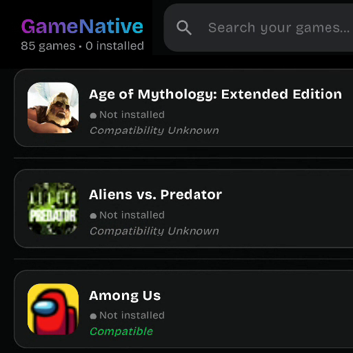
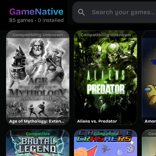
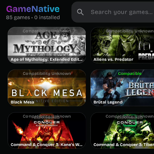
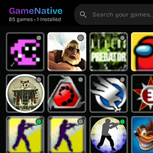
Grid Layout
The <grid> layout arranges game cards in a responsive grid pattern. It automatically calculates the number of columns based on screen width and cellWidth. Use grids for traditional library views where users can browse many games at once. The grid supports both portrait (capsule) and landscape (hero) aspect ratios.
<layout>
    <grid cellWidth="150"
          aspectRatio="1.5"
          hSpacing="16"
          vSpacing="16"
          padding="80 20"
          verticalAlign="center"
          selectionMode="moving"
          itemCard="gameCard"
          highlightBorderWidth="3"
          highlightCornerRadius="12" />
</layout>| Attribute | Required | Description |
|---|---|---|
cellWidth | ✓ | Minimum cell width for auto columns |
itemCard | ✓ | Card ID to use for items |
columns | Fixed column count (omit for auto-calculation) | |
cellHeight | Fixed cell height (or use aspectRatio) | |
aspectRatio | Width/height ratio (e.g., 0.67 for capsule, 2.14 for hero) | |
hSpacing | Horizontal gap between cells (default: 0) | |
vSpacing | Vertical gap between cells (default: 0) | |
padding | Content padding: "top right bottom left" | |
selectionMode | "moving" (default) or "stationary" | |
verticalAlign | "top" (default), "center", "bottom" | |
highlightBorderWidth | Focus border thickness (default: 3) | |
highlightCornerRadius | Focus border corner radius (default: 8) | |
navigationId | ID for navigation targeting |
Grid Separator
Separators add visual dividers between grid rows. They're particularly useful for single-column list layouts where you want horizontal lines between items. The separator content is defined using standard layer elements (rect, image, text) without game data bindings.
<grid columns="1" cellWidth="100%" ...>
    <separator height="1" margin="12 0">
        <rect x="0" y="0" width="100%" height="1" color="#22FFFFFF" />
    </separator>
</grid>| Attribute | Required | Description |
|---|---|---|
height | ✓ | Height of separator content area |
margin | Margin around separator: "vertical horizontal" |
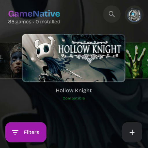
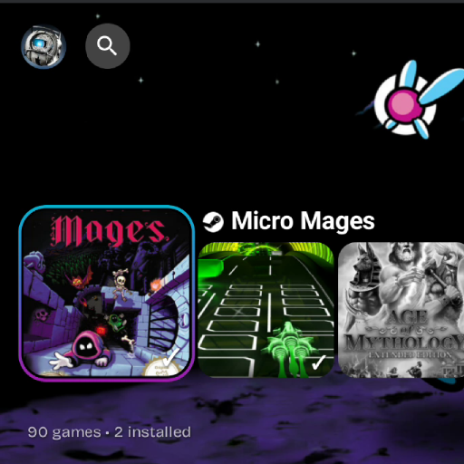
Carousel Layout
The <carousel> layout arranges game cards in a horizontal or vertical scrolling list with smooth focus effects. Use carousels for immersive browsing experiences where the focused game takes center stage. Carousels support scaling effects, opacity transitions, and dynamic background images that change as you browse—perfect for console-style interfaces.
<layout>
    <carousel orientation="horizontal"
              centerFocus="true"
              horizontalAlign="center"
              verticalAlign="center"
              verticalOffset="20"
              itemWidth="200"
              itemHeight="300"
              itemSpacing="16"
              focusedScale="1.2"
              unfocusedAlpha="0.7"
              focusedSpacing="30"
              beforeFocusOffset="50"
              focusedBackground="@{game.libraryHero}"
              backgroundOpacity="0.3"
              backgroundTransitionSpeed="400"
              selectionMode="stationary"
              itemCard="gameCard"
              highlightBorderWidth="0" />
</layout>| Attribute | Required | Description |
|---|---|---|
itemWidth | ✓ | Width of each carousel item |
itemHeight | ✓ | Height of each carousel item |
itemCard | ✓ | Card ID to use for items |
orientation | "horizontal" (default) or "vertical" | |
centerFocus | Center focused item on screen (default: false) | |
itemSpacing | Spacing between items (default: 0) | |
focusedScale | Scale multiplier for focused item (default: 1.0) | |
unfocusedAlpha | Opacity of non-focused items (default: 1.0) | |
focusedSpacing | Extra spacing around focused item (default: 0) | |
beforeFocusOffset | Offset for items before focus (default: 0) | |
focusedOffsetX/Y | Position offset for focused item (default: 0) | |
focusedBackground | Background image binding for focus | |
backgroundOpacity | Background image opacity (default: 0.3) | |
backgroundTransitionSpeed | Crossfade duration in ms (default: 400) | |
selectionMode | "stationary" (default) or "moving" | |
horizontalAlign | "start" (default), "center", "end" | |
verticalAlign | "top" (default), "center", "bottom" | |
horizontalOffset | Offset from horizontal alignment (default: 0) | |
verticalOffset | Offset from vertical alignment (default: 0) | |
highlightBorderWidth | Focus border thickness (default: 3) | |
highlightCornerRadius | Focus border corner radius (default: 8) | |
navigationId | ID for navigation targeting |
Fixed Elements
Fixed elements are UI components that remain in place while game content scrolls. They provide essential app functionality—searching, filtering, adding games, and accessing settings. Fixed elements are organized into containers (like "topBar" and "bottomBar") that can have their own backgrounds and visibility settings.
Unlike card layers, fixed elements are functional components that the app renders with built-in behavior. You control their appearance and position, but the app handles their interaction logic.
Defining Fixed Containers
Like cards, fixed containers can be defined in two ways:
- Directly in
<layout>— Most common approach, keeps everything in one place - In
<elements>— For complex themes, pre-define containers alongside your cards
<layout>
    <!-- Main content (grid or carousel) -->
    <grid ... />

    <!-- Top bar -->
    <fixed id="topBar" backgroundColor="#CC000000" height="72">
        <header x="16" y="8" anchor="topLeft" ... />
        <searchBar x="200" y="12" ... />
        <profileButton x="16" y="12" anchor="topRight" ... />
    </fixed>

    <!-- Bottom bar -->
    <fixed id="bottomBar">
        <filterButton x="100" y="24" anchor="bottomRight" ... />
        <addButton x="16" y="24" anchor="bottomRight" ... />
    </fixed>
</layout>
Fixed Container Attributes
Fixed containers group related UI elements that stay in place while content scrolls. Typical uses include top bars (header, search, profile) and bottom bars (filter, add buttons). You can have multiple containers with different backgrounds and visibility settings for portrait/landscape modes.
| Attribute | Required | Description |
|---|---|---|
id | ✓ | Unique identifier for the container |
backgroundColor | Container background (ARGB, null = transparent) | |
height | Container height (auto if omitted) | |
padding | Internal padding | |
visibility | "portrait", "landscape", or "always" (default) | |
cornerRadius | Background corner radius (default: 0) | |
zIndex | Stacking order relative to other layout elements |
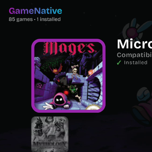
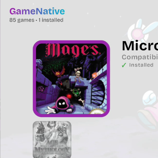
Header
The <header> element displays app branding and library statistics. It automatically shows the app name with gradient styling, current theme name, and game counts (total and installed). Each part can be toggled on/off. Place it in a top bar container for consistent positioning across orientations.
<header x="16" y="8"
        anchor="topLeft"
        textColor="#FFFFFFFF"
        showAppName="true"
        showThemeName="false"
        showGameCount="true"
        textSize="14"
        fontWeight="bold"
        textShadowColor="#AA000000"
        textShadowRadius="4"
        textShadowOffsetX="1"
textShadowOffsetY="2" />| Attribute | Required | Description |
|---|---|---|
x, y | ✓ | Position coordinates |
showAppName | Display "GameNative" with gradient (default: true) | |
showThemeName | Display current theme name (default: true) | |
showGameCount | Display game/installed counts (default: true) | |
textColor | Text color (ARGB, default: white) | |
textSize | Font size (default: 14) | |
fontWeight | "bold" (default), "normal", "medium", etc. | |
backgroundColor | Background color (null = transparent) | |
padding | Internal padding (default: 8) | |
cornerRadius | Background corner radius (default: 0) | |
textShadowColor | Shadow color (ARGB) | |
textShadowRadius | Shadow blur radius (default: 0) | |
textShadowOffsetX/Y | Shadow offset (default: 0) |
SearchBar
The <searchBar> element provides game filtering functionality. Users can type to filter games by name. The collapsible option shrinks it to an icon when inactive, saving space in compact layouts. It expands when focused or when text is entered.
<searchBar navigationId="searchBtn"
           x="200" y="12"
           width="400" height="48"
           anchor="topLeft"
           backgroundColor="#FF1E1E1E"
           textColor="#FFFFFFFF"
           borderRadius="24"
           collapsible="true"
           expandDirection="right"
           highlightOpacity="0.8"
           highlightBorderWidth="2"
           navigateRight="profileBtn"
navigateDown="grid" />| Attribute | Required | Description |
|---|---|---|
x, y | ✓ | Position coordinates |
width, height | ✓ | Search bar dimensions |
backgroundColor | Background color (ARGB) | |
textColor | Text/icon color (ARGB) | |
borderRadius | Corner radius in dp (default: 8) | |
collapsible | Collapse to icon when inactive (default: false) | |
expandDirection | "left" (default) or "right" expansion | |
navigationId | ID for navigation targeting |
Button Elements
Button elements provide the main interactive controls for your theme. Each button has built-in functionality—you customize their appearance and position while the app handles click behavior. All buttons support controller navigation with customizable highlight styling.
ProfileButton
The <profileButton> opens the user profile/settings screen. It displays the user's Steam avatar when logged in, or a default icon otherwise. Typically placed in the top-right corner of the interface.
<profileButton navigationId="profileBtn"
               x="16" y="12"
               anchor="topRight"
               size="48"
               iconSize="36"
               padding="6"
               backgroundColor="#66808080"
               cornerRadius="24"
               highlightBorderWidth="2"
navigateLeft="searchBtn" />| Attribute | Required | Description |
|---|---|---|
x, y | ✓ | Position coordinates |
size | Button container size in dp (default: 48) | |
iconSize | Profile icon size in dp (default: 24) | |
padding | Internal padding (default: 8) | |
backgroundColor | Background color (ARGB) | |
cornerRadius | Corner radius (default: 12, size/2 = circle) | |
navigationId | ID for navigation targeting |
FilterButton & AddButton
The <filterButton> opens a bottom sheet for filtering and sorting games by various criteria (installed status, compatibility, etc.). The <addButton> opens a dialog to add custom (non-Steam) games to the library. Both support expanded mode which shows text labels alongside icons.
<filterButton navigationId="filterBtn"
              x="100" y="24"
              anchor="bottomRight"
              expanded="true"
              size="56"
              iconSize="24"
              backgroundColor="#00000000"
              iconColor="#FFFFFFFF"
              cornerRadius="16"
              padding="0 20"
              textShadowColor="#AA000000"
              textShadowRadius="4"
              navigateUp="grid"
              navigateRight="addBtn" />

<addButton navigationId="addBtn"
           x="16" y="24"
           anchor="bottomRight"
           expanded="false"
           size="56"
           iconSize="24"
           cornerRadius="28"
navigateLeft="filterBtn" />| Attribute | Required | Description |
|---|---|---|
x, y | ✓ | Position coordinates |
expanded | Show text label (true) or icon only (default: filterBtn=true, addBtn=false) | |
size | Button size in dp (default: 56) | |
iconSize | Icon size inside button (default: 24) | |
backgroundColor | Background color (ARGB, null = theme primary) | |
iconColor | Icon tint color (ARGB, null = theme onPrimary) | |
cornerRadius | Corner radius (default: 16, size/2 = circle) | |
padding | CSS-like padding: "all" or "vertical horizontal" | |
textShadowColor | Text shadow color (for expanded mode) | |
textShadowRadius | Text shadow blur radius (default: 0) | |
textShadowOffsetX/Y | Text shadow offset (default: 0) | |
navigationId | ID for navigation targeting |
Other Fixed Elements
Beyond the functional buttons, you can add static decorative and informational elements to your fixed containers. These elements don't have built-in click behavior—they're purely visual, letting you create custom layouts with backgrounds, logos, and additional information.
SystemTime
The <systemTime> element displays the device's current time. It updates automatically and supports both 12-hour (with AM/PM) and 24-hour formats. Ideal for console-style interfaces where users want to see the time without leaving the app.
<systemTime x="24" y="24"
            anchor="topRight"
            textSize="18"
            textColor="#FFFFFFFF"
            fontWeight="medium"
use24Hour="false" />| Attribute | Required | Description |
|---|---|---|
x, y | ✓ | Position coordinates |
textSize | Font size in sp (default: 16) | |
textColor | Text color (ARGB, default: white) | |
fontWeight | "normal" (default), "bold", "medium", etc. | |
use24Hour | 24-hour format (true) or 12-hour with AM/PM (default: false) |
Static Image
Static <image> elements in fixed containers display images that don't change with game selection. Use them for logos, decorative graphics, icons, or background elements. Images are loaded from the theme's assets/ folder.
<image x="16" y="16"
       width="120" height="40"
       src="assets/logo.png"
       scaleType="contain"
       cornerRadius="8"
       opacity="0.9"
anchor="topLeft" />| Attribute | Required | Description |
|---|---|---|
x, y | ✓ | Position coordinates |
width, height | ✓ | Image dimensions |
src | ✓ | Image path (relative to theme folder) |
scaleType | "cover" (default), "contain"/"fit", "fill"/"stretch", "none" | |
cornerRadius | Corner radius | |
opacity | Transparency (default: 1.0) |
Static Video
Static <video> elements play video content in fixed positions. Use them for animated backgrounds, promotional loops, or ambient effects. Videos are typically set to autoplay, loop, and mute to run continuously without user interaction.
<video x="0" y="0"
       width="100%" height="100%"
       src="assets/background.mp4"
       poster="assets/poster.png"
       autoplay="true" loop="true" muted="true"
       cornerRadius="0" />
Static Text
Static <text> elements display fixed text content. Use them for labels, section titles, instructions, or decorative text. Unlike text in cards, these don't use game data bindings—they show the same content regardless of which game is selected.
<text x="16" y="16"
      text="My Library"
      textSize="24"
      color="#FFFFFFFF"
      fontWeight="bold"
      fontStyle="normal"
      maxLines="1"
      overflow="ellipsis"
opacity="1.0" />| Attribute | Required | Description |
|---|---|---|
x, y | ✓ | Position coordinates |
text | ✓ | Text content to display |
textSize | Font size in sp (default: 14) | |
color | Text color (ARGB, default: white) | |
fontWeight | "normal" (default), "bold", "medium", "semibold" | |
fontStyle | "normal" (default) or "italic" | |
textAlign | "left" (default), "center", "right" | |
maxLines | Maximum lines (null = unlimited) | |
overflow | "ellipsis" (default), "clip", "visible" | |
opacity | Transparency (default: 1.0) |
Rect (Background/Overlay)
Static <rect> elements draw filled shapes in fixed positions. Use them for full-screen backgrounds, gradient overlays for text readability, divider lines, or decorative shapes. Gradient rects are particularly useful for fading backgrounds from solid to transparent.
<rect x="0" y="0"
      width="100%" height="80"
      color="#CC000000"
      cornerRadius="0"
      borderWidth="1"
      borderColor="#22FFFFFF"
      gradientStart="#CC000000"
      gradientEnd="#00000000"
      gradientAngle="90"
anchor="topLeft" />| Attribute | Required | Description |
|---|---|---|
x, y | ✓ | Position coordinates |
width, height | ✓ | Rectangle dimensions |
color | Fill color (ARGB, default: transparent) | |
cornerRadius | Corner radius | |
borderWidth | Border stroke width (default: 0) | |
borderColor | Border color (ARGB) | |
gradientStart | Gradient start color (overrides color) | |
gradientEnd | Gradient end color | |
gradientAngle | Gradient angle in degrees (default: 0) | |
opacity | Transparency (default: 1.0) |
Shadow & Backdrop (Fixed)
Static <shadow> and <backdrop> elements work similarly to their card layer counterparts but in fixed positions. Use shadows for depth effects on fixed UI elements, and backdrops for frosted glass panels or blur effects over scrolling content.
offsetX/offsetY attributes, while card layer shadows use dx/dy.
<!-- Drop shadow (fixed element) -->
<shadow x="0" y="0" width="200" height="100"
        radius="16" color="#66000000"
        offsetX="0" offsetY="4" />

<!-- Blur backdrop -->
<backdrop x="0" y="0" width="100%" height="100%"
          blurRadius="20" tint="#44000000" />
Game Data Bindings
Use these bindings to display dynamic game information in your theme. Reference them with the @{binding.path} syntax.
| Binding | Type | Description |
|---|---|---|
@{game.title} | String | Game name |
@{game.cover} | URL | Icon/logo image |
@{game.capsule} | URL | Portrait cover (600x900) |
@{game.hero} | URL | Header banner (460x215) |
@{game.libraryHero} | URL | Large banner (1920x620) |
@{game.appId} | String | Steam App ID or custom ID |
Status Bindings
| Binding | Type | Description |
|---|---|---|
@{game.isInstalled} | Boolean | "true" if game is installed |
@{game.installStatus} | String | "Installed" or "Not Installed" |
@{game.installStatus.color} | Color | Green or gray based on status |
@{game.lastPlayed} | String | Last played timestamp |
Compatibility Bindings
| Binding | Type | Description |
|---|---|---|
@{game.compatibility.label} | String | "Compatible", "Not Compatible", etc. |
@{game.compatibility.color} | Color | Status color (green/red/gray) |
@{game.compatibility.visible} | Boolean | "true" if status is known |
Source Bindings
| Binding | Type | Description |
|---|---|---|
@{game.isSteam} | Boolean | "true" for Steam games |
@{game.isCustom} | Boolean | "true" for custom games |
@{game.source} | String | "steam" or "custom_game" |
Using Bindings for Conditional Visibility
The visibleWhen attribute uses the standard binding syntax. The element is shown only when the binding evaluates to "true".
<!-- Show checkmark only when installed -->
<text text="✓" visibleWhen="@{game.isInstalled}" />

<!-- Show Steam icon only for Steam games -->
<image src="assets/steam.png" visibleWhen="@{game.isSteam}" />

<!-- Dynamic color from binding (these DO use @{...}) -->
<text text="@{game.compatibility.label}"
color="@{game.compatibility.color}" />@{...} syntax consistently—visibleWhen, text, src, color, and more.
System Information
System-level information is displayed through dedicated UI elements rather than bindings. Here's how to show various system data:
App & Library Info (Header Element)
The <header> element provides built-in display of app and library information:
| Attribute | Default | Description |
|---|---|---|
showAppName | true | Displays "GameNative" with gradient styling |
showThemeName | true | Displays "Theme: {current theme name}" |
showGameCount | true | Displays "{total} Games • {installed} Installed" |
<header x="16" y="8" anchor="topLeft"
        textColor="#FFFFFFFF"
        showAppName="true"
        showThemeName="false"
        showGameCount="true"
        textSize="14" />
Current Time (SystemTime Element)
The <systemTime> element displays the device's current time:
| Attribute | Default | Description |
|---|---|---|
textSize | 16 | Font size in sp |
textColor | white | Text color (ARGB) |
fontWeight | normal | "normal", "bold", "medium", etc. |
use24Hour | false | Use 24-hour format (true) or 12-hour with AM/PM (false) |
<systemTime x="24" y="24"
            anchor="topRight"
            textSize="18"
            textColor="#FFFFFFFF"
            fontWeight="medium"
            use24Hour="false" />
Localized Strings
Reference localized app strings using the @string/ prefix:
<button text="@string/open_button" ... />You can also define custom strings in your theme's locales/ folder:
<!-- locales/default.xml -->
<resources>
    <string name="my_custom_label">Custom Text</string>
</resources>
System Colors
Use Material Design system colors that automatically adapt to the app's theme. Reference them with the @color/ prefix in any color attribute:
| Color Reference | Description |
|---|---|
@color/primary | Primary brand color |
@color/onPrimary | Text/icons on primary |
@color/primaryContainer | Primary container color |
@color/onPrimaryContainer | Text/icons on primary container |
@color/secondary | Secondary accent color |
@color/onSecondary | Text/icons on secondary |
@color/secondaryContainer | Secondary container color |
@color/onSecondaryContainer | Text/icons on secondary container |
@color/tertiary | Tertiary accent color |
@color/onTertiary | Text/icons on tertiary |
@color/tertiaryContainer | Tertiary container color |
@color/onTertiaryContainer | Text/icons on tertiary container |
@color/background | Background color |
@color/onBackground | Text/icons on background |
@color/surface | Surface/card color |
@color/onSurface | Text/icons on surface |
@color/surfaceVariant | Surface variant color |
@color/onSurfaceVariant | Text/icons on surface variant |
@color/error | Error color |
@color/onError | Text/icons on error |
@color/errorContainer | Error container color |
@color/onErrorContainer | Text/icons on error container |
@color/outline | Outline/border color |
@color/outlineVariant | Outline variant color |
<button backgroundColor="@color/primary"
        textColor="@color/onPrimary" />
Color Format
Colors use ARGB hex format: #AARRGGBB
#FFFFFFFF- Opaque white#88000000- 53% black overlay#00000000- Fully transparent#FF6C5CE7- Opaque purple
Positioning Reference
Coordinate Systems
Positioning works the same way for both card layers and fixed elements, just with different parent containers:
| Context | Parent Container | Description |
|---|---|---|
| Card Layers | Card Canvas | x/y positions are relative to the card's bounds. Anchors work relative to the card. |
| Fixed Elements | Screen | x/y positions are relative to the screen. Anchors work relative to the screen edges. |
Anchor Points
The anchor attribute determines the reference point for positioning within the parent container (card or screen). Anchors are fully supported for both card layers and fixed elements.
Parent container (card or screen)
| Anchor Value | Description |
|---|---|
topLeft | Top-left corner (default) |
topCenter | Top edge, centered horizontally |
topRight | Top-right corner |
centerLeft | Left edge, centered vertically |
center | Center of element |
centerRight | Right edge, centered vertically |
bottomLeft | Bottom-left corner |
bottomCenter | Bottom edge, centered horizontally |
bottomRight | Bottom-right corner |
<!-- Card layer: position from top-left of card -->
<image x="10" y="20" anchor="topLeft" ... />

<!-- Card layer: position from bottom-right of card (e.g., installed checkmark) -->
<text x="8" y="8" anchor="bottomRight" text="✓" ... />

<!-- Card layer: center horizontally within card -->
<text x="0" y="10" anchor="topCenter" text="@{game.title}" ... />

<!-- Fixed element: position at bottom-right of screen, 16px from edges -->
<addButton x="16" y="16" anchor="bottomRight" ... />

<!-- Fixed element: center horizontally at top of screen -->
<header x="0" y="24" anchor="topCenter" ... />anchor="bottomRight" and x="8" y="8", the element is positioned 8px from the right edge and 8px from the bottom edge of the parent (card or screen).
Dimensions
Sizes and positions can be specified in several formats:
| Format | Example | Description |
|---|---|---|
| Pixels | 120 | Absolute pixel value |
| Percentage | 50% | Relative to parent size |
| Full | 100% | Fill parent dimension |
| Negative | -16 | Offset from edge |
Corner Radius (CSS-like)
Corner radius uses CSS-like shorthand syntax:
| Format | Example | Description |
|---|---|---|
| 1 value | "12" | All corners 12dp |
| 2 values | "12 0" | Top-left/bottom-right 12, top-right/bottom-left 0 |
| 4 values | "12 12 0 0" | Top-left, top-right, bottom-right, bottom-left |
<!-- Rounded top only -->
<rect cornerRadius="12 12 0 0" ... />

<!-- Rounded bottom only -->
<rect cornerRadius="0 0 12 12" ... />
Visibility
Control element visibility based on orientation:
<!-- Only visible in portrait mode -->
<text visibility="portrait" ... />

<!-- Only visible in landscape mode -->
<image visibility="landscape" ... />

<!-- Always visible (default) -->
<rect visibility="always" ... />
Z-Index (Stacking Order)
Control which elements appear on top using zIndex. Higher values render on top:
<!-- Background (behind everything) -->
<rect zIndex="-1" ... />

<!-- Default layer -->
<image zIndex="0" ... />

<!-- Overlay (on top) -->
<text zIndex="1" ... />
Relative vs Global Stacking
The zIndex is relative to sibling elements within the same container, not global:
- Card layers: zIndex determines stacking order among layers within that card
- Fixed container elements: zIndex determines stacking order among elements within that fixed container (e.g., topBar or bottomBar)
However, the parent container's position in the layout affects overall visibility. For example, elements in a bottomBar fixed container will naturally render on top of elements in the main layout area.
Quick Reference
A condensed overview of all theme elements and their key attributes for quick lookup.
All Elements at a Glance
| Element | Context | Key Attributes | Purpose |
|---|---|---|---|
<card> | Elements/Layout | id, width, height | Game card template container |
<image> | Card/Fixed | src, fallback, scaleType, cornerRadius | Display images from bindings or assets |
<text> | Card/Fixed | text, textSize, color, fontWeight | Render text with styling |
<rect> | Card/Fixed | color, cornerRadius, borderWidth, gradientStart/End | Draw shapes, backgrounds, overlays |
<border> | Card | strokeWidth, color, cornerRadius | Stroke-only outline (no fill) |
<shadow> | Card/Fixed | radius, color, dx/dy or offsetX/Y | Drop shadow effects |
<backdrop> | Card/Fixed | blurRadius, tint, cornerRadius | Frosted glass blur effect |
<video> | Card/Fixed | src, poster, autoplay, loop | Embed video content |
<button> | Card | text, backgroundColor, textColor | Styled button element |
<grid> | Layout | cellWidth, aspectRatio, itemCard | Grid arrangement of cards |
<carousel> | Layout | itemWidth/Height, focusedScale, focusedBackground | Scrolling carousel of cards |
<fixed> | Layout | id, backgroundColor, height | Container for fixed UI elements |
<header> | Fixed | showAppName, showGameCount, textColor | App branding and stats |
<searchBar> | Fixed | width, height, collapsible | Game filter input |
<profileButton> | Fixed | size, iconSize, cornerRadius | User profile/settings button |
<filterButton> | Fixed | expanded, size, backgroundColor | Filter/sort bottom sheet |
<addButton> | Fixed | expanded, size, cornerRadius | Add custom game dialog |
<systemTime> | Fixed | textSize, textColor, use24Hour | Display current time |
Common Binding Reference
| Category | Bindings |
|---|---|
| Images | @{game.capsule}, @{game.hero}, @{game.libraryHero}, @{game.cover} |
| Text | @{game.title}, @{game.appId}, @{game.lastPlayed} |
| Status | @{game.isInstalled}, @{game.installStatus}, @{game.installStatus.color} |
| Compatibility | @{game.compatibility.label}, @{game.compatibility.color} |
| Source | @{game.isSteam}, @{game.isCustom}, @{game.source} |
Starter Template
Copy this minimal theme structure to get started quickly:
id and title in manifest.xml, then customize from there.
<!-- manifest.xml -->
<manifest>
    <id>my-theme</id>
    <title>My Theme</title>
    <version>1.0.0</version>
    <engineVersion>1.*</engineVersion>
    <minAppVersion>0.0.0</minAppVersion>
    <description>My custom theme</description>
    <preview src="/assets/theme.png" />
    <theme source="/theme.xml" variables="/variables.xml" />
</manifest>
<!-- theme.xml (minimal grid) -->
<theme>
<elements>
<card id="gameCard" width="100%" height="100%">
<image x="0" y="0" width="100%" height="100%"
src="@{game.capsule}" cornerRadius="@{vars.radius}" scaleType="cover" />
</card>
</elements>
<layout>
<grid cellWidth="150" aspectRatio="1.5" hSpacing="16" vSpacing="16"
padding="80 16" itemCard="gameCard" />
<fixed id="topBar" backgroundColor="#CC000000" height="72">
<header x="16" y="16" anchor="topLeft" />
<profileButton x="16" y="12" anchor="topRight" />
</fixed>
<fixed id="bottomBar">
<filterButton x="80" y="24" anchor="bottomRight" />
<addButton x="16" y="24" anchor="bottomRight" />
</fixed>
</layout>
</theme><!-- variables.xml (optional) -->
<variables>
<var name="radius" value="12" />
<breakpoint orientation="portrait">
<var name="radius" value="8" />
</breakpoint>
</variables>Common Patterns
Copy-paste these proven patterns to add common features to your theme.
Status Badge (Installed Checkmark)
Show an indicator when a game is installed:
<!-- Background circle -->
<rect x="6" y="6" width="24" height="24"
      color="#CC000000" cornerRadius="12" anchor="bottomLeft"
      visibleWhen="@{game.isInstalled}" />

<!-- Checkmark icon -->
<text x="6" y="6" width="24" height="24"
      text="✓" textSize="14" color="#FF4CAF50" fontWeight="bold"
      textAlign="center" anchor="bottomLeft"
      visibleWhen="@{game.isInstalled}" />
Compatibility Indicator Dot
Show a colored dot indicating game compatibility:
<!-- Dark background -->
<rect x="6" y="6" width="18" height="18"
      color="#AA000000" cornerRadius="9" anchor="topRight" />

<!-- Colored dot (color from binding) -->
<rect x="9" y="9" width="12" height="12"
      color="@{game.compatibility.color}" cornerRadius="6" anchor="topRight" />
Gradient Fade for Text Readability
Add a gradient overlay so text is readable over images:
<!-- Bottom fade gradient -->
<rect x="0" y="0" width="100%" height="50%"
      gradientStart="#00000000" gradientEnd="#CC000000"
      gradientAngle="180" anchor="bottomLeft" />

<!-- Text on top of gradient -->
<text x="12" y="12" width="90%" anchor="bottomLeft"
      text="@{game.title}" textSize="14" color="#FFFFFFFF"
      fontWeight="bold" maxLines="2" />
Focus Border with Gradient
Show a gradient border when the card is focused:
<rect x="0" y="0" width="100%" height="100%"
      color="#00000000"
      borderWidth="3"
      borderGradient="true"
      cornerRadius="12"
      focusOnly="true"
      focusTransitionSpeed="200" />
Text with Drop Shadow
Add shadow for better contrast over variable backgrounds:
<text x="12" y="12" width="80%"
      text="@{game.title}"
      textSize="16" color="#FFFFFFFF" fontWeight="bold"
      maxLines="1" overflow="ellipsis"
      shadowColor="#AA000000"
      shadowRadius="4"
      shadowOffsetX="1"
      shadowOffsetY="2" />
Source Icon (Steam/Custom)
Show different icons based on game source:
<!-- Steam icon -->
<image x="8" y="8" width="20" height="20"
       src="assets/steam.png" scaleType="contain"
       anchor="topLeft" focusOnly="true"
       visibleWhen="@{game.isSteam}" />

<!-- Custom game icon -->
<image x="8" y="8" width="20" height="20"
       src="assets/folder.png" scaleType="contain"
       anchor="topLeft" focusOnly="true"
       visibleWhen="@{game.isCustom}" />
Title Only When Focused
Show game title with fade animation on focus:
<text x="0" y="8" width="100%"
      text="@{game.title}"
      textSize="14" color="#FFFFFFFF"
      textAlign="center" maxLines="1"
      focusOnly="true"
      focusTransitionSpeed="250"
      anchor="bottomCenter" />
Different Layouts for Portrait/Landscape
Show elements only in specific orientations:
<!-- Compact title for portrait -->
<text x="8" y="8" width="90%"
      text="@{game.title}" textSize="12"
      visibility="portrait" />

<!-- Detailed info for landscape -->
<text x="16" y="16" width="80%"
      text="@{game.title}" textSize="16"
      visibility="landscape" />

<text x="16" y="40" width="80%"
      text="@{game.compatibility.label}" textSize="12"
      color="@{game.compatibility.color}"
      visibility="landscape" />
Frosted Glass Panel
Create a blurred glass effect for overlays:
<!-- Blur backdrop -->
<backdrop x="0" y="0" width="100%" height="80"
          blurRadius="20" tint="#66000000"
          cornerRadius="0 0 16 16"
          anchor="topLeft" />

<!-- Content on top -->
<header x="16" y="16" anchor="topLeft" textColor="#FFFFFFFF" />
FAQ: How Do I...
Answers to common theme development questions.
...create different layouts for portrait and landscape?
Use breakpoints in your variables file to define orientation-specific values:
<variables>
    <!-- Default (landscape) values -->
    <var name="columns" value="4" />
    <var name="cardSize" value="200" />

    <!-- Portrait overrides -->
    <breakpoint orientation="portrait">
        <var name="columns" value="2" />
        <var name="cardSize" value="150" />
    </breakpoint>
</variables>
Then reference these variables in your theme: cellWidth="@{vars.cardSize}"
...show/hide elements based on game status?
Use the visibleWhen attribute with a binding:
<!-- Show only for installed games -->
<text text="Installed" visibleWhen="@{game.isInstalled}" />

<!-- Show only for Steam games -->
<image src="assets/steam.png" visibleWhen="@{game.isSteam}" />
...make the focused card stand out?
Use focusOnly="true" to show elements only when focused, and configure carousel scaling:
<!-- In card definition -->
<rect borderWidth="3" borderGradient="true"
      focusOnly="true" focusTransitionSpeed="200" />

<!-- In carousel layout -->
<carousel focusedScale="1.2" unfocusedAlpha="0.6" />
...use the game's artwork as a background?
Use the focusedBackground attribute on a carousel:
<carousel focusedBackground="@{game.libraryHero}"
          backgroundOpacity="0.4"
          backgroundTransitionSpeed="400" />
...position elements from different corners?
Use the anchor attribute. See the Positioning section for all options:
<!-- Bottom-right corner, 16px from edges -->
<addButton x="16" y="16" anchor="bottomRight" />

<!-- Centered horizontally at top -->
<header x="0" y="24" anchor="topCenter" />
...add rounded corners to only some sides?
Use CSS-like shorthand for cornerRadius:
<!-- Rounded top only: topLeft topRight bottomRight bottomLeft -->
<rect cornerRadius="12 12 0 0" />

<!-- Rounded bottom only -->
<rect cornerRadius="0 0 12 12" />
...use the app's theme colors?
Reference system colors with @color/:
<button backgroundColor="@color/primary"
        textColor="@color/onPrimary" />

<rect color="@color/surface"
      borderColor="@color/outline" />
...create a full-width list instead of a grid?
Set columns="1" and cellWidth="100%" on your grid:
<grid columns="1" cellWidth="100%" cellHeight="80"
      vSpacing="8" padding="80 16" itemCard="listCard">
    <separator height="1" margin="4 0">
        <rect x="0" y="0" width="100%" height="1" color="#22FFFFFF" />
    </separator>
</grid>
...display the current time?
Add a <systemTime> element to a fixed container:
<fixed id="topBar">
    <systemTime x="24" y="24" anchor="topRight"
                textSize="18" textColor="#FFFFFFFF"
                use24Hour="false" />
</fixed>
...test my theme changes quickly?
After adding your theme via the "Add External Theme" button, you can edit the theme files directly. Just restart the app to see your changes—no need to re-add the theme each time.
Troubleshooting
Common issues and how to fix them.
Theme Not Appearing in App
- Verify
manifest.xmlexists in the theme root folder - Check that
<id>is unique and uses only lowercase letters, numbers, and hyphens - Ensure
<theme source="...">points to the correct theme file path - Confirm the theme folder was added via "Add External Theme" button
- Try restarting the app after adding the theme
Elements Not Rendering
| Symptom | Likely Cause | Fix |
|---|---|---|
| Image shows blank | Invalid src path or binding |
Check asset path is relative to theme folder (e.g., assets/icon.png) or binding syntax (@{game.capsule}) |
| Element not visible | Zero width/height or wrong position | Ensure width and height are set; check x, y, and anchor |
| Text not showing | Color blends with background | Use contrasting color or add shadowColor |
| Conditional element never shows | Incorrect visibleWhen binding |
Use @{...} syntax: visibleWhen="@{game.isInstalled}" |
| Focus effects not working | focusOnly missing or wrong |
Add focusOnly="true" to focus-specific elements |
| Element behind other elements | Stacking order issue | Adjust zIndex or reorder elements in XML (later = on top) |
Common XML Mistakes
| Mistake | Correct |
|---|---|
visible="true" |
visibleWhen="@{game.isInstalled}" |
color="white" |
color="#FFFFFFFF" (ARGB hex) |
src="game.capsule" |
src="@{game.capsule}" (binding syntax) |
cornerRadius="12px" |
cornerRadius="12" (no units) |
<card>...<card> |
<card>...</card> (proper closing tag) |
text=@{game.title} |
text="@{game.title}" (quotes required) |
Layout Issues
| Issue | Solution |
|---|---|
| Grid has wrong number of columns | Remove columns attribute to auto-calculate, or set explicitly |
| Cards overlap or have gaps | Check hSpacing, vSpacing, and padding values |
| Carousel items cut off at edges | Adjust horizontalOffset or padding |
| Fixed elements hidden by content | Ensure adequate padding on grid/carousel for fixed element space |
| Card doesn't match layout | Verify itemCard ID matches card's id attribute |
Variables Not Working
- Check that
variablesattribute in manifest points to correct file - Ensure variable names match exactly (case-sensitive)
- Use correct reference syntax:
@{vars.variableName} - Verify breakpoint
orientationis "portrait" or "landscape" (not "Portrait")
Best Practices
Recommendations for creating polished, performant themes.
⚡ Performance
| Tip | Why |
|---|---|
| Keep layer count minimal per card | Each layer adds rendering overhead, especially in large grids |
| Optimize image assets | Large images consume memory; compress PNGs and keep dimensions reasonable |
Use focusOnly for detail layers |
Reduces rendering load when elements are only visible on focus |
Prefer cornerRadius over image masks |
Built-in corner rounding is more efficient than transparent PNG corners |
Use backdrop blur sparingly |
Blur effects are GPU-intensive; avoid on many simultaneous elements |
| Avoid excessive video layers | Video playback consumes significant resources |
♿ Accessibility
| Guideline | Recommendation |
|---|---|
| Text Size | Use minimum 12sp for body text, 14sp+ for important labels |
| Color Contrast | Ensure text has sufficient contrast against backgrounds (4.5:1 minimum) |
| Focus Indicators | Make focus states clearly visible—use borders, scaling, or color changes |
| Touch/Click Targets | Buttons should be at least 48dp for comfortable touch |
| Text Shadows | Add shadows when text overlays variable images for consistent readability |
📱 Responsive Design
- Test both orientations: Use breakpoints to adapt layouts for portrait and landscape
- Use percentage widths: Prefer
width="100%"over fixed pixels where appropriate - Consider screen sizes: Test on different devices—phones, tablets, Android TV
- Adjust spacing: Reduce
hSpacingandvSpacingin portrait for more content - Hide non-essential elements: Use
visibility="landscape"for elements that clutter small screens
📂 File Organization
MyTheme/
├── manifest.xml       ← Required: theme identity
├── theme.xml          ← Required: layout definition
├── variables.xml      ← Optional: reusable values
├── assets/
│   ├── theme.png      ← Preview image (recommended)
│   ├── icons/         ← Organized icon assets
│   └── backgrounds/   ← Background images/videos
└── locales/           ← Optional: translations
    ├── default.xml    ← Default language
    └── es.xml         ← Spanish translations
✅ Theme Checklist
Before sharing your theme:
- ✅ Test in both portrait and landscape orientations
- ✅ Verify all functional buttons work (profile, filter, add)
- ✅ Check focus navigation with controller/keyboard
- ✅ Ensure text is readable over all backgrounds
- ✅ Test with many games (100+) for performance
- ✅ Add a preview image (
assets/theme.png) - ✅ Fill out manifest with accurate version and description
- ✅ Use unique
<id>that won't conflict with other themes
Complete Examples
Minimal Grid Theme
A simple theme with a grid of game covers:
<!-- manifest.xml -->
<manifest>
    <id>minimal-grid</id>
    <title>Minimal Grid</title>
    <version>1.0.0</version>
    <engineVersion>1.*</engineVersion>
    <minAppVersion>0.0.0</minAppVersion>
    <theme source="/theme.xml" />
</manifest>
<!-- theme.xml -->
<theme>
<elements>
<card id="gameCard" width="100%" height="100%">
<image x="0" y="0" width="100%" height="100%"
src="@{game.capsule}" cornerRadius="8" scaleType="cover" />
<text x="8" y="8" width="90%" anchor="bottomLeft"
text="@{game.title}" textSize="12" color="#FFFFFFFF"
maxLines="1" fontWeight="bold" />
</card>
</elements>
<layout>
<grid cellWidth="150" aspectRatio="1.5"
hSpacing="16" vSpacing="16"
padding="80 16"
selectionMode="moving" itemCard="gameCard" />
<fixed id="topBar" backgroundColor="#CC000000" height="72">
<header x="16" y="8" anchor="topLeft"
textColor="#FFFFFFFF" showAppName="true" />
<profileButton x="16" y="12" anchor="topRight" size="48" />
</fixed>
<fixed id="bottomBar">
<filterButton x="80" y="24" anchor="bottomRight" expanded="true" />
<addButton x="16" y="24" anchor="bottomRight" />
</fixed>
</layout>
</theme>Carousel with Hero Background
A focused carousel that displays the selected game's artwork as a background:
<theme>
    <elements>
        <card id="gameCard" width="200" height="300">
            <image x="0" y="0" width="100%" height="250"
                   src="@{game.capsule}" cornerRadius="12" scaleType="cover" />
            <rect x="0" y="0" width="100%" height="250"
                  color="#00000000" borderWidth="2" borderGradient="true"
                  cornerRadius="12" focusOnly="true" />
            <text x="0" y="260" width="100%"
                  text="@{game.title}" textSize="14" color="#FFFFFFFF"
                  textAlign="center" maxLines="1"
                  focusOnly="true" focusTransitionSpeed="200" />
        </card>
    </elements>

    <layout>
        <carousel centerFocus="true"
                  verticalAlign="center"
                  itemWidth="200" itemHeight="300"
                  itemSpacing="20"
                  focusedScale="1.15"
                  unfocusedAlpha="0.6"
                  selectionMode="stationary"
                  itemCard="gameCard"
                  focusedBackground="@{game.libraryHero}"
                  backgroundOpacity="0.4"
                  backgroundTransitionSpeed="400"
                  highlightBorderWidth="0" />

        <fixed id="topBar">
            <header x="24" y="24" anchor="topLeft"
                    textColor="#FFFFFFFF" showGameCount="true"
                    textShadowColor="#88000000" textShadowRadius="4" />
            <systemTime x="24" y="24" anchor="topRight"
                        textSize="18" textColor="#FFFFFFFF" />
        </fixed>

        <fixed id="bottomBar">
            <filterButton x="100" y="24" anchor="bottomRight" expanded="true"
                          backgroundColor="#00000000" iconColor="#FFFFFFFF" />
            <addButton x="16" y="24" anchor="bottomRight"
                       backgroundColor="#00000000" iconColor="#FFFFFFFF" />
        </fixed>
    </layout>
</theme>
Built-in Theme Examples
Explore these built-in themes as reference implementations. Each demonstrates different layout styles and features: