This project aims to unleash WebRTC creativity using web components. It has a collection of more than seventy web components for building a wide range of real-time communication and collaboration web applications.
I started this project with one generic web component, <video-io>, for publish-subscribe in WebRTC apps. It has a simple video box abstraction that can be published or subscribed to a named stream. It was inspired by my earlier flash-videoio project, and implemented a subset of the ideas presented in my blog post. The motivation, software architecture, implementation, and various connectors of <video-io> are presented in the research paper, A Generic Web Component for WebRTC Pub-Sub. In summary, it promotes reuse of media features across different applications, reduces vendor lock-in of communication features, and provides a flexible, extensible, secure, feature-rich, and end-point driven web component to support a large number of communication scenarios.
As I worked through many sample and demo web apps using this <video-io> component, I kept creating more abstractions and web components, e.g., for layout of multiple video boxes, or text chat, or speech transcription, or call signaling, and so on. The collection will keep growing, and improving, as I work on more application scenarios. But the basic foundational ideas or the theme of this project remains the same, as follow:
I will create a separate research paper for the motivation and software architecture.
Here, I present an extensive hands-on tutorial of the various web components, or RTC Bricks.
Please follow the basic topics below for a tutorial on how to use the video-io and
named-stream web components. The tutorial is intended to be
sequential. Even if you need information on a specific use case, I recommend that you go through
all the topics in sequence for the first time, under the basic category. The other
advanced topics do not need to be followed in sequence.
These include advanced usages such as video image manipulation and multi-party
conferencing, and include other components such as flex-box
for conference display layout and shared-storage for generic end-point driven
software implementations of communication applications. Web components for several common
scenarios are also described, e.g., text-chat, locked-notepad or
click-to-call. A navigatable and interactive content is shown below.
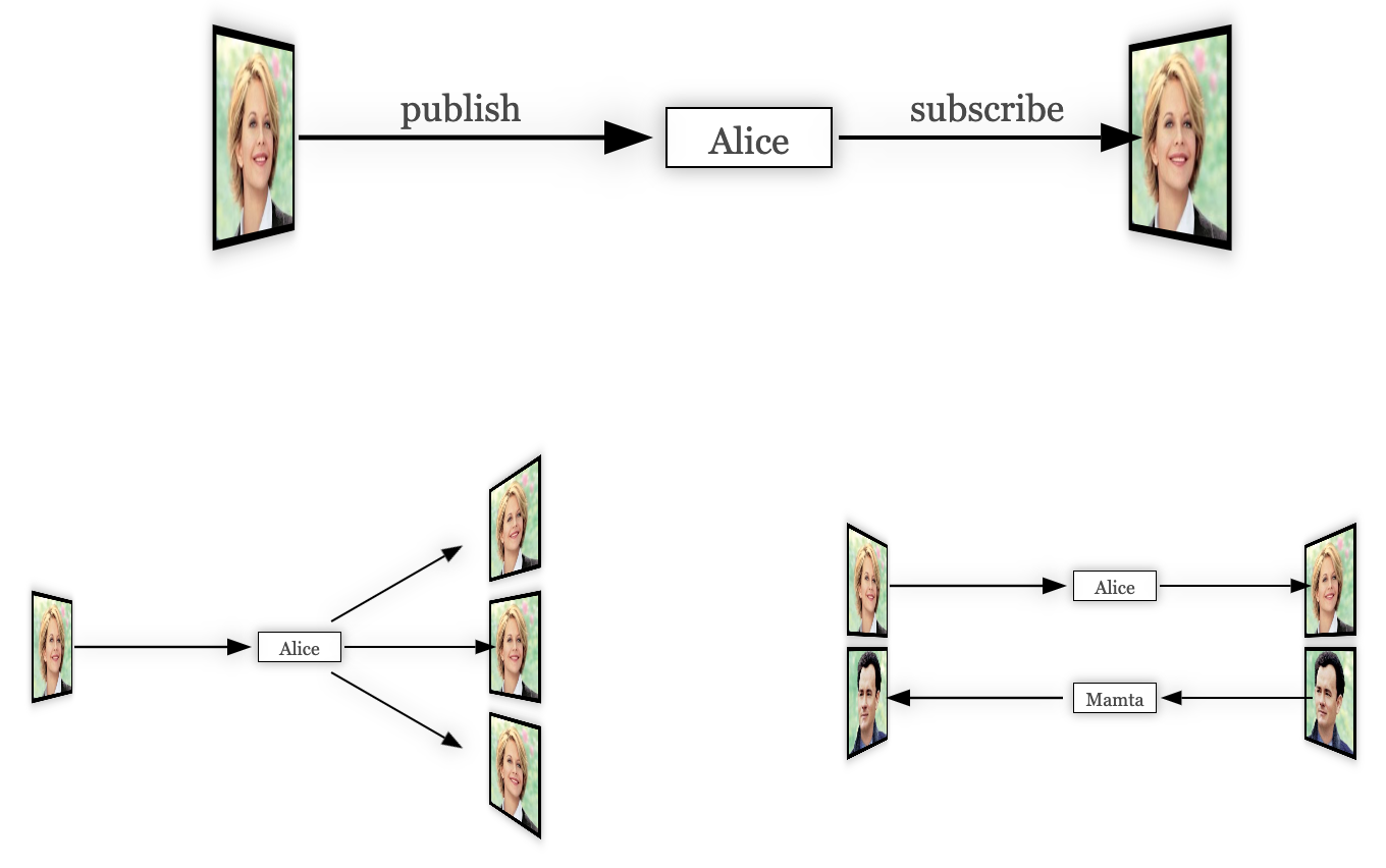
Video-io is a web component demonstrating several generic WebRTC related use cases, e.g., live camera view, recording of multimedia messages, live video call or conferencing, in client-server as well as peer-to-peer topology. It combines the various media and connection abstractions available in WebRTC, and exposes a single video box abstraction. The video box can be attached to a named stream, and configured in either a publish or subscribe mode.
The basic idea is very simple. It is based on the well proven named stream abstraction previously used by Flash Player and ActionScript application developers for building real-time multimedia applications.

 publish
subscribe
publish
subscribe

Consider the above example with two video boxes, both attached to the same named stream, "Alice", one to publish and the other to subscribe. When two more video boxes subscribe to the same named stream, "Alice", you get one to many video broadcast. When two video boxes come in the reverse direction attached to a different named stream, "Bob", you get two-party video call. This simple abstraction facilitates a wide range of use cases as your will see later.
To include the web component, do the following in the head section of your HTML document.
<script type="text/javascript" src="https://rtcbricks.kundansingh.com/v1/video-io.js"></script>
Although web component is now ubiquitous, to ensure compatibility across various browsers, you may want to include the light weight polyfill for Web components before including any of the components described in this document, as shown below.
<script type="text/javascript" src="https://rtcbricks.kundansingh.com/v1/webcomponents-lite.js"></script>
<script type="text/javascript" src="https://rtcbricks.kundansingh.com/v1/video-io.js"></script>
Alternatively, a better option is to checkout the code from the project repository, and host it on your own web server. Our components are vanilla JavaScript files without dependency on external frameworks, so should be pretty easy to include in any of your web application with or without your favorite framework.
In the body section of the HTML document, include a video-io
element, e.g.,
<video-io></video-io>
The component instance can now be used in the script.
You can also specify additional attributes such as id or controls
in HTML, e.g.,
<video-io id="video" controls></video-io>
See How to use the video-io API? for a complete list of attributes and properties.
All the web components and sample apps defined in this project interpret
a consistent configuration for console logging. The included "log-level.js" script
defines a global log_level function which can be used by any
existing or new code to get a custom console object that adheres to
the same consistent configuration. To use this, just include the script in
the main HTML as follows.
<script type="text/javascript" src="https://rtcbricks.kundansingh.com/v1/log-level.js"></script>
Then, in the web component definition or in any other script code,
override the global console object with the one obtained from
this customized logging as follows.
const console = (window || self).log_level();
It allows passing the log-level URL parameter to the main HTML page to configure the
console logging, e.g., "index.html?log-level=4".
The default in most cases is to enable level 3 (info) and lower. The
allowed values for the URL parameter are number 0 to 5, which correspond to
disable (0), error (1), warn (2), info (3), debug or log (4), and trace (5), respectively.
Any non-numeric value is interpreted as to enable all log levels.
This tutorial's main web page also accepts the log-level URL parameter,
and passes it to any included demo or test pages.
Since the parent web app that uses our web component,
may or may not include this script,
all our web components include the following code, or its variation, to
check if log_level is defined, and to fallback to the global console
if not.
const console = (window || self).log_level?.(document.currentScript?.src.match(/\blog-level=(\d+)\b/)?.[1]) || (window || self).console;
This allows other web apps to define their own customization for
console logging if needed.
Furthermore, the above code allows enabling log level individually in a specific
script, e.g., the following shows logging enabled only for the flex-box
component but not for the video-io component.
<script type="text/javascript" src="video-io.js"></script>
<script type="text/javascript" src="flex-box.js?log-level=5"></script>
For the purpose of this tutorial, just supplying the log-level URL parameter should be enough to control the console logging in various demo and test apps.
One of the first things that you can do is to capture from webcam and display the video.
This is done by using the publish attribute as follows.
<video-io controls publish="true"></video-io>
You will notice such buttons throughout this tutorial. These are intended to show you live demonstration of the relevant code and usage of the component. Click on it to try the specific example usage. Use shift+click on desktop or long click on mobile to open it in a new window. Make sure to stop the loaded demo after you are done, to unload that external web app. Click on the show code link on the right to see the code for that demo.
When you try the above example, you will notice a few things.
The default size of the component is 320x240 pixels.
The default camera capture ratio is 4:3. The controls
attribute causes it to display the controls on mouse hover. A publisher mode component
by default has three buttons - one to pause or play the video, and
two for camera and microphone.
Stopping the publishing is done by resetting the publish property as follows.
<script type="text/javascript">
    video.publish = false; // stop publish
    video.publish = true;  // start again
</script>
By default, publish is done for both audio and video. To disable one, you can use the
microphone or camera attributes.
<video-io controls microphone="false" publish="true"></video-io>Or in JavaScript, using properties, as follows.
    video.microphone = false;
    video.publish = true;
The above example uses an external button to control the publish state. You will notice in the above example that the microphone icon is muted.
Use the CSS styles to change the display size. Use the camdimension attribute and
property to change the camera capture size.
<video-io style="width: 960px; height: 540px;"></video-io>
<script type="text/javascript">
    video.camdimension = "1280x720";
    video.publish = true;
</script>
Although the code snippet above shows camdimension set as property, it can also
be specified as an attribute. Many properties of the component instance are also available as attributes,
that can be set in markup. See How to use the video-io API? for a
complete list of attributes and properties.
The local camera preview is mirrored by default. This can be changed to not mirror the preview
video using the mirrored attribute to false
<video-io mirrored="false" publish="true"></video-io>
Alternatively, you can use the --preview-transform CSS style attribute.
<video-io style="--preview-transform: none;" publish="true"></video-io>
Use the screen attribute or property to publish using screen capture instead of camera. Note that, unlike the camera preview, the screen capture preview is not mirrored.
<video-io screen="true" microphone="false" publish="true" style="background: black;"></video-io>
Generally, for screen share, you should disable the microphone, so that sound is not captured too, and you should style the background color, so that the difference in aspect ratio is prominently shown as black.
Additionally, you can alter the other constraints such as camdimension or framerate
that apply to both camera and screen capture. It is recommended to use lower framerate for screen capture,
if the screen size is too big, e.g.,
<video-io screen="true" ... desiredframerate="3" publish="true"></video-io>
A lower screen share framerate is useful in keeping the bitrate in check, without losing the picture
quality. Unlike camera capture, a screen capture treats camdimension as maximum constraint,
and the actual dimension may be smaller, e.g., if the value is 640x480 but the screen size is 1280x720, then
the screen capture is scaled down to 640x360 due to maximum width and height constraints.
When the video is playing, the playing property is changed to reflect that.
The pause control element of the component may be used by the user to directly change the
playing state of the video.
For a publisher component, this playing state does not affect the state of the published media stream.
This may cause unintended behavior, when the publisher side user pauses her video, but
the subscribers continue to see and hear the live audio and video stream from the publisher.
The autoenable property and attribute can change this behavior. If set for
a publisher component, it ties the displayed video with the published stream, i.e., when the
video pauses, then the published media stream is disabled too.
This section describes some ways to change the appearance and general behavior of the component, independent of the publisher or subscriber mode.
The default background color of the component is transparent. This can be changed using the
background or background-color CSS style attribute.
posterUse the poster attribute or property to display an image before the video is
loaded or played.
<video-io mirrored="false" poster="some-image.jpg" ...></video-io>
When using the poster attribute, it is recommended to reset the mirrored
attribute, to prevent the poster image from getting flipped horizontally.
If the aspect ratio of the video in the media stream is different than the display size aspect
ratio, then the object-fit CSS style attribute determines how the video is displayed.
The default is contain. This can be changed to cover or fill.
<style>video-io { width: 180px; height: 240px; }</style>
...
<video-io id="video1" style="background: green;"></video-io>
<video-io id="video2" style="object-fit: cover;"></video-io>
<video-io id="video3" style="object-fit: fill;"></video-io>
The component has three slots for header, footer and controls in the display. The header and footer are displayed as persistent overlay on top of the video element, but behind the controls if any. The controls are displayed in the middle of the built-in controls when visible. An example usage of these slots is to display the name of the person in a video call, or the status of the connection.
<style>video-io > span { color: white; }</style>
...
<video-io id="video">
<span slot="header">Queen Elsa</span>
<span slot="footer" style="margin-left: 40%; line-height: 30px;"></span>
<span slot="controls" onclick="alert('clicked');"></span>
</video-io>
<script type="text/javascript">
...
video.addEventListener("propertychange", e => {
if (e.property == "playing")
video.querySelector('span[slot="footer"]').innerText = "Playing: " + e.newValue;
});
</script>
The controls, header or footer sizes are fixed in the component implementation, e.g., the control buttons are 36x36 pixels, irrespective of how large the component is displayed. An application may need to adjust the controls, header or footer sizes to match the display size of the component, e.g., if displaying in 160x120 then use smaller size buttons, and if displaying in 640x480 then use larger size buttons. This can be done using the CSS transform and zoom attributes.
There is also a zoom property in the component which can be used as
follows. The default is treated as no zoom, or value of 1.0. The controls are made smaller
using zoom of less than 1 and larger using zoom of more than 1. For example, using zoom
value of 0.5 will make the control buttons half the size, and using 1.25 will make them
25% larger.
<video-io zoom="0.5" controls />
<video-io zoom="1.25" controls />
The following example shows the components displayed in small sizes, one without zoom and other with zoom. The header, footer and controls are enabled for all the instances for comparison.
One way to calculate the right value for zoom is as follows. Suppose the buttons appear the right size for component size of 320x240. To scale the buttons proportionally, you can derive the zoom factor using the ratio of the actual display size and this right size.
const desired = {width: 320, height: 240}; // right size for buttons to appear good.
const actual = {width: 640, height: 360};  // actual size for display of component.
video.style.width = actual.width; video.style.height = actual.height;
video.zoom = Math.min(actual.width/desired.width, actual.height/desired.height);
Be careful when using a small zoom value, especially on mobile or low accessibility devices, that the buttons may become too small to click.
The magnifier attribute or property can be used to show a magnifying glass on mouse
hover for the displayed video.
<video-io ... magnifier="40px,2x" />
The example above creates a magnifying glass with diameter about 40px, and performs 2x magnification. Alternatively, the values can be specified as percent, e.g., "50%,300%" will cause the diameter to be about 50% of the component height, and magnification of 3x. Note that magnification of less than 1x is not allowed.
<video-io ... magnifier="50%,300%" />
Try the following example to experiment with the magnifier glass.
This and the next feature are useful for quickly checking some small text during screen share, when the component size is small.
The zoomable property controls whether the user can drag-select a
portion of the video and zoom.
<video-io ... zoomable="true" />
Try the following example to experiment with select to zoom. Once the publish starts, click, drag and select a rectangle on the video, to zoom in. Then click again to restore.
If already zoomed, then a mouse down on the component resets the zoom. If already
zoomed, and the component is resized, then the zoom value is preserved and the
object-fit style is honored. To try that out, use the following
example - it opens in a new tab; try resizing the window, with or without zoom on the video.
A video-io component instance can be in a publish or subscribe mode. Previously, we
showed examples of the publish mode. The subscribe mode is relatively easy, as there is no capture
device involved. For real-time media flow, a publisher instance is connected to a subscriber
instance. These instances may be running on separate browsers or machines. For discussion in this
section, we assume that both are running on the same web page.
There are two ways to connect the publisher and subscriber instances: point-to-point and named streams. The point-to-point connection is similar to the WebRTC peer connection abstraction, albeit unidirectional only. The named streams abstraction will be discussed in the next sub-section.
In the point-to-point connection, one instance of publisher connects to one instance of subscriber. The application manages data exchange between these instances. In particular, the instance emits the data event, which must be applied to the other instance. An example follows.
<video-io id="video1" controls autoenable="true"></video-io>
<video-io id="video2" controls></video-io>
<script type="text/javascript">
    const video1 = document.querySelector("#video1"),
          video2 = document.querySelector("#video2");

    video1.addEventListener("data", e => video2.apply(e.data));
    video2.addEventListener("data", e => video1.apply(e.data));

    video1.publish = video2.subscribe = true;
</script>
The above example creates two instances of video-io. The first one publishes
microphone and camera to the second one. The second one is in subscribe mode. The data event contains
signaling data for offer/answer and ICE candidates as specified in the WebRTC APIs. If you are familiar
with the WebRTC APIs, you can follow the rough sequence of events by logging the data value.
Although both the instances are shown as part of the same web page here, a real application will use some WebRTC notification service to exchange the data between the two distributed instances.
As before you can stop the publish mode, by resetting the publish property.
Similarly, resetting the subscribe property stops the play. In the point-to-point
mode, once the subscribe has stopped, it cannot be started again, and a new component
instance must be used for any new media stream subscription.
The point-to-point abstraction should avoided unless the named stream mode is not easily applicable. Point-to-point is typically useful when integrating with existing communication service for which a named stream implementation is not available or hard to do. The named stream abstraction provides several benefits as discussed next. It also decouples the client-side app and the notification service, so that the service can be easily replaced by another in the future, while keeping the client application logic intact.
In this approach, at most one publisher and zero or more subscribers can be attached to a named stream. All the subscribers receive the media stream from the publisher if present. Using named streams for connecting the publisher and subscriber is preferred to point-to-point, because of several reasons.
NetStream model of Flash PlayerThe named-stream component provides the bare bone necessity needed for
implementing the above approach, within a single web application. In a real application, this
is extended to other components that use a WebRTC notification service or a media server
to allow distributed publishers and subscribers.
The following example illustrates the basic concept using the named-stream component.
It uses three video-io components, one as publisher and two as subscribers, all
attached to the same named-stream instance.
<named-stream id="stream"></named-stream>
<video-io id="video1" controls autoenable="true" microphone="false"></video-io>
<video-io id="video2" controls></video-io>
<video-io id="video3" controls></video-io>
<script type="text/javascript">
    const [video1, video2, video3, stream] = ["video1", "video2", "video3", "stream"]
          .map(id => document.getElementById(id));

    video1.srcObject = video2.srcObject = video3.srcObject = stream;
    video1.publish = video2.subscribe = video3.subscribe = true;
</script>
To try the example above, click on the publish and subscribe buttons in different order and see the effect. Then try to stop and restart them in different orders.
As shown above, the srcObject property is used to bind a video-io instance
to a named stream, and the publish or subscribe function is used to
configure it as a publisher or subscriber. Note that if the srcObject is set then
the application should not use the data event, because the named stream instance
processes that internally.
If using thesrcObjectproperty, make sure to set thepublishorsubscribeproperty after setting thesrcObject, and not to use them as attributes.
Alternatively, you can use the for attribute in the markup to configure the named stream
as shown below. The attribute value is the ID of the DOM element of the named stream.
<named-stream id="stream"></named-stream>
<video-io id="video1" controls autoenable="true" for="stream" publish="true"></video-io>
<video-io id="video2" for="stream" subscribe="true"></video-io>
<video-io id="video3" for="stream" subscribe="true"></video-io>
If using theforattribute, make sure that the named stream DOM element thatforrefers to is included before thevideo-ioelement, so that when thevideo-iocomponent instance is attached to the DOM, it can find the correspondingnamed-streamin the DOM too.
The example above uses one instance of the named-stream component. This works only for
this type of named stream component, but not for the others described below. For the other named
stream components that connect to a server in some way, a separate instance of the component is needed
for each video-io component instance.
When the publisher pauses the video, the subscriber sees black video feed. This default behavior
can be changed using the autopause property, set on the publisher. If true, then it
sends an event to the subscriber before the playing property is changed on the publisher.
The subscriber in turn can pause and play the video, to avoid showing the black video feed during
publisher side pause.
<named-stream id="stream"></named-stream>
<video-io id="video1" controls autoenable="true" autopause="true" for="stream" publish="true"></video-io>
<video-io id="video2" for="stream" subscribe="true"></video-io>
Setting autopause shows consistent video behavior on publisher and subscriber side,
instead of publisher paused and subscriber with black video feed.
rtclite-stream for NotificationAs mentioned before, a real application will likely use a WebRTC notification service to
exchange the signaling data among the different distributed instances of the video-io
components running in different user browsers.
My earlier open source project rtclite has a light weight notification server based on named streams. The concept is first explained in a blog post on WebRTC notification system, but extended to named stream with the server code in streams.py file and an example client is in streams.html.
First, follow the instructions there to install and run the notification server, and try out the example client code. I run the notication service for local testing as follows, using Python 2.7, on TCP port 8080.
python -m rtclite.app.web.rtc.streams -l tcp:0.0.0.0:8080 -d
I have also ported that notificaion server to NodeJS, and included in this project for convenience. I run this notification server for local testing as follows, after installing the dependencies.
cd srv
npm install
node streams.js -p 8080 -d
Default port is already 8080, so the -p option above is redundant.
Default log level is info, and -d option creates verbose log,
whereas -q is for the quieter mode with only error logging.
Next, use the rtclite-stream component instead of the default named-stream,
and try it out below. Note that the named streams in separate web pages refer to the same stream at the
notification server, if the same src attribute is used.
<!-- in <head> -->
<script type="text/javascript" href="https://rtcbricks.kundansingh.com/v1/rtclite-stream.js"></script>
...
<!-- in <body> -->
<rtclite-stream id="stream" src="ws://localhost:8080/stream/1234"></rtclite-stream>
<video-io id="video" controls autoenable="true" for="stream"></video-io>
<script type="text/javascript">
    const video = document.querySelector("#video");
    ...
    video.publish = true;
    ... // or
    video.subscribe = true;
</script>
Try the following to launch one publisher and one or more subscribers for a named stream. You can
pick any randomly unique stream name. This example uses a standalone video.html
web app that configured one video-io and one specific named stream instance
using the various URL parameters.
Note that this rtclite-stream component provides a one-to-one
mapping to the stream publish or subscribe operation,
and hence, each such stream instance may be attached to only one video-io instance.
Please note that the notification server described above does not have any access control. It may be extended to add some form of authentication and access control for your need on top of the basic connection.
The following table describes all the attributes and properties of the component. Additional methods are in the named-stream base class.
I have created another component, firebase-stream, that uses the
Firebase project to implement the notification system.
Unlike the previous rtclite-stream component, which requires a separate stream object for attaching to each
video-io instance, the single firebase-stream object may be attached to multiple
video-io instances in your web app. Behind the scenes, the component provides a proxy to reach
and manipulate data on the Cloud Firestore
database. So it does not matter whether you use a single or separate firebase-stream objects
for all the video-io instances on the web page.
First, signup for the Firebase account, create a sample app, and add the Cloud Firestore feature to the app.
Second, include the relevant scripts in your web application as shown below. Next, use
the firebase-stream component instead of the default named-stream. Then, configure the
component by providing your app's details such as apiKey, projectId and appId. Other fields are
not needed. After that, this component instance may be used with video-io as shown in
other examples previously.
<!-- in <head> -->
<script type="text/javascript" href="https://www.gstatic.com/firebasejs/12.9.0/firebase-app-compat.js"></script>
<script type="text/javascript" href="https://www.gstatic.com/firebasejs/12.9.0/firebase-firestore-compat.js"></script>
<script type="text/javascript" href="https://rtcbricks.kundansingh.com/v1/firebase-stream.js"></script>
...
<!-- in <body> -->
<firebase-stream id="stream" src=""></firebase-stream>
<script type="text/javascript">
document.querySelector("#stream").src = "id:123456?config=" + encodeURIComponent(JSON.stringify({
    apiKey: ..., projectId: ..., appId: ...
}));
</script>
I use the legacy API with chaining, as I find it easier to understand and program with. You are free to update the firebase-stream.js component file to use the modular API.
To make sure that the following sample uses the right configuration, first set the apiKey, projectId and appId in your localStorage, using the JavaScript console. Keep the console open to see any error or warning when you try the example later.
localStorage["firebase-stream"] = JSON.stringify({
    apiKey: "...", projectId: "...", appId: "..."
});
Try the following example which opens one publisher and two subscribers, and allows you to start or stop the publisher and subscriber.
Try the following to launch one publisher and one or more subscribers for a named stream. You can
pick any randomly unique stream name. It uses the same video.html web app mentioned earlier,
but to use the firebase-stream instance this time.
Please note that the notification server described above may require privacy protection of the keys. Please read the Firebase and Firestore documentation to secure your application by adding appropriate authentication, and access control on your database. Also, take measures to secure the app credentials.
The following table describes all the attributes and properties of the component. Additional methods are in the named-stream base class.
Graph Universe Node database is an open source
project
for fast and distributed data storage and synchronization.
To use this, first follow the simple instructions of that project
to install the node locally. Next, use our dbgun-stream
web component as the named stream implementation as shown below. It takes
the stream name, and a config with list of peers and other options.
<!-- in <head> -->
<script type="text/javascript" href="https://cdn.jsdelivr.net/npm/gun/gun.js"></script>
<script type="text/javascript" href="https://rtcbricks.kundansingh.com/v1/dbgun-stream.js"></script>
...
<!-- in <body> -->
<dbgun-stream id="stream"></dbgun-stream>
<script type="text/javascript">
  document.querySelector("dbgun-stream").src = "id:1234"
    + "?config=" + encodeURIComponent(JSON.stringify({
      peers: [ 'http://localhost:8765/gun', ... ], // may include others
      localStorage: false, radisk: false,
  }));
</script>
Try the following example which opens one publisher and two subscribers, connected to the locally running database as mentioned above.
The following table describes all the attributes and properties of the component. Additional methods are in the named-stream base class.
Use of other databases to implement the notification service is discussed in How to create a stream using shared data? Use of external media servers such as Janus or FreeSwitch is discussed later in How to work with a media server?
Use the record attribute or property to enable recording of the published or
subscribed stream.
Note that the recording is done on the client side by default. Use the recorddata property
to access the recorded blob. This can then be converted and assigned to the src URL of a media
element, or downloaded locally. An example follows.
<video-io record="true" publish="true"></video-io>
<video autoplay></video>
<script type="text/javascript">
    const video = document.querySelector("video-io");
    video.record = false; // to stop recording
    const blob = video.recordeddata;
    if (blob) {
        const url = URL.createObjectURL(blob);
        ... // play this url in <video> element or download it
        const player = document.querySelector("video");
        player.src = url;
    }
</script>
There are few other properties that can alter the behavior. The recordmode controls
whether the recorded data is overwritten (default) or appended ("append") for subsequent recordings in the
same component instance. In the example above, this should be set before the first recording,
to ensure that it takes effect on subsequent recording. The recordtype controls the content type of
the recorded data. Supported content types depend on the browser.
Playing the recorded data, converted to a URL, can be done in the standard video element
as shown in the example above.
The recordmax property controls the maximum duration of recording in seconds.
If a negative value is supplied, then the last that many seconds are accessible in recordeddata.
In this mode, the recordeddata value may be a promise, and must be resolved to access
the actual data.
video.recordmax = -10; // last 10s of recordings
...
const blob = video.recordeddata; // it may be a blob or a promise
Promise.resolve(blob).then(blob => {
    if (blob) {
        const url = URL.createObjectURL(blob);
        ... // play this url in <video> element or download it
        const player = document.querySelector("video");
        player.src = url;
    }
});
</script>
Try the following example to record the subscribed stream, instead of the published, and to allow playing the last 30 seconds at any time.
You can use an audio elements instead
of video to only play sound of the last N-seconds. The recordmax is set to
30 seconds in the above example, but if there is not enough recorded data, the played recording will be smaller.
You can also use currentTime on the media element to play the last 10s for example, even
if the recording is for last 30s.
Some applications need delayed playback of audio and video instead of in real-time. For example, in real-time captioning, live events with moderation, or ability to look at your back or side in a video mirror. Such delayed video can be played using the recording feature shown earlier.
A naive approach can setup a periodic timer, say for 10s, and
access the recordeddata, and play in a video element.
The code snippet is shown below. This uses the continuous recording with default
recordmode, where the recording is restarted after the recordeddata
property is accessed.
<video-io record="true" publish="true"></video-io>
<video autoplay></video>
<script type="text/javascript">
    const video = document.querySelector("video-io");
    const player = document.querySelector("video");
    setInterval(() => {
        player.src = URL.createObjectURL(video.recordeddata);
    }, 10000);
</script>
This works, with a problem, that everytime the video elements src is updated
with the last recorded segment of 10s, there is flicker.
To solve the issue, a new delayed-video component is used. Internally,
it employs two video elements, and two MediaRecorder instances,
running in parallel. It switches the display to the video element that has started playing
recently, thus avoiding any flicker. The following example shows how to use it.
<video-io id="video" record="true" publish="true"></video-io>
<delayed-video for="video" delay="10"></delayed-video>
Instead of specifying the for attribute
with value as the identifier of the video-io instance, you can set the input
property as the video-io instance, or the srcObject property as a
MediaStream instance. The following are equivalent, assuming that the stream exists.
player.setAttribute("for", "video");
player.input = document.getElementById("video");
player.srcObject = document.getElementById("video").videoStream;
Try the following example. You can change the delay value before starting.
The delayed-video component has attributes for delay, controls,
and for. It has properties for input and srcObject in addition
to delay and controls. Only one of for,
input or srcObject must be specified, in addition to a
valid delay, for the recording and delayed playback to start.
These attributes and properties are summarized below.
Previously, we have shown several examples of attributes and properties. Here we formally define those and enumerate and describe all the available values.
An attribute is accessible and settable in the HTML markup of the component. A property is readable and/or writable in the JavaScript code. Generally every attribute in our component is available as a property too, but not the reverse.
Some properties are also reflected as an attribute, which means that the current value of the property is updated in the component attribute. Unless marked as such, this is not the default. Thus, if a property is updated via attribute, but accessed via property, it will get the last update from attribute. But, if the property is updated via JavaScript property setter, and accessed via attribute, its value will not be correct. If the property is marked as "reflected as attribute" in the table below, then its value will be correct. Note that only a non-default property value is reflected as attribute, because a missing attribute indicates the default property value.
Following example shows the camera attribute and property.
<video-io ... camera="true" ...></video-io>
<script type="text/javascript">
    let video = document.querySelector("video-io");
    video.camera = false; // access the property
</script>
A property can have one of the four types - bool (for boolean), string, number or object.
The corresponding attribute is always a string in the HTML markup, but can represent the
correct value in string, e.g., camera="true".
Some boolean attributes may be treated differently - their presence may indicate a value of
true, and absence a value of false, e.g., the controls attribute.
For a number-type property, typically the JavaScript NaN indicates that the property
is not yet set, whereas an empty string in the attribute value indicates the same. For a string-type
property, typically an empty string indicates an unset value both in property and attribute.
Generally, a number-type property defaults to JavaScript NaN and a string-type
property defaults to an empty string. For several number-type properties, setting the value to NaN
does not do anything. For example, even though the default volume on launch of the component is 1,
once it is set to say 0.5, setting it next to NaN keeps it at 0.5 instead of reverting to original
default of 1. Similarly for other number properties such as the desiredframerate property.
Some properties are read-only, some are write-only, but most of them are read-write properties.
A write-only property is useful for invoking a function, e.g., getstats is set
to true, to have the component populate the quality metrics such as the
lost, bitrate and framerate properties. This avoids the need to
periodically capture the quality metrics, and only updates them when the trigger property,
getstats, is set.
Setting an attribute in the markup initializes the property, if it is not read-only. A read-only property cannot be set and has no effect even if the corresponding attribute is set.
While setting a property as an object is trivial for primitive types of bool, number or string, it is not so for an object type. We assume JSON formatted string value for the attribute when setting an object type property via the attribute.
You can try out the various properties and attributes below, and test the publish-subscribe behavior
of the component. It includes two video-io components, and allows you
to control various properties, and view their changes. Although not shown in the screenshot
below, it allows read/write of object properties as well. Note that some properties must be
set before publish or subscribe is set for them to take any effect.
Try enabling the publish checkbox on first and the subscribe on second to get started.
Some of the properties below are not yet implemented, and are marked so. Some of the properties are related to some other properties, and are marked so.
The table above is the complete reference for the properties and attributes of the video-io component.
Previously, we used the "data" event from the component instance. In addition, there are some other events dispatched by the component as shown below. The "propertychange" event is the most important.
Previously, we used the "data" event from the component instance to deliver to another component instance
via the apply function, when creating a point-to-point publisher-subscriber connection.
Furthermore, we used a few implementations of named streams to connect with the component instance.
Here, we go through the video-io component and named stream APIs that are useful for such interactions, including the
functions in the components.
Sample implementations of three named streams are available from us. If you want to implement another named stream component, e.g., to use a different signaling or notification channel for your WebRTC application, you can use the following interface to do so. A named stream component must implement the following functions. The video-io component instance invokes these functions on the attached named stream component instance.
Please see the named-stream.js or rtclite-stream.js file for examples of how to
implement a named stream component.
We have also created a standalone web app named video-io that can show zero or more video-io web components wrapped in a flex-box component. Although the video-io web component shows a single video in publish or subscribe mode, many video conferencing related use cases require showing multiple video elements at the same time. The flex-box web component, which is described later How to customize multi-video layout?, is used to layout multiple video-io or other elements.
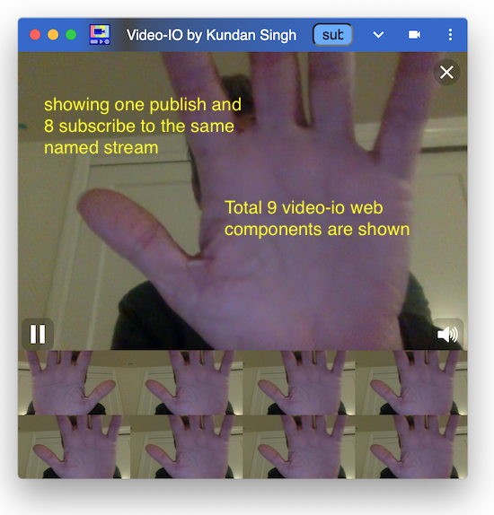
This video-io standalone web app can be installed as a progressive web app (PWA), on desktop or mobile. To use the installed app, first launch the web app in the browser, then use the browser's prompt or the install button near the address bar to install it locally. Try the following to launch the web app with a local camera preview, and a local subscribed view of the same, and then click the install button near the address bar.
https://rtcbricks.kundansingh.com/v1/video-io.html?publish=...&subscribe=...
Note that the PWA manifest file for this app expects
the web page of the app to be at /v1/video-io.html. So if your testing
is not on this path, it may not allow or show the install button. Alternatively,
you can edit the video-io.json file for another path as per your hosting.
The user interface allows publish or subscribe of the named streams, e.g.,
by entering publish=alice or subscribe=alice it uses the local named-stream components,
and it attaches a video-io component to each such stream. For testing with
external named streams, you need to specify the full description, e.g.,
publish=rtclite:ws://localhost:8080/streams/1234
will publish to that named stream using the rtclite-stream component. A list of publish and subscribe
parameters can also be supplied on launch. It can also be launched on
desktop, if not already open, to add a new stream using its URL protocol handlers:
web+ezpub or web+ezsub, for publish or subscribe, respectively.
Note that the protocol handler feature is not supported on mobile.
If a user opens a URL
web+ezpub:rtclite:ws://localhost:8080/streams/1234,
it adds a video-io web component instance, and an attached rtclite-stream web component.
It then connects to the presumed rtclite service at localhost port 8080, over a
websocket transport, and publishes camera/mic media to the named stream, streams/1234.
The flex-box component allows dynamically adjusting the layout, e.g., double clicking on a video to put it in presenter mode, or resize videos based on available size and aspect ratio of the window. It allows drag-and-drop of the video elements, e.g., to re-order them in the display, or to pop out a video to a separate window or tab, or to move or copy a publish or subscribe video stream from one app instance to another.
Besides the publish and subscribe URL parameters, it also accepts config parameter,
and the corresponding web+ezcfg: protocol handler. The config parameter
value can be used to set the attributes or styles on all included or individual video-io
elements. Consider the following example of the URL parameter:
?publish=...&config=video1.screen%3Dtrue%26video.style.object-fit%3Dcontain
Note that the parameters are parsed and processed sequentially.
It creates a publish video-io first after processing the publish parameter, and labels it as video1.
Then the config parametre is parsed, to interpret two actual values as follows. Note that
the full parameter value is escaped.
video1.screen=true
video.style.object-fit=contain
The first one is applied to the individual video-io instance labeled video1,
and causes it to use screen share to publish, instead of the default camera video feed.
The second is applied generically to all video-io instances including the previously
created as well as those that will be created in the future in this instance of the app.
In this case it changes the object-fit style of the video-io component to
contain instead of default cover, so that sides in the video
are not cut-off, and a padding is used instead.
The config parameter can also be used to set the attribute or style on the flex-box container. Consider the following example, which turns the flex-box display to pip or picture-in-picture mode, and uses the second video as the background.
...&config=box.display%3Dpip%26video2.float%3D (same as below)
box.display=pip
video2.float=
All the properties and styles of the video-io components are detailed in the previous chapter, How to use the video-io API? Additionally, standard CSS styles can be used too.
The goal of this video-io app, separate from the video-io web component, is to create a generic user interface for web video conferencing applications, where the conferencing app logic can reside in external software, which invokes this app to display, capture, publish and subscribe various media streams using the protocol handler. The extensive video-io component API can be used to further customize its behavior using the URL parameters.
We have also built a native Electron app, which uses the same code as the PWA, but wraps it in the Electron packager. The protocol handlers are ezpub, ezsub, and ezcfg without the "web+" prefix. It supports the same set of configurations as the PWA.
The sample app can built, tested and packaged as follows:
cd 11-electron-app
npm install
npm start ezpub:one ezsub:one
npm run make
The main app logic is in main.js, which parses the command line or launch parameters, and opens the external video-io.html web app. To enable screen sharing or desktop capture from the electron app, it uses preload.js and renderer.js to replace getDisplayMedia with custom desktop capturer. There is also an example package.json file for building the app. These are only for trial purpose, and a real world app will need to edit and customize these.
The Electron app and the progressive web app described in the previous chapter behave almost the same. In general, a progressive web app is preferred to an Electron app, for similar functionality. However, the native Electron can provide many additional features that are not available in a web app. In this chapter, we describe a separate native Electron app that enables a wide range of features and constructs that are not available in a web app.
The architecture is shown below, where the native Electron app acts as a plugin to enable and expose several Electron APIs such as for opening a native window, getting system information, DNS resolver, and TCP and UDP sockets. The basic idea is inspired by my earlier project, flash-network (see more here), that used a native AIR (Adobe Integrated Runtime) app to expose certain network APIs to web apps, including for my SIP-in-JavaScript project.
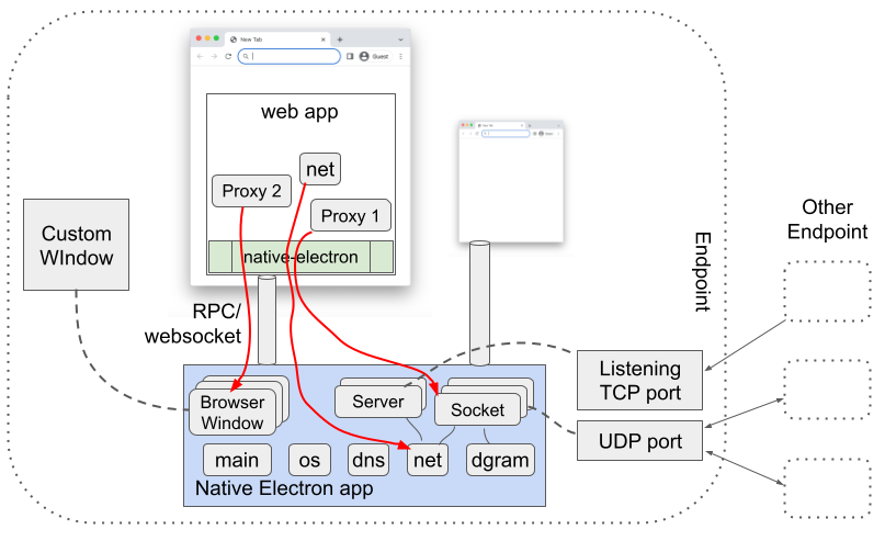
These Electron features are exposed using a web component, native-electron,
from a web app. This allows the web app to use, say, UDP or TCP socket,
for implementing advanced networking applications such as peer-to-peer or
application level multicast, or for implementing custom window behavior,
such as to open a transparent or frameless browser window
for a more immersive video conferencing display, or for drawing on the screen
or showing the mouse pointer of the other participants during a screen share enabled
video collaboration.
To use these feature, first build the native app as follows, and run it on the local machine.
cd 12-native-electron-app
npm install
npm start
npm run make
You may enable it to bind to all the interfaces, instead of only the local interface by default, using the -h option shown below. If no port, using -p, is specified, then it uses the default port of 9090. You may also want to edit the package.json or other source files to customize your native app.
cd 12-native-electron-app
npm start -- -h 0.0.0.0 -p 9090
Once the native electron app is running locally, use a native-electron web
component in the web app to connect to the native app as shown below.
<script type="text/javascript" src="https://rtcbricks.kundansingh.com/v1/native-electron.js"></script>
...
<native-electron src="ws://localhost:9090/native-electron"></native-electron>
When the src property is set, it attempts to connect to that
service, using websocket, assuming it as a locally running Native Electron app.
This websocket connection is then used as a channel for various RPC (remote procedure call)
interactions between the client (web app's native-electron component instance)
and the server (locally running Native Electron app).
Although the native app is expected to run on the local machine, it is not a requirement. The web component can connect to a remotely running native app as long as such connections are allowed. The native app itself may restrict incoming connection to be from only a localhost, by binding to the local IP interface (default) instead of all.
The local native app assigns an identifier to each channel, so that it can corelate the various APIs and proxy objects related to that channel. The web app can supply this identifier, using the id parameter, or let it be generated by the client side web component, as follows. The component internally replaces "{id}" in the URL with its own randomly generated identiier.
<native-electron src="ws://localhost:9090/native-electron?id={id}"></native-electron>
The native features exposed by this component are grouped into five modules. These are os, dns, net, dgram and main, corresponding to the similarly named modules in NodeJS, except that main is used for the browser window related APIs. The client side component just exposes these as proxy objects, so that the web app can invoke any method on those.
For example, if the web app calls a method, say, dns.lookup("www.google.com"), as shown below, then the web component serializes the method request and all the parameters, and sends it to the native app.
const {dns, os, dgram} = document.querySelector("native-electron");
const platform = await os.platform(); // "darwin", "win32", or "linux"
const result = await dns.lookup("www.google.com"); // e.g., {"address": "142.250.189.154","family":4}
When the native app receives this, it deserializes the request, runs the command using the NodeJS module, and returns the response or error, again after serialization. The web component then returns that response, after deserialization, as the resolved value of the promise returned by that method, dns.lookup.
Some NodeJS APIs such as dgram.createSocket return an object that are only valid in the native app, not in the web app. For such cases, the serialization and deserialization step ensures that a proxy object is exposed in the web app, with a unique identifier, so that further method calls or usage of that proxy object in the web app, results in the corresponding action on the real object in the native app. Such implementations are well known and thoroughly researched in RPC literature.
In the following example, the socket variable is actually a proxy object. Further method such as send on that object ensures that the native app uses the right underlying socket object. Setting the event handler, allows the web app to receive that event.
const socket = await dgram.createSocket({type: "udp4", ...});
socket.onmessage = (msg, rinfo) => { ... };
await socket.send("testing", 8123, "192.168.1.2");
Try the following example to test some APIs including opening a window, doing DNS lookups, create TCP and UDP server and client sockets, and sending messages. The test takes several seconds to complete successfully. Use the JS console of the browser to see any errors outside the component.
When the channel that created the proxy object is closed, the proxy object is automatically deleted and cleaned up by the native app. This avoids leaking memory, and automatically closes any windows or sockets when the connected web page closes.
The native-electron component is agnostic to the full set of APIs supported in these modules, and those are actually determined by the connected native app. If an API is not supported, e.g., due to mismatch in platform or version of the NodeJS used in the native app, it responds with an appropriate error.
Because of the nature of such RPC-based APIs, all the methods on the various modules or various proxy objects must be asynchronous, using promise based syntax in the web app, as illustrated above. Note that all the proxy objects in the web component receive all the relevant events from the native app, and depending on which event has a handler installed, only those are triggered or dispatched by the component. This may change in the future to optimize, e.g., to receive only the events with installed handlers from the native app, instead of all the events.
Property access in JavaScript is synchronous, whereas our RPC-based API requires asynchronous interaction to get or set a property. Hence, our proxied objects or modules do not provide any direct property access. However, if the property access is via a method call, such as address() on net.Socket, then those are supported. This may change in the future, to proactively get the property values and keep them updated in the proxied object in the web component.
The following table describes all the properties of the component.
The following table shows all the events dispatched by the component instance.
As mentioned earlier, the native app defines what APIs are supported in the various modules, os, dns, dgram, net and main, as well as on various proxied objects such as net.Socket, net.Server, dgram.Socket or BrowserWindow. These APIs are well documented in NodeJS and/or ElectronJS as referenced above.
Our native electron app also has a subset list of supported APIs as described here. In particular, these global methods on the modules are supported. These are documented in the NodeJS and/or ElectronJS references.
| Module | Methods |
|---|---|
| dns | getServers, lookup, resolve, resolve4, resolve6, resolveAny, resolveCaa, resolveCname, resolveMx, resolveNaptr, resolveNs, resolvePtr, resolveSoa, resolveSrv, resolveTlsa, resolveTxt, reverse |
| os | arch, cpus, endianness, freemem, hostname, loadavg, machine, networkInterfaces, platform, release, totalmem, type, uptime, version |
| net | connect, createConnection, createServer, isIP, isIPv4, isIPv6 |
| dgram | createSocket |
| main | createWindow, getAllWindows, getFocusedWindow, fromId |
The following methods on the proxied objects are supported. These objects are either created by the modules methods, or received in an event or method of another proxied object. These are documented in the NodeJS and/or ElectronJS references mentioned above.
| Object | Methods |
|---|---|
| net.Server | address, close, getConnections, listen |
| net.Socket | address, connect, destroy, end, pause, pipe, resetAndDestroy, resume, setEncoding, setKeepAlive, setNoDelay, setTimeout, getTypeOfService, setTypeOfService, write |
| dgram.Socket | addMembership, addSourceSpecificMembership, address, bind, close, connect, disconnect, dropMembership, dropSourceSpecificMembership, getRecvBufferSize, getSendBufferSize, getSendQueueSize, getSendQueueCount, remoteAddress, send, setBroadcast, setMulticastInterface, setMulticastLoopback, setMulticastTTL, setRecvBufferSize, setSendBufferSize, setTTL |
| BrowserWindow | destroy, close, focus, blur, isFocused, show, showInactive, hide, isVisible, isModal, maximize, unmaximize, isMaximized, minimize, restore, isMinimized, setFullScreen, isFullScreen, setSimpleFullScreen, isSimpleFullScreen, isNormal, setAspectRatio, setBackgroundColor, setBounds, getBounds, getBackgroundColor, setContentBounds, getContentBounds, getNormalBounds, setEnabled, isEnabled, setSize, getSize, setContentSize, getContentSize, getMinimumSize, setMinimumSize, getMaximumSize, setMaximumSize, setResizable, isResizable, setMovable, isMovable, setMinimizable, isMinimizable, setMaximizable, isMaximizable, setFullScreenable, isFullScreenable, setClosable, isClosable, setAlwaysOnTop, isAlwaysOnTop, moveAbove, moveTop, center, setPosition, getPosition, setTitle, getTitle, flashFrame, setSkipTaskbar, setKiosk, isKiosk, isTabletMode, getMediaSourceId, loadURL, reload, setOpacity, getOpacity, setIgnoreMouseEvents, setContentProtection, isContentProtected, setFocusable, isFocusable |
Note that some method results are redacted, e.g., the MAC address field is redacted in the result of os.networkInterfaces. Some methods have restrictions, e.g., net.Socket's listen or dgram.Socket's bind does not allow Unix path, and must use a port, and it does not allow listening or binding to port number less than or equal to 1024 for some protection.
Try the following example to view most of the APIs, and try them in real time.
The test example above allows you to edit the parameters of various methods, and invoke them in any order. It also shows when an event handler is called. It has extensive test setup for TCP and UDP socket, as well as browser window.
A major benefit of using the native electron app is that the web app can implement browser window features that are not available to the web app. The BrowserWindow object in ElectronJS is versatile and flexible to accomplish a number of use cases, such as transparent background, frameless window, semi-transparent overlay, and so on. We demonstrate two such use cases below.
The first example uses the rtclite stream to connect a publisher and subscriber to the same locally running service, but displays each video-io component in its own transparent window, with rounded shape to display the videos in circle. Those windows have no visible controls, and are displayed with always-on-top flag enabled. They can be dragged around on the screen to move, or dragged to resize near the corner.
Make sure that the rtclite streams service and the Native Electron app are running locally. Then try the following example to launch the two video-io instances.
The second example allows drawing on the screen. It uses a transparent full size window and loads the overlay-draw.html web app in that window. This web app is a simple drawing application that uses SVG and user mouse input to draw lines. You can first try the web app as follows. Click on the color picker to pick a pen color. Then click-and-drag the mouse within the web app area to draw lines.
Next, to test drawing with the overlay transparent window, make sure that the Native Electron app is running locally on the default port. Then try the following example. Then click the Start button to start drawing, and double click anywhere to stop. Click anywhere and drag to draw. The drawing disappears 8s after completing the last continuous drawing. Use Shift key when completing a drawing to change the disappearance timer to 60s.
A color picker is shown by default on top-left of the screen when the drawing is enabled. Click the picker to change the pen color if needed. You can also long press and drag the picker to a different position on the screen.
Internally the above example loads a generic overlaw-draw.html web app in a transparent window.
The Native Electron app's menu includes options to launch these windows: a self camera preview in a circle shape, and the drawing overlay described above.
The web APIs exposed by the native-electron component in conjunction with the locally running Native Electron app are very powerful. If misused, they can cause damage to the local system such as by exploiting vulnerability in Electron, NodeJS or their dependencies. Thus, such APIs should be allowed only from trusted web pages or apps.
The Native Electron app implements a simple authentication to ensure that the web apps cannot connect to the native app for the first time without a user interaction and input. This mechanism attempts to keep the end user in control of the authentication and authorization phases. Here, we describe how it works.
When the native-electron web component, used in a web app, attempts to connect to the local app, on WebSocket, the native app checks the HTTP Origin header of the request, and the access code in the connection URL parameter. If the access code is missing, or if the native app already has an access code for this origin but is different from the access code supplied in the URL parameter, then the native app displays the access code prominently on the screen, and responds with an error. The access code disappears after a brief timeout, of say, 5s. The native-electron web component, on an error, prompts the end user to enter the access code. If the user cancels the prompt, the connection is no longer re-attempted. If the user manually enters the access code in the prompt, and continues, it is reattempted. It causes the native-electron web component to retry the WebSocket connection, with the new access code in the URL parameter. If the access code is successfully verified by the native app, it allows the WebSocket connection to proceed. This authentication process is similar to what was used in my earlier flash-network project mentioned before. Subsequent RPC on this connection are further controlled based on API access control described later.
The Native Electron app has three user interface windows for access control, that can be shown directly using the application menu of the locally running native app. The first one is for access code management for various origins, such as to edit or delete them. The second one for web API access control, which allows the end user to disable some APIs from certain origins, or from all. And the third one is for listing and controlling all the active connections from the web app. This interface also shows all the created proxy objects such as TCP or UDP sockets and windows, and allows the end user to close an individual object, or the whole connection from that web app to the native app.
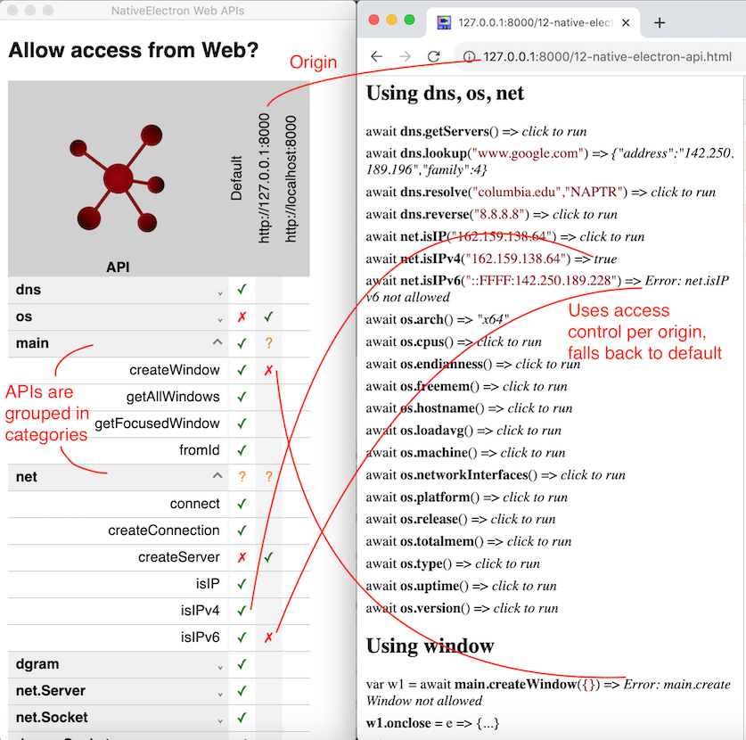
The above screenshot shows the native app's web API access control window on the left, and the test web page opened in the browser on the right. It also shows how the various permissions on the APIs affect the tests, e.g., isIPv6 is blocked for the origin of the web page, but isIPv4 has no override permission so it falls back to the default, which is allowed. The access control window shows the API methods grouped in high level categories, and allows setting the access control for the whole category, or the individual method in that category. Access control can be set for the web page origin, or if not set, then it falls back to the default column as shown above.
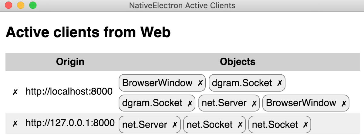
The above screenshot shows the native app's active client window, with various active connections from web apps, and their created objects. The cross button in the row closes the connection from that web app, and the cross button next to the object type closes that object. Note that our native-electron web component is designed to reconnect automatically, so closing the connection usually results in an immediate reconnect. To really block the web app, you should also delete or change the access code in the first user interface described earlier.
The device-selector component can be used to display a user interface to allow
selecting media devices. It allows selecting microphone, speaker and camera devices.
When this component is attached to another target video-io component,
it automatically sets the devices on the target. The controls in this
component automatically adjust on resize.
Try the following example to explore device selection. Give it a try from a machine that has multiple devices such as two webcams or two microphones.
The following table describes all the properties of the component.
The following table shows all the methods of the component.
The following table shows all the events dispatched by the component instance.
The user interface of the component can be customized using the following styles.
The channel property of the video-io component can be used to enable the
underlying data channel between publisher and subscribers, similar to the media path, but
bi-directional.
<video-io id="video1" channel="true" publish="true"></video-io>
<video-io id="video2" channel="true" subscribe="true"></video-io>
This then allows you to send some text data using the send method, which is then received
and delievered via the message event on the other end.
video1.send("... some text ...");
video2.addEventListener("message", event => {
    // event.data is the text data received.
});
The data channel is established along with the media path, when the component is published or subscribed.
Hence, the channel property must be set before publish or subscribe is initiated. A data-only path may be
achieved by disabling camera and microphone properties of the publish side.
In the full mesh or peer-to-peer case,
the data channel, like the media path, is between the publisher and all the subscribers. Thus, it allows
sending data from the publisher to the subscribers, and from the subscriber to the publisher. It does not
allow sending data among the subscribers, as the peer connection is only between the publisher and
the subscriber, but not between two subscribers.
However, the application can implement higher-level logic to
facilitate data routing at the publisher, by receiving from one subscriber and sending back to all,
such that the original subscriber ignores the reflected data.
Try the following example to explore how the bi-directional data path works.
The example does not enable audio/video by default, but uses the video-io component display to
show the shared image files, if any. To enable audio/video, you need to click to enable publish and
subscribes, and the camera/microphone on the publisher.
Similar to the underlying WebRTC data channel, the component can support sending text string, Blob,
ArrayBuffer or ArrayBufferView. The image file send in the above example uses
a Blob, and if that fails, it falls back to ArrayBuffer,
because Blob support was added only recently in Chrome's data channel.
When a media server such as Janus is used in the media path, then the data channel is between the publisher and the media server, and between the subscriber and the media server. Thus, unless the media server supports the data channel and implements the message routing logic, you will not have publisher to subscriber or subscriber to publisher data path using this mechanism. This is similar to the media path requirement at the media server.
Later, we will see how this feature can be combined with the speech-text component
to implement captioning and other features. Although, the channel feature is useful, it is not
enough to implement several communication use cases such as discovering participants in a call or
registering to receive incoming call. For that we need some other application logic such as based on
shared data, described next.
The ability to access and modify shared data is crucial in a distributed application such as two-party call, multi-party conference or online panel discussion. Furthermore, the clients can get notified when a piece of shared data is modified, and can update the client display state. For example, participants list or user's presence information can be stored as shared data. And user's client can modify and get notified on modification of such, to implement the entire application logic in the endpoint.
This type of resource-oriented software architecture has been researched and has matured already, e.g., in my previous work onrestserverandvvowproject, as well as with the popular Firebase real-time database.
The SharedStorage class in this project has an implementation of the shared data
abstraction for local testing and demonstrations. The individual subclass implementations further
extend this for real world applications by using specific server side storage, such as in
restserver-storage.js. This section shows how
to use the base SharedStorage class for initial testing, and to replace it with
others if needed.
To get started, include the implementation script, and create a SharedStorage
instance as follows.
<script type="text/javascript" src="https://rtcbricks.kundansingh.com/v1/shared-storage.js"></script>
<script type="text/javascript">
    const db = new SharedStorage("local");
</script>
The constructor parameter in the above example causes it to use an internal LocalSharedStorage
implementation, using the browser's localStorage, and is good only for local
demonstrations. The shared-storage implementation can be extended
to support other specific storage implementations using this mechanism as shown below.
To construct the shared storage with a specific implementation such as in restserver-storage.js, use the following.
<script type="text/javascript" src="https://rtcbricks.kundansingh.com/v1/restserver-storage.js"></script>
<script type="text/javascript">
    const db = new SharedStorage(new RestserverStorage(...));
</script>
Alternatively, the shared-storage component can be included as follows by supplying
the string source attribute.
<shared-storage id="storage" src="..."></shared-storage>
If src is "local", then it uses localStorage internally.
If src is a websocket URL such as "wss://...", then it uses restserver-storage
with the supplied server information.
The id attribute of the shared-storage instance identifies the
shared storage element on the web page, and can be used by other components to link to this
data storage. Such other components are described later in this document including in
the collaboration and telephony topics. Those components accept the storage element identifier
using the for-storage attribute as shown below.
<text-feed-data for-storage="storage" ...></text-feed-data>
There are two types of data structures allowed in such storage - single object or a list of objects. Such data is identified by an hierarchical path on that storage, e.g., "users/alice/contacts" may represent the contacts list of user Alice. The following example shows how to get reference to an object or a list, or a nested object or list.
const uref = db.list("users");
const vref = db.object("version");
const sref = db.object("version").object("software");
const cref = db.list("users").object("alice").list("contacts");
As you can see, the data is organized hierarchically. An object's parent may be another object or a list. A list's parent may not be another list. Hierarchical structure allows storing and managing data in a scope for access control and cleanup. Those familiar with Firestore will find that object here is like a document, and list here is like a collection, except that our list is implicitly ordered.
Getting the reference can be done via a nested path directly. The two lines in each of the following blocks of code are identical.
const sref = db.object("version").object("software");
const sref = db.object("version/software");
const cref = db.list("users").object("alice").list("contacts");
const cref = db.list("users/alice/contacts");
Following data operations are allowed on an object reference: create, read,
update or delete. Every function in the following example returns a promise.
The difference between create and update is that create will fail if the object
already exists, whereas update will not. If the object does not already exist, then
create and update will have the same effect. Moreover, update can be used to perform
partial update of the object value, e.g., to add, change or delete some attributes.
In particular, using undefined as attribute value deletes an existing
attribute.
await ref.create({name: "Bob", email: "bob@office.com", phone: "+12123334444"});
const data = await ref.read();
await ref.update({name: "Bob Smith", phone: undefined}); // change name, remove phone, unchanged email
await ref.delete();
When creating a new object, if you do not care about whether the object existed previously, then use the update function, instead of create. You can use create to implement some form of lock or mutex actually. For example, a client does a create on a object path. If that succeeds, it continues performing some contentious operation, otherwise it does not. After completing the operation, it deletes the object path.
Following data operations are allowed on a list reference: add, getall, removeall. Every function in the following example returns a promise.
const id = await ref.add({name: "Alice", email: "alice@home.com"});
const list = await ref.getall();
await ref.removeall();
The getall function allows filtering, ordering and limiting the result.
Note that the list children are ordered in their natural creation order, i.e., the
order in which the children are created either using add on the list reference
or using create or update on the child object reference.
Some examples of filtering, ordering and limiting the result follows.
const sorted = await ref.getall({order: 'name'});
const page2 = await ref.getall({offset: 10, limit: 10}); // zero-based index 10-19
const result = await ref.getall({filter: data => data.name.match(/kundan/i)});
const count = await ref.getall({reduce: (data, sum) => (sum+1), initial: 0}); // returns count
In addition to the data operations on the object or list reference, you can also perform
event subscription and notification. The onchange handler on the object
reference is called whenever the object value at that path is created, updated or deleted.
The onchange handler on the list reference is called whenever its child object
is created, updated or deleted. Additionally, any application level event data may be
dispatched on any object or list reference using the notify function,
which invokes the onnotify handler of that object or list reference.
To unsubscribe to receive events, just reset the handler to null.
With remote shared object, the event handlers are crucial in detecting changes in the
shared data structures of the application. For example, a contact list application
sets the onchange handler on the contacts list, to detect any change in that
data, and to show the updated list. Some examples of onchange are shown below.
oref.onchange = ({type, value}) => { // on object reference
    // type is one of "create", "update" or "delete"
    // data is the updated object value for create or update, and previous value for delete.
};
lref.onchange = ({type, value, id}) => { // on list reference
    // type and value are as before.
    // id the child object's id.
};
Note that if both getall and onchange is used on a list
reference, then there may be duplicates either due to race condition, timing of
when the item is added to the list, or a nuance of the actual storage implementation.
The application should check for duplicates, e.g., by using unique item identifier
in the list.
Some examples of onnotify and the corresponding notify function
are shown below. The notify function returns a promise that resolves to the count of
receivers that received the notification. If the count is 0, that means the notification
was not really delivered to any, such as when were no listeners. Note that the notification
is not stored for later delivery. This may require the application to use other
ways to find out if the notification was sent before it installed the listener.
ref.onnotify = ({data, from}) => {
    // data is whatever serializable object was supplied in notify.
};
const count = await ref.notify({type: "message", value: "Hello there!"});
Each client is associated with a unique identifier. The identifier may change when the client is reconnected. This identifier is also carried as part of the event so that the handler can check who originated the change in data, or who dispatched the notification. Note, however, that the semantics of this client identifier is implementation dependent, and may not align with the application's interpretation.
The notify and onnotify examples do not require that the
object or list reference have any real data stored there. This allows constructing
data paths to exchange events even without storing any data in the storage.
Unlike other real-time databases, this shared object abstraction allows transient objects. A transient object is deleted automatically and immediately when the client which created that object is disconnected. Other clients that listen to the event on that object path will receive the delete event. This allows readily implementing presence and real-time events when needed.
By default, the create and add functions create persistent
object. An object or list reference can be marked as transient, to create a transient
object as shown below. The update function generally preserves the existing
persistent or transient mode of the object. If update is called to actually create a
previously non-existent object, then the object reference's mode is used similar to
create. Moreover, for the transient mode, the update function changes the anchor of
when the transient object will be deleted, to that of the client that invoked the update,
instead of the one that previously invoked a create, if any.
await oref.transient().create({name: "Bob"});
await lref.transient().add({name: "Alice"});
The details of the shared-storage web component API is summarized below.
When the shared storage component uses a "local" source, it enables demonstration of this named stream within a single application, using the localStorage of the browser. Here, we describe how to attach external storage services to the shared storage, such as using RestserverStorage or FirebaseStorage.
As mentioned before, the shared storage component can be an external storage service such as
RestserverStorage, e.g., by specifying a "ws:" or "wss:" URL in the
src attribute. Developers are refered to the
vvowproject
for installing and running the Python or PHP-based restserver.
I have also ported that resource server to NodeJS, and included in this project for convenience. This ported server implements a subset of the features, e.g., it supports only the in-memory database, instead of MySQL, PostgreSQL and SQLite3 supported by the earlier the Python or PHP implementations. I run this resource server for local testing as follows, after installing the dependencies.
cd srv
npm install
node restserver.js -p 8080 -d
Default port is already 8080, so the -p option above is redundant.
Default log level is info, and -d option creates verbose log,
whereas -q is for the quieter mode with only error logging.
Try the above example, after running the resource server locally, on the default port 8080. This tests the various APIs of the resource server.
The restserver-storage web component extends the shared-storage
element, to force use RestserverStorage internally, and behaves as if the shared storage's
src attribute is set to websocket URL. The impl property
cannot be set directly in this web component.
<restserver-storage id="storage1" src="ws://localhost:8080/restserver"></restserver-storage>
Try the following example, after running the resource server locally, and check the code and JavaScript console.
The following table describes all the attributes and properties of the component. Additional properties and methods are in the shared-storage base class.
I have also implemented a basic FirebaseStorage component that can attach to the
shared-storage web component and use the Cloud Firestore behind the scenes.
This can be done by specifying a "firebase-storage:..." value in the src
attribute, with the JSON string containing your firebase configuration.
<!-- in <head> -->
<script type="text/javascript" href="https://www.gstatic.com/firebasejs/12.9.0/firebase-app-compat.js"></script>
<script type="text/javascript" href="https://www.gstatic.com/firebasejs/12.9.0/firebase-firestore-compat.js"></script>
<script type="text/javascript" href="https://rtcbricks.kundansingh.com/v1/shared-storage.js"></script>
<script type="text/javascript" href="https://rtcbricks.kundansingh.com/v1/firebase-storage.js"></script>
...
<!-- in <body> -->
<shared-storage id="storage1" src="firebase-storage:..."></shared-storage>
Alternatively, you can directly assign the implementation, impl,
to the shared-storage component, as follows.
<shared-storage id="storage" src=""></shared-storage>
<script type="text/javascript">
  document.querySelector("#storage").impl = new FirebaseStorage({
    apiKey: ..., projectId: ..., appId: ...
  });
  document.querySelector("#storage").dispatchEvent(new Event("ready"));
</script>
The actual Firestore APIs, even though operate on similar hierarchical data store, are not quite compatible with the shared-storage component. In particular, Firestore has no concept of transient resources, i.e., ability to automatically remove some resources on client disconnect, the change listener also retrieves the full data set, and there is a constraint of alternating collection and object in the resource path.
This required some changes in my implementation to work around
the restrictions using timeouts, soft state for transient resources,
explicit cleanups on beforeunload and initial connection, and ignoring
initial data set retrieval on the change listener. Moreover, generic
notification on a resource path, without actual data storage is not available,
so my workaround uses a temporary short-lived resource to emulate a notification
This can potentially cause double notifications, or duplicates when
onchange and getall are used together on the
same list resource. Item identifier is used to detect duplicates.
The storage-stream component that does not use alternate list
and object resources by default, has a fixpath property to enable a
workaround to support this constraint.
My implementationof FirebaseStorage is primitive, good for demonstration purpose, but not ready for production. Moving parts of the implementation to service worker may mitigate some of the problems in the future.
To make sure that the following demonstration uses the right configuration, first set the apiKey, projectId and appId in your localStorage, using the JavaScript console. Keep the console open to see any error or warning when you try the example later.
localStorage["firebase-stream"] = JSON.stringify({
    apiKey: "...", projectId: "...", appId: "..."
});
Try the following example to see some shared-storage APIs in action, using firebase-storage for actual data storage and notifications.
The firebase-storage web component extends the shared-storage
element, to force use FirebaseStorage internally, and has a convenient config
property to set the configuration as an object. Try the following example, and check
the code and JavaScript console.
<firebase-storage id="storage1" src=""></firebase-storage>
<script type="text/javascript">
  let storage1 = document.querySelector("#storage1");
  // storage1.src = "local"; // throws an error
  // storage1.impl = ...;    // throws an error
  storage1.config = { apiKey: ..., projectId: ..., appId: ... }; // works
</script>
This web component can be used in place of shared-storage when needed,
as a storage attached to an internal FirebaseStorage,
instead of having to attach the specific implementation to that storage.
The following table describes all the attributes and properties of the component. Additional properties and methods are in the shared-storage base class.
The redundant-storage web component, and the corresponding RedundantStorage
implementation enable storage redundancy for reliability. Note that the RedundantStorage object
is internally used automatically in the web component, and is not available to app directly.
The implementation is primitive, only supports restserver-storage currently, and may be improved in the future. The following example shows how to use the component to include two separate restserver-storage so that data is stored at two servers, and any of them can be used to read. If one server is terminated or crashes, the app continues to work.
<!-- in <head> -->
<script type="text/javascript" href="https://rtcbricks.kundansingh.com/v1/restserver-storage.js"></script>
<script type="text/javascript" href="https://rtcbricks.kundansingh.com/v1/redundant-storage.js"></script>
...
<!-- in <body> -->
<redundant-storage id="storage1">
    <restserver-storage src="ws://localhost:8080/restserver"></restserver-storage>
    <restserver-storage src="ws://localhost:8082/restserver"></restserver-storage>
</redundant-storage>
Internally, this component modifies some of the data access and notification APIs, to
ensure that data stored on all the storage services are consistent. For many of the write APIs
such as create, update, read, delete,
removeall it just invokes the similar API on all the included components. For the
read APIs such as read or getall it invokes the similar API on
all the included components, and succeeds if any of them reponds -- the first response is used.
One write API to list, add, is non-trivial, because invoking this on all the included
components will create separate identifiers for the new object in the list. Since this identifier
is used by the app logic, this is not derirable. Hence, the component attempts to add
the object on one of the active included storage component first, and then uses that returned
identifier to create that object on all the other included components.
This opens door for race conditions, that should be detected and worked
around by the application.
Internally, the component sends any notification to all the included components,
but detects and avoids duplicates when a notification is received. This may be improved in the
future to use sequential notification sending, to avoid unnecessary traffic, for
notify and onnotify. However, duplicate avoidance is still
needed for onchange notifications, unless the actual service is updated
to avoid sending such change notifications.
The partition-storage web component can be implemented for scalability,
e.g., by sharding based on the resource path of the collection (list), and requiring that
collection and object are alternating in the path. This is needed to ensure that the
a list resource and the objects of that list resource are both handled by the same
partition.
The following example shows three restserver-storage destinations
included in the partition storage, so that on average each storage will handle one third
of the resource paths.
<partition-storage id="storage1">
    <restserver-storage src="ws://localhost:8080/restserver"></restserver-storage>
    <restserver-storage src="ws://localhost:8082/restserver"></restserver-storage>
    <restserver-storage src="ws://localhost:8084/restserver"></restserver-storage>
</partition-storage>
The following example shows how to combine the partition (scalability) and redundant (reliability) storage. Here, the same three destinations are used, but each destination also acts as a backup to another destination. Thus, each resource path gets stored at two servers, depending on ther primary and secondary redundant storage in that partition.
<partition-storage id="storage1">
    <redundant-storage id="storage1">
        <restserver-storage src="ws://localhost:8080/restserver"></restserver-storage>
        <restserver-storage src="ws://localhost:8082/restserver"></restserver-storage>
    </redundant-storage>
    <redundant-storage id="storage1">
        <restserver-storage src="ws://localhost:8082/restserver"></restserver-storage>
        <restserver-storage src="ws://localhost:8084/restserver"></restserver-storage>
    </redundant-storage>
    <redundant-storage id="storage1">
        <restserver-storage src="ws://localhost:8084/restserver"></restserver-storage>
        <restserver-storage src="ws://localhost:8080/restserver"></restserver-storage>
    </redundant-storage>
</partition-storage>
As we will see in the next few sections, the shared storage abstraction can be used to implement a wide range of application scenarios.
A new named stream component, storage-stream, is implemented using the
shared-storage component. This enables use of single application service for
both shared data and publish-subscribe named stream, such as when using
the RestserverStorage implementation.
Similar to the named-stream or rtclite-stream component,
the storage-stream enables full-mesh media path from publisher
to each subscriber. The example code below is almost identical to the named stream examples
shown previously. Depending on the specific shared storage implementation, additional
dependencies are needed, as mentioned earlier.
<!-- in <head> -->
<script type="text/javascript" src="https://rtcbricks.kundansingh.com/v1/shared-storage.js"></script>
<script type="text/javascript" src="https://rtcbricks.kundansingh.com/v1/storage-stream.js"></script>
...
<!-- in <body> -->
<shared-storage id="storage" src="..." ></shared-storage>
<storage-stream id="stream" for-storage="storage" path="streams/1234"></storage-stream>
<video-io id="video" controls autoenable="true" for="stream" ... ></video-io>
When the path attribute is set on the component, it extends it to define the storage paths for the one publisher, and zero or more subscribers. For example, if the path is set to "streams/1234" then the publisher object's path becomes "streams/1234/publisher", and the subscribers list's path becomes "streams/1234/subscribers", to which subscribers are added as child objects using randomly assigned unique identifiers. Once this structure is established, the full mesh media path is created by exchanging signaling data between the publisher and each subscriber, via a series of notify messages. The publisher and subscribers can join or leave in any order, similar to other named streams described earlier. The publisher's path is used to send a message to the publisher, and the subscribers child path is used to send a message to that subscriber.
The following table describes all the attributes and properties of the storage-stream component.
Additional properties and methods are in the named-stream base class.
The following example uses external restserver as described in the previous section, for shared storage implementation.
Try the above example, to test the storage stream implemented using
resource server, after running the resource server locally, as described in
the previous chapter. If you run the resource server on another publicly accessible
machine, edit the src attribute of the web components in the above
example first.
Try the above example, to test the storage stream implemented using Cloud Firestore service, after setting the Firebase configuration in localStorage as described earlier.
Try the following example to test the redundant-storage component for
reliability, after running two instances of the resource server locally
on ports 8080 and 8082. During the session, try terminating one instance, and see how
the client behaves for subsequent tests.
Try the following example to test the partition-storage component for
scalability, after running two instances of the resource server locally
on ports 8080 and 8082. Each run uses a new random stream name, which may get assigned
to the first or the second server. Notice that only one of the server will be used, depending
on which partition the resource path maps to.
My other project, Ezcall,
uses a peer-to-peer network and storage for video conferencing. The peer-to-peer
implementation is part of this project, in peer-storage.js. It has two classes,
PeerNetworkImpl and PeerStorageImpl, as implementations of a P2P network node,
and the associated shared data storage, respectively. The details of the implementation,
a research paper showing the motivation and architecture, as well as a demonstration
are available on the project website linked above.
Our shared-storage component has a well defined interface to implement the
actual data storage logic, and the PeerStorageImpl class can provide
the peer-to-peer storage implementation for that interface,
similar to how the RestserverStorage class
provides the resource server storage implementation. It needs to work with external call
signaling, and data channel for the actual transfer and synchronization of data
among the peers, as described in the above project.
Note that shared-storage is a web component, but other classes are not, and must
be plugged into this web component to change the component's storage implementation.
The storage-stream, which is also a web component, only uses the shared-storage
abstraction, and does not care about the specific storage implementation.
The following example shows how to plug in the peer-to-peer storage, and
use the storage-stream with video-io as before. Note that the src attribute
of shared storage is not set, but the impl property is explicitly
updated to plug in the storage implementation.
<!-- in <head> -->
<script type="text/javascript" src="https://rtcbricks.kundansingh.com/v1/shared-storage.js"></script>
<script type="text/javascript" src="https://rtcbricks.kundansingh.com/v1/peer-storage.js"></script>
<script type="text/javascript" src="https://rtcbricks.kundansingh.com/v1/storage-stream.js"></script>
...
<!-- in <body> -->
<shared-storage id="storage"></shared-storage>
<storage-stream id="stream" for-storage="storage" path="streams/1234"></storage-stream>
<video-io id="video" controls autoenable="true" for="stream" ... ></video-io>
<script type="text/javascript">
  const storage = document.querySelector("shared-storage");
  const id = "..."; // unique id of this peer
  storage.impl = new PeerStorageImpl(id);
  storage.net = new PeerNetworkImpl("fullmesh", id);
  storage.impl.net = storage.net;
  storage.dispatchEvent(new Event("ready"));
</script>
The PeerNetworkImpl currently supports two network topologies: fullmesh and tree.
The fullmesh topology assumes a full mesh connection among all the
peers, where the tree topology assumes a spanning tree topology.
This distinction is useful in the underlying implementation for
message routing or flooding for data transfer or synchronization
in the peer-to-peer network. The class also includes a convenience
function to connect the shared-storage instances, and is useful
for local demonstrations, as the following example show.
<shared-storage id="storage1"></shared-storage>
<shared-storage id="storage2"></shared-storage>
<shared-storage id="storage3"></shared-storage>
<script type="text/javascript">
  const storages = [...document.querySelectorAll("shared-storage")];
  PeerNetworkImpl.connectall("fullmesh", ...storages);
</script>
The peer-storage web component extends the shared-storage
component, and includes both PeerStorageImpl and PeerNetworkImpl. It
is configured using topology and peerid
attributes or properties. Internally, it is just a convenient way to
wrap multiple objects in a single component, and can be used in place
of shared-storage as shown below.
<peer-storage id="storage1" topology="fullmesh" peerid="first"></peer-storage>
Try the following example to emulate a peer-to-peer network among users, connected via the media-chat component, which is described later.
You can launch the above example in a separate window, and pass the
URL parameter, say, ?users=10 to emulate 10 users instead
of the default 6. It can emulate up to 30 users or nodes for local testing
of text chat, and peer-to-peer network and storage,
but the media conference will get overwhelmed with more than 4
simultaneous video users.
The following table describes all the attributes and properties of the component. Additional properties and methods are in the shared-storage base class.
The techniques described in How to connect publisher and subscriber?
is sufficient to establish one-to-many broadcast. The various video-io instances publish
or subscribe to some named stream to facilitate this.
An application can also show a list of all the publishers, and allow the user to subscribe to one, similar to tuning a radio station. The shared storage described earlier can be used, e.g., using a shared list, say, "stations". A publisher picks a name, and adds it in that list. Using a transient object ensures that the object is removed when the publisher is closed.
db.list("stations").transient().add({name: "channel one"})
A subscriber can show the list to the user to select. It also keeps track of changes in the list.
const items = await db.list("stations").getall();
// use items to show list of stations.
// each item is an array with key-value: ["..id..", {name: ...}]
db.list("stations").onchange = event => {
    // event.type is "itemcreate" or "itemdelete" (or "itemupdate")
    // update display list based on event.id and event.newValue
};
The above example allows you to publish some streams, and view them. There can be more than one viewers for the same stream. When the published stream is stopped, all the viewers are also stopped.
If the application needs to avoid duplicate names, it can use the name as object identifier
in the path. In that case it must also check if another client is publishing on the same
channel before publishing self, using the create method on the object reference.
The above example shows that same name will not be published twice, because the shared object's create will fail. To sanitize the name to shared object path segment, all non-alphanumeric letters are changes to "-", and all alphanumeric characters are converted to lower case, for comparison.
The named stream may be replaced by other implementations such as rtclite-stream or janus-stream, for a real distributed application. Later we will see how to use peer-to-peer for such broadcast.
The techniques described in How to connect publisher and subscriber? along with an external call signaling protocol is sufficient to establish a two-party call or multi-party video conference. The call signaling can be implemented using the shared storage described earlier.
For a two party call, each party creates
two video-io components, one to publish and the other to subscribe. The two parties
choose and share the named stream information with each other as shown below.
The call signaling protocol is used for three things: (a) to register a user name, so that others
can discover and reach this user, (b) to send an intent to call, so that the other user can answer or
decline, and (c) to exchange the named stream information so that both the clients can launch the
video-io components.
These can be accomplished using the shared storage described before. For example, data path of the form "users/{name}" can represent the user's presence. The user's client can listen for events on this, and other users can send notification to this data path. One example follows:
This is just one example. Order of some steps may be altered, e.g., step 2 and step 5 may be postponed after call is answered. Following is another example. The important thing is to understand the three phases - call intent, video-io component, and stream name exchange.
The specific steps of sending and receiving call intent or answer can be codified using
SharedStorage as follows. Let's assume the client can be in four states:
idle, inviting, invited or active. We will use notification "invite" to send the
call intent, and "answer" to respond. Other notifications such as "cancel", "decline" or
"end" will also be used with their intuitive meanings.
Suppose, the caller is user "alice" and receiver is user "bob". Both the clients listen for incoming notifications on their respective shared object. For example, the receiver side code looks like the following.
db.object("users/bob").onnotify = event => { ... }
When the caller initiates a call, it sends a notification "invite" with additional details such as caller's named stream and caller name, triggered on the receiver user's shared object, as follows. It then changes the state to "inviting".
db.object("users/bob").notify({type: "invite", from: "alice", stream: "abc1"});
When the receiver gets this notification, it prompts the user about the incoming call, and changes the state to "invited". If the user answers the call, it changes the state to "active", and sends back a notification "answer" to the caller as follows. It includes additional details such as receiver's named stream.
db.object("users/alice").notify({type: "answer", stream: "xyz2"});
When the caller receives this notification, it changes the state to "active" too. The complete code path can be tried below, and looked up in the code sample there. It also covers other notifications such as to "cancel", "decline" or "end" the call.
The example above shows the state transition of the caller and receiver clients on different events such as button clicks to invite or answer.
The above example shows a very simple call signaling protocol using the shared storage. A real call application will likely be much more complex to handle some or all of these requirements:
The first two requirements can be implemented as follows. Each call "invite" includes an unique invitation identifier. This is included in all related notifications of "answer", "decline" or "cancel". It is not needed in "end". Additionally, when a call is answered or declined from one device of the receiver, the caller sends a "cancel", so that all other devices in pending incoming invitation state can clean up and stop ringing. Moreover, another response besides "decline" may be needed, to stop ringing of only the local device, but not others. These ideas are similar to the SIP forking proxy behavior of an INVITE request.
The implementation is demonstrated below. You can try registering two clients with the same name, and have the third client call that name. A new state of "ready" is included, to distinguish from unregistered "idle" state. The example includes four clients for further experimentation.
Here are the experiments you can try in the above example. Register the four clients with their default names, Alice and Bob, two clients per name. Invite from first client of Alice to Bob, and notice both of the Bob's clients receiving the invite. Answer from one of the Bob's clients, and notice that the other client stops incoming call state, and the two party call is established between the first client of Alice and the answering client of Bob, with two-way video. Note that the sound is disabled in the above example, to avoid local audio feedback loop. Click on the end button to stop the two-party call, which also stops the two-way video. Now repeat the above call, but decline from one client of Bob. Next, repeat the above with two-way video, and then attempt another call from the second client of Alice to Bob, and note which client receives the invitation, and how two separate calls are possible between these users on separate clients. Next, unregister the clients from their users, and register only some, to see that call invitation is not received on unregistered client. Try registering with other names, and calling others names, including non-existent names, to see the behavior.
The display controls are updated in the above example to reflect the internal state of the client. The behavior is similar to a typical softphone from traditional VoIP system. Some behavior can easily be added or altered such as for missed call notification, ringing sound, or when to show the videos.
An alternate implementation can be done as follows. Instead of a shared receiver object at "users/bob", the receiver user can add its device contact as a transient object in the list "users/bob/devices". When the caller user attempts to send a call invite, it locates all the items of the list, and sends the notification to each. This allows the caller to manage separate receiver devices and their call state independently, e.g., for sequential forking, parallel forking, or a mix of two. Folks familiar with VoIP or SIP (Session Initiation Protocol) can see similarity with them, and that is expected. In fact, for a full fledged phone system, the call signaling will likely become similar to the existing signaling protocol.
Generally, there are two models of signaling used for multi-party calls:
For the join-leave model, we can use the shared storage, to store the
participants of a call, e.g., "calls/1234/users/alice" represents the
user "alice" in a call with call identifier "1234". For this to work, the call
identifier must be known to all the participants. The participants can discover
each other by listening to any change in shared list of "calls/1234/users".
For simplicity, we can assume the participant identifier, e.g., "alice", to be same
as her published stream name. Thus, in an N-party call, each participant
has one publish video-io component and N-1 subscribe
video-io components.
In the example above, you can try joining the different clients in different order, or change some call identifier to have some clients join a different call. For simple layout of videos, each publisher has the same fixed position in each client viewer, and the layout is fixed for a four-party call.
The invite-answer model is well suited for a telephone style system. It turns out that we can build a system that combines both the models, described earlier as the two-party call and join-leave conference. The idea is to keep join-leave as default, but be able to convey the call identifier via invite-answer notification. Once the call is joined, user can only leave, but cannot force another user to end too via call signaling. Thus, unlike the previous two-party call signaling, the "end" notification is not used anymore. All the other notifications of "invite", "cancel", "answer" and "decline" are still valid. Additionally, a new notification of "redirect" is used, similar to decline, but it redirects the caller to another call, and it is up to the caller whether to join the new proposed call, if it is not already in the original call, or do not join the new call, if it is already in the original call with other folks. The state machine is also altered so that it allows multiple invites, but at most one pending.
The combined model uses both types of shared data - for call signaling use "users/alice", and for call membership use "calls/1234/users/alice".
In the example above, you can try various sequence of events by registering, inviting, or joining to see the expected behavior. For example, after registering the users on their devices, call from Alice to Bob, and Carol to David, and click answer to be in a call. Then call from Alice to Carol, and select to answer. This will cause Carol's device to switch to the incoming call, and leave the original call with David. Then call from David to Bob, and select to redirect. This will cause David's client to leave the original call without any other participant, and join Bob's call. The redirect is not processed on the caller if it is in a call with another person.
For simplicity, only a maximum of four videos, including one self preview, are shown. If there are more than four participants in the call, only three others plus self will be shown. The first video is always reserved for self preview. You will also notice that the video layout is not adjusted when participants leave. That is covered in the next section.
The flex-box web component is a container to display multiple videos,
images or other content.
The existing CSS display styles of flex or grid are powerful and can be used in a variety of scenarios to achieve the desired layout. However, they often need to be tweaked for a video conferencing display and user experience. This component internally uses those CSS styles, and allows customizing the display using a few attributes, while catering to a wide range of display scenarios suitable for video conferencing.
Try the example below for join-leave style multi-party conference, but using the
flex-box container for video layout. It allows seeing the behavior
as the window size changes, or the video orientation is altered for a participant.
The basic usage of the flex-box component is shown below.
In this example the container flex-box contains three div elements.
The container controls the overall layout. The child items control
the item attributes such as the natural size of the item, whether to layout
in landscape or portrait mode, and how flexible the aspect ratio should be.
<script type="text/javascript" src="https://rtcbricks.kundansingh.com/v1/flex-box.js"></script>
<flex-box display="grid">
    <div width="320" height="240" min-ratio="1:1" max-ratio="16:9"></div>
    <div width="320" height="180" min-ratio="4:3" max-ratio="16:9"></div>
    <div width="240" height="320" min-ratio="9:16" max-ratio="3:4"></div>
</flex-box>
The container can display the items in different layouts. Some examples are shown below. Here the container itself is in two different sizes or dimensions: landscape vs. portrait, showing three different layouts in each dimension: inline-block, flex and grid.
The container component's display attribute controls the overall layout of
the items in the display, and can take one of these values.
| display | Description |
|---|---|
| inline-block | (default) Items are in their natural sizes, scaled to fit while reducing empty space. |
This is the default value that appears as inline-block CSS display. The items
are laid out one after other in their natural sizes specified using the width
and height attributes.
| |
| flex | Items are altered to change the aspect ratios, to minimize the empty space. |
This uses the CSS flex display internally, positioning the
items in multiple rows, such that heights of all the items are same, but widths are flexible.
The min-ratio and max-ratio attributes of the item help
in determining the actual size and position of the item, and use-border
determines how to adjust size and position within these ratios.
| |
| grid | Items are laid out in NxM grid, while reducing outside empty space. |
This uses the CSS grid display internally, such that the
bounding box is of the same size for each item. The component's ratio
attribute helps in determining the actual size of the item's bounding box.
| |
| pip | One item is in background, and all other items are overlaid on top, near a side. |
| The picture-in-picture (PIP) display shows one item in full size in the background, and all other items overlaid on top in a row or column. All the overlaid items are arranged in a line, either a row or a column, and attach to one of the four sides. If float item's fraction or factor is specified, then non-float items can overflow the view, and can be viewed on scrolling. | |
| page | Some items may overflow the displayed page, and can be viewed on scrolling. |
| This allows scrolling through the items, instead of cramping all the items in displayed view of the container. This is particularly suitable for keeping a minimum size of the item, even when large number of items are present. | |
| line | Items are displayed horizontally or vertically, with scrolling enabled. |
| This is like page display, but has only one row or one column, depending on the width and height or the container. This allows scrolling through the items. This is suitable for keeping the container user interface narrow with either horizontal or vertical alignment, such as a side bar or bottom bar of video elements. |
The following example allows you to see the different display values as the window size changes, and as the items are added or removed from the container. The items are randomly added with landscape or portrait orientation. The window sizes are randomly modified periodically.
A few things to note in the above example: first, the flex display gives
a more fuller experience, while reducing the empty space not occupied by any item.
Second, except for the inline-block display, the item's aspect ratio
may be altered to fit in the layout. The item can specify the range of aspect ratios
within which it may be altered. Third, the inline-block display avoids
the extra padding within the item, especially for the portrait mode items.
The pip display is suitable for small number of items, and always
has a float item, and that appears in the background. By default, the
display attempts to squeeze all the non-float items to be displayed on a side. However,
if the fraction or factor is specified on the float item, e.g., "4x" or "80%",
then the non-float items are forced to occupy that much space, and hence can overflow.
In that case, scrolling can be used to view the overflow or hidden non-float items. It
can also be used to move the non-float items out of view if needed, to avoid
overlapping with the float item.
The page display is
suitable for keeping a minimum display size of the items, so that if not all items can
be shown, then you can use scrolling to see the other items. It shows the items
similar to grid, attempting to show 9 or more items, but does not scale up to
fill empty space if needed. If a float item is present, then
it is similar to the flex display, with one line of non-float items, while showing up to 3 or more
non-float items by default depending on the scaling factor.
Besides the mandatory display attribute, there are other attributes
that control the display behavior of the component. Some of there are described below.
The transition attribute on the component defaults to use a CSS linear
transition with 0.3s duration for all changes in position or size of the child items.
It also does the fade-in or fade-out effect using the transition on the opacity CSS attribute when the child
item is added or removed, respectively. One side effect of this is that when a child
item is removed from this container, the actual removal is delayed until the fade-out
effect is completed. These transitions or animations can be disabled by setting the
transition attribute value to "none".
<flex-box display="flex" transition="none" />
The ratio attribute on the component is an estimate of the
child items aspect ratio, and is used to guess the initial layout before arriving at
an optimized layout internally. It defaults to "16:9" for HD-ratio. It is generally
ignored for the inline-block display.
<flex-box display="grid" ratio="4:3" />
In the page display, without any float item, the min-count
attribute can be used to change the minimum number of boxes shown,
and can affect the size of the boxes relative to the container size.
The default value is 9, and using
a larger number can give more number of items per page. Note, however, that
the actual items per page may be larger than the specified number. When a
float item is present then the float property value of that item controls
the size of float and non-float items.
<flex-box display="page" min-count="12" />
The debug attribute when set to true allows you to see the layout positions
and sizes using a rectangle overlay, and be able to debug them using browser's dev tools.
Without this, internally, the implementation hides the actual layout calculations
and just sets the absolute positions and sizes of the container items.
<flex-box display="..." debug="true" />
As shown previously, the container item can have attributes to control the display.
Note that the width and height attributes are required
on the item for layout.
The applyPosition method can be called on this component to force
update its layout. This is useful when the component width and height are dynamically
updated in JavaScript instead of using CSS, based on any change in the container size.
The argument, if true, causes a slight delay in layout update, to allow accommodating
multiple calls, e.g., in response to continuous resize events.
var box = document.querySelector("flex-box");
box.applyPosition();     // update layout immediately
box.applyPosition(true); // update layout after brief 50ms delay
The float attribute of the item
is quite flexible in positioning the item outside the defined display
layout of the container. In a video conferencing application, for example, it can be used to
show large video of the screen share, presenter or talker. The different values of
display attribute have different behavior for float vs. non-float items.
At the high level, except for the grid display, the available space
is divided into two parts - one for float item, and the other for all the non-float
items.
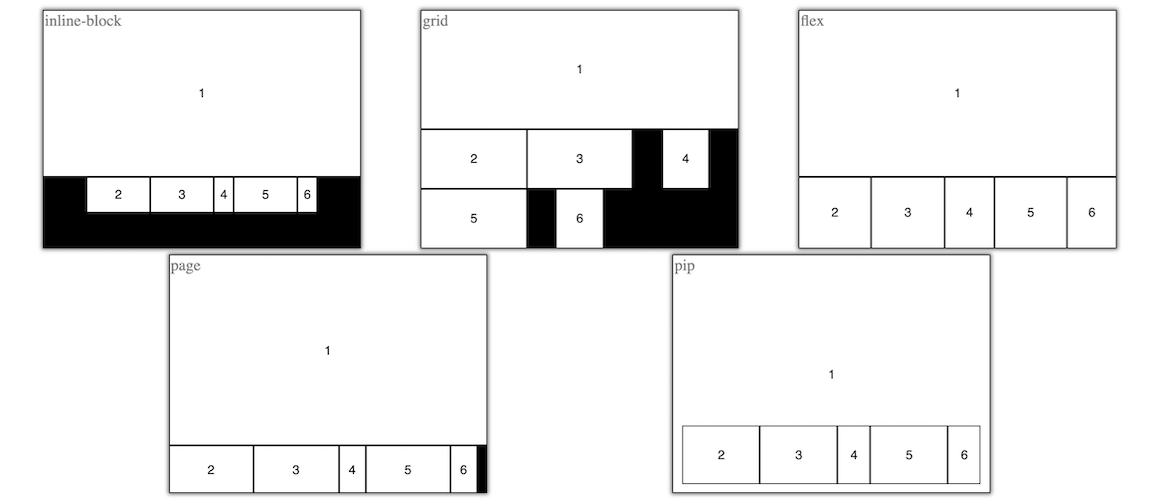
The float attribute value can be empty, or a fraction or factor,
along with an optional desired position. For example, "80%" indicates that the float
item takes roughly 80% size on the main axis. The main axis is usually determined
by the difference in aspect ratios of the container and the float item. The percentage
or fraction value is typically used for the flex, inline-block,
pip or page display, but not for the grid display.
Typically, a minimum 50% fraction value is imposed for the float item, when in flex,
or inline-block display.
For the grid display, a factor such as "3x" is used, indicating that the
float item is 3-times larger than the non-float item. For a pip or page display,
either fraction or factor may be used. For a pip display, a fraction 80% is same as factor 5x,
indicating that the non-float items will take 20% or 1/5th the space compared to viewable float
background item, since the non-float item is overlapping the float item.
For a page display, a fraction 80% is same as factor 4x,
indicating that the non-float items will take 20% of 1/5th the same compared to the
remaining space of 4/5th of float item, since the float item is not in background but
non-overlapping with non-float item.
Position can be specified for the float item, for example, as "bottom left" or "top" or "right" or default of "top left". When using two values, the implementation is flexible in picking one of the two, based on the aspect ratios of the available space vs. the float item, so as to reduce the empty space and change in aspect ratios. These fraction or factor and position values can be combined, e.g., "70% top right", which allows the float item to take roughly 70% of available space and be attached to either top or right side of the available space.
For the pip display,
the float item is always full size in the background, but its position value allows
positioning the other non-float items. For example, if "top left" is specified, then
non-float items are on bottom or right
The following example compares the different displays when default float attribute is set on one of the item.
Empty value is interpreted in the context of the display attribute.
For grid, it assumes "3x top left" and for others "80% top left" or "70% top left"
depending of whether the non-float boxes are less than five or not, respectively.
To position the active speaker video in large size on top or left, you can specify
the fraction, e.g., 80%, to be used by the speaker video, and the position, e.g.,
"bottom left" to prefer bottom or left in "flex" or bottom-left in "grid".
By default, only one item can have the float attribute set in a container. If another item's float is set, the previous item's float attribute is implicitly removed.
Try the following example to experiment with various attributes. It starts with the flex display with one window size. You can change the display, window size or other attributes to see how the component behaves. There are buttons to add or remove boxes to see the behavior of different attributes with different number of boxes in the container.
The above can be used as a test tool for trying out various displays, their attributes, float vs. non-float items, and interaction with user via built-in controls.
The component has several user interaction controls triggered via mouse, as follows:
| Interaction | Description |
|---|---|
| dblclick | To toggle item's float behavior, or to change the float item. |
Double clicking on a box makes it float with the last float
attribute value if any, or default "top left". Double clicking on a float box removes
its float attribute. Note that the pip display must have a float item, so
removing the float attribute is not allowed in that display.
| |
| dragmove | To re-position a non-float item, or to attach float item to a side. |
You can also drag-move an item to a different place. Click and hold the
left mouse button briefly to see the move cursor. Then drag
the box over to another item. If the target item is another non-float item then
the dragged item is moved to the position based on the order of that target
item. If the target item is a float item, then the dragged item is made float
instead. If the float item is dragged, it can be moved to one of the four sides,
to attach the float item to that side. This is not available in grid
because in that display the float item does not attach to a side.
| |
| resize | To change size ratio of float item vs. non-float area. |
When you hover the mouse over the border of the float and other boxes,
you will notice a divider. Click drag on the divider to change the ratio of the
space taken by the float item and the other boxes, similar to setting the float attribute.
This is not allowed in the grid display.
| |
| scroll | To scroll through all the items if overflow in page or pip display. |
In page display, or in pip display with fraction or factor
specified on the float item, if there are more items than what can be
shown in the container's view, then the user can scroll to see other items. The scrolling
behavior is like line scrolling instead of page navigation.
|
These interactions are illustrated below.
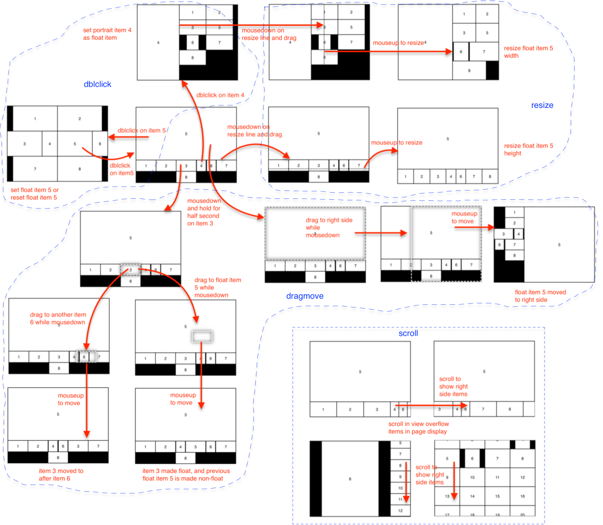
These user interaction controls can be disabled using the disallow attribute on the container component as follows, using comma separated values to disable.
<flex-box ... disallow="dblclick,dragmove,resize,scroll"></flex-box>
You can use the scrollTo function shown below, to show an item
programmatically when scroll is disallowed. This only works when the display is set to
page.
let flexbox = ..., item = ...; // some item added to flex-box
flexbox.scrollTo(item);
When a container item is made visible or hidden due to scrolling in the page, then
the container component dispatches a change event with the details. This is
also dispatched when the display attribute changes to or from page and
scrolling get enabled. After the display change to page, until this event is received,
you can assume that all child items are getting displayed. The
event object contains list of child items that were made visible and hidden, as shown below.
let flexbox = ...;
flexbox.addEventListener("change", event => {
    // event.detail.visible and .hidden arrays contain zero or more child elements.
});
In the context of multi-party video conference display, the range of aspect ratio adjustment is important. Typically, for webcam videos, adjusting the ratio, and perhaps, zooming in, is desirable. For screenshare or other content video, keeping the original aspect ratio is preferred.
Later, we describe how to use 3D layout for the video-io components,
in a multi-party call.
The flex-box component also dispatches a change event whenever
position or size of any of the container item changes, or when the size of the container
changes, which may trigger a change in layout. This is used by spatial audio as discussed
later.
The following table describes all the attributes of the component.
The following table shows all the methods of the component.
The following table shows all the events dispatched by the component instance.
The underlying WebRTC technology used in the video-io component is inherently
peer-to-peer for media path. However, many real-world call and conferencing applications
rely on media servers for various functions including recording, interactive voice
prompts, audio mixing, or video switching or routing. Here, we will describe how to
connect video-io with popular media servers.
There are two types of media server - mixing vs. switching. A mixing server typically combines the media stream from the participants, and sends back one stream to each participant. An audio bridge is an example that mixes audio, such that each participant receives one stream containing audio from all the other participants, excluding self audio. A switching server receives a media stream from each participant, and routes it to all the other participants. A video MCU (multipoint control unit) is an example of a mixing server, and an SFU (selective forwarding unit) is an example of a switching server.
Unlike a peer-to-peer full mesh topology, with N-1 outbound and N-1 inbound media streams at each participant, the switching mode reduces the number of outbound streams from each participant to just one. The inbound streams count remain the same. Additional video techniques such as SVC (scalable video coding) or Simulcast can further reduce the bandwidth of inbound streams at the participants. This makes switching or SFU servers very popular in emerging WebRTC based video conferencing systems. A real service often employs a combination of mixing and switching services for various types of optimizations.
Here we describe how to use the popular Janus SFU and FreeSwitch MCU as media servers
with the video-io component. In particular, the new named stream
components of janus-stream and verto-stream facilitate
implementing the named stream abstraction that is used by video-io in
various apps, while preserving the publish-subscribe model of the named stream
abstraction.
The janus-stream component allows using the video-io instances with the
Janus media server.
The server is used for both notification and media path. This is an example
of client-server conference where media path is from a publisher client to the Janus server, and from
the Janus server to each of the subscriber client. This is unlike the peer-to-peer media path from
publisher client to every subscriber client enabled by the previous rtclite-stream,
named-stream and firebase-stream components.
The janus-stream component presents a
wrapper around the Janus APIs to provide named stream abstraction. Janus already includes the publish-subscribe
abstraction as part of its videoroom plugin, which allows a participant to publish one feed and
subscribe to that feed from all the other participants. The Janus APIs allow the subscriber to subscribe to
a feed after it has started publishing. The janus-stream component works around
this limitation to allow the publisher and subscriber clients to come and go in any order. This is done
by using two plugin attachments in subscriber client, one for publisher type but without actually
publishing, so that it can receive events, and another for subscriber type.
The example code is almost identical to the named stream examples shown previously, except that some external dependencies
are included too. The component's src attribute may be configured to point to the Janus
server instance, using either websocket or http-polling. The additional room and feed
parameters configure the named stream. Behind the scenes, it uses that room and feed ID for the
media publisher. If the room does not exist, then it is created dynamically. Note that the room and feed ID
are numeric in earlier versions of Janus APIs.
<!-- in <head> -->
<script type="text/javascript" src="https://cdnjs.cloudflare.com/ajax/libs/webrtc-adapter/9.0.3/adapter.min.js"></script>
<script type="text/javascript" src="https://janus-legacy.conf.meetecho.com/janus.js"></script>
<script type="text/javascript" src="https://rtcbricks.kundansingh.com/v1/janus-stream.js"></script>
...
<!-- in <body> -->
<janus-stream id="stream" src="https://janus.conf.meetecho.com/janus?room=1234&feed=5678"></janus-stream>
<video-io id="video" controls autoenable="true" keeptracks="true" for="stream" ... ></video-io>
Note the keeptracks attribute in the example above. This allows a published component to
keep the tracks active, and use the enabled flag to mute or unmute the audio or video track, when the control
buttons are pressed or the camera or microphone property is changed. This is a
workaround for the legacy janus.js implementation which does not correctly
add or remove the tracks, when re-using an external stream. When the issue is fixed in that code, you may remove
the keeptracks attribute. A downside of using this attribute is that the capture devices are
occupied even if muted from the component.
Alternatively, you can use our modified janus.js file. The following sample is same as above,
except that it loads our janus.js file, and does not use the keeptracks attribute.
<!-- in <head> -->
<script type="text/javascript" src="https://cdnjs.cloudflare.com/ajax/libs/webrtc-adapter/9.0.3/adapter.min.js"></script>
<script type="text/javascript" src="https://rtcbricks.kundansingh.com/v1/janus.js"></script>
<script type="text/javascript" src="https://rtcbricks.kundansingh.com/v1/janus-stream.js"></script>
...
<!-- in <body> -->
<janus-stream id="stream" src="https://janus.conf.meetecho.com/janus?room=1234&feed=9012"></janus-stream>
<video-io id="video" controls autoenable="true" for="stream" ... ></video-io>
Try the following to launch one publisher and one or more subscribers for a named stream. You can pick any randomly unique number for room and feed ID.
In your real application, you may want to install your own Janus server, and connect using websocket URL.
The following table describes all the attributes and properties of the component. Additional methods are in the named-stream base class.
The verto-stream component alows using the video-io instances with the
FreeSwitch media server
via it's Verto endpoint.
Unlike the previous Janus based component, this does not really need a notification service.
The publisher publishes one stream to a conference room, and the subscribers subscribe to that stream
from the conference room. Both publisher and subscribe connect to the server as active participants,
sending the offer, and receiving the answer for media sessions. In a way, the MCU functions are
minimized, since each named stream is mapped to a unique conference room, and using only one active
stream in a conference room.
There are some important differences between the verto-stream component and
the other similar components described previously. First, the stream instance can only be attached
to one video-io instance at any time. Second, audio and video tracks are always included,
although may be disabled if needed. Third, the underlying peer connection must include older
"plan-b" semantics for SDP and "max-compat" mode of bundle policy.
<!-- in <head> -->
<script type="text/javascript" src="https://rtcbricks.kundansingh.com/v1/verto-stream.js"></script>
...
<!-- in <body> -->
<verto-stream id="stream" src="wss://my.freeswitch.org?params=..."></verto-stream>
<video-io id="video" controls autoenable="true" keeptracks="true" for="stream"></video-io>
The video-io instance is configured to use plan-b and max-compat as follows. It
also uses a default STUN server. This must be done before setting the publish or subscribe
property.
let video = document.querySelector("video-io");
video.configuration = {
    iceServers: [{urls: "stun:stun.l.google.com:19302"}],
    sdpSemantics: "plan-b",
    bundlePolicy: "max-compat"
};
The media server path specified in the src attribute is connected to via
the Verto protocol over JSON RPC. The parameters supplied to that URL is used as parameters for
various API requests such as login, invite or bye.
And example is shown below:
let stream = document.querySelector("verto-stream");
let server = "..."; // host name or IP address of the media server
let sessid = "..."; // randomly unique session id
let dialogParams = {destination_number: "...", callID: "..."};
let params = {
    login: {sessid: sessid},
    relogin: {sessid: sessid, login: "...", passwd: "...", loginParams: {}, userVariables: {}},
    invite: {sessid: sessid, dialogParams: dialogParams},
    bye: {sessid: sessid, dialogParams: dialogParams},
}
let src = "wss://" + server + "?params=" + encodeURIComponent(JSON.stringify(params));
stream.setAttribute("src", src);
The example above shows that the login request will use a sessid
parameter, and relogin request after an authentication failure will use additional
credentials such as login and passwd. The verto.invite
request will use the same sessid, and a new dialogParams value containing
the destination number and call identifier. All these parameters are specific to your setup
of the FreeSwitch, and will change depending on what is needed by your setup. The example
above assumes that the destination number is used to connect the call to the right
conference room. In that case, the publisher and subscriber instances should both use the
same destination number. However, sessid and call identifier should be randomly unique for each
session and call attempt. Thus, when a new call is attempted, e.g., by resetting publish and
setting it again, you should change the callID parameter.
Try the example below, assuming the server is properly configured.
The above example relies on a tightly controlled flow of publisher and subscriber. The component implementation itself is very primitive, and not ready for anything beyond a proof-of-concept or demonstration application. The main reason is that the Verto client library is too involved with tight coupling of notification and media features. So I decided to not use that, and directly implement the low level communication over web socket, for the minimum set of features needed for this project.
The following table describes all the attributes and properties of the component. Additional methods are in the named-stream base class.
Here we describe how to connect with popular hosted conference services such as Agora, Jitsi, LiveKit, VideoSDK.live and others. Unlike the previously discussed Janus and Freeswitch media servers, these hosted services are one level up, i.e., they present a higher level API for implementing video call, conference or other application. Although most of these have a conference room abstraction, the specifics of the API are different. The basic idea is similar to the media server's named stream implementation, i.e., use a conference room as the stream name, and have only one publisher per room.
Building an application using video-io's generic application interface, and using a service specific named stream connecting to one of these services, allows you to decouple the application logic from the service specific access control or differences in the APIs of these services. However, since the peer connection is often handled by the service specific named stream implementation, some properties and attributes of video-io that are dependent on the connection, are not available with these named stream implementations.
Jitsi is an open source video conferencing server, which also has a hosted jitsi-as-a-service offering. Our jitsi-stream web component takes a room identifier representing the stream name, an application identifier and an authentication token, to connect to this service.
let stream = document.querySelector("jitsi-stream");
let src = "roomid=...&appid=...&token=...";
stream.setAttribute("src", src);
To try the example below, first signup for an account on JaaS, get the appid and 2-hr token, and plug that in, before trying the example below. Similar configuration should be possible for the installed Jitsi media server.
The following table describes all the attributes and properties of the component. Additional methods are in the named-stream base class.
Agora is another developer friendly video conferencing service. Our agora-stream component takes a channel name representing a named stream, and an application identifier and authentication token.
let stream = document.querySelector("agora-stream");
let src = "?channel=...&appid=...&token=...";
stream.setAttribute("src", src);
To try the example below, first signup for an account on Agora, create a project, get the appId, generate a temporary token for channel test1, and plug those in, before trying the example below.
The following table describes all the attributes and properties of the component. Additional methods are in the named-stream base class.
LiveKit is another open source developer platform for video conferencing. Our livekit-stream component takes a room name representing a named stream, and a sandbox test server to connect to. Connecting to non-sandbox, or production server, is similar, and can be accomplished by modifying the component implementation.
let stream = document.querySelector("livekit-stream");
let src = "?room=...&sandbox=...";
stream.setAttribute("src", src);
To try the example below, first signup for an account on LiveKit, create a project, use a sandbox token server, and plug those in, before trying the example below.
The following table describes all the attributes and properties of the component. Additional methods are in the named-stream base class.
VideoSDK.live is also a developer platform and service for video conferencing. Our videosdklive-stream component takes a room name for a named stream, and an authentication token that includes other data for connection to that service.
let stream = document.querySelector("videosdklive-stream");
let src = "https://api.videosdk.live/v2/rooms?room=...&token=...";
stream.setAttribute("src", src);
To try the example below, first signup for an account on VideoSDK.live, create a project or use auto generated, generate an API token, and plug that in, before trying the example below.
The following table describes all the attributes and properties of the component. Additional methods are in the named-stream base class.
The examples shown above with four specific hosted services are for demonstration only, and we do not endorse, ensourage or discourage use of any specific service. The next section describes how to add a named stream connection to any third-party hosted service.
Here, additional topics related to named streams are covered.
The generic external-stream web component is useful in connecting to any external
media server or conference service. It takes a URL of an external web app,
loads it in an internal sandboxed iframe or an external popup window, and delegates
the named stream interface function to that web app. Since Chrome does not support
transfer of a MediaStream object between window contexts, it uses a
peer connection between the main web application and the external web app, to
exchange the media streams - the published media stream from the video-io is sent
from the main app to the external web app in the iframe or window, and the
subscribed media stream is sent from the external web app to the main app.
This approach allows us to keep any service-specific named stream implementations
outside our code, and potentially hosted by the same vendor that provides the service.
<external-stream ... src="https://..."></external-stream>The following sample app delegates the named stream implementation to http://localhost:8004/external-stream.html which takes name parameter for the stream name, and in turn implements a simple local named stream implementation for this demonstrations. First run a web server to make the included external-stream.html web app available at this URL before trying the example below.
$ python -m SimpleHTTPServer 8004Then try the following example with external app loaded in a sandboxed iframe.
To load the external web app in a popup window, use the type of window in the attribute.
<external-stream ... type="window" src="https://..."></external-stream>Try this example where the external app is loaded in a popup window.
The following table describes all the attributes and properties of the component. Additional methods are in the named-stream base class.
The named stream abstraction allows at most one publisher and zero or more subscribers
attached to a single stream. It also requires a video-io component instance to be attached
to only one named stream. Note that the video-io component has a reference to a named stream
via the for or srcObject property, and the named stream’s publish
and subscribe methods get the video-io’s reference as a parameter.
In a real video conference
app, in one endpoint, usually only one video-io instance is attached to a named stream, because other
video-io instances that need to be attached to the same named stream usually run on
other endpoints.
A subscriber video-io attached to one named stream is fine, but a publisher video-io
attached to only one named stream can be limiting for some application use cases,
where a single video-io may need to be published to multiple streams.
One option is to use the input property of video-io to do a fork.
Another option is to use a stream-stream component.
A split-stream acts as a container with two or more other named stream components. It allows the split-stream to use the published media stream in both the included named streams. The publisher video-io attached to the parent split-stream component, whereas the subscriber video-io attaches to the individual child named stream.
<split-stream id="stream1">
  <rtclite-stream id="stream2" ...></rtclite-stream>
  <firebase-stream id="stream3" ...></firebase-stream>
</split-stream>
Try this example which uses the basic named-stream components inside the split-stream.
The techniques described in How to connect publisher and subscriber?
and How to clone and modify the video stream? can be used to create a
broadcast tree of the video-io instances running on various nodes. The publisher
is the root node with only one video-io instance for publishing, and one
named-stream (or any of its subclass) instance. The other viewers include two
video-io instances, and two named-stream instances. One set is to
subscribe to the parent node's stream in the broadcast tree. The other set is to publish to the
child nodes in the tree. The publish instance uses the input property assigned to
the subscribe instance, so that the received media stream is republished to a new named stream
from that node.
The example below shows a 7-node broadcast tree, where each node republishes to two other child nodes. You can pause an root or intermediate node's video to see the effect on the subtree it publishes to.
Depending on the upstream bandwidth of the intermediate nodes, each node can determine how many child nodes it will serve. Depending on the latency among the nodes, an intermediate node can pick the right parent node. Such algorithms are outside the scope of this document, but have been well researched as part of the multicast and application level multicast related prior studies.
Furthermore, the techniques described in How to do end-to-end encryption? can be used to prevent intermediate nodes from decrypting the media unless they have the right key. This makes such intermediate nodes as part of the peer-to-peer infrastructure or super-nodes, that serve other nodes, without any self benefit in that particular session.
Use the secret attribute or property to enable end-to-end encryption using insertable
streams, in publish or subscribe video-io instance. Internally, the implementation uses a worker
thread to perform the actual encryption or decryption.
<named-stream id="stream"></named-stream>
<video-io id="video1" autoenable="true"></video-io>
<video-io id="video2"></video-io>
<video-io id="video3"></video-io>
<script type="text/javascript">
    ...
    video1.srcObject = video2.srcObject = video3.srcObject = stream;
    video1.secret = video2.secret = "password123";
    video1.publish = video2.subscribe = video3.subscribe = true;
</script>
The example shows three video-io components, one publisher and two subscribers. One of
the subscriber uses the right shared secret as the publisher, and can decode the audio and video stream. The
other subscriber does not use the secret and cannot decode the audio and video stream. It is recommended
to mute the sound on that instance, to avoid garbled audio playback from that instance.
The above sample does not use a middlebox or a selective forwarding unit. Hence, it does not really need end-to-end encryption, since WebRTC is already encrypted end-to-end for media path. However, the same code fragment will work with middlebox too that break the end-to-end media path of WebRTC. In that case the encryption used here will prevent the middlebox from accessing the unencrypted media.
Previously, we have shown examples of capturing video from webcam, screen or app. Here, we will show how to modify a video stream in real-time, e.g., to put caption or mix or perform some image processing on each frame. This is doable both in publish and subscribe mode. In subscribe mode, it is also possible to re-publish the clone of the received video with or without modification.
First, there is a input property of the video-io component that can be
assigned to either a video or canvas element, or a MediaStream instance.
Alternatively, it can be assigned to another video-io instance, or to a video-mix
instance. We will discuss video-mix later in this section. For now, the following example
shows a video element that plays some stored MP4 file, and is piped to a publishing video-io
instance, which is then transported to a subscribed video-io instance. Setting the input
property of the middle video-io element makes it use the supplied video element
as the media source on publish, instead of capturing from camera and microphone.
<named-stream id="stream"></named-stream>
<video id="video1" autoplay controls></video>
<video-io id="video2" autoenable="true" controls></video-io>
<video-io id="video3" controls></video-io>
<script type="text/javascript">
    const video1 = ..., video2 = ..., video3 = ..., stream = ...;
    video2.input = video1;
    video2.srcObject = video3.srcObject = stream;
    video1.src = "...somefile.mp4";
    video2.publish = video3.subscribe = true;
</script>
As mentioned earlier, it is recommended to set autoenable in a publisher instance,
so that pausing the video also disables the published tracks. Note that the camera and
microphone controls are not shown when the input source is used, e.g., in video2
above.
Second, there is a new video-mix custom element or component. It can modify and mix the audio/video
stream from one or more sources. The following example shows how to add caption on a video. Internally, the
component has a canvas element which is used to periodically render and manipulate the video stream.
<named-stream id="stream"></named-stream>
<video-io id="video1" microphone="false" controls></video-io>
<video-io id="video2" autoenable="true" controls></video-io>
<video-io id="video3" controls></video-io>
<video-mix id="mixer">
    <script for="video1" type="text/plain">
        canvas.width = video.videoWidth;
        canvas.height = video.videoHeight;
        let ctx = canvas.getContext("2d");
        ctx.drawImage(video, 0, 0);       // first draw the video frame
        ...                               // set text style
        let text = new Date().toLocaleString();
        ctx.fillText(text, 320, 10, 640); // then draw the text.
    </script>
</video-mix>
<script type="text/javascript">
    ...                                   // define video1, video2, etc
    video2.input = mixer;
    mixer.input = [video1];
    video2.srcObject = video3.srcObject = stream;
    video1.publish = video2.publish = video3.subscribe = true;
</script>
Note that the second video-io instance uses the video-mix instance as input
instead of camera and microphone. The video-mix instance itself is defined to manipulate
the canvas based on the video frame and current date string. The second video-io instance is
published, and is subscribed by the third video-io instance to show publisher-subscriber
media flow of the modified video stream.
Thevideo-mixelement can take multiple video input, and can compose the video layout based on the application logic supplied in the element'sscriptchild elements. Theforattribute of thescriptelement indicates the element that is fed to this script code. Note that such script tag must have thetypeattribute of"text/plain". The script gets several local variables for use such ascanvas,videoandscript, for those related DOM elements.
Instead of using the script child elements in the video-mix component instance,
you can use an event handler to manipulate the canvas as follows. The "frame" event type is
dispatched with an event object that includes the canvas and videos attributes.
The videos value is an array with video elements corresponding to the
input attribute of the video-mix instance. In this example, it is set to
one item array of video1.
<video-mix id="mixer"></video-mix>
<script type="text/javascript">
    ...
    mixer.addEventListener("frame", e => {
        e.canvas.width = 640; e.canvas.height = 480;
        const ctx = e.canvas.getContext("2d");
        if (e.videos[0]) {
            ctx.drawImage(e.videos[0], 0, 0);
        }
        ...
        ctx.fillText(text, 320, 10, 640);
    });
    ...
    video2.input = mixer;
    mixer.input = [video1];
    video1.publish = video2.publish = true;
</script>
You may use both the "frame" event listener as well as the script child elements in the
video-mix component. The event listener is processed before the script tags.
Consider another example as shown below, where video1 and video2 capture from
the webcam and screen, respectively, and feed their video to video3. Here video3 combines the
two streams, e.g., in picture-in-picture mode, to generate a new stream. Then video3 may be published
to a named stream, which other players can view as one stream.
<video-io id="video1" controls></video-io>
<video-io id="video2" controls screen="true" microphone="false" desiredframerate="3"></video-io>
<video-io id="video3" autoenable="true" controls></video-io>
<video-mix id="mixer">
    <script for="video2" type="text/plain">
        canvas.width = 640; // stretch to fixed size background.
        canvas.height = 480;
        canvas.getContext("2d").drawImage(video, 0, 0, 640, 480);
    </script>
    <script for="video1" type="text/plain">
        // position foreground on top-right as picture-in-picture 60x60 size
        canvas.getContext("2d").drawImage(video, 120, 40, 400, 400, 570, 10, 60, 60);
    </script>
</video-mix>
<script type="text/javascript">
    ...
    mixer.audio = [video1];         // use audio from video1
    mixer.input = [video1, video2]; // layout has two videos
    video3.input = mixer;           // feed mixer to video3
    video1.publish = video2.publish = video3.publish = true;
</script>
The video-mix custom element allows setting the video layout using canvas operations, and
can do advanced layout such as with drop shadow and clip-in-circle. You can try the sample code
by clicking on the "change" button in the previous example.
The following example shows how to change brightness, contrast, color, and other image properties in
live video, which can then be published in a call. It also uses the --preview-transfrom CSS
style to mirror the second video similar to the first camera published video.
<video-mix id="mixer">
    <script for="..." type="text/plain">
        canvas.width = video.videoWidth; canvas.height = video.videoHeight;
        const ctx = canvas.getContext("2d");
        ctx.filter = "brightness(130%) contrast(80%)";
        ctx.drawImage(video, 0, 0);
    </script>
</video-mix>
Here is another example that shows a multi-party conference layout. The video elements
are laid out in 3x2 tile.
You may alternatively add the script element dynamically in JavaScript. Please inspect
the example code to learn how to do that.
<video-mix id="mixer">
    <script for="video1" type="text/plain">
        canvas.width = 640;
        canvas.height = 480;
        canvas.getContext("2d").drawImage(video, 107, 0, 426, 480, 0, 213, 240);
    </script>
    <script for="video2" type="text/plain">
        canvas.getContext("2d").drawImage(video, 107, 0, 426, 480, 214, 0, 213, 240);
    </script>
    <script for="video3" type="text/plain">
        canvas.getContext("2d").drawImage(video, 107, 0, 426, 480, 428, 0, 213, 240);
    </script>
    <script for="video4" type="text/plain">
        canvas.getContext("2d").drawImage(video, 107, 0, 426, 480, 0, 240, 213, 240);
    </script>
    <script for="video5" type="text/plain">
        canvas.getContext("2d").drawImage(video, 107, 0, 426, 480, 214, 240, 213, 240);
    </script>
    <script for="video6" type="text/plain">
        canvas.getContext("2d").drawImage(video, 107, 0, 426, 480, 428, 240, 213, 240);
    </script>
</video-mix>
Although the previous example demonstrates the same video copied to multiple slots, they can be different video elements, e.g., subscribed to different participant's published named streams in a conference call.
Note, however, that you do not generally need to use the video-mix component in a conference
or video call application. Separate video-io elements subscribed to different participants'
published named streams can be displayed separately in the app, instead of having to create a mixed
video stream. However, for certain use cases, such as recording or republished mixed or modified stream,
the application could use the video-mix component.
Previously, in How to clone and modify the video stream?, it was shown how to get access to and modify the raw image data, such as to put caption or multi-party layout. The same concept can be used to apply image processing algorithms in real-time to the frames of the video stream, and to publish the modified video stream.
The following example uses MediaPipe to segment a person in an image. It generates four new video streams:
for the segment, with blur background, with removed background, and with virtual background.
For optimization, a single mixer
is used to generate the segment mask video, and to write to other canvas elements. These
other elements are used as input for the other video-io instances.
The following example uses Tensorflow to segment a person in an image using the bodypix model.
It is similar to the previous except that it is slower, so framerate is reduced to 5fps.
It generates three new video streams:
for the segment, with blur background, and with removed background. For optimization, a single mixer
is used to generate the segment mask video, and to write to other canvas elements. These
other elements are used as input for the other video-io instances.
In practice, you should move the Tensorflow related code to a separate worker thread to speed up processing, without blocking the user interface thread. Moreover, invoking the algorithm on every frame is not required either.
The following example uses trackingjs library for detecting face, and draws a rectangle on top of the video identifying the detected face if any.
In practice, this can be used for zooming in to the detected face, or to blur out everything not a face, or to augment with external drawings such as hat or sunglasses on top of the video.
The following example shows how to mix images from multiple cameras to generate a single combined
video stream that can be published. This example will work only if you have more than one cameras,
and it will use the first two cameras found in the devices property. The example code
uses intermediate canvas and image processing to combine the two images with alpha-gradient in the
middle.
In practice, using multiple cameras can lead to many innovative use cases in video conferencing. The image processing shown in the above example is just one use case.
The following example shows how to alter the video speed in the modified video stream. The basic idea is to change the perceived frame rate to slow motion or fast forward, by saving images in the frame event or playing saved ones faster. The example alters between slow motion and fast forward mode.
Note that the audio is not altered. In practice this feature can be used for instant replay, e.g., to play last 10 seconds in slow motion, and to speed up after that to catchup. This is similar to instant replay in TV.
The following example shows capturing an image from the webcam slowly from left to right, so that the view can change during the capture, and create dramatic effects. It is modified from my earlier toy project capture-slowly. The basic idea is to use a backup canvas to capture one vertical line of pixels at a time. Additionally, the preview of the capture shows the part that are already captured as static image portion on the left of the yellow line, and the part that is still pending as video portion on the right of the yellow line, as the yellow line moves from left to right during capture.
Click on the start button to start the slow capture. Once completed, the download button is active, and the right side preview shows the captured image. Click on the clear button to stop the capture or the pause button to temporarily pause the moving yellow line of active capture. The following examples illustrate the dramatic effects using slow capture.
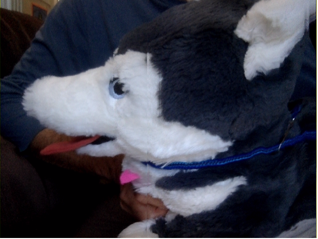
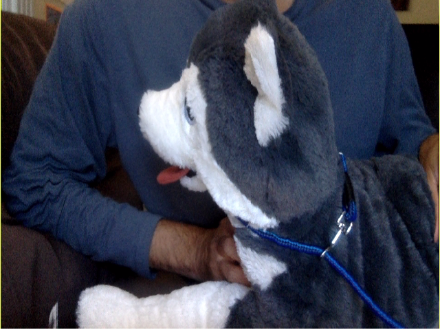
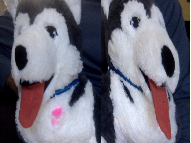
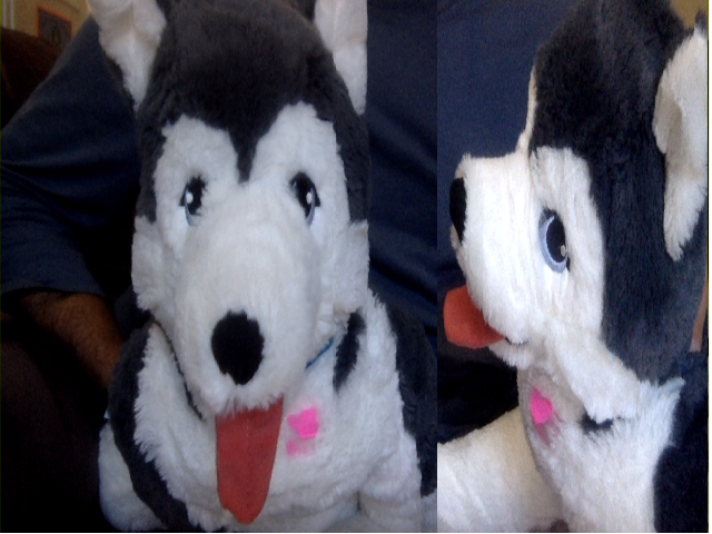
The last two images are captured with a single stuffie, using the pause button, to generate two pictures during slow capture. The first four effects are done by slowly moving the stuffie along or away from the moving yellow line, to stretch or compress the picture horizontally.
Here is an example that demonstrates how to convert live webcam feed to sketch art using the technique that uses grayscale, invert and blur filters followed by color-dodge to mix. Additionally, image sharpen is performed at the end.
A few controls allow removing background before conversion, changing the blur size, or sharpness scale.
The p5.js project provides a JavaScript library for creative coding and drawing for artists and designers. The following example shows how to use this third-party library to add special effects like snowflakes, rain, fire, particles or pixels. The project includes hundreds of effects and drawing examples, and a handful of them are included in this example below.
The included effects are further illustrated below: snowflakes, pixels, particles, rain, bouncy, explosion and fire.


This example does not use video-mix because p5.js already provides
similar functions using its canvas for drawing. The example uses two video-io
instances - the first one's video element is wrapped in p5.MediaElement,
so that it can be used there, and the second one's input is assigned to
p5's canvas element. After that all the drawings are done in p5, but
without the global context.
Here is an example that uses the popular opencv.js project to generate a new video stream with the webcam video projected onto a rectangle detected in a background image.
Clicking the first background image allows you to change the background in the generated and project third video. The application logic is explained in the following diagram.
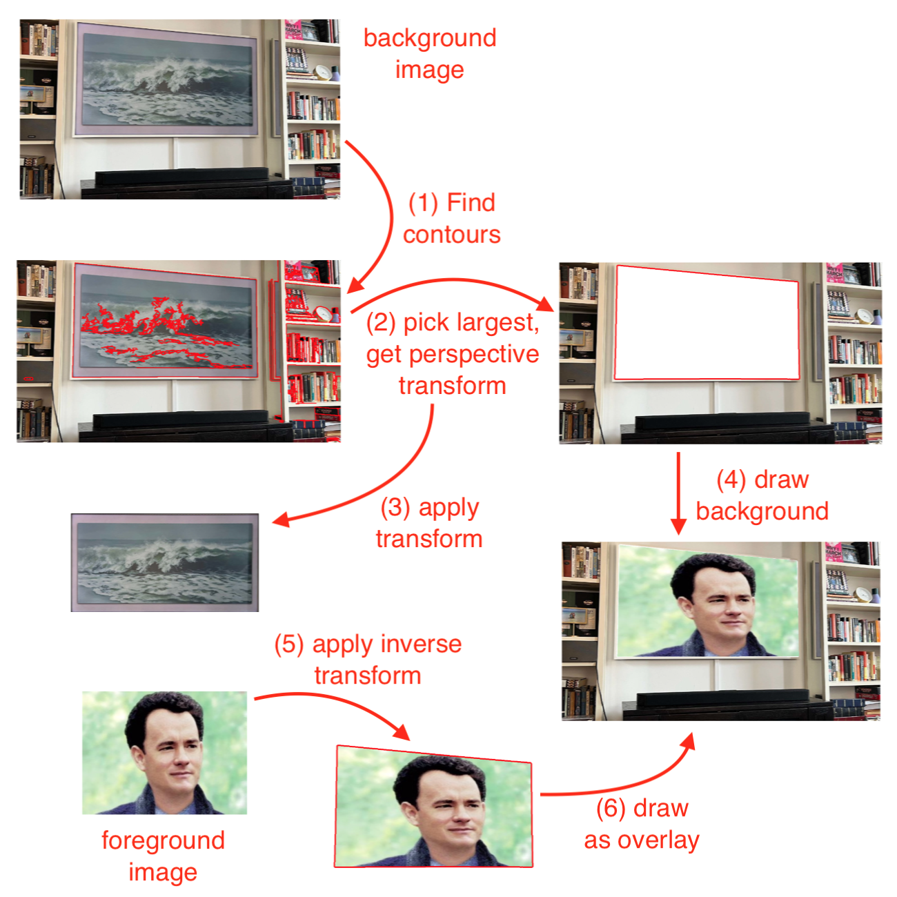
Rectangle detection in the current implementation is not very accurate. This application is also meant only for demonstration purpose, and is not robust. The following example takes two input images and generates two output images using the above application logic.
Some use cases for detecting rectangles and perspective projections are as follows:
The second and third use cases are not yet feasible in real-time, due to the large processing requirement of shape detection in the current code. They can however be done in a semi-real-time manner, where detection happens only periodically, say, once in 5 or 10 seconds. Furthermore, user assisted rectangle detection can be used instead of automatic, by allowing the user to click-select the four corners of the rectangle in the video.
The alternative glfx.js project provides a more efficient WebGL based perspective transformation. The higher level API of this project is also easier to use then the previous one.
The above example is similar to the one previously shown, except that it uses this new library, and it allows user assisted rectangle detection. It allows drag-move of the four corners of the rectangle in the source image.
In addition to perspective transform, the glfx.js project implements several image effects in JavaScript using WebGL. Here is an example that demonstrates various image processing effects on webcam video using the glfx.js project.
The included effects are further illustrated below: brightnessContrast, hueSaturation, vibrance, denoise, unsharpMask, noise, sepia, vignette, zoomBlur, triangleBlur, tiltShift, lensBlur, swirl, bulgePinch, perspective, ink, edgeWork, hexagonalPixelate, dotScreen, and colorHalftone.


The lightweight pixelmatch.js library compares two images to detect differences in pixels. This is useful in a variety of scenarios, including optimization for security camera. The following example shows the difference detected using pixel match due a slight movement of the object in view.
Try the following as an example security camera application. Once started, move away from the camera for few minutes. Then appear again briefly for 10-30 seconds, and move away again. Come back and see the recordings captured, both snapshots and video, for the duration when there was some activity in the webcam video.
It uses recordmax property of the video-io component, to keep
recording of the last ten seconds of the webcam video. It periodically captures snapshots every
five seconds. It then uses pixelmatch.js to detect any differences in the snapshot from the
previous snapshot. If a difference is detected, in more than 0.1% of pixels, indicating some
activity in the webcam video, then it updates the recordmax property to record
longer video, and continues to save the snapshots. After no activity is detected, it saves the
recorded video as well as stops saving the snapshots, and reverts the recordmax
property back to last ten seconds.
The net effect is that it captures and records video and images of any activity detected, including few seconds before the activity started, and few seconds after it stopped. Not saving the images or video when there is no activity helps in storage management as well as review of the security camera footage. The sensitity of activity detection can be easily adjusted based on the threshold for pixel match.
Tesseract.js is a JavaScript library for optical character recognition. It takes an image and extracts words in almost any language. The following example uses it to extract notes out of shared screen or app video.
First, click to start the screen or app capture in the video-io instance
on the left. You can resize the red selector, to limit how much of the video image to
use for text detection. Typically, you would ignore the window header or footer.
Click on the detect button to detect text and populate it in the textarea
on the right. You can also check the auto checkbox. If checked, it automatically triggers
detection when the video image changes by more than 4% in pixel comparison. This is useful
for slide share scenario, where it automatically captures the text notes when the slide
changes. Clicking on the ignore button deletes the last detection from the text.
The Web Audio API is very powerful in applying simple processing such as gain, delay,
low pass filter as well as for complex signal processing such as for sound analyzer, colvolver,
wave shaper. The audio-context component wraps these features provided by
the built-in AudioContext and related interfaces in the browser.
Similar to the video-mix component, it plugs into the video-io
instances, and can intercept and modify the audio stream.
Similar to the delayed-video component,
you can include and attach an audio-context instance to a video-io
instance using one of these attributes or properties: for, input
or srcObject. Internally, both for and input are used to
extract a srcObject and applied. Only one of for, input,
or srcObject must be specified. These attributes and properties are
summarized below.
| Property | Description |
|---|---|
| for | attribute, optional |
| Set to the id of the source video-io element. The video-io element must be present in DOM at the time this attribute is set. | |
| input | property, optional |
| Set to the video-io element DOM object. | |
| srcObject | property, optional |
| Set to the MediaStream instance. See localStream or videoStream of video-io. | |
| remote | boolean, attribute and property, optional, default is false |
| If attribute is present or if the property is set to true, then this instance is attached to a subscriber (or received or remote) MediaStream instance. Default is to assume a publish (or sent or local) MediaStream instance. |
The audio-context
component is implemented to work with both the publish and subscribe video-io
instances. However, internally, the implementation differs due to some unresolved issues in the
browser at this time. Thus, you must explicitly specify if the component is being applied to
publish or subscribe mode.
The following example shows how to use the component.
It uses the for attribute to attach the component to the source.
<video-io id="video" publish="true"></video-io>
<audio-context for="video">
    <delay value="4"></delay>
    <gain value="0.8"></gain>
</audio-context>
The example shows two audio processing nodes applied to the published audio track —
the delay and gain nodes — in that order. The delay node causes a delay in the
audio path by the supplied number of seconds, and the gain causes the volume change on a scale
of 0 to 1. Developers familiar with the Web Audio API or AudioContext
can see how these map to the built-in APIs.
Here is another example that does the same things, but uses the input
property of the component.
<video-io ... ></video-io>
<audio-context ...>...</audio-context>
<script type="text/javascript">
    const video = document.querySelector("video-io");
    const context = document.querySelector("audio-context");
    context.input = video;
</script>
The following example shows how to use the srcObject property directly
if you do not use or want to use the video-io component, as long as you have a
MediaStream object.
const stream = await navigator.mediaDevices.getUserMedia({audio: true});
context.srcObject = stream;
The following example shows the gain node applied to the subscribed track. Note
the remote attribute on the component instance.
<video-io id="receive" subscribe="true"></video-io>
<audio-context for="receive" remote="true">
    <gain value="0.5"></gain>
</audio-context>
The component implementation is actually pretty generic, and can include any type of
audio processing node supported by AudioContext. The popular DelayNode,
GainNode and BiquadFilterNode constructs are explicitly allowed
via their named elements, delay, gain and biquad-filter,
respectively. However, these or any other node instance can be included using the generic
script element described below. Moreover, these explicitly allowed elements may
also be included using the input element with the specified name.
Consider the following example, with four audio nodes in the component.
<audio-context ...>
    <delay value="2"></delay>
    <biquad-filter value="lowshelf" frequency="1000" gain="10"></biquad-filter>
    <input type="range" name="gain" min="0" max="1" step="0.02" value="0.8"
        onchange="event.currentTarget.setAttribute('value', event.currentTarget.value);"/>
    <script type="text/plain">
        let node = context.createGain();
        node.gain.value = 1;
        return node;
    </script>
</audio-context>
The gain, delay and biquad-filter elements use
the value attribute to set their primary values, which are the gain value
between 0 and 1, delay value in seconds, and the filter type. The delay element
also allows a max attribute for the maximum delay in seconds, and unlike
the DelayNode API, the attribute defaults to 60 seconds. The biquad-filter
element allows several other attributes including frequency, detune,
Q and gain, similar to the BiquadFilter API.
Using a headset is recommended for trying out the following example to avoid audio loop. It uses the above example snippet, at the publisher side, to play sound on the subscriber side. The camera is turned off for this audio-only example.
The example above shows four audio nodes: delay for 2 seconds,
biquad-filter as bass booster, input for gain control via
user input, and script for gain control via script. The last one particularly
allows generic creation and application on any audio node.
The input element contained in the component is displayed as a regular
HTML element, with the difference that its name attribute defines the audio node
type and its value attribute defines the primary value of that node. To allow
user control of the value, the change must be propagated to the attribute, as shown in the
example with the onchange event handler. The primary value of the gain and the
delay nodes is trivial, and that of the biquad-filter node is the filter type such
as lowshelf or lowpass. For more information please refer to those
built-in APIs.
The script element must have the type attribute set to
text/plain. The body of the element must be written in JavaScript assuming that it
will be called from a function, similar to the video-mix element's script
child. Here, the function body must return an instance of the newly created audio node object.
The above example shows a bypass audio node with gain of 1 for demonstration. In practice,
this can be any other audio node such as a convolver or wave shaper, whose attributes may be
controlled independently in the app. The function body gets a local parameter named
context representing the underlying AudioContext instance.
Since enabling AudioContext requires user interaction in modern browsers,
the above example includes another button to start, which when clicked triggers the
user interaction necessary to enable the internal audio-context
implementation.
The next example uses the audio-context component attached to a
publishing video-io component, and uses AnalyserNode to
draw the audio waveform and frequency.
Later in this document, we will also cover How to enable spatial or 3D audio?.
Converting between speech and text is often needed for accessibility, captioning or just for saving bandwidth. Modern browsers natively support speech recognition and speech synthesis. However, there are certain restrictions, such as speech recognition can only be applied to local microphone captured sound. This makes certain features such as closed caption on received stream not trivial. In this section, we will describe how to achieve various such use cases in an application.
The speech-text component allows speech recognition and speech synthesis using
builtin JavaScript APIs as follows. To enable continuous speech recognition, set the
recognize attribute on the instance.
<speech-text id="speech" recognize></speech-text>
This will cause the recognize
event dispatched often from the component instance whenever a final or interim transcript is recognized from
the user's microphone.
let speech = document.querySelector("#speech");
speech.addEventListener("recognize", event => {
    // either event.transcript (final) or event.interim (interim) string is valid.
});
Try the following example to perform both speech recognition and speech synthesis on the recognized final transcript.
The above example allows you to experiment with the lang and voice
properties, described below. It also allows you speak out some custom text, or selectively
disable or enable recognition and synthesis.
| Property | Description |
|---|---|
| lang |
A valid language code such as en-US. If not supplied, then uses
platform specific navigator.language or defaults to en-US. If explicitly set, then
it is used for both speech recognition and synthesis. If voice property is set, then the lang is
implicitly derived from the voice value, but can be overwritten by explicitly setting this property.
|
| voices | (readonly)
A list of items, each containing name, lang or local attribute. The name and lang are strings,
and local is boolean indicating local or server driven synthesis.
The name of an item may be used as a value of the voice property.
|
| voice |
A valid voice name to be used for speech synthesis. It must be the name attribute of an item
of the voices list.
|
| exclusive | (boolean) If set, then speech recognition is paused when speech synthesis is in progress, to avoid feedback from spoken sound of speaker back to speech recognition from microphone. This is recommended when not using the headset and when both recognition and synthesis are active. |
These properties are also reflected as attributes. Thus, the following two are equivalent.
speech.setAttribute("lang", "hi-IN"); // attribute
speech.lang = "hi-IN";                // property
Usually only one of lang or voice needs to be set, and the other is
automatically derived.
| Function | Description |
|---|---|
| speak | speech.speak("Hello there, how are you?"); |
| Convert the supplied text to speech and play out the voice. | |
| cancel | speech.cancel(); |
| Cancel any ongoing text to speech and stop voice play out. | |
| text | var text = await speech.text("yes | no | maybe"); |
Recognize speech to text using the supplied optional grammar. It returns a promise that resolves to
the recognized text. The supplied grammar string should either be in #JSGF format,
or contain list of text phrases such as red | green | blue | black. |
More examples of this component are described next.
Closed caption can be implemented using the speech-text component. The data channel
described earlier can be used to send the recognized text from publisher to subscriber and displayed
as closed caption on subscriber as well.
Try the following example to see the closed and open captions in action.
The example above allows you to experiment with various options such as to enable or disable automatic speech recognition for caption, to speak out closed caption, or to hide background in open caption.
The example above uses a speech-text to detect text from speech, and when detected, uses
the send function on the publisher video-io to send the caption text.
speech.addEventListener("recognize", event => {
    if (event.transcript && !event.interim)
        video1.send(JSON.stringify({type: "caption", caption: event.transcript}));
});
In this example, for closed caption, the publisher side displays both the final and interim transcript, whereas the send is done to the subscriber only for the final transcript, which only displays that.
Open caption differs from closed caption in that the caption text is part of the video stream in open caption, whereas the user can control when and how to display the caption text in closed caption. These differ from subtitles, which often refers to caption text with translated language, e.g., sound is in one language and caption text is in another.
Open caption is implemented using the video-mix component in the above example. In particular,
it draws the text on the canvas of the component, which is then used as input source of another
publisher. The canvas context's measureText function is used to detect long line
captions, and split them across multiple lines. In the above example, the open caption is set
for both final and interim transcript of speech recognition. The checkbox allows enabling or
disabling the closed caption on the publisher side. However, that is not possible on the
subscriber side, since caption text will already be part of the received video stream, instead
of out-of-band, via data channel.
Chat or comic book style speech bubbles can easily be implemented and attached to the
speech recognition flow. The speech-bubble container component implements a
multi-party conference interface where each participant appears in a tiny box, and speech
bubbles are used to show the spoken text by the participants. If text chat is enabled,
then it can reuse the speech bubbles too.
Try the following example with a pre-configured conversation flow to get started to see that in action.
In the above example, you can move the participant boxes to a different position on
left or right side. Click-and-hold on the box to enable move.
When you click on a participant box, it allows you to type a message
sent from that participant in the layout. Spoken voice is also captured and recognized
using the speech-text component, and sent as message from a random participant.
This is for demonstration purpose only. Resizing the display verically shows or hides
participant boxes or slots at the bottom if available or applicable.
Furthermore, the message history is stored, and can be retrieved, using the arrow keys. The up arrow goes all the way to the beginning of the conversation. The left and right arrows go one message at a time backwards or forwards. And the down arrow stops the history display, and goes to the end of the conversation so far, for next live message display. The message bubble from history display appears in a different color, and also shows the date/time of when the message was added to the component. You cannot click on the box to send a live message in the history display.
The container component is used similar to other containers such as flex-box
as shown below. It is recommended to use div elements as children, and wrap
other elements such as img or video or video-io inside
div if needed.
<script type="text/javascript" src="https://rtcbricks.kundansingh.com/v1/speech-bubble.js"></script>
...
<speech-bubble>
    <div>..first participant...</div>
    <div>..second participant...</div>
    <div>..third participant...</div>
</speech-bubble>
A couple of customization is allowed by the component, e.g., the shape
attribute can take value of "rounded" or "circle", to show the participant boxes in
that shape.
<speech-bubble shape="rounded">...</speech-bubble>
The textsmall property with default 0 can take a number, for length of the
text, such that a smaller text is displayed in ellipse shaped bubble instead of
rectangular. The textclip property with default 100 can take a number,
for length of the text, such that a larger text is clipped and a ellipsis is shown.
const space = document.querySelector("speech-bubble");
space.textsmall = 50;
space.textclip = 200;
Finally, CSS style can directly be used on the container as well as the bubbles as follows.
speech-bubble {
    background: black;
}
speech-bubble::part(bubble) {
    border: solid 2px black;
}
The underlying code of the example application shows the usage of certain
functions such as says and input. These are illustrated
below.
const space = document.querySelector("speech-bubble");
const second = document.querySelector("speech-bubble > :nth-child(2)");
space.says(second, "How are you?"); // live message
const first = document.querySelector("speech-bubble > :nth-child(1)");
const ts = new Date("4/13/2026 6:30:05 PM").getTime();
space.says(first, "Hello there!", ts); // history message with timestamp
space.input(second, "Hello"); // unsent typed message in input box
As mentioned before, the speech-text component can be used to
feed a text message from a participant displayed in the container.
<speech-text recognize></speech-text>
const speech = document.querySelector("speech-text");
speech.addEventListener("recognize", event => {
    if (event.interim) {
        space.input(first, event.interim); // unsent yet
    } else if (event.transcript) {
        space.input(first, ""); // remove input box
        space.says(first, event.transcript); // sent message
    }
});
Note that the container component is just for display, and does not actually send the text message. You can use the other mechanisms such as data channel or shared data described earlier to send and receive text chat in an application.
The image processing techniques such as face tracking described earlier using the
video-mix component can potentially be used to zoom to the participant face
to be displayed in the box, captured from live camera, for a video conferencing
experience.
Another component comic-space is a container that implements
comic book style speech bubbles where participants or characters are aligned at the
bottom of the page, and some content such as shared screen video can be in the
background. It also removes background from participant image using the
body-pix segmentation model mentioned earlier, and converts the images to comic
book style characters by re-adjusting the colors. In the future, this may be
changed using AI to use, say, Gibli style pictures.
Try the following example with pre-configured conversation flow to get started to see that in action.
Many of the other functions in this component is similar to that in the speech-bubble
component. The properties of textsmall and textclip, and the
style for the bubble part are also applicable to this component.
Some differences are as follows. The participants are represented using
background removed image or video instead of in a circle. The speech bubbles grow
upwards instead of downwards. The participant images are not draggable.
And if there are too many participants that can fit horizontally, then the list of
participants becomes scrollable. The background removal and comicification is done
in the app itself instead of the component, and the component just displays the
supplied images representing the participants as an overlay.
We provide two web components for displaying multiple video-io or other components
in a 3-dimensional (3D) space. These are primitive implementations, and may require further work in
a real 3D video conferencing application. The components are generic and can
be used for display of other web elements besides the video-io components.
The following example shows a sample 3D space using the popular three.js
Javascript library. It uses video-io elements, but can be changed to video or
custom img elements, as we will see later.
Note that the example uses threejs' OrbitControls to navigate the camera around
the scene. You can,
The threejs-space web component is a wrapper around the three.js library to
facilitate the above behavior. Besides the default navigation shown above, the component also allows
clicking on the displayed items, and when clicked, attempts to put that item as target focus of the
camera.
By default a grid is displayed, along with some ambient lighting. Those can be altered by changing the component implementation.
To use the component in your implementation, first include the three.js and
OrbitControls.js from that project, and then our threejs-space.js, as follows.
<script type="text/javascript" src="https://rawcdn.githack.com/mrdoob/three.js/r132/build/three.min.js"></script>
<script type="text/javascript" src="https://rawcdn.githack.com/mrdoob/three.js/r132/examples/js/controls/OrbitControls.js"></script>
<script type="text/javascript" src="https://rtcbricks.kundansingh.com/v1/threejs-space.js"></script>
After that, use the threejs-space element as the container for other elements
of type video-io, video or img. An example is shown below.
The path to the font file should be correct, e.g.,
https://rawcdn.githack.com/mrdoob/three.js/r132/examples/fonts/helvetiker_regular.typeface.json
<threejs-space font="https://... typeface.json"
    camera3d="x:-100,y:10,z:300" target3d="x:0,y:50,z:0" >
    <video-io id="video1" for="stream" subscribe="true"
        displayname="Big Screen"
        position3d="shape:rectangle,w:240,h:180,x:150,y:100,z:-100,ry:-45deg" ></video-io>
    <video-io id="video2" for="stream" autoenable="true" microphone="false" publish="true"
        displayname="First"
        position3d="shape:cube,side:30,x:-50,y:15,z:0" ></video-io>
    <video-io id="video3" for="stream" subscribe="true"
        displayname="Second"
        position3d="shape:cube,side:30,x:0,y:15,z:0" ></video-io>
</threejs-space>
Many of the attribute values shown above are optional, and the implementation picks the right defaults as needed. The attributes are in a set of name-value pairs, and set as comma separated name:value format as shown above. The name-value pairs can also be represented using JSON object, and set using property via script as shown below. When setting via script, numeric values vs. string are used as applicable.
document.querySelector("threejs-space").target3d = {x: 100, y: 50, z: 0};
document.querySelector("#video1").position3d = {x: 300, y: 200, shape: "rectangle"};
Setting an attribute/property applies the change, instead of full override of the name-value pairs.
For example, if the initial attribute value for camera3d included x, y, z; but the
property JSON object included only y, then other x and z will remain unchanged.
The attributes/properties are described below. For the container element:
displayname attribute
of any of the container item is set. The font is needed for rendering the display name text.
There is no default for font, and if not supplied, then display names are not shown.fov, aspect, near and
far for the underlying PerspectiveCamera instance of three.js. The default
for camera3d is
{x:0,y:10,z:300, fov:45,aspect:...,near:1,far:10000}, where the default for the
aspect property is derived from the containers currently displayed aspect ratio.min and max for
minDistance and maxDistance, respectively, of the underlying
OrbitControls instance of three.js. The default for target3d is
{x:0,y:0,z:0, min:50,max:500}.For the container items, the allowed attributes are:
font attribute of the container must be valid too.shape for the display
shape. Currently, shape can be one of "cube" or "rectangle" (default). For cube,
additionally, the side property can specify the size of the side, default to 30. For
rectangle, the w and h properties can specify the width and height, and default to 40 and 30, respectively.One issue with the previous three.js based approach is that it uses canvas internally,
and WebGL for rendering everything
on that canvas. This makes it hard to apply CSS or other DOM manipulation to the 3D objects directly.
Thus, the rendered cube or rectangle or other shapes are rigid, and cannot be easily styled or
changed by the application, unless the component creates an appropriate mapping from those styles to
the rendered objects on the canvas.
Fortunately, 3D is natively supported in CSS, using perspective and transform attributes. Unlike a true computer graphics or vision library like three.js, this approach lacks the implicit lighting and shadow support, making the visuals less appealing. However, it is easier to deal with and has better integration with existing web development tools and skills.
Here, we describe an alternate web component that facilitates rendering of video-io instances
in a 3D space using CSS and DOM manipulation. Try the following example.
It shows multiple elements included in a 3D space. Double-clicking on an element makes it
focussed in the view by moving the camera infront of that element. A small anchor point appears
at the center to allow resetting the camera to the original position. Several white dots on black
background appear mimicing stars in the space. The above example uses the virtual-space
web component described next.
The virtual-space web component can be included and used in your application as follows.
<script src="https://rtcbricks.kundansingh.com/v1/virtual-space.js"></script>
<virtual-space stars bgstars>
    <img src="..."
        style="width: 1000px; height: 700px;"
        position3d="x:200,y:-400,z:0,rx:-30,ry:-30" />
    ...
</virtual-space>
The component supports these attributes:
The container items can be any valid HTML element including img, video,
video-io or even span or div. The size of the
item can be specified using standard CSS or other means. The parent container component
interprets these attributes on the item:
The position3d attribute directly maps to the CSS transform attribute for
positioning the element. It just provides a convenient way to easily change the position
of the item. The item is comma separated list of name:value, where the property
name is one of x, y, z for position in px unit, rx, ry, rz for rotation in degrees,
and s for scaling if needed.
To bring the camera to the front of the item on some event, just set the selected property, as shown below.
<img ... ondblclick="event.currentTarget.setAttribute('selected', '');" />
document.querySelector("img").ondblclick = event => {
    event.currentTarget.setAttribute('selected', '');
}
A number of controlling behavior of the component is currently fixed in the implementation, and may be exposed as configurable properties or attributes in the future.
Try the following example to compare the two components, virtual-space on left,
and threejs-space on right.
Rendering video elements for multi-party conferencing using the three.js or CSS based components described previously is not trivial. In particular, it requires you to visualize the 3D layout, and setup the positions and rotations of the video elements, and camera angles and target focus precisely for a good visual effect.
Here we show how to define a generic behavior for N-elements, such as in a carousel. This can be used to display the multi-party video elements in a circle, and can scale to different number of participants. The element selection can be done using events such as click or talker indictaion, to rotate the carousel, and bring the selected element to the front of the camera. The example below shows five boxes in a eight-slot carousel display. Double clicking on a box brings it to front.
The code snippet which calculates the position3d attribute of the boxes is shown
below.
let count = 5, minimum = 8;   // actual and slots count
let w = 320, h = 180, m = 10; // box size and margin
const radius = Math.round(((w + 2*m)/2)/Math.tan(Math.PI/Math.max(minimum, count)));

for (let i=0; i<count; ++i) {
    // to keep first item in center.
    const j = count >= minimum || i < count / 2 ? i : (minimum - count + i);
    const theta = Math.round((j / Math.max(minimum, count)) * 360);
    const p = {ry: theta, z: radius}; // transform
    ...
    const div = document.createElement("div");
    div.style.width = w + 'px'; div.style.height = h + 'px';
    div.setAttribute("position3d", `ry:${p.ry},z:${p.z}`);
    document.querySelector("virtual-space").appendChild(div);
    ...
}
To visualize the carousel, you need to visualize the transform for each box. First, we calculate the angle of the box. Then rotate the box with that angle on Y-axis, and move the box away from center on Z-axis. How much to move away depends on the radius of the carousel, which depends on the number of slots and width of each slot. Note that the order of transform is crucial here to see the desired effect, because the rotation also causes the axes to rotate for future moves and rotations.
The virtual-space component also dispatches three events —
added, removed and transform — when
a container item is added or removed or its position is altered by applying the
CSS 3D transform. The transform event is also dispatched when the
viewer or camera position is altered in the component, e.g., via navigation
described earlier. The element property in the event object contains the
DOM element such as the container item to which the event applies.
For the
transform event, the subtype and transform
properties are also present. The subtype is either observer
or object, to indicate that the element is the viewer or camera or the
container item. The transform property is just the string containing
the applied CSS transform, which can also be obtained via the CSS transform style attribute.
These events are used by spatial audio as discussed later, and can be used
by your application for other purposes.
Previously we showed how to use the Web Audio API with video-io using the
audio-context component. Here, we further expand the use of Web Audio API for
spatial or 3D audio. Unlike attaching to the video-io instance, the spatial
audio contructs attach to the container instances such as flex-box or
virtual-space. The basic idea is to make the sound from a container item
appear to come from a position and in a direction, and have the listener present in the space
to listen to the sounds from different container items differently.
We have implemented two such spatial audio components — spatial-audio
and audio-space — that attach to flex-box and virtual-space,
respectively, to cater to 2D and 3D positions of the container items, respectively.
However, these new components are generic and can potentially be attached to other
similarly behaving containers of video elements. In particular, spatial-audio
can potentially be used with the comic-space component too.
This component caters to the spatial sound requirements of 2D layouts such as
flex-box. The sound source model does not use a panner cone, but assumes
equal sound in all direction, attenuated by distance. The 2D position of the container
item inside the container component determines the position of the sound source from that
container item. The listener is assumed to be at the center of the rectangular box that
covers all the container items. In particular, it is not at the center of the container,
but at the center of the imaginary rectangle that covers all the container items, especially when there
are empty spaces in the container. At this time, the component does not work with the
scrollable view of the flex-box, e.g., when the display is
set to page.
To use the component, just create it and assign its for attribute or
input property. The for attribute contains the id
of the associated 2D container such as flex-box as shown below.
<flex-box id="flexbox" ...>
    <video .../> <video .../> <video .../>
</flex-box>
<spatial-audio for="flexbox"></spatial-audio>
The container item must be present in the DOM, when the for attribute
is assigned. Alternatively, the input attribute can be set to the container
instance as shown below.
<flex-box> ... </flex-box>
<spatial-audio></spatial-audio>
<script type="text/javascript">
let flexbox = document.querySelector("flex-box"),
    spatial = document.querySelector("spatial-audio");
spatial.input = flexbox;
</script>
The flex-box container items must include width
and height for their layout, and may be of a sound producing elements
such as video or video-io, or some non-sound producing
element. Internally, the spatial-audio component ignores the
non-sound producing elements in the container.
Once attached, the component listens for any change event dispatched
from the container, and readjusts the spatial sound positions of various sound sources
on such events, and on the initial attachment. The flex-box container
dispatches such an event anytime there is any change in the position or any container
item or any change in the size of the container itself.
Try the following example with a headset to see the spatial audio combined with
flex-box.
The example above has three container items, all video elements,
playing the same video. As you mute and unmute some or all of the elements, you can
hear the sound coming from different directions.
The spatial sound position of the elements are assumed to be all the way from left to all the way to right, and all the way from top to all the way bottom. Thus, if there are only one row of elements, as in the above example, they will all be centered vertically, and the three elements are aligned at -0.5, 0 and +0.5 positions, in a -0.5 to 0.5 space horizontally. If there are five such items, then they will likely get positioned at -0.5, -0.25, 0, +0.25 and +0.5. Other layout positions are similarly calculated by mapping the center of the element to a 2D space such that the elements cover the whole space both vertically and horizontally. Thus, this is just one way of mapping the 2D positions to 2D sound positions.
For a real 3D positional audio, the actual position of the container item is
assigned to the sound source associated with that item. This only makes good sense
when the layout is also in 3D, such as with virtual-space or threejs-space.
The audio-space component does this and is described here.
Using the component is similar to the previous, using either the for
attribute or the input property. The following example shows the
for attribute.
<virtual-space id="space" ...>
    ...
</virtual-space>
<audio-space for="space"></audio-space>
Try the following example with a headset to see the spatial audio combined with
virtual-space. Click on a video to toggle play and pause. Then use the
3D navigation described earlier to rotate or move the listener in the space.
As mentioned earlier, double clicking on the video brings the listener to focus.
Try the following example as another layout of the same set of video elements.
Unlike the previous component which keeps the listener position and orientation fixed, but changes the sound source positions, this one can modify both the listener position and orientation as you navigate in the 3D space, and the source position and orientation. By default, the sound is assumed to be front facing from the sound source, and the listener position and orientation is same as interpreted in the 3D view of the container.
When attached, the audio-space component instance listens for the three
events from the container instance — added, removed and
transform — and alters the position and orientation of the
source of the container item and/or the listener.
Unlike the previous 2D spatial audio component, this one uses a panner cone for the
sound source. The default values for the PannerNode is shown below.
As mentioned before, the position and orientation of the sound source is same as
their position and front-facing vector in the 3D layout of virtual-space.
{
    coneInnerAngle: 30, coneOuterAngle: 90, coneOuterGain: 0.1,
    panningModel: "equalpower", distanceModel: "linear",
    maxDistance: 10000, refDistance: 1, rollOffFactor: 1, ...
}
The default values for the specific sound source can be altered by using the
audio3d attribute on the container item as shown below. The first
video element alters the panner attribute, but the second one uses
the default.
<virtual-space id="space" ...>
    <video ... audio3d="i:90,o:180,g:0,m:40000"></video>
    <video ... ></video>
</virtual-space>
The value of audio3d attribute is a comma separate name:value
pair, where name is a short hand for the panner properties as shown below.
{
    i: "coneInnerAngle", o: "coneOuterAngle", g: "coneOuterGain",
    p: "panningModel", d: "distanceModel", m: "maxDistance",
    r: "refDistance", f: "rollOffFactor",
}
Thus the example above changes for the first video: coneInnerAngle from default
30 to new 90, coneOuterAngle from default 90 to new 180,
coneOuterGain from default 0.1 to new 0 (no sound if outside the outer
angle), maxDistance from default 10000 to new 40000 (in pixels).
The net effect of these is that the first video can be listened much farther, and
at a larger angle, but cannot be listened if not in front facing.
Both, 3D layout and 3D sound, are very complex topics, and these components
attempt to provide a bridge to use them with other useful components
of video-io or flex-box we created. However, the
new components virtual-space, spatial-audio and audio-space
are not comprehensive to cover all types of application scenarios. Some generic hooks
are available nevertheless, to allow using some complex scenarios. If the
existing implementation is not enough, you can always create a derived component
that extends our initial implementation.
We have created several web components to support multimedia collaboration
use cases such as text chat, user roster, white board, notepad,
and multimedia conference. These components use the shared storage abstraction described in
How to use shared data? The basic idea is to provide the
data model for the component via a shared-storage instance,
at a specific data path, e.g., "path/to/my/contacts". The separate instances
of the web components running on separate machines can then interact with the
data in real-time and provide the needed functionality to the user.
For each of the collaboration use case component, we also created a data model
component that attaches to a shared-storage. This allows separating
the view and functionality of the collaboration use case, from its data, and
more importantly, allows replacing with a different data model that does not use
our shared storage based architecture.
The following diagram shows how various web components including the collaboration components are related, use the shared storage, and interact with other components.
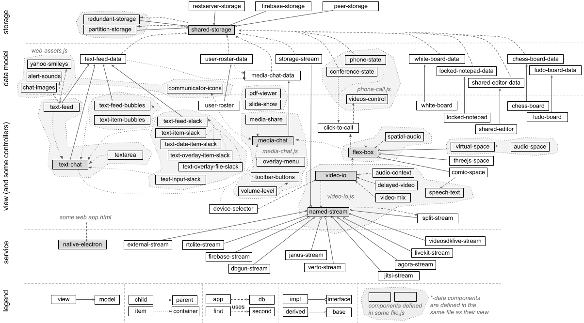
Besides the list and object data abstractions
discussed earlier, there are several other supporting implementations in
shared-storage.js as shown below. These are used in implementing
the various collaboration use cases described in subsequent sections using the
model-view design pattern. In particular, the main collaboration use case
is implemented in the view component such as text-feed or
shared-editor, and shared-storage based data model is
implemented in a separate component such as text-feed-data
or shared-editor-data. The programming interface of the data model
component is designed to be generic enough, such that it can be replaced
with another component implementation using the same interface, but a different
backend service, instead of the storage based one, such as
my restserver project.
| Class | Description |
|---|---|
| ProxyDataElement | Base-class for view component. |
The constructor allows creating shadow DOM and properties based on the supplied
metadata object and HTML+CSS text. The data and for-data
properties are included in the base class implementation, and allow setting
the data model object by reference or by DOM id, respectively.
A sub-class instance can set the data_handler property
in the constructor to receive and process events from the
attached data model. Additonally, a ready read-only property
is available to indicate when the data model is set and is ready to be used.
If additional properties are specified using the metadata in the constructor,
those are created, and convenient methods are used to read or write them.
For example, if property name is defined,
then _on_name(...) is invoked for that property access.
| |
| ProxyStorageElement | Base-class for storage based data model component. |
The constructor allows creating optional shadow DOM and properties based on the supplied
metadata object and HTML+CSS text. The sub-class can use convenient methods
such as wraplist and wrapobject to create
wrapper list and object even before the storage is ready or connected.
The storage and for-storage
properties are included in the base class implementation, and allow setting
the storage object by reference or by DOM id, respectively.
Additonally, a ready read-only property
is available to indicate when the data model is set and is ready to be used.
If additional properties are specified using the metadata in the constructor,
those are created, and convenient methods are used to read or write them.
For example, if property name is defined,
then _on_name(...) is invoked for that property access.
|
The metadata object used in the sub-class constructor provides a
high level programmatic description of the component. This is used for
automatic document generation as well as for creating property accessors
in the constructor. An example is shown below.
const metadata = {
    name: "my-view",
    description: "An example view to show in different ways.",
    properties: Object.assign({
        display: {
            type: "string", default: "inline", ...
            desc: "Controls the overall display.",
        },
        ...
    }, ProxyDataElement.metadata.properties),
    methods: {
        adjust: {
            desc: "Adjust the display now or on delay",
            example: 'view.adjust(200)',
            args: [{
                name: "delay", type: "number",
                desc: "Delay in milliseconds.",
            },{
                name: "callback", type: "function", required: false,
                desc: "Optional callback when completed.",
            }],
        },
        ...
    },
    events: {
        move: {
            desc: "Dispatched when view is moving.",
            example: '{type: "move", data: ...}',
            related: "method:adjust",
            attrs: {
                data: {
                    desc: "Additional data about the move",
                    type: "object",
                },
                ...
            },
        },
        ...
    },
    styles: {
        "--bgcolor": {
            desc: "Background color",
            default: "lightgreen",
        },
        "--color": {
            desc: "Text color",
        },
        ...
    },
}
There are several attributes such as default,
desc, related
in various objects that define the behavior
of the property, method, event or style. For example, the property object
can additionally include instanceof:[...], readOnly:true,
or automatic:false properties to further refine the property
behavior.
An example code structure for a fake view component is shown below.
const metadata1 = {...};
const template1 = document.createElement("template");
template1.innerHTML = `... CSS + HTML ...`;
class MyViewElement extends ProxyDataElement {
    static get metadata() { return metadata1; }
    static get observedAttributes() {
        return ProxyBaseElement.attributes(metadata1);
    }
    constructor() {
        super(metadata1, template1);
        ...
        this.data_handler = {
            set: (old, value) => { ... },
            ready: e => { ... },
            moving: ({value}) => { ... },
        };
    },
    _on_display(old, value) {
        ...
    }
    adjust(delay, callback) {
        ...
    }
    ...
}
customElements.define("my-view", MyViewElement);
An example code structure for a fake data model component is shown below.
const metadata2 = {...};
class MyDataElement extends ProxyStorageElement {
    static get metadata() { return metadata2; }
    static get observedAttributes() {
        return ProxyBaseElement.attributes(metadata2);
    }
    constructor() {
        super(metadata1);
        ...
        this._list = this.wraplist('{path}/moves');
        this._object = this.wrapobject('{path}/info');
        this._list.onchange = ({type, value, id}) => {...};
        this._object.onnotify => ({data}) => {...};
        ...
    },
    _connectedCallback() {...}
    _disconnectedCallback() {...}

    _on_moving(old, value) {
        ...
    }
    ...
}
customElements.define("my-data", MyDataElement);
The wraplist and wrapobject methods in the data model
instance return a wrapper to the list and object reference. They behave
similar to the those as described in
How to use shared data?. A wrapper, allows those
references to be updated automatically when the parameterized path
property is set, e.g., when path is set to "data/123" then
'{path}/info' becomes "data/123/info", and an actual list or object is
created for that. The onchange and onnotify
methods on those wrappers can be assigned to handle change or notify
events on the underlying data path's list or object. The event is same as
described earlier. Those wrappers also have methods such as add,
set, setattrs, remove,
removeall, getall and notify.
To enable text chat among collaborating users, there are two web components:
text-feed and text-chat, and one data model web
component: text-feed-data.
The text-feed component displays real-time text feed of a shared
list of messages. The text-chat component then uses this,
along with a text input area, typing indication and drag-and-drop file sharing
features, to provide a full text chat support among collaborating users.
The following example shows how to include the text-feed component.
<script type="text/javascript" src="https://rtcbricks.kundansingh.com/v1/text-chat.js"></script>
...
<text-feed></text-feed>
This component also supports popular text chat features such as smileys
or emoticons, and alert sound on new messages.
To show smileys or to play sound on new messages, you can set the smileys
or sounds property to the corresponding data objects that supply those assets. Alternatively, the
for-smileys or for-sounds attribute can be used to
identify the data object elements as follows. These included web assets have
example components for sounds and smileys from popular third-party services.
<script type="text/javascript" src="https://rtcbricks.kundansingh.com/v1/web-assets.js"></script>
...
<alert-sounds id="sounds" />
<yahoo-smileys id="smileys" />
<text-feed for-smileys="smileys" for-sounds="sounds"></text-feed>
To add a new message to the feed, use the add method. The
message data should include the optional sender name and message text. It may
include other information as described later.
const feed = document.querySelector("text-feed");
let msg_id = "M1234"; // some unique identifier
feed.add(msg_id, {from: "Alice", text: "Hello there!"});
A missing sender name indicates a system generated message, and is displayed differently. Successive messages from the same sender are grouped together. Usually the message date is not displayed unless there is a time gap since the last message.
Try the following example to see the component in action, as messages are typed on behalf of different users. Wait a minute after a message to see the last message's date/time too.
Without attaching to a storage, the component just acts as a user interface for
displaying text feed.
The following code fragment attaches a shared-storage instance to a
text-feed-data, which in turn attaches to the text-feed instance,
so that it can read messages from the storage. The required path property determines
the storage path of the list of messages to show in real-time. Internally, the data model
component reads and subscribes to changes in the list of messages on that storage path.
<shared-storage id="storage" ...></shared-storage>
<text-feed-data id="data" for-storage="storage" path="sessions/chat123"></text-feed-data>
<text-feed for-data="data" ...></text-feed>
By changing the storage instance using its src property, the application can use different backend
databases such as RestserverStorage or FirebaseStorage. By replacing
the data model of text-feed-data with a different component, the application can
use a different messaging service instead of the shared storage component.
An example message object is shown below. All fields are optional, except for text.
The disposition of "message" is assumed if missing, if from or fromid is present,
otherwise "info" is assumed. The created attribute stores a numeric timestamp or a
string representing date/time of when the message was generated. Interpretation of these
attributes remains with the application. The text-feed component uses the
disposition to display the messages differently.
{
    from: "sender name", fromid: "sender id", created: ...timestamp...,
    text: "message content", type: "text/plain", disposition: "message"
}
Try the following example with three text-feed instances for three
example users, that can add messages to the attached shared-storage, where all
the instances use the same path property.
The text-feed component also implements several other common features found
in popular instant messagsers such as to convert typed URL text to clickable links,
play sound alert on received messages, or convert typed patterns to corresponding smileys.
The text-chat component uses the text-feed component and a
text input area to implement multiparty text chat. It can use text-feed-data
as the data model to send messages or typing indication. It also supports file sharing using
convenient drag-and-drop to the input area. The following example shows a component instance
with the supplied user information, unique identifier and screen name.
<text-feed-data id="data" self="alice" displayname="Alice" for-storage="..." path="..." />
<text-chat for-data="data" />
The following example shows a component instance with an explicitly supplied and nested
text-feed component instance. This allows customizing the nested component such as
for styles, smileys or sounds.
The data model is set on the container text-chat instance, which is
automatically passed to the nested instance.
<text-chat for-data="data">
    <text-feed for-smileys="..." for-sounds="..."></text-feed>
</text-chat>
The following example shows a nested textarea component that serves as the
input area. This allows customizing the nested component such as for the placeholder text,
font or color.
<text-chat for-data="data">
    <text-feed for-smileys="..." for-sounds="..."></text-feed>
    <textarea slot="textarea"></textarea>
</text-chat>
Try the following example with two text-chat instances for two
example users. Also try the file sharing using drag-and-drop.
Besides showing the text messages, it also shows typing indication.
And here is the same example, but using a peer-to-peer storage.
And the same example, but using Cloud Firestore storage. Make sure to set the right Firebase configuration in localStorage for this to work.
The text-feed-bubbles component is similar to text-feed,
except that it shows the chat messages as speech bubbles, instead of a simple
continuous text area, similar to
other popular text chat applications. Additionally, it includes child elements of
text-item-bubbles component, one per message. This allows better styling or replacing
the individual message display, if needed.
The following example shows how to include the text-feed-bubbles and
text-item-bubbles components.
It has a dependency on text-chat component.
<script type="text/javascript" src="https://rtcbricks.kundansingh.com/v1/text-chat.js"></script>
<script type="text/javascript" src="https://rtcbricks.kundansingh.com/v1/text-chat-bubbles.js"></script>
...
<text-feed-bubbles ...>
    <text-item-bubbles ...>...</text-item-bubbles>
    <text-item-bubbles ...>...</text-item-bubbles>
    ...
</text-feed-bubbles>
When this component is included in a text-chat instance or attached to
a storage path, it adds the child text-item-bubbles elements automatically based on the messages
received or sent on the storage path. An example embedding is shown below, where you
do not need to explicitly include the text-item-bubbles elements
<text-chat for-data="data">
    <text-feed-bubbles input="true" showtyping="true"></text-feed-bubbles>
</text-chat>
Note the input and showtyping attributes above.
The component also includes text input area and typing indicator, separate and independent
from the parent text-chat component. Thus, to use those features, the input
is disabled in the parent, which implicitly disables typing indicator in the parent, and
both input and typing indicators are enabled in the child component.
Try the following example with two text chat instances, each including a text-feed-bubbles instances,
and one text-chat instance with a default text-feed implicitly included,
representing three separate users. All instances
are connected to the same storage path, and can interoperate with each other.
Note the difference in how the typing indication is shown.
This component can be customized in a variety of ways. Unlike the previous simple example,
you can set the bubble arrow, color, font, sender icon, sender label and many other attributes.
Try the following example with ten text chat instances, representing ten separate users in the chat,
nine of which use customized text-feed-bubbles instances, and the last one does not.
The various attributes and styles configured on each instance are also shown for
reference. The example has code to inject pre-defined messages from different instances. You can
also interact with any of the connected component to see how the chat messages and
typing indications are shown.
Try the following example to experiment with various attributes and styles on this component. On the left is the component instance of the following form. On the right, it has controls to change the properties and styles of the component instance. If you change a property or style in a text box, press the enter key to apply the changes. It also allows adding a message to the component, by emulating a message sent by another user, using the text input area on the bottom right.
<text-feed-data id="data" self="bob" displayname="Bob" path="..."></text-feed-data>
<text-chat for-data="data" ... input="false">
  <text-feed-bubbles input="true" showtyping="true" for-storage="..." for-sounds="..." for-smileys="..."
    arrow="c-upper" icon="circle" label="other" selfright="true" showself="true" grouped="true"
    style="--background-color-other:lightblue;--background-color-self:lightgreen;...">
  </text-feed-bubbles>
</text-chat>
The component may be used for user interface without any attached data model
such as text-feed-data or shared-storage.
The attached storage based data model is needed only for sending some message, or receiving
shared message. The example above uses the component directly for many of the controls including
sending and receiving of messages. Only file sharing needs the data model in the above example.
Similar to the text-chat and text-feed
components, you can share files using drag-and-drop, send HTML content,
send smileys, and convert typed URLs to clickable links, in the message display.
Alternatively, you can use another rich text editor such as the shared-editor
component, described later, to facilitate HTML editing for use with
sending HTML content. In that case, you should disable the built-in input area
using the input attribute. The enter event from the
editor instance should be used to explicitly send a chat message, using
the correct type. In particular, if the content is not HTML,
it should use "text/plain", and if the content is HTML, it should use "text/html".
Example code snippet is shown below.
<text-chat ... input="false">
    <text-feed-bubbles ...></text-feed-bubbles>
</text-chat>
<shared-editor disabled="..." wraptext="true"></shared-editor>
const editor = document.querySelector("shared-editor");
const chat = document.querySelector("text-chat");
editor.addEventListener("enter", event => {
    let text = editor.content;
    setTimeout(() => { editor.content = ""; });
    let type = "text/html";
    const match = text.match(/^<p>([\s\S]*)<\/p>$/m);
    if (match)
        text = match[1];
    const type = (text.indexOf("<") < 0) ? undefined : "text/html";
    chat.send({type, text});
});
Instead of using an external shared-editor, you can embed it
by including as a child of text-chat in the inputarea
slot as follows. Note that in this mode, it should not disable chat input, and
it should use events on the
editor to inform the parent text-chat about this new text input.
Since the editor is included in the chat component as inputarea,
the chat component can listen to the textinput and typing
events from the embedded editor.
<text-chat ...>
    <text-feed-bubbles ...></text-feed-bubbles>
    <shared-editor slot="inputarea" disabled="..." wraptext="true"></shared-editor>
</text-chat>
const editor = document.querySelector("shared-editor");
editor.addEventListener("enter", event => {
    let text = editor.content;
    setTimeout(() => { editor.content = ""; });
    let type = "text/html";
    const match = text.match(/^<p>([\s\S]*)<\/p>$/m);
    if (match)
        text = match[1];
    const type = (text.indexOf("<") < 0) ? undefined : "text/html";
    const ev = new Event("textinput");
    ev.data = {type, text};
    editor.dispatchEvent(ev);
});
Try the following example, with two instances of the text-chat component
attached to two instances of shared-editor, and a third text-chat
component with default input, representing three separate users in a chat conversation.
The first instance uses an external shared-editor whereas the second
one uses an embedded shared-editor.
Currently, the text-feed-bubbles implementation has some limitations
such as lack of pagination or scrolling, and inability to delete a message. These
may be improved in the future.
As mentioned before, a text-item-bubbles instance represents a single text message
or speech bubble as a child element of the text-feed-bubbles instance.
When text-feed-bubbles component is used and attached to a data model,
then its add or send method create the text-item-bubbles
component instances as needed. However, when creating custom feed, with custom
items, you can create the text-item-bubbles manually, and add as child of
text-feed-bubbles.
Try the following example to see the component display with various included
text-item-bubbles instances customized using their various attributes.
The component may include other HTML elements too, similar to the last div
element shown below.
<text-feed-bubbles>
    <text-item-bubbles class="chat" mine="false" place="left"
        arrow="c-upper" icon="circle" hasicon="true" haslabel="true"
        from="Bob" fromid="bob">
        Hello, how are you?
    </text-item-bubbles>
    <text-item-bubbles ... mine="true" place="right"
        arrow="c-lower" icon="square" ... haslabel="false"
        style="--background-color-self: lightblue;">
        Where are you? Are you <b>around</b>?
    </text-item-bubbles>
    <text-item-bubbles class="info">
        This is a system message
    </text-item-bubbles>
    <text-item-bubbles ...
        arrow="p-upper" icon="none" hasicon="false" ...
        style="--background-color-other: lightgreen;">
        check this out.<br/>
        <img src="51-text-chat-face1.jpg" width="30">
    </text-item-bubbles>
    <div style="clear: both; text-align: right; margin: 10px;">
        This div is with embedded content <b>image</b><br/>
        <img src="51-text-chat-face1.jpg" style="zoom: 0.2;">
    </div>
</text-feed-bubbles>
The following table describes all the attributes of the text-item-bubbles component,
with the exception of data and input, which are properties. Note that
unlike other components, this one does not map the attributes to properties.
There are no methods, but setting the data or input
property cause the desired effect of creating the internal elements in the
display.
All the styles described in text-feed-bubbles also apply to
text-item-bubbles, and may be set on that component, if needed.
By default, once a message is sent, it cannot be changed. However, message editing
feature can be enabled in various components using the allowedit property.
Enabling it on text-chat allows use of up and down arrow to select a
previous message from the history of messages sent from this instance, and be able to
edit and re-send it. Enabling it on text-feed or text-feed-bubbles
allows replacing an existing
message with the edited one received from the data model. Enabling it on the text-feed-data
data model allows replacing the actual message in the storage, and triggering the right
update event to inform the attached text-feed element to update its interface.
To enable the editable message feature, all the three components should have allowedit set,
and additionally, the text-chat component should have the maxhistory
set, as shown below.
<text-feed-data id="data" ... allowedit="true"></text-feed-data>
<text-chat for-data="data" allowedit="true" maxhistory="10">
    <text-feed ... allowedit="true"></text-feed>
</text-chat>
Try the following example emulating two users in a text chat using text-feed. After sending new
messages, use the up arrow to select one of the previously sent message, edit it, and
press enter to send an update.
The only difference is that the left one does not have allowedit for the text-feed
component. Thus, when an update or edit is received, the left one strikes out the
previous message, and adds the new one at the end, whereas the right one with
allowedit for its text-feed replaces
the previous message with the new one.
The allowedit property on the parent text-chat component enables viewing
historical message in the input area, and when a message from history is edited, it
enables storing the message edit event in the chat history. The allowedit
property on the text-feed component enable replacing a message from history with the
edit, and without that property, it appends at the end, while striking out the message from history.
In addition to replacing a previous message with an edit, it also enables removing the previous
message if the edit deletes the message text.
Now try again with the text-feed-bubbles component used by the first two
users, and text-feed without allowedit by the third.
The above example is similar to the earlier one, except that allowedit is set
on various components. Note that the text-feed-bubbles component hides an empty
or deleted message only when showempty is set to false, which is done for the
second chat component in the example above, but not the first one.
Message editing is also allowed in the component described next.
To demonstrates the use of web components in enterprise messaging related use cases,
we also implemented these components: text-feed-slack, text-item-slack,
text-input-slack, and related text-date-item-slack, text-overlay-file-slack,
and text-overlay-item-slack components. The text-feed-slack component
extends text-feed to implement the user interface inspired by and mimicking the popular Slack
application. It embeds text-item-slack and text-date-item-slack
elements to represents chat messages and date demarcation, respectively. Additionally, the
user interface for overlay on chat message or attachment, are in text-overlay-item-slack
and text-overlay-file-slack, respectively.
<script type="text/javascript" src="https://rtcbricks.kundansingh.com/v1/text-chat.js"></script>
<script type="text/javascript" src="https://rtcbricks.kundansingh.com/v1/text-chat-slack.js"></script>
...
<text-feed-slack ...>
    <text-date-item-slack ...>...</text-date-item-slack>
    <text-item-slack ...>...</text-item-slack>
    <text-item-slack ...>...</text-item-slack>
    ...
</text-feed-slack>
These components are highly experimental and primitive, and only the basic user interface and connection to storage is implemented for demonstration purpose. These components are not endorsed, supported or related to the official Slack product or its organization in any way. The goal is to merely show that real-world user interfaces and messaging applications can be built using the web components and supporting storage elements described in this project.
The following example shows how to try out these components, in an example message session.
Collaborative applications often need the ability to display a list of users along with their attributes or capabilities. For example, a contact list in a messenger application or an attendee list in a conference application show the list of users along with some audio or video indication.
The user-roster component shows a list of users and their attributes,
based on the list data from a data model. An example is shown below.
<shared-storage id="storage" src="..."></shared-storage>
<user-roster-data id="data" for-storage="storage" self="alice" path="sessions/contacts123"></user-roster-data>
<user-roster for-data="data"></user-roster>
The default icons can be altered using a web assets component that supplies the relevant
image data. This is similar to the sounds and smileys web assets components used
in text-feed, and illustrated below.
<communicator-icons id="icons"></communicator-icons>
<user-roster for-icons="icons" ...></user-roster>
The user item in the list data is an object with these attributes: name, status, message, chatting, audio, video, contact. The first three are of type string, and others are boolean. Only the name attribute is required, and all others are optional. Additionally, these attributes may be present to indicate the current communication state: play_audio, play_video, publish_audio, publish_video. The index of the item in the list data is the identifier of the user item. Thus, the list could actually be treated as a map or hash table data.
Try the following example with three user-roster instances,
each attached to a separate user-roster-data instance, but all
the data model instances using the same user list in the same storage.
The three roster and data model instances represent three
separate logged in user via the self property. The first two use
custom icons from web assets. The last two order the list by name. The second instance
is configured to always show the action buttons. These are similar to the
attendee lists shown in a conference application, to three different users.
Try the following example to edit various properties of the user-roster
component to see how it behaves. Setting the local presence status is only allowed for the
self item, displayed as the first in the list. The action buttons, to initiate audio/video call
or to star/unstar an item, may be displayed on
mouse hover or always. The audio and video capabilities are reflected
in the presence icon, but only when it is not offline. The external items from the
communicator-icons web assets component appears different than the default.
The above example also shows how the component behaves when searching for an item, and how the component groups the users by their presence status.
The media-chat component enables a full fledged multimedia chat, and includes
other components to perform text chat, display attendee list, and optional video-io elements.
Separate instances of the component can connect to the same storage path to participate in
a multimedia chat. An example is shown below that includes text-chat,
user-roster and flex-box to handle text chat, attendee list and
videos display, respectively. Additionally toolbar-buttons is used to
display the toolbar. Except for the toolbar or overlay menu, the order of the included components is important, and is
preserved in the display.
The media-chat instance
uses a media-chat-data instance as the data model, which in turn includes
text-feed-data and user-roster-data as data models for the included
text-chat and user-roster, respectively.
<media-chat-data id="data" self="alice" displayname="Alice"></media-chat-data>
<media-chat for-data="data" ...>
    <toolbar-buttons slot="buttons">
        <span>Weekly status sync</span>
        <button name="audio" toggle></button>
        <button name="video" toggle></button>
        <button name="clear"></button>
    </toolbar-buttons>
    <flex-box slot="videos"></flex-box>
    <user-roster slot="roster"></user-roster>
    <text-chat slot="chat">
        <text-feed></text-feed>
    </text-chat>
</media-chat>
The data model is passed to the included component when needed. Thus, the top level data model component creates the included data model components for feed and roster, using the same storage, and after modifying the path as needed. For example, if the top level component's path is "sessions/conf123" then the path for roster's data model becomes "sessions/conf123/users", for chat's data model becomes "sessions/conf123/messages", and the path to store the audio/video attendees becomes "sessions/conf123/calls".
Try the following example with three media-chat instances,
each attached to the same storage path, but representing
separate logged in user via the self property.
The attributes used in the three instances are indicated below. Note the use
of different videos-ratio in the second, the use of
text-feed-bubbles in the third, and the use of overlay-menu
in the third.
<media-chat-data id="data1" for-storage="..." path="..."
    self="alice" displayname="Alice"></media-chat-data>
<media-chat for-data="data1">
  <toolbar-buttons slot="buttons">...</toolbar-buttons>
  <flex-box slot="videos"></flex-box>
  <user-roster slot="roster"></user-roster>
  <text-chat slot="chat">
    <text-feed for-smileys="..." for-sounds="..."></text-feed>
  </text-chat>
</media-chat>
<media-chat-data id="data2" for-storage="..." path="..."
    self="bob" displayname="Bob"></media-chat-data>
<media-chat for-data="data2" videos-ratio="1.333">
  <toolbar-buttons slot="buttons">...</toolbar-buttons>
  <flex-box slot="videos"></flex-box>
  <text-chat slot="chat" showtyping="true">
    <text-feed for-smileys="..." for-sounds="..."></text-feed>
  </text-chat>
</media-chat>
<media-chat-data id="data3" for-storage="..." path="..."
    self="carol" displayname="Carol"></media-chat-data>
<media-chat for-data="data3">
  <toolbar-buttons slot="buttons">...</toolbar-buttons>
  <overlay-menu slot="menu">...</overlay-menu>
  <user-roster slot="roster"></user-roster>
  <flex-box slot="videos"></flex-box>
  <text-chat slot="chat" input="false">
    <text-feed-bubbles input="true" showtyping="true"></text-feed-bubbles>
  </text-chat>
</media-chat>
And here is the same example, but with four users and using a peer-to-peer storage.
And here is the same example, but using Cloud Firestore storage. Make sure to set the right Firebase configuration in localStorage for this to work.
The examples above show the default messenger style display.
The user interface is highly customizable to cater to different scenarios. The
display
property controls the overall layout. It can be set to messenger, hangout, filmstrip or videocity.
The messenger display is similar to chat-first apps such as once popular Yahoo messenger, with focus on text chat, and inline videos box when needed. The order of included components determines the display order in which the user-roster, text-chat and flex-box (videos box) are displayed.
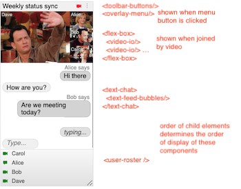
The hangout display is similar to video-first apps such as Google hangout, with focus on videos, and the ability to show chat and roster on the side. The order of included user-roster and text-chat determines their display order. Also, whether the flex-box is included before or after those components, determines whether the videos appear on the left or right of those components.
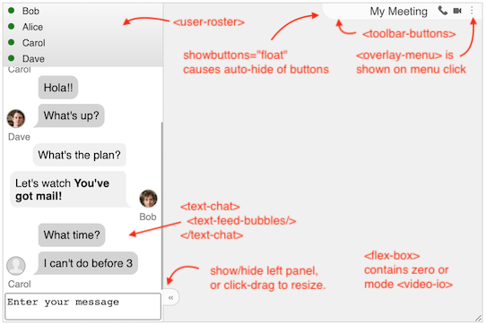
The filmstrip display is intended for a narrow aspect ratio near the side of display area. Without any audio or video call, it appears similar to the messenger display, with the order of text-chat and user-roster preserved based on the included components' order. However, videos are displayed in a separate view. The flip view button allows flipping between the chat and roster view on one side and the list of videos laid out in filmstrip on the other.
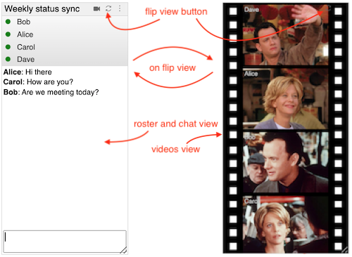
The videocity display is inspired from my earlier Flash-based
project of the same name. It
displays a video player style interface, where all the elements such as text-chat, user-roster,
individual video or screen share, or other items, are included in a flex-box
component. The display's intended use case is to embed it in a web page.
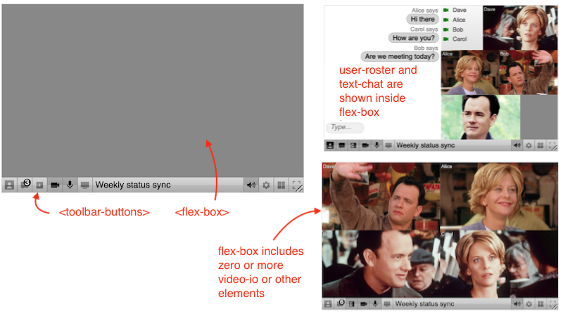
Try the following example with four media-chat instances in four
different display values: hangout, filmstrip, messenger, and videocity, respectively.
<media-chat ... display="hangout" showheader="false">
    <toolbar-buttons ...>...</toolbar-buttons>
    <overlay-menu ...>...</overlay-menu>
    <user-roster ...></user-roster>
    <flex-box ... disallow="dragmove"></flex-box>
    <text-chat ...>...</text-chat>
</media-chat>
<media-chat ... display="filmstrip">
    <toolbar-buttons ...>...</toolbar-buttons>
    <overlay-menu ...>...</overlay-menu>
    <flex-box ... disallow="dragmove,dblclick"></flex-box>
    <user-roster ...></user-roster>
    <text-chat ...></text-chat>
</media-chat>
<media-chat ... display="messenger">
    <toolbar-buttons ...>...</toolbar-buttons>
    <overlay-menu ...>...</overlay-menu>
    <flex-box ... disallow="dragmove"></flex-box>
    <text-chat ...></text-chat>
    <user-roster ...></user-roster>
</media-chat>
<media-chat ... display="videocity">
    <toolbar-buttons ...>...</toolbar-buttons>
    <overlay-menu ...>...</overlay-menu>
    <flex-box ... disallow="dragmove"></flex-box>
    <text-chat ...></text-chat>
    <user-roster ...></user-roster>
</media-chat>
These examples allow resizing the components to see the layout update, especially for
hangout display, which auto-hides the sidebar on small width. If the showchat
attribute is set, then resize does not change the sidebar display. Certain features such
as dragmove and dblclick of the included flex-box components
are disabled in different display modes. The dragmove usually
interferes with animation, and dblclick is already used to flip the view in the filmstrip
display.
In the examples above, the toolbar-buttons component is shown by default at
the top for all displays,
except for videocity, where it appears at the bottom. The toolbar shows the optional topic, and
includes some buttons to initiate or terminate an audio or video call. It can optionally include
a menu item, in which case the separate overlay-menu component is shown when clicked.
The filmstrip display should include a flip view button, and should not include audio
call button. Additionally, it can show a button to clear the text chat. If the menu item is
included, then the clear button is replaced by the menu button in the examples below,
which when clicked shows a dropdown menu defined by the overlay-menu component.
The menu contains other options besides clearing the text chat. For example, it allows
turning on or off devices such as microphone or webcam. It allows sharing screen or tab or window.
It also allows popping out the videos box in a separate window.
The display of a received video depends on the display property: in messenger, received videos are not shown unless the local user is also joined with video; in hangout, received videos are shown if joined with audio or video; and in filmstrip or videocity, received videos are shown even if not joined with audio or video, as soon as another user enables the video. The display also affects when the screen share can be enabled. For example, in messenger, it can be enabled after joining with video; in hangout or filmstrip, it can be enabled after joining with audio or video; but in videocity, it can be enabled without joining the call.
The showchat property can control whether to show the chat view.
When display is filmstrip, it shows either the chat view or the flipped video view.
When display is hangout, chat and roster appear in the sidebar, and the display can also
change on clicking the toggle button, or automatically on resize depending on the
width of the component. In hangout display, the toggle button can be click-dragged
to resize the chat versus videos area.
Try the following example to see the various properties of various connected components in action. It also allows changing the toolbar and menu items.
The left side in the above example allows changing various properties and styles. The right side shows the component in action. There are some pre-configured items in the user-roster and text-chat for demonstration purpose. The left side also allows sending a sample text message from another user.
The toolbar-buttons and overlay-menu components are used
in the previous examples to customize the toolbar buttons and the overlay menu.
The overlay menu is shown when the menu button in the toolbar is clicked.
The toolbar-buttons component can include other elements such as
button or span. An included button can be customized
by the application. Pre-configured customization of certain buttons and actions
is already implemented, and is configured using the name,
toggle and show-if attributes.
Additionally, if toggle is set,
then selected attribute can make it on by default.
The following example shows a toolbar with four items - a static text for title, and three buttons - with pre-configured display and action.
<toolbar-buttons ...>
    <span>Weekly status sync</span>
    <button name="audio" toggle title="start/stop an audio call"></button>
    <button name="video" toggle title="start/stop a video call"></button>
    <button name="menu" title="more actions"></button>
</toolbar-buttons>
The overlay-menu component, if included, is automatically
shown when the menu button is clicked in the toolbar. It can include other
span elements for customization. The included span can be
customized by the application. Pre-configured customization of certain actions
is already implemented, and is configured using the name,
toggle and show-if attributes.
Additionally, if toggle is
set, then checked attribute can make it on or off by default.
Unlike a toggle button with two display states, the menu item can be shown
in three states - checked, crossed, or no marking (neither checked or crossed).
If the toggle attribute is included without any value, then the
menu item allows checked or no marking states only. If the toggle
attribute is set with value of true, then the menu item allows checked or crossed
states only. These differences are useful in representing states of different activities
or features, e.g., toggle="true" is used to show camera or microphone state,
whereas toggle is used to show screen share or full screen state.
The following example shows a menu with six items. Some of the items have implicit display constraints, e.g., screenshare or popout is not shown unless video call is active in the messenger display.
<overlay-menu slot="menu">
    <span name="microphone" toggle="true" checked="true">Microphone</span>
    <span name="camera" toggle="true" checked="true">Webcam</span>
    <span name="screenshare" toggle>Share screen</span>
    <span name="clear">Clear text chat</span>
    <span name="popout">Popout videos</span>
    <span name="fullscreen" toggle>Full screen</span>
</overlay-menu>
The show-if attribute, if present on the items included in the
toolbar or menu, controls when that button or menu item is shown. The attribute
value is a condition that can use some pre-defined state variables. The
following example shows that the screenshare menu item is shown when calltype
is not "none", and popout is shown when calltype is "video" and popout does not already
exist. This attribute's value must
be assigned during element initialization, and must not be changed later.
<overlay-menu slot="menu">
    ...
    <span name="screenshare" toggle show-if="calltype!='none'">Share screen</span>
    <span name="popout" show-if="!popout && calltype=='video'">Popout videos</span>
</overlay-menu>
The pre-defined state variables are as follows: display, calltype, popout, hasmenu,
selfvideo, othervideos. The display and calltype string variables correspond to the same named
properties of
the media-chat component. The popout and hasmenu boolean variables indicate
whether popout already exists, and whether overlay-menu component exists, respectively.
The selfvideo boolean variable is true when a publishing video-io component
for local audio and/or video exists, and the othervideos boolean variable is true when one or more subscribing
video-io components exist.
For pre-configured items in toolbar or menu, the toggle state
is also pre-defined, and must be used accordingly. The following table
shows all the pre-configured items and their behavior.
| Feature | Description |
|---|---|
| roster | (toggle) show or hide the user roster, applicable only when display="videocity". |
| chat | (toggle) show or hide the text chat, applicable only when display="videocity". |
| video | (toggle) start or stop a video call from this client. |
| audio | (toggle) start or stop an audio call from this client. |
| upload | (not yet implemented) Upload some media or file to share with others. |
| camera | (toggle=true) Enable or disable local webcam. |
| microphone | (toggle=true) Enable or disable local microphone. |
| sound | (toggle) Enable or disable speaker sound. |
| flip | Change the view between chat-roster and videos, applicable only when display="filmstrip". |
| settings | (not yet implemented) show device and/or client settings. |
| layout | Change the display property of the included flex-box to cycle through flex, grid, pip, page, and inline-block. |
| fullscreen | (toggle) enable or disable the full screen mode. |
| screenshare | (toggle) start or stop screen or window share. |
| clear | Clear the text chat history locally. |
| menu | Show the included overlay-menu component. |
The example shown previously allows experimenting with various buttons
and menu items in different displays. In particular, the order of the
items in these components determines the display order within the
toolbar or menu. The showbuttons attribute of media-chat
component determines where and how the toolbar appears, e.g., top or bottom, none
or a special value of float. If set to float, then the toolbar auto-hides
after few seconds when the mouse is not over the component.
The speaker and speakervideo properties control
how to display active speakers or talkers. The included user-roster
component can highlight the active speaker by changing the background color,
icon, shadow on the icon, or the display order of users in the roster. This is
controlled using the speaker property. On the other hand, the
speakervideo property allows highlighting active speaker in the
videos display, e.g., by slowly zooming in, setting a border color,
making the speaker video as float in the flex-box component,
or changing non-speakers to monochrome color.
The volume-level component can be used to display the
sound activity level of the microphone or speaker sound, as well as to
display and control the volume or gain. The examples shown earlier with
display of "videocity" demonstrate this. Internally, the microphone
level is captured using the included publishing video-io
component, whereas the speaker level is captured by aggregating the
sound levels of all the subscribed video-io components
included in the media-chat component. Note that the
speakerlevel property of the component must be set for
this to work.
By default, entering a text message in the media-chat
component's included text-chat component, sends it to the
text chat channel, and is viewable by all the participants. Using the
allowprivate property, it also
supports sending a private text message, by prefixing the message with
the special @ character, e.g., "@alice How are you?" will be sent to only the user with
identifier alice from the roster. Such private messages are not stored
in chat history of the storage, and hence, are not available on reload, or
if the target user is not yet joined. In the user interface, clicking
on the user item in the roster automatically puts the prefix in the
text input area to allow sending the private message. The text chat
display also labels the private messages by including sender and receiver
both, instead of just sender name for public messages.
If the allowaction property is set, then text input
starting with forward slash / character is treated as an action command,
and an event is dispatched to the application instead of sending that text
on the text chat channel. This allows intercepting such actions, e.g.,
the text entered as "/join video" could be interpreted in the application to join the
call with video. More concrete examples of such actions will be shown later.
The allowsync and syncstate properties
control and indicate how the layout of the videos part is synchronized
among the participants. Note that this is not supported when display is
filmstrip. In all other cases, it can choose to optionally synchronize
layout - from loose to strict modes - where one participant becomes
the owner of the layout, and shares layout attributes with others,
who then attempt to synchronize their layout with the received attributes.
In loose synchronization, high level
attributes such as which video is float in the flex-box and/or what
display is used, is shared, whereas
in strict mode, relative positions and sizes of all the boxes
in flex-box are shared.
The media-chat component described here is versatile
and customizable using its various properties such as display, speakervideo, allowsync,
allowaction, and others. Later, we will further explore how to share
custom apps with other participants in a chat.
Shared white board and notepad are important collaboration tool. The white-board
component implements a simple white board which can be attached to a white-board-data data model
to enable shared white board.
Try the following example to see the white-board component
in action.
<white-board></white-board>
Besides drawings and text inserts, it also allows drag and drop of image files.
Try the following example of two shared white-board
instances attached to the same storage path using two separate
white-board-data instances, representing two
collaborating users.
<white-board-data id="data1" for-storage="..." path="..." ></white-board-data>
<white-board for-data="data1"></white-board>
The data architecture uses a list of drawings, text or content information in the shared storage. The ordering of the list items is important. The item data includes all the information needed to render the drawing, text or content.
The locked-notepad component implements a text editor that
can be locked for editing to avoid conflict. It can be attached to a
locked-notepad-data data model to enable shared notepad.
<locked-notepad></locked-notepad>
Try the following example of two locked-notepad
instances attached to the same path on storage using two separate
locked-notepad-data instances, representing two
collaborating users.
<locked-notepad-data id="data1" self="alice" for-storage="..." path="..." ></locked-notepad-data>
<locked-notepad for-data="data1"></locked-notepad>
Only one user may have the editing lock at any time.
Note that editing is allowed only when lock is acquired, as indicated by the pencil icon.
To gain the lock, click on the lock icon at the bottom. If the
lock is actively used by the other user, that user must release
the lock first by clicking on the pencil icon. On inactivity, the
lock is automatically released. The identifier of the user
indicated by the self attribute is used to store the
lock in the storage.
The component also supports various non-trivial forms for editing such as copy, cut and paste. The editing is propagated to other instances on the storage path using the notification messages of the shared storage. The data architecture uses the last commited copy of the entire text followed by delta changes of the current editing session. Once the editing lock is released by this user, or acquired by another user, the delta changes are merged and the commited copy is updated.
The shared-editor component, on the other hand, includes a
rich-text-editor. Unlike the previous component, this one does not require
locking to edit the text, although locking is supported to avoid conflict.
Like the previous component, this one can also be attached to a data model,
shared-editor-data, and a shared storage to enable shared editing.
<shared-editor></shared-editor>
Try the following example of two shared-editor
instances attached to the same path on storage, representing two
collaborating users.
<shared-editor-data id="data1" self="alice" for-storage="..." path="..." ></shared-editor-data>
<shared-editor for-data="data1"></shared-editor>
Our implementation has only some of the basic rich text editing support. Moreover, the real-time synchronization of the shared text can have inconsistencies due to conflicts in simultaneous editing on connected instances. However, it shows the concept, and in the future, the consistency may be improved using operational transforms.
In the current implementation, to work around the inconsistencies, we provide a feature to perform locked editing and upload. When the editor is locked, only the owner can edit the shared text, and others see a copy of it. When the owner unlocks the editor, he can upload her local edited copy to the shared storage, which gets delivered to other connected instances.
At most one user may have the editing lock at any time. However, if no user has the editing lock, then any user can edit the shared text.
The tools bar includes several rich text editing options, in addition to other functions such as to upload the text to shared storage or to download the text from shared storage. The source text is stored as HTML. Inserting an image is allowed. Clicking on an inserted image allows adjusting the size. However, the size change is not propagated implicitly to the shared storage or other users, because there is no easy way to identify the same image on the receiver side. This may get fixed in the future. The tools bar size is reduced when the component size falls below some threshold in width or height. You can try that by resizing the component.
The component can be used as a standalone rich text editor without a shared storage. Try the following example of a standalone editor, with various features enabled or disabled.
When a data model is attached, it uses the data model for the baseline text, incremental changes, and the editing lock, if any. The caret and/or cursor position of the remote users on the shared editor is also shown. Similar to the previous component, this one commits the incremental changes on certain events such as when the upload button is clicked, or the source HTML editing is completed.
The complete list of features in the tools bar are as follows:
| Feature | Example and description |
|---|---|
| Bold | This is <strong>bold</strong> |
| Bold text using the <strong> tag. Select some text and click on button. If the selection is already a part of an existing such tag, then the tag is removed. Shortcut is ctrl+B | |
| Italic | This is <em>italic</em> |
| Italic text using the <em> tag. Select some text and click on button. If the selection is already a part of an existing such tag, then the tag is removed. Shortcut is ctrl+I | |
| Underline | This is <u>underline</u> |
| Underline text using the <i> tag. Select some text and click on button. If the selection is already a part of an existing such tag, then the tag is removed. Shortcut is ctrl+U. | |
| Link | This is a <a href="http://something">link text</a> |
| Anchor link using the <a href="..."> tag. If the button is clicked, it converts the selected URL text if any to a link. If non-URL text is selected, it prompts to enter the URL. If no text is selected, it prompts to enter the URL and inserts that as link text. If the selection is already part of an existing such tag, then only the href attribute is changed. Empty value entered in the prompt causes removal of the tag. Shortcut is ctrl+L. | |
| Source | |
| Clicking this button toggles the view between rich text editor view and source HTML view. In the rich text editor view, any update is immediately propagated to the shared storage, and to other connected instances. In the source HTML view, editing is not propagated immediately. When the button is clicked again in the source HTML view, at that time the locally edited source HTML text is saved in the shared storage, and it switches to the rich text editor view. If the editor is locked by another connected instance, and saving the text is not allowed at the moment, then it indicates that state, and remains in the source HTML view. However, if the close button is clicked, the local changes in the source HTML view are discarded without saving. Shortcut is ctrl+X. | |
| Code | This is <code>code format</code> |
| Pre-formatted text using the <code> tag. Select some text and click on button. If the selection is already a part of an existing such tag, then the tag is removed. | |
| Font Size | <span style="font-size: 150%">some text</span> |
| When the button is clicked, the font size of the selected text is changed, and applied using the <span style="font-size: ..."> tag. The selection is changed on subsequent clicks in round robin, to these values: 125%, 150%, 200%, 300%, 25%, 50%, 75% and back to 100%. | |
| Font Face | <span style="font-family: arial,sans-serif">some text</span> |
| When the button is clicked, the font family of the selected text is changed, and applied using the <span style="font-family: ..."> tag. The selection is changed on subsequent clicks in round robin, to these values: Arial, Times New Roman, Georgia, Verdana, Tahoma, Trebuchet, Courier New, and Fantasy. | |
| Color | <span style="color: red">some text</span> |
| When the button is clicked, it prompts for the text color name or code, and applies that to the selected text using the <span style="color: ..."> tag. User can enter color name recognized in CSS, such as red, blue, darkgreen, redorange, etc., or can enter the code such as #ff8080. If the selection is already a part of an existing such tag, then only the style is changed. Empty value entered in the prompt causes removal of the style or the tag. | |
| Background | <span style="background-color: lightblue">some text</span> |
| When the button is clicked, it prompts for the text background color name or code, and applies that to the selected text using the <span style="background-color: ...">. Similar to previous, the user can enter the color name or code, recognized in CSS. If the selection is already a part of an existing such tag, then only the style is changed. Empty value entered in the prompt causes removal of the style or the tag. | |
| Abbreviation | This uses <abbr title="cascading style sheet">CSS</abbr> |
| When the button is clicked, it prompts for the meaning or content for the abbreviated text, and applies it to the selected text using the <abbr title="..."> tag. If the selection is already a part of an existing such tag, then only the title attribute is changed. Empty value entered in the prompt causes removal of the tag. | |
| Image | <img alt="" src="data:image/jpg;..."> |
When the button is clicked, it opens the file selection dialog box to select an image
file, and inserts it in the text, using the <img alt="" src="..."> tag. It uses
a data URL for the src attribute. If the
selection is already part of an existing such tag, then only the src
attribute is changed.
| |
| Pointer | |
| Clicking the button toggles the mouse pointer display state. When enabled, it sends the mouse pointer's coordinates to all the other instances, which then display the mouse pointer annotated with its label. This feature allows pointing to a part of the editor text, and the pointer is visible to other connected instances' users. Note that text editing caret display state is enabled by default. | |
| Upload | |
| When the button is clicked, it uploads the local editor's text to the shared storage, so that other connected instances are synced to this instance's text. It may override other connected instances' text. It also cleans up the shared storage, so that the incremental changes are collapsed, and only the final text copy is saved. | |
| Download | |
| When the button is clicked, it downloads the text from the shared storage, and updates the local editor's text with that. It may override and discard local editor's content and unsaved changes. It first loads the text, and then applies any incremental changes, to the local editor's text. This operation is allowed even when the editing is locked by another instance. | |
| Lock | |
| When the button is clicked, it attempts to toggle the lock state of the editor. If the editor is not locked, then it grabs the lock, thus preventing other connected instances from editing the text. If the editor is already locked by this instance, then it releases the lock, thus allowing other connected instances to edit or grab the lock. If the editor is already lock by another instance, then it delivers a message to that instance about the lock request. The lock button's icon turns red or green depending on the state of locked by another instance or locked by self, respectively. | |
| Close | |
| In the source HTML view, an additional close button is shown. When the button is clicked, it discards any local editing in the source HTML view, and goes back to the rich text editor view, without saving the changes to the shared storage. | |
| Resize | |
| This is not in the tools bar, but appears as a resize control at the bottom right corner of the editor. Click-and-drag on this control allows resizing the editor's user interface. |
The collaboration tools described previously such as for text chat, notepad or whiteboard are examples of endpoint driven applications. The shared storage based data models for these tools enable collaboration. The shared storage based collaboration is not limited to these use cases, but can be expanded to others that need shared state among participants such as shared games.
Here, we describe two components to enable shared Chess and Ludo board games. The concept can be easily applied to other multiplayer games.
Try the following example to see the chess-board component
in action. It is a clean slate chess board, with no restrictions or rules
on how the pieces move. Click on a piece and then click on another position
to move the piece. The movement is recorded on the right side. The last move
is highlighted. The buttons on the right allow you to reset the board and
to rotate the board, if needed.
<chess-board></chess-board>
The component can be attached to a data model, which can be based on storage, such as
chess-board-data. In that case it stores
all the moves in the list data on the storage, and updates the user interface
when a move is detected.
<chess-board-data id="data" for-storage="..." path="..." ></chess-board-data>
<chess-board for-data="data"></chess-board>
Try the following example with four chess-board
instances, covering two separate games, by attaching to two separate
paths on the storage. The styles for the third and fourth instances are
altered from their defaults. The second and fourth instances are
rotated once to appear as the opponent side view. See the rotate
function described later.
Try the following example to see the ludo-board component
in action. It is a clean slate board with no restrictions or rules imposed.
It is upto the players to follow and impose the rules.
<ludo-board></ludo-board>
There are two buttons near the center of the board. One is to clear the board to the initial state. The other is to roll the dice using the random function in JavaScript to generate the dice value. The pieces can be moved by drag-and-drop to any location.
When the board instance is attached to a storage based data model, ludo-board-data,
it can use the storage
to keep track of positions of the pieces and to notify the dice value from the last
dice roll. The component instance then uses the storage to update the
local user interface.
<ludo-board-data id="data" for-storage="..." path="..." ></ludo-board-data>
<ludo-board for-data="data"></ludo-board>
Try the following example with two ludo-board
instances, attached to the same path on storage. You can notice the synchronized
dice roll and piece movements.
The media-chat component allows sharing text, audio, video, screen or an app window
with other participants. It also has methods such as startshare,
stopshare, addshare and removeshare, which are
used to share custom apps such as those described previously, with other participants.
Our first example is about a survey app - one participant sends a survey question in the chat, gathers responses from everyone, and closes the survey to display the results to everyone. First, we add a new button in the toolbar and a new item in the menu, to launch this feature.
<media-chat ...>
  <toolbar-buttons ...>
    <button name="survey" title="start participants survey">
      <img src="... path to an icon ..."/>
    </button>
  </toolbar-buttons>
  <overlay-menu ...>
    <span name="survey">Participants survey</span>
  </overlay-menu>
  ...
</media-chat>
Next, when the button or menu item is clicked, we display a box
to enter and edit survey question. The addshare method is used to
add the view element to either the videos flex-box or the chat
text-feed or text-feed-bubbles component.
button.onclick = span.onclick = event => {
  const div = ... // create the view element
  ...
  media.addshare("survey", {}, div, "feed");
  ...
};
When an app view is added to the component, a wrapper media-share
component instance is used to wrap the supplied view element. This wrapper has
certain attributes and properties to control its behavior, e.g., to center
the display or to disable the popout feature. If changes are desired, then
those can be applied to the parent element as follows.
setTimeout(() => {
    div.parentNode.setAttribute("display", "center");
    div.parentNode.setAttribute("popout", "none");
});
Within the view element, there could be a button, which when clicked
actually shares the app data with other participants using the startshare
method. But first, the previous view should be removed using the removeshare
method, and the same identifier as before.
share.onclick = event => {
  media.removeshare("survey");
  media.startshare({type: "survey", topic: "Do you like this?", buttons: ["Yes", "No"]});
};
Note that from and fromid are automatically
added to the app data supplied in startshare internally.
The app data is then received by all the connected clients, including the
sender client, and delivered to the application using the addshare event.
The media-chat component creates a bi-directional communication
channel to exchange messages about this shared app between the application and
the app instances running on various connected clients.
The data property of the event contains the
app data supplied in startshare. The id property is
a system generated unique identifier for this app instance. The container
property is the desired container of videos, feed or a new dialog box, if any. The application
can set this value to force a specific container for this app view.
Finally, the port property is a port of the underlying
MessageChannel instance.
media.addEventListener("addshare", event => {
  const {id, data, container, port} = event;
  if (data.type == "survey") {
    const div = ... // create view element
    setTimeout(() => { /* set display and popout */ ... });
    event.container = "feed";
    // whether this client initiated the app
    const owner = data.fromid == media.self;
    port.onmessage = ev => {
        const {fromid, data} = ev.data;
        // ... process message from other client
    };
    ...
    buttons.forEach(button => {
      button.onclick = event => {
        const data = ... // data to send
        port.postMessage(data);
      };
    });
  }
});
By carefully crafting the view element and the data exchange among the app instances, the survey question and answers are conveyed and displayed among different connected clients. Using owner detection, different views are shown to different participants, i.e., the survey sender versus the responders.
When the user clicks on the close button of the shared app to remove it,
the removeshare event is automatically dispatched to the
application. In this example, the client can close the survey app if the
owner closes its app.
media.addEventListener("removeshare", event => {
  const {id, data, view, port} = event;
  if (data.type == "survey") {
    const owner = data.fromid == media.self;
    if (owner) {
        port.postMessage({type: "close", ...});
    }
  }
});
...
media.addEventListener("addshare", event => {
  ...
  port.onmessage = ev => {
    const {fromid, data} = ev.data;
    if (data.type == "close") {
      ... // close the survey view
    }
  };
  ...
});
Try the following example that includes the survey app in the menu of the first client, and the toolbar of the last client. It also includes several other apps, that are described later in this section. The complete application code is included in the example.
When the first client launches the survey app, it gets the editable view of the app (see the first image below). The editor allows entering a question, and a bunch of answer buttons. On enter, the editable app is closed, and the question and buttons data is used to launch the app on all the clients. When an answer button is clicked, the app becomes disabled to prevent more clicks (second image). The selection on a non-sender client is delivered to the sender client, so that the sender can see all the results in real-time (third image), and can decide when to close the survey. When the sender closes the survey app, the current results are delivered to all the other clients, which then display the results (fourth image). If the non-sender client did not yet select an answer, it gets disabled anyways. Any non-sender client can close the app at any time, without affecting the app on the other clients.
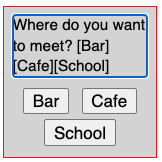
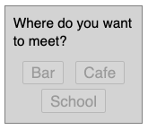
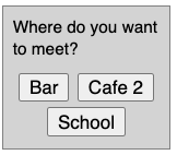
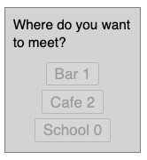
Another way to launch the survey app is using the action command on the text chat. If the user enters a text such as "/survey Do you like this? [Yes][No]", then that is intercepted in the above examples to launch the survey app with the provided question and answers.
media.addEventListener("action", event => {
  const action = event.value;
  if (action.startsWith("survey ")) {
    let question, answers = [];
    ... // extract question and answers using regexp
    media.startshare({type: "survey", question, answers});
  }
});
Next, we describe other shared apps included in the previous example.
The slide-show component can display one or more files with
page navigation. Unlike other storage based components, this one does not depend
on storage. It uses MessageChannel's port to communicate with the
application, such as to send or receive commands for page navigation, video seek,
or PDF navigation.
The previously shown example app includes two menu items that use this component. The "Send media file" item is used to upload and send one or more files to all the participant clients, so that the clients can display them. In that mode, the sender does not control the navigation, and each client can independently navigate, control or close the shared app. The "Media slide show" item is used to provide a synchronized slide show experience, where the sharer controls and navigates the app on all the receiver clients. In this mode, typically, the navigation controls are disabled or not shown on the receiving client or non-owner app instance.
First, the upload_files function is used to gather a list of
files using the file selection dialog box. This list is then sent to all the
clients using startshare. Additional flag can indicate whether
synchronized control is desired or not.
menuitem.onclick = async event => {
  const files = await upload_files({
    accept: "image/*,video/*,application/pdf", multiple: ""
  });
  const value = files.map(file => {
    const {name, type, size, url} = file;
    return {name, type, size, url};
  });
  media.startshare({type: "files", value});
};
On receiving the addshare event, the application creates a
slide-show app. Its owner property, if set, makes it behave
in a synchronized control mode.
media.addEventListener("addshare", event => {
  ...
  if (data.type == "files") {
    const div = event.view = ... // new slide-show element
    div.owner = data.fromid == media.self;
    div.port = port; // for communication
    div.data = data.value; // list of files received
  }
});
If PDF file is included in the list of files, then the component
uses another pdf-viewer component internally to display the
file. It has external dependency on the pdfjs project, and requires certain
initialization to be done in the application. Please see the source code
of the previous example application to learn more about this.
The slide-show component is capable of handling
image, video and PDF files. The page navigation control appear on the
left and right, and allow navigating among files. In synchronized
control mode, the navigation from the owner app is sent to all the other
connected apps, using the port. Additionally, for video
display, changes in the player control of the owner such as play or
pause, or seek, are sent to the connected app, so that all the other
clients can emulate the same player control. For PDF file viewer, the
page navigation within that file is sent to all the connected apps.
When a file is shared via the text chat or drag-and-drop
in the text input area, the chat history data contains the full content of
the file. When such a file share link is clicked from the text chat component,
it dispatches the openurl event, which bubbles up to
the application. The application can listen to this, and decide to
use the slide-show component to show the file inline,
instead of doing download, for certain file types.
media.addEventListener("openurl", event => {
  const {url, data} = event;
  if (data.type.startsWith("image/") || data.type.startsWith("video/")) {
    event.url = "";
    const div = ... // new slide-show element
    div.data = [{name: data.download, type: data.type, url}];
    media.addshare("openurl", {}, div, "dialog");
    ...
  }
});
Note that resetting the url property of the event causes the
underlying text chat component to not process the event further. Otherwise, it
would attempt to download the file as its default processing.
The media-chat component already includes support for sharing
webcam, screen (or window) as demonstrated earlier, by joining the call with
video, and/or starting screen share from menu or toolbar button. The component
maintains a single state for such sharing.
To enable sharing of multiple
webcams or screens from the same client, the application can wrap the
corresponding video-io component as a shared app.
The previous example includes menu items to share another app or to share
webcam. When sharing another app, the sharing client sets the publish
and screen properties of the video-io component, and the other
clients set the subscribe property. The display property of the
parent media-share component is set to zoom, and
the container is set to videos. Additionally, the
named-stream information is also provided by the sharer to
other clients, so that all the clients can connect to the same named stream.
Such tricks to quickly enable new sharing apps is possible due to
loose coupling among the client apps, and the flexible and versatile
video-io and named-stream components.
media.addEventListener("addshare", event => {
  const {id, data, container, port} = event;
  if (data.type == "shareapp") {
    const div = event.view = ... // new video-io element
    ...
    div.srcObject = ... // stream for this app
    if (data.fromid == media.self) {
      div.screen = true;
      div.publish = true;
    } else {
      div.subscribe = true;
    }
    event.container = "videos";
    setTimeout(() => {
        div.parentNode.display = "zoom";
        div.parentNode.popout = "none";
    });
  }
});
When sharing a webcam, similar process is done, except that the
device-selector component is launched first on the sharer client,
to select the webcam to share. The device identifier of the selected webcam is
then used by the sharer's publishing video-io.
menuitem.onclick = event => {
  const div = ... // new device-selector element
  div.mirrored = div.showsave = div.autosize = true;
  div.microphone = div.sound = false;
  ...
  media.addshare("device-selector", {}, div, "dialog");
  ...
  div.addEventListener("save", ev => {
    const device = div.videoinput?.deviceId;
    media.removeshare("device-selector");
    ...
    media.startshare({type: "sharewebcam", {device, ...}});
  });
};
media.addEventListener("addshare", event => {
  ...
  if (data.type == "sharewebcam") {
    ...
    div.camname = data.value.device;
    div.microphone = div.sound = false;
    ...
  }
});
When removeshare is dispatched, the application should
cleanup the named stream and the video-io component
associated with the shared app.
We have already seen the collaboration applications such as whiteboard,
shared editor, notepad and games such as chess and ludo. Such external
component implementations can be easily wrapped as a shared app in
media-chat. Just like before, a menu item or toolbar button
is added, which when clicked, invokes the startshare method.
If multiple instances are desired then separate storage paths are picked
by the sharer, and sent to other participants, otherwise a fixed path based on the
parent component's path can be used.
menuitem.onclick = event => {
  media.startshare({type: "whiteboard"});
};
media.addEventListener("addshare", event => {
  ...
  if (data.type == "whiteboard") {
    const wb_data = ... // new white-board-data element
    wb_data.storage = media.data.storage;
    wb_data.path = media.data.path + "/wb123";
    ...
    const wb = ... // new white-board element
    wb.position = "top-left";
    wb.label = media.displayname;
    wb.data = wb_data;
    ...
  }
});
The parent media-share component's display property
should be used prudently depending on the wrapped app view. Furthermore,
the style attribute of the app can be set as needed.
When the app is removed, the app view and corresponding data elements can be removed from the document, to cleanup.
The text chat action is installed in the previous example to start these apps from the text chat input area too. For example, typing "/start whiteboard" or "/start chess" are interpreted to launch those apps.
Earlier in How to do two-party video call? we described and illustrated state machines for single line and multiple line video phone device engaged in a call. Later in How to do multi-party video conference? we described and illustrated join-leave as well as invite-answer models for conference signaling. Those examples used state machines in the application, while using the shared storage for exchange of signaling and media negotiation messages. Here, we will describe a few web components that implement a generic state machine for phone calls and conferences, using audio and/or video.
The phone-state component implements the state machine for phone registration and
call. The conference-state component implements the state machine for conference
join and leave membership, and maintains a list of active members in the conference.
Applications that use phone or conference state machines still need some common set of
functions independent of the specific state machine, e.g., to add or remove video-io
instances when a call is connected or when a conference is joined or when a member
joins or leaves a conference. Such features are enabled in the videos-control
component. It acts as a controller to connect a phone-state or
conference-state or a similar component with one or more video-io
elements to create a call or conference experience.
Try the following example with four phone-state
instances, representing four phone devices. Each can register and
make/receive calls. Make sure to enter after typing the text to
update any property.
The actual media is outside the scope of this
component, and is implemented in the application using the videos-control
component supplied with two fixed video-io elements per
phone instance. The exclusive determines whether the
phone device registers exclusively for a name, and must be set before
registering. The earlymedia
property determines whether the media is started early, before the call is
established, when applicable.
The conference-state component has a simple state machine with
only one boolean flag indicating whether the user has joined the conference or not.
Internally it also maintains the membership information, and allows setting
the member data item in the conference. The data is shared among all the members.
Try the following example with four conference-state
instances, representing four conference users. Make sure to enter after typing the text to
update the property.
The self identifier, if missing, is picked automatically and randomly, before
joining the conference. A videos-control element is used per user to
facilitate media display using the four fixed video-io instances per
user view. Alternatively, a flex-box component may be used.
The telephony use case related components described previously such as
phone-state or conference-state are largely independent
of the media features. An application typically need to connect these state
machines with collaboration related components such as videos-control,
white-board, or text-chat.
However, a number of telephony related applications use a few well defined
scenarios, such as click-to-call, click-to-join or call queues. The click-to-call
component is a general purpose implementation for several of such scenarios including
click to call or answer, click to join or leave, queue incoming calls, or
distribute outbound calls.
The click-to-call component includes zero or more instances of
the phone-state or conference-state components. At least
one state component is needed for proper functioning. The number and type of
the state components, together with some other attributes, determine the
behavior of the component in various scenarios.
The high level scenarios are shown below.
| Scenario | Description |
|---|---|
| Phone | One phone-state |
| This acts as a single line phone device. It registers to receive incoming calls. It can make outgoing calls. | |
| Conference | One conference-state |
| This acts as a single attendee in a conference. It can join or leave a conference. | |
| Invited conference | One conference-state and one phone-state |
| This acts as a single attendee in a conference. But it also allows inviting other users to that conference, and getting invited by other users to a conference. | |
| Call queue | Multiple phone-state, queue="true" |
| This acts as an incoming call queue. It registers to receive incoming calls. When a call is answered, more incoming calls get queued, and can be answered or declined after the current call completes. | |
| Call distribute | Multiple phone-state, distribute="sequence" or "parallel" |
| This acts as an outgoing call distributor to multiple distinct targets. When any of the target user answers, the call is completed, and the remaining steps are stopped. The call may be distributed in sequence or parallel, with or without timeouts. |
To be consistent with a simple click-to-call user experience, a single button
in the component facilitates most of the user interactions. For example,
once the target is set, and the component is in idle phone state, then clicking on the
button initiates an outgoing call. When the phone state is inviting or ringing or active,
clicking on the button terminates the pending or active call. When the phone state is
invited, for incoming call, clicking on the button can launch another confirmation
box to answer or decline the call. Alternatively, the answer property
can be set to click-and-hold to answer versus click to decline.
For a conference scenario, the single button can be used to join a conference if the conference state is idle, or to leave the conference if it is not. For an invited conference scenario, the behavior of the button is heuristically determined based on the phone and conference states. For example, in an idle state, it could first join the conference, and if the other target user is set, then send a call invite to that user as well. For an incoming call invite, it could answer the call and join the conference after confirmation. For an active or pending call or conference, clicking the button terminates the call invite or leaves the conference or both.
With multiple phone states, the behavior becomes more intriguing. For example, for the call distribution use case, clicking on a pending state with sequential distribution cancels the current call, and goes to the next target in the sequence. For the call queue scenario, clicking on an active call terminates the call, and launches the confirmation for the next incoming call in the queue, if any.
By default, calltype is audio, and must be set to video, to
support video calls. In a conference or invited conference scenario,
different attendees may use
different calltype values - some join with audio only, and some with audio and
video. However, in a phone scenario, both sides must use the same calltype.
Typically, a call invite from an audio-only caller is delivered to both the video and
audio-only receiver, and if the video receiver answers, that receiver
just does not use the video media type. However, a call invite from a video caller
is automatically rejected with missed call indication from an audio-only
receiver, so that if the caller's intention is a video call, then it does not get
picked by an audio-only receiver.
The phone and invited conference scenarios use the same phone state protocol for signaling. However, they are not compatible with each other. For example, a user in the invited conference scenario may not engage in a phone call with a user in the phone scenario, and vice-versa. However, a user in the conference and the invited conference scenarios using the same conference state protocol are compatible with each other - no matter how the conference invitation was sent, both can join the same conference. The call queue and call distribution scenarios are compatible with the phone scenario.
Some examples of the component used in various scenarios are shown below.
The storage property or for-storage attribute in the
state machine components, phone-state and conference-state,
are required.
// allow outbound and inbound call
    <click-to-call self="bob" other="alice" calltype="video">
        <phone-state for-storage="..."></phone-state>
    </click-to-call>
// anonymous click-to-call
    <click-to-call other="alice">
        <phone-state ...></phone-state>
    </click-to-call>
// call distributor in sequence
    <click-to-call self="carol" other="alice,bob" distribute="sequence" incoming="false">
        <phone-state ...></phone-state>
        <phone-state ...></phone-state>
    </click-to-call>
// call queue
    <click-to-call self="carol" queue="true" outgoing="false">
        <phone-state ...></phone-state>
        <phone-state ...></phone-state>
        <phone-state ...></phone-state>
    </click-to-call>
// conference join
    <click-to-call self="bob" join="conf123" calltype="video">
        <conference-state ...></conference-state>
    </click-to-call>
// invited anonymous conference
    <click-to-call self="alice" other="bob">
        <phone-state ...></phone-state>
        <conference-state ...></conference-state>
    </click-to-call>
// invited conference anonymous caller
    <click-to-call other="bob" join="conf123">
        <phone-state ...></phone-state>
        <conference-state ...></conference-state>
    </click-to-call>
To see these in action, try the following example with several click-to-call
instances. Some are configured with one phone-state,
some with one conference-state, some with one phone-state and one conference-state,
and some with multiple phone-state components.
Clicking on the attribute allows you to edit them and reconfigure the component.
Most of the instances use the inline videos shown in the box, but some use
the open feature to launch a separate browser window or tab for the videos.
All the behavior of the component is customizable using the various properties and
methods described later.
This project has a number of new web components that are useful in implementing a wide range of communicating applications such as video call, broadcast, conference, and so on. This document includes many code snippets and sample applications to get started quickly, as well as to try new things by extending the existing applications.
The following diagram shows all the web components included in the project, how they are related to each other, and how they interact with each other.
The components and classes are summarized below.
| Component | Description | ||||||||||||||||||||||||||||||||||||||||||||||||||||||||||||||||||||||||||||||||||||||||||||||||||||||||||||||||||||||||||||||||||||||||||
|---|---|---|---|---|---|---|---|---|---|---|---|---|---|---|---|---|---|---|---|---|---|---|---|---|---|---|---|---|---|---|---|---|---|---|---|---|---|---|---|---|---|---|---|---|---|---|---|---|---|---|---|---|---|---|---|---|---|---|---|---|---|---|---|---|---|---|---|---|---|---|---|---|---|---|---|---|---|---|---|---|---|---|---|---|---|---|---|---|---|---|---|---|---|---|---|---|---|---|---|---|---|---|---|---|---|---|---|---|---|---|---|---|---|---|---|---|---|---|---|---|---|---|---|---|---|---|---|---|---|---|---|---|---|---|---|---|---|---|---|
| video-io | Include video-io.js | ||||||||||||||||||||||||||||||||||||||||||||||||||||||||||||||||||||||||||||||||||||||||||||||||||||||||||||||||||||||||||||||||||||||||||
This is the main video box which can be in publish or subscribe mode. The publish
mode is used for webcam view and/or for sending local audio/video to other end. And
the subscribe mode is used to display and listen to remote audio/video.
| |||||||||||||||||||||||||||||||||||||||||||||||||||||||||||||||||||||||||||||||||||||||||||||||||||||||||||||||||||||||||||||||||||||||||||
| named-stream | Include video-io.js | ||||||||||||||||||||||||||||||||||||||||||||||||||||||||||||||||||||||||||||||||||||||||||||||||||||||||||||||||||||||||||||||||||||||||||
The base named stream abstraction is used for local demonstrations only. For real
applications, use a derived component from the list below,
or create your own for some other service. The named stream works with the
video-io component to publish or subscribe.
| |||||||||||||||||||||||||||||||||||||||||||||||||||||||||||||||||||||||||||||||||||||||||||||||||||||||||||||||||||||||||||||||||||||||||||
| shared-storage | Include shared-storage.js | ||||||||||||||||||||||||||||||||||||||||||||||||||||||||||||||||||||||||||||||||||||||||||||||||||||||||||||||||||||||||||||||||||||||||||
The base shared storage abstraction in the form of the shared-storage component and
the SharedStorage class. These are used
for implementing various endpoint-driven application logic. For real applications,
use a derived class such as RestserverStorage or PeerStorageImpl, or
specify the implementation via the src attribute of shared-storage.
| |||||||||||||||||||||||||||||||||||||||||||||||||||||||||||||||||||||||||||||||||||||||||||||||||||||||||||||||||||||||||||||||||||||||||||
| flex-box | Include flex-box.js | ||||||||||||||||||||||||||||||||||||||||||||||||||||||||||||||||||||||||||||||||||||||||||||||||||||||||||||||||||||||||||||||||||||||||||
The flexible layout container component that can work in fixed, grid or flexible
mode for a wide range of layout requirements of multi-party video conferencing.
| |||||||||||||||||||||||||||||||||||||||||||||||||||||||||||||||||||||||||||||||||||||||||||||||||||||||||||||||||||||||||||||||||||||||||||
| collaboration | |||||||||||||||||||||||||||||||||||||||||||||||||||||||||||||||||||||||||||||||||||||||||||||||||||||||||||||||||||||||||||||||||||||||||||
Components for text chat, media chat, white board, locked notepad, and games.
All these work with the shared-storage component.
| |||||||||||||||||||||||||||||||||||||||||||||||||||||||||||||||||||||||||||||||||||||||||||||||||||||||||||||||||||||||||||||||||||||||||||
| telephony | |||||||||||||||||||||||||||||||||||||||||||||||||||||||||||||||||||||||||||||||||||||||||||||||||||||||||||||||||||||||||||||||||||||||||||
Components for phone and conference states and various forms of telephony
scenarios. Many of these work with the shared-storage component.
| |||||||||||||||||||||||||||||||||||||||||||||||||||||||||||||||||||||||||||||||||||||||||||||||||||||||||||||||||||||||||||||||||||||||||||
| native-electron | Include native-electron.js | ||||||||||||||||||||||||||||||||||||||||||||||||||||||||||||||||||||||||||||||||||||||||||||||||||||||||||||||||||||||||||||||||||||||||||
| This component works with an external Native Electron app to support native features such as TCP and UDP sockets, raw DNS, system information, and customized or frameless windows. |