class: center, middle, inverse, title-slide # the ggplot glow-up ## making lovely data visualizations in R ### Ludmila Janda ### Amplify ### 2019/09/19 --- # Amplify  --- [Glow-up definition](https://twitter.com/zhiiiyang/status/1135743078881304576) 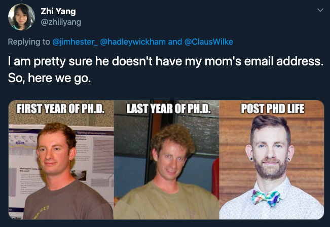 --- ### Motivation 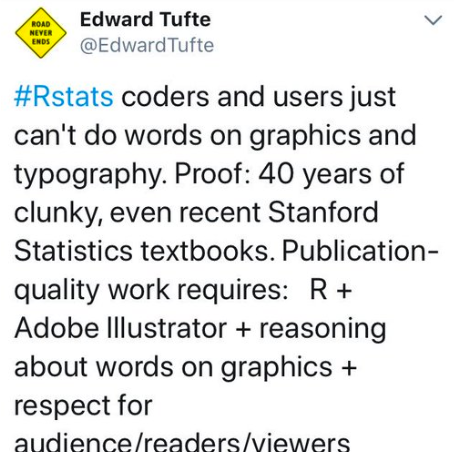 --- ### Motivation 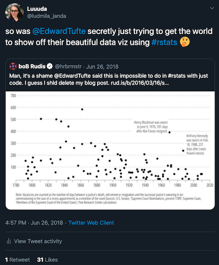 --- ### Motivation 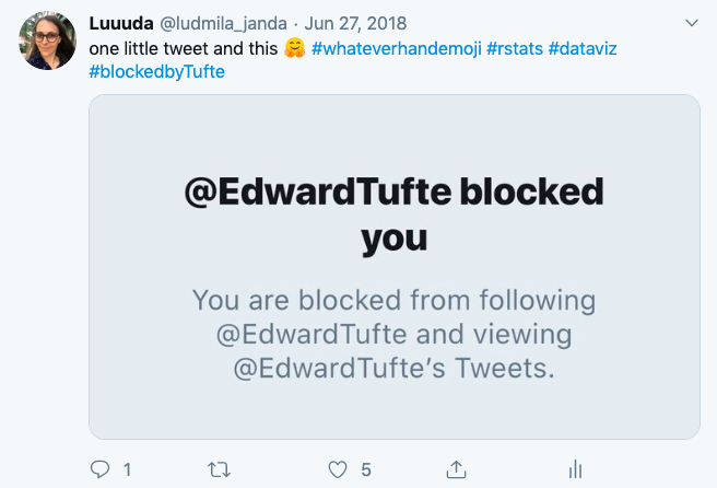 --- ### Motivation - One of the great powers of R is visualization -- - Yet graphs like this persist <!-- --> --- ```r ggplot(diamonds, aes(factor(cut), price)) + geom_boxplot() + labs(title = "Diamond Prices By Cut") + theme_minimal() ``` <!-- --> --- ### Make your own theme! ```r theme_diamonds <- function(x) { theme(text = element_text(family = "Luminari"), axis.text = element_text(size = 10, color = "skyblue"), axis.title.x = element_text(size = 12, color = "skyblue", vjust = -3), axis.title.y = element_text(size = 12, color = "skyblue", vjust = 6), axis.line.x = element_line(color = "gold"), axis.line.y = element_line(color = "gold"), axis.ticks = element_line(color = "gold"), plot.title = element_text(size = 14, face = "bold", color = "skyblue"), plot.caption = element_text(color = "skyblue"), plot.margin = margin(t = 0.5, r = 0.5, b = 0.5, l = 0.5, "cm"), panel.background = element_rect(fill = "white"), panel.grid.minor = element_blank()) } ``` --- <!-- --> --- ```r library(scales) ggplot(diamonds, aes(cut, price)) + geom_boxplot() + scale_y_continuous(label = comma) + labs(x = "Cut", y = "Price", title = "Diamond Prices By Cut") + theme_diamonds() ``` <!-- --> --- ```r ggplot(diamonds, aes(cut, price)) + geom_dotplot(binaxis = "y", stackdir = "center", stackratio = 0.5, dotsize = 0.5, binwidth = 30, alpha = 0.5) + scale_y_continuous(label = comma) + labs(x = "Cut", y = "Price", title = "Diamond Prices By Cut") + theme_diamonds() ``` <!-- --> --- ```r ggplot(diamonds, aes(cut, price, color = cut)) + geom_dotplot(binaxis = "y", stackdir = "center", stackratio = 0.5, dotsize = 0.5, binwidth = 30, alpha = 0.5) + gghighlight::gghighlight(cut == "Ideal") + scale_y_continuous(label = comma) + labs(x = "Cut", y = "Price", title = "Diamond Prices By Cut") + theme_diamonds() ``` <!-- --> --- ```r ggplot(diamonds, aes(price, cut)) + ggridges::geom_density_ridges(alpha = 0.5, scale = 1.4, # ridge height/overlap rel_min_height = 0.001) + # where to draw line scale_x_continuous(limits = c(0, 22000), # set cutoff expand = c(0.01, 0), # allow expansion label = comma) + scale_y_discrete(expand = c(0.1, 0)) + # padding around graph labs(x = "Price", y = "Cut", title = "Diamond Prices By Cut") + theme_diamonds() ``` <!-- --> --- ```r ggplot(diamonds, aes(price, cut)) + geom_density_ridges(scale = 1.4, rel_min_height = 0.001, alpha = 0.5, quantile_lines = TRUE, quantiles = 2) + scale_x_continuous(limits = c(0, 22000), expand = c(0.01, 0), label = comma) + scale_y_discrete(expand = c(0.1, 0)) + labs(x = "Price", y = "Cut", title = "Diamond Prices By Cut") + theme_diamonds() ``` <!-- --> --- ```r library(viridis) ggplot(diamonds, aes(price, cut, fill = ..x..)) + geom_density_ridges_gradient(scale = 1.4, rel_min_height = 0.001, gradient_lwd = 1) + ## add gradient scale_x_continuous(limits = c(0, 2000), expand = c(0.01, 0), label = comma) + scale_y_discrete(expand = c(0.1, 0)) + viridis::scale_fill_viridis(name = "Price", option = "D") + labs(x = "Price", y = "Cut", title = "Diamond Prices By Cut") + theme_diamonds() ``` <!-- --> --- ```r ggplot(diamonds, aes(price, cut, fill = factor(..quantile..))) + stat_density_ridges(scale = 1.4, rel_min_height = 0.001, geom = "density_ridges_gradient", calc_ecdf = TRUE, quantiles = 4, quantile_lines = TRUE) + scale_x_continuous(limits = c(0, 22000), expand = c(0.01, 0), label = comma) + scale_y_discrete(expand = c(0.1, 0)) + viridis::scale_fill_viridis(discrete = TRUE, name = "Quartiles") + labs(x = "Price", y = "Cut", title = "Diamond Prices By Cut") + theme_diamonds() ``` <!-- --> --- ```r ggplot(diamonds, aes(price, cut)) + geom_density_ridges(scale = 1.4, rel_min_height = 0.001, alpha = 0.5, size = 0.25, jittered_points = TRUE, point_shape = "|", point_size = 3, position = position_jitter(height = 0)) + scale_x_continuous(limits = c(0, 22000), expand = c(0.01, 0), label = comma) + scale_y_discrete(expand = c(0.1, 0)) + labs(x = "Price", y = "Cut", title = "Diamond Prices By Cut") + theme_diamonds() ``` <!-- --> --- <!-- --> --- ```r ## FROM: https://orchid00.github.io/tidy_raincloudplot source("see code above") lb <- function(x) mean(x) - ((0.5)*sd(x)) ub <- function(x) mean(x) + ((0.5)*sd(x)) sumld <- diamonds %>% group_by(cut) %>% summarise(mean = mean(price), median = median(price), lower = lb(price), upper = ub(price)) ggplot(data = diamonds, aes(y = price, x = cut, fill = cut)) + geom_flat_violin(position = position_nudge(x = .2, y = 0), alpha = .8) + geom_point(aes(y = price, color = cut), position = position_jitter(width = .15), size = .5, alpha = 0.8) + geom_point(data = sumld, aes(x = cut, y = mean), position = position_nudge(x = 0.3), size = 2.5) + geom_errorbar(data = sumld, aes(ymin = lower, ymax = upper, y = mean), position = position_nudge(x = 0.3), width = 0) + scale_y_continuous(limits = c(0, 22000), expand = c(0.01, 0), label = comma) + scale_x_discrete(expand = c(0.1, 0)) + labs(x = "Price", y = "Cut", title = "Diamond Prices By Cut") + guides(fill = FALSE) + guides(color = FALSE) + coord_flip() + theme_diamonds() ``` --- ### TidyTuesday [Github](https://github.com/rfordatascience/tidytuesday), [Shiny app: tidytuesday.rocks](https://nsgrantham.shinyapps.io/tidytuesdayrocks/) 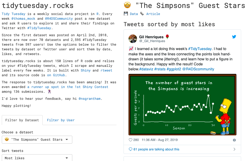 --- ```r plot <- theme_void() + theme(text = element_text(family = "Gaegu"), axis.text = element_text(size = 15, color = "white"), axis.title = element_text(size = 20, color = "white"), plot.title = element_text(size = 25,face = "bold", color = "white", hjust = 0.5), plot.caption = element_text(color = "white"), plot.margin = margin(t = 1, r = 3, b = 1, l = 1, "cm"), axis.title.y = element_text(angle = 90)) ggimage::ggbackground(plot, "chalkboard_simpsons.gif", by = "height") ``` <!-- --> --- ```r library(magick) propic <- image_read(here::here("images/propic.png")) bigdata <- image_read('https://jeroen.github.io/images/bigdata.jpg') bdl <- image_scale(image_rotate(image_background(propic, "none"), 300), "x150") ic <- image_composite(image_scale(bigdata, "x400"), bdl, offset = "+170+140") image_write(ic, here::here("images/ic.png")) ```  --- ```r library(magick) jared <- image_read(here::here("images/jared.jpeg")) j1 <- image_annotate(jared, "hey.... I heard you were the September speaker for the meetup", size = 20, gravity = "east", color = "white") image_write(j1, here::here("images/j1.png")) ```  --- ```r f1 <- image_read(here::here("images/fig.png")) s1 <- image_read(here::here("images/simpsons.jpeg")) out <- image_composite(f1, s1, offset = "+1600+30") image_write(out, here::here("images/out.png")) ```  --- ```r ggplot(GOT_pets, aes(fct_infreq(animals_name), fill = species)) + geom_bar() + scale_fill_got_d(option = "Targaryen", direction = - 1) + labs(title = "A Goat Named Arya", subtitle = "Game of Thrones Inspired (Maybe) Pet Names in Seattle", x = element_blank(), y = element_blank(), caption = "@MaraAlexeev") + theme_minimal() + theme(legend.position = c(0.9, 0.6)) + labs(fill = "Pet Species") + theme(text = element_text(size = 9, family = "Cinzel")) ``` <!-- --> --- ### Alluvial Plot <!-- --> --- ### Alluvial Plot Code ```r sim_data_pre_post <- read_csv(here::here("sim_data_pre_post.csv")) %>% select(student, unit_title, assessment, score_level) %>% mutate(score_level = factor(score_level), assessment = factor(assessment, levels = c("pre", "post"))) %>% spread(assessment, score_level) # get wide dataset (pivot_wider) head(sim_data_pre_post, 5) ``` ``` ## # A tibble: 5 x 4 ## student unit_title pre post ## <dbl> <chr> <fct> <fct> ## 1 1 Dinosaur Domestication 2 4 ## 2 1 Earth's Giant Turtle 2 1 ## 3 1 Life on Mars 1 2 ## 4 1 Potions 1 4 ## 5 1 Unicorn Traits and Reproduction 1 4 ``` --- ### Alluvial Plot Code ```r sim_data_pre_post <- sim_data_pre_post %>% ggalluvial::to_lodes_form(key = "assessment", axes = 3:4) # set up dataset head(sim_data_pre_post, 5) ``` ``` ## # A tibble: 5 x 5 ## student unit_title alluvium assessment stratum ## <dbl> <chr> <int> <fct> <fct> ## 1 1 Dinosaur Domestication 1 pre 2 ## 2 1 Earth's Giant Turtle 2 pre 2 ## 3 1 Life on Mars 3 pre 1 ## 4 1 Potions 4 pre 1 ## 5 1 Unicorn Traits and Reproduction 5 pre 1 ``` --- ### Alluvial Plot Code ```r sim_data_pre_post %>% ggplot(aes(x = assessment, # categorical x var (pre or post) stratum = fct_rev(stratum), # categorical var (score_level) alluvium = alluvium, # individual/unit (student) fill = fct_rev(stratum), # color of fill label = fct_rev(stratum))) + ggalluvial::geom_flow(alpha = 0.5) + ggalluvial::geom_stratum() + scale_fill_manual("Score Level", values = c("1" = "#4d5050", "2" = "#c2c5c6", "3" = "#f2ac80", "4" = "#F37321")) + scale_y_continuous(labels = comma) + labs(x = "") + facet_wrap(~unit_title, scales = "free_y") + theme_minimal() + theme(panel.border = element_blank(), panel.grid.major = element_blank(), panel.grid.minor = element_blank(), axis.line = element_line(colour = "grey"), axis.text.x = element_text(size = 18), axis.text.y = element_text(size = 14), strip.text.x = element_text(size = 16), legend.position = "bottom", legend.title = element_text(size = 16), legend.text = element_text(size = 16)) ``` --- <!-- --> --- ```r ## FROM: https://mdneuzerling.com/post/my-data-science-job-hunt/ job_outcomes %>% mutate(final_outcome = coalesce(outcome, `2nd stage`, `1st stage`)) %>% ggalluvial::to_lodes_form(key = "contact", axes = 2:5) %>% ggplot(aes(x = contact, stratum = stratum, alluvium = alluvium, label = stratum)) + geom_alluvium(aes(fill = final_outcome), color = "darkgrey", na.rm = TRUE) + geom_stratum(na.rm = TRUE) + geom_text(stat = "stratum", na.rm = TRUE, size = 1) + scale_fill_manual(values = c("ghosted" = "#F0E442", "no role" = "#CC79A7", "withdrew" = "#0072B2", "rejected" = "#D55E00", "offer" = "#009E73")) + labs(x = "", fill = "Final Outcome", caption = "David Neuzerling @mdneuzerling") + theme_minimal(legend.position = "bottom") + theme(text = element_text(size = 12)) ``` --- <!-- --> --- ```r plot <- ggplot(df_scores, aes(x = reorder(publisher, average_score), y = metascore)) + geom_jitter(aes(color = publisher), size = 5, alpha = 0.25, width = 0.15) + ggforce::geom_mark_circle(x = 10, y = 94, color = 'grey50', label.fill = NA, expand = unit(4, "mm")) + geom_segment(aes(x = publisher, xend = publisher, y = total_avg, yend = average_score), size = 0.5, color='gray30') + geom_point(mapping = aes(x = publisher, y = average_score, fill = publisher), color = "gray30", shape = 21, size = 7, stroke = 1) + geom_hline(aes(yintercept = total_avg), color = "gray30", size = 0.5) + annotate("text", x = 6.6, y = 86, fontface = "bold", label = 'Average Overall') + annotate("text", x = 6.3, y = 86, label = glue::glue('{round(total_avg, 1)} Metascore')) + annotate("text", x = 2.5, y = 55, fontface = "italic", label = 'Average per publisher') + annotate("text", x = 9.7, y = 45, fontface = "bold", label = 'Worst Game Overall') + annotate("text", x = 9.4, y = 45, label = "Rogue Warrior") + annotate("text", x = 9.6, y = 88, fontface = "bold", label = 'Best Games Overall') + annotate("text", x = 9.3, y = 88, label = "Elder Scroll Series") + coord_flip() + scale_y_continuous(limits = c(25, 100))+ theme_minimal() + guides(color = FALSE, fill = FALSE) + labs(title = "PC Game Ratings by Publisher", subtitle = "Ratings based on Metascore out of 100", caption = "Tanya Shapiro @tanya_shapiro", x = "", y = 'METASCORE', color = "# of Owners") ``` --- ```r arrows <- tibble( x1 = c(6.2, #Avg Overall 2.6, #Avg Per Publisher 2.6, #Avg Per Publisher 9.4, #Worst Game 9.7), #Best Game x2 = c(5.5, #Avg Overall 4.1, 3.1, 9.9, 9.9), y1 = c(86, #Avg Overall 55, #Avg Per Publisher 55, #Avg Per Publisher 40, 88), y2 = c(total_avg, #Avg Overall 70.2, #Avg Per Publisher 68.2, #Avg Per Publisher 30, 92)) # add arrows p <- plot + geom_curve(data = arrows, aes(x = x1, y = y1, xend = x2, yend = y2), arrow = arrow(length = unit(0.07, "inch")), size = 0.6, color = "gray20", curvature = -0.25) ``` --- [Cédric Scherer, king of #tidytuesday](https://github.com/Z3tt/TidyTuesday)  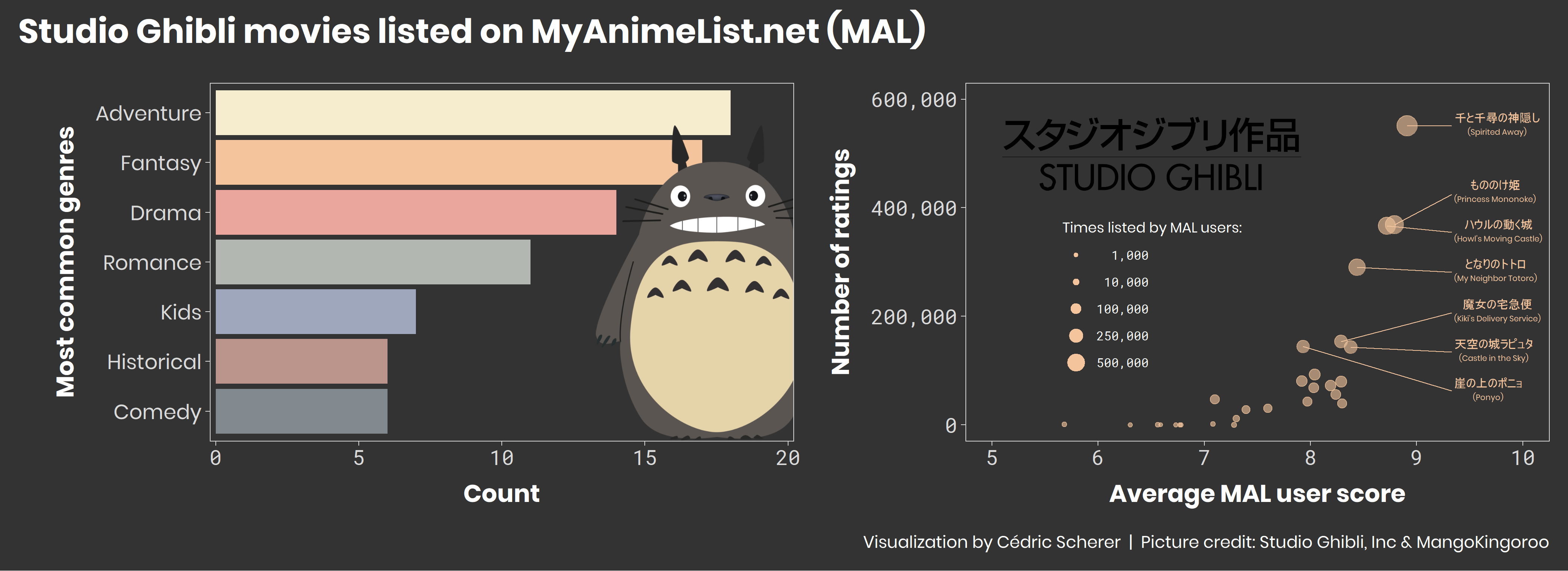 --- ```r ## FROM: https://twitter.com/lpmkremer/status/1168912680767447040?s=21 dat <- bind_rows( tibble(x = rnorm(7000, sd = 1), y = rnorm(7000, sd = 10), group = "foo"), tibble(x = rnorm(3000, mean = 1, sd = .5), y = rnorm(3000, mean = 7, sd = 5), group = "bar")) ggplot(data = dat, mapping = aes(x = x, y = y)) + geom_pointdensity(adjust = 3) + scale_color_viridis() + theme_minimal() ``` <!-- --> --- # In Summary - Change your background -- - Pick a nice font and font size -- - Annotate away! -- - Use ggplot and ggplot adjacent packages -- - Add images -- - Follow #TidyTuesday -- - HAVE FUN! --  --- ### More resources Take a sad plot and make it better (from Alison Hill: https://alison.rbind.io/talk/2018-ohsu-sad-plot-better/ BBC Visual and Data Journalism cookbook for R graphics: https://bbc.github.io/rcookbook/ The Economist: https://medium.economist.com/mistakes-weve-drawn-a-few-8cdd8a42d368 New way to make alluvial charts: https://ggforce.data-imaginist.com/reference/geom_parallel_sets.html You Can Design a Good Chart with R (on the Tufte tweetstorm): https://medium.com/nightingale/you-can-design-a-good-chart-with-r-5d00ed7dd18e ggridges gallery: https://cran.r-project.org/web/packages/ggridges/vignettes/gallery.html --- # Thank you - Samuel Crane, @samuelcrane and Amplify - Sebastian Teran Hidalgo, @steranhidalgo - RLadies-NYC, @RLadiesNYC - Jared Lander, @jaredlander - all the #TidyTuesday contributors: Gil Henriques, @_Gil_Henriques Mara Alexeev, @MaraAlexeev David Neuzerling, @mdneuzerling Tanya Shapiro, @tanya_shapiro Cédric Scherer, @CedScherer - the Rstats community ---