class: center, middle, inverse, title-slide .title[ # Interactive Graphs with Plotly and Dash ] .subtitle[ ## IDS Workshop on interactive data visualization Plotly and Dash in R ] .author[ ### Giorgio Coppola, Gayatri Shejwal, Lonny Chen ] .institute[ ### Hertie School ] --- class: inverse, center, middle name: welcome # Welcome! <html><div style='float:left'></div><hr color='#EB811B' size=1px style="width:1000px; margin:auto;"/></html> --- # Introduction Data visualization is a powerful mean to understand complex data and communicate insights effectively, revealing the hidden patterns and trends that wouldn't be obvious in tabular data, turning raw data into information. The tools we are going to introduce today serve exactly this purpose, enhancing the visualization possibilities offered by other static visualization packages such as `ggplot2`. <br> -- **What tools allow to do so?** Plotly and Dash! And we will introduce both! Indeed, `plotly` and `dash` are 💫 interactive 💫, in the sense that the user can interact with the data through the graph directly. This allows possibilities for higher understanding of the data. --- # Introduction ### Why interactive graphs? 📉 -- <br> * *Engagement*: Makes data come alive (interactive) and is more engaging for users. This increase understanding and retention. -- * *Depth*: Allows users to drill down and explore nuances, as interaction allows to create narratives more easily. Users can ask 'why' and get answers instantly by exploring the chart or graph. -- * *Decision-making*: Facilitates more informed decisions. <br> Both `plotly` and `dash` are interactive, but we can say that the level of interaction is different: `plotly` appears very similar to a static plot, with the difference that we can hover your cursor over it, accessing further data. `dash` on the other hand, creates proper dashboards, namely HTML apps, allowing even more interaction. --- # Plotly ### What is Plotly? -- Plotly is actually a company headquartered in Montreal, Canada, providing online graphing, analytics, and statistics tools, as well as scientific graphing libraries for Python, R, MATLAB, Perl, Julia, Arduino, JavaScript and REST. In this contex, with Plotly we refer to the R package for to create interactive graphs. -- # Plotly ### Advantages of using Plotly -- - Seamless integration with R and `ggplot2`, through the `ggplotly` function, that converts your static plots to an interactive web-based version! -- - Diverse range of plots and customization (wide array of chart types with extensive customization options), as well as the possibility to zoom in and out into the plot, or select a certain part of the plot and explore it specifically. Users can pan, zoom, and hover over the plots to get more information. -- - HTML web integration of graphs, makes visualization more accessible and intuitive. --- # Plotly ### Main distinctive features: the building blocks! 🔨 <br> Plotly's main feature is interactivity! It is achieved by a couple of operations within the `plot_ly` function: -- * **data**: a data frame (what a surprise!) * **x and y**: the variables for the x and y axes, respectively * **type**: the type of plot you want to create (e.g. "scatter", "bar", "box", etc). * **mode**: determines whether the scatter plot should show "markers", "lines", "text", or a combination thereof * **color**: specifies the color of data points or lines. This can be used to distinguish between different groups or represent a continuous variable -- Nothing really interactive until now... --- # Plotly ### Main distinctive features: the building blocks! 🔨 <br> ... What enables interaction: * **Hovertext & Tooltip**: - *Hovertext*: This is the text that appears when a user hovers over a specific data point or element in a Plotly plot. It's essentially a string or array of strings associated with each data point. - *Tooltip*: This is the box or interface that displays the hovertext. While "hovertext" refers specifically to the text content, "tooltip" encompasses the overall appearance and context of the hover information. <br> -- These can be highly customized: more info [here](https://plotly.com/r/hover-text-and-formatting/) for `plot_ly` and [here](https://plotly.com/ggplot2/hover-text-and-formatting/) for `ggplot2`, using `ggplotly`. --- # Plotly ### Some visualization examples. Some cool, non-trivial, yet not too complex, visualization that encapsulate the power of Plotly: <br> Let's play around a bit with the [Breweries and Beers by Style and US State Data](https://github.com/plotly/datasets/blob/master/beers.csv) 🍺! For the variables (ref: [Growler Guys](https://thegrowlerguys.com/understanding-abv-and-ibu/)): * `abv` - Alcohol by Volume (ABV), a standard measurement of alcohol content * `ibu` - International Bitterness Units (IBU), ranges from 5 to 100+. A beer over 60 is considered bitter. * `style_group` - eight beer types and "other" in the dataset (pre-processed) * `state` - US state We will create: 1. Histogram of ABV 2. Bar chart of beer types 3. Boxplot of ABV 4. Scatter plot of ABV vs. IBU --- class: custom-slide <style> .custom-slide .remark-code, .custom-slide .remark-inline-code { font-size: 14px; } </style> # Plotly more in-depth: Examples ### Example 1: Histogram Let's create a plotly graph plotting the 'alcohol by volume' `abv` variable against the beer 'count', to see the distribution of beer production in terms of alcohol level. We can do this with one line using the `plot_ly` function and specifying type [`histogram`](https://plotly.com/r/histograms/)! <br> -- .pull-left[ ```r fig1a <- beers %>% plot_ly(x = ~abv, type = "histogram") ``` ] .pull-right[ <div class="plotly html-widget html-fill-item-overflow-hidden html-fill-item" id="htmlwidget-58aff596786cbfae18e1" style="width:450px;height:360px;"></div> <script type="application/json" data-for="htmlwidget-58aff596786cbfae18e1">{"x":{"visdat":{"179e91b25b0aa":["function () ","plotlyVisDat"]},"cur_data":"179e91b25b0aa","attrs":{"179e91b25b0aa":{"x":{},"alpha_stroke":1,"sizes":[10,100],"spans":[1,20],"type":"histogram"}},"layout":{"margin":{"b":40,"l":60,"t":25,"r":10},"xaxis":{"domain":[0,1],"automargin":true,"title":"abv"},"yaxis":{"domain":[0,1],"automargin":true},"hovermode":"closest","showlegend":false},"source":"A","config":{"modeBarButtonsToAdd":["hoverclosest","hovercompare"],"showSendToCloud":false},"data":[{"x":[0.050000000000000003,0.066000000000000003,0.070999999999999994,0.089999999999999997,0.074999999999999997,0.076999999999999999,0.044999999999999998,0.065000000000000002,0.055,0.085999999999999993,0.071999999999999995,0.072999999999999995,0.069000000000000006,0.085000000000000006,0.060999999999999999,0.059999999999999998,0.059999999999999998,0.059999999999999998,0.059999999999999998,0.081999999999999906,0.081999999999999906,0.099000000000000005,0.079000000000000001,0.079000000000000001,0.043999999999999997,0.049000000000000002,0.049000000000000002,0.049000000000000002,0.070000000000000007,0.070000000000000007,0.070000000000000007,0.085000000000000006,0.096999999999999906,0.043999999999999997,0.079000000000000001,0.068000000000000005,0.083000000000000004,0.070000000000000007,0.049000000000000002,0.070000000000000007,0.050000000000000003,0.058999999999999997,0.035000000000000003,0.044999999999999998,0.055,0.059999999999999998,0.055,0.065000000000000002,0.065000000000000002,0.050000000000000003,0.065000000000000002,0.050000000000000003,0.089999999999999997,0.069000000000000006,0.089999999999999997,0.045999999999999999,0.051999999999999998,0.058999999999999997,0.053999999999999999,0.053999999999999999,0.084000000000000005,0.037999999999999999,0.055,0.055,0.065000000000000002,0.042000000000000003,0.044999999999999998,0.081999999999999906,0.050000000000000003,0.080000000000000002,0.125,0.076999999999999999,0.042000000000000003,0.050000000000000003,0.066000000000000003,0.040000000000000001,0.055,0.075999999999999998,0.050999999999999997,0.065000000000000002,0.059999999999999998,0.050000000000000003,0.052999999999999999,0.050000000000000003,0.051999999999999998,0.040000000000000001,0.052999999999999999,0.081999999999999906,0.052999999999999999,0.052999999999999999,0.057000000000000002,0.042999999999999997,0.065000000000000002,0.053999999999999999,0.062,0.062,0.058999999999999997,0.065000000000000002,0.044999999999999998,0.049000000000000002,0.055999999999999897,0.042000000000000003,0.042000000000000003,0.048000000000000001,0.059999999999999998,0.057000000000000002,0.055999999999999897,0.070000000000000007,0.057999999999999899,0.057000000000000002,0.055,0.057999999999999899,0.055999999999999897,0.057000000000000002,0.069000000000000006,0.070000000000000007,0.057999999999999899,0.055999999999999897,0.055,0.059999999999999998,0.053999999999999999,0.047,0.050000000000000003,0.050000000000000003,0.050000000000000003,0.068000000000000005,0.059999999999999998,0.085000000000000006,0.070999999999999994,0.047,0.059999999999999998,0.059999999999999998,0.062,0.051999999999999998,0.091999999999999998,0.050999999999999997,0.051999999999999998,0.070000000000000007,0.032000000000000001,0.052999999999999999,0.059999999999999998,0.048000000000000001,0.076999999999999999,0.076999999999999999,0.055999999999999897,0.070000000000000007,0.057000000000000002,0.081999999999999906,0.062,0.059999999999999998,0.074999999999999997,0.055,0.051999999999999998,0.044999999999999998,0.050000000000000003,0.050000000000000003,0.070000000000000007,0.062,0.050999999999999997,0.052999999999999999,0.051999999999999998,0.080000000000000002,0.064000000000000001,0.047,0.055999999999999897,0.063,0.055,0.062,0.071999999999999995,0.048000000000000001,0.067000000000000004,0.091999999999999998,0.060999999999999999,0.085999999999999993,0.059999999999999998,0.049000000000000002,0.070000000000000007,0.050000000000000003,0.059999999999999998,0.059999999999999998,0.068000000000000005,0.043999999999999997,0.070000000000000007,0.037999999999999999,0.051999999999999998,0.070000000000000007,0.045999999999999999,0.070000000000000007,0.044999999999999998,0.044999999999999998,0.035000000000000003,0.070000000000000007,0.059999999999999998,0.044999999999999998,0.049000000000000002,0.067000000000000004,0.068000000000000005,0.050000000000000003,0.050999999999999997,0.053999999999999999,0.067000000000000004,0.050000000000000003,0.053999999999999999,0.052999999999999999,0.070000000000000007,0.047,0.068000000000000005,0.066000000000000003,0.047,0.055,0.049000000000000002,0.069000000000000006,0.087999999999999995,0.050000000000000003,0.057999999999999899,0.068000000000000005,0.048000000000000001,0.057999999999999899,0.059999999999999998,0.050000000000000003,0.057999999999999899,0.070000000000000007,0.057999999999999899,0.043999999999999997,0.083000000000000004,0.057000000000000002,0.059999999999999998,0.071999999999999995,0.055999999999999897,0.062,0.059999999999999998,0.050000000000000003,0.055,0.052999999999999999,0.078,0.047,0.064000000000000001,0.055999999999999897,0.059999999999999998,0.081000000000000003,0.095000000000000001,0.040999999999999898,0.067000000000000004,0.070000000000000007,0.065000000000000002,0.059999999999999998,0.080000000000000002,0.062,0.059999999999999998,0.074999999999999997,0.050000000000000003,0.059999999999999998,0.062,0.050000000000000003,0.050000000000000003,0.050999999999999997,0.071999999999999995,0.050999999999999997,0.050000000000000003,0.062,0.047,0.050000000000000003,0.050000000000000003,0.050999999999999997,0.069000000000000006,0.057999999999999899,0.052999999999999999,0.099000000000000005,0.098000000000000004,0.055,0.066000000000000003,0.055,0.051999999999999998,0.063,0.053999999999999999,0.071999999999999995,0.044999999999999998,0.074999999999999997,0.050000000000000003,0.057999999999999899,0.070999999999999994,0.070999999999999994,0.078,0.066000000000000003,0.048000000000000001,0.045999999999999999,0.072999999999999995,0.048000000000000001,0.059999999999999998,0.051999999999999998,0.068000000000000005,0.070000000000000007,0.055,0.050000000000000003,0.055,0.080000000000000002,0.096000000000000002,0.051999999999999998,0.050000000000000003,0.064000000000000001,0.044999999999999998,0.055999999999999897,0.055999999999999897,0.055999999999999897,0.045999999999999999,0.058999999999999997,0.058999999999999997,0.080000000000000002,0.058999999999999997,0.065000000000000002,0.052999999999999999,0.058999999999999997,0.049000000000000002,0.070000000000000007,0.059999999999999998,0.043999999999999997,0.055,0.059999999999999998,0.052999999999999999,0.040000000000000001,0.050000000000000003,0.050000000000000003,0.065000000000000002,0.055,0.059999999999999998,0.042000000000000003,0.040000000000000001,0.050999999999999997,0.044999999999999998,0.066000000000000003,0.074999999999999997,0.048000000000000001,0.055999999999999897,0.070000000000000007,0.047,0.068000000000000005,0.047,0.047,0.048000000000000001,0.049000000000000002,0.052999999999999999,0.064000000000000001,0.060999999999999999,0.057999999999999899,0.057999999999999899,0.048000000000000001,0.048000000000000001,0.066000000000000003,0.070999999999999994,0.044999999999999998,0.065000000000000002,0.055,0.055999999999999897,0.049000000000000002,0.049000000000000002,0.052999999999999999,0.052999999999999999,0.049000000000000002,0.049000000000000002,0.057000000000000002,0.049000000000000002,0.062,0.065000000000000002,0.057999999999999899,0.047,0.059999999999999998,0.057000000000000002,0.070000000000000007,0.059999999999999998,0.055,0.051999999999999998,0.050000000000000003,0.042000000000000003,0.044999999999999998,0.062,0.053999999999999999,0.050000000000000003,0.071999999999999995,0.050000000000000003,0.055,0.057999999999999899,0.052999999999999999,0.067000000000000004,0.059999999999999998,0.098000000000000004,0.059999999999999998,0.070000000000000007,0.076999999999999999,0.065000000000000002,0.065000000000000002,0.065000000000000002,0.065000000000000002,0.050000000000000003,0.089999999999999997,0.055,0.058999999999999997,0.066000000000000003,0.040999999999999898,0.081999999999999906,0.065000000000000002,0.062,0.060999999999999999,0.063,0.055999999999999897,0.099000000000000005,0.050999999999999997,0.062,0.062,0.052999999999999999,0.063,0.064000000000000001,0.070000000000000007,0.067000000000000004,0.067000000000000004,0.050000000000000003,0.059999999999999998,0.065000000000000002,0.044999999999999998,0.063,0.092999999999999999,0.072999999999999995,0.055999999999999897,0.092999999999999999,0.065000000000000002,0.050000000000000003,0.089999999999999997,0.081999999999999906,0.098000000000000004,0.059999999999999998,0.099000000000000005,0.095000000000000001,0.091999999999999998,0.065000000000000002,0.099000000000000005,0.062,0.089999999999999997,0.091999999999999998,0.096999999999999906,0.085000000000000006,0.055,0.059999999999999998,0.065000000000000002,0.060999999999999999,0.050000000000000003,0.051999999999999998,0.048000000000000001,0.060999999999999999,0.068000000000000005,0.044999999999999998,0.068000000000000005,0.044999999999999998,0.051999999999999998,0.051999999999999998,0.080000000000000002,0.072999999999999995,0.099000000000000005,0.062,0.057999999999999899,0.051999999999999998,0.052999999999999999,0.044999999999999998,0.059999999999999998,0.059999999999999998,0.089999999999999997,0.065000000000000002,0.068000000000000005,0.078,0.055,0.099000000000000005,0.059999999999999998,0.065000000000000002,0.068000000000000005,0.071999999999999995,0.068000000000000005,0.055,0.050000000000000003,0.055999999999999897,0.049000000000000002,0.068000000000000005,0.049000000000000002,0.042999999999999997,0.092999999999999999,0.062,0.059999999999999998,0.048000000000000001,0.076999999999999999,0.096999999999999906,0.051999999999999998,0.052999999999999999,0.063,0.068000000000000005,0.063,0.052999999999999999,0.068000000000000005,0.059999999999999998,0.055999999999999897,0.039,0.053999999999999999,0.060999999999999999,0.060999999999999999,0.055999999999999897,0.055999999999999897,0.055999999999999897,0.055999999999999897,0.055999999999999897,0.053999999999999999,0.060999999999999999,0.050000000000000003,0.065000000000000002,0.099000000000000005,0.089999999999999997,0.055,0.053999999999999999,0.055,0.055,0.049000000000000002,0.065000000000000002,0.051999999999999998,0.045999999999999999,0.055999999999999897,0.045999999999999999,0.062,0.051999999999999998,0.042000000000000003,0.051999999999999998,0.050000000000000003,0.040000000000000001,0.050000000000000003,0.035000000000000003,0.058999999999999997,0.057000000000000002,0.050999999999999997,0.099000000000000005,0.039,0.078,0.042000000000000003,0.069000000000000006,0.069000000000000006,0.055999999999999897,0.051999999999999998,0.047,0.070000000000000007,0.047,0.051999999999999998,0.055999999999999897,0.048000000000000001,0.078,0.057999999999999899,0.053999999999999999,0.085000000000000006,0.068000000000000005,0.050999999999999997,0.050999999999999997,0.050000000000000003,0.050000000000000003,0.050000000000000003,0.050000000000000003,0.044999999999999998,0.050000000000000003,0.051999999999999998,0.050999999999999997,0.071999999999999995,0.095000000000000001,0.074999999999999997,0.070000000000000007,0.059999999999999998,0.050000000000000003,0.070000000000000007,0.044999999999999998,0.065000000000000002,0.055,0.044999999999999998,0.080000000000000002,0.055,0.057000000000000002,0.057000000000000002,0.051999999999999998,0.088999999999999996,0.049000000000000002,0.050000000000000003,0.050000000000000003,0.055,0.062,0.081999999999999906,0.055,0.055,0.059999999999999998,0.044999999999999998,0.070000000000000007,0.070000000000000007,0.063,0.070000000000000007,0.070000000000000007,0.070000000000000007,0.055,0.051999999999999998,0.074999999999999997,0.074999999999999997,0.080000000000000002,0.050000000000000003,0.055,0.055,0.050000000000000003,0.071999999999999995,0.074999999999999997,0.050000000000000003,0.048000000000000001,0.059999999999999998,0.044999999999999998,0.062,0.065000000000000002,0.037999999999999999,0.055999999999999897,0.067000000000000004,0.059999999999999998,0.043999999999999997,0.047,0.062,0.045999999999999999,0.065000000000000002,0.051999999999999998,0.051999999999999998,0.057999999999999899,0.068000000000000005,0.048000000000000001,0.055999999999999897,0.050000000000000003,0.051999999999999998,0.057000000000000002,0.060999999999999999,0.037999999999999999,0.050000000000000003,0.048000000000000001,0.074999999999999997,0.076999999999999999,0.059999999999999998,0.074999999999999997,0.058999999999999997,0.051999999999999998,0.059999999999999998,0.051999999999999998,0.065000000000000002,0.044999999999999998,0.049000000000000002,0.055,0.055999999999999897,0.065000000000000002,0.066000000000000003,0.055,0.044999999999999998,0.055,0.069000000000000006,0.059999999999999998,0.059999999999999998,0.051999999999999998,0.049000000000000002,0.053999999999999999,0.080000000000000002,0.063,0.044999999999999998,0.059999999999999998,0.080000000000000002,0.050000000000000003,0.052999999999999999,0.055,0.091999999999999998,0.065000000000000002,0.070000000000000007,0.059999999999999998,0.065000000000000002,0.065000000000000002,0.071999999999999995,0.055,0.050000000000000003,0.050000000000000003,0.063,0.059999999999999998,0.074999999999999997,0.085000000000000006,0.059999999999999998,0.070000000000000007,0.048000000000000001,0.045999999999999999,0.051999999999999998,0.070000000000000007,0.044999999999999998,0.050000000000000003,0.058999999999999997,0.055999999999999897,0.065000000000000002,0.057999999999999899,0.070000000000000007,0.050000000000000003,0.050000000000000003,0.051999999999999998,0.049000000000000002,0.063,0.050000000000000003,0.050000000000000003,0.096000000000000002,0.049000000000000002,0.043999999999999997,0.051999999999999998,0.053999999999999999,0.070999999999999994,0.073999999999999996,0.044999999999999998,0.065000000000000002,0.049000000000000002,0.050999999999999997,0.066000000000000003,0.050999999999999997,0.042999999999999997,0.057999999999999899,0.060999999999999999,0.044999999999999998,0.050000000000000003,0.078,0.059999999999999998,0.050000000000000003,0.055,0.044999999999999998,0.078,0.057000000000000002,0.049000000000000002,0.070000000000000007,0.050000000000000003,0.051999999999999998,0.051999999999999998,0.050000000000000003,0.062,0.042999999999999997,0.062,0.049000000000000002,0.070000000000000007,0.050999999999999997,0.051999999999999998,0.048000000000000001,0.053999999999999999,0.040000000000000001,0.085000000000000006,0.055,0.027,0.055,0.050000000000000003,0.044999999999999998,0.067000000000000004,0.063,0.070000000000000007,0.070000000000000007,0.050000000000000003,0.050000000000000003,0.050000000000000003,0.070000000000000007,0.074999999999999997,0.045999999999999999,0.050999999999999997,0.074999999999999997,0.069000000000000006,0.050000000000000003,0.081000000000000003,0.081999999999999906,0.081999999999999906,0.055,0.044999999999999998,0.055,0.048000000000000001,0.089999999999999997,0.080000000000000002,0.085999999999999993,0.050000000000000003,0.052999999999999999,0.080000000000000002,0.055,0.074999999999999997,0.055,0.047,0.044999999999999998,0.074999999999999997,0.052999999999999999,0.047,0.047,0.065000000000000002,0.050000000000000003,0.059999999999999998,0.055,0.070999999999999994,0.047,0.040000000000000001,0.070000000000000007,0.078,0.059999999999999998,0.065000000000000002,0.044999999999999998,0.050000000000000003,0.069000000000000006,0.051999999999999998,0.062,0.044999999999999998,0.065000000000000002,0.062,0.067000000000000004,0.057999999999999899,0.051999999999999998,0.055,0.087999999999999995,0.050999999999999997,0.073999999999999996,0.047,0.055999999999999897,0.045999999999999999,0.063,0.085000000000000006,0.071999999999999995,0.047,0.075999999999999998,0.057000000000000002,0.051999999999999998,0.055,0.050000000000000003,0.059999999999999998,0.064000000000000001,0.040000000000000001,0.051999999999999998,0.059999999999999998,0.050999999999999997,0.042000000000000003,0.067000000000000004,0.059999999999999998,0.051999999999999998,0.059999999999999998,0.050000000000000003,0.057000000000000002,0.070000000000000007,0.055999999999999897,0.069000000000000006,0.055,0.052999999999999999,0.065000000000000002,0.059999999999999998,0.042000000000000003,0.068000000000000005,0.042000000000000003,0.058999999999999997,0.043999999999999997,0.040000000000000001,0.044999999999999998,0.080000000000000002,0.065000000000000002,0.065000000000000002,0.055999999999999897,0.065000000000000002,0.052999999999999999,0.070000000000000007,0.051999999999999998,0.070000000000000007,0.050000000000000003,0.071999999999999995,0.049000000000000002,0.050000000000000003,0.067000000000000004,0.071999999999999995,0.057999999999999899,0.073999999999999996,0.080000000000000002,0.094,0.058999999999999997,0.045999999999999999,0.068000000000000005,0.058999999999999997,0.050000000000000003,0.055,0.080000000000000002,0.080000000000000002,0.058999999999999997,0.045999999999999999,0.070000000000000007,0.070000000000000007,0.059999999999999998,0.055999999999999897,0.092999999999999999,0.059999999999999998,0.059999999999999998,0.057999999999999899,0.055,0.058999999999999997,0.053999999999999999,0.053999999999999999,0.042000000000000003,0.042000000000000003,0.042000000000000003,0.051999999999999998,0.050000000000000003,0.051999999999999998,0.053999999999999999,0.042999999999999997,0.049000000000000002,0.055,0.052999999999999999,0.057000000000000002,0.055999999999999897,0.062,0.057000000000000002,0.052999999999999999,0.055999999999999897,0.057000000000000002,0.044999999999999998,0.057000000000000002,0.057000000000000002,0.059999999999999998,0.050999999999999997,0.074999999999999997,0.080000000000000002,0.055999999999999897,0.057000000000000002,0.042000000000000003,0.062,0.052999999999999999,0.050000000000000003,0.086999999999999994,0.060999999999999999,0.070999999999999994,0.083000000000000004,0.050000000000000003,0.095000000000000001,0.072999999999999995,0.070999999999999994,0.044999999999999998,0.044999999999999998,0.051999999999999998,0.051999999999999998,0.050000000000000003,0.070000000000000007,0.048000000000000001,0.048000000000000001,0.048000000000000001,0.050000000000000003,0.059999999999999998,0.055,0.053999999999999999,0.052999999999999999,0.089999999999999997,0.070000000000000007,0.070000000000000007,0.058999999999999997,0.048000000000000001,0.059999999999999998,0.052999999999999999,0.053999999999999999,0.050000000000000003,0.057000000000000002,0.067000000000000004,0.057999999999999899,0.085000000000000006,0.057999999999999899,0.059999999999999998,0.040000000000000001,0.055,0.059999999999999998,0.059999999999999998,0.049000000000000002,0.044999999999999998,0.065000000000000002,0.050000000000000003,0.050000000000000003,0.065000000000000002,0.074999999999999997,0.050000000000000003,0.040000000000000001,0.089999999999999997,0.063,0.069000000000000006,0.047,0.070000000000000007,0.080000000000000002,0.057000000000000002,0.055,0.059999999999999998,0.059999999999999998,0.042000000000000003,0.051999999999999998,0.070000000000000007,0.051999999999999998,0.045999999999999999,0.042999999999999997,0.074999999999999997,0.043999999999999997,0.055999999999999897,0.051999999999999998,0.062,0.048000000000000001,0.050000000000000003,0.058999999999999997,0.058999999999999997,0.055,0.058999999999999997,0.050000000000000003,0.048000000000000001,0.050000000000000003,0.058999999999999997,0.048000000000000001,0.049000000000000002,0.053999999999999999,0.064000000000000001,0.064000000000000001,0.083000000000000004,0.075999999999999998,0.062,0.087999999999999995,0.071999999999999995,0.059999999999999998,0.059999999999999998,0.063,0.080000000000000002,0.099000000000000005,0.063,0.070000000000000007,0.043999999999999997,0.044999999999999998,0.055,0.044999999999999998,0.055,0.049000000000000002,0.055,0.066000000000000003,0.042000000000000003,0.042000000000000003,0.047,0.057999999999999899,0.049000000000000002,0.078,0.063,0.049000000000000002,0.048000000000000001,0.065000000000000002,0.065000000000000002,0.049000000000000002,0.070000000000000007,0.050999999999999997,0.050999999999999997,0.059999999999999998,0.065000000000000002,0.068000000000000005,0.027,0.039,0.039,0.039,0.039,0.039,0.039,0.039,0.039,0.039,0.039,0.039,0.039,0.057999999999999899,0.057999999999999899,0.066000000000000003,0.072999999999999995,0.059999999999999998,0.057999999999999899,0.072999999999999995,0.050999999999999997,0.066000000000000003,0.055999999999999897,0.050999999999999997,0.059999999999999998,0.065000000000000002,0.055,0.068000000000000005,0.065000000000000002,0.050000000000000003,0.045999999999999999,0.065000000000000002,0.053999999999999999,0.048000000000000001,0.055,0.058999999999999997,0.057999999999999899,0.070000000000000007,0.055,0.044999999999999998,0.068000000000000005,0.052999999999999999,0.049000000000000002,0.051999999999999998,0.048000000000000001,0.071999999999999995,0.067000000000000004,0.049000000000000002,0.050000000000000003,0.050999999999999997,0.055,0.055,0.065000000000000002,0.070000000000000007,0.050000000000000003,0.067000000000000004,0.069000000000000006,0.044999999999999998,0.055,0.055,0.059999999999999998,0.059999999999999998,0.050000000000000003,0.050000000000000003,0.092999999999999999,0.051999999999999998,0.070999999999999994,0.074999999999999997,0.051999999999999998,0.057999999999999899,0.055,0.055,0.047,0.066000000000000003,0.095000000000000001,0.049000000000000002,0.051999999999999998,0.066000000000000003,0.057000000000000002,0.059999999999999998,0.055,0.057999999999999899,0.050000000000000003,0.068000000000000005,0.057999999999999899,0.065000000000000002,0.065000000000000002,0.065000000000000002,0.055,0.065000000000000002,0.065000000000000002,0.050999999999999997,0.055,0.059999999999999998,0.057000000000000002,0.049000000000000002,0.063,0.048000000000000001,0.045999999999999999,0.045999999999999999,0.045999999999999999,0.045999999999999999,0.040000000000000001,0.080000000000000002,0.053999999999999999,0.071999999999999995,0.066000000000000003,0.048000000000000001,0.044999999999999998,0.068000000000000005,0.050000000000000003,0.055,0.050000000000000003,0.048000000000000001,0.064000000000000001,0.064000000000000001,0.055999999999999897,0.050000000000000003,0.050999999999999997,0.057000000000000002,0.050000000000000003,0.050000000000000003,0.057000000000000002,0.051999999999999998,0.059999999999999998,0.057999999999999899,0.057000000000000002,0.051999999999999998,0.065000000000000002,0.057000000000000002,0.059999999999999998,0.074999999999999997,0.057000000000000002,0.057999999999999899,0.060999999999999999,0.058999999999999997,0.045999999999999999,0.071999999999999995,0.040000000000000001,0.045999999999999999,0.045999999999999999,0.048000000000000001,0.055,0.044999999999999998,0.062,0.055999999999999897,0.051999999999999998,0.062,0.051999999999999998,0.048000000000000001,0.037999999999999999,0.050999999999999997,0.053999999999999999,0.052999999999999999,0.060999999999999999,0.057999999999999899,0.050000000000000003,0.050999999999999997,0.050000000000000003,0.055,0.099000000000000005,0.042999999999999997,0.085000000000000006,0.079000000000000001,0.047,0.050000000000000003,0.069000000000000006,0.070000000000000007,0.059999999999999998,0.050999999999999997,0.055,0.050999999999999997,0.042000000000000003,0.065000000000000002,0.042000000000000003,0.044999999999999998,0.071999999999999995,0.067000000000000004,0.044999999999999998,0.055,0.055,0.050000000000000003,0.089999999999999997,0.059999999999999998,0.085000000000000006,0.099000000000000005,0.080000000000000002,0.059999999999999998,0.095000000000000001,0.066000000000000003,0.047,0.062,0.071999999999999995,0.050000000000000003,0.099000000000000005,0.063,0.096999999999999906,0.050000000000000003,0.065000000000000002,0.050000000000000003,0.080000000000000002,0.080000000000000002,0.050000000000000003,0.050000000000000003,0.065000000000000002,0.065000000000000002,0.042000000000000003,0.065000000000000002,0.050999999999999997,0.044999999999999998,0.044999999999999998,0.048000000000000001,0.047,0.050000000000000003,0.059999999999999998,0.047,0.055,0.055,0.050999999999999997,0.055,0.050000000000000003,0.070000000000000007,0.081999999999999906,0.059999999999999998,0.050000000000000003,0.068000000000000005,0.055,0.044999999999999998,0.057000000000000002,0.062,0.036999999999999998,0.036999999999999998,0.036999999999999998,0.069000000000000006,0.069000000000000006,0.069000000000000006,0.071999999999999995,0.071999999999999995,0.042000000000000003,0.051999999999999998,0.051999999999999998,0.053999999999999999,0.052999999999999999,0.052999999999999999,0.070999999999999994,0.052999999999999999,0.055999999999999897,0.063,0.063,0.048000000000000001,0.050000000000000003,0.057000000000000002,0.080000000000000002,0.074999999999999997,0.059999999999999998,0.080000000000000002,0.063,0.057999999999999899,0.083000000000000004,0.080000000000000002,0.074999999999999997,0.074999999999999997,0.065000000000000002,0.042999999999999997,0.074999999999999997,0.052999999999999999,0.050000000000000003,0.068000000000000005,0.048000000000000001,0.048000000000000001,0.086999999999999994,0.050999999999999997,0.074999999999999997,0.065000000000000002,0.091999999999999998,0.048000000000000001,0.050999999999999997,0.099000000000000005,0.053999999999999999,0.040000000000000001,0.050000000000000003,0.062,0.062,0.055,0.055,0.055,0.050000000000000003,0.042000000000000003,0.055,0.050000000000000003,0.050000000000000003,0.068000000000000005,0.048000000000000001,0.091999999999999998,0.040000000000000001,0.040000000000000001,0.040000000000000001,0.040000000000000001,0.055,0.055999999999999897,0.042000000000000003,0.074999999999999997,0.068000000000000005,0.051999999999999998,0.067000000000000004,0.055,0.047,0.057999999999999899,0.065000000000000002,0.050000000000000003,0.053999999999999999,0.086999999999999994,0.057999999999999899,0.055999999999999897,0.059999999999999998,0.055999999999999897,0.049000000000000002,0.047,0.045999999999999999,0.050000000000000003,0.051999999999999998,0.050000000000000003,0.050000000000000003,0.051999999999999998,0.070000000000000007,0.081999999999999906,0.085000000000000006,0.071999999999999995,0.042000000000000003,0.085000000000000006,0.055,0.050000000000000003,0.040000000000000001,0.040000000000000001,0.052999999999999999,0.052999999999999999,0.036999999999999998,0.051999999999999998,0.052999999999999999,0.085999999999999993,0.042000000000000003,0.050000000000000003,0.042000000000000003,0.070000000000000007,0.065000000000000002,0.055,0.052999999999999999,0.073999999999999996,0.085000000000000006,0.085000000000000006,0.073999999999999996,0.052999999999999999,0.060999999999999999,0.065000000000000002,0.048000000000000001,0.048000000000000001,0.057000000000000002,0.066000000000000003,0.048000000000000001,0.044999999999999998,0.065000000000000002,0.050000000000000003,0.055999999999999897,0.048000000000000001,0.055,0.051999999999999998,0.048000000000000001,0.051999999999999998,0.050000000000000003,0.051999999999999998,0.050000000000000003,0.065000000000000002,0.051999999999999998,0.065000000000000002,0.048000000000000001,0.051999999999999998,0.034000000000000002,0.062,0.050000000000000003,0.050000000000000003,0.089999999999999997,0.087999999999999995,0.089999999999999997,0.087999999999999995,0.050000000000000003,0.050000000000000003,0.062,0.050000000000000003,0.068000000000000005,0.087999999999999995,0.065000000000000002,0.039,0.049000000000000002,0.055999999999999897,0.055999999999999897,0.051999999999999998,0.053999999999999999,0.045999999999999999,0.042000000000000003,0.071999999999999995,0.053999999999999999,0.055,0.055,0.050999999999999997,0.071999999999999995,0.059999999999999998,0.060999999999999999,0.055,0.044999999999999998,0.044999999999999998,0.049000000000000002,0.048000000000000001,0.059999999999999998,0.059999999999999998,0.055999999999999897,0.069000000000000006,0.063,0.063,0.044999999999999998,0.044999999999999998,0.042999999999999997,0.040000000000000001,0.055,0.060999999999999999,0.050999999999999997,0.067000000000000004,0.053999999999999999,0.057999999999999899,0.067000000000000004,0.081999999999999906,0.049000000000000002,0.048000000000000001,0.048000000000000001,0.047,0.050999999999999997,0.050000000000000003,0.044999999999999998,0.091999999999999998,0.086999999999999994,0.053999999999999999,0.047,0.050999999999999997,0.050999999999999997,0.047,0.095000000000000001,0.065000000000000002,0.059999999999999998,0.050000000000000003,0.057000000000000002,0.050000000000000003,0.059999999999999998,0.065000000000000002,0.068000000000000005,0.055,0.045999999999999999,0.044999999999999998,0.065000000000000002,0.074999999999999997,0.055,0.048000000000000001,0.052999999999999999,0.055,0.067000000000000004,0.042000000000000003,0.040999999999999898,0.065000000000000002,0.052999999999999999,0.049000000000000002,0.051999999999999998,0.080000000000000002,0.050000000000000003,0.065000000000000002,0.065000000000000002,0.052999999999999999,0.085000000000000006,0.085000000000000006,0.065000000000000002,0.070000000000000007,0.065000000000000002,0.065000000000000002,0.086999999999999994,0.065000000000000002,0.065000000000000002,0.086999999999999994,0.089999999999999997,0.080000000000000002,0.080000000000000002,0.080000000000000002,0.089999999999999997,0.086999999999999994,0.099000000000000005,0.052999999999999999,0.099000000000000005,0.080000000000000002,0.086999999999999994,0.065000000000000002,0.091999999999999998,0.095000000000000001,0.099000000000000005,0.080000000000000002,0.080000000000000002,0.080000000000000002,0.065000000000000002,0.065000000000000002,0.065000000000000002,0.065000000000000002,0.065000000000000002,0.051999999999999998,0.086999999999999994,0.086999999999999994,0.099000000000000005,0.080000000000000002,0.080000000000000002,0.065000000000000002,0.065000000000000002,0.055,0.055,0.040000000000000001,0.048000000000000001,0.052999999999999999,0.051999999999999998,0.052999999999999999,0.044999999999999998,0.043999999999999997,0.050000000000000003,0.042000000000000003,0.062,0.043999999999999997,0.048000000000000001,0.055,0.050000000000000003,0.045999999999999999,0.050000000000000003,0.040000000000000001,0.050000000000000003,0.065000000000000002,0.062,0.042000000000000003,0.044999999999999998,0.055,0.048000000000000001,0.057999999999999899,0.065000000000000002,0.050000000000000003,0.050000000000000003,0.050999999999999997,0.047,0.049000000000000002,0.047,0.047,0.047,0.040999999999999898,0.058999999999999997,0.069000000000000006,0.067000000000000004,0.060999999999999999,0.055999999999999897,0.072999999999999995,0.070000000000000007,0.050000000000000003,0.050000000000000003,0.059999999999999998,0.070000000000000007,0.059999999999999998,0.044999999999999998,0.055,0.044999999999999998,0.055,0.070000000000000007,0.065000000000000002,0.069000000000000006,0.057000000000000002,0.044999999999999998,0.049000000000000002,0.068000000000000005,0.050000000000000003,0.053999999999999999,0.099000000000000005,0.058999999999999997,0.069000000000000006,0.059999999999999998,0.057999999999999899,0.057000000000000002,0.057999999999999899,0.058999999999999997,0.051999999999999998,0.051999999999999998,0.044999999999999998,0.055,0.045999999999999999,0.057999999999999899,0.043999999999999997,0.045999999999999999,0.099000000000000005,0.050999999999999997,0.058999999999999997,0.052999999999999999,0.059999999999999998,0.050999999999999997,0.071999999999999995,0.062,0.049000000000000002,0.050999999999999997,0.055,0.070000000000000007,0.047,0.057999999999999899,0.055,0.065000000000000002,0.065000000000000002,0.057999999999999899,0.080000000000000002,0.080000000000000002,0.080000000000000002,0.050000000000000003,0.050000000000000003,0.089999999999999997,0.070000000000000007,0.099000000000000005,0.050000000000000003,0.070000000000000007,0.064000000000000001,0.064000000000000001,0.050000000000000003,0.045999999999999999,0.055999999999999897,0.062,0.055,0.068000000000000005,0.057999999999999899,0.060999999999999999,0.057000000000000002,0.068000000000000005,0.065000000000000002,0.050000000000000003,0.057000000000000002,0.055,0.059999999999999998,0.057999999999999899,0.051999999999999998,0.042999999999999997,0.071999999999999995,0.048000000000000001,0.037999999999999999,0.035000000000000003,0.042999999999999997,0.050000000000000003,0.050000000000000003,0.050000000000000003,0.055,0.050000000000000003,0.062,0.080000000000000002,0.050000000000000003,0.070999999999999994,0.062,0.048000000000000001,0.080000000000000002,0.081000000000000003,0.052999999999999999,0.050999999999999997,0.060999999999999999,0.055,0.062,0.048000000000000001,0.044999999999999998,0.052999999999999999,0.055,0.058999999999999997,0.050000000000000003,0.070000000000000007,0.055,0.050999999999999997,0.075999999999999998,0.070000000000000007,0.080000000000000002,0.070999999999999994,0.099000000000000005,0.050999999999999997,0.055999999999999897,0.071999999999999995,0.063,0.044999999999999998,0.055999999999999897,0.072999999999999995,0.048000000000000001,0.072999999999999995,0.055999999999999897,0.050000000000000003,0.068000000000000005,0.051999999999999998,0.048000000000000001,0.069000000000000006,0.095000000000000001,0.090999999999999998,0.055,0.050000000000000003,0.059999999999999998,0.065000000000000002,0.055,0.050000000000000003,0.070000000000000007,0.069000000000000006,0.055,0.081000000000000003,0.050000000000000003,0.055,0.070000000000000007,0.050000000000000003,0.055,0.055,0.057999999999999899,0.068000000000000005,0.088999999999999996,0.053999999999999999,0.070000000000000007,0.055,0.070999999999999994,0.044999999999999998,0.080000000000000002,0.055,0.066000000000000003,0.050000000000000003,0.065000000000000002,0.065000000000000002,0.065000000000000002,0.050000000000000003,0.050000000000000003,0.044999999999999998,0.050000000000000003,0.040999999999999898,0.044999999999999998,0.047,0.073999999999999996,0.065000000000000002,0.065000000000000002,0.070000000000000007,0.070000000000000007,0.076999999999999999,0.052999999999999999,0.076999999999999999,0.059999999999999998,0.070000000000000007,0.068000000000000005,0.050000000000000003,0.069000000000000006,0.050999999999999997,0.047,0.050999999999999997,0.051999999999999998,0.071999999999999995,0.059999999999999998,0.059999999999999998,0.055999999999999897,0.048000000000000001,0.050000000000000003,0.071999999999999995,0.055999999999999897,0.069000000000000006,0.042000000000000003,0.059999999999999998,0.068000000000000005,0.10000000000000001,0.042000000000000003,0.080000000000000002,0.032000000000000001,0.065000000000000002,0.047,0.099000000000000005,0.070000000000000007,0.067000000000000004,0.053999999999999999,0.051999999999999998,0.063,0.064000000000000001,0.099000000000000005,0.058999999999999997,0.051999999999999998,0.049000000000000002,0.090999999999999998,0.063,0.059999999999999998,0.053999999999999999,0.051999999999999998,0.063,0.064000000000000001,0.044999999999999998,0.073999999999999996,0.068000000000000005,0.057999999999999899,0.057999999999999899,0.080000000000000002,0.042000000000000003,0.052999999999999999,0.060999999999999999,0.057000000000000002,0.068000000000000005,0.057999999999999899,0.070999999999999994,0.085000000000000006,0.081999999999999906,0.049000000000000002,0.059999999999999998,0.055,0.055999999999999897,0.062,0.049000000000000002,0.055,0.084000000000000005,0.057999999999999899,0.070000000000000007,0.052999999999999999,0.055999999999999897,0.049000000000000002,0.050999999999999997,0.070000000000000007,0.057999999999999899,0.062,0.050000000000000003,0.059999999999999998,0.053999999999999999,0.050000000000000003,0.050000000000000003,0.051999999999999998,0.068000000000000005,0.050000000000000003,0.091999999999999998,0.063,0.063,0.059999999999999998,0.079000000000000001,0.099000000000000005,0.055,0.050000000000000003,0.064000000000000001,0.099000000000000005,0.042999999999999997,0.051999999999999998,0.045999999999999999,0.057000000000000002,0.084000000000000005,0.063,0.070000000000000007,0.055,0.080000000000000002,0.050000000000000003,0.035000000000000003,0.048000000000000001,0.055,0.074999999999999997,0.076999999999999999,0.052999999999999999,0.057999999999999899,0.050000000000000003,0.080000000000000002,0.057999999999999899,0.050000000000000003,0.057999999999999899,0.065000000000000002,0.055,0.069000000000000006,0.085000000000000006,0.091999999999999998,0.085000000000000006,0.071999999999999995,0.050000000000000003,0.099000000000000005,0.055,0.069000000000000006,0.083000000000000004,0.065000000000000002,0.050000000000000003,0.047,0.057999999999999899,0.096000000000000002,0.081999999999999906,0.079000000000000001,0.059999999999999998,0.055,0.096000000000000002,0.072999999999999995,0.062,0.059999999999999998,0.057999999999999899,0.055,0.050000000000000003,0.050000000000000003,0.055999999999999897,0.051999999999999998,0.042000000000000003,0.065000000000000002,0.048000000000000001,0.065000000000000002,0.065000000000000002,0.049000000000000002,0.057000000000000002,0.065000000000000002,0.047,0.047,0.053999999999999999,0.047,0.051999999999999998,0.063,0.047,0.047,0.047,0.062,0.057000000000000002,0.051999999999999998,0.050000000000000003,0.050000000000000003,0.035000000000000003,0.049000000000000002,0.057000000000000002,0.053999999999999999,0.050000000000000003,0.053999999999999999,0.047,0.047,0.050999999999999997,0.050000000000000003,0.050000000000000003,0.044999999999999998,0.044999999999999998,0.050999999999999997,0.050000000000000003,0.071999999999999995,0.050000000000000003,0.040999999999999898,0.040999999999999898,0.032000000000000001,0.052999999999999999,0.052999999999999999,0.047,0.083000000000000004,0.051999999999999998,0.053999999999999999,0.053999999999999999,0.057999999999999899,0.083000000000000004,0.099000000000000005,0.089999999999999997,0.052999999999999999,0.064000000000000001,0.063,0.064000000000000001,0.064000000000000001,0.089999999999999997,0.065000000000000002,0.074999999999999997,0.055999999999999897,0.099000000000000005,0.063,0.053999999999999999,0.070999999999999994,0.053999999999999999,0.099000000000000005,0.070000000000000007,0.089999999999999997,0.055,0.051999999999999998,0.051999999999999998,0.080000000000000002,0.090999999999999998,0.089999999999999997,0.074999999999999997,0.055,0.099000000000000005,0.053999999999999999,0.052999999999999999,0.055999999999999897,0.044999999999999998,0.070000000000000007,0.071999999999999995,0.057000000000000002,0.099000000000000005,0.072999999999999995,0.074999999999999997,0.040000000000000001,0.055,0.050999999999999997,0.050999999999999997,0.096999999999999906,0.050999999999999997,0.067000000000000004,0.062,0.072999999999999995,0.050000000000000003,0.055999999999999897,0.050000000000000003,0.058999999999999997,0.044999999999999998,0.055,0.057000000000000002,0.064000000000000001,0.053999999999999999,0.080000000000000002,0.050000000000000003,0.050000000000000003,0.050000000000000003,0.049000000000000002,0.050000000000000003,0.050000000000000003,0.049000000000000002,0.085000000000000006,0.048000000000000001,0.062,0.055999999999999897,0.050000000000000003,0.068000000000000005,0.043999999999999997,0.071999999999999995,0.050000000000000003,0.050000000000000003,0.051999999999999998,0.085000000000000006,0.050000000000000003,0.050000000000000003,0.071999999999999995,0.043999999999999997,0.050000000000000003,0.063,0.068000000000000005,0.055999999999999897,0.055,0.070000000000000007,0.065000000000000002,0.070000000000000007,0.057000000000000002,0.080000000000000002,0.057000000000000002,0.064000000000000001,0.055,0.048000000000000001,0.040000000000000001,0.066000000000000003,0.047,0.055,0.063,0.055999999999999897,0.070999999999999994,0.059999999999999998,0.096000000000000002,0.080000000000000002,0.070000000000000007,0.080000000000000002,0.080000000000000002,0.045999999999999999,0.070000000000000007,0.048000000000000001,0.058999999999999997,0.050000000000000003,0.072999999999999995,0.070000000000000007,0.051999999999999998,0.057000000000000002,0.063,0.051999999999999998,0.055,0.050000000000000003,0.069000000000000006,0.099000000000000005,0.045999999999999999,0.044999999999999998,0.051999999999999998,0.057999999999999899,0.058999999999999997,0.047,0.043999999999999997,0.048000000000000001,0.051999999999999998,0.040999999999999898,0.049000000000000002,0.050999999999999997,0.040000000000000001,0.062,0.062,0.052999999999999999,0.059999999999999998,0.055,0.055,0.053999999999999999,0.052999999999999999,0.051999999999999998,0.065000000000000002,0.074999999999999997,0.057999999999999899,0.051999999999999998,0.12,0.055,0.085000000000000006,0.057999999999999899,0.050999999999999997,0.051999999999999998,0.044999999999999998,0.055,0.070000000000000007,0.070000000000000007,0.050000000000000003,0.044999999999999998,0.055,0.044999999999999998,0.072999999999999995,0.055,0.050000000000000003,0.068000000000000005,0.062,0.065000000000000002,0.059999999999999998,0.057000000000000002,0.050000000000000003,0.080000000000000002,0.081999999999999906,0.074999999999999997,0.044999999999999998,0.081999999999999906,0.074999999999999997,0.055,0.062,0.053999999999999999,0.074999999999999997,0.050999999999999997,0.040999999999999898,0.048000000000000001,0.051999999999999998,0.062,0.048000000000000001,0.062,0.057000000000000002,0.053999999999999999,0.051999999999999998,0.062,0.048000000000000001,0.045999999999999999,0.063,0.057999999999999899,0.057999999999999899,0.050999999999999997,0.050999999999999997,0.076999999999999999,0.044999999999999998,0.065000000000000002,0.070000000000000007,0.065000000000000002,0.044999999999999998,0.050000000000000003,0.059999999999999998,0.071999999999999995,0.048000000000000001,0.050000000000000003,0.050000000000000003,0.040000000000000001,0.040000000000000001,0.072999999999999995,0.040000000000000001,0.040000000000000001,0.072999999999999995,0.040000000000000001,0.040000000000000001,0.055,0.059999999999999998,0.047,0.065000000000000002,0.065000000000000002,0.065000000000000002,0.001,0.068000000000000005,0.064000000000000001,0.078,0.085000000000000006,0.085000000000000006,0.042000000000000003,0.055,0.059999999999999998,0.044999999999999998,0.044999999999999998,0.059999999999999998,0.128,0.104,0.068000000000000005,0.099000000000000005,0.075999999999999998,0.059999999999999998,0.065000000000000002,0.074999999999999997,0.099000000000000005,0.081999999999999906,0.076999999999999999,0.074999999999999997,0.069000000000000006,0.048000000000000001,0.048000000000000001,0.067000000000000004,0.057999999999999899,0.071999999999999995,0.052999999999999999,0.065000000000000002,0.040000000000000001,0.089999999999999997,0.080000000000000002,0.059999999999999998,0.059999999999999998,0.040000000000000001,0.089999999999999997,0.040000000000000001,0.068000000000000005,0.069000000000000006,0.068000000000000005,0.068000000000000005,0.068000000000000005,0.051999999999999998,0.091999999999999998,0.079000000000000001,0.074999999999999997,0.091999999999999998,0.072999999999999995,0.074999999999999997,0.040000000000000001,0.059999999999999998,0.055999999999999897,0.047,0.085000000000000006,0.047,0.050999999999999997,0.040000000000000001,0.051999999999999998,0.044999999999999998,0.059999999999999998,0.047,0.051999999999999998,0.053999999999999999,0.070000000000000007,0.070000000000000007,0.089999999999999997,0.070000000000000007,0.055,0.055,0.040000000000000001,0.050000000000000003,0.068000000000000005,0.057000000000000002,0.051999999999999998,0.057999999999999899,0.080000000000000002,0.074999999999999997,0.049000000000000002,0.051999999999999998,0.055,0.050000000000000003,0.055,0.055,0.059999999999999998,0.049000000000000002,0.049000000000000002,0.049000000000000002,0.081999999999999906,0.044999999999999998,0.050000000000000003,0.051999999999999998,0.081999999999999906,0.081999999999999906,0.042000000000000003,0.059999999999999998,0.044999999999999998,0.055999999999999897,0.068000000000000005,0.057000000000000002,0.044999999999999998,0.050999999999999997,0.053999999999999999,0.074999999999999997,0.050000000000000003,0.071999999999999995,0.050000000000000003,0.073999999999999996,0.080000000000000002,0.055,0.070999999999999994,0.051999999999999998,0.048000000000000001,0.058999999999999997,0.062,0.044999999999999998,0.057999999999999899,0.044999999999999998,0.058999999999999997,0.047,0.050000000000000003,0.065000000000000002,0.0279999999999999,0.065000000000000002,0.069000000000000006,0.044999999999999998,0.076999999999999999,0.069000000000000006,0.059999999999999998,0.042000000000000003,0.081999999999999906,0.055,0.074999999999999997,0.067000000000000004,0.051999999999999998,0.055,0.055,0.051999999999999998],"type":"histogram","marker":{"color":"rgba(31,119,180,1)","line":{"color":"rgba(31,119,180,1)"}},"error_y":{"color":"rgba(31,119,180,1)"},"error_x":{"color":"rgba(31,119,180,1)"},"xaxis":"x","yaxis":"y","frame":null}],"highlight":{"on":"plotly_click","persistent":false,"dynamic":false,"selectize":false,"opacityDim":0.20000000000000001,"selected":{"opacity":1},"debounce":0},"shinyEvents":["plotly_hover","plotly_click","plotly_selected","plotly_relayout","plotly_brushed","plotly_brushing","plotly_clickannotation","plotly_doubleclick","plotly_deselect","plotly_afterplot","plotly_sunburstclick"],"base_url":"https://plot.ly"},"evals":[],"jsHooks":[]}</script> ] --- class: custom-slide <style> .custom-slide .remark-code, .custom-slide .remark-inline-code { font-size: 14px; } </style> # Plotly more in-depth: Examples ### Example 1: Histogram with formatting A few more arguments to `plot_ly` lets us specify `xbins` and `color`. Piping the `plot_ly` output into the `layout` function lets us add title, and axis formatting to the plot. <br> -- .pull-left[ ```r fig1b <- beers %>% plot_ly(x = ~abv, type = "histogram", xbins = list(start = 0, size = 0.005), color = "orange") %>% layout( title = "ABV Histogram", xaxis = list(title = "Alcohol by Volume (ABV)", tick0 = 0, dtick = 0.01), yaxis = list(title = "Count of beers"), bargap = 0.05 ) ``` ] .pull-right[ <div class="plotly html-widget html-fill-item-overflow-hidden html-fill-item" id="htmlwidget-30aea829c89de3e19de0" style="width:450px;height:360px;"></div> <script type="application/json" data-for="htmlwidget-30aea829c89de3e19de0">{"x":{"visdat":{"179e973ae3124":["function () ","plotlyVisDat"]},"cur_data":"179e973ae3124","attrs":{"179e973ae3124":{"x":{},"xbins":{"start":0,"size":0.0050000000000000001},"color":"orange","alpha_stroke":1,"sizes":[10,100],"spans":[1,20],"type":"histogram"}},"layout":{"margin":{"b":40,"l":60,"t":25,"r":10},"title":"ABV Histogram","xaxis":{"domain":[0,1],"automargin":true,"title":"Alcohol by Volume (ABV)","tick0":0,"dtick":0.01},"yaxis":{"domain":[0,1],"automargin":true,"title":"Count of beers"},"bargap":0.050000000000000003,"hovermode":"closest","showlegend":false},"source":"A","config":{"modeBarButtonsToAdd":["hoverclosest","hovercompare"],"showSendToCloud":false},"data":[{"x":[0.050000000000000003,0.066000000000000003,0.070999999999999994,0.089999999999999997,0.074999999999999997,0.076999999999999999,0.044999999999999998,0.065000000000000002,0.055,0.085999999999999993,0.071999999999999995,0.072999999999999995,0.069000000000000006,0.085000000000000006,0.060999999999999999,0.059999999999999998,0.059999999999999998,0.059999999999999998,0.059999999999999998,0.081999999999999906,0.081999999999999906,0.099000000000000005,0.079000000000000001,0.079000000000000001,0.043999999999999997,0.049000000000000002,0.049000000000000002,0.049000000000000002,0.070000000000000007,0.070000000000000007,0.070000000000000007,0.085000000000000006,0.096999999999999906,0.043999999999999997,0.079000000000000001,0.068000000000000005,0.083000000000000004,0.070000000000000007,0.049000000000000002,0.070000000000000007,0.050000000000000003,0.058999999999999997,0.035000000000000003,0.044999999999999998,0.055,0.059999999999999998,0.055,0.065000000000000002,0.065000000000000002,0.050000000000000003,0.065000000000000002,0.050000000000000003,0.089999999999999997,0.069000000000000006,0.089999999999999997,0.045999999999999999,0.051999999999999998,0.058999999999999997,0.053999999999999999,0.053999999999999999,0.084000000000000005,0.037999999999999999,0.055,0.055,0.065000000000000002,0.042000000000000003,0.044999999999999998,0.081999999999999906,0.050000000000000003,0.080000000000000002,0.125,0.076999999999999999,0.042000000000000003,0.050000000000000003,0.066000000000000003,0.040000000000000001,0.055,0.075999999999999998,0.050999999999999997,0.065000000000000002,0.059999999999999998,0.050000000000000003,0.052999999999999999,0.050000000000000003,0.051999999999999998,0.040000000000000001,0.052999999999999999,0.081999999999999906,0.052999999999999999,0.052999999999999999,0.057000000000000002,0.042999999999999997,0.065000000000000002,0.053999999999999999,0.062,0.062,0.058999999999999997,0.065000000000000002,0.044999999999999998,0.049000000000000002,0.055999999999999897,0.042000000000000003,0.042000000000000003,0.048000000000000001,0.059999999999999998,0.057000000000000002,0.055999999999999897,0.070000000000000007,0.057999999999999899,0.057000000000000002,0.055,0.057999999999999899,0.055999999999999897,0.057000000000000002,0.069000000000000006,0.070000000000000007,0.057999999999999899,0.055999999999999897,0.055,0.059999999999999998,0.053999999999999999,0.047,0.050000000000000003,0.050000000000000003,0.050000000000000003,0.068000000000000005,0.059999999999999998,0.085000000000000006,0.070999999999999994,0.047,0.059999999999999998,0.059999999999999998,0.062,0.051999999999999998,0.091999999999999998,0.050999999999999997,0.051999999999999998,0.070000000000000007,0.032000000000000001,0.052999999999999999,0.059999999999999998,0.048000000000000001,0.076999999999999999,0.076999999999999999,0.055999999999999897,0.070000000000000007,0.057000000000000002,0.081999999999999906,0.062,0.059999999999999998,0.074999999999999997,0.055,0.051999999999999998,0.044999999999999998,0.050000000000000003,0.050000000000000003,0.070000000000000007,0.062,0.050999999999999997,0.052999999999999999,0.051999999999999998,0.080000000000000002,0.064000000000000001,0.047,0.055999999999999897,0.063,0.055,0.062,0.071999999999999995,0.048000000000000001,0.067000000000000004,0.091999999999999998,0.060999999999999999,0.085999999999999993,0.059999999999999998,0.049000000000000002,0.070000000000000007,0.050000000000000003,0.059999999999999998,0.059999999999999998,0.068000000000000005,0.043999999999999997,0.070000000000000007,0.037999999999999999,0.051999999999999998,0.070000000000000007,0.045999999999999999,0.070000000000000007,0.044999999999999998,0.044999999999999998,0.035000000000000003,0.070000000000000007,0.059999999999999998,0.044999999999999998,0.049000000000000002,0.067000000000000004,0.068000000000000005,0.050000000000000003,0.050999999999999997,0.053999999999999999,0.067000000000000004,0.050000000000000003,0.053999999999999999,0.052999999999999999,0.070000000000000007,0.047,0.068000000000000005,0.066000000000000003,0.047,0.055,0.049000000000000002,0.069000000000000006,0.087999999999999995,0.050000000000000003,0.057999999999999899,0.068000000000000005,0.048000000000000001,0.057999999999999899,0.059999999999999998,0.050000000000000003,0.057999999999999899,0.070000000000000007,0.057999999999999899,0.043999999999999997,0.083000000000000004,0.057000000000000002,0.059999999999999998,0.071999999999999995,0.055999999999999897,0.062,0.059999999999999998,0.050000000000000003,0.055,0.052999999999999999,0.078,0.047,0.064000000000000001,0.055999999999999897,0.059999999999999998,0.081000000000000003,0.095000000000000001,0.040999999999999898,0.067000000000000004,0.070000000000000007,0.065000000000000002,0.059999999999999998,0.080000000000000002,0.062,0.059999999999999998,0.074999999999999997,0.050000000000000003,0.059999999999999998,0.062,0.050000000000000003,0.050000000000000003,0.050999999999999997,0.071999999999999995,0.050999999999999997,0.050000000000000003,0.062,0.047,0.050000000000000003,0.050000000000000003,0.050999999999999997,0.069000000000000006,0.057999999999999899,0.052999999999999999,0.099000000000000005,0.098000000000000004,0.055,0.066000000000000003,0.055,0.051999999999999998,0.063,0.053999999999999999,0.071999999999999995,0.044999999999999998,0.074999999999999997,0.050000000000000003,0.057999999999999899,0.070999999999999994,0.070999999999999994,0.078,0.066000000000000003,0.048000000000000001,0.045999999999999999,0.072999999999999995,0.048000000000000001,0.059999999999999998,0.051999999999999998,0.068000000000000005,0.070000000000000007,0.055,0.050000000000000003,0.055,0.080000000000000002,0.096000000000000002,0.051999999999999998,0.050000000000000003,0.064000000000000001,0.044999999999999998,0.055999999999999897,0.055999999999999897,0.055999999999999897,0.045999999999999999,0.058999999999999997,0.058999999999999997,0.080000000000000002,0.058999999999999997,0.065000000000000002,0.052999999999999999,0.058999999999999997,0.049000000000000002,0.070000000000000007,0.059999999999999998,0.043999999999999997,0.055,0.059999999999999998,0.052999999999999999,0.040000000000000001,0.050000000000000003,0.050000000000000003,0.065000000000000002,0.055,0.059999999999999998,0.042000000000000003,0.040000000000000001,0.050999999999999997,0.044999999999999998,0.066000000000000003,0.074999999999999997,0.048000000000000001,0.055999999999999897,0.070000000000000007,0.047,0.068000000000000005,0.047,0.047,0.048000000000000001,0.049000000000000002,0.052999999999999999,0.064000000000000001,0.060999999999999999,0.057999999999999899,0.057999999999999899,0.048000000000000001,0.048000000000000001,0.066000000000000003,0.070999999999999994,0.044999999999999998,0.065000000000000002,0.055,0.055999999999999897,0.049000000000000002,0.049000000000000002,0.052999999999999999,0.052999999999999999,0.049000000000000002,0.049000000000000002,0.057000000000000002,0.049000000000000002,0.062,0.065000000000000002,0.057999999999999899,0.047,0.059999999999999998,0.057000000000000002,0.070000000000000007,0.059999999999999998,0.055,0.051999999999999998,0.050000000000000003,0.042000000000000003,0.044999999999999998,0.062,0.053999999999999999,0.050000000000000003,0.071999999999999995,0.050000000000000003,0.055,0.057999999999999899,0.052999999999999999,0.067000000000000004,0.059999999999999998,0.098000000000000004,0.059999999999999998,0.070000000000000007,0.076999999999999999,0.065000000000000002,0.065000000000000002,0.065000000000000002,0.065000000000000002,0.050000000000000003,0.089999999999999997,0.055,0.058999999999999997,0.066000000000000003,0.040999999999999898,0.081999999999999906,0.065000000000000002,0.062,0.060999999999999999,0.063,0.055999999999999897,0.099000000000000005,0.050999999999999997,0.062,0.062,0.052999999999999999,0.063,0.064000000000000001,0.070000000000000007,0.067000000000000004,0.067000000000000004,0.050000000000000003,0.059999999999999998,0.065000000000000002,0.044999999999999998,0.063,0.092999999999999999,0.072999999999999995,0.055999999999999897,0.092999999999999999,0.065000000000000002,0.050000000000000003,0.089999999999999997,0.081999999999999906,0.098000000000000004,0.059999999999999998,0.099000000000000005,0.095000000000000001,0.091999999999999998,0.065000000000000002,0.099000000000000005,0.062,0.089999999999999997,0.091999999999999998,0.096999999999999906,0.085000000000000006,0.055,0.059999999999999998,0.065000000000000002,0.060999999999999999,0.050000000000000003,0.051999999999999998,0.048000000000000001,0.060999999999999999,0.068000000000000005,0.044999999999999998,0.068000000000000005,0.044999999999999998,0.051999999999999998,0.051999999999999998,0.080000000000000002,0.072999999999999995,0.099000000000000005,0.062,0.057999999999999899,0.051999999999999998,0.052999999999999999,0.044999999999999998,0.059999999999999998,0.059999999999999998,0.089999999999999997,0.065000000000000002,0.068000000000000005,0.078,0.055,0.099000000000000005,0.059999999999999998,0.065000000000000002,0.068000000000000005,0.071999999999999995,0.068000000000000005,0.055,0.050000000000000003,0.055999999999999897,0.049000000000000002,0.068000000000000005,0.049000000000000002,0.042999999999999997,0.092999999999999999,0.062,0.059999999999999998,0.048000000000000001,0.076999999999999999,0.096999999999999906,0.051999999999999998,0.052999999999999999,0.063,0.068000000000000005,0.063,0.052999999999999999,0.068000000000000005,0.059999999999999998,0.055999999999999897,0.039,0.053999999999999999,0.060999999999999999,0.060999999999999999,0.055999999999999897,0.055999999999999897,0.055999999999999897,0.055999999999999897,0.055999999999999897,0.053999999999999999,0.060999999999999999,0.050000000000000003,0.065000000000000002,0.099000000000000005,0.089999999999999997,0.055,0.053999999999999999,0.055,0.055,0.049000000000000002,0.065000000000000002,0.051999999999999998,0.045999999999999999,0.055999999999999897,0.045999999999999999,0.062,0.051999999999999998,0.042000000000000003,0.051999999999999998,0.050000000000000003,0.040000000000000001,0.050000000000000003,0.035000000000000003,0.058999999999999997,0.057000000000000002,0.050999999999999997,0.099000000000000005,0.039,0.078,0.042000000000000003,0.069000000000000006,0.069000000000000006,0.055999999999999897,0.051999999999999998,0.047,0.070000000000000007,0.047,0.051999999999999998,0.055999999999999897,0.048000000000000001,0.078,0.057999999999999899,0.053999999999999999,0.085000000000000006,0.068000000000000005,0.050999999999999997,0.050999999999999997,0.050000000000000003,0.050000000000000003,0.050000000000000003,0.050000000000000003,0.044999999999999998,0.050000000000000003,0.051999999999999998,0.050999999999999997,0.071999999999999995,0.095000000000000001,0.074999999999999997,0.070000000000000007,0.059999999999999998,0.050000000000000003,0.070000000000000007,0.044999999999999998,0.065000000000000002,0.055,0.044999999999999998,0.080000000000000002,0.055,0.057000000000000002,0.057000000000000002,0.051999999999999998,0.088999999999999996,0.049000000000000002,0.050000000000000003,0.050000000000000003,0.055,0.062,0.081999999999999906,0.055,0.055,0.059999999999999998,0.044999999999999998,0.070000000000000007,0.070000000000000007,0.063,0.070000000000000007,0.070000000000000007,0.070000000000000007,0.055,0.051999999999999998,0.074999999999999997,0.074999999999999997,0.080000000000000002,0.050000000000000003,0.055,0.055,0.050000000000000003,0.071999999999999995,0.074999999999999997,0.050000000000000003,0.048000000000000001,0.059999999999999998,0.044999999999999998,0.062,0.065000000000000002,0.037999999999999999,0.055999999999999897,0.067000000000000004,0.059999999999999998,0.043999999999999997,0.047,0.062,0.045999999999999999,0.065000000000000002,0.051999999999999998,0.051999999999999998,0.057999999999999899,0.068000000000000005,0.048000000000000001,0.055999999999999897,0.050000000000000003,0.051999999999999998,0.057000000000000002,0.060999999999999999,0.037999999999999999,0.050000000000000003,0.048000000000000001,0.074999999999999997,0.076999999999999999,0.059999999999999998,0.074999999999999997,0.058999999999999997,0.051999999999999998,0.059999999999999998,0.051999999999999998,0.065000000000000002,0.044999999999999998,0.049000000000000002,0.055,0.055999999999999897,0.065000000000000002,0.066000000000000003,0.055,0.044999999999999998,0.055,0.069000000000000006,0.059999999999999998,0.059999999999999998,0.051999999999999998,0.049000000000000002,0.053999999999999999,0.080000000000000002,0.063,0.044999999999999998,0.059999999999999998,0.080000000000000002,0.050000000000000003,0.052999999999999999,0.055,0.091999999999999998,0.065000000000000002,0.070000000000000007,0.059999999999999998,0.065000000000000002,0.065000000000000002,0.071999999999999995,0.055,0.050000000000000003,0.050000000000000003,0.063,0.059999999999999998,0.074999999999999997,0.085000000000000006,0.059999999999999998,0.070000000000000007,0.048000000000000001,0.045999999999999999,0.051999999999999998,0.070000000000000007,0.044999999999999998,0.050000000000000003,0.058999999999999997,0.055999999999999897,0.065000000000000002,0.057999999999999899,0.070000000000000007,0.050000000000000003,0.050000000000000003,0.051999999999999998,0.049000000000000002,0.063,0.050000000000000003,0.050000000000000003,0.096000000000000002,0.049000000000000002,0.043999999999999997,0.051999999999999998,0.053999999999999999,0.070999999999999994,0.073999999999999996,0.044999999999999998,0.065000000000000002,0.049000000000000002,0.050999999999999997,0.066000000000000003,0.050999999999999997,0.042999999999999997,0.057999999999999899,0.060999999999999999,0.044999999999999998,0.050000000000000003,0.078,0.059999999999999998,0.050000000000000003,0.055,0.044999999999999998,0.078,0.057000000000000002,0.049000000000000002,0.070000000000000007,0.050000000000000003,0.051999999999999998,0.051999999999999998,0.050000000000000003,0.062,0.042999999999999997,0.062,0.049000000000000002,0.070000000000000007,0.050999999999999997,0.051999999999999998,0.048000000000000001,0.053999999999999999,0.040000000000000001,0.085000000000000006,0.055,0.027,0.055,0.050000000000000003,0.044999999999999998,0.067000000000000004,0.063,0.070000000000000007,0.070000000000000007,0.050000000000000003,0.050000000000000003,0.050000000000000003,0.070000000000000007,0.074999999999999997,0.045999999999999999,0.050999999999999997,0.074999999999999997,0.069000000000000006,0.050000000000000003,0.081000000000000003,0.081999999999999906,0.081999999999999906,0.055,0.044999999999999998,0.055,0.048000000000000001,0.089999999999999997,0.080000000000000002,0.085999999999999993,0.050000000000000003,0.052999999999999999,0.080000000000000002,0.055,0.074999999999999997,0.055,0.047,0.044999999999999998,0.074999999999999997,0.052999999999999999,0.047,0.047,0.065000000000000002,0.050000000000000003,0.059999999999999998,0.055,0.070999999999999994,0.047,0.040000000000000001,0.070000000000000007,0.078,0.059999999999999998,0.065000000000000002,0.044999999999999998,0.050000000000000003,0.069000000000000006,0.051999999999999998,0.062,0.044999999999999998,0.065000000000000002,0.062,0.067000000000000004,0.057999999999999899,0.051999999999999998,0.055,0.087999999999999995,0.050999999999999997,0.073999999999999996,0.047,0.055999999999999897,0.045999999999999999,0.063,0.085000000000000006,0.071999999999999995,0.047,0.075999999999999998,0.057000000000000002,0.051999999999999998,0.055,0.050000000000000003,0.059999999999999998,0.064000000000000001,0.040000000000000001,0.051999999999999998,0.059999999999999998,0.050999999999999997,0.042000000000000003,0.067000000000000004,0.059999999999999998,0.051999999999999998,0.059999999999999998,0.050000000000000003,0.057000000000000002,0.070000000000000007,0.055999999999999897,0.069000000000000006,0.055,0.052999999999999999,0.065000000000000002,0.059999999999999998,0.042000000000000003,0.068000000000000005,0.042000000000000003,0.058999999999999997,0.043999999999999997,0.040000000000000001,0.044999999999999998,0.080000000000000002,0.065000000000000002,0.065000000000000002,0.055999999999999897,0.065000000000000002,0.052999999999999999,0.070000000000000007,0.051999999999999998,0.070000000000000007,0.050000000000000003,0.071999999999999995,0.049000000000000002,0.050000000000000003,0.067000000000000004,0.071999999999999995,0.057999999999999899,0.073999999999999996,0.080000000000000002,0.094,0.058999999999999997,0.045999999999999999,0.068000000000000005,0.058999999999999997,0.050000000000000003,0.055,0.080000000000000002,0.080000000000000002,0.058999999999999997,0.045999999999999999,0.070000000000000007,0.070000000000000007,0.059999999999999998,0.055999999999999897,0.092999999999999999,0.059999999999999998,0.059999999999999998,0.057999999999999899,0.055,0.058999999999999997,0.053999999999999999,0.053999999999999999,0.042000000000000003,0.042000000000000003,0.042000000000000003,0.051999999999999998,0.050000000000000003,0.051999999999999998,0.053999999999999999,0.042999999999999997,0.049000000000000002,0.055,0.052999999999999999,0.057000000000000002,0.055999999999999897,0.062,0.057000000000000002,0.052999999999999999,0.055999999999999897,0.057000000000000002,0.044999999999999998,0.057000000000000002,0.057000000000000002,0.059999999999999998,0.050999999999999997,0.074999999999999997,0.080000000000000002,0.055999999999999897,0.057000000000000002,0.042000000000000003,0.062,0.052999999999999999,0.050000000000000003,0.086999999999999994,0.060999999999999999,0.070999999999999994,0.083000000000000004,0.050000000000000003,0.095000000000000001,0.072999999999999995,0.070999999999999994,0.044999999999999998,0.044999999999999998,0.051999999999999998,0.051999999999999998,0.050000000000000003,0.070000000000000007,0.048000000000000001,0.048000000000000001,0.048000000000000001,0.050000000000000003,0.059999999999999998,0.055,0.053999999999999999,0.052999999999999999,0.089999999999999997,0.070000000000000007,0.070000000000000007,0.058999999999999997,0.048000000000000001,0.059999999999999998,0.052999999999999999,0.053999999999999999,0.050000000000000003,0.057000000000000002,0.067000000000000004,0.057999999999999899,0.085000000000000006,0.057999999999999899,0.059999999999999998,0.040000000000000001,0.055,0.059999999999999998,0.059999999999999998,0.049000000000000002,0.044999999999999998,0.065000000000000002,0.050000000000000003,0.050000000000000003,0.065000000000000002,0.074999999999999997,0.050000000000000003,0.040000000000000001,0.089999999999999997,0.063,0.069000000000000006,0.047,0.070000000000000007,0.080000000000000002,0.057000000000000002,0.055,0.059999999999999998,0.059999999999999998,0.042000000000000003,0.051999999999999998,0.070000000000000007,0.051999999999999998,0.045999999999999999,0.042999999999999997,0.074999999999999997,0.043999999999999997,0.055999999999999897,0.051999999999999998,0.062,0.048000000000000001,0.050000000000000003,0.058999999999999997,0.058999999999999997,0.055,0.058999999999999997,0.050000000000000003,0.048000000000000001,0.050000000000000003,0.058999999999999997,0.048000000000000001,0.049000000000000002,0.053999999999999999,0.064000000000000001,0.064000000000000001,0.083000000000000004,0.075999999999999998,0.062,0.087999999999999995,0.071999999999999995,0.059999999999999998,0.059999999999999998,0.063,0.080000000000000002,0.099000000000000005,0.063,0.070000000000000007,0.043999999999999997,0.044999999999999998,0.055,0.044999999999999998,0.055,0.049000000000000002,0.055,0.066000000000000003,0.042000000000000003,0.042000000000000003,0.047,0.057999999999999899,0.049000000000000002,0.078,0.063,0.049000000000000002,0.048000000000000001,0.065000000000000002,0.065000000000000002,0.049000000000000002,0.070000000000000007,0.050999999999999997,0.050999999999999997,0.059999999999999998,0.065000000000000002,0.068000000000000005,0.027,0.039,0.039,0.039,0.039,0.039,0.039,0.039,0.039,0.039,0.039,0.039,0.039,0.057999999999999899,0.057999999999999899,0.066000000000000003,0.072999999999999995,0.059999999999999998,0.057999999999999899,0.072999999999999995,0.050999999999999997,0.066000000000000003,0.055999999999999897,0.050999999999999997,0.059999999999999998,0.065000000000000002,0.055,0.068000000000000005,0.065000000000000002,0.050000000000000003,0.045999999999999999,0.065000000000000002,0.053999999999999999,0.048000000000000001,0.055,0.058999999999999997,0.057999999999999899,0.070000000000000007,0.055,0.044999999999999998,0.068000000000000005,0.052999999999999999,0.049000000000000002,0.051999999999999998,0.048000000000000001,0.071999999999999995,0.067000000000000004,0.049000000000000002,0.050000000000000003,0.050999999999999997,0.055,0.055,0.065000000000000002,0.070000000000000007,0.050000000000000003,0.067000000000000004,0.069000000000000006,0.044999999999999998,0.055,0.055,0.059999999999999998,0.059999999999999998,0.050000000000000003,0.050000000000000003,0.092999999999999999,0.051999999999999998,0.070999999999999994,0.074999999999999997,0.051999999999999998,0.057999999999999899,0.055,0.055,0.047,0.066000000000000003,0.095000000000000001,0.049000000000000002,0.051999999999999998,0.066000000000000003,0.057000000000000002,0.059999999999999998,0.055,0.057999999999999899,0.050000000000000003,0.068000000000000005,0.057999999999999899,0.065000000000000002,0.065000000000000002,0.065000000000000002,0.055,0.065000000000000002,0.065000000000000002,0.050999999999999997,0.055,0.059999999999999998,0.057000000000000002,0.049000000000000002,0.063,0.048000000000000001,0.045999999999999999,0.045999999999999999,0.045999999999999999,0.045999999999999999,0.040000000000000001,0.080000000000000002,0.053999999999999999,0.071999999999999995,0.066000000000000003,0.048000000000000001,0.044999999999999998,0.068000000000000005,0.050000000000000003,0.055,0.050000000000000003,0.048000000000000001,0.064000000000000001,0.064000000000000001,0.055999999999999897,0.050000000000000003,0.050999999999999997,0.057000000000000002,0.050000000000000003,0.050000000000000003,0.057000000000000002,0.051999999999999998,0.059999999999999998,0.057999999999999899,0.057000000000000002,0.051999999999999998,0.065000000000000002,0.057000000000000002,0.059999999999999998,0.074999999999999997,0.057000000000000002,0.057999999999999899,0.060999999999999999,0.058999999999999997,0.045999999999999999,0.071999999999999995,0.040000000000000001,0.045999999999999999,0.045999999999999999,0.048000000000000001,0.055,0.044999999999999998,0.062,0.055999999999999897,0.051999999999999998,0.062,0.051999999999999998,0.048000000000000001,0.037999999999999999,0.050999999999999997,0.053999999999999999,0.052999999999999999,0.060999999999999999,0.057999999999999899,0.050000000000000003,0.050999999999999997,0.050000000000000003,0.055,0.099000000000000005,0.042999999999999997,0.085000000000000006,0.079000000000000001,0.047,0.050000000000000003,0.069000000000000006,0.070000000000000007,0.059999999999999998,0.050999999999999997,0.055,0.050999999999999997,0.042000000000000003,0.065000000000000002,0.042000000000000003,0.044999999999999998,0.071999999999999995,0.067000000000000004,0.044999999999999998,0.055,0.055,0.050000000000000003,0.089999999999999997,0.059999999999999998,0.085000000000000006,0.099000000000000005,0.080000000000000002,0.059999999999999998,0.095000000000000001,0.066000000000000003,0.047,0.062,0.071999999999999995,0.050000000000000003,0.099000000000000005,0.063,0.096999999999999906,0.050000000000000003,0.065000000000000002,0.050000000000000003,0.080000000000000002,0.080000000000000002,0.050000000000000003,0.050000000000000003,0.065000000000000002,0.065000000000000002,0.042000000000000003,0.065000000000000002,0.050999999999999997,0.044999999999999998,0.044999999999999998,0.048000000000000001,0.047,0.050000000000000003,0.059999999999999998,0.047,0.055,0.055,0.050999999999999997,0.055,0.050000000000000003,0.070000000000000007,0.081999999999999906,0.059999999999999998,0.050000000000000003,0.068000000000000005,0.055,0.044999999999999998,0.057000000000000002,0.062,0.036999999999999998,0.036999999999999998,0.036999999999999998,0.069000000000000006,0.069000000000000006,0.069000000000000006,0.071999999999999995,0.071999999999999995,0.042000000000000003,0.051999999999999998,0.051999999999999998,0.053999999999999999,0.052999999999999999,0.052999999999999999,0.070999999999999994,0.052999999999999999,0.055999999999999897,0.063,0.063,0.048000000000000001,0.050000000000000003,0.057000000000000002,0.080000000000000002,0.074999999999999997,0.059999999999999998,0.080000000000000002,0.063,0.057999999999999899,0.083000000000000004,0.080000000000000002,0.074999999999999997,0.074999999999999997,0.065000000000000002,0.042999999999999997,0.074999999999999997,0.052999999999999999,0.050000000000000003,0.068000000000000005,0.048000000000000001,0.048000000000000001,0.086999999999999994,0.050999999999999997,0.074999999999999997,0.065000000000000002,0.091999999999999998,0.048000000000000001,0.050999999999999997,0.099000000000000005,0.053999999999999999,0.040000000000000001,0.050000000000000003,0.062,0.062,0.055,0.055,0.055,0.050000000000000003,0.042000000000000003,0.055,0.050000000000000003,0.050000000000000003,0.068000000000000005,0.048000000000000001,0.091999999999999998,0.040000000000000001,0.040000000000000001,0.040000000000000001,0.040000000000000001,0.055,0.055999999999999897,0.042000000000000003,0.074999999999999997,0.068000000000000005,0.051999999999999998,0.067000000000000004,0.055,0.047,0.057999999999999899,0.065000000000000002,0.050000000000000003,0.053999999999999999,0.086999999999999994,0.057999999999999899,0.055999999999999897,0.059999999999999998,0.055999999999999897,0.049000000000000002,0.047,0.045999999999999999,0.050000000000000003,0.051999999999999998,0.050000000000000003,0.050000000000000003,0.051999999999999998,0.070000000000000007,0.081999999999999906,0.085000000000000006,0.071999999999999995,0.042000000000000003,0.085000000000000006,0.055,0.050000000000000003,0.040000000000000001,0.040000000000000001,0.052999999999999999,0.052999999999999999,0.036999999999999998,0.051999999999999998,0.052999999999999999,0.085999999999999993,0.042000000000000003,0.050000000000000003,0.042000000000000003,0.070000000000000007,0.065000000000000002,0.055,0.052999999999999999,0.073999999999999996,0.085000000000000006,0.085000000000000006,0.073999999999999996,0.052999999999999999,0.060999999999999999,0.065000000000000002,0.048000000000000001,0.048000000000000001,0.057000000000000002,0.066000000000000003,0.048000000000000001,0.044999999999999998,0.065000000000000002,0.050000000000000003,0.055999999999999897,0.048000000000000001,0.055,0.051999999999999998,0.048000000000000001,0.051999999999999998,0.050000000000000003,0.051999999999999998,0.050000000000000003,0.065000000000000002,0.051999999999999998,0.065000000000000002,0.048000000000000001,0.051999999999999998,0.034000000000000002,0.062,0.050000000000000003,0.050000000000000003,0.089999999999999997,0.087999999999999995,0.089999999999999997,0.087999999999999995,0.050000000000000003,0.050000000000000003,0.062,0.050000000000000003,0.068000000000000005,0.087999999999999995,0.065000000000000002,0.039,0.049000000000000002,0.055999999999999897,0.055999999999999897,0.051999999999999998,0.053999999999999999,0.045999999999999999,0.042000000000000003,0.071999999999999995,0.053999999999999999,0.055,0.055,0.050999999999999997,0.071999999999999995,0.059999999999999998,0.060999999999999999,0.055,0.044999999999999998,0.044999999999999998,0.049000000000000002,0.048000000000000001,0.059999999999999998,0.059999999999999998,0.055999999999999897,0.069000000000000006,0.063,0.063,0.044999999999999998,0.044999999999999998,0.042999999999999997,0.040000000000000001,0.055,0.060999999999999999,0.050999999999999997,0.067000000000000004,0.053999999999999999,0.057999999999999899,0.067000000000000004,0.081999999999999906,0.049000000000000002,0.048000000000000001,0.048000000000000001,0.047,0.050999999999999997,0.050000000000000003,0.044999999999999998,0.091999999999999998,0.086999999999999994,0.053999999999999999,0.047,0.050999999999999997,0.050999999999999997,0.047,0.095000000000000001,0.065000000000000002,0.059999999999999998,0.050000000000000003,0.057000000000000002,0.050000000000000003,0.059999999999999998,0.065000000000000002,0.068000000000000005,0.055,0.045999999999999999,0.044999999999999998,0.065000000000000002,0.074999999999999997,0.055,0.048000000000000001,0.052999999999999999,0.055,0.067000000000000004,0.042000000000000003,0.040999999999999898,0.065000000000000002,0.052999999999999999,0.049000000000000002,0.051999999999999998,0.080000000000000002,0.050000000000000003,0.065000000000000002,0.065000000000000002,0.052999999999999999,0.085000000000000006,0.085000000000000006,0.065000000000000002,0.070000000000000007,0.065000000000000002,0.065000000000000002,0.086999999999999994,0.065000000000000002,0.065000000000000002,0.086999999999999994,0.089999999999999997,0.080000000000000002,0.080000000000000002,0.080000000000000002,0.089999999999999997,0.086999999999999994,0.099000000000000005,0.052999999999999999,0.099000000000000005,0.080000000000000002,0.086999999999999994,0.065000000000000002,0.091999999999999998,0.095000000000000001,0.099000000000000005,0.080000000000000002,0.080000000000000002,0.080000000000000002,0.065000000000000002,0.065000000000000002,0.065000000000000002,0.065000000000000002,0.065000000000000002,0.051999999999999998,0.086999999999999994,0.086999999999999994,0.099000000000000005,0.080000000000000002,0.080000000000000002,0.065000000000000002,0.065000000000000002,0.055,0.055,0.040000000000000001,0.048000000000000001,0.052999999999999999,0.051999999999999998,0.052999999999999999,0.044999999999999998,0.043999999999999997,0.050000000000000003,0.042000000000000003,0.062,0.043999999999999997,0.048000000000000001,0.055,0.050000000000000003,0.045999999999999999,0.050000000000000003,0.040000000000000001,0.050000000000000003,0.065000000000000002,0.062,0.042000000000000003,0.044999999999999998,0.055,0.048000000000000001,0.057999999999999899,0.065000000000000002,0.050000000000000003,0.050000000000000003,0.050999999999999997,0.047,0.049000000000000002,0.047,0.047,0.047,0.040999999999999898,0.058999999999999997,0.069000000000000006,0.067000000000000004,0.060999999999999999,0.055999999999999897,0.072999999999999995,0.070000000000000007,0.050000000000000003,0.050000000000000003,0.059999999999999998,0.070000000000000007,0.059999999999999998,0.044999999999999998,0.055,0.044999999999999998,0.055,0.070000000000000007,0.065000000000000002,0.069000000000000006,0.057000000000000002,0.044999999999999998,0.049000000000000002,0.068000000000000005,0.050000000000000003,0.053999999999999999,0.099000000000000005,0.058999999999999997,0.069000000000000006,0.059999999999999998,0.057999999999999899,0.057000000000000002,0.057999999999999899,0.058999999999999997,0.051999999999999998,0.051999999999999998,0.044999999999999998,0.055,0.045999999999999999,0.057999999999999899,0.043999999999999997,0.045999999999999999,0.099000000000000005,0.050999999999999997,0.058999999999999997,0.052999999999999999,0.059999999999999998,0.050999999999999997,0.071999999999999995,0.062,0.049000000000000002,0.050999999999999997,0.055,0.070000000000000007,0.047,0.057999999999999899,0.055,0.065000000000000002,0.065000000000000002,0.057999999999999899,0.080000000000000002,0.080000000000000002,0.080000000000000002,0.050000000000000003,0.050000000000000003,0.089999999999999997,0.070000000000000007,0.099000000000000005,0.050000000000000003,0.070000000000000007,0.064000000000000001,0.064000000000000001,0.050000000000000003,0.045999999999999999,0.055999999999999897,0.062,0.055,0.068000000000000005,0.057999999999999899,0.060999999999999999,0.057000000000000002,0.068000000000000005,0.065000000000000002,0.050000000000000003,0.057000000000000002,0.055,0.059999999999999998,0.057999999999999899,0.051999999999999998,0.042999999999999997,0.071999999999999995,0.048000000000000001,0.037999999999999999,0.035000000000000003,0.042999999999999997,0.050000000000000003,0.050000000000000003,0.050000000000000003,0.055,0.050000000000000003,0.062,0.080000000000000002,0.050000000000000003,0.070999999999999994,0.062,0.048000000000000001,0.080000000000000002,0.081000000000000003,0.052999999999999999,0.050999999999999997,0.060999999999999999,0.055,0.062,0.048000000000000001,0.044999999999999998,0.052999999999999999,0.055,0.058999999999999997,0.050000000000000003,0.070000000000000007,0.055,0.050999999999999997,0.075999999999999998,0.070000000000000007,0.080000000000000002,0.070999999999999994,0.099000000000000005,0.050999999999999997,0.055999999999999897,0.071999999999999995,0.063,0.044999999999999998,0.055999999999999897,0.072999999999999995,0.048000000000000001,0.072999999999999995,0.055999999999999897,0.050000000000000003,0.068000000000000005,0.051999999999999998,0.048000000000000001,0.069000000000000006,0.095000000000000001,0.090999999999999998,0.055,0.050000000000000003,0.059999999999999998,0.065000000000000002,0.055,0.050000000000000003,0.070000000000000007,0.069000000000000006,0.055,0.081000000000000003,0.050000000000000003,0.055,0.070000000000000007,0.050000000000000003,0.055,0.055,0.057999999999999899,0.068000000000000005,0.088999999999999996,0.053999999999999999,0.070000000000000007,0.055,0.070999999999999994,0.044999999999999998,0.080000000000000002,0.055,0.066000000000000003,0.050000000000000003,0.065000000000000002,0.065000000000000002,0.065000000000000002,0.050000000000000003,0.050000000000000003,0.044999999999999998,0.050000000000000003,0.040999999999999898,0.044999999999999998,0.047,0.073999999999999996,0.065000000000000002,0.065000000000000002,0.070000000000000007,0.070000000000000007,0.076999999999999999,0.052999999999999999,0.076999999999999999,0.059999999999999998,0.070000000000000007,0.068000000000000005,0.050000000000000003,0.069000000000000006,0.050999999999999997,0.047,0.050999999999999997,0.051999999999999998,0.071999999999999995,0.059999999999999998,0.059999999999999998,0.055999999999999897,0.048000000000000001,0.050000000000000003,0.071999999999999995,0.055999999999999897,0.069000000000000006,0.042000000000000003,0.059999999999999998,0.068000000000000005,0.10000000000000001,0.042000000000000003,0.080000000000000002,0.032000000000000001,0.065000000000000002,0.047,0.099000000000000005,0.070000000000000007,0.067000000000000004,0.053999999999999999,0.051999999999999998,0.063,0.064000000000000001,0.099000000000000005,0.058999999999999997,0.051999999999999998,0.049000000000000002,0.090999999999999998,0.063,0.059999999999999998,0.053999999999999999,0.051999999999999998,0.063,0.064000000000000001,0.044999999999999998,0.073999999999999996,0.068000000000000005,0.057999999999999899,0.057999999999999899,0.080000000000000002,0.042000000000000003,0.052999999999999999,0.060999999999999999,0.057000000000000002,0.068000000000000005,0.057999999999999899,0.070999999999999994,0.085000000000000006,0.081999999999999906,0.049000000000000002,0.059999999999999998,0.055,0.055999999999999897,0.062,0.049000000000000002,0.055,0.084000000000000005,0.057999999999999899,0.070000000000000007,0.052999999999999999,0.055999999999999897,0.049000000000000002,0.050999999999999997,0.070000000000000007,0.057999999999999899,0.062,0.050000000000000003,0.059999999999999998,0.053999999999999999,0.050000000000000003,0.050000000000000003,0.051999999999999998,0.068000000000000005,0.050000000000000003,0.091999999999999998,0.063,0.063,0.059999999999999998,0.079000000000000001,0.099000000000000005,0.055,0.050000000000000003,0.064000000000000001,0.099000000000000005,0.042999999999999997,0.051999999999999998,0.045999999999999999,0.057000000000000002,0.084000000000000005,0.063,0.070000000000000007,0.055,0.080000000000000002,0.050000000000000003,0.035000000000000003,0.048000000000000001,0.055,0.074999999999999997,0.076999999999999999,0.052999999999999999,0.057999999999999899,0.050000000000000003,0.080000000000000002,0.057999999999999899,0.050000000000000003,0.057999999999999899,0.065000000000000002,0.055,0.069000000000000006,0.085000000000000006,0.091999999999999998,0.085000000000000006,0.071999999999999995,0.050000000000000003,0.099000000000000005,0.055,0.069000000000000006,0.083000000000000004,0.065000000000000002,0.050000000000000003,0.047,0.057999999999999899,0.096000000000000002,0.081999999999999906,0.079000000000000001,0.059999999999999998,0.055,0.096000000000000002,0.072999999999999995,0.062,0.059999999999999998,0.057999999999999899,0.055,0.050000000000000003,0.050000000000000003,0.055999999999999897,0.051999999999999998,0.042000000000000003,0.065000000000000002,0.048000000000000001,0.065000000000000002,0.065000000000000002,0.049000000000000002,0.057000000000000002,0.065000000000000002,0.047,0.047,0.053999999999999999,0.047,0.051999999999999998,0.063,0.047,0.047,0.047,0.062,0.057000000000000002,0.051999999999999998,0.050000000000000003,0.050000000000000003,0.035000000000000003,0.049000000000000002,0.057000000000000002,0.053999999999999999,0.050000000000000003,0.053999999999999999,0.047,0.047,0.050999999999999997,0.050000000000000003,0.050000000000000003,0.044999999999999998,0.044999999999999998,0.050999999999999997,0.050000000000000003,0.071999999999999995,0.050000000000000003,0.040999999999999898,0.040999999999999898,0.032000000000000001,0.052999999999999999,0.052999999999999999,0.047,0.083000000000000004,0.051999999999999998,0.053999999999999999,0.053999999999999999,0.057999999999999899,0.083000000000000004,0.099000000000000005,0.089999999999999997,0.052999999999999999,0.064000000000000001,0.063,0.064000000000000001,0.064000000000000001,0.089999999999999997,0.065000000000000002,0.074999999999999997,0.055999999999999897,0.099000000000000005,0.063,0.053999999999999999,0.070999999999999994,0.053999999999999999,0.099000000000000005,0.070000000000000007,0.089999999999999997,0.055,0.051999999999999998,0.051999999999999998,0.080000000000000002,0.090999999999999998,0.089999999999999997,0.074999999999999997,0.055,0.099000000000000005,0.053999999999999999,0.052999999999999999,0.055999999999999897,0.044999999999999998,0.070000000000000007,0.071999999999999995,0.057000000000000002,0.099000000000000005,0.072999999999999995,0.074999999999999997,0.040000000000000001,0.055,0.050999999999999997,0.050999999999999997,0.096999999999999906,0.050999999999999997,0.067000000000000004,0.062,0.072999999999999995,0.050000000000000003,0.055999999999999897,0.050000000000000003,0.058999999999999997,0.044999999999999998,0.055,0.057000000000000002,0.064000000000000001,0.053999999999999999,0.080000000000000002,0.050000000000000003,0.050000000000000003,0.050000000000000003,0.049000000000000002,0.050000000000000003,0.050000000000000003,0.049000000000000002,0.085000000000000006,0.048000000000000001,0.062,0.055999999999999897,0.050000000000000003,0.068000000000000005,0.043999999999999997,0.071999999999999995,0.050000000000000003,0.050000000000000003,0.051999999999999998,0.085000000000000006,0.050000000000000003,0.050000000000000003,0.071999999999999995,0.043999999999999997,0.050000000000000003,0.063,0.068000000000000005,0.055999999999999897,0.055,0.070000000000000007,0.065000000000000002,0.070000000000000007,0.057000000000000002,0.080000000000000002,0.057000000000000002,0.064000000000000001,0.055,0.048000000000000001,0.040000000000000001,0.066000000000000003,0.047,0.055,0.063,0.055999999999999897,0.070999999999999994,0.059999999999999998,0.096000000000000002,0.080000000000000002,0.070000000000000007,0.080000000000000002,0.080000000000000002,0.045999999999999999,0.070000000000000007,0.048000000000000001,0.058999999999999997,0.050000000000000003,0.072999999999999995,0.070000000000000007,0.051999999999999998,0.057000000000000002,0.063,0.051999999999999998,0.055,0.050000000000000003,0.069000000000000006,0.099000000000000005,0.045999999999999999,0.044999999999999998,0.051999999999999998,0.057999999999999899,0.058999999999999997,0.047,0.043999999999999997,0.048000000000000001,0.051999999999999998,0.040999999999999898,0.049000000000000002,0.050999999999999997,0.040000000000000001,0.062,0.062,0.052999999999999999,0.059999999999999998,0.055,0.055,0.053999999999999999,0.052999999999999999,0.051999999999999998,0.065000000000000002,0.074999999999999997,0.057999999999999899,0.051999999999999998,0.12,0.055,0.085000000000000006,0.057999999999999899,0.050999999999999997,0.051999999999999998,0.044999999999999998,0.055,0.070000000000000007,0.070000000000000007,0.050000000000000003,0.044999999999999998,0.055,0.044999999999999998,0.072999999999999995,0.055,0.050000000000000003,0.068000000000000005,0.062,0.065000000000000002,0.059999999999999998,0.057000000000000002,0.050000000000000003,0.080000000000000002,0.081999999999999906,0.074999999999999997,0.044999999999999998,0.081999999999999906,0.074999999999999997,0.055,0.062,0.053999999999999999,0.074999999999999997,0.050999999999999997,0.040999999999999898,0.048000000000000001,0.051999999999999998,0.062,0.048000000000000001,0.062,0.057000000000000002,0.053999999999999999,0.051999999999999998,0.062,0.048000000000000001,0.045999999999999999,0.063,0.057999999999999899,0.057999999999999899,0.050999999999999997,0.050999999999999997,0.076999999999999999,0.044999999999999998,0.065000000000000002,0.070000000000000007,0.065000000000000002,0.044999999999999998,0.050000000000000003,0.059999999999999998,0.071999999999999995,0.048000000000000001,0.050000000000000003,0.050000000000000003,0.040000000000000001,0.040000000000000001,0.072999999999999995,0.040000000000000001,0.040000000000000001,0.072999999999999995,0.040000000000000001,0.040000000000000001,0.055,0.059999999999999998,0.047,0.065000000000000002,0.065000000000000002,0.065000000000000002,0.001,0.068000000000000005,0.064000000000000001,0.078,0.085000000000000006,0.085000000000000006,0.042000000000000003,0.055,0.059999999999999998,0.044999999999999998,0.044999999999999998,0.059999999999999998,0.128,0.104,0.068000000000000005,0.099000000000000005,0.075999999999999998,0.059999999999999998,0.065000000000000002,0.074999999999999997,0.099000000000000005,0.081999999999999906,0.076999999999999999,0.074999999999999997,0.069000000000000006,0.048000000000000001,0.048000000000000001,0.067000000000000004,0.057999999999999899,0.071999999999999995,0.052999999999999999,0.065000000000000002,0.040000000000000001,0.089999999999999997,0.080000000000000002,0.059999999999999998,0.059999999999999998,0.040000000000000001,0.089999999999999997,0.040000000000000001,0.068000000000000005,0.069000000000000006,0.068000000000000005,0.068000000000000005,0.068000000000000005,0.051999999999999998,0.091999999999999998,0.079000000000000001,0.074999999999999997,0.091999999999999998,0.072999999999999995,0.074999999999999997,0.040000000000000001,0.059999999999999998,0.055999999999999897,0.047,0.085000000000000006,0.047,0.050999999999999997,0.040000000000000001,0.051999999999999998,0.044999999999999998,0.059999999999999998,0.047,0.051999999999999998,0.053999999999999999,0.070000000000000007,0.070000000000000007,0.089999999999999997,0.070000000000000007,0.055,0.055,0.040000000000000001,0.050000000000000003,0.068000000000000005,0.057000000000000002,0.051999999999999998,0.057999999999999899,0.080000000000000002,0.074999999999999997,0.049000000000000002,0.051999999999999998,0.055,0.050000000000000003,0.055,0.055,0.059999999999999998,0.049000000000000002,0.049000000000000002,0.049000000000000002,0.081999999999999906,0.044999999999999998,0.050000000000000003,0.051999999999999998,0.081999999999999906,0.081999999999999906,0.042000000000000003,0.059999999999999998,0.044999999999999998,0.055999999999999897,0.068000000000000005,0.057000000000000002,0.044999999999999998,0.050999999999999997,0.053999999999999999,0.074999999999999997,0.050000000000000003,0.071999999999999995,0.050000000000000003,0.073999999999999996,0.080000000000000002,0.055,0.070999999999999994,0.051999999999999998,0.048000000000000001,0.058999999999999997,0.062,0.044999999999999998,0.057999999999999899,0.044999999999999998,0.058999999999999997,0.047,0.050000000000000003,0.065000000000000002,0.0279999999999999,0.065000000000000002,0.069000000000000006,0.044999999999999998,0.076999999999999999,0.069000000000000006,0.059999999999999998,0.042000000000000003,0.081999999999999906,0.055,0.074999999999999997,0.067000000000000004,0.051999999999999998,0.055,0.055,0.051999999999999998],"xbins":{"start":0,"size":0.0050000000000000001},"type":"histogram","name":"orange","marker":{"color":"rgba(252,141,98,1)","line":{"color":"rgba(252,141,98,1)"}},"textfont":{"color":"rgba(252,141,98,1)"},"error_y":{"color":"rgba(252,141,98,1)"},"error_x":{"color":"rgba(252,141,98,1)"},"xaxis":"x","yaxis":"y","frame":null}],"highlight":{"on":"plotly_click","persistent":false,"dynamic":false,"selectize":false,"opacityDim":0.20000000000000001,"selected":{"opacity":1},"debounce":0},"shinyEvents":["plotly_hover","plotly_click","plotly_selected","plotly_relayout","plotly_brushed","plotly_brushing","plotly_clickannotation","plotly_doubleclick","plotly_deselect","plotly_afterplot","plotly_sunburstclick"],"base_url":"https://plot.ly"},"evals":[],"jsHooks":[]}</script> ] --- class: custom-slide <style> .custom-slide .remark-code, .custom-slide .remark-inline-code { font-size: 14px; } </style> # Plotly more in-depth: Examples ### Example 2: Bar chart And which different types of beer are included and in which amounts? Let's see using a [`bar`](https://plotly.com/r/bar-charts/) chart of the 'count' of the `style_group` variable.<br> -- .pull-left[ ```r fig2 <- beers %>% count(style_group) %>% plot_ly(x = ~style_group, y = ~n, type = "bar") %>% layout(xaxis = list(categoryorder = "total descending")) ``` ] .pull-right[ <div class="plotly html-widget html-fill-item-overflow-hidden html-fill-item" id="htmlwidget-e42422b85ec50d695b28" style="width:450px;height:360px;"></div> <script type="application/json" data-for="htmlwidget-e42422b85ec50d695b28">{"x":{"visdat":{"179e9fd07ba0":["function () ","plotlyVisDat"]},"cur_data":"179e9fd07ba0","attrs":{"179e9fd07ba0":{"x":{},"y":{},"alpha_stroke":1,"sizes":[10,100],"spans":[1,20],"type":"bar"}},"layout":{"margin":{"b":40,"l":60,"t":25,"r":10},"xaxis":{"domain":[0,1],"automargin":true,"categoryorder":"total descending","title":"style_group","type":"category","categoryarray":["Ale","Barleywine","IPA","Lager","Other","Pilsner","Porter","Radler/Fruit","Stout"]},"yaxis":{"domain":[0,1],"automargin":true,"title":"n"},"hovermode":"closest","showlegend":false},"source":"A","config":{"modeBarButtonsToAdd":["hoverclosest","hovercompare"],"showSendToCloud":false},"data":[{"x":["Ale","Barleywine","IPA","Lager","Other","Pilsner","Porter","Radler/Fruit","Stout"],"y":[963,6,571,171,382,91,74,52,100],"type":"bar","marker":{"color":"rgba(31,119,180,1)","line":{"color":"rgba(31,119,180,1)"}},"error_y":{"color":"rgba(31,119,180,1)"},"error_x":{"color":"rgba(31,119,180,1)"},"xaxis":"x","yaxis":"y","frame":null}],"highlight":{"on":"plotly_click","persistent":false,"dynamic":false,"selectize":false,"opacityDim":0.20000000000000001,"selected":{"opacity":1},"debounce":0},"shinyEvents":["plotly_hover","plotly_click","plotly_selected","plotly_relayout","plotly_brushed","plotly_brushing","plotly_clickannotation","plotly_doubleclick","plotly_deselect","plotly_afterplot","plotly_sunburstclick"],"base_url":"https://plot.ly"},"evals":[],"jsHooks":[]}</script> ] --- class: custom-slide <style> .custom-slide .remark-code, .custom-slide .remark-inline-code { font-size: 14px; } </style> # Plotly more in-depth: Examples ### Example 3: Boxplot What about a boxplot of type [`box`](https://plotly.com/r/box-plots/) showing how alcohol level varies for different types of beer using the `style_group` variable?<br> * What patterns do you see in the data? -- .pull-left[ ```r fig3 <- beers %>% plot_ly(x = ~abv, color = ~style_group, type = "box", showlegend = F) ``` ] .pull-right[ <div class="plotly html-widget html-fill-item-overflow-hidden html-fill-item" id="htmlwidget-1b19ef11de09fe833212" style="width:450px;height:360px;"></div> <script type="application/json" data-for="htmlwidget-1b19ef11de09fe833212">{"x":{"visdat":{"179e9661b58c3":["function () ","plotlyVisDat"]},"cur_data":"179e9661b58c3","attrs":{"179e9661b58c3":{"x":{},"showlegend":false,"color":{},"alpha_stroke":1,"sizes":[10,100],"spans":[1,20],"type":"box"}},"layout":{"margin":{"b":40,"l":60,"t":25,"r":10},"xaxis":{"domain":[0,1],"automargin":true,"title":"abv"},"yaxis":{"domain":[0,1],"automargin":true},"hovermode":"closest","showlegend":false},"source":"A","config":{"modeBarButtonsToAdd":["hoverclosest","hovercompare"],"showSendToCloud":false},"data":[{"fillcolor":"rgba(102,194,165,0.5)","x":[0.066000000000000003,0.044999999999999998,0.055,0.071999999999999995,0.072999999999999995,0.069000000000000006,0.060999999999999999,0.043999999999999997,0.085000000000000006,0.043999999999999997,0.068000000000000005,0.083000000000000004,0.050000000000000003,0.058999999999999997,0.044999999999999998,0.055,0.059999999999999998,0.055,0.050000000000000003,0.089999999999999997,0.089999999999999997,0.051999999999999998,0.053999999999999999,0.053999999999999999,0.050000000000000003,0.042000000000000003,0.066000000000000003,0.040000000000000001,0.050999999999999997,0.065000000000000002,0.050000000000000003,0.050000000000000003,0.052999999999999999,0.052999999999999999,0.057000000000000002,0.053999999999999999,0.044999999999999998,0.042000000000000003,0.059999999999999998,0.055999999999999897,0.057999999999999899,0.057999999999999899,0.055999999999999897,0.057999999999999899,0.055999999999999897,0.055,0.053999999999999999,0.068000000000000005,0.047,0.059999999999999998,0.062,0.051999999999999998,0.050999999999999997,0.076999999999999999,0.055999999999999897,0.059999999999999998,0.044999999999999998,0.070000000000000007,0.050999999999999997,0.064000000000000001,0.055,0.062,0.048000000000000001,0.060999999999999999,0.049000000000000002,0.050000000000000003,0.059999999999999998,0.059999999999999998,0.043999999999999997,0.035000000000000003,0.044999999999999998,0.047,0.047,0.055,0.049000000000000002,0.057999999999999899,0.057999999999999899,0.057999999999999899,0.057999999999999899,0.057000000000000002,0.059999999999999998,0.059999999999999998,0.052999999999999999,0.059999999999999998,0.081000000000000003,0.067000000000000004,0.059999999999999998,0.050000000000000003,0.050000000000000003,0.050999999999999997,0.071999999999999995,0.050999999999999997,0.050000000000000003,0.047,0.050000000000000003,0.050000000000000003,0.050999999999999997,0.057999999999999899,0.052999999999999999,0.055,0.051999999999999998,0.063,0.053999999999999999,0.044999999999999998,0.057999999999999899,0.070999999999999994,0.078,0.066000000000000003,0.048000000000000001,0.045999999999999999,0.051999999999999998,0.068000000000000005,0.055,0.050000000000000003,0.055,0.080000000000000002,0.064000000000000001,0.044999999999999998,0.045999999999999999,0.058999999999999997,0.058999999999999997,0.070000000000000007,0.043999999999999997,0.055,0.059999999999999998,0.074999999999999997,0.047,0.047,0.047,0.052999999999999999,0.057999999999999899,0.057999999999999899,0.048000000000000001,0.052999999999999999,0.049000000000000002,0.057000000000000002,0.049000000000000002,0.065000000000000002,0.047,0.055,0.051999999999999998,0.042000000000000003,0.044999999999999998,0.053999999999999999,0.050000000000000003,0.055,0.057999999999999899,0.052999999999999999,0.067000000000000004,0.059999999999999998,0.065000000000000002,0.089999999999999997,0.058999999999999997,0.081999999999999906,0.062,0.062,0.067000000000000004,0.067000000000000004,0.050000000000000003,0.065000000000000002,0.072999999999999995,0.050000000000000003,0.089999999999999997,0.098000000000000004,0.059999999999999998,0.091999999999999998,0.062,0.089999999999999997,0.085000000000000006,0.055,0.059999999999999998,0.060999999999999999,0.050000000000000003,0.051999999999999998,0.048000000000000001,0.044999999999999998,0.044999999999999998,0.072999999999999995,0.062,0.044999999999999998,0.059999999999999998,0.065000000000000002,0.068000000000000005,0.055,0.059999999999999998,0.065000000000000002,0.068000000000000005,0.055,0.055999999999999897,0.042999999999999997,0.062,0.059999999999999998,0.052999999999999999,0.063,0.063,0.052999999999999999,0.055999999999999897,0.053999999999999999,0.055999999999999897,0.055999999999999897,0.055999999999999897,0.055999999999999897,0.055999999999999897,0.053999999999999999,0.099000000000000005,0.055,0.055,0.049000000000000002,0.065000000000000002,0.042000000000000003,0.050000000000000003,0.040000000000000001,0.050000000000000003,0.035000000000000003,0.099000000000000005,0.055999999999999897,0.055999999999999897,0.078,0.057999999999999899,0.050999999999999997,0.050000000000000003,0.050000000000000003,0.050000000000000003,0.051999999999999998,0.074999999999999997,0.055,0.044999999999999998,0.080000000000000002,0.081999999999999906,0.055,0.063,0.055,0.051999999999999998,0.050000000000000003,0.055,0.055,0.071999999999999995,0.059999999999999998,0.055999999999999897,0.059999999999999998,0.043999999999999997,0.047,0.062,0.051999999999999998,0.051999999999999998,0.055999999999999897,0.051999999999999998,0.048000000000000001,0.076999999999999999,0.059999999999999998,0.074999999999999997,0.059999999999999998,0.051999999999999998,0.049000000000000002,0.055999999999999897,0.065000000000000002,0.055,0.044999999999999998,0.055,0.059999999999999998,0.049000000000000002,0.080000000000000002,0.044999999999999998,0.080000000000000002,0.050000000000000003,0.070000000000000007,0.059999999999999998,0.050000000000000003,0.050000000000000003,0.063,0.074999999999999997,0.059999999999999998,0.048000000000000001,0.051999999999999998,0.050000000000000003,0.055999999999999897,0.057999999999999899,0.050000000000000003,0.049000000000000002,0.049000000000000002,0.043999999999999997,0.051999999999999998,0.053999999999999999,0.073999999999999996,0.044999999999999998,0.057999999999999899,0.044999999999999998,0.050000000000000003,0.059999999999999998,0.050000000000000003,0.070000000000000007,0.051999999999999998,0.049000000000000002,0.050999999999999997,0.051999999999999998,0.055,0.055,0.050000000000000003,0.044999999999999998,0.063,0.050000000000000003,0.074999999999999997,0.074999999999999997,0.050000000000000003,0.080000000000000002,0.085999999999999993,0.050000000000000003,0.080000000000000002,0.055,0.055,0.047,0.047,0.047,0.050000000000000003,0.055,0.078,0.044999999999999998,0.051999999999999998,0.062,0.057999999999999899,0.055,0.047,0.055999999999999897,0.085000000000000006,0.051999999999999998,0.050000000000000003,0.059999999999999998,0.050000000000000003,0.057000000000000002,0.055999999999999897,0.065000000000000002,0.068000000000000005,0.044999999999999998,0.080000000000000002,0.065000000000000002,0.065000000000000002,0.055999999999999897,0.070000000000000007,0.050000000000000003,0.049000000000000002,0.050000000000000003,0.057999999999999899,0.055,0.059999999999999998,0.055999999999999897,0.057999999999999899,0.055,0.053999999999999999,0.053999999999999999,0.042000000000000003,0.042000000000000003,0.042000000000000003,0.050000000000000003,0.053999999999999999,0.042999999999999997,0.049000000000000002,0.055,0.052999999999999999,0.052999999999999999,0.044999999999999998,0.059999999999999998,0.042000000000000003,0.052999999999999999,0.050000000000000003,0.086999999999999994,0.060999999999999999,0.072999999999999995,0.051999999999999998,0.070000000000000007,0.048000000000000001,0.048000000000000001,0.050000000000000003,0.053999999999999999,0.052999999999999999,0.070000000000000007,0.048000000000000001,0.052999999999999999,0.053999999999999999,0.050000000000000003,0.057000000000000002,0.067000000000000004,0.059999999999999998,0.055,0.059999999999999998,0.049000000000000002,0.044999999999999998,0.050000000000000003,0.065000000000000002,0.050000000000000003,0.047,0.055,0.059999999999999998,0.042000000000000003,0.051999999999999998,0.051999999999999998,0.043999999999999997,0.055999999999999897,0.058999999999999997,0.048000000000000001,0.049000000000000002,0.053999999999999999,0.064000000000000001,0.064000000000000001,0.083000000000000004,0.059999999999999998,0.063,0.070000000000000007,0.043999999999999997,0.055,0.044999999999999998,0.049000000000000002,0.055,0.066000000000000003,0.042000000000000003,0.047,0.049000000000000002,0.078,0.049000000000000002,0.049000000000000002,0.059999999999999998,0.039,0.039,0.039,0.039,0.039,0.039,0.039,0.039,0.039,0.039,0.039,0.039,0.057999999999999899,0.072999999999999995,0.057999999999999899,0.072999999999999995,0.055999999999999897,0.065000000000000002,0.045999999999999999,0.065000000000000002,0.053999999999999999,0.048000000000000001,0.055,0.057999999999999899,0.055,0.044999999999999998,0.052999999999999999,0.049000000000000002,0.055,0.050000000000000003,0.067000000000000004,0.055,0.059999999999999998,0.050000000000000003,0.055,0.066000000000000003,0.057999999999999899,0.050000000000000003,0.057999999999999899,0.065000000000000002,0.055,0.065000000000000002,0.050999999999999997,0.049000000000000002,0.048000000000000001,0.040000000000000001,0.080000000000000002,0.050000000000000003,0.055,0.050000000000000003,0.050000000000000003,0.057000000000000002,0.059999999999999998,0.057000000000000002,0.057000000000000002,0.057000000000000002,0.060999999999999999,0.045999999999999999,0.051999999999999998,0.048000000000000001,0.037999999999999999,0.050999999999999997,0.053999999999999999,0.057999999999999899,0.050000000000000003,0.050999999999999997,0.050000000000000003,0.055,0.042999999999999997,0.050000000000000003,0.070000000000000007,0.059999999999999998,0.044999999999999998,0.044999999999999998,0.055,0.050000000000000003,0.059999999999999998,0.095000000000000001,0.066000000000000003,0.050000000000000003,0.063,0.050000000000000003,0.050000000000000003,0.050000000000000003,0.050000000000000003,0.047,0.055,0.055,0.050999999999999997,0.050000000000000003,0.070000000000000007,0.059999999999999998,0.055,0.036999999999999998,0.042000000000000003,0.051999999999999998,0.053999999999999999,0.052999999999999999,0.052999999999999999,0.055999999999999897,0.050000000000000003,0.059999999999999998,0.063,0.065000000000000002,0.052999999999999999,0.048000000000000001,0.050999999999999997,0.065000000000000002,0.050999999999999997,0.050000000000000003,0.048000000000000001,0.040000000000000001,0.040000000000000001,0.055,0.055999999999999897,0.042000000000000003,0.051999999999999998,0.067000000000000004,0.055,0.047,0.065000000000000002,0.050000000000000003,0.053999999999999999,0.057999999999999899,0.055999999999999897,0.047,0.051999999999999998,0.050000000000000003,0.051999999999999998,0.081999999999999906,0.052999999999999999,0.052999999999999999,0.042000000000000003,0.050000000000000003,0.042000000000000003,0.052999999999999999,0.073999999999999996,0.073999999999999996,0.052999999999999999,0.060999999999999999,0.048000000000000001,0.057000000000000002,0.051999999999999998,0.048000000000000001,0.051999999999999998,0.051999999999999998,0.051999999999999998,0.048000000000000001,0.051999999999999998,0.050000000000000003,0.089999999999999997,0.089999999999999997,0.050000000000000003,0.050000000000000003,0.039,0.049000000000000002,0.055999999999999897,0.051999999999999998,0.053999999999999999,0.042000000000000003,0.055,0.055,0.050999999999999997,0.055,0.048000000000000001,0.059999999999999998,0.063,0.044999999999999998,0.055,0.053999999999999999,0.048000000000000001,0.047,0.091999999999999998,0.086999999999999994,0.050999999999999997,0.050999999999999997,0.095000000000000001,0.065000000000000002,0.059999999999999998,0.050000000000000003,0.065000000000000002,0.045999999999999999,0.044999999999999998,0.065000000000000002,0.055,0.048000000000000001,0.065000000000000002,0.052999999999999999,0.051999999999999998,0.080000000000000002,0.050000000000000003,0.065000000000000002,0.065000000000000002,0.065000000000000002,0.070000000000000007,0.065000000000000002,0.065000000000000002,0.065000000000000002,0.065000000000000002,0.089999999999999997,0.080000000000000002,0.080000000000000002,0.080000000000000002,0.065000000000000002,0.080000000000000002,0.080000000000000002,0.080000000000000002,0.065000000000000002,0.065000000000000002,0.065000000000000002,0.065000000000000002,0.065000000000000002,0.051999999999999998,0.080000000000000002,0.065000000000000002,0.065000000000000002,0.055,0.040000000000000001,0.052999999999999999,0.051999999999999998,0.052999999999999999,0.042000000000000003,0.048000000000000001,0.055,0.050000000000000003,0.042000000000000003,0.055,0.048000000000000001,0.057999999999999899,0.050000000000000003,0.047,0.047,0.047,0.047,0.058999999999999997,0.055999999999999897,0.072999999999999995,0.050000000000000003,0.070000000000000007,0.044999999999999998,0.044999999999999998,0.055,0.065000000000000002,0.057000000000000002,0.049000000000000002,0.053999999999999999,0.058999999999999997,0.057000000000000002,0.058999999999999997,0.044999999999999998,0.057999999999999899,0.099000000000000005,0.050999999999999997,0.058999999999999997,0.059999999999999998,0.050999999999999997,0.071999999999999995,0.050999999999999997,0.057999999999999899,0.050000000000000003,0.050000000000000003,0.050000000000000003,0.055999999999999897,0.062,0.055,0.068000000000000005,0.057000000000000002,0.055,0.059999999999999998,0.042999999999999997,0.048000000000000001,0.037999999999999999,0.042999999999999997,0.050000000000000003,0.055,0.080000000000000002,0.048000000000000001,0.080000000000000002,0.081000000000000003,0.052999999999999999,0.050999999999999997,0.058999999999999997,0.050999999999999997,0.075999999999999998,0.070999999999999994,0.099000000000000005,0.050999999999999997,0.055999999999999897,0.071999999999999995,0.055999999999999897,0.072999999999999995,0.072999999999999995,0.055999999999999897,0.051999999999999998,0.050000000000000003,0.059999999999999998,0.055,0.055,0.055,0.055,0.055,0.057999999999999899,0.068000000000000005,0.053999999999999999,0.055,0.070999999999999994,0.044999999999999998,0.050000000000000003,0.050000000000000003,0.050000000000000003,0.076999999999999999,0.052999999999999999,0.076999999999999999,0.059999999999999998,0.068000000000000005,0.050000000000000003,0.050999999999999997,0.047,0.050999999999999997,0.055999999999999897,0.048000000000000001,0.055999999999999897,0.042000000000000003,0.059999999999999998,0.080000000000000002,0.047,0.070000000000000007,0.051999999999999998,0.058999999999999997,0.051999999999999998,0.049000000000000002,0.059999999999999998,0.051999999999999998,0.052999999999999999,0.060999999999999999,0.057999999999999899,0.049000000000000002,0.050999999999999997,0.057999999999999899,0.062,0.059999999999999998,0.050000000000000003,0.051999999999999998,0.055,0.042999999999999997,0.051999999999999998,0.045999999999999999,0.084000000000000005,0.080000000000000002,0.057999999999999899,0.050000000000000003,0.080000000000000002,0.050000000000000003,0.057999999999999899,0.065000000000000002,0.055,0.071999999999999995,0.050000000000000003,0.055,0.065000000000000002,0.050000000000000003,0.057999999999999899,0.059999999999999998,0.072999999999999995,0.059999999999999998,0.057999999999999899,0.055,0.055999999999999897,0.065000000000000002,0.053999999999999999,0.051999999999999998,0.051999999999999998,0.050000000000000003,0.050000000000000003,0.035000000000000003,0.053999999999999999,0.050000000000000003,0.053999999999999999,0.050999999999999997,0.050000000000000003,0.050000000000000003,0.044999999999999998,0.044999999999999998,0.052999999999999999,0.047,0.053999999999999999,0.057999999999999899,0.083000000000000004,0.099000000000000005,0.089999999999999997,0.052999999999999999,0.089999999999999997,0.055999999999999897,0.053999999999999999,0.070000000000000007,0.080000000000000002,0.089999999999999997,0.053999999999999999,0.052999999999999999,0.055999999999999897,0.099000000000000005,0.050999999999999997,0.050999999999999997,0.067000000000000004,0.055999999999999897,0.058999999999999997,0.053999999999999999,0.050000000000000003,0.050000000000000003,0.050000000000000003,0.048000000000000001,0.055999999999999897,0.043999999999999997,0.050000000000000003,0.051999999999999998,0.050000000000000003,0.043999999999999997,0.055999999999999897,0.057000000000000002,0.055,0.047,0.055,0.063,0.059999999999999998,0.045999999999999999,0.048000000000000001,0.058999999999999997,0.050000000000000003,0.072999999999999995,0.051999999999999998,0.057000000000000002,0.063,0.051999999999999998,0.069000000000000006,0.051999999999999998,0.057999999999999899,0.047,0.048000000000000001,0.051999999999999998,0.040999999999999898,0.049000000000000002,0.040000000000000001,0.052999999999999999,0.055,0.053999999999999999,0.051999999999999998,0.050999999999999997,0.055,0.044999999999999998,0.055,0.044999999999999998,0.059999999999999998,0.080000000000000002,0.074999999999999997,0.055,0.051999999999999998,0.057000000000000002,0.053999999999999999,0.051999999999999998,0.045999999999999999,0.057999999999999899,0.057999999999999899,0.050999999999999997,0.065000000000000002,0.070000000000000007,0.048000000000000001,0.050000000000000003,0.040000000000000001,0.040000000000000001,0.040000000000000001,0.068000000000000005,0.064000000000000001,0.055,0.068000000000000005,0.075999999999999998,0.059999999999999998,0.074999999999999997,0.076999999999999999,0.074999999999999997,0.067000000000000004,0.057999999999999899,0.052999999999999999,0.040000000000000001,0.040000000000000001,0.074999999999999997,0.091999999999999998,0.047,0.050999999999999997,0.051999999999999998,0.047,0.053999999999999999,0.055,0.055,0.051999999999999998,0.044999999999999998,0.050000000000000003,0.051999999999999998,0.044999999999999998,0.055999999999999897,0.068000000000000005,0.057000000000000002,0.050999999999999997,0.071999999999999995,0.050000000000000003,0.058999999999999997,0.044999999999999998,0.059999999999999998,0.081999999999999906,0.055,0.051999999999999998,0.055,0.051999999999999998],"showlegend":false,"type":"box","orientation":"h","name":"Ale","marker":{"color":"rgba(102,194,165,1)","line":{"color":"rgba(102,194,165,1)"}},"line":{"color":"rgba(102,194,165,1)"},"xaxis":"x","yaxis":"y","frame":null},{"fillcolor":"rgba(239,150,106,0.5)","x":[0.099000000000000005,0.125,0.099000000000000005,0.099000000000000005,0.099000000000000005,0.099000000000000005],"showlegend":false,"type":"box","orientation":"h","name":"Barleywine","marker":{"color":"rgba(239,150,106,1)","line":{"color":"rgba(239,150,106,1)"}},"line":{"color":"rgba(239,150,106,1)"},"xaxis":"x","yaxis":"y","frame":null},{"fillcolor":"rgba(178,156,177,0.5)","x":[0.070999999999999994,0.089999999999999997,0.074999999999999997,0.085999999999999993,0.085000000000000006,0.070000000000000007,0.070000000000000007,0.070000000000000007,0.096999999999999906,0.070000000000000007,0.070000000000000007,0.065000000000000002,0.065000000000000002,0.065000000000000002,0.050000000000000003,0.069000000000000006,0.058999999999999997,0.084000000000000005,0.065000000000000002,0.081999999999999906,0.080000000000000002,0.075999999999999998,0.059999999999999998,0.081999999999999906,0.065000000000000002,0.062,0.062,0.058999999999999997,0.065000000000000002,0.070000000000000007,0.070000000000000007,0.059999999999999998,0.070999999999999994,0.070000000000000007,0.059999999999999998,0.076999999999999999,0.070000000000000007,0.081999999999999906,0.074999999999999997,0.050000000000000003,0.062,0.080000000000000002,0.063,0.067000000000000004,0.085999999999999993,0.070000000000000007,0.068000000000000005,0.070000000000000007,0.037999999999999999,0.070000000000000007,0.070000000000000007,0.070000000000000007,0.059999999999999998,0.067000000000000004,0.067000000000000004,0.069000000000000006,0.087999999999999995,0.068000000000000005,0.070000000000000007,0.043999999999999997,0.083000000000000004,0.071999999999999995,0.062,0.055,0.078,0.095000000000000001,0.070000000000000007,0.062,0.074999999999999997,0.059999999999999998,0.062,0.062,0.069000000000000006,0.098000000000000004,0.066000000000000003,0.074999999999999997,0.048000000000000001,0.070000000000000007,0.096000000000000002,0.080000000000000002,0.059999999999999998,0.065000000000000002,0.042000000000000003,0.066000000000000003,0.070000000000000007,0.068000000000000005,0.066000000000000003,0.065000000000000002,0.062,0.057999999999999899,0.070000000000000007,0.062,0.071999999999999995,0.059999999999999998,0.065000000000000002,0.050000000000000003,0.055,0.062,0.052999999999999999,0.092999999999999999,0.092999999999999999,0.096999999999999906,0.065000000000000002,0.060999999999999999,0.068000000000000005,0.068000000000000005,0.080000000000000002,0.089999999999999997,0.099000000000000005,0.071999999999999995,0.068000000000000005,0.068000000000000005,0.076999999999999999,0.096999999999999906,0.068000000000000005,0.068000000000000005,0.060999999999999999,0.060999999999999999,0.060999999999999999,0.065000000000000002,0.089999999999999997,0.055,0.055999999999999897,0.062,0.057000000000000002,0.078,0.042000000000000003,0.051999999999999998,0.051999999999999998,0.085000000000000006,0.068000000000000005,0.071999999999999995,0.095000000000000001,0.070000000000000007,0.057000000000000002,0.088999999999999996,0.062,0.044999999999999998,0.070000000000000007,0.070000000000000007,0.070000000000000007,0.070000000000000007,0.070000000000000007,0.074999999999999997,0.074999999999999997,0.074999999999999997,0.065000000000000002,0.067000000000000004,0.065000000000000002,0.068000000000000005,0.065000000000000002,0.059999999999999998,0.063,0.091999999999999998,0.065000000000000002,0.065000000000000002,0.065000000000000002,0.071999999999999995,0.085000000000000006,0.070000000000000007,0.044999999999999998,0.065000000000000002,0.070000000000000007,0.063,0.096000000000000002,0.070999999999999994,0.065000000000000002,0.066000000000000003,0.060999999999999999,0.078,0.078,0.062,0.042999999999999997,0.062,0.070000000000000007,0.085000000000000006,0.027,0.067000000000000004,0.070000000000000007,0.070000000000000007,0.050999999999999997,0.069000000000000006,0.081000000000000003,0.081999999999999906,0.081999999999999906,0.089999999999999997,0.074999999999999997,0.044999999999999998,0.074999999999999997,0.059999999999999998,0.070999999999999994,0.070000000000000007,0.059999999999999998,0.069000000000000006,0.062,0.044999999999999998,0.065000000000000002,0.067000000000000004,0.073999999999999996,0.063,0.071999999999999995,0.047,0.075999999999999998,0.059999999999999998,0.064000000000000001,0.067000000000000004,0.070000000000000007,0.069000000000000006,0.058999999999999997,0.040000000000000001,0.065000000000000002,0.070000000000000007,0.071999999999999995,0.067000000000000004,0.073999999999999996,0.080000000000000002,0.094,0.058999999999999997,0.068000000000000005,0.058999999999999997,0.080000000000000002,0.080000000000000002,0.058999999999999997,0.070000000000000007,0.092999999999999999,0.059999999999999998,0.058999999999999997,0.062,0.062,0.070999999999999994,0.050000000000000003,0.070999999999999994,0.070000000000000007,0.085000000000000006,0.074999999999999997,0.040000000000000001,0.069000000000000006,0.070000000000000007,0.059999999999999998,0.070000000000000007,0.074999999999999997,0.062,0.058999999999999997,0.058999999999999997,0.058999999999999997,0.075999999999999998,0.087999999999999995,0.071999999999999995,0.080000000000000002,0.042000000000000003,0.057999999999999899,0.063,0.065000000000000002,0.065000000000000002,0.070000000000000007,0.066000000000000003,0.059999999999999998,0.066000000000000003,0.068000000000000005,0.070000000000000007,0.068000000000000005,0.065000000000000002,0.070000000000000007,0.069000000000000006,0.059999999999999998,0.092999999999999999,0.070999999999999994,0.095000000000000001,0.066000000000000003,0.059999999999999998,0.068000000000000005,0.065000000000000002,0.065000000000000002,0.065000000000000002,0.059999999999999998,0.063,0.071999999999999995,0.068000000000000005,0.064000000000000001,0.064000000000000001,0.055999999999999897,0.057000000000000002,0.065000000000000002,0.058999999999999997,0.055,0.044999999999999998,0.062,0.060999999999999999,0.099000000000000005,0.069000000000000006,0.065000000000000002,0.055,0.085000000000000006,0.099000000000000005,0.080000000000000002,0.062,0.071999999999999995,0.096999999999999906,0.080000000000000002,0.080000000000000002,0.065000000000000002,0.065000000000000002,0.059999999999999998,0.068000000000000005,0.062,0.071999999999999995,0.071999999999999995,0.070999999999999994,0.063,0.063,0.057000000000000002,0.080000000000000002,0.074999999999999997,0.080000000000000002,0.083000000000000004,0.080000000000000002,0.074999999999999997,0.074999999999999997,0.074999999999999997,0.068000000000000005,0.086999999999999994,0.074999999999999997,0.068000000000000005,0.091999999999999998,0.040000000000000001,0.074999999999999997,0.068000000000000005,0.086999999999999994,0.070000000000000007,0.071999999999999995,0.085000000000000006,0.085000000000000006,0.065000000000000002,0.066000000000000003,0.044999999999999998,0.065000000000000002,0.065000000000000002,0.065000000000000002,0.062,0.087999999999999995,0.087999999999999995,0.062,0.087999999999999995,0.065000000000000002,0.071999999999999995,0.071999999999999995,0.059999999999999998,0.044999999999999998,0.069000000000000006,0.063,0.042999999999999997,0.060999999999999999,0.067000000000000004,0.067000000000000004,0.074999999999999997,0.049000000000000002,0.085000000000000006,0.085000000000000006,0.086999999999999994,0.086999999999999994,0.080000000000000002,0.089999999999999997,0.086999999999999994,0.099000000000000005,0.086999999999999994,0.091999999999999998,0.086999999999999994,0.086999999999999994,0.080000000000000002,0.055,0.048000000000000001,0.062,0.065000000000000002,0.062,0.065000000000000002,0.050000000000000003,0.067000000000000004,0.060999999999999999,0.070000000000000007,0.070000000000000007,0.069000000000000006,0.044999999999999998,0.068000000000000005,0.062,0.055,0.070000000000000007,0.065000000000000002,0.065000000000000002,0.070000000000000007,0.099000000000000005,0.070000000000000007,0.065000000000000002,0.071999999999999995,0.050000000000000003,0.050000000000000003,0.050000000000000003,0.062,0.062,0.070000000000000007,0.070000000000000007,0.063,0.068000000000000005,0.090999999999999998,0.065000000000000002,0.070000000000000007,0.070000000000000007,0.088999999999999996,0.070000000000000007,0.066000000000000003,0.044999999999999998,0.073999999999999996,0.070000000000000007,0.070000000000000007,0.069000000000000006,0.071999999999999995,0.071999999999999995,0.068000000000000005,0.065000000000000002,0.099000000000000005,0.067000000000000004,0.064000000000000001,0.090999999999999998,0.064000000000000001,0.044999999999999998,0.068000000000000005,0.068000000000000005,0.070999999999999994,0.085000000000000006,0.059999999999999998,0.062,0.084000000000000005,0.070000000000000007,0.070000000000000007,0.068000000000000005,0.091999999999999998,0.063,0.063,0.079000000000000001,0.063,0.055,0.055,0.074999999999999997,0.076999999999999999,0.085000000000000006,0.091999999999999998,0.085000000000000006,0.099000000000000005,0.047,0.096000000000000002,0.079000000000000001,0.096000000000000002,0.062,0.065000000000000002,0.065000000000000002,0.065000000000000002,0.063,0.071999999999999995,0.083000000000000004,0.064000000000000001,0.063,0.064000000000000001,0.064000000000000001,0.074999999999999997,0.090999999999999998,0.074999999999999997,0.070000000000000007,0.071999999999999995,0.072999999999999995,0.074999999999999997,0.096999999999999906,0.062,0.072999999999999995,0.064000000000000001,0.080000000000000002,0.050000000000000003,0.050000000000000003,0.068000000000000005,0.071999999999999995,0.063,0.068000000000000005,0.070000000000000007,0.070000000000000007,0.064000000000000001,0.066000000000000003,0.070999999999999994,0.096000000000000002,0.070000000000000007,0.080000000000000002,0.080000000000000002,0.070000000000000007,0.050000000000000003,0.099000000000000005,0.045999999999999999,0.062,0.059999999999999998,0.065000000000000002,0.085000000000000006,0.057999999999999899,0.070000000000000007,0.072999999999999995,0.068000000000000005,0.062,0.057000000000000002,0.074999999999999997,0.062,0.074999999999999997,0.040999999999999898,0.048000000000000001,0.062,0.062,0.062,0.048000000000000001,0.063,0.065000000000000002,0.059999999999999998,0.071999999999999995,0.040000000000000001,0.072999999999999995,0.072999999999999995,0.059999999999999998,0.085000000000000006,0.044999999999999998,0.059999999999999998,0.065000000000000002,0.099000000000000005,0.071999999999999995,0.065000000000000002,0.089999999999999997,0.059999999999999998,0.059999999999999998,0.089999999999999997,0.072999999999999995,0.040000000000000001,0.059999999999999998,0.055999999999999897,0.085000000000000006,0.040000000000000001,0.059999999999999998,0.051999999999999998,0.070000000000000007,0.068000000000000005,0.057999999999999899,0.074999999999999997,0.050000000000000003,0.059999999999999998,0.081999999999999906,0.081999999999999906,0.081999999999999906,0.073999999999999996,0.070999999999999994,0.048000000000000001,0.062,0.057999999999999899,0.058999999999999997,0.065000000000000002,0.065000000000000002,0.069000000000000006,0.076999999999999999,0.069000000000000006,0.067000000000000004],"showlegend":false,"type":"box","orientation":"h","name":"IPA","marker":{"color":"rgba(178,156,177,1)","line":{"color":"rgba(178,156,177,1)"}},"line":{"color":"rgba(178,156,177,1)"},"xaxis":"x","yaxis":"y","frame":null},{"fillcolor":"rgba(201,148,198,0.5)","x":[0.050000000000000003,0.055,0.055,0.044999999999999998,0.052999999999999999,0.049000000000000002,0.055,0.050000000000000003,0.045999999999999999,0.068000000000000005,0.050999999999999997,0.052999999999999999,0.055,0.059999999999999998,0.052999999999999999,0.050000000000000003,0.050999999999999997,0.044999999999999998,0.049000000000000002,0.049000000000000002,0.049000000000000002,0.049000000000000002,0.051999999999999998,0.051999999999999998,0.052999999999999999,0.050000000000000003,0.039,0.051999999999999998,0.045999999999999999,0.045999999999999999,0.051999999999999998,0.051999999999999998,0.050000000000000003,0.044999999999999998,0.050000000000000003,0.051999999999999998,0.050000000000000003,0.048000000000000001,0.062,0.037999999999999999,0.037999999999999999,0.055,0.059999999999999998,0.049000000000000002,0.050000000000000003,0.050000000000000003,0.047,0.050999999999999997,0.040000000000000001,0.055,0.042000000000000003,0.071999999999999995,0.051999999999999998,0.057000000000000002,0.057000000000000002,0.057000000000000002,0.044999999999999998,0.044999999999999998,0.051999999999999998,0.048000000000000001,0.059999999999999998,0.063,0.042999999999999997,0.062,0.048000000000000001,0.050999999999999997,0.050999999999999997,0.055,0.048000000000000001,0.071999999999999995,0.067000000000000004,0.049000000000000002,0.051999999999999998,0.057999999999999899,0.049000000000000002,0.057000000000000002,0.045999999999999999,0.045999999999999999,0.045999999999999999,0.045999999999999999,0.071999999999999995,0.045999999999999999,0.044999999999999998,0.044999999999999998,0.048000000000000001,0.044999999999999998,0.048000000000000001,0.040000000000000001,0.050000000000000003,0.062,0.062,0.055,0.055,0.055,0.050000000000000003,0.042000000000000003,0.055,0.050000000000000003,0.055999999999999897,0.042000000000000003,0.050000000000000003,0.040000000000000001,0.040000000000000001,0.036999999999999998,0.050000000000000003,0.055999999999999897,0.055,0.050000000000000003,0.050000000000000003,0.050000000000000003,0.059999999999999998,0.052999999999999999,0.055,0.067000000000000004,0.042000000000000003,0.040999999999999898,0.043999999999999997,0.040000000000000001,0.050999999999999997,0.040999999999999898,0.069000000000000006,0.059999999999999998,0.045999999999999999,0.045999999999999999,0.055,0.044999999999999998,0.055,0.055,0.048000000000000001,0.044999999999999998,0.042000000000000003,0.049000000000000002,0.052999999999999999,0.050000000000000003,0.035000000000000003,0.050000000000000003,0.050000000000000003,0.057000000000000002,0.047,0.047,0.047,0.047,0.047,0.047,0.047,0.047,0.050000000000000003,0.040999999999999898,0.040999999999999898,0.032000000000000001,0.051999999999999998,0.051999999999999998,0.051999999999999998,0.044999999999999998,0.055,0.055,0.053999999999999999,0.050999999999999997,0.050999999999999997,0.044999999999999998,0.040000000000000001,0.059999999999999998,0.048000000000000001,0.048000000000000001,0.051999999999999998,0.050000000000000003,0.055,0.047],"showlegend":false,"type":"box","orientation":"h","name":"Lager","marker":{"color":"rgba(201,148,198,1)","line":{"color":"rgba(201,148,198,1)"}},"line":{"color":"rgba(201,148,198,1)"},"xaxis":"x","yaxis":"y","frame":null},{"fillcolor":"rgba(205,180,144,0.5)","x":[0.059999999999999998,0.059999999999999998,0.059999999999999998,0.059999999999999998,0.081999999999999906,0.079000000000000001,0.079000000000000001,0.035000000000000003,0.045999999999999999,0.037999999999999999,0.042999999999999997,0.055999999999999897,0.042000000000000003,0.048000000000000001,0.069000000000000006,0.050000000000000003,0.050000000000000003,0.050000000000000003,0.059999999999999998,0.051999999999999998,0.032000000000000001,0.048000000000000001,0.051999999999999998,0.055999999999999897,0.071999999999999995,0.091999999999999998,0.051999999999999998,0.044999999999999998,0.044999999999999998,0.050000000000000003,0.053999999999999999,0.050000000000000003,0.052999999999999999,0.070000000000000007,0.066000000000000003,0.048000000000000001,0.059999999999999998,0.050000000000000003,0.055999999999999897,0.055999999999999897,0.040999999999999898,0.099000000000000005,0.071999999999999995,0.050000000000000003,0.072999999999999995,0.055999999999999897,0.055999999999999897,0.055999999999999897,0.058999999999999997,0.058999999999999997,0.065000000000000002,0.049000000000000002,0.040000000000000001,0.055999999999999897,0.048000000000000001,0.064000000000000001,0.055,0.055999999999999897,0.052999999999999999,0.059999999999999998,0.050000000000000003,0.070000000000000007,0.076999999999999999,0.065000000000000002,0.065000000000000002,0.066000000000000003,0.040999999999999898,0.065000000000000002,0.060999999999999999,0.099000000000000005,0.050999999999999997,0.063,0.059999999999999998,0.044999999999999998,0.065000000000000002,0.081999999999999906,0.099000000000000005,0.065000000000000002,0.091999999999999998,0.099000000000000005,0.057999999999999899,0.051999999999999998,0.059999999999999998,0.049000000000000002,0.048000000000000001,0.058999999999999997,0.050999999999999997,0.039,0.069000000000000006,0.069000000000000006,0.047,0.070000000000000007,0.047,0.048000000000000001,0.050999999999999997,0.050999999999999997,0.070000000000000007,0.050000000000000003,0.044999999999999998,0.055,0.050000000000000003,0.050000000000000003,0.055,0.055,0.050000000000000003,0.044999999999999998,0.045999999999999999,0.060999999999999999,0.050000000000000003,0.051999999999999998,0.044999999999999998,0.066000000000000003,0.051999999999999998,0.053999999999999999,0.059999999999999998,0.052999999999999999,0.051999999999999998,0.050000000000000003,0.049000000000000002,0.050999999999999997,0.042999999999999997,0.057000000000000002,0.040000000000000001,0.050000000000000003,0.050000000000000003,0.044999999999999998,0.048000000000000001,0.065000000000000002,0.050000000000000003,0.051999999999999998,0.045999999999999999,0.051999999999999998,0.059999999999999998,0.051999999999999998,0.052999999999999999,0.059999999999999998,0.042000000000000003,0.043999999999999997,0.052999999999999999,0.051999999999999998,0.045999999999999999,0.050000000000000003,0.045999999999999999,0.057000000000000002,0.050999999999999997,0.083000000000000004,0.055,0.089999999999999997,0.058999999999999997,0.057999999999999899,0.057999999999999899,0.040000000000000001,0.065000000000000002,0.089999999999999997,0.051999999999999998,0.048000000000000001,0.050000000000000003,0.055,0.050000000000000003,0.050000000000000003,0.048000000000000001,0.059999999999999998,0.068000000000000005,0.050999999999999997,0.059999999999999998,0.065000000000000002,0.058999999999999997,0.051999999999999998,0.050000000000000003,0.050999999999999997,0.044999999999999998,0.050000000000000003,0.074999999999999997,0.051999999999999998,0.055,0.047,0.051999999999999998,0.057000000000000002,0.053999999999999999,0.066000000000000003,0.048000000000000001,0.044999999999999998,0.050999999999999997,0.050000000000000003,0.057999999999999899,0.045999999999999999,0.062,0.085000000000000006,0.047,0.055,0.071999999999999995,0.067000000000000004,0.089999999999999997,0.050000000000000003,0.042000000000000003,0.050000000000000003,0.036999999999999998,0.069000000000000006,0.069000000000000006,0.069000000000000006,0.048000000000000001,0.057999999999999899,0.042999999999999997,0.048000000000000001,0.091999999999999998,0.099000000000000005,0.053999999999999999,0.040000000000000001,0.059999999999999998,0.049000000000000002,0.045999999999999999,0.050000000000000003,0.085000000000000006,0.085000000000000006,0.055,0.065000000000000002,0.055,0.048000000000000001,0.034000000000000002,0.055999999999999897,0.045999999999999999,0.053999999999999999,0.055999999999999897,0.049000000000000002,0.048000000000000001,0.050999999999999997,0.044999999999999998,0.047,0.047,0.050000000000000003,0.044999999999999998,0.043999999999999997,0.050000000000000003,0.069000000000000006,0.059999999999999998,0.051999999999999998,0.051999999999999998,0.043999999999999997,0.045999999999999999,0.057999999999999899,0.055,0.080000000000000002,0.080000000000000002,0.080000000000000002,0.050000000000000003,0.057999999999999899,0.060999999999999999,0.057000000000000002,0.050000000000000003,0.051999999999999998,0.035000000000000003,0.050000000000000003,0.062,0.060999999999999999,0.044999999999999998,0.050000000000000003,0.048000000000000001,0.095000000000000001,0.055,0.050000000000000003,0.081000000000000003,0.050000000000000003,0.065000000000000002,0.065000000000000002,0.065000000000000002,0.050000000000000003,0.040999999999999898,0.065000000000000002,0.065000000000000002,0.059999999999999998,0.059999999999999998,0.069000000000000006,0.042000000000000003,0.063,0.063,0.073999999999999996,0.057000000000000002,0.081999999999999906,0.055,0.055999999999999897,0.055,0.057999999999999899,0.055999999999999897,0.050000000000000003,0.059999999999999998,0.050000000000000003,0.064000000000000001,0.070000000000000007,0.050000000000000003,0.052999999999999999,0.069000000000000006,0.069000000000000006,0.051999999999999998,0.048000000000000001,0.049000000000000002,0.062,0.057000000000000002,0.049000000000000002,0.057000000000000002,0.050999999999999997,0.052999999999999999,0.065000000000000002,0.063,0.089999999999999997,0.055,0.055,0.057000000000000002,0.040000000000000001,0.055,0.050999999999999997,0.050000000000000003,0.044999999999999998,0.057000000000000002,0.049000000000000002,0.049000000000000002,0.085000000000000006,0.071999999999999995,0.085000000000000006,0.057000000000000002,0.080000000000000002,0.048000000000000001,0.055999999999999897,0.070000000000000007,0.055,0.043999999999999997,0.052999999999999999,0.074999999999999997,0.055,0.050000000000000003,0.050000000000000003,0.081999999999999906,0.081999999999999906,0.076999999999999999,0.044999999999999998,0.050000000000000003,0.040000000000000001,0.047,0.065000000000000002,0.065000000000000002,0.065000000000000002,0.001,0.085000000000000006,0.042000000000000003,0.044999999999999998,0.128,0.104,0.081999999999999906,0.080000000000000002,0.068000000000000005,0.069000000000000006,0.068000000000000005,0.068000000000000005,0.068000000000000005,0.091999999999999998,0.079000000000000001,0.047,0.089999999999999997,0.040000000000000001,0.050000000000000003,0.057000000000000002,0.080000000000000002,0.049000000000000002,0.055,0.055,0.055,0.049000000000000002,0.049000000000000002,0.042000000000000003,0.074999999999999997,0.050000000000000003,0.044999999999999998,0.042000000000000003,0.055],"showlegend":false,"type":"box","orientation":"h","name":"Other","marker":{"color":"rgba(205,180,144,1)","line":{"color":"rgba(205,180,144,1)"}},"line":{"color":"rgba(205,180,144,1)"},"xaxis":"x","yaxis":"y","frame":null},{"fillcolor":"rgba(202,217,72,0.5)","x":[0.050000000000000003,0.055,0.051999999999999998,0.040000000000000001,0.052999999999999999,0.047,0.049000000000000002,0.053999999999999999,0.050000000000000003,0.047,0.050000000000000003,0.051999999999999998,0.050000000000000003,0.048000000000000001,0.048000000000000001,0.050000000000000003,0.053999999999999999,0.049000000000000002,0.048000000000000001,0.050000000000000003,0.045999999999999999,0.044999999999999998,0.053999999999999999,0.055,0.052999999999999999,0.051999999999999998,0.050000000000000003,0.080000000000000002,0.057000000000000002,0.063,0.055,0.050999999999999997,0.055,0.055,0.048000000000000001,0.050000000000000003,0.051999999999999998,0.048000000000000001,0.055999999999999897,0.052999999999999999,0.042000000000000003,0.042000000000000003,0.047,0.050999999999999997,0.055,0.050000000000000003,0.050000000000000003,0.051999999999999998,0.085999999999999993,0.048000000000000001,0.048000000000000001,0.050000000000000003,0.050000000000000003,0.044999999999999998,0.044999999999999998,0.040000000000000001,0.052999999999999999,0.052999999999999999,0.045999999999999999,0.050000000000000003,0.044999999999999998,0.049000000000000002,0.050000000000000003,0.057999999999999899,0.057999999999999899,0.052999999999999999,0.049000000000000002,0.052999999999999999,0.055,0.051999999999999998,0.050000000000000003,0.053999999999999999,0.053999999999999999,0.049000000000000002,0.050000000000000003,0.048000000000000001,0.042000000000000003,0.053999999999999999,0.055,0.050000000000000003,0.044999999999999998,0.044999999999999998,0.044999999999999998,0.048000000000000001,0.050000000000000003,0.055,0.074999999999999997,0.044999999999999998,0.044999999999999998,0.0279999999999999],"showlegend":false,"type":"box","orientation":"h","name":"Pilsner","marker":{"color":"rgba(202,217,72,1)","line":{"color":"rgba(202,217,72,1)"}},"line":{"color":"rgba(202,217,72,1)"},"xaxis":"x","yaxis":"y","frame":null},{"fillcolor":"rgba(250,212,80,0.5)","x":[0.065000000000000002,0.081999999999999906,0.059999999999999998,0.052999999999999999,0.062,0.055,0.059999999999999998,0.064000000000000001,0.070999999999999994,0.060999999999999999,0.070999999999999994,0.059999999999999998,0.057000000000000002,0.055999999999999897,0.051999999999999998,0.059999999999999998,0.053999999999999999,0.059999999999999998,0.080000000000000002,0.055,0.069000000000000006,0.055,0.070000000000000007,0.050000000000000003,0.048000000000000001,0.055,0.040000000000000001,0.065000000000000002,0.057000000000000002,0.050999999999999997,0.059999999999999998,0.070000000000000007,0.055999999999999897,0.055999999999999897,0.055999999999999897,0.059999999999999998,0.065000000000000002,0.055,0.059999999999999998,0.057000000000000002,0.036999999999999998,0.051999999999999998,0.070000000000000007,0.059999999999999998,0.081999999999999906,0.053999999999999999,0.055,0.050000000000000003,0.055,0.055,0.047,0.068000000000000005,0.057999999999999899,0.069000000000000006,0.069000000000000006,0.070000000000000007,0.10000000000000001,0.099000000000000005,0.057000000000000002,0.081999999999999906,0.053999999999999999,0.062,0.065000000000000002,0.062,0.057999999999999899,0.051999999999999998,0.070000000000000007,0.078,0.070000000000000007,0.080000000000000002,0.051999999999999998],"showlegend":false,"type":"box","orientation":"h","name":"Porter","marker":{"color":"rgba(250,212,80,1)","line":{"color":"rgba(250,212,80,1)"}},"line":{"color":"rgba(250,212,80,1)"},"xaxis":"x","yaxis":"y","frame":null},{"fillcolor":"rgba(223,194,152,0.5)","x":[0.049000000000000002,0.049000000000000002,0.049000000000000002,0.049000000000000002,0.042000000000000003,0.051999999999999998,0.050000000000000003,0.059999999999999998,0.044999999999999998,0.050000000000000003,0.070000000000000007,0.055999999999999897,0.078,0.065000000000000002,0.057000000000000002,0.057999999999999899,0.050000000000000003,0.050999999999999997,0.055,0.051999999999999998,0.045999999999999999,0.042000000000000003,0.057000000000000002,0.057000000000000002,0.050000000000000003,0.045999999999999999,0.044999999999999998,0.027,0.050000000000000003,0.055,0.051999999999999998,0.040000000000000001,0.079000000000000001,0.050999999999999997,0.050999999999999997,0.059999999999999998,0.047,0.081999999999999906,0.052999999999999999,0.050999999999999997,0.059999999999999998,0.048000000000000001,0.050000000000000003,0.047,0.032000000000000001,0.040000000000000001,0.050999999999999997,0.051999999999999998,0.050000000000000003,0.040000000000000001,0.044999999999999998,0.049000000000000002],"showlegend":false,"type":"box","orientation":"h","name":"Radler/Fruit","marker":{"color":"rgba(223,194,152,1)","line":{"color":"rgba(223,194,152,1)"}},"line":{"color":"rgba(223,194,152,1)"},"xaxis":"x","yaxis":"y","frame":null},{"fillcolor":"rgba(179,179,179,0.5)","x":[0.076999999999999999,0.079000000000000001,0.076999999999999999,0.052999999999999999,0.057000000000000002,0.057000000000000002,0.057000000000000002,0.047,0.085000000000000006,0.091999999999999998,0.057000000000000002,0.068000000000000005,0.065000000000000002,0.080000000000000002,0.055,0.059999999999999998,0.050000000000000003,0.040000000000000001,0.098000000000000004,0.063,0.064000000000000001,0.063,0.095000000000000001,0.099000000000000005,0.049000000000000002,0.092999999999999999,0.059999999999999998,0.057000000000000002,0.074999999999999997,0.058999999999999997,0.058999999999999997,0.070000000000000007,0.052999999999999999,0.087999999999999995,0.055,0.059999999999999998,0.074999999999999997,0.080000000000000002,0.095000000000000001,0.059999999999999998,0.099000000000000005,0.057999999999999899,0.057999999999999899,0.074999999999999997,0.051999999999999998,0.099000000000000005,0.065000000000000002,0.065000000000000002,0.057999999999999899,0.052999999999999999,0.068000000000000005,0.060999999999999999,0.049000000000000002,0.057999999999999899,0.057000000000000002,0.068000000000000005,0.099000000000000005,0.095000000000000001,0.099000000000000005,0.099000000000000005,0.050000000000000003,0.089999999999999997,0.064000000000000001,0.064000000000000001,0.070999999999999994,0.050000000000000003,0.080000000000000002,0.080000000000000002,0.063,0.057999999999999899,0.057999999999999899,0.080000000000000002,0.053999999999999999,0.099000000000000005,0.057999999999999899,0.083000000000000004,0.055,0.050000000000000003,0.099000000000000005,0.070999999999999994,0.050000000000000003,0.050000000000000003,0.050000000000000003,0.050000000000000003,0.080000000000000002,0.058999999999999997,0.055,0.12,0.065000000000000002,0.099000000000000005,0.069000000000000006,0.051999999999999998,0.070000000000000007,0.059999999999999998,0.053999999999999999,0.074999999999999997],"showlegend":false,"type":"box","orientation":"h","name":"Stout","marker":{"color":"rgba(179,179,179,1)","line":{"color":"rgba(179,179,179,1)"}},"line":{"color":"rgba(179,179,179,1)"},"xaxis":"x","yaxis":"y","frame":null}],"highlight":{"on":"plotly_click","persistent":false,"dynamic":false,"selectize":false,"opacityDim":0.20000000000000001,"selected":{"opacity":1},"debounce":0},"shinyEvents":["plotly_hover","plotly_click","plotly_selected","plotly_relayout","plotly_brushed","plotly_brushing","plotly_clickannotation","plotly_doubleclick","plotly_deselect","plotly_afterplot","plotly_sunburstclick"],"base_url":"https://plot.ly"},"evals":[],"jsHooks":[]}</script> ] --- class: custom-slide <style> .custom-slide .remark-code, .custom-slide .remark-inline-code { font-size: 14px; } </style> # Plotly more in-depth: Examples ### Example 4: Scatter plot And what about comparing alcohol level against bitterness? We need a [`scatter`](https://plotly.com/r/line-and-scatter/) plot! * Notice how the `color` and the powerful interactive `hovertext` arguments work to enhance the plot * What patterns do you see now? (Tip: filter out beer types in the legend) -- .pull-left[ ```r beer_hover = ~paste('Beer: ', beer, '</br>Style: ', style, '</br>Style Group: ', style_group) fig4 <- beers %>% plot_ly(x = ~abv, y = ~ibu, type = "scatter", mode = "markers", color = ~style_group, hovertext = beer_hover) %>% layout( title = "Beers scatter plot: ABV vs. IBU", xaxis = list(title = "Alcohol by Volume (ABV)"), yaxis = list(title = "International Bitterness Units (IBU)") ) ``` ] .pull-right[ <div class="plotly html-widget html-fill-item-overflow-hidden html-fill-item" id="htmlwidget-c67fab767bc1207c22a2" style="width:450px;height:360px;"></div> <script type="application/json" data-for="htmlwidget-c67fab767bc1207c22a2">{"x":{"visdat":{"179e94d5d48d8":["function () ","plotlyVisDat"]},"cur_data":"179e94d5d48d8","attrs":{"179e94d5d48d8":{"x":{},"y":{},"mode":"markers","hovertext":{},"color":{},"alpha_stroke":1,"sizes":[10,100],"spans":[1,20],"type":"scatter"}},"layout":{"margin":{"b":40,"l":60,"t":25,"r":10},"title":"Beers scatter plot: ABV vs. IBU","xaxis":{"domain":[0,1],"automargin":true,"title":"Alcohol by Volume (ABV)"},"yaxis":{"domain":[0,1],"automargin":true,"title":"International Bitterness Units (IBU)"},"hovermode":"closest","showlegend":true},"source":"A","config":{"modeBarButtonsToAdd":["hoverclosest","hovercompare"],"showSendToCloud":false},"data":[{"x":[0.060999999999999999,0.043999999999999997,0.085000000000000006,0.043999999999999997,0.068000000000000005,0.083000000000000004,0.044999999999999998,0.050000000000000003,0.089999999999999997,0.051999999999999998,0.053999999999999999,0.053999999999999999,0.050000000000000003,0.042000000000000003,0.066000000000000003,0.040000000000000001,0.050999999999999997,0.050000000000000003,0.050000000000000003,0.052999999999999999,0.052999999999999999,0.055999999999999897,0.057999999999999899,0.057999999999999899,0.055999999999999897,0.057999999999999899,0.055999999999999897,0.055,0.047,0.059999999999999998,0.062,0.050999999999999997,0.055999999999999897,0.059999999999999998,0.044999999999999998,0.055,0.062,0.048000000000000001,0.060999999999999999,0.059999999999999998,0.043999999999999997,0.035000000000000003,0.055,0.049000000000000002,0.057999999999999899,0.057000000000000002,0.059999999999999998,0.052999999999999999,0.081000000000000003,0.067000000000000004,0.050000000000000003,0.050000000000000003,0.050999999999999997,0.071999999999999995,0.050999999999999997,0.050000000000000003,0.050000000000000003,0.050000000000000003,0.050999999999999997,0.057999999999999899,0.052999999999999999,0.055,0.044999999999999998,0.057999999999999899,0.070999999999999994,0.078,0.066000000000000003,0.048000000000000001,0.045999999999999999,0.045999999999999999,0.058999999999999997,0.058999999999999997,0.043999999999999997,0.074999999999999997,0.052999999999999999,0.052999999999999999,0.049000000000000002,0.057000000000000002,0.049000000000000002,0.051999999999999998,0.042000000000000003,0.044999999999999998,0.053999999999999999,0.050000000000000003,0.055,0.050000000000000003,0.051999999999999998,0.072999999999999995,0.062,0.059999999999999998,0.055,0.068000000000000005,0.055,0.055999999999999897,0.052999999999999999,0.063,0.063,0.052999999999999999,0.055999999999999897,0.053999999999999999,0.055999999999999897,0.055999999999999897,0.055999999999999897,0.055999999999999897,0.055999999999999897,0.053999999999999999,0.099000000000000005,0.055,0.055,0.049000000000000002,0.065000000000000002,0.099000000000000005,0.078,0.050999999999999997,0.050000000000000003,0.051999999999999998,0.074999999999999997,0.055,0.080000000000000002,0.081999999999999906,0.055,0.055,0.071999999999999995,0.059999999999999998,0.043999999999999997,0.047,0.062,0.051999999999999998,0.051999999999999998,0.055999999999999897,0.076999999999999999,0.059999999999999998,0.074999999999999997,0.051999999999999998,0.049000000000000002,0.059999999999999998,0.050000000000000003,0.063,0.074999999999999997,0.048000000000000001,0.051999999999999998,0.050000000000000003,0.055999999999999897,0.057999999999999899,0.050000000000000003,0.049000000000000002,0.049000000000000002,0.043999999999999997,0.051999999999999998,0.053999999999999999,0.073999999999999996,0.057999999999999899,0.044999999999999998,0.049000000000000002,0.050000000000000003,0.044999999999999998,0.063,0.050000000000000003,0.074999999999999997,0.074999999999999997,0.080000000000000002,0.050000000000000003,0.080000000000000002,0.047,0.050000000000000003,0.047,0.055999999999999897,0.085000000000000006,0.051999999999999998,0.059999999999999998,0.050000000000000003,0.057000000000000002,0.065000000000000002,0.065000000000000002,0.065000000000000002,0.055999999999999897,0.070000000000000007,0.049000000000000002,0.050000000000000003,0.057999999999999899,0.055,0.059999999999999998,0.055999999999999897,0.057999999999999899,0.055,0.053999999999999999,0.053999999999999999,0.042000000000000003,0.042000000000000003,0.042000000000000003,0.042999999999999997,0.049000000000000002,0.055,0.052999999999999999,0.052999999999999999,0.044999999999999998,0.059999999999999998,0.042000000000000003,0.052999999999999999,0.051999999999999998,0.070000000000000007,0.050000000000000003,0.053999999999999999,0.052999999999999999,0.070000000000000007,0.048000000000000001,0.052999999999999999,0.053999999999999999,0.050000000000000003,0.057000000000000002,0.067000000000000004,0.059999999999999998,0.059999999999999998,0.049000000000000002,0.044999999999999998,0.050000000000000003,0.065000000000000002,0.050000000000000003,0.051999999999999998,0.043999999999999997,0.055999999999999897,0.058999999999999997,0.048000000000000001,0.063,0.070000000000000007,0.043999999999999997,0.044999999999999998,0.049000000000000002,0.055,0.066000000000000003,0.042000000000000003,0.047,0.049000000000000002,0.078,0.049000000000000002,0.049000000000000002,0.059999999999999998,0.039,0.039,0.039,0.039,0.039,0.039,0.039,0.039,0.039,0.039,0.039,0.039,0.057999999999999899,0.072999999999999995,0.057999999999999899,0.072999999999999995,0.045999999999999999,0.065000000000000002,0.053999999999999999,0.048000000000000001,0.055,0.057999999999999899,0.055,0.044999999999999998,0.052999999999999999,0.055,0.050000000000000003,0.055,0.066000000000000003,0.050000000000000003,0.065000000000000002,0.055,0.065000000000000002,0.048000000000000001,0.040000000000000001,0.050000000000000003,0.059999999999999998,0.057000000000000002,0.057000000000000002,0.057000000000000002,0.060999999999999999,0.045999999999999999,0.037999999999999999,0.050999999999999997,0.050999999999999997,0.042999999999999997,0.050000000000000003,0.070000000000000007,0.059999999999999998,0.044999999999999998,0.050000000000000003,0.059999999999999998,0.095000000000000001,0.066000000000000003,0.050000000000000003,0.050000000000000003,0.050000000000000003,0.050999999999999997,0.059999999999999998,0.055,0.036999999999999998,0.042000000000000003,0.051999999999999998,0.053999999999999999,0.052999999999999999,0.052999999999999999,0.050000000000000003,0.059999999999999998,0.063,0.050999999999999997,0.065000000000000002,0.050999999999999997,0.048000000000000001,0.051999999999999998,0.067000000000000004,0.055,0.047,0.065000000000000002,0.055999999999999897,0.047,0.051999999999999998,0.051999999999999998,0.052999999999999999,0.052999999999999999,0.042000000000000003,0.050000000000000003,0.042000000000000003,0.060999999999999999,0.048000000000000001,0.057000000000000002,0.051999999999999998,0.051999999999999998,0.051999999999999998,0.051999999999999998,0.055999999999999897,0.051999999999999998,0.042000000000000003,0.050999999999999997,0.048000000000000001,0.059999999999999998,0.063,0.053999999999999999,0.048000000000000001,0.091999999999999998,0.086999999999999994,0.095000000000000001,0.065000000000000002,0.059999999999999998,0.050000000000000003,0.065000000000000002,0.045999999999999999,0.065000000000000002,0.065000000000000002,0.065000000000000002,0.065000000000000002,0.065000000000000002,0.065000000000000002,0.065000000000000002,0.080000000000000002,0.080000000000000002,0.065000000000000002,0.080000000000000002,0.080000000000000002,0.080000000000000002,0.065000000000000002,0.065000000000000002,0.065000000000000002,0.065000000000000002,0.065000000000000002,0.080000000000000002,0.065000000000000002,0.065000000000000002,0.055,0.040000000000000001,0.051999999999999998,0.052999999999999999,0.042000000000000003,0.048000000000000001,0.055,0.050000000000000003,0.055,0.048000000000000001,0.050000000000000003,0.058999999999999997,0.044999999999999998,0.044999999999999998,0.055,0.057000000000000002,0.053999999999999999,0.058999999999999997,0.057000000000000002,0.058999999999999997,0.044999999999999998,0.057999999999999899,0.099000000000000005,0.050999999999999997,0.059999999999999998,0.050999999999999997,0.071999999999999995,0.050999999999999997,0.057999999999999899,0.050000000000000003,0.050000000000000003,0.055,0.057000000000000002,0.055,0.059999999999999998,0.042999999999999997,0.048000000000000001,0.055,0.075999999999999998,0.070999999999999994,0.055999999999999897,0.055999999999999897,0.072999999999999995,0.072999999999999995,0.055999999999999897,0.051999999999999998,0.050000000000000003,0.055,0.055,0.055,0.055,0.055,0.057999999999999899,0.068000000000000005,0.055,0.070999999999999994,0.050000000000000003,0.050000000000000003,0.050000000000000003,0.076999999999999999,0.052999999999999999,0.076999999999999999,0.059999999999999998,0.055999999999999897,0.048000000000000001,0.055999999999999897,0.047,0.070000000000000007,0.051999999999999998,0.058999999999999997,0.051999999999999998,0.049000000000000002,0.059999999999999998,0.051999999999999998,0.057999999999999899,0.050999999999999997,0.057999999999999899,0.062,0.059999999999999998,0.050000000000000003,0.051999999999999998,0.051999999999999998,0.045999999999999999,0.084000000000000005,0.057999999999999899,0.050000000000000003,0.080000000000000002,0.050000000000000003,0.057999999999999899,0.065000000000000002,0.071999999999999995,0.050000000000000003,0.065000000000000002,0.050000000000000003,0.065000000000000002,0.053999999999999999,0.051999999999999998,0.051999999999999998,0.050000000000000003,0.050000000000000003,0.053999999999999999,0.050000000000000003,0.053999999999999999,0.050999999999999997,0.052999999999999999,0.047,0.057999999999999899,0.083000000000000004,0.099000000000000005,0.089999999999999997,0.052999999999999999,0.089999999999999997,0.055999999999999897,0.053999999999999999,0.089999999999999997,0.053999999999999999,0.052999999999999999,0.055999999999999897,0.099000000000000005,0.050999999999999997,0.050999999999999997,0.067000000000000004,0.055999999999999897,0.058999999999999997,0.050000000000000003,0.050000000000000003,0.048000000000000001,0.055999999999999897,0.043999999999999997,0.050000000000000003,0.050000000000000003,0.043999999999999997,0.047,0.055,0.063,0.045999999999999999,0.048000000000000001,0.058999999999999997,0.051999999999999998,0.057000000000000002,0.063,0.051999999999999998,0.069000000000000006,0.048000000000000001,0.040000000000000001,0.052999999999999999,0.055,0.053999999999999999,0.050999999999999997,0.044999999999999998,0.055,0.044999999999999998,0.059999999999999998,0.074999999999999997,0.055,0.051999999999999998,0.057000000000000002,0.053999999999999999,0.051999999999999998,0.057999999999999899,0.057999999999999899,0.050999999999999997,0.070000000000000007,0.050000000000000003,0.040000000000000001,0.040000000000000001,0.040000000000000001,0.068000000000000005,0.074999999999999997,0.074999999999999997,0.052999999999999999,0.074999999999999997,0.091999999999999998,0.050999999999999997,0.051999999999999998,0.053999999999999999,0.051999999999999998,0.055999999999999897,0.068000000000000005,0.057000000000000002,0.050999999999999997,0.059999999999999998,0.055],"y":[60,42,52,42,65,35,18,28,50,18,30,30,20,42,21,13,38,20,35,36,40,4,15,15,4,15,4,28,19,55,17,20,27,35,8,17,17,23,41,43,38,45,35,28,45,27,34,20,17,85,40,35,26,60,26,35,40,35,26,38,43,45,16,44,83,34,44,16,20,35,60,60,16,22,45,7,35,35,35,40,9,15,19,21,28,15,17,85,42,40,40,16,40,36,25,35,35,25,55,24,55,55,55,55,55,24,43,30,35,10,80,100,16,36,18,42,77,30,69,65,25,25,75,75,13,17,55,24,24,21,71,46,25,25,25,31,15,37,33,25,23,16,46,46,40,22,22,45,26,27,12,49,18,23,32,19,55,20,53,53,80,22,72,20,27,19,16,50,20,21,28,36,33,35,45,30,24,15,26,35,20,18,36,36,40,30,30,18,18,20,21,21,35,22,22,36,25,26,22,49,22,30,30,48,22,25,48,30,30,44,71,54,54,22,6,25,25,35,18,18,55,20,10,30,68,22,32,20,60,30,25,28,20,60,20,20,50,20,20,20,20,20,20,20,20,20,20,20,20,60,70,60,70,27,80,45,32,42,58,20,20,28,37,50,40,20,15,11,50,11,11,9,12,30,42,40,47,30,30,18,31,32,18,40,32,30,21,18,25,49,44,20,35,12,20,24,15,53,22,23,42,30,16,24,24,30,24,20,24,44,50,75,30,46,115,28,14,21,21,10,14,24,22,24,11,15,29,18,18,18,18,30,50,35,31,19,38,42,24,35,72,29,19,26,29,45,65,20,65,65,65,65,65,65,65,70,35,65,35,35,35,65,65,65,65,65,35,65,65,55,39,23,48,35,35,25,61,10,15,40,25,18,18,20,31,45,14,68,14,35,60,85,21,50,21,55,17,27,40,25,40,42,42,60,45,25,60,78,36,40,35,55,55,35,40,15,20,45,45,45,20,20,65,30,95,11,45,30,40,20,40,53,37,26,37,50,70,34,47,11,35,48,34,39,40,35,33,55,22,32,32,12,90,60,20,80,20,60,45,40,20,45,20,65,33,9,7,7,7,32,7,33,31,49,55,20,23,36,30,23,30,50,23,30,23,20,50,85,45,45,33,35,18,19,19,20,20,12,20,20,22,42,35,23,20,16,15,16,46,50,35,34,18,18,22,64,37,22,18,37,28,30,93,52,27,36,20,27,43,43,36,68,10,17,34,29,24,30,30,22,31,25,17,20,20,27,41,21,20,45,50,40],"mode":"markers","hovertext":["Beer: Bitter Bitch <\/br>Style: American Pale Ale (APA) <\/br>Style Group: Ale","Beer: Bitter American <\/br>Style: American Pale Ale (APA) <\/br>Style Group: Ale","Beer: Special Edition: Allies Win The War! <\/br>Style: English Strong Ale <\/br>Style Group: Ale","Beer: Bitter American (2011) <\/br>Style: American Pale Ale (APA) <\/br>Style Group: Ale","Beer: Back in Black <\/br>Style: American Black Ale <\/br>Style Group: Ale","Beer: Monk's Blood <\/br>Style: Belgian Dark Ale <\/br>Style Group: Ale","Beer: Send Help <\/br>Style: American Blonde Ale <\/br>Style Group: Ale","Beer: Contact High <\/br>Style: American Pale Wheat Ale <\/br>Style Group: Ale","Beer: Ironman <\/br>Style: English Strong Ale <\/br>Style Group: Ale","Beer: Copperhead Amber <\/br>Style: Belgian Dark Ale <\/br>Style Group: Ale","Beer: British Pale Ale (2010) <\/br>Style: English Pale Ale <\/br>Style Group: Ale","Beer: British Pale Ale <\/br>Style: English Pale Ale <\/br>Style Group: Ale","Beer: The Brown Note <\/br>Style: American Brown Ale <\/br>Style Group: Ale","Beer: A Beer <\/br>Style: American Pale Ale (APA) <\/br>Style Group: Ale","Beer: Flesh Gourd'n <\/br>Style: Pumpkin Ale <\/br>Style Group: Ale","Beer: Sho'nuff <\/br>Style: Belgian Pale Ale <\/br>Style Group: Ale","Beer: Coq de la Marche <\/br>Style: Saison / Farmhouse Ale <\/br>Style Group: Ale","Beer: The Brown Note <\/br>Style: English Brown Ale <\/br>Style Group: Ale","Beer: Oatmeal PSA <\/br>Style: American Pale Ale (APA) <\/br>Style Group: Ale","Beer: Klickitat Pale Ale <\/br>Style: American Pale Ale (APA) <\/br>Style Group: Ale","Beer: Freeride APA <\/br>Style: American Pale Ale (APA) <\/br>Style Group: Ale","Beer: Summer Solstice <\/br>Style: Cream Ale <\/br>Style Group: Ale","Beer: Boont Amber Ale <\/br>Style: American Amber / Red Ale <\/br>Style Group: Ale","Beer: Boont Amber Ale (2010) <\/br>Style: American Amber / Red Ale <\/br>Style Group: Ale","Beer: Summer Solstice Cerveza Crema (2009) <\/br>Style: Cream Ale <\/br>Style Group: Ale","Beer: Boont Amber Ale (2011) <\/br>Style: American Amber / Red Ale <\/br>Style Group: Ale","Beer: Summer Solstice (2011) <\/br>Style: Cream Ale <\/br>Style Group: Ale","Beer: Poleeko Gold Pale Ale (2009) <\/br>Style: American Pale Ale (APA) <\/br>Style Group: Ale","Beer: Honey Badger Blonde <\/br>Style: American Blonde Ale <\/br>Style Group: Ale","Beer: Sky High Rye <\/br>Style: American Pale Ale (APA) <\/br>Style Group: Ale","Beer: Whitsun <\/br>Style: American Pale Wheat Ale <\/br>Style Group: Ale","Beer: Greenbelt Farmhouse Ale <\/br>Style: Saison / Farmhouse Ale <\/br>Style Group: Ale","Beer: This Season's Blonde <\/br>Style: American Blonde Ale <\/br>Style Group: Ale","Beer: Old Red Beard Amber Ale <\/br>Style: American Amber / Red Ale <\/br>Style Group: Ale","Beer: Dirty Blonde Ale <\/br>Style: American Blonde Ale <\/br>Style Group: Ale","Beer: Ellie’s Brown Ale <\/br>Style: American Brown Ale <\/br>Style Group: Ale","Beer: Pumpkin Beast <\/br>Style: Pumpkin Ale <\/br>Style Group: Ale","Beer: Mad Beach <\/br>Style: American Pale Wheat Ale <\/br>Style Group: Ale","Beer: Hot Rod Red <\/br>Style: American Amber / Red Ale <\/br>Style Group: Ale","Beer: Naked Pig Pale Ale <\/br>Style: American Pale Ale (APA) <\/br>Style Group: Ale","Beer: Field 41 Pale Ale <\/br>Style: American Pale Ale (APA) <\/br>Style Group: Ale","Beer: Banner American Ale <\/br>Style: American Amber / Red Ale <\/br>Style Group: Ale","Beer: Amber Road <\/br>Style: American Amber / Red Ale <\/br>Style Group: Ale","Beer: Pamola Xtra Pale Ale <\/br>Style: American Pale Ale (APA) <\/br>Style Group: Ale","Beer: Fenway American Pale Ale <\/br>Style: American Pale Ale (APA) <\/br>Style Group: Ale","Beer: Nordic Blonde <\/br>Style: American Blonde Ale <\/br>Style Group: Ale","Beer: Bent Paddle Black Ale <\/br>Style: American Black Ale <\/br>Style Group: Ale","Beer: Steel Rail Extra Pale Ale <\/br>Style: American Pale Ale (APA) <\/br>Style Group: Ale","Beer: Aprè Shred <\/br>Style: American Strong Ale <\/br>Style Group: Ale","Beer: Disconnected Red <\/br>Style: American Amber / Red Ale <\/br>Style Group: Ale","Beer: Scape Goat Pale Ale <\/br>Style: English Pale Ale <\/br>Style Group: Ale","Beer: Montana Trout Slayer Ale <\/br>Style: American Pale Wheat Ale <\/br>Style Group: Ale","Beer: Moose Drool Brown Ale <\/br>Style: American Brown Ale <\/br>Style Group: Ale","Beer: Powder Hound Winter Ale <\/br>Style: English Strong Ale <\/br>Style Group: Ale","Beer: Moose Drool Brown Ale (2011) <\/br>Style: American Brown Ale <\/br>Style Group: Ale","Beer: Montana Trout Slayer Ale (2012) <\/br>Style: American Pale Wheat Ale <\/br>Style Group: Ale","Beer: Scape Goat Pale Ale (2010) <\/br>Style: English Pale Ale <\/br>Style Group: Ale","Beer: Montana Trout Slayer Ale (2009) <\/br>Style: American Pale Wheat Ale <\/br>Style Group: Ale","Beer: Moose Drool Brown Ale (2009) <\/br>Style: American Brown Ale <\/br>Style Group: Ale","Beer: Wavemaker <\/br>Style: American Amber / Red Ale <\/br>Style Group: Ale","Beer: Jack Pine Savage <\/br>Style: American Pale Ale (APA) <\/br>Style Group: Ale","Beer: Jalapeno Pale Ale <\/br>Style: American Pale Ale (APA) <\/br>Style Group: Ale","Beer: Deception <\/br>Style: American Blonde Ale <\/br>Style Group: Ale","Beer: Aftermath Pale Ale <\/br>Style: American Pale Ale (APA) <\/br>Style Group: Ale","Beer: American India Red Ale <\/br>Style: American Strong Ale <\/br>Style Group: Ale","Beer: American Red Saison <\/br>Style: Saison / Farmhouse Ale <\/br>Style Group: Ale","Beer: Colorado Red Ale <\/br>Style: American Amber / Red Ale <\/br>Style Group: Ale","Beer: Saddle Bronc Brown Ale <\/br>Style: American Brown Ale <\/br>Style Group: Ale","Beer: Bomber Mountain Amber Ale <\/br>Style: American Amber / Red Ale <\/br>Style Group: Ale","Beer: 834 Happy As Ale <\/br>Style: American Pale Ale (APA) <\/br>Style Group: Ale","Beer: Full Nelson Pale Ale <\/br>Style: American Pale Ale (APA) <\/br>Style Group: Ale","Beer: Full Nelson Pale Ale (2010) <\/br>Style: American Pale Ale (APA) <\/br>Style Group: Ale","Beer: Blue Point Summer Ale <\/br>Style: American Blonde Ale <\/br>Style Group: Ale","Beer: Kilt Dropper Scotch Ale <\/br>Style: Scotch Ale / Wee Heavy <\/br>Style Group: Ale","Beer: Kindler Pale Ale <\/br>Style: American Pale Ale (APA) <\/br>Style Group: Ale","Beer: Samuel Adams Summer Ale <\/br>Style: American Pale Wheat Ale <\/br>Style Group: Ale","Beer: Hazed & Infused <\/br>Style: American Pale Ale (APA) <\/br>Style Group: Ale","Beer: Hoopla Pale Ale <\/br>Style: American Pale Ale (APA) <\/br>Style Group: Ale","Beer: Hazed & Infused (2010) <\/br>Style: American Pale Ale (APA) <\/br>Style Group: Ale","Beer: Evil Owl <\/br>Style: American Amber / Red Ale <\/br>Style Group: Ale","Beer: Agave Wheat <\/br>Style: American Pale Wheat Ale <\/br>Style Group: Ale","Beer: SummerBright Ale <\/br>Style: American Pale Wheat Ale <\/br>Style Group: Ale","Beer: Avalanche Ale <\/br>Style: American Amber / Red Ale <\/br>Style Group: Ale","Beer: Rollin Dirty Red Ale <\/br>Style: Irish Red Ale <\/br>Style Group: Ale","Beer: Are Wheat There Yet? <\/br>Style: American Pale Wheat Ale <\/br>Style Group: Ale","Beer: Northern Lights Amber Ale <\/br>Style: American Amber / Red Ale <\/br>Style Group: Ale","Beer: Polar Pale Ale <\/br>Style: American Pale Ale (APA) <\/br>Style Group: Ale","Beer: Black Adder IBA (Current) <\/br>Style: American Black Ale <\/br>Style Group: Ale","Beer: Tule Duck Red Ale (Current) <\/br>Style: American Amber / Red Ale <\/br>Style Group: Ale","Beer: 1836 <\/br>Style: American Blonde Ale <\/br>Style Group: Ale","Beer: Pale Alement <\/br>Style: American Pale Ale (APA) <\/br>Style Group: Ale","Beer: Joey Wheat <\/br>Style: American Pale Wheat Ale <\/br>Style Group: Ale","Beer: Pale Alement <\/br>Style: American Pale Ale (APA) <\/br>Style Group: Ale","Beer: Mucho Aloha Hawaiian Pale Ale <\/br>Style: American Pale Ale (APA) <\/br>Style Group: Ale","Beer: Horny Toad Cerveza <\/br>Style: American Blonde Ale <\/br>Style Group: Ale","Beer: Native Amber <\/br>Style: American Amber / Red Ale <\/br>Style Group: Ale","Beer: Native Amber (2013) <\/br>Style: American Amber / Red Ale <\/br>Style Group: Ale","Beer: Horny Toad Cerveza (2013) <\/br>Style: American Blonde Ale <\/br>Style Group: Ale","Beer: Caldera Pale Ale <\/br>Style: American Pale Ale (APA) <\/br>Style Group: Ale","Beer: Ashland Amber Ale (2009) <\/br>Style: American Amber / Red Ale <\/br>Style Group: Ale","Beer: Caldera Pale Ale (2010) <\/br>Style: American Pale Ale (APA) <\/br>Style Group: Ale","Beer: Caldera Pale Ale (2009) <\/br>Style: American Pale Ale (APA) <\/br>Style Group: Ale","Beer: Caldera Pale Ale (2005) <\/br>Style: American Pale Ale (APA) <\/br>Style Group: Ale","Beer: Caldera Pale Ale (2007) <\/br>Style: American Pale Ale (APA) <\/br>Style Group: Ale","Beer: Caldera Pale Ale (2011) <\/br>Style: American Pale Ale (APA) <\/br>Style Group: Ale","Beer: Ashland Amber Ale <\/br>Style: American Amber / Red Ale <\/br>Style Group: Ale","Beer: Imperial Pumpkin Stout <\/br>Style: Pumpkin Ale <\/br>Style Group: Ale","Beer: Fisherman's Brew <\/br>Style: American Amber / Red Ale <\/br>Style Group: Ale","Beer: Cape Cod Red <\/br>Style: American Amber / Red Ale <\/br>Style Group: Ale","Beer: Beach Blonde <\/br>Style: American Blonde Ale <\/br>Style Group: Ale","Beer: Dark Voyage Black IPA (2013) <\/br>Style: American Black Ale <\/br>Style Group: Ale","Beer: Epitome <\/br>Style: American Black Ale <\/br>Style Group: Ale","Beer: Seiche Scottish Ale <\/br>Style: Scottish Ale <\/br>Style Group: Ale","Beer: Elliott's Phoned Home Pale Ale <\/br>Style: American Pale Ale (APA) <\/br>Style Group: Ale","Beer: The Lawn Ranger <\/br>Style: Cream Ale <\/br>Style Group: Ale","Beer: Ray Ray’s Pale Ale <\/br>Style: American Pale Ale (APA) <\/br>Style Group: Ale","Beer: Catch 23 <\/br>Style: American Black Ale <\/br>Style Group: Ale","Beer: Pail Ale <\/br>Style: American Pale Ale (APA) <\/br>Style Group: Ale","Beer: 8 Barrel <\/br>Style: American Strong Ale <\/br>Style Group: Ale","Beer: Wandering Pelican <\/br>Style: American Black Ale <\/br>Style Group: Ale","Beer: Maduro Brown Ale <\/br>Style: English Brown Ale <\/br>Style Group: Ale","Beer: Maduro Brown Ale <\/br>Style: American Brown Ale <\/br>Style Group: Ale","Beer: Tocobaga Red Ale <\/br>Style: American Amber / Red Ale <\/br>Style Group: Ale","Beer: Cascadian Dark Ale <\/br>Style: American Black Ale <\/br>Style Group: Ale","Beer: Wheat the People <\/br>Style: American Pale Wheat Ale <\/br>Style Group: Ale","Beer: Tybee Island Blonde <\/br>Style: American Blonde Ale <\/br>Style Group: Ale","Beer: Savannah Brown Ale <\/br>Style: American Brown Ale <\/br>Style Group: Ale","Beer: Hurricane Amber Ale (2004) <\/br>Style: American Amber / Red Ale <\/br>Style Group: Ale","Beer: Hurricane Amber Ale <\/br>Style: American Amber / Red Ale <\/br>Style Group: Ale","Beer: Farmer John's Multi-Grain Ale <\/br>Style: American Blonde Ale <\/br>Style Group: Ale","Beer: Eclipse Black IPA <\/br>Style: American Black Ale <\/br>Style Group: Ale","Beer: Neomexicanus Native <\/br>Style: American Pale Ale (APA) <\/br>Style Group: Ale","Beer: Old Soul <\/br>Style: Belgian Strong Pale Ale <\/br>Style Group: Ale","Beer: Crazy Mountain Amber Ale <\/br>Style: American Amber / Red Ale <\/br>Style Group: Ale","Beer: Aviator Raspberry Blonde <\/br>Style: American Blonde Ale <\/br>Style Group: Ale","Beer: South Ridge Amber Ale <\/br>Style: American Amber / Red Ale <\/br>Style Group: Ale","Beer: The Tradition <\/br>Style: American Blonde Ale <\/br>Style Group: Ale","Beer: Dead Armadillo Amber Ale <\/br>Style: American Amber / Red Ale <\/br>Style Group: Ale","Beer: Oak Cliff Coffee Ale <\/br>Style: American Brown Ale <\/br>Style Group: Ale","Beer: Farmhouse Wit <\/br>Style: Saison / Farmhouse Ale <\/br>Style Group: Ale","Beer: Dallas Blonde <\/br>Style: American Blonde Ale <\/br>Style Group: Ale","Beer: Gutch English Style Mild Ale <\/br>Style: English Pale Mild Ale <\/br>Style Group: Ale","Beer: Mother Ale <\/br>Style: American Blonde Ale <\/br>Style Group: Ale","Beer: Single Engine Red <\/br>Style: Irish Red Ale <\/br>Style Group: Ale","Beer: Mirror Pond Pale Ale <\/br>Style: American Pale Ale (APA) <\/br>Style Group: Ale","Beer: Abbey's Single (2015- ) <\/br>Style: Abbey Single Ale <\/br>Style Group: Ale","Beer: Abbey's Single Ale (Current) <\/br>Style: Abbey Single Ale <\/br>Style Group: Ale","Beer: Bravo Four Point <\/br>Style: American Pale Ale (APA) <\/br>Style Group: Ale","Beer: Striped Bass Pale Ale <\/br>Style: American Pale Ale (APA) <\/br>Style Group: Ale","Beer: Deadicated Amber <\/br>Style: American Amber / Red Ale <\/br>Style Group: Ale","Beer: Full Boar Scotch Ale <\/br>Style: Scotch Ale / Wee Heavy <\/br>Style Group: Ale","Beer: Dry Dock Amber Ale <\/br>Style: American Amber / Red Ale <\/br>Style Group: Ale","Beer: Dundee Summer Wheat Beer <\/br>Style: American Pale Wheat Ale <\/br>Style Group: Ale","Beer: Blonde Czich <\/br>Style: American Blonde Ale <\/br>Style Group: Ale","Beer: Iron Horse Pale Ale <\/br>Style: American Pale Ale (APA) <\/br>Style Group: Ale","Beer: Stone's Throw IPA <\/br>Style: Scottish Ale <\/br>Style Group: Ale","Beer: Trail Head <\/br>Style: American Pale Ale (APA) <\/br>Style Group: Ale","Beer: Parcae Belgian Style Pale Ale <\/br>Style: Belgian Pale Ale <\/br>Style Group: Ale","Beer: Loki Red Ale <\/br>Style: American Amber / Red Ale <\/br>Style Group: Ale","Beer: Loki Red Ale (2013) <\/br>Style: American Amber / Red Ale <\/br>Style Group: Ale","Beer: Sobek & Set <\/br>Style: American Black Ale <\/br>Style Group: Ale","Beer: Wet Hot American Wheat Ale <\/br>Style: American Pale Wheat Ale <\/br>Style Group: Ale","Beer: Fascist Pig Ale <\/br>Style: American Amber / Red Ale <\/br>Style Group: Ale","Beer: 805 <\/br>Style: American Blonde Ale <\/br>Style Group: Ale","Beer: Hinchtown Hammer Down <\/br>Style: American Blonde Ale <\/br>Style Group: Ale","Beer: Park <\/br>Style: American Pale Wheat Ale <\/br>Style Group: Ale","Beer: Westfalia <\/br>Style: American Amber / Red Ale <\/br>Style Group: Ale","Beer: Dirty Bastard <\/br>Style: Scotch Ale / Wee Heavy <\/br>Style Group: Ale","Beer: Local Buzz <\/br>Style: American Blonde Ale <\/br>Style Group: Ale","Beer: Kilt Lifter Scottish-Style Ale (2009) <\/br>Style: Scottish Ale <\/br>Style Group: Ale","Beer: Suncaster Summer Wheat <\/br>Style: American Pale Wheat Ale <\/br>Style Group: Ale","Beer: Brass Knuckle Pale Ale <\/br>Style: American Pale Ale (APA) <\/br>Style Group: Ale","Beer: Texicali <\/br>Style: American Brown Ale <\/br>Style Group: Ale","Beer: Harvest Ale <\/br>Style: Saison / Farmhouse Ale <\/br>Style Group: Ale","Beer: Fremont Summer Ale <\/br>Style: American Pale Ale (APA) <\/br>Style Group: Ale","Beer: Universale Pale Ale <\/br>Style: American Pale Ale (APA) <\/br>Style Group: Ale","Beer: Wee-Heavy-Er Scotch Ale <\/br>Style: Scotch Ale / Wee Heavy <\/br>Style Group: Ale","Beer: Boathouse Blonde <\/br>Style: American Blonde Ale <\/br>Style Group: Ale","Beer: Cedar Point <\/br>Style: American Amber / Red Ale <\/br>Style Group: Ale","Beer: Saison Pamplemousse <\/br>Style: Saison / Farmhouse Ale <\/br>Style Group: Ale","Beer: Get Up Offa That Brown <\/br>Style: American Brown Ale <\/br>Style Group: Ale","Beer: Sweet As Pacific Ale <\/br>Style: American Pale Wheat Ale <\/br>Style Group: Ale","Beer: Good People Pale Ale <\/br>Style: American Pale Ale (APA) <\/br>Style Group: Ale","Beer: Good People American Brown Ale <\/br>Style: American Brown Ale <\/br>Style Group: Ale","Beer: Mountain Rescue Pale Ale <\/br>Style: American Pale Ale (APA) <\/br>Style Group: Ale","Beer: 312 Urban Pale Ale <\/br>Style: American Pale Ale (APA) <\/br>Style Group: Ale","Beer: 312 Urban Pale Ale <\/br>Style: American Pale Ale (APA) <\/br>Style Group: Ale","Beer: 312 Urban Wheat Ale <\/br>Style: American Pale Wheat Ale <\/br>Style Group: Ale","Beer: 312 Urban Wheat Ale <\/br>Style: American Pale Wheat Ale <\/br>Style Group: Ale","Beer: 312 Urban Wheat Ale (2012) <\/br>Style: American Pale Wheat Ale <\/br>Style Group: Ale","Beer: Monarch Classic American Wheat <\/br>Style: American Pale Wheat Ale <\/br>Style Group: Ale","Beer: Sir William's English Brown Ale <\/br>Style: English Brown Ale <\/br>Style Group: Ale","Beer: Lakefire Rye Pale Ale <\/br>Style: American Pale Ale (APA) <\/br>Style Group: Ale","Beer: Beer Agent Re-Ignition <\/br>Style: American Blonde Ale <\/br>Style Group: Ale","Beer: Great Crescent Blonde Ale <\/br>Style: American Blonde Ale <\/br>Style Group: Ale","Beer: Great Crescent Brown Ale <\/br>Style: American Brown Ale <\/br>Style Group: Ale","Beer: Frosted Fields Winter Wheat <\/br>Style: American Dark Wheat Ale <\/br>Style Group: Ale","Beer: Great Crescent Mild Ale <\/br>Style: English Dark Mild Ale <\/br>Style Group: Ale","Beer: Great Crescent Blonde Ale (2011) <\/br>Style: American Blonde Ale <\/br>Style Group: Ale","Beer: Commotion APA <\/br>Style: American Pale Ale (APA) <\/br>Style Group: Ale","Beer: Barrel Aged Farmer <\/br>Style: American Brown Ale <\/br>Style Group: Ale","Beer: Owney Irish Style Red Ale <\/br>Style: Irish Red Ale <\/br>Style Group: Ale","Beer: Roller Dam Red Ale <\/br>Style: Irish Red Ale <\/br>Style Group: Ale","Beer: 483 Pale Ale <\/br>Style: American Pale Ale (APA) <\/br>Style Group: Ale","Beer: Farmer Brown Ale <\/br>Style: American Brown Ale <\/br>Style Group: Ale","Beer: 40th Annual Bix Street Fest Copper Ale (Current) <\/br>Style: American Amber / Red Ale <\/br>Style Group: Ale","Beer: 483 Pale Ale (2010) <\/br>Style: American Pale Ale (APA) <\/br>Style Group: Ale","Beer: Roller Dam Red Ale (2010) <\/br>Style: Irish Red Ale <\/br>Style Group: Ale","Beer: Pablo Beach Pale Ale <\/br>Style: American Pale Ale (APA) <\/br>Style Group: Ale","Beer: Wild Trail Pale Ale <\/br>Style: American Pale Ale (APA) <\/br>Style Group: Ale","Beer: Mothman Black IPA <\/br>Style: American Black Ale <\/br>Style Group: Ale","Beer: Flying Jenny Extra Pale Ale <\/br>Style: American Pale Ale (APA) <\/br>Style Group: Ale","Beer: Flying Jenny Extra Pale Ale (2012) <\/br>Style: American Pale Ale (APA) <\/br>Style Group: Ale","Beer: Flagship Ale <\/br>Style: Cream Ale <\/br>Style Group: Ale","Beer: Mr. Blue Sky <\/br>Style: American Pale Wheat Ale <\/br>Style Group: Ale","Beer: Screamin’ Pumpkin <\/br>Style: Pumpkin Ale <\/br>Style Group: Ale","Beer: El Rojo <\/br>Style: American Amber / Red Ale <\/br>Style Group: Ale","Beer: Grind Line <\/br>Style: American Pale Ale (APA) <\/br>Style Group: Ale","Beer: Half Full Bright Ale <\/br>Style: American Blonde Ale <\/br>Style Group: Ale","Beer: Hardywood Cream Ale <\/br>Style: Cream Ale <\/br>Style Group: Ale","Beer: Capital Trail Pale Ale <\/br>Style: American Pale Ale (APA) <\/br>Style Group: Ale","Beer: UFO Pumpkin <\/br>Style: Pumpkin Ale <\/br>Style Group: Ale","Beer: UFO White <\/br>Style: American Pale Wheat Ale <\/br>Style Group: Ale","Beer: Grazias <\/br>Style: Cream Ale <\/br>Style Group: Ale","Beer: The Power of Zeus <\/br>Style: American Pale Ale (APA) <\/br>Style Group: Ale","Beer: Tonganoxie Honey Wheat <\/br>Style: American Pale Wheat Ale <\/br>Style Group: Ale","Beer: The 12th Canâ„¢ <\/br>Style: American Pale Ale (APA) <\/br>Style Group: Ale","Beer: Hilliard's Blonde <\/br>Style: American Blonde Ale <\/br>Style Group: Ale","Beer: Hilliard's Amber Ale <\/br>Style: American Amber / Red Ale <\/br>Style Group: Ale","Beer: Hilliard's Saison <\/br>Style: Saison / Farmhouse Ale <\/br>Style Group: Ale","Beer: Provision <\/br>Style: Saison / Farmhouse Ale <\/br>Style Group: Ale","Beer: One Nut Brown <\/br>Style: American Brown Ale <\/br>Style Group: Ale","Beer: Double D Blonde <\/br>Style: American Blonde Ale <\/br>Style Group: Ale","Beer: Festeroo Winter Ale <\/br>Style: American Strong Ale <\/br>Style Group: Ale","Beer: Double D Blonde (2013) <\/br>Style: American Blonde Ale <\/br>Style Group: Ale","Beer: Double D Blonde (2011) <\/br>Style: American Blonde Ale <\/br>Style Group: Ale","Beer: Pale Dog <\/br>Style: American Pale Ale (APA) <\/br>Style Group: Ale","Beer: Nonstop Hef Hop <\/br>Style: American Pale Wheat Ale <\/br>Style Group: Ale","Beer: Nonstop Hef Hop <\/br>Style: American Pale Wheat Ale <\/br>Style Group: Ale","Beer: Nonstop Hef Hop <\/br>Style: American Pale Wheat Ale <\/br>Style Group: Ale","Beer: Nonstop Hef Hop <\/br>Style: American Pale Wheat Ale <\/br>Style Group: Ale","Beer: Nonstop Hef Hop <\/br>Style: American Pale Wheat Ale <\/br>Style Group: Ale","Beer: Nonstop Hef Hop <\/br>Style: American Pale Wheat Ale <\/br>Style Group: Ale","Beer: Nonstop Hef Hop <\/br>Style: American Pale Wheat Ale <\/br>Style Group: Ale","Beer: Nonstop Hef Hop <\/br>Style: American Pale Wheat Ale <\/br>Style Group: Ale","Beer: Nonstop Hef Hop <\/br>Style: American Pale Wheat Ale <\/br>Style Group: Ale","Beer: Nonstop Hef Hop <\/br>Style: American Pale Wheat Ale <\/br>Style Group: Ale","Beer: Nonstop Hef Hop <\/br>Style: American Pale Wheat Ale <\/br>Style Group: Ale","Beer: Nonstop Hef Hop <\/br>Style: American Pale Wheat Ale <\/br>Style Group: Ale","Beer: Rise Up Red <\/br>Style: American Amber / Red Ale <\/br>Style Group: Ale","Beer: Abominable Winter Ale <\/br>Style: American Strong Ale <\/br>Style Group: Ale","Beer: Rise-Up Red (2014) <\/br>Style: American Amber / Red Ale <\/br>Style Group: Ale","Beer: Abominable Winter Ale (2012) <\/br>Style: American Strong Ale <\/br>Style Group: Ale","Beer: Shenanigans Summer Ale <\/br>Style: American Pale Wheat Ale <\/br>Style Group: Ale","Beer: Midnight Ryder <\/br>Style: American Black Ale <\/br>Style Group: Ale","Beer: Day Tripper Pale Ale <\/br>Style: American Pale Ale (APA) <\/br>Style Group: Ale","Beer: Oklahoma Suks <\/br>Style: American Amber / Red Ale <\/br>Style Group: Ale","Beer: Power & Light <\/br>Style: American Pale Ale (APA) <\/br>Style Group: Ale","Beer: Tribute <\/br>Style: American Pale Ale (APA) <\/br>Style Group: Ale","Beer: Hijack <\/br>Style: Cream Ale <\/br>Style Group: Ale","Beer: Jon Boat Coastal Ale <\/br>Style: American Blonde Ale <\/br>Style Group: Ale","Beer: People's Pale Ale <\/br>Style: American Pale Ale (APA) <\/br>Style Group: Ale","Beer: Thunder Ann <\/br>Style: American Pale Ale (APA) <\/br>Style Group: Ale","Beer: Fox Tail Gluten Free Ale <\/br>Style: American Pale Ale (APA) <\/br>Style Group: Ale","Beer: Weekend Warrior Pale Ale <\/br>Style: American Pale Ale (APA) <\/br>Style Group: Ale","Beer: Barn Burner Saison <\/br>Style: Saison / Farmhouse Ale <\/br>Style Group: Ale","Beer: Peninsula Brewers Reserve (PBR) <\/br>Style: American Blonde Ale <\/br>Style Group: Ale","Beer: Cold Smoke Scotch Ale (2007) <\/br>Style: Scotch Ale / Wee Heavy <\/br>Style Group: Ale","Beer: Eddy Out Pale Ale <\/br>Style: American Pale Ale (APA) <\/br>Style Group: Ale","Beer: Cold Smoke Scotch Ale <\/br>Style: Scotch Ale / Wee Heavy <\/br>Style Group: Ale","Beer: Blackberry Wheat <\/br>Style: American Pale Wheat Ale <\/br>Style Group: Ale","Beer: Choc Beer (2003) <\/br>Style: American Dark Wheat Ale <\/br>Style Group: Ale","Beer: Laughing Dog Cream Ale <\/br>Style: Cream Ale <\/br>Style Group: Ale","Beer: Farm Girl Saison <\/br>Style: Saison / Farmhouse Ale <\/br>Style Group: Ale","Beer: American Hero <\/br>Style: American Amber / Red Ale <\/br>Style Group: Ale","Beer: Peach Pale Ale <\/br>Style: American Pale Ale (APA) <\/br>Style Group: Ale","Beer: Peacemaker Pale Ale <\/br>Style: American Pale Ale (APA) <\/br>Style Group: Ale","Beer: Sweet Josie <\/br>Style: American Brown Ale <\/br>Style Group: Ale","Beer: Long Trail Ale <\/br>Style: American Amber / Red Ale <\/br>Style Group: Ale","Beer: Pub Ale <\/br>Style: English Dark Mild Ale <\/br>Style Group: Ale","Beer: Ballistic Blonde <\/br>Style: Belgian Pale Ale <\/br>Style Group: Ale","Beer: Mac's Scottish Style Amber Ale (2000) <\/br>Style: American Amber / Red Ale <\/br>Style Group: Ale","Beer: Sol Drifter <\/br>Style: American Blonde Ale <\/br>Style Group: Ale","Beer: SPRYE <\/br>Style: American Pale Ale (APA) <\/br>Style Group: Ale","Beer: Gnarly Brown <\/br>Style: American Brown Ale <\/br>Style Group: Ale","Beer: Happy Amber <\/br>Style: American Amber / Red Ale <\/br>Style Group: Ale","Beer: Belgian Style Session Ale <\/br>Style: Belgian Pale Ale <\/br>Style Group: Ale","Beer: Summer Paradise <\/br>Style: American Pale Wheat Ale <\/br>Style Group: Ale","Beer: Riverwalk Blonde Ale <\/br>Style: American Blonde Ale <\/br>Style Group: Ale","Beer: Gillespie Brown Ale <\/br>Style: American Brown Ale <\/br>Style Group: Ale","Beer: Manzanita Pale Ale <\/br>Style: American Pale Ale (APA) <\/br>Style Group: Ale","Beer: River House <\/br>Style: Saison / Farmhouse Ale <\/br>Style Group: Ale","Beer: Rubberneck Red <\/br>Style: American Amber / Red Ale <\/br>Style Group: Ale","Beer: Blueberry Blonde Ale <\/br>Style: American Blonde Ale <\/br>Style Group: Ale","Beer: Lahaina Town Brown <\/br>Style: American Brown Ale <\/br>Style Group: Ale","Beer: Sobrehumano Palena'ole <\/br>Style: American Amber / Red Ale <\/br>Style Group: Ale","Beer: Mana Wheat <\/br>Style: American Pale Wheat Ale <\/br>Style Group: Ale","Beer: Back in the Saddle Rye Pale Ale <\/br>Style: American Pale Ale (APA) <\/br>Style Group: Ale","Beer: Humpback Blonde Ale <\/br>Style: American Blonde Ale <\/br>Style Group: Ale","Beer: Volcano Red Ale <\/br>Style: American Amber / Red Ale <\/br>Style Group: Ale","Beer: Mauna Kea Pale Ale <\/br>Style: American Pale Ale (APA) <\/br>Style Group: Ale","Beer: Gator Tail Brown Ale <\/br>Style: American Brown Ale <\/br>Style Group: Ale","Beer: Big Rod Coconut Ale <\/br>Style: American Blonde Ale <\/br>Style Group: Ale","Beer: Kodiak Brown Ale <\/br>Style: American Brown Ale <\/br>Style Group: Ale","Beer: Jucundus <\/br>Style: Wheat Ale <\/br>Style Group: Ale","Beer: Grazias <\/br>Style: Cream Ale <\/br>Style Group: Ale","Beer: Louie's Demise Amber Ale <\/br>Style: American Amber / Red Ale <\/br>Style Group: Ale","Beer: Booyah Farmhouse Ale <\/br>Style: Saison / Farmhouse Ale <\/br>Style Group: Ale","Beer: Louie’s Demise Immort-Ale (2010) <\/br>Style: American Amber / Red Ale <\/br>Style Group: Ale","Beer: El Conquistador Extra Pale Ale <\/br>Style: American Pale Ale (APA) <\/br>Style Group: Ale","Beer: Oneida <\/br>Style: American Pale Ale (APA) <\/br>Style Group: Ale","Beer: Aurora <\/br>Style: American Amber / Red Ale <\/br>Style Group: Ale","Beer: Lomaland <\/br>Style: Saison / Farmhouse Ale <\/br>Style Group: Ale","Beer: Fortunate Islands <\/br>Style: American Pale Wheat Ale <\/br>Style Group: Ale","Beer: Blazing World <\/br>Style: American Amber / Red Ale <\/br>Style Group: Ale","Beer: Montauk Summer Ale <\/br>Style: American Blonde Ale <\/br>Style Group: Ale","Beer: Honey Wheat <\/br>Style: American Pale Wheat Ale <\/br>Style Group: Ale","Beer: Cali Creamin' <\/br>Style: Cream Ale <\/br>Style Group: Ale","Beer: Towhead <\/br>Style: American Blonde Ale <\/br>Style Group: Ale","Beer: Mustang Golden Ale <\/br>Style: American Blonde Ale <\/br>Style Group: Ale","Beer: Washita Wheat <\/br>Style: American Pale Wheat Ale <\/br>Style Group: Ale","Beer: Narragansett Summer Ale <\/br>Style: American Pale Wheat Ale <\/br>Style Group: Ale","Beer: Narragansett Cream Ale <\/br>Style: Cream Ale <\/br>Style Group: Ale","Beer: Narragansett Summer Ale <\/br>Style: American Pale Wheat Ale <\/br>Style Group: Ale","Beer: Wick For Brains <\/br>Style: Pumpkin Ale <\/br>Style Group: Ale","Beer: Brunette Nut Brown Ale <\/br>Style: English Brown Ale <\/br>Style Group: Ale","Beer: Cardinal Pale Ale <\/br>Style: American Pale Ale (APA) <\/br>Style Group: Ale","Beer: Fat Tire Amber Ale <\/br>Style: American Amber / Red Ale <\/br>Style Group: Ale","Beer: Fat Tire Amber Ale (2011) <\/br>Style: American Amber / Red Ale <\/br>Style Group: Ale","Beer: Fat Tire Amber Ale <\/br>Style: American Amber / Red Ale <\/br>Style Group: Ale","Beer: Fat Tire Amber Ale (2008) <\/br>Style: American Amber / Red Ale <\/br>Style Group: Ale","Beer: Kadigan <\/br>Style: American Blonde Ale <\/br>Style Group: Ale","Beer: Dammit Jim! <\/br>Style: American Amber / Red Ale <\/br>Style Group: Ale","Beer: Cream Ale <\/br>Style: Cream Ale <\/br>Style Group: Ale","Beer: Jam Session <\/br>Style: American Pale Ale (APA) <\/br>Style Group: Ale","Beer: Wall's End <\/br>Style: English Brown Ale <\/br>Style Group: Ale","Beer: Pumpion <\/br>Style: Pumpkin Ale <\/br>Style Group: Ale","Beer: Three Skulls Ale Pale Ale <\/br>Style: American Pale Ale (APA) <\/br>Style Group: Ale","Beer: Oakshire Amber Ale <\/br>Style: American Amber / Red Ale <\/br>Style Group: Ale","Beer: Slow Ride <\/br>Style: American Pale Ale (APA) <\/br>Style Group: Ale","Beer: Perpetual Darkness <\/br>Style: Belgian Strong Dark Ale <\/br>Style Group: Ale","Beer: Clan Warrior <\/br>Style: Scotch Ale / Wee Heavy <\/br>Style Group: Ale","Beer: The Hole in Hadrian's Wall <\/br>Style: Scottish Ale <\/br>Style Group: Ale","Beer: 33 Select Brown Ale <\/br>Style: American Brown Ale <\/br>Style Group: Ale","Beer: Midwest Charm Farmhouse Ale <\/br>Style: Saison / Farmhouse Ale <\/br>Style Group: Ale","Beer: Boji Blue Pale Ale <\/br>Style: American Pale Ale (APA) <\/br>Style Group: Ale","Beer: Falling Down Brown Ale <\/br>Style: American Brown Ale <\/br>Style Group: Ale","Beer: Old Forge Pumpkin Ale <\/br>Style: Pumpkin Ale <\/br>Style Group: Ale","Beer: Dale's Pale Ale <\/br>Style: American Pale Ale (APA) <\/br>Style Group: Ale","Beer: Dale's Pale Ale <\/br>Style: American Pale Ale (APA) <\/br>Style Group: Ale","Beer: Dale's Pale Ale <\/br>Style: American Pale Ale (APA) <\/br>Style Group: Ale","Beer: Dale's Pale Ale (10 Year Anniversary) <\/br>Style: American Pale Ale (APA) <\/br>Style Group: Ale","Beer: Dale's Pale Ale (2012) <\/br>Style: American Pale Ale (APA) <\/br>Style Group: Ale","Beer: Dale's Pale Ale (2011) <\/br>Style: American Pale Ale (APA) <\/br>Style Group: Ale","Beer: Dale's Pale Ale (2010) <\/br>Style: American Pale Ale (APA) <\/br>Style Group: Ale","Beer: HGH (Home Grown Hops): Part Duh <\/br>Style: American Strong Ale <\/br>Style Group: Ale","Beer: Old Chub <\/br>Style: Scottish Ale <\/br>Style Group: Ale","Beer: Dale's Pale Ale <\/br>Style: American Pale Ale (APA) <\/br>Style Group: Ale","Beer: Old Chub (2008) <\/br>Style: Scottish Ale <\/br>Style Group: Ale","Beer: Old Chub (2004) <\/br>Style: Scottish Ale <\/br>Style Group: Ale","Beer: Old Chub (2003) <\/br>Style: Scottish Ale <\/br>Style Group: Ale","Beer: Dale's Pale Ale (2008) <\/br>Style: American Pale Ale (APA) <\/br>Style Group: Ale","Beer: Dale's Pale Ale (2006) <\/br>Style: American Pale Ale (APA) <\/br>Style Group: Ale","Beer: Dale's Pale Ale (2004) <\/br>Style: American Pale Ale (APA) <\/br>Style Group: Ale","Beer: Dale's Pale Ale (2003) <\/br>Style: American Pale Ale (APA) <\/br>Style Group: Ale","Beer: Dale's Pale Ale (2002) <\/br>Style: American Pale Ale (APA) <\/br>Style Group: Ale","Beer: Old Chub <\/br>Style: Scottish Ale <\/br>Style Group: Ale","Beer: Dale's Pale Ale <\/br>Style: American Pale Ale (APA) <\/br>Style Group: Ale","Beer: Dale's Pale Ale <\/br>Style: American Pale Ale (APA) <\/br>Style Group: Ale","Beer: Overgrown American Pale Ale <\/br>Style: American Pale Ale (APA) <\/br>Style Group: Ale","Beer: Ozark American Pale Ale <\/br>Style: American Pale Ale (APA) <\/br>Style Group: Ale","Beer: Rustic Red <\/br>Style: Irish Red Ale <\/br>Style Group: Ale","Beer: Stimulator Pale Ale <\/br>Style: American Pale Ale (APA) <\/br>Style Group: Ale","Beer: Rodeo Rye Pale Ale <\/br>Style: American Pale Ale (APA) <\/br>Style Group: Ale","Beer: Payette Pale Ale <\/br>Style: American Pale Ale (APA) <\/br>Style Group: Ale","Beer: Mutton Buster <\/br>Style: American Brown Ale <\/br>Style Group: Ale","Beer: Summer Session Ale <\/br>Style: American Pale Wheat Ale <\/br>Style Group: Ale","Beer: Hotbox Brown <\/br>Style: American Brown Ale <\/br>Style Group: Ale","Beer: Gold <\/br>Style: American Blonde Ale <\/br>Style Group: Ale","Beer: Veteran’s Pale Ale (VPA) <\/br>Style: American Pale Ale (APA) <\/br>Style Group: Ale","Beer: North 45 Amber Ale <\/br>Style: American Amber / Red Ale <\/br>Style Group: Ale","Beer: Float Trip Ale <\/br>Style: American Blonde Ale <\/br>Style Group: Ale","Beer: Black Walnut Wheat <\/br>Style: American Dark Wheat Ale <\/br>Style Group: Ale","Beer: McKinney Eddy Amber Ale <\/br>Style: American Amber / Red Ale <\/br>Style Group: Ale","Beer: Pisgah Pale Ale <\/br>Style: American Pale Ale (APA) <\/br>Style Group: Ale","Beer: Mazzie <\/br>Style: American Pale Ale (APA) <\/br>Style Group: Ale","Beer: Morning Wood Wheat (Current) <\/br>Style: American Pale Wheat Ale <\/br>Style Group: Ale","Beer: Over the Rail Pale Ale <\/br>Style: American Pale Ale (APA) <\/br>Style Group: Ale","Beer: Morning Wood Wheat (Current) <\/br>Style: American Pale Wheat Ale <\/br>Style Group: Ale","Beer: Golden Fleece <\/br>Style: Belgian Pale Ale <\/br>Style Group: Ale","Beer: Pride of Texas Pale Ale <\/br>Style: American Pale Ale (APA) <\/br>Style Group: Ale","Beer: BLAKKR <\/br>Style: American Black Ale <\/br>Style Group: Ale","Beer: Firemans #4 Blonde Ale (2013) <\/br>Style: American Blonde Ale <\/br>Style Group: Ale","Beer: Four Squared (2015) <\/br>Style: American Blonde Ale <\/br>Style Group: Ale","Beer: Firemans #4 Blonde Ale (2015) <\/br>Style: American Blonde Ale <\/br>Style Group: Ale","Beer: Watership Brown Ale <\/br>Style: American Brown Ale <\/br>Style Group: Ale","Beer: Farmer's Daughter Blonde <\/br>Style: American Blonde Ale <\/br>Style Group: Ale","Beer: Copper Hook (2011) <\/br>Style: American Amber / Red Ale <\/br>Style Group: Ale","Beer: Consilium <\/br>Style: American Pale Ale (APA) <\/br>Style Group: Ale","Beer: 5:00 O'Clock Afternoon Ale <\/br>Style: American Blonde Ale <\/br>Style Group: Ale","Beer: Fist City <\/br>Style: American Pale Ale (APA) <\/br>Style Group: Ale","Beer: Hustle <\/br>Style: American Amber / Red Ale <\/br>Style Group: Ale","Beer: Pure Fury <\/br>Style: American Pale Ale (APA) <\/br>Style Group: Ale","Beer: Dad <\/br>Style: American Amber / Red Ale <\/br>Style Group: Ale","Beer: Zen <\/br>Style: American Pale Ale (APA) <\/br>Style Group: Ale","Beer: Cougar <\/br>Style: American Blonde Ale <\/br>Style Group: Ale","Beer: Hop Bomber Rye Pale Ale <\/br>Style: American Pale Ale (APA) <\/br>Style Group: Ale","Beer: 12th Round <\/br>Style: American Strong Ale <\/br>Style Group: Ale","Beer: Sundown <\/br>Style: Saison / Farmhouse Ale <\/br>Style Group: Ale","Beer: Original Slacker Ale <\/br>Style: English Brown Ale <\/br>Style Group: Ale","Beer: 1881 California Red <\/br>Style: American Amber / Red Ale <\/br>Style Group: Ale","Beer: CAPT Black IPA <\/br>Style: American Black Ale <\/br>Style Group: Ale","Beer: CAPT Black IPA <\/br>Style: American Black Ale <\/br>Style Group: Ale","Beer: 1881 California Red Ale <\/br>Style: American Amber / Red Ale <\/br>Style Group: Ale","Beer: Saint Archer Pale Ale <\/br>Style: American Pale Ale (APA) <\/br>Style Group: Ale","Beer: SunSpot Golden Ale <\/br>Style: American Blonde Ale <\/br>Style Group: Ale","Beer: Epicenter Amber Ale <\/br>Style: American Amber / Red Ale <\/br>Style Group: Ale","Beer: Devil’s Ale <\/br>Style: American Pale Ale (APA) <\/br>Style Group: Ale","Beer: American Idiot Ale (2012) <\/br>Style: American Pale Ale (APA) <\/br>Style Group: Ale","Beer: Devil’s Ale (2010) <\/br>Style: American Pale Ale (APA) <\/br>Style Group: Ale","Beer: Epicenter Amber Ale (2010) <\/br>Style: American Amber / Red Ale <\/br>Style Group: Ale","Beer: Sanitas Saison Ale <\/br>Style: Saison / Farmhouse Ale <\/br>Style Group: Ale","Beer: Sanitas Black IPA <\/br>Style: American Black Ale <\/br>Style Group: Ale","Beer: Saison 88 <\/br>Style: Saison / Farmhouse Ale <\/br>Style Group: Ale","Beer: Black IPA <\/br>Style: American Black Ale <\/br>Style Group: Ale","Beer: Oval Beach Blonde Ale <\/br>Style: American Blonde Ale <\/br>Style Group: Ale","Beer: Schlafly Yakima Wheat Ale <\/br>Style: American Pale Wheat Ale <\/br>Style Group: Ale","Beer: Schlafly American Brown Ale <\/br>Style: American Brown Ale <\/br>Style Group: Ale","Beer: Seventh Son of a Seventh Son <\/br>Style: American Strong Ale <\/br>Style Group: Ale","Beer: Stone Fort Brown Ale <\/br>Style: English Brown Ale <\/br>Style Group: Ale","Beer: Seventh Son Hopped Red Ale <\/br>Style: American Amber / Red Ale <\/br>Style Group: Ale","Beer: Humulus Nimbus Super Pale Ale <\/br>Style: American Pale Ale (APA) <\/br>Style Group: Ale","Beer: Sierra Nevada Pale Ale <\/br>Style: American Pale Ale (APA) <\/br>Style Group: Ale","Beer: Old Chico Crystal Wheat <\/br>Style: American Pale Wheat Ale <\/br>Style Group: Ale","Beer: Sierra Nevada Pale Ale <\/br>Style: American Pale Ale (APA) <\/br>Style Group: Ale","Beer: Sensi Harvest <\/br>Style: American Pale Ale (APA) <\/br>Style Group: Ale","Beer: Global Warmer <\/br>Style: American Strong Ale <\/br>Style Group: Ale","Beer: Sweet Action <\/br>Style: Cream Ale <\/br>Style Group: Ale","Beer: Brownstone <\/br>Style: American Brown Ale <\/br>Style Group: Ale","Beer: Apollo <\/br>Style: American Pale Wheat Ale <\/br>Style Group: Ale","Beer: Harbinger <\/br>Style: Saison / Farmhouse Ale <\/br>Style Group: Ale","Beer: Autumnation (2011-12) (2011) <\/br>Style: Pumpkin Ale <\/br>Style Group: Ale","Beer: Sweet Action (2011) <\/br>Style: Cream Ale <\/br>Style Group: Ale","Beer: Iron Butt Red Ale <\/br>Style: American Amber / Red Ale <\/br>Style Group: Ale","Beer: Phoenix Pale Ale <\/br>Style: American Pale Ale (APA) <\/br>Style Group: Ale","Beer: Murphy's Law <\/br>Style: American Amber / Red Ale <\/br>Style Group: Ale","Beer: Alter Ego <\/br>Style: Saison / Farmhouse Ale <\/br>Style Group: Ale","Beer: Snow King Pale Ale <\/br>Style: American Pale Ale (APA) <\/br>Style Group: Ale","Beer: OB-1 Organic Ale <\/br>Style: English Brown Ale <\/br>Style Group: Ale","Beer: Snake River Pale Ale <\/br>Style: American Pale Ale (APA) <\/br>Style Group: Ale","Beer: Hell-Diver Pale Ale <\/br>Style: American Pale Ale (APA) <\/br>Style Group: Ale","Beer: Woolybugger Wheat <\/br>Style: American Pale Wheat Ale <\/br>Style Group: Ale","Beer: Winterfest <\/br>Style: American Strong Ale <\/br>Style Group: Ale","Beer: Devil's Harvest Extra Pale Ale <\/br>Style: American Pale Ale (APA) <\/br>Style Group: Ale","Beer: Suzy B Dirty Blonde Ale <\/br>Style: American Blonde Ale <\/br>Style Group: Ale","Beer: Mississippi Fire Ant <\/br>Style: American Amber / Red Ale <\/br>Style Group: Ale","Beer: Suzy B Dirty Blonde Ale <\/br>Style: American Blonde Ale <\/br>Style Group: Ale","Beer: Devil's Harvest Extra Pale Ale <\/br>Style: American Pale Ale (APA) <\/br>Style Group: Ale","Beer: Pine Belt Pale Ale <\/br>Style: American Pale Ale (APA) <\/br>Style Group: Ale","Beer: Old Potentate <\/br>Style: Old Ale <\/br>Style Group: Ale","Beer: Bombshell Blonde <\/br>Style: American Blonde Ale <\/br>Style Group: Ale","Beer: Pine Belt Pale Ale <\/br>Style: American Pale Ale (APA) <\/br>Style Group: Ale","Beer: Bombshell Blonde <\/br>Style: American Blonde Ale <\/br>Style Group: Ale","Beer: Third Eye Enlightened Pale Ale <\/br>Style: American Pale Ale (APA) <\/br>Style Group: Ale","Beer: Point Cascade Pale Ale (2013) <\/br>Style: American Pale Ale (APA) <\/br>Style Group: Ale","Beer: Onyx Black Ale <\/br>Style: American Black Ale <\/br>Style Group: Ale","Beer: Point Nude Beach Summer Wheat <\/br>Style: American Pale Wheat Ale <\/br>Style Group: Ale","Beer: Point Nude Beach Summer Wheat <\/br>Style: American Pale Wheat Ale <\/br>Style Group: Ale","Beer: Point Nude Beach Summer Wheat (2011) <\/br>Style: American Pale Wheat Ale <\/br>Style Group: Ale","Beer: 2012 Black Ale <\/br>Style: American Brown Ale <\/br>Style Group: Ale","Beer: Point Nude Beach Summer Wheat (2010) <\/br>Style: American Pale Wheat Ale <\/br>Style Group: Ale","Beer: Point Cascade Pale Ale <\/br>Style: American Pale Ale (APA) <\/br>Style Group: Ale","Beer: Wisco Disco <\/br>Style: American Amber / Red Ale <\/br>Style Group: Ale","Beer: Extra Pale Ale <\/br>Style: American Pale Ale (APA) <\/br>Style Group: Ale","Beer: Hopvale Organic Ale <\/br>Style: American Pale Ale (APA) <\/br>Style Group: Ale","Beer: Hop Up Offa That Brett (2014) <\/br>Style: Belgian Pale Ale <\/br>Style Group: Ale","Beer: PV Muckle (2013) <\/br>Style: Scotch Ale / Wee Heavy <\/br>Style Group: Ale","Beer: Bourbon Barrel Batch 666: Sympathy for the Devil <\/br>Style: Belgian Dark Ale <\/br>Style Group: Ale","Beer: Whip Fight <\/br>Style: Scotch Ale / Wee Heavy <\/br>Style Group: Ale","Beer: Port Barrel Wee Mac <\/br>Style: Scotch Ale / Wee Heavy <\/br>Style Group: Ale","Beer: Wee Muckle <\/br>Style: Scotch Ale / Wee Heavy <\/br>Style Group: Ale","Beer: Osiris Pale Ale <\/br>Style: American Pale Ale (APA) <\/br>Style Group: Ale","Beer: Bourbon Barrel Wee Mac <\/br>Style: Scottish Ale <\/br>Style Group: Ale","Beer: Wee Muckle (2011) <\/br>Style: Scotch Ale / Wee Heavy <\/br>Style Group: Ale","Beer: Wee Mac Scottish-Style Ale <\/br>Style: Scottish Ale <\/br>Style Group: Ale","Beer: Sunlight Cream Ale <\/br>Style: Cream Ale <\/br>Style Group: Ale","Beer: Osiris Pale Ale (2010) <\/br>Style: American Pale Ale (APA) <\/br>Style Group: Ale","Beer: BLAKKR <\/br>Style: American Black Ale <\/br>Style Group: Ale","Beer: Coffee Bender <\/br>Style: American Brown Ale <\/br>Style Group: Ale","Beer: Bender <\/br>Style: American Brown Ale <\/br>Style Group: Ale","Beer: CynicAle <\/br>Style: Saison / Farmhouse Ale <\/br>Style Group: Ale","Beer: Stump Knocker Pale Ale <\/br>Style: American Pale Ale (APA) <\/br>Style Group: Ale","Beer: Wild Night <\/br>Style: Cream Ale <\/br>Style Group: Ale","Beer: Blacktop Blonde <\/br>Style: American Blonde Ale <\/br>Style Group: Ale","Beer: Blacktop Blonde <\/br>Style: American Blonde Ale <\/br>Style Group: Ale","Beer: Ginger Peach Saison <\/br>Style: Saison / Farmhouse Ale <\/br>Style Group: Ale","Beer: Wild Plum Farmhouse Ale <\/br>Style: Saison / Farmhouse Ale <\/br>Style Group: Ale","Beer: Tallgrass Pub Ale <\/br>Style: American Brown Ale <\/br>Style Group: Ale","Beer: Halcyon Unfiltered Wheat <\/br>Style: American Pale Wheat Ale <\/br>Style Group: Ale","Beer: Halcyon Unfiltered Wheat <\/br>Style: American Pale Wheat Ale <\/br>Style Group: Ale","Beer: Tallgrass Ale <\/br>Style: American Brown Ale <\/br>Style Group: Ale","Beer: RecreationAle <\/br>Style: American Pale Ale (APA) <\/br>Style Group: Ale","Beer: First Stand <\/br>Style: Saison / Farmhouse Ale <\/br>Style Group: Ale","Beer: Battle LIne <\/br>Style: American Brown Ale <\/br>Style Group: Ale","Beer: Bomber Mountain Amber Ale (2013) <\/br>Style: American Amber / Red Ale <\/br>Style Group: Ale","Beer: Saddle Bronc Brown Ale (2013) <\/br>Style: English Brown Ale <\/br>Style Group: Ale","Beer: Wagon Box Wheat Beer <\/br>Style: American Pale Wheat Ale <\/br>Style Group: Ale","Beer: Bronx Summer Pale Ale <\/br>Style: American Pale Ale (APA) <\/br>Style Group: Ale","Beer: Bronx Black Pale Ale <\/br>Style: American Black Ale <\/br>Style Group: Ale","Beer: Bronx Pale Ale <\/br>Style: American Pale Ale (APA) <\/br>Style Group: Ale","Beer: Surfrider <\/br>Style: American Pale Ale (APA) <\/br>Style Group: Ale","Beer: Grandma's Pecan <\/br>Style: English Brown Ale <\/br>Style Group: Ale","Beer: Hunny Do Wheat <\/br>Style: American Pale Wheat Ale <\/br>Style Group: Ale","Beer: Knotty Blonde Ale <\/br>Style: American Blonde Ale <\/br>Style Group: Ale","Beer: Hydraulion Red <\/br>Style: Irish Red Ale <\/br>Style Group: Ale","Beer: Citra Faced <\/br>Style: American Pale Wheat Ale <\/br>Style Group: Ale","Beer: Pale <\/br>Style: American Pale Ale (APA) <\/br>Style Group: Ale","Beer: Rivet Irish Red Ale <\/br>Style: Irish Red Ale <\/br>Style Group: Ale","Beer: Tin Roof Blonde Ale <\/br>Style: American Blonde Ale <\/br>Style Group: Ale","Beer: Voodoo Bengal Pale Ale <\/br>Style: American Pale Ale (APA) <\/br>Style Group: Ale","Beer: Perfect Tin Amber <\/br>Style: American Amber / Red Ale <\/br>Style Group: Ale","Beer: Farmer's Tan Red Ale <\/br>Style: American Amber / Red Ale <\/br>Style Group: Ale","Beer: Nugget Nectar <\/br>Style: American Amber / Red Ale <\/br>Style Group: Ale","Beer: Greenville Pale Ale <\/br>Style: American Pale Ale (APA) <\/br>Style Group: Ale","Beer: Immersion Amber <\/br>Style: American Amber / Red Ale <\/br>Style Group: Ale","Beer: Persnickety Pale <\/br>Style: American Pale Ale (APA) <\/br>Style Group: Ale","Beer: SoDo Brown Ale <\/br>Style: American Brown Ale <\/br>Style Group: Ale","Beer: Immersion Amber Ale (2011) <\/br>Style: American Amber / Red Ale <\/br>Style Group: Ale","Beer: Night Cat <\/br>Style: American Dark Wheat Ale <\/br>Style Group: Ale","Beer: Night Cat (2014) <\/br>Style: American Dark Wheat Ale <\/br>Style Group: Ale","Beer: Sidekick Extra Pale Ale <\/br>Style: American Pale Ale (APA) <\/br>Style Group: Ale","Beer: Cane and Ebel <\/br>Style: American Strong Ale <\/br>Style Group: Ale","Beer: PUNK'N <\/br>Style: Pumpkin Ale <\/br>Style Group: Ale","Beer: SUM'R <\/br>Style: American Blonde Ale <\/br>Style Group: Ale","Beer: Cutthroat Pale Ale <\/br>Style: American Pale Ale (APA) <\/br>Style Group: Ale","Beer: WYLD Extra Pale Ale <\/br>Style: American Pale Ale (APA) <\/br>Style Group: Ale","Beer: Lee Hill Series Vol. 2 - Wild Saison <\/br>Style: American Wild Ale <\/br>Style Group: Ale","Beer: Ferus Fluxus Wild Belgian Pale Ale <\/br>Style: American Wild Ale <\/br>Style Group: Ale","Beer: Upslope Belgian Style Pale Ale <\/br>Style: Belgian Pale Ale <\/br>Style Group: Ale","Beer: Common Sense Kentucky Common Ale <\/br>Style: American Brown Ale <\/br>Style Group: Ale","Beer: Wynona's Big Brown Ale <\/br>Style: American Brown Ale <\/br>Style Group: Ale","Beer: Gran Met <\/br>Style: Belgian Strong Pale Ale <\/br>Style Group: Ale","Beer: Country Pale Ale <\/br>Style: English Pale Ale <\/br>Style Group: Ale","Beer: Pumpkan <\/br>Style: Pumpkin Ale <\/br>Style Group: Ale","Beer: Ermal's <\/br>Style: Cream Ale <\/br>Style Group: Ale","Beer: Phat Chance <\/br>Style: American Blonde Ale <\/br>Style Group: Ale","Beer: Paddy Pale Ale <\/br>Style: American Pale Ale (APA) <\/br>Style Group: Ale","Beer: Blonde Hunny <\/br>Style: Belgian Pale Ale <\/br>Style Group: Ale","Beer: Wild Wolf Wee Heavy Scottish Style Ale <\/br>Style: Scotch Ale / Wee Heavy <\/br>Style Group: Ale","Beer: Alpha Ale <\/br>Style: American Pale Ale (APA) <\/br>Style Group: Ale","Beer: Worthy Pale <\/br>Style: American Pale Ale (APA) <\/br>Style Group: Ale","Beer: Silverback Pale Ale <\/br>Style: American Pale Ale (APA) <\/br>Style Group: Ale"],"type":"scatter","name":"Ale","marker":{"color":"rgba(102,194,165,1)","line":{"color":"rgba(102,194,165,1)"}},"textfont":{"color":"rgba(102,194,165,1)"},"error_y":{"color":"rgba(102,194,165,1)"},"error_x":{"color":"rgba(102,194,165,1)"},"line":{"color":"rgba(102,194,165,1)"},"xaxis":"x","yaxis":"y","frame":null},{"x":[0.099000000000000005,0.125,0.099000000000000005,0.099000000000000005,0.099000000000000005],"y":[92,80,100,60,60],"mode":"markers","hovertext":["Beer: Lower De Boom <\/br>Style: American Barleywine <\/br>Style Group: Barleywine","Beer: London Balling <\/br>Style: English Barleywine <\/br>Style Group: Barleywine","Beer: Old Devil's Tooth <\/br>Style: American Barleywine <\/br>Style Group: Barleywine","Beer: Bourbon Barrel Johan <\/br>Style: English Barleywine <\/br>Style Group: Barleywine","Beer: Johan the Barleywine <\/br>Style: English Barleywine <\/br>Style Group: Barleywine"],"type":"scatter","name":"Barleywine","marker":{"color":"rgba(239,150,106,1)","line":{"color":"rgba(239,150,106,1)"}},"textfont":{"color":"rgba(239,150,106,1)"},"error_y":{"color":"rgba(239,150,106,1)"},"error_x":{"color":"rgba(239,150,106,1)"},"line":{"color":"rgba(239,150,106,1)"},"xaxis":"x","yaxis":"y","frame":null},{"x":[0.070000000000000007,0.070000000000000007,0.070000000000000007,0.096999999999999906,0.070000000000000007,0.070000000000000007,0.050000000000000003,0.069000000000000006,0.058999999999999997,0.084000000000000005,0.065000000000000002,0.081999999999999906,0.080000000000000002,0.075999999999999998,0.059999999999999998,0.081999999999999906,0.062,0.070000000000000007,0.070000000000000007,0.070999999999999994,0.070000000000000007,0.059999999999999998,0.070000000000000007,0.081999999999999906,0.074999999999999997,0.050000000000000003,0.063,0.068000000000000005,0.037999999999999999,0.070000000000000007,0.070000000000000007,0.070000000000000007,0.059999999999999998,0.067000000000000004,0.067000000000000004,0.069000000000000006,0.087999999999999995,0.068000000000000005,0.043999999999999997,0.071999999999999995,0.062,0.055,0.095000000000000001,0.074999999999999997,0.059999999999999998,0.062,0.062,0.069000000000000006,0.098000000000000004,0.066000000000000003,0.074999999999999997,0.048000000000000001,0.070000000000000007,0.080000000000000002,0.059999999999999998,0.042000000000000003,0.066000000000000003,0.070000000000000007,0.066000000000000003,0.065000000000000002,0.062,0.070000000000000007,0.062,0.071999999999999995,0.060999999999999999,0.068000000000000005,0.068000000000000005,0.089999999999999997,0.099000000000000005,0.071999999999999995,0.068000000000000005,0.068000000000000005,0.060999999999999999,0.060999999999999999,0.060999999999999999,0.089999999999999997,0.055,0.055999999999999897,0.062,0.078,0.042000000000000003,0.085000000000000006,0.068000000000000005,0.071999999999999995,0.095000000000000001,0.070000000000000007,0.057000000000000002,0.088999999999999996,0.062,0.070000000000000007,0.070000000000000007,0.070000000000000007,0.070000000000000007,0.070000000000000007,0.074999999999999997,0.074999999999999997,0.074999999999999997,0.067000000000000004,0.065000000000000002,0.068000000000000005,0.065000000000000002,0.091999999999999998,0.065000000000000002,0.085000000000000006,0.070000000000000007,0.044999999999999998,0.065000000000000002,0.063,0.096000000000000002,0.070999999999999994,0.065000000000000002,0.066000000000000003,0.060999999999999999,0.078,0.078,0.042999999999999997,0.062,0.070000000000000007,0.067000000000000004,0.070000000000000007,0.070000000000000007,0.081999999999999906,0.044999999999999998,0.074999999999999997,0.059999999999999998,0.070999999999999994,0.070000000000000007,0.069000000000000006,0.073999999999999996,0.063,0.071999999999999995,0.047,0.075999999999999998,0.064000000000000001,0.067000000000000004,0.070000000000000007,0.069000000000000006,0.058999999999999997,0.065000000000000002,0.070000000000000007,0.071999999999999995,0.067000000000000004,0.073999999999999996,0.080000000000000002,0.094,0.058999999999999997,0.068000000000000005,0.058999999999999997,0.080000000000000002,0.080000000000000002,0.058999999999999997,0.070000000000000007,0.092999999999999999,0.059999999999999998,0.058999999999999997,0.062,0.062,0.070000000000000007,0.085000000000000006,0.040000000000000001,0.069000000000000006,0.070000000000000007,0.074999999999999997,0.062,0.058999999999999997,0.058999999999999997,0.058999999999999997,0.075999999999999998,0.087999999999999995,0.071999999999999995,0.080000000000000002,0.057999999999999899,0.063,0.065000000000000002,0.065000000000000002,0.066000000000000003,0.059999999999999998,0.066000000000000003,0.068000000000000005,0.070000000000000007,0.068000000000000005,0.092999999999999999,0.095000000000000001,0.066000000000000003,0.059999999999999998,0.065000000000000002,0.065000000000000002,0.065000000000000002,0.059999999999999998,0.063,0.071999999999999995,0.064000000000000001,0.064000000000000001,0.055999999999999897,0.065000000000000002,0.058999999999999997,0.062,0.069000000000000006,0.085000000000000006,0.099000000000000005,0.080000000000000002,0.065000000000000002,0.065000000000000002,0.068000000000000005,0.062,0.071999999999999995,0.071999999999999995,0.070999999999999994,0.063,0.063,0.057000000000000002,0.080000000000000002,0.074999999999999997,0.080000000000000002,0.086999999999999994,0.074999999999999997,0.068000000000000005,0.091999999999999998,0.074999999999999997,0.068000000000000005,0.070000000000000007,0.085000000000000006,0.085000000000000006,0.065000000000000002,0.044999999999999998,0.065000000000000002,0.065000000000000002,0.065000000000000002,0.087999999999999995,0.087999999999999995,0.071999999999999995,0.044999999999999998,0.060999999999999999,0.067000000000000004,0.067000000000000004,0.049000000000000002,0.086999999999999994,0.086999999999999994,0.089999999999999997,0.086999999999999994,0.099000000000000005,0.086999999999999994,0.091999999999999998,0.086999999999999994,0.086999999999999994,0.080000000000000002,0.055,0.062,0.065000000000000002,0.062,0.065000000000000002,0.050000000000000003,0.067000000000000004,0.060999999999999999,0.070000000000000007,0.070000000000000007,0.069000000000000006,0.062,0.055,0.065000000000000002,0.065000000000000002,0.070000000000000007,0.099000000000000005,0.070000000000000007,0.065000000000000002,0.071999999999999995,0.050000000000000003,0.050000000000000003,0.070000000000000007,0.068000000000000005,0.090999999999999998,0.070000000000000007,0.070000000000000007,0.088999999999999996,0.044999999999999998,0.073999999999999996,0.070000000000000007,0.070000000000000007,0.069000000000000006,0.071999999999999995,0.071999999999999995,0.065000000000000002,0.099000000000000005,0.067000000000000004,0.064000000000000001,0.090999999999999998,0.064000000000000001,0.068000000000000005,0.068000000000000005,0.070999999999999994,0.059999999999999998,0.084000000000000005,0.070000000000000007,0.070000000000000007,0.068000000000000005,0.063,0.063,0.063,0.055,0.055,0.074999999999999997,0.076999999999999999,0.085000000000000006,0.091999999999999998,0.085000000000000006,0.099000000000000005,0.047,0.065000000000000002,0.065000000000000002,0.065000000000000002,0.063,0.071999999999999995,0.083000000000000004,0.064000000000000001,0.063,0.064000000000000001,0.064000000000000001,0.074999999999999997,0.090999999999999998,0.074999999999999997,0.072999999999999995,0.074999999999999997,0.096999999999999906,0.062,0.072999999999999995,0.080000000000000002,0.050000000000000003,0.050000000000000003,0.068000000000000005,0.071999999999999995,0.063,0.070000000000000007,0.070999999999999994,0.080000000000000002,0.080000000000000002,0.070000000000000007,0.099000000000000005,0.045999999999999999,0.062,0.059999999999999998,0.085000000000000006,0.057999999999999899,0.070000000000000007,0.072999999999999995,0.062,0.074999999999999997,0.062,0.074999999999999997,0.040999999999999898,0.048000000000000001,0.062,0.062,0.062,0.048000000000000001,0.063,0.040000000000000001,0.072999999999999995,0.072999999999999995,0.059999999999999998,0.085000000000000006,0.044999999999999998,0.065000000000000002,0.099000000000000005,0.065000000000000002,0.089999999999999997,0.089999999999999997,0.072999999999999995,0.040000000000000001,0.059999999999999998,0.055999999999999897,0.085000000000000006,0.040000000000000001,0.059999999999999998,0.051999999999999998,0.068000000000000005,0.057999999999999899,0.074999999999999997,0.081999999999999906,0.081999999999999906,0.081999999999999906,0.073999999999999996,0.070999999999999994,0.048000000000000001,0.062,0.057999999999999899,0.058999999999999997,0.065000000000000002,0.065000000000000002,0.069000000000000006,0.076999999999999999,0.069000000000000006,0.067000000000000004],"y":[70,70,70,94,65,82,45,65,75,82,52,68,68,68,65,103,43,80,80,75,45,69,67,138,115,62,69,70,40,75,70,46,60,60,70,69,108,85,44,87,68,40,104,60,55,65,65,81,76,50,35,47,51,80,40,30,72,94,72,45,80,80,68,60,64,47,47,118,115,86,100,100,94,94,94,130,64,55,70,80,35,90,70,85,99,65,58,126,65,60,60,60,60,60,70,70,70,60,75,75,65,115,80,100,70,44,71,76,85,85,72,100,64,74,74,60,80,61,70,80,70,80,47,75,104,60,70,65,97,42,65,42,73,90,47,70,69,70,80,73,50,70,74,70,92,60,65,60,70,70,60,70,103,64,55,60,60,70,69,55,67,40,70,45,42,42,42,65,77,45,86,45,70,90,90,75,60,75,90,75,55,90,85,70,64,65,65,65,70,65,100,66,95,70,75,42,65,70,85,93,88,60,60,68,65,75,75,62,61,61,70,100,85,100,80,51,66,75,85,75,70,86,86,65,40,70,70,70,85,85,80,50,66,70,70,35,85,85,60,85,100,85,85,60,85,85,45,65,77,62,65,35,74,60,75,70,51,55,45,44,44,100,100,100,70,75,55,100,80,66,99,85,85,88,30,60,105,68,65,65,65,62,111,74,62,103,62,65,65,92,70,90,113,88,60,100,100,100,40,65,72,65,110,100,110,100,35,52,52,65,64,70,100,75,75,75,75,77,91,77,69,90,120,99,50,95,44,44,110,93,60,80,69,120,120,75,101,45,82,50,115,36,60,87,72,85,65,63,41,48,70,70,70,48,69,42,83,82,75,90,50,33,90,70,75,75,85,37,55,50,85,37,55,67,65,55,89,100,100,100,83,60,38,61,72,135,82,69,69,30,69,45],"mode":"markers","hovertext":["Beer: 21st Amendment IPA (2006) <\/br>Style: American IPA <\/br>Style Group: IPA","Beer: Brew Free! or Die IPA (2008) <\/br>Style: American IPA <\/br>Style Group: IPA","Beer: Brew Free! or Die IPA (2009) <\/br>Style: American IPA <\/br>Style Group: IPA","Beer: Hop Crisis <\/br>Style: American Double / Imperial IPA <\/br>Style Group: IPA","Beer: Brew Free! or Die IPA <\/br>Style: American IPA <\/br>Style Group: IPA","Beer: Bimini Twist <\/br>Style: American IPA <\/br>Style Group: IPA","Beer: Citrafest <\/br>Style: American IPA <\/br>Style Group: IPA","Beer: Scarecrow <\/br>Style: American IPA <\/br>Style Group: IPA","Beer: Rude Parrot IPA <\/br>Style: American IPA <\/br>Style Group: IPA","Beer: Ballz Deep Double IPA <\/br>Style: American Double / Imperial IPA <\/br>Style Group: IPA","Beer: Jockamo IPA <\/br>Style: American IPA <\/br>Style Group: IPA","Beer: Citra Ass Down <\/br>Style: American IPA <\/br>Style Group: IPA","Beer: Citra Ass Down <\/br>Style: American Double / Imperial IPA <\/br>Style Group: IPA","Beer: Rico Sauvin <\/br>Style: American Double / Imperial IPA <\/br>Style Group: IPA","Beer: Pile of Face <\/br>Style: American IPA <\/br>Style Group: IPA","Beer: Yellow Wolf Imperial IPA <\/br>Style: American Double / Imperial IPA <\/br>Style Group: IPA","Beer: Desolation IPA <\/br>Style: American IPA <\/br>Style Group: IPA","Beer: Hop Ottin' IPA <\/br>Style: American IPA <\/br>Style Group: IPA","Beer: Hop Ottin' IPA (2011) <\/br>Style: American IPA <\/br>Style Group: IPA","Beer: Long Leaf <\/br>Style: American IPA <\/br>Style Group: IPA","Beer: Green Bullet Organic India Pale Ale <\/br>Style: American IPA <\/br>Style Group: IPA","Beer: Shiva IPA <\/br>Style: American IPA <\/br>Style Group: IPA","Beer: Independence Pass Ale <\/br>Style: American IPA <\/br>Style Group: IPA","Beer: Bitter Bitch Imperial IPA <\/br>Style: American Double / Imperial IPA <\/br>Style Group: IPA","Beer: Hop A-Peel <\/br>Style: American Double / Imperial IPA <\/br>Style Group: IPA","Beer: Grand Circus IPA <\/br>Style: American IPA <\/br>Style Group: IPA","Beer: Avery India Pale Ale <\/br>Style: American IPA <\/br>Style Group: IPA","Beer: Topcutter India Pale Ale <\/br>Style: American IPA <\/br>Style Group: IPA","Beer: Even Keel <\/br>Style: American IPA <\/br>Style Group: IPA","Beer: Big Eye India Pale Ale <\/br>Style: American IPA <\/br>Style Group: IPA","Beer: Sculpin IPA <\/br>Style: American IPA <\/br>Style Group: IPA","Beer: Thai.p.a <\/br>Style: American IPA <\/br>Style Group: IPA","Beer: Barrio Blanco <\/br>Style: American IPA <\/br>Style Group: IPA","Beer: Ultra Gnar Gnar IPA <\/br>Style: American IPA <\/br>Style Group: IPA","Beer: Sky-Five <\/br>Style: American IPA <\/br>Style Group: IPA","Beer: Stowaway IPA <\/br>Style: American IPA <\/br>Style Group: IPA","Beer: Hoptopus Double IPA <\/br>Style: American Double / Imperial IPA <\/br>Style Group: IPA","Beer: Back Bay IPA <\/br>Style: American IPA <\/br>Style Group: IPA","Beer: Moar <\/br>Style: English India Pale Ale (IPA) <\/br>Style Group: IPA","Beer: Harness the Winter <\/br>Style: American IPA <\/br>Style Group: IPA","Beer: Bent Hop Golden IPA <\/br>Style: American IPA <\/br>Style Group: IPA","Beer: Lost Sailor IPA <\/br>Style: English India Pale Ale (IPA) <\/br>Style Group: IPA","Beer: Hemlock Double IPA <\/br>Style: American Double / Imperial IPA <\/br>Style Group: IPA","Beer: Galaxy IPA <\/br>Style: American IPA <\/br>Style Group: IPA","Beer: House Brand IPA <\/br>Style: American IPA <\/br>Style Group: IPA","Beer: Big Sky IPA <\/br>Style: American IPA <\/br>Style Group: IPA","Beer: Big Sky IPA (2012) <\/br>Style: American IPA <\/br>Style Group: IPA","Beer: Arcus IPA <\/br>Style: American IPA <\/br>Style Group: IPA","Beer: Bad Axe Imperial IPA <\/br>Style: American Double / Imperial IPA <\/br>Style Group: IPA","Beer: Bark Bite IPA <\/br>Style: American IPA <\/br>Style Group: IPA","Beer: Blackmarket Rye IPA <\/br>Style: American IPA <\/br>Style Group: IPA","Beer: Nordskye <\/br>Style: American IPA <\/br>Style Group: IPA","Beer: 51K IPA <\/br>Style: American IPA <\/br>Style Group: IPA","Beer: Quarter Mile Double IPA <\/br>Style: American Double / Imperial IPA <\/br>Style Group: IPA","Beer: Blue Point White IPA <\/br>Style: American White IPA <\/br>Style Group: IPA","Beer: Longhop IPA <\/br>Style: American IPA <\/br>Style Group: IPA","Beer: Firestarter India Pale Ale <\/br>Style: American IPA <\/br>Style Group: IPA","Beer: Farmer Wirtz India Pale Ale <\/br>Style: English India Pale Ale (IPA) <\/br>Style Group: IPA","Beer: Firestarter India Pale Ale <\/br>Style: American IPA <\/br>Style Group: IPA","Beer: Rebel IPA <\/br>Style: American IPA <\/br>Style Group: IPA","Beer: Heavy Lifting <\/br>Style: American IPA <\/br>Style Group: IPA","Beer: Bozone HopZone IPA <\/br>Style: American IPA <\/br>Style Group: IPA","Beer: Lucky U IPA <\/br>Style: American IPA <\/br>Style Group: IPA","Beer: Last Stop IPA <\/br>Style: American IPA <\/br>Style Group: IPA","Beer: Fairweather IPA <\/br>Style: American IPA <\/br>Style Group: IPA","Beer: East India Pale Ale <\/br>Style: English India Pale Ale (IPA) <\/br>Style Group: IPA","Beer: East India Pale Ale <\/br>Style: English India Pale Ale (IPA) <\/br>Style Group: IPA","Beer: More Cowbell <\/br>Style: American Double / Imperial IPA <\/br>Style Group: IPA","Beer: Hopkick Dropkick <\/br>Style: American Double / Imperial IPA <\/br>Style Group: IPA","Beer: 3:33 Black IPA <\/br>Style: American IPA <\/br>Style Group: IPA","Beer: F5 IPA <\/br>Style: American IPA <\/br>Style Group: IPA","Beer: Hopportunity Knocks IPA <\/br>Style: American IPA <\/br>Style Group: IPA","Beer: Caldera IPA (2009) <\/br>Style: American IPA <\/br>Style Group: IPA","Beer: Caldera IPA (2007) <\/br>Style: American IPA <\/br>Style Group: IPA","Beer: Caldera IPA <\/br>Style: American IPA <\/br>Style Group: IPA","Beer: Dead-Eye DIPA <\/br>Style: American Double / Imperial IPA <\/br>Style Group: IPA","Beer: Fisherman's IPA <\/br>Style: American IPA <\/br>Style Group: IPA","Beer: Ghost Ship White IPA <\/br>Style: American IPA <\/br>Style Group: IPA","Beer: Mutiny IPA <\/br>Style: American IPA <\/br>Style Group: IPA","Beer: 077XX <\/br>Style: American Double / Imperial IPA <\/br>Style Group: IPA","Beer: Boat Beer <\/br>Style: American IPA <\/br>Style Group: IPA","Beer: Gone A-Rye <\/br>Style: American Double / Imperial IPA <\/br>Style Group: IPA","Beer: Dankosaurus <\/br>Style: American IPA <\/br>Style Group: IPA","Beer: Lucky Day IPA <\/br>Style: American IPA <\/br>Style Group: IPA","Beer: Terrace Hill Double IPA <\/br>Style: American Double / Imperial IPA <\/br>Style Group: IPA","Beer: Missile IPA <\/br>Style: American IPA <\/br>Style Group: IPA","Beer: IPA #11 <\/br>Style: American IPA <\/br>Style Group: IPA","Beer: Bay of Bengal Double IPA (2014) <\/br>Style: American Double / Imperial IPA <\/br>Style Group: IPA","Beer: Operation Homefront <\/br>Style: American IPA <\/br>Style Group: IPA","Beer: Hopped on the High Seas (Hop #529) <\/br>Style: American IPA <\/br>Style Group: IPA","Beer: Hopped on the High Seas (Calypso) <\/br>Style: American IPA <\/br>Style Group: IPA","Beer: Dry-Hopped On The High Seas Caribbean-Style IPA <\/br>Style: American IPA <\/br>Style Group: IPA","Beer: Hopped on the High Seas (Citra) <\/br>Style: American IPA <\/br>Style Group: IPA","Beer: Hopped on the High Seas (Ahtanum) <\/br>Style: American IPA <\/br>Style Group: IPA","Beer: Humidor Series India Pale Ale <\/br>Style: American IPA <\/br>Style Group: IPA","Beer: Jai Alai IPA Aged on White Oak <\/br>Style: American IPA <\/br>Style Group: IPA","Beer: Jai Alai IPA <\/br>Style: American IPA <\/br>Style Group: IPA","Beer: Jacaranada Rye IPA <\/br>Style: American IPA <\/br>Style Group: IPA","Beer: Newport Storm IPA <\/br>Style: American IPA <\/br>Style Group: IPA","Beer: Des Moines IPA <\/br>Style: American IPA <\/br>Style Group: IPA","Beer: Tropicalia <\/br>Style: American IPA <\/br>Style Group: IPA","Beer: On the Wings of Armageddon <\/br>Style: American Double / Imperial IPA <\/br>Style Group: IPA","Beer: The Corruption <\/br>Style: American IPA <\/br>Style Group: IPA","Beer: Dream Crusher Double IPA <\/br>Style: American Double / Imperial IPA <\/br>Style Group: IPA","Beer: Deep Ellum IPA <\/br>Style: American IPA <\/br>Style Group: IPA","Beer: Thrasher Session India Pale Ale <\/br>Style: American IPA <\/br>Style Group: IPA","Beer: Twister Creek India Pale Ale <\/br>Style: American IPA <\/br>Style Group: IPA","Beer: Vertex IPA <\/br>Style: American IPA <\/br>Style Group: IPA","Beer: Hoperation Overload <\/br>Style: American Double / Imperial IPA <\/br>Style Group: IPA","Beer: California Sunshine Rye IPA <\/br>Style: American IPA <\/br>Style Group: IPA","Beer: Filthy Hoppin' IPA <\/br>Style: American IPA <\/br>Style Group: IPA","Beer: Hop Abomination <\/br>Style: American IPA <\/br>Style Group: IPA","Beer: Category 3 IPA <\/br>Style: American IPA <\/br>Style Group: IPA","Beer: Crank Yanker IPA <\/br>Style: American IPA <\/br>Style Group: IPA","Beer: Crank Yanker IPA (2011) <\/br>Style: American IPA <\/br>Style Group: IPA","Beer: Little Sister India Style Session Ale <\/br>Style: American IPA <\/br>Style Group: IPA","Beer: Country Boy IPA <\/br>Style: American IPA <\/br>Style Group: IPA","Beer: White Reaper <\/br>Style: Belgian IPA <\/br>Style Group: IPA","Beer: Wood Chipper India Pale Ale <\/br>Style: American IPA <\/br>Style Group: IPA","Beer: Hop Stalker Fresh Hop IPA <\/br>Style: American IPA <\/br>Style Group: IPA","Beer: Moirai India Pale Ale <\/br>Style: American IPA <\/br>Style Group: IPA","Beer: Second Fiddle <\/br>Style: American Double / Imperial IPA <\/br>Style Group: IPA","Beer: Easy Jack <\/br>Style: American IPA <\/br>Style Group: IPA","Beer: Union Jack <\/br>Style: American IPA <\/br>Style Group: IPA","Beer: Half Cycle IPA <\/br>Style: American IPA <\/br>Style Group: IPA","Beer: Snake Dog IPA <\/br>Style: American IPA <\/br>Style Group: IPA","Beer: Flying Mouse 4 <\/br>Style: American IPA <\/br>Style Group: IPA","Beer: 1916 Shore Shiver <\/br>Style: American IPA <\/br>Style Group: IPA","Beer: Vortex IPA <\/br>Style: American IPA <\/br>Style Group: IPA","Beer: Villager <\/br>Style: American IPA <\/br>Style Group: IPA","Beer: Centennial IPA <\/br>Style: American IPA <\/br>Style Group: IPA","Beer: All Day IPA <\/br>Style: American IPA <\/br>Style Group: IPA","Beer: El Chingon IPA <\/br>Style: American IPA <\/br>Style Group: IPA","Beer: The Gadget <\/br>Style: American IPA <\/br>Style Group: IPA","Beer: Hop Knot IPA <\/br>Style: American IPA <\/br>Style Group: IPA","Beer: Big Star White IPA <\/br>Style: American White IPA <\/br>Style Group: IPA","Beer: Batch 69 IPA <\/br>Style: American IPA <\/br>Style Group: IPA","Beer: Soul Doubt <\/br>Style: American IPA <\/br>Style Group: IPA","Beer: Interurban IPA <\/br>Style: American IPA <\/br>Style Group: IPA","Beer: Salamander Slam <\/br>Style: American IPA <\/br>Style Group: IPA","Beer: No Wake IPA <\/br>Style: American IPA <\/br>Style Group: IPA","Beer: Clean Shave IPA <\/br>Style: American IPA <\/br>Style Group: IPA","Beer: 2020 IPA <\/br>Style: American IPA <\/br>Style Group: IPA","Beer: Wolf Among Weeds IPA <\/br>Style: American IPA <\/br>Style Group: IPA","Beer: Better Weather IPA <\/br>Style: American IPA <\/br>Style Group: IPA","Beer: Point the Way IPA <\/br>Style: American IPA <\/br>Style Group: IPA","Beer: Heal the Bay IPA <\/br>Style: American IPA <\/br>Style Group: IPA","Beer: Point the Way IPA <\/br>Style: American IPA <\/br>Style Group: IPA","Beer: Burning Bush Smoked IPA <\/br>Style: American IPA <\/br>Style Group: IPA","Beer: Wolf Among Weeds IPA (2012) <\/br>Style: American IPA <\/br>Style Group: IPA","Beer: Point the Way IPA (2012) <\/br>Style: American IPA <\/br>Style Group: IPA","Beer: Descender IPA <\/br>Style: American IPA <\/br>Style Group: IPA","Beer: Snake Handler Double IPA <\/br>Style: American Double / Imperial IPA <\/br>Style Group: IPA","Beer: Good People IPA <\/br>Style: American IPA <\/br>Style Group: IPA","Beer: Goose Island India Pale Ale <\/br>Style: American IPA <\/br>Style Group: IPA","Beer: Great Crescent IPA <\/br>Style: American IPA <\/br>Style Group: IPA","Beer: Great Crescent IPA (2011) <\/br>Style: American IPA <\/br>Style Group: IPA","Beer: Big Cock IPA <\/br>Style: American IPA <\/br>Style Group: IPA","Beer: Captain's Daughter <\/br>Style: American Double / Imperial IPA <\/br>Style Group: IPA","Beer: Norm's Gateway IPA <\/br>Style: American IPA <\/br>Style Group: IPA","Beer: Supergoose IPA <\/br>Style: American IPA <\/br>Style Group: IPA","Beer: Pursuit <\/br>Style: American IPA <\/br>Style Group: IPA","Beer: The Great Return <\/br>Style: American IPA <\/br>Style Group: IPA","Beer: The Long Thaw White IPA <\/br>Style: American White IPA <\/br>Style Group: IPA","Beer: Harpoon IPA <\/br>Style: American IPA <\/br>Style Group: IPA","Beer: Harpoon IPA (2012) <\/br>Style: American IPA <\/br>Style Group: IPA","Beer: Harpoon IPA (2010) <\/br>Style: American IPA <\/br>Style Group: IPA","Beer: Groupe G <\/br>Style: Belgian IPA <\/br>Style Group: IPA","Beer: Hill 88 Double IPA <\/br>Style: American Double / Imperial IPA <\/br>Style Group: IPA","Beer: Loose Cannon <\/br>Style: American IPA <\/br>Style Group: IPA","Beer: Habitus IPA <\/br>Style: American IPA <\/br>Style Group: IPA","Beer: Hop Farm IPA <\/br>Style: American IPA <\/br>Style Group: IPA","Beer: Proxima IPA <\/br>Style: American IPA <\/br>Style Group: IPA","Beer: Alphadelic IPA <\/br>Style: American IPA <\/br>Style Group: IPA","Beer: Alphadelic IPA (2011) <\/br>Style: American IPA <\/br>Style Group: IPA","Beer: Hopworks IPA <\/br>Style: American IPA <\/br>Style Group: IPA","Beer: Pigwar White India Pale Ale <\/br>Style: American White IPA <\/br>Style Group: IPA","Beer: Hopworks IPA (2012) <\/br>Style: American IPA <\/br>Style Group: IPA","Beer: Let It Ride IPA <\/br>Style: American IPA <\/br>Style Group: IPA","Beer: Infamous IPA <\/br>Style: American IPA <\/br>Style Group: IPA","Beer: I-10 IPA <\/br>Style: American IPA <\/br>Style Group: IPA","Beer: Hop Box Imperial IPA <\/br>Style: American Double / Imperial IPA <\/br>Style Group: IPA","Beer: Rodeo Clown Double IPA <\/br>Style: American Double / Imperial IPA <\/br>Style Group: IPA","Beer: Hopadillo India Pale Ale <\/br>Style: American IPA <\/br>Style Group: IPA","Beer: KelSo India Pale Ale <\/br>Style: American IPA <\/br>Style Group: IPA","Beer: Double Haul IPA (2009) <\/br>Style: American IPA <\/br>Style Group: IPA","Beer: Double Haul IPA (2006) <\/br>Style: American IPA <\/br>Style Group: IPA","Beer: Double Haul IPA <\/br>Style: American IPA <\/br>Style Group: IPA","Beer: King Street IPA <\/br>Style: American IPA <\/br>Style Group: IPA","Beer: India Pale Ale <\/br>Style: American IPA <\/br>Style Group: IPA","Beer: Elevated IPA <\/br>Style: American IPA <\/br>Style Group: IPA","Beer: Laughing Dog IPA <\/br>Style: American IPA <\/br>Style Group: IPA","Beer: Madra Allta <\/br>Style: American IPA <\/br>Style Group: IPA","Beer: Duluchan India Pale Ale <\/br>Style: American IPA <\/br>Style Group: IPA","Beer: Irregardless IPA <\/br>Style: American IPA <\/br>Style Group: IPA","Beer: Long Trail IPA <\/br>Style: English India Pale Ale (IPA) <\/br>Style Group: IPA","Beer: Face Plant IPA <\/br>Style: American IPA <\/br>Style Group: IPA","Beer: Psychopathy <\/br>Style: American IPA <\/br>Style Group: IPA","Beer: Dreamin' Double IPA <\/br>Style: American Double / Imperial IPA <\/br>Style Group: IPA","Beer: Chaotic Double IPA <\/br>Style: American Double / Imperial IPA <\/br>Style Group: IPA","Beer: Manzanita IPA <\/br>Style: American IPA <\/br>Style Group: IPA","Beer: Our Legacy IPA <\/br>Style: American IPA <\/br>Style Group: IPA","Beer: Our Legacy IPA <\/br>Style: American IPA <\/br>Style Group: IPA","Beer: Flyin' HI.P.Hay <\/br>Style: American IPA <\/br>Style Group: IPA","Beer: Big Swell IPA <\/br>Style: American IPA <\/br>Style Group: IPA","Beer: Tsunami IPA <\/br>Style: American IPA <\/br>Style Group: IPA","Beer: Tsunami IPA <\/br>Style: American IPA <\/br>Style Group: IPA","Beer: Miami Vice IPA <\/br>Style: American IPA <\/br>Style Group: IPA","Beer: Pleasure Town <\/br>Style: American IPA <\/br>Style Group: IPA","Beer: Pleasure Town IPA <\/br>Style: American IPA <\/br>Style Group: IPA","Beer: Sockeye Red IPA <\/br>Style: American IPA <\/br>Style Group: IPA","Beer: Habitus (2014) <\/br>Style: American Double / Imperial IPA <\/br>Style Group: IPA","Beer: Solis <\/br>Style: American IPA <\/br>Style Group: IPA","Beer: Habitus <\/br>Style: American Double / Imperial IPA <\/br>Style Group: IPA","Beer: Hop Freak <\/br>Style: American Double / Imperial IPA <\/br>Style Group: IPA","Beer: Hop Happy <\/br>Style: American IPA <\/br>Style Group: IPA","Beer: Mission IPA <\/br>Style: American IPA <\/br>Style Group: IPA","Beer: Shipwrecked Double IPA <\/br>Style: American Double / Imperial IPA <\/br>Style Group: IPA","Beer: City of the Sun <\/br>Style: American IPA <\/br>Style Group: IPA","Beer: Booming Rollers <\/br>Style: American IPA <\/br>Style Group: IPA","Beer: Lil' Helper <\/br>Style: American IPA <\/br>Style Group: IPA","Beer: Old Grogham Imperial India Pale Ale <\/br>Style: American Double / Imperial IPA <\/br>Style Group: IPA","Beer: Old Grogham Imperial India Pale Ale (2012) <\/br>Style: American Double / Imperial IPA <\/br>Style Group: IPA","Beer: Nebraska India Pale Ale <\/br>Style: American IPA <\/br>Style Group: IPA","Beer: Slow Ride <\/br>Style: American IPA <\/br>Style Group: IPA","Beer: Ranger IPA <\/br>Style: American IPA <\/br>Style Group: IPA","Beer: Ranger IPA <\/br>Style: American IPA <\/br>Style Group: IPA","Beer: Ranger IPA (Current) <\/br>Style: American IPA <\/br>Style Group: IPA","Beer: Gandhi-Bot Double IPA (12 oz.) <\/br>Style: American Double / Imperial IPA <\/br>Style Group: IPA","Beer: Gandhi-Bot Double IPA (16 oz.) (2010) <\/br>Style: American Double / Imperial IPA <\/br>Style Group: IPA","Beer: Hop Drop 'N Roll IPA <\/br>Style: American IPA <\/br>Style Group: IPA","Beer: Get Together <\/br>Style: American IPA <\/br>Style Group: IPA","Beer: 5 Day IPA <\/br>Style: American IPA <\/br>Style Group: IPA","Beer: Watershed IPA <\/br>Style: American IPA <\/br>Style Group: IPA","Beer: Watershed IPA (2013) <\/br>Style: American IPA <\/br>Style Group: IPA","Beer: Pinner Throwback IPA <\/br>Style: American IPA <\/br>Style Group: IPA","Beer: Gordon Imperial Red (2010) <\/br>Style: American Double / Imperial IPA <\/br>Style Group: IPA","Beer: G'KNIGHT (16 oz.) <\/br>Style: American Double / Imperial IPA <\/br>Style Group: IPA","Beer: One Hit Wonder <\/br>Style: American Double / Imperial IPA <\/br>Style Group: IPA","Beer: G'KNIGHT (12 oz.) <\/br>Style: American Double / Imperial IPA <\/br>Style Group: IPA","Beer: GUBNA Imperial IPA <\/br>Style: American Double / Imperial IPA <\/br>Style Group: IPA","Beer: Gordon Ale (2009) <\/br>Style: American Double / Imperial IPA <\/br>Style Group: IPA","Beer: Gordon (2005) <\/br>Style: American Double / Imperial IPA <\/br>Style Group: IPA","Beer: Gordon Beer (2006) <\/br>Style: American Double / Imperial IPA <\/br>Style Group: IPA","Beer: G'KNIGHT <\/br>Style: American Double / Imperial IPA <\/br>Style Group: IPA","Beer: Deviant Dale's IPA <\/br>Style: American Double / Imperial IPA <\/br>Style Group: IPA","Beer: Fresh Slice White IPA <\/br>Style: American White IPA <\/br>Style Group: IPA","Beer: Outlaw IPA <\/br>Style: American IPA <\/br>Style Group: IPA","Beer: Mound Builder IPA <\/br>Style: American IPA <\/br>Style Group: IPA","Beer: Amazon Princess IPA <\/br>Style: American IPA <\/br>Style Group: IPA","Beer: 98 Problems (Cuz A Hop Ain't One) <\/br>Style: American IPA <\/br>Style Group: IPA","Beer: Grapefruit IPA <\/br>Style: American IPA <\/br>Style Group: IPA","Beer: Mind's Eye PA <\/br>Style: American IPA <\/br>Style Group: IPA","Beer: Camelback <\/br>Style: American IPA <\/br>Style Group: IPA","Beer: Elephant Rock IPA <\/br>Style: American IPA <\/br>Style Group: IPA","Beer: Missouri Mule India Pale Ale <\/br>Style: American IPA <\/br>Style Group: IPA","Beer: GreyBeardâ„¢ IPA <\/br>Style: American IPA <\/br>Style Group: IPA","Beer: Gangway IPA <\/br>Style: American IPA <\/br>Style Group: IPA","Beer: Pump House IPA <\/br>Style: American IPA <\/br>Style Group: IPA","Beer: Long Hammer IPA <\/br>Style: American IPA <\/br>Style Group: IPA","Beer: Long Hammer IPA <\/br>Style: American IPA <\/br>Style Group: IPA","Beer: Redacted Rye IPA <\/br>Style: American IPA <\/br>Style Group: IPA","Beer: Elevation Triple India Pale Ale <\/br>Style: American Double / Imperial IPA <\/br>Style Group: IPA","Beer: Ryeteous Rye IPA (2012) <\/br>Style: American IPA <\/br>Style Group: IPA","Beer: Anti-Hero IPA <\/br>Style: American IPA <\/br>Style Group: IPA","Beer: Truth <\/br>Style: American IPA <\/br>Style Group: IPA","Beer: Lil SIPA <\/br>Style: American IPA <\/br>Style Group: IPA","Beer: Jah Mon <\/br>Style: American IPA <\/br>Style Group: IPA","Beer: RoughTail IPA <\/br>Style: American IPA <\/br>Style Group: IPA","Beer: Saint Archer IPA <\/br>Style: American IPA <\/br>Style Group: IPA","Beer: Count Hopula (Vault Series) <\/br>Style: American Double / Imperial IPA <\/br>Style Group: IPA","Beer: Hop Shock IPA <\/br>Style: American IPA <\/br>Style Group: IPA","Beer: Hop Shock IPA (2010) <\/br>Style: American IPA <\/br>Style Group: IPA","Beer: Giant DIPA <\/br>Style: American Double / Imperial IPA <\/br>Style Group: IPA","Beer: Schlafly IPA <\/br>Style: American IPA <\/br>Style Group: IPA","Beer: Blur India Pale Ale <\/br>Style: American IPA <\/br>Style Group: IPA","Beer: Frankenlou's IPA <\/br>Style: American IPA <\/br>Style Group: IPA","Beer: Golden Ratio IPA <\/br>Style: American IPA <\/br>Style Group: IPA","Beer: Monkey Fist IPA <\/br>Style: American IPA <\/br>Style Group: IPA","Beer: Torpedo <\/br>Style: American IPA <\/br>Style Group: IPA","Beer: Torpedo <\/br>Style: American IPA <\/br>Style Group: IPA","Beer: Bengali <\/br>Style: American IPA <\/br>Style Group: IPA","Beer: Hi-Res <\/br>Style: American Double / Imperial IPA <\/br>Style Group: IPA","Beer: Autumnation (2013) <\/br>Style: American IPA <\/br>Style Group: IPA","Beer: Bengali Tiger <\/br>Style: American IPA <\/br>Style Group: IPA","Beer: Resin <\/br>Style: American Double / Imperial IPA <\/br>Style Group: IPA","Beer: Bengali Tiger (2011) <\/br>Style: American IPA <\/br>Style Group: IPA","Beer: Modus Hoperandi <\/br>Style: American IPA <\/br>Style Group: IPA","Beer: Modus Hoperandi <\/br>Style: American IPA <\/br>Style Group: IPA","Beer: Initial Point India Pale Ale <\/br>Style: American IPA <\/br>Style Group: IPA","Beer: Homefront IPA <\/br>Style: American IPA <\/br>Style Group: IPA","Beer: Odyssey Imperial IPA <\/br>Style: American Double / Imperial IPA <\/br>Style Group: IPA","Beer: 113 IPA <\/br>Style: American IPA <\/br>Style Group: IPA","Beer: Rule G IPA <\/br>Style: American IPA <\/br>Style Group: IPA","Beer: Pako’s EyePA <\/br>Style: American IPA <\/br>Style Group: IPA","Beer: Dagger Falls IPA <\/br>Style: American IPA <\/br>Style Group: IPA","Beer: Dagger Falls IPA <\/br>Style: American IPA <\/br>Style Group: IPA","Beer: Dagger Falls IPA <\/br>Style: American IPA <\/br>Style Group: IPA","Beer: Texas Pale Ale (TPA) <\/br>Style: American IPA <\/br>Style Group: IPA","Beer: Nice Rack IPA <\/br>Style: American IPA <\/br>Style Group: IPA","Beer: 2014 IPA Cicada Series <\/br>Style: American IPA <\/br>Style Group: IPA","Beer: Sinister Minister Black IPA <\/br>Style: American IPA <\/br>Style Group: IPA","Beer: Red Cockaded Ale <\/br>Style: American Double / Imperial IPA <\/br>Style Group: IPA","Beer: Valkyrie Double IPA <\/br>Style: American Double / Imperial IPA <\/br>Style Group: IPA","Beer: Red Cockaded Ale (2013) <\/br>Style: American Double / Imperial IPA <\/br>Style Group: IPA","Beer: PRO-AM (2012) (2012) <\/br>Style: American Double / Imperial IPA <\/br>Style Group: IPA","Beer: Baby Daddy Session IPA <\/br>Style: American IPA <\/br>Style Group: IPA","Beer: Northern Lights India Pale Ale <\/br>Style: American IPA <\/br>Style Group: IPA","Beer: Northern Lights India Pale Ale <\/br>Style: American IPA <\/br>Style Group: IPA","Beer: Third Eye Pale Ale <\/br>Style: American IPA <\/br>Style Group: IPA","Beer: Beyond The Pale IPA <\/br>Style: American IPA <\/br>Style Group: IPA","Beer: Monkeynaut IPA <\/br>Style: American IPA <\/br>Style Group: IPA","Beer: Unchained #18 Hop Silo <\/br>Style: American Double / Imperial IPA <\/br>Style Group: IPA","Beer: Fistful Of Hops Red <\/br>Style: American IPA <\/br>Style Group: IPA","Beer: Fistful of Hops Orange <\/br>Style: American IPA <\/br>Style Group: IPA","Beer: Fistful Of Hops Blue <\/br>Style: American IPA <\/br>Style Group: IPA","Beer: Fistful of Hops Green <\/br>Style: American IPA <\/br>Style Group: IPA","Beer: Grapefruit Jungle (GFJ) <\/br>Style: American IPA <\/br>Style Group: IPA","Beer: Isis <\/br>Style: American Double / Imperial IPA <\/br>Style Group: IPA","Beer: Grapefruit Jungle (GFJ) (2011) <\/br>Style: American IPA <\/br>Style Group: IPA","Beer: Overrated! West Coast Style IPA <\/br>Style: American IPA <\/br>Style Group: IPA","Beer: WET <\/br>Style: American IPA <\/br>Style Group: IPA","Beer: Abrasive Ale <\/br>Style: American Double / Imperial IPA <\/br>Style Group: IPA","Beer: Furious <\/br>Style: American IPA <\/br>Style Group: IPA","Beer: Big Nose <\/br>Style: American IPA <\/br>Style Group: IPA","Beer: Dodgy Knight Imperial IPA <\/br>Style: American Double / Imperial IPA <\/br>Style Group: IPA","Beer: TailGate IPA <\/br>Style: American IPA <\/br>Style Group: IPA","Beer: TailGate IPA <\/br>Style: American IPA <\/br>Style Group: IPA","Beer: Ethos IPA <\/br>Style: American IPA <\/br>Style Group: IPA","Beer: Oasis (2010) <\/br>Style: American Double / Imperial IPA <\/br>Style Group: IPA","Beer: Tallgrass IPA <\/br>Style: American IPA <\/br>Style Group: IPA","Beer: Old Elephant Foot IPA <\/br>Style: American IPA <\/br>Style Group: IPA","Beer: Brutus <\/br>Style: English India Pale Ale (IPA) <\/br>Style Group: IPA","Beer: Heady Topper <\/br>Style: American Double / Imperial IPA <\/br>Style Group: IPA","Beer: Heady Topper <\/br>Style: American Double / Imperial IPA <\/br>Style Group: IPA","Beer: Indian Paintbrush IPA <\/br>Style: American IPA <\/br>Style Group: IPA","Beer: Double Trunk <\/br>Style: American Double / Imperial IPA <\/br>Style Group: IPA","Beer: Just IPA <\/br>Style: American IPA <\/br>Style Group: IPA","Beer: Hoodoo Voodoo IPA <\/br>Style: American IPA <\/br>Style Group: IPA","Beer: 40 Mile IPA <\/br>Style: American IPA <\/br>Style Group: IPA","Beer: Overlord Imperial IPA <\/br>Style: American Double / Imperial IPA <\/br>Style Group: IPA","Beer: Alloy <\/br>Style: American IPA <\/br>Style Group: IPA","Beer: Juke Joint IPA <\/br>Style: American IPA <\/br>Style Group: IPA","Beer: IPA & a Half <\/br>Style: American IPA <\/br>Style Group: IPA","Beer: Almanac IPA <\/br>Style: American IPA <\/br>Style Group: IPA","Beer: Perpetual IPA <\/br>Style: American IPA <\/br>Style Group: IPA","Beer: Hoppy Boy <\/br>Style: American IPA <\/br>Style Group: IPA","Beer: Chupahopra <\/br>Style: American IPA <\/br>Style Group: IPA","Beer: Day Hike Session <\/br>Style: American IPA <\/br>Style Group: IPA","Beer: Trailhead ISA <\/br>Style: American IPA <\/br>Style Group: IPA","Beer: Evo IPA <\/br>Style: American IPA <\/br>Style Group: IPA","Beer: Evolutionary IPA (2012) <\/br>Style: American IPA <\/br>Style Group: IPA","Beer: Evolutionary IPA (2011) <\/br>Style: American IPA <\/br>Style Group: IPA","Beer: Trailhead India Style Session Ale (2011) <\/br>Style: American IPA <\/br>Style Group: IPA","Beer: Wobble <\/br>Style: American IPA <\/br>Style Group: IPA","Beer: Trader Session IPA <\/br>Style: American IPA <\/br>Style Group: IPA","Beer: Hop Nosh IPA <\/br>Style: American IPA <\/br>Style Group: IPA","Beer: Hop Notch IPA (2013) <\/br>Style: American IPA <\/br>Style Group: IPA","Beer: The Green Room <\/br>Style: American IPA <\/br>Style Group: IPA","Beer: Double Duckpin <\/br>Style: American Double / Imperial IPA <\/br>Style Group: IPA","Beer: Campside Session IPA <\/br>Style: American IPA <\/br>Style Group: IPA","Beer: Thai Style White IPA <\/br>Style: American White IPA <\/br>Style Group: IPA","Beer: Upslope Imperial India Pale Ale <\/br>Style: American Double / Imperial IPA <\/br>Style Group: IPA","Beer: Upstate I.P.W. <\/br>Style: American IPA <\/br>Style Group: IPA","Beer: Squatters Hop Rising Double IPA <\/br>Style: American Double / Imperial IPA <\/br>Style Group: IPA","Beer: Squatters Hop Rising Double IPA (2014) <\/br>Style: American Double / Imperial IPA <\/br>Style Group: IPA","Beer: Good Vibes IPA <\/br>Style: American IPA <\/br>Style Group: IPA","Beer: Wachusett Light IPA <\/br>Style: American IPA <\/br>Style Group: IPA","Beer: Green Monsta IPA <\/br>Style: American IPA <\/br>Style Group: IPA","Beer: Wachusett IPA <\/br>Style: American IPA <\/br>Style Group: IPA","Beer: Larry Imperial IPA <\/br>Style: American Double / Imperial IPA <\/br>Style Group: IPA","Beer: Wachusett Light IPA (2013) <\/br>Style: American IPA <\/br>Style Group: IPA","Beer: Green Monsta IPA <\/br>Style: American IPA <\/br>Style Group: IPA","Beer: Self Starter <\/br>Style: American IPA <\/br>Style Group: IPA","Beer: Westbrook IPA <\/br>Style: American IPA <\/br>Style Group: IPA","Beer: Charlie in the Rye <\/br>Style: American IPA <\/br>Style Group: IPA","Beer: O’Malley’s IPA <\/br>Style: American IPA <\/br>Style Group: IPA","Beer: Hop Slayer Double IPA <\/br>Style: American Double / Imperial IPA <\/br>Style Group: IPA","Beer: Hop Slayer Double IPA (2011) <\/br>Style: American Double / Imperial IPA <\/br>Style Group: IPA","Beer: Hop Slayer Double IPA (2011) <\/br>Style: American Double / Imperial IPA <\/br>Style Group: IPA","Beer: Ace IPA <\/br>Style: American IPA <\/br>Style Group: IPA","Beer: #002 American I.P.A. <\/br>Style: American IPA <\/br>Style Group: IPA","Beer: #004 Session I.P.A. <\/br>Style: American IPA <\/br>Style Group: IPA","Beer: Ananda India Pale Ale <\/br>Style: American IPA <\/br>Style Group: IPA","Beer: Train Hopper <\/br>Style: American IPA <\/br>Style Group: IPA","Beer: Troopers Alley IPA <\/br>Style: American IPA <\/br>Style Group: IPA","Beer: 4000 Footer IPA <\/br>Style: American IPA <\/br>Style Group: IPA","Beer: Be Hoppy IPA <\/br>Style: American IPA <\/br>Style Group: IPA","Beer: Worthy IPA <\/br>Style: American IPA <\/br>Style Group: IPA","Beer: Lights Out Vanilla Cream Extra Stout <\/br>Style: American Double / Imperial IPA <\/br>Style Group: IPA","Beer: Worthy IPA (2013) <\/br>Style: American IPA <\/br>Style Group: IPA","Beer: Belgorado <\/br>Style: Belgian IPA <\/br>Style Group: IPA"],"type":"scatter","name":"IPA","marker":{"color":"rgba(178,156,177,1)","line":{"color":"rgba(178,156,177,1)"}},"textfont":{"color":"rgba(178,156,177,1)"},"error_y":{"color":"rgba(178,156,177,1)"},"error_x":{"color":"rgba(178,156,177,1)"},"line":{"color":"rgba(178,156,177,1)"},"xaxis":"x","yaxis":"y","frame":null},{"x":[0.055,0.055,0.044999999999999998,0.052999999999999999,0.055,0.050000000000000003,0.068000000000000005,0.050999999999999997,0.052999999999999999,0.055,0.044999999999999998,0.049000000000000002,0.049000000000000002,0.049000000000000002,0.050000000000000003,0.039,0.051999999999999998,0.045999999999999999,0.045999999999999999,0.050000000000000003,0.044999999999999998,0.050000000000000003,0.049000000000000002,0.047,0.055,0.042000000000000003,0.071999999999999995,0.051999999999999998,0.057000000000000002,0.057000000000000002,0.057000000000000002,0.044999999999999998,0.044999999999999998,0.048000000000000001,0.063,0.042999999999999997,0.062,0.048000000000000001,0.050999999999999997,0.048000000000000001,0.071999999999999995,0.067000000000000004,0.049000000000000002,0.051999999999999998,0.057999999999999899,0.049000000000000002,0.057000000000000002,0.045999999999999999,0.045999999999999999,0.045999999999999999,0.045999999999999999,0.071999999999999995,0.045999999999999999,0.044999999999999998,0.048000000000000001,0.055999999999999897,0.036999999999999998,0.050000000000000003,0.055999999999999897,0.050000000000000003,0.050000000000000003,0.040000000000000001,0.040999999999999898,0.069000000000000006,0.059999999999999998,0.048000000000000001,0.044999999999999998,0.042000000000000003,0.049000000000000002,0.052999999999999999,0.050000000000000003,0.050000000000000003,0.050000000000000003,0.057000000000000002,0.047,0.047,0.047,0.047,0.047,0.047,0.047,0.047,0.040999999999999898,0.040999999999999898,0.032000000000000001,0.051999999999999998,0.051999999999999998,0.051999999999999998,0.055,0.053999999999999999,0.050999999999999997,0.050999999999999997,0.040000000000000001,0.048000000000000001,0.048000000000000001,0.047],"y":[26,26,17,18,25,12,62,45,22,28,27,30,30,30,14,16,28,18,18,40,24,40,25,28,18,20,75,19,27,27,23,15,15,20,43,14,40,13,40,15,80,65,45,15,25,45,19,18,18,18,18,33,30,18,18,18,10,29,21,29,29,12,12,17,15,42,17,18,18,21,18,22,22,25,9,9,9,9,9,9,14,9,8,8,13,29,24,24,33,26,19,17,22,15,22,15],"mode":"markers","hovertext":["Beer: Colorado Native <\/br>Style: American Amber / Red Lager <\/br>Style Group: Lager","Beer: Colorado Native (2011) <\/br>Style: American Amber / Red Lager <\/br>Style Group: Lager","Beer: Abita Amber <\/br>Style: American Amber / Red Lager <\/br>Style Group: Lager","Beer: Alaskan Amber <\/br>Style: Altbier <\/br>Style Group: Lager","Beer: El Steinber Dark Lager <\/br>Style: Vienna Lager <\/br>Style Group: Lager","Beer: Atwater's Lager <\/br>Style: Munich Helles Lager <\/br>Style Group: Lager","Beer: In-Tents India Pale Lager <\/br>Style: American Pale Lager <\/br>Style Group: Lager","Beer: Celestial Meridian Cascadian Dark Lager <\/br>Style: Euro Dark Lager <\/br>Style Group: Lager","Beer: Blue Mountain Classic Lager <\/br>Style: Euro Pale Lager <\/br>Style Group: Lager","Beer: Toasted Lager <\/br>Style: Vienna Lager <\/br>Style Group: Lager","Beer: Bomb Lager (Old Recipe) <\/br>Style: Munich Helles Lager <\/br>Style Group: Lager","Beer: Boston Lager <\/br>Style: Vienna Lager <\/br>Style Group: Lager","Beer: Boston Lager <\/br>Style: Vienna Lager <\/br>Style Group: Lager","Beer: Boston Lager <\/br>Style: Vienna Lager <\/br>Style Group: Lager","Beer: Couch Select Lager <\/br>Style: American Pale Lager <\/br>Style Group: Lager","Beer: Lawnmower Lager <\/br>Style: American Adjunct Lager <\/br>Style Group: Lager","Beer: Wisconsin Amber <\/br>Style: Vienna Lager <\/br>Style Group: Lager","Beer: Lake House <\/br>Style: Munich Helles Lager <\/br>Style Group: Lager","Beer: Lake House <\/br>Style: Munich Helles Lager <\/br>Style Group: Lager","Beer: Main St. Virginia Ale <\/br>Style: Altbier <\/br>Style Group: Lager","Beer: Chin Music Amber Lager <\/br>Style: American Amber / Red Lager <\/br>Style Group: Lager","Beer: Main St. Virginia Ale <\/br>Style: Altbier <\/br>Style Group: Lager","Beer: Dottie Seattle Lager <\/br>Style: American Amber / Red Lager <\/br>Style Group: Lager","Beer: Underdog Atlantic Lager <\/br>Style: American Pale Lager <\/br>Style Group: Lager","Beer: Twisted Helles Summer Lager <\/br>Style: Munich Helles Lager <\/br>Style Group: Lager","Beer: Bat Outta Helles <\/br>Style: Munich Helles Lager <\/br>Style Group: Lager","Beer: Might As Well IPL <\/br>Style: American Pale Lager <\/br>Style Group: Lager","Beer: Beaver Logger <\/br>Style: American Pale Lager <\/br>Style Group: Lager","Beer: Aurora Lager <\/br>Style: Dortmunder / Export Lager <\/br>Style Group: Lager","Beer: Aurora Lager (2011) <\/br>Style: Dortmunder / Export Lager <\/br>Style Group: Lager","Beer: Great Crescent Dark Lager <\/br>Style: Euro Dark Lager <\/br>Style Group: Lager","Beer: Black Star Double Hopped Golden Lager (24 oz.) <\/br>Style: American Pale Lager <\/br>Style Group: Lager","Beer: Black Star Double Hopped Golden Lager (12 oz.) <\/br>Style: American Pale Lager <\/br>Style Group: Lager","Beer: Dos Pistolas <\/br>Style: Vienna Lager <\/br>Style Group: Lager","Beer: Little Red Cap <\/br>Style: Altbier <\/br>Style Group: Lager","Beer: Hangar 24 Helles Lager <\/br>Style: Munich Helles Lager <\/br>Style Group: Lager","Beer: Pt. Bonita Rustic Lager <\/br>Style: American Pale Lager <\/br>Style Group: Lager","Beer: 541 American Lager <\/br>Style: American Pale Lager <\/br>Style Group: Lager","Beer: Alteration <\/br>Style: Altbier <\/br>Style Group: Lager","Beer: Leisure Time <\/br>Style: American Pale Lager <\/br>Style Group: Lager","Beer: Excess IPL <\/br>Style: American India Pale Lager <\/br>Style Group: Lager","Beer: Hoponius Union <\/br>Style: American India Pale Lager <\/br>Style Group: Lager","Beer: Calyptra <\/br>Style: American India Pale Lager <\/br>Style Group: Lager","Beer: Joseph James American Lager <\/br>Style: American Adjunct Lager <\/br>Style Group: Lager","Beer: Mother in Lager <\/br>Style: Munich Dunkel Lager <\/br>Style Group: Lager","Beer: Sympathy for the Lager <\/br>Style: American Amber / Red Lager <\/br>Style Group: Lager","Beer: KelSo Nut Brown Lager <\/br>Style: Euro Dark Lager <\/br>Style Group: Lager","Beer: Longboard Island Lager <\/br>Style: American Amber / Red Lager <\/br>Style Group: Lager","Beer: Longboard Island Lager <\/br>Style: American Amber / Red Lager <\/br>Style Group: Lager","Beer: Longboard Island Lager <\/br>Style: American Amber / Red Lager <\/br>Style Group: Lager","Beer: Longboard Island Lager <\/br>Style: American Amber / Red Lager <\/br>Style Group: Lager","Beer: Double Bag <\/br>Style: Altbier <\/br>Style Group: Lager","Beer: Long Trail Ale (1) <\/br>Style: Altbier <\/br>Style Group: Lager","Beer: Bikini Blonde Lager <\/br>Style: Munich Helles Lager <\/br>Style Group: Lager","Beer: Flaming Damsel Lager (2010) <\/br>Style: Vienna Lager <\/br>Style Group: Lager","Beer: When Helles Freezes Over <\/br>Style: Munich Helles Lager <\/br>Style Group: Lager","Beer: Gansett Light <\/br>Style: Light Lager <\/br>Style Group: Lager","Beer: Shift <\/br>Style: American Pale Lager <\/br>Style Group: Lager","Beer: 1554 Black Lager <\/br>Style: Euro Dark Lager <\/br>Style Group: Lager","Beer: Shift (1) <\/br>Style: American Pale Lager <\/br>Style Group: Lager","Beer: Shift <\/br>Style: American Pale Lager <\/br>Style Group: Lager","Beer: Lobo Lito <\/br>Style: Light Lager <\/br>Style Group: Lager","Beer: Sparkle <\/br>Style: American Pale Lager <\/br>Style Group: Lager","Beer: Hideout Helles <\/br>Style: Munich Helles Lager <\/br>Style Group: Lager","Beer: Dead Eye Dunkel <\/br>Style: Munich Dunkel Lager <\/br>Style Group: Lager","Beer: Ruhstaller's Gilt Edge Lager Beer <\/br>Style: American Amber / Red Lager <\/br>Style Group: Lager","Beer: Schlafly Summer Lager <\/br>Style: Munich Helles Lager <\/br>Style Group: Lager","Beer: Mexican Logger <\/br>Style: American Pale Lager <\/br>Style Group: Lager","Beer: Helles Golden Lager <\/br>Style: Munich Helles Lager <\/br>Style Group: Lager","Beer: Dunkel Lager <\/br>Style: Munich Dunkel Lager <\/br>Style Group: Lager","Beer: Snake River Lager <\/br>Style: Vienna Lager <\/br>Style Group: Lager","Beer: Special Amber <\/br>Style: Vienna Lager <\/br>Style Group: Lager","Beer: Special Amber <\/br>Style: Vienna Lager <\/br>Style Group: Lager","Beer: Steam Engine Lager <\/br>Style: American Amber / Red Lager <\/br>Style Group: Lager","Beer: Point Special (Current) <\/br>Style: American Adjunct Lager <\/br>Style Group: Lager","Beer: Point Special <\/br>Style: American Adjunct Lager <\/br>Style Group: Lager","Beer: Point Special <\/br>Style: American Adjunct Lager <\/br>Style Group: Lager","Beer: Point Special (2013) <\/br>Style: American Adjunct Lager <\/br>Style Group: Lager","Beer: Point Special (2012) <\/br>Style: American Adjunct Lager <\/br>Style Group: Lager","Beer: Point Special Lager <\/br>Style: American Adjunct Lager <\/br>Style Group: Lager","Beer: Point Amber Classic <\/br>Style: American Amber / Red Lager <\/br>Style Group: Lager","Beer: Point Special Lager <\/br>Style: American Adjunct Lager <\/br>Style Group: Lager","Beer: American Lager <\/br>Style: American Adjunct Lager <\/br>Style Group: Lager","Beer: American Amber <\/br>Style: American Amber / Red Lager <\/br>Style Group: Lager","Beer: American Light <\/br>Style: Light Lager <\/br>Style Group: Lager","Beer: Tip Off <\/br>Style: Altbier <\/br>Style Group: Lager","Beer: Indianapolis Indians Lager <\/br>Style: Dortmunder / Export Lager <\/br>Style Group: Lager","Beer: Indians Victory Lager (2012) <\/br>Style: Dortmunder / Export Lager <\/br>Style Group: Lager","Beer: Ornery Amber Lager (2003) <\/br>Style: Vienna Lager <\/br>Style Group: Lager","Beer: Cow Creek <\/br>Style: American Amber / Red Lager <\/br>Style Group: Lager","Beer: Twisted X <\/br>Style: American Adjunct Lager <\/br>Style Group: Lager","Beer: Dog Days Lager <\/br>Style: Dortmunder / Export Lager <\/br>Style Group: Lager","Beer: Yard Sale Winter Lager <\/br>Style: American Amber / Red Lager <\/br>Style Group: Lager","Beer: Top Rope Mexican-style Craft Lager <\/br>Style: Vienna Lager <\/br>Style Group: Lager","Beer: Upslope Craft Lager <\/br>Style: Vienna Lager <\/br>Style Group: Lager","Beer: Wolverine Premium Lager <\/br>Style: American Pale Lager <\/br>Style Group: Lager"],"type":"scatter","name":"Lager","marker":{"color":"rgba(201,148,198,1)","line":{"color":"rgba(201,148,198,1)"}},"textfont":{"color":"rgba(201,148,198,1)"},"error_y":{"color":"rgba(201,148,198,1)"},"error_x":{"color":"rgba(201,148,198,1)"},"line":{"color":"rgba(201,148,198,1)"},"xaxis":"x","yaxis":"y","frame":null},{"x":[0.079000000000000001,0.079000000000000001,0.035000000000000003,0.045999999999999999,0.069000000000000006,0.051999999999999998,0.032000000000000001,0.055999999999999897,0.071999999999999995,0.091999999999999998,0.051999999999999998,0.044999999999999998,0.050000000000000003,0.053999999999999999,0.050000000000000003,0.070000000000000007,0.048000000000000001,0.055999999999999897,0.099000000000000005,0.071999999999999995,0.050000000000000003,0.055999999999999897,0.055999999999999897,0.055999999999999897,0.065000000000000002,0.049000000000000002,0.055999999999999897,0.048000000000000001,0.052999999999999999,0.059999999999999998,0.057999999999999899,0.051999999999999998,0.059999999999999998,0.058999999999999997,0.039,0.048000000000000001,0.050999999999999997,0.050999999999999997,0.050000000000000003,0.055,0.055,0.050000000000000003,0.045999999999999999,0.051999999999999998,0.051999999999999998,0.052999999999999999,0.051999999999999998,0.050000000000000003,0.042999999999999997,0.050000000000000003,0.050000000000000003,0.048000000000000001,0.050000000000000003,0.045999999999999999,0.051999999999999998,0.059999999999999998,0.052999999999999999,0.042000000000000003,0.043999999999999997,0.052999999999999999,0.051999999999999998,0.045999999999999999,0.045999999999999999,0.057000000000000002,0.050999999999999997,0.055,0.089999999999999997,0.058999999999999997,0.040000000000000001,0.051999999999999998,0.050000000000000003,0.055,0.050000000000000003,0.050000000000000003,0.059999999999999998,0.050999999999999997,0.065000000000000002,0.058999999999999997,0.051999999999999998,0.050000000000000003,0.074999999999999997,0.051999999999999998,0.055,0.047,0.051999999999999998,0.057000000000000002,0.053999999999999999,0.066000000000000003,0.048000000000000001,0.057999999999999899,0.045999999999999999,0.047,0.055,0.089999999999999997,0.050000000000000003,0.036999999999999998,0.048000000000000001,0.057999999999999899,0.042999999999999997,0.059999999999999998,0.049000000000000002,0.045999999999999999,0.065000000000000002,0.055,0.048000000000000001,0.034000000000000002,0.055999999999999897,0.055999999999999897,0.049000000000000002,0.048000000000000001,0.050000000000000003,0.044999999999999998,0.043999999999999997,0.069000000000000006,0.059999999999999998,0.051999999999999998,0.051999999999999998,0.043999999999999997,0.045999999999999999,0.057999999999999899,0.050000000000000003,0.057999999999999899,0.060999999999999999,0.057000000000000002,0.050000000000000003,0.051999999999999998,0.044999999999999998,0.050000000000000003,0.048000000000000001,0.095000000000000001,0.050000000000000003,0.050000000000000003,0.040999999999999898,0.042000000000000003,0.063,0.063,0.057000000000000002,0.055,0.055999999999999897,0.055,0.057999999999999899,0.055999999999999897,0.070000000000000007,0.050000000000000003,0.052999999999999999,0.069000000000000006,0.069000000000000006,0.048000000000000001,0.049000000000000002,0.057000000000000002,0.049000000000000002,0.057000000000000002,0.050999999999999997,0.052999999999999999,0.065000000000000002,0.063,0.089999999999999997,0.055,0.055,0.040000000000000001,0.055,0.050999999999999997,0.050000000000000003,0.049000000000000002,0.049000000000000002,0.085000000000000006,0.071999999999999995,0.080000000000000002,0.055999999999999897,0.052999999999999999,0.081999999999999906,0.076999999999999999,0.040000000000000001,0.047,0.042000000000000003,0.044999999999999998,0.091999999999999998,0.079000000000000001,0.040000000000000001,0.050000000000000003,0.057000000000000002,0.049000000000000002,0.049000000000000002,0.049000000000000002,0.042000000000000003,0.044999999999999998],"y":[45,45,11,15,6,10,27,10,22,5,23,20,20,55,28,42,16,32,85,75,8,37,37,37,30,16,26,38,15,25,35,40,20,22,9,16,35,15,22,40,25,18,11,15,23,11,16,12,12,20,20,20,18,17,17,21,27,10,5,32,42,15,15,25,13,10,99,25,20,15,28,30,28,28,30,17,22,27,18,15,24,16,25,20,15,10,15,30,28,11,8,11,13,30,12,21,12,28,8,49,24,24,32,15,10,6,20,47,27,35,23,22,28,20,20,18,18,5,25,18,16,15,31,25,14,21,28,15,22,25,15,15,16,16,57,57,58,16,25,16,25,11,18,22,45,23,23,12,17,15,13,15,25,40,55,23,24,23,23,37,34,20,10,28,28,34,93,22,12,27,25,23,32,25,10,15,25,23,5,16,22,28,30,30,13,25],"mode":"markers","hovertext":["Beer: Fireside Chat <\/br>Style: Winter Warmer <\/br>Style Group: Other","Beer: Fireside Chat (2010) <\/br>Style: Winter Warmer <\/br>Style Group: Other","Beer: Passion Fruit Prussia <\/br>Style: Berliner Weissbier <\/br>Style Group: Other","Beer: Honey Kolsch <\/br>Style: Kölsch <\/br>Style Group: Other","Beer: Winter Solstice <\/br>Style: Winter Warmer <\/br>Style Group: Other","Beer: Mo's Gose <\/br>Style: Gose <\/br>Style Group: Other","Beer: Rocket Girl <\/br>Style: Kölsch <\/br>Style Group: Other","Beer: White Rascal <\/br>Style: Witbier <\/br>Style Group: Other","Beer: OktoberBeast <\/br>Style: Märzen / Oktoberfest <\/br>Style Group: Other","Beer: Devils Tramping Ground Tripel <\/br>Style: Tripel <\/br>Style Group: Other","Beer: Ballast Point Pale Ale <\/br>Style: Kölsch <\/br>Style Group: Other","Beer: Banner American Rye <\/br>Style: Rye Beer <\/br>Style Group: Other","Beer: Lost Meridian Wit <\/br>Style: Witbier <\/br>Style Group: Other","Beer: Wagon Party <\/br>Style: California Common / Steam Beer <\/br>Style Group: Other","Beer: Stargrazer <\/br>Style: Schwarzbier <\/br>Style Group: Other","Beer: On the Count of 3 (2015) <\/br>Style: Hefeweizen <\/br>Style Group: Other","Beer: Bunker Hill Blueberry Ale <\/br>Style: Other <\/br>Style Group: Other","Beer: 14° ESB <\/br>Style: Extra Special / Strong Bitter (ESB) <\/br>Style Group: Other","Beer: Forest Fire Imperial Smoked Rye <\/br>Style: Rye Beer <\/br>Style Group: Other","Beer: Saucy Intruder <\/br>Style: Rye Beer <\/br>Style Group: Other","Beer: Black Market Hefeweizen <\/br>Style: Hefeweizen <\/br>Style Group: Other","Beer: 1327 Pod's ESB <\/br>Style: Extra Special / Strong Bitter (ESB) <\/br>Style Group: Other","Beer: 1327 Pod's ESB <\/br>Style: Extra Special / Strong Bitter (ESB) <\/br>Style Group: Other","Beer: 1327 Pod's ESB <\/br>Style: Extra Special / Strong Bitter (ESB) <\/br>Style Group: Other","Beer: Steel Wheels ESB <\/br>Style: Extra Special / Strong Bitter (ESB) <\/br>Style Group: Other","Beer: Kölsch 151 <\/br>Style: Kölsch <\/br>Style Group: Other","Beer: Gyptoberfest <\/br>Style: Märzen / Oktoberfest <\/br>Style Group: Other","Beer: Screaming Eagle Special Ale ESB <\/br>Style: Extra Special / Strong Bitter (ESB) <\/br>Style Group: Other","Beer: Samuel Adams Octoberfest <\/br>Style: Märzen / Oktoberfest <\/br>Style Group: Other","Beer: Bozone Hefe Weizen <\/br>Style: Hefeweizen <\/br>Style Group: Other","Beer: Original Orange Blossom Ale (Current) <\/br>Style: Herbed / Spiced Beer <\/br>Style Group: Other","Beer: Black Noddy Lager (Current) <\/br>Style: Schwarzbier <\/br>Style Group: Other","Beer: Summer's Wit <\/br>Style: Witbier <\/br>Style Group: Other","Beer: Santa's Secret <\/br>Style: Winter Warmer <\/br>Style Group: Other","Beer: Monkey Chased the Weasel <\/br>Style: Berliner Weissbier <\/br>Style Group: Other","Beer: Whitecap Wit <\/br>Style: Witbier <\/br>Style Group: Other","Beer: Scruffy's Smoked Alt <\/br>Style: Smoked Beer <\/br>Style Group: Other","Beer: Chai Ale <\/br>Style: Herbed / Spiced Beer <\/br>Style Group: Other","Beer: Killer Kolsch <\/br>Style: Kölsch <\/br>Style Group: Other","Beer: Oktoberfest <\/br>Style: Märzen / Oktoberfest <\/br>Style Group: Other","Beer: Cubano Espresso <\/br>Style: Bock <\/br>Style Group: Other","Beer: Florida Cracker Belgian Wit <\/br>Style: Witbier <\/br>Style Group: Other","Beer: Rhode Island Blueberry <\/br>Style: Kölsch <\/br>Style Group: Other","Beer: Lava Lake Wit <\/br>Style: Witbier <\/br>Style Group: Other","Beer: Summertime Ale <\/br>Style: Kölsch <\/br>Style Group: Other","Beer: El Hefe Speaks <\/br>Style: Hefeweizen <\/br>Style Group: Other","Beer: Weissenheimer <\/br>Style: Hefeweizen <\/br>Style Group: Other","Beer: Here Gose Nothin' <\/br>Style: Gose <\/br>Style Group: Other","Beer: Dry Dock Hefeweizen <\/br>Style: Hefeweizen <\/br>Style Group: Other","Beer: Norns Roggenbier <\/br>Style: Roggenbier <\/br>Style Group: Other","Beer: Laimas Kölsch Style Ale <\/br>Style: Kölsch <\/br>Style Group: Other","Beer: FMB 101 <\/br>Style: Kölsch <\/br>Style Group: Other","Beer: What the Butler Saw <\/br>Style: Witbier <\/br>Style Group: Other","Beer: KSA <\/br>Style: Kölsch <\/br>Style Group: Other","Beer: Sunbru Kölsch <\/br>Style: Kölsch <\/br>Style Group: Other","Beer: Kilt Lifter Scottish-Style Ale <\/br>Style: NA <\/br>Style Group: Other","Beer: OktoberFiesta <\/br>Style: NA <\/br>Style Group: Other","Beer: Rye Wit <\/br>Style: Witbier <\/br>Style Group: Other","Beer: Yo Soy Un Berliner <\/br>Style: Berliner Weissbier <\/br>Style Group: Other","Beer: Gateway Kolsch Style Ale <\/br>Style: Kölsch <\/br>Style Group: Other","Beer: 13 Rebels ESB <\/br>Style: Extra Special / Strong Bitter (ESB) <\/br>Style Group: Other","Beer: Golden Road Hefeweizen <\/br>Style: Hefeweizen <\/br>Style Group: Other","Beer: Golden Road Hefeweizen (2012) <\/br>Style: Hefeweizen <\/br>Style Group: Other","Beer: Great Crescent Oktoberfest Lager <\/br>Style: Märzen / Oktoberfest <\/br>Style Group: Other","Beer: Great Crescent Belgian Style Wit <\/br>Style: Witbier <\/br>Style Group: Other","Beer: Widespread Wit <\/br>Style: Witbier <\/br>Style Group: Other","Beer: Hop A Potamus Double Dark Rye Pale Ale <\/br>Style: Rye Beer <\/br>Style Group: Other","Beer: Oktoberfest <\/br>Style: Märzen / Oktoberfest <\/br>Style Group: Other","Beer: Hazy Day Belgian-Style Wit <\/br>Style: Witbier <\/br>Style Group: Other","Beer: UFO Gingerland <\/br>Style: Herbed / Spiced Beer <\/br>Style Group: Other","Beer: Harpoon Summer Beer <\/br>Style: Kölsch <\/br>Style Group: Other","Beer: Harpoon Octoberfest <\/br>Style: Märzen / Oktoberfest <\/br>Style Group: Other","Beer: Harpoon Summer Beer (2012) <\/br>Style: Kölsch <\/br>Style Group: Other","Beer: Harpoon Summer Beer (2010) <\/br>Style: Kölsch <\/br>Style Group: Other","Beer: AARGHtoberfest! <\/br>Style: Märzen / Oktoberfest <\/br>Style Group: Other","Beer: Laka Laka Pineapple <\/br>Style: Hefeweizen <\/br>Style Group: Other","Beer: Stir Crazy Winter Ale <\/br>Style: Winter Warmer <\/br>Style Group: Other","Beer: White Rabbit <\/br>Style: Witbier <\/br>Style Group: Other","Beer: House Lager <\/br>Style: Keller Bier / Zwickel Bier <\/br>Style Group: Other","Beer: Weize Guy <\/br>Style: Hefeweizen <\/br>Style Group: Other","Beer: Lewbricator Wheat Dopplebock <\/br>Style: Doppelbock <\/br>Style Group: Other","Beer: Weisse Versa (2012) <\/br>Style: Hefeweizen <\/br>Style Group: Other","Beer: Karbachtoberfest <\/br>Style: Märzen / Oktoberfest <\/br>Style Group: Other","Beer: Love Street Summer Seasonal (2014) <\/br>Style: Kölsch <\/br>Style Group: Other","Beer: Weisse Versa <\/br>Style: Hefeweizen <\/br>Style Group: Other","Beer: King Street Hefeweizen <\/br>Style: Hefeweizen <\/br>Style Group: Other","Beer: A Slice of Hefen <\/br>Style: Hefeweizen <\/br>Style Group: Other","Beer: Rumspringa Golden Bock <\/br>Style: Maibock / Helles Bock <\/br>Style Group: Other","Beer: Lancaster German Style Kölsch <\/br>Style: Kölsch <\/br>Style Group: Other","Beer: Shotgun Betty <\/br>Style: Hefeweizen <\/br>Style Group: Other","Beer: Gose <\/br>Style: Gose <\/br>Style Group: Other","Beer: LIFT <\/br>Style: Kölsch <\/br>Style Group: Other","Beer: Elder Betty <\/br>Style: Hefeweizen <\/br>Style Group: Other","Beer: Monk from the 'Yunk <\/br>Style: Tripel <\/br>Style Group: Other","Beer: La Perouse White <\/br>Style: Witbier <\/br>Style Group: Other","Beer: Pace Setter Belgian Style Wit <\/br>Style: Witbier <\/br>Style Group: Other","Beer: Snowshoe White Ale <\/br>Style: Witbier <\/br>Style Group: Other","Beer: Claritas <\/br>Style: Kölsch <\/br>Style Group: Other","Beer: Daft Funk <\/br>Style: Berliner Weissbier <\/br>Style Group: Other","Beer: Driftwood Ale <\/br>Style: Extra Special / Strong Bitter (ESB) <\/br>Style Group: Other","Beer: Morgan Street Oktoberfest <\/br>Style: Märzen / Oktoberfest <\/br>Style Group: Other","Beer: Black Bear Dark Lager <\/br>Style: Schwarzbier <\/br>Style Group: Other","Beer: Narragansett Bock <\/br>Style: Bock <\/br>Style Group: Other","Beer: Narragansett Fest Lager <\/br>Style: Märzen / Oktoberfest <\/br>Style Group: Other","Beer: EOS Hefeweizen <\/br>Style: Hefeweizen <\/br>Style Group: Other","Beer: Weiss Trash Culture <\/br>Style: Berliner Weissbier <\/br>Style Group: Other","Beer: Skylight <\/br>Style: Dunkelweizen <\/br>Style Group: Other","Beer: Parapet ESB <\/br>Style: Extra Special / Strong Bitter (ESB) <\/br>Style Group: Other","Beer: London Homesick Ale <\/br>Style: English Bitter <\/br>Style Group: Other","Beer: Luchesa Lager <\/br>Style: Keller Bier / Zwickel Bier <\/br>Style Group: Other","Beer: Boji Beach Golden Rye Ale <\/br>Style: Rye Beer <\/br>Style Group: Other","Beer: Old Town Ale <\/br>Style: Kölsch <\/br>Style Group: Other","Beer: Car 21 <\/br>Style: English Bitter <\/br>Style Group: Other","Beer: Horny Monk <\/br>Style: Dubbel <\/br>Style Group: Other","Beer: Hot Date Ale <\/br>Style: Chile Beer <\/br>Style Group: Other","Beer: Pyramid Hefeweizen (2011) <\/br>Style: Hefeweizen <\/br>Style Group: Other","Beer: Haywire Hefeweizen (2010) <\/br>Style: Hefeweizen <\/br>Style Group: Other","Beer: 18th Anniversary Gose <\/br>Style: Gose <\/br>Style Group: Other","Beer: White (2015) <\/br>Style: Witbier <\/br>Style Group: Other","Beer: Honey Rye <\/br>Style: Rye Beer <\/br>Style Group: Other","Beer: Blood Orange Wit <\/br>Style: Witbier <\/br>Style Group: Other","Beer: Rosa Hibiscus Ale <\/br>Style: Herbed / Spiced Beer <\/br>Style Group: Other","Beer: Fistmas Ale <\/br>Style: Herbed / Spiced Beer <\/br>Style Group: Other","Beer: Oktoberfest Revolution <\/br>Style: Märzen / Oktoberfest <\/br>Style Group: Other","Beer: Bottom Up Belgian Wit <\/br>Style: Witbier <\/br>Style Group: Other","Beer: Franz <\/br>Style: Märzen / Oktoberfest <\/br>Style Group: Other","Beer: Dog Days Summer Ale <\/br>Style: Kölsch <\/br>Style Group: Other","Beer: Saint Archer White Ale <\/br>Style: Witbier <\/br>Style Group: Other","Beer: Saint Archer Blonde <\/br>Style: Kölsch <\/br>Style Group: Other","Beer: Winter Warmer (Vault Series) <\/br>Style: Winter Warmer <\/br>Style Group: Other","Beer: SanTan HefeWeizen <\/br>Style: Hefeweizen <\/br>Style Group: Other","Beer: SanTan HefeWeizen (2010) <\/br>Style: Hefeweizen <\/br>Style Group: Other","Beer: Schlafly Hefeweizen <\/br>Style: Hefeweizen <\/br>Style Group: Other","Beer: Jammer <\/br>Style: Gose <\/br>Style Group: Other","Beer: Righteous Ale <\/br>Style: Rye Beer <\/br>Style Group: Other","Beer: Righteous Ale (2011) <\/br>Style: Rye Beer <\/br>Style Group: Other","Beer: ESB Special Ale <\/br>Style: Extra Special / Strong Bitter (ESB) <\/br>Style Group: Other","Beer: Sly Fox Christmas Ale 2013 <\/br>Style: Winter Warmer <\/br>Style Group: Other","Beer: Grisette <\/br>Style: Grisette <\/br>Style Group: Other","Beer: Sly Fox Christmas Ale 2012 (2012) <\/br>Style: Winter Warmer <\/br>Style Group: Other","Beer: Oktoberfest Lager <\/br>Style: Märzen / Oktoberfest <\/br>Style Group: Other","Beer: Royal Weisse Ale <\/br>Style: Hefeweizen <\/br>Style Group: Other","Beer: LuckenBock <\/br>Style: Bock <\/br>Style Group: Other","Beer: Kol' Beer <\/br>Style: Kölsch <\/br>Style Group: Other","Beer: Jack the Sipper <\/br>Style: Extra Special / Strong Bitter (ESB) <\/br>Style Group: Other","Beer: Le Mort Vivant <\/br>Style: Bière de Garde <\/br>Style Group: Other","Beer: Le Mort Vivant (2011) <\/br>Style: Bière de Garde <\/br>Style Group: Other","Beer: Festie <\/br>Style: Märzen / Oktoberfest <\/br>Style Group: Other","Beer: Colorado Kölsch <\/br>Style: Kölsch <\/br>Style Group: Other","Beer: Point Oktoberfest <\/br>Style: Märzen / Oktoberfest <\/br>Style Group: Other","Beer: Three Kings Ale <\/br>Style: Kölsch <\/br>Style Group: Other","Beer: Point Oktoberfest <\/br>Style: Märzen / Oktoberfest <\/br>Style Group: Other","Beer: Sand Island Lighthouse <\/br>Style: Kölsch <\/br>Style Group: Other","Beer: Make It So <\/br>Style: Extra Special / Strong Bitter (ESB) <\/br>Style Group: Other","Beer: Royal Brat <\/br>Style: Extra Special / Strong Bitter (ESB) <\/br>Style Group: Other","Beer: Stupid Sexy Flanders <\/br>Style: Flanders Oud Bruin <\/br>Style Group: Other","Beer: The Velvet Fog <\/br>Style: Quadrupel (Quad) <\/br>Style Group: Other","Beer: Sun King Oktoberfest <\/br>Style: Märzen / Oktoberfest <\/br>Style Group: Other","Beer: Sun King Oktoberfest (2011) <\/br>Style: Märzen / Oktoberfest <\/br>Style Group: Other","Beer: Bitter Brewer <\/br>Style: English Bitter <\/br>Style Group: Other","Beer: SurlyFest <\/br>Style: Rye Beer <\/br>Style Group: Other","Beer: Hell <\/br>Style: Keller Bier / Zwickel Bier <\/br>Style Group: Other","Beer: Cotton Mouth <\/br>Style: Witbier <\/br>Style Group: Other","Beer: TailGate Hefeweizen <\/br>Style: Hefeweizen <\/br>Style Group: Other","Beer: TailGate Hefeweizen <\/br>Style: Hefeweizen <\/br>Style Group: Other","Beer: Wooden Rooster <\/br>Style: Tripel <\/br>Style Group: Other","Beer: Oasis <\/br>Style: Extra Special / Strong Bitter (ESB) <\/br>Style Group: Other","Beer: Deduction <\/br>Style: Dubbel <\/br>Style Group: Other","Beer: Broken Bridge <\/br>Style: Dunkelweizen <\/br>Style Group: Other","Beer: Yoshi's Nectar <\/br>Style: California Common / Steam Beer <\/br>Style Group: Other","Beer: Troegenator Doublebock <\/br>Style: Doppelbock <\/br>Style Group: Other","Beer: Atom Smasher <\/br>Style: Märzen / Oktoberfest <\/br>Style Group: Other","Beer: Organic Baba Black Lager <\/br>Style: Schwarzbier <\/br>Style Group: Other","Beer: Humbucker Helles <\/br>Style: Maibock / Helles Bock <\/br>Style Group: Other","Beer: Old Pro <\/br>Style: Gose <\/br>Style Group: Other","Beer: Upland Wheat Ale <\/br>Style: Witbier <\/br>Style Group: Other","Beer: Voodoo Love Child <\/br>Style: Tripel <\/br>Style Group: Other","Beer: White Magick of the Sun <\/br>Style: Witbier <\/br>Style Group: Other","Beer: Westbrook Gose <\/br>Style: Gose <\/br>Style Group: Other","Beer: White Thai <\/br>Style: Witbier <\/br>Style Group: Other","Beer: Westfield Octoberfest <\/br>Style: Märzen / Oktoberfest <\/br>Style Group: Other","Beer: L'il Lucy's Hot Pepper Ale <\/br>Style: Chile Beer <\/br>Style Group: Other","Beer: Hefe Black <\/br>Style: Hefeweizen <\/br>Style Group: Other","Beer: Widmer Brothers Hefeweizen <\/br>Style: Hefeweizen <\/br>Style Group: Other","Beer: Wild Onion Summer Wit <\/br>Style: Witbier <\/br>Style Group: Other","Beer: Easy Day Kolsch <\/br>Style: Kölsch <\/br>Style Group: Other"],"type":"scatter","name":"Other","marker":{"color":"rgba(205,180,144,1)","line":{"color":"rgba(205,180,144,1)"}},"textfont":{"color":"rgba(205,180,144,1)"},"error_y":{"color":"rgba(205,180,144,1)"},"error_x":{"color":"rgba(205,180,144,1)"},"line":{"color":"rgba(205,180,144,1)"},"xaxis":"x","yaxis":"y","frame":null},{"x":[0.050000000000000003,0.055,0.051999999999999998,0.040000000000000001,0.047,0.049000000000000002,0.053999999999999999,0.050000000000000003,0.050000000000000003,0.048000000000000001,0.053999999999999999,0.049000000000000002,0.048000000000000001,0.053999999999999999,0.055,0.050000000000000003,0.063,0.055,0.050999999999999997,0.055,0.048000000000000001,0.051999999999999998,0.048000000000000001,0.055999999999999897,0.052999999999999999,0.050000000000000003,0.051999999999999998,0.085999999999999993,0.052999999999999999,0.052999999999999999,0.050000000000000003,0.057999999999999899,0.057999999999999899,0.052999999999999999,0.050000000000000003,0.053999999999999999,0.053999999999999999,0.049000000000000002,0.048000000000000001,0.042000000000000003,0.055,0.050000000000000003,0.044999999999999998,0.044999999999999998,0.074999999999999997,0.044999999999999998,0.044999999999999998,0.0279999999999999],"y":[25,17,33,20,42,22,48,38,32,30,35,29,22,48,45,35,21,34,32,23,9,30,20,55,20,35,30,35,35,35,17,21,21,52,28,42,42,44,32,20,35,16,35,45,85,25,23,15],"mode":"markers","hovertext":["Beer: Rules are Rules <\/br>Style: German Pilsener <\/br>Style Group: Pilsner","Beer: Bloody Show <\/br>Style: American Pilsner <\/br>Style Group: Pilsner","Beer: Pre Flight Pilsner <\/br>Style: American Pilsner <\/br>Style Group: Pilsner","Beer: P-Town Pilsner <\/br>Style: American Pilsner <\/br>Style Group: Pilsner","Beer: Avery Joe’s Premium American Pilsner <\/br>Style: German Pilsener <\/br>Style Group: Pilsner","Beer: Hop in the ‘Pool Helles <\/br>Style: American Pilsner <\/br>Style Group: Pilsner","Beer: Wonderstuff <\/br>Style: German Pilsener <\/br>Style Group: Pilsner","Beer: Venture Pils <\/br>Style: German Pilsener <\/br>Style Group: Pilsner","Beer: Big River Pilsner <\/br>Style: Czech Pilsener <\/br>Style Group: Pilsner","Beer: Wood Splitter Pilsner <\/br>Style: Czech Pilsener <\/br>Style Group: Pilsner","Beer: Fisherman's Pils <\/br>Style: German Pilsener <\/br>Style Group: Pilsner","Beer: Churchkey Pilsner Style Beer <\/br>Style: American Pilsner <\/br>Style Group: Pilsner","Beer: Capital Gold Golden Lager <\/br>Style: German Pilsener <\/br>Style Group: Pilsner","Beer: General George Patton Pilsner <\/br>Style: Czech Pilsener <\/br>Style Group: Pilsner","Beer: Czech Yo Self <\/br>Style: Czech Pilsener <\/br>Style Group: Pilsner","Beer: Grand Trunk Bohemian Pils <\/br>Style: Czech Pilsener <\/br>Style Group: Pilsner","Beer: The Golden One <\/br>Style: American Pilsner <\/br>Style Group: Pilsner","Beer: Hilliard's Pils <\/br>Style: Czech Pilsener <\/br>Style Group: Pilsner","Beer: HUB Lager <\/br>Style: Czech Pilsener <\/br>Style Group: Pilsner","Beer: KelSo Pilsner <\/br>Style: Czech Pilsener <\/br>Style Group: Pilsner","Beer: Two-One Niner <\/br>Style: American Pilsner <\/br>Style Group: Pilsner","Beer: Getaway <\/br>Style: German Pilsener <\/br>Style Group: Pilsner","Beer: Vermont Pilsner <\/br>Style: German Pilsener <\/br>Style Group: Pilsner","Beer: Rhino Chasers Pilsner <\/br>Style: Czech Pilsener <\/br>Style Group: Pilsner","Beer: Lumberyard Pilsner <\/br>Style: American Pilsner <\/br>Style Group: Pilsner","Beer: Golden Pilsner <\/br>Style: German Pilsener <\/br>Style Group: Pilsner","Beer: Bohemian Pils <\/br>Style: American Pilsner <\/br>Style Group: Pilsner","Beer: Narragansett Bohemian Pilsner <\/br>Style: German Pilsener <\/br>Style Group: Pilsner","Beer: Mama's Little Yella Pils <\/br>Style: Czech Pilsener <\/br>Style Group: Pilsner","Beer: Mama's Little Yella Pils <\/br>Style: Czech Pilsener <\/br>Style Group: Pilsner","Beer: Robert Earl Keen Honey Pils <\/br>Style: American Pilsner <\/br>Style Group: Pilsner","Beer: Peacemaker Pilsner <\/br>Style: Czech Pilsener <\/br>Style Group: Pilsner","Beer: Pallavicini Pilsner (2009) <\/br>Style: Czech Pilsener <\/br>Style Group: Pilsner","Beer: Hans' Pils (2015) <\/br>Style: German Pilsener <\/br>Style Group: Pilsner","Beer: Summerfest <\/br>Style: Czech Pilsener <\/br>Style Group: Pilsner","Beer: The Crisp <\/br>Style: German Pilsener <\/br>Style Group: Pilsner","Beer: The Crisp (2011) <\/br>Style: German Pilsener <\/br>Style Group: Pilsner","Beer: Pikeland Pils <\/br>Style: German Pilsener <\/br>Style Group: Pilsner","Beer: Na Zdravà Pilsner <\/br>Style: Czech Pilsener <\/br>Style Group: Pilsner","Beer: Starr Pils <\/br>Style: German Pilsener <\/br>Style Group: Pilsner","Beer: Take Two Pils <\/br>Style: German Pilsener <\/br>Style Group: Pilsner","Beer: Köld Lager (2010) <\/br>Style: German Pilsener <\/br>Style Group: Pilsner","Beer: Circuit Bohemian Pilsner <\/br>Style: Czech Pilsener <\/br>Style Group: Pilsner","Beer: Sunshine Pils <\/br>Style: American Pilsner <\/br>Style Group: Pilsner","Beer: Pilzilla <\/br>Style: American Double / Imperial Pilsner <\/br>Style Group: Pilsner","Beer: Wild Wolf American Pilsner <\/br>Style: American Pilsner <\/br>Style Group: Pilsner","Beer: Tiny Bomb <\/br>Style: American Pilsner <\/br>Style Group: Pilsner","Beer: Summer Brew <\/br>Style: American Pilsner <\/br>Style Group: Pilsner"],"type":"scatter","name":"Pilsner","marker":{"color":"rgba(202,217,72,1)","line":{"color":"rgba(202,217,72,1)"}},"textfont":{"color":"rgba(202,217,72,1)"},"error_y":{"color":"rgba(202,217,72,1)"},"error_x":{"color":"rgba(202,217,72,1)"},"line":{"color":"rgba(202,217,72,1)"},"xaxis":"x","yaxis":"y","frame":null},{"x":[0.059999999999999998,0.052999999999999999,0.062,0.055,0.070999999999999994,0.070999999999999994,0.059999999999999998,0.057000000000000002,0.080000000000000002,0.055,0.057000000000000002,0.070000000000000007,0.055999999999999897,0.055999999999999897,0.055999999999999897,0.059999999999999998,0.057000000000000002,0.036999999999999998,0.051999999999999998,0.070000000000000007,0.059999999999999998,0.081999999999999906,0.053999999999999999,0.050000000000000003,0.055,0.055,0.047,0.068000000000000005,0.057999999999999899,0.069000000000000006,0.069000000000000006,0.070000000000000007,0.10000000000000001,0.099000000000000005,0.053999999999999999,0.062,0.065000000000000002,0.062,0.057999999999999899,0.051999999999999998,0.070000000000000007,0.080000000000000002],"y":[23,26,35,12,45,16,52,52,65,30,40,11,33,33,33,34,30,34,27,22,25,25,36,24,25,30,25,28,35,20,20,55,52,85,23,35,35,40,20,50,35,31],"mode":"markers","hovertext":["Beer: Porter (a/k/a Black Gold Porter) <\/br>Style: American Porter <\/br>Style Group: Porter","Beer: Ninja Porter <\/br>Style: American Porter <\/br>Style Group: Porter","Beer: Poop Deck Porter <\/br>Style: American Porter <\/br>Style Group: Porter","Beer: Vanilla Java Porter <\/br>Style: American Porter <\/br>Style Group: Porter","Beer: American Red Porter <\/br>Style: American Porter <\/br>Style Group: Porter","Beer: Noche Dulce <\/br>Style: American Porter <\/br>Style Group: Porter","Beer: Plum St. Porter <\/br>Style: American Porter <\/br>Style Group: Porter","Beer: Plum St. Porter <\/br>Style: American Porter <\/br>Style Group: Porter","Beer: José Martà American Porter <\/br>Style: American Porter <\/br>Style Group: Porter","Beer: Hodad Porter <\/br>Style: American Porter <\/br>Style Group: Porter","Beer: Block Party Robust Porter <\/br>Style: American Porter <\/br>Style Group: Porter","Beer: Vanilla Porter <\/br>Style: American Porter <\/br>Style Group: Porter","Beer: Bourbon Barrel Aged Coconut Porter <\/br>Style: American Porter <\/br>Style Group: Porter","Beer: Great Crescent Coconut Porter <\/br>Style: American Porter <\/br>Style Group: Porter","Beer: Great Crescent Coconut Porter (2012) <\/br>Style: American Porter <\/br>Style Group: Porter","Beer: Leaning Chimney Smoked Porter <\/br>Style: American Porter <\/br>Style Group: Porter","Beer: CoCoNut Porter <\/br>Style: American Porter <\/br>Style Group: Porter","Beer: Pit Stop Chocolate Porter <\/br>Style: American Porter <\/br>Style Group: Porter","Beer: Hawaiian Crow Porter <\/br>Style: American Porter <\/br>Style Group: Porter","Beer: Narragansett Porter <\/br>Style: American Porter <\/br>Style Group: Porter","Beer: Stronghold <\/br>Style: American Porter <\/br>Style Group: Porter","Beer: Lake Monster <\/br>Style: Baltic Porter <\/br>Style Group: Porter","Beer: Psycho Penguin Vanilla Porter <\/br>Style: American Porter <\/br>Style Group: Porter","Beer: Cache La Porter <\/br>Style: American Porter <\/br>Style Group: Porter","Beer: Old Tom Porter <\/br>Style: American Porter <\/br>Style Group: Porter","Beer: Smoking Mirror <\/br>Style: American Porter <\/br>Style Group: Porter","Beer: Vanilla Porter <\/br>Style: American Porter <\/br>Style Group: Porter","Beer: Eugene Porter <\/br>Style: American Porter <\/br>Style Group: Porter","Beer: Panther <\/br>Style: American Porter <\/br>Style Group: Porter","Beer: Sex Panther <\/br>Style: American Porter <\/br>Style Group: Porter","Beer: Sex Panther (2014) <\/br>Style: American Porter <\/br>Style Group: Porter","Beer: Becky's Black Cat Porter <\/br>Style: American Porter <\/br>Style Group: Porter","Beer: 4Beans <\/br>Style: Baltic Porter <\/br>Style Group: Porter","Beer: 3Beans <\/br>Style: Baltic Porter <\/br>Style Group: Porter","Beer: Cowbell <\/br>Style: American Porter <\/br>Style Group: Porter","Beer: Zombie Monkie <\/br>Style: American Porter <\/br>Style Group: Porter","Beer: Peck's Porter <\/br>Style: American Porter <\/br>Style Group: Porter","Beer: Fivepine Chocolate Porter <\/br>Style: American Porter <\/br>Style Group: Porter","Beer: Cafe Leche <\/br>Style: American Porter <\/br>Style Group: Porter","Beer: 3 Gear Robust Porter <\/br>Style: American Porter <\/br>Style Group: Porter","Beer: Parade Ground Coffee Porter <\/br>Style: American Porter <\/br>Style Group: Porter","Beer: P-51 Porter <\/br>Style: American Porter <\/br>Style Group: Porter"],"type":"scatter","name":"Porter","marker":{"color":"rgba(250,212,80,1)","line":{"color":"rgba(250,212,80,1)"}},"textfont":{"color":"rgba(250,212,80,1)"},"error_y":{"color":"rgba(250,212,80,1)"},"error_x":{"color":"rgba(250,212,80,1)"},"line":{"color":"rgba(250,212,80,1)"},"xaxis":"x","yaxis":"y","frame":null},{"x":[0.049000000000000002,0.049000000000000002,0.049000000000000002,0.049000000000000002,0.042000000000000003,0.050000000000000003,0.044999999999999998,0.065000000000000002,0.057000000000000002,0.050999999999999997,0.042000000000000003,0.057000000000000002,0.057000000000000002,0.050000000000000003,0.045999999999999999,0.027,0.050000000000000003,0.051999999999999998,0.040000000000000001,0.079000000000000001,0.050999999999999997,0.050999999999999997,0.059999999999999998,0.052999999999999999,0.050999999999999997,0.059999999999999998,0.050000000000000003,0.032000000000000001,0.050999999999999997,0.051999999999999998,0.050000000000000003,0.044999999999999998,0.049000000000000002],"y":[17,17,17,17,13,10,8,8,10,17,9,18,18,5,17,21,10,20,8,18,20,20,14,11,7,24,20,7,11,12,21,10,30],"mode":"markers","hovertext":["Beer: Hell or High Watermelon Wheat (2009) <\/br>Style: Fruit / Vegetable Beer <\/br>Style Group: Radler/Fruit","Beer: Hell or High Watermelon Wheat (2009) <\/br>Style: Fruit / Vegetable Beer <\/br>Style Group: Radler/Fruit","Beer: 21st Amendment Watermelon Wheat Beer (2006) <\/br>Style: Fruit / Vegetable Beer <\/br>Style Group: Radler/Fruit","Beer: Hell or High Watermelon Wheat <\/br>Style: Fruit / Vegetable Beer <\/br>Style Group: Radler/Fruit","Beer: Purple Haze <\/br>Style: Fruit / Vegetable Beer <\/br>Style Group: Radler/Fruit","Beer: Watermelon Ale <\/br>Style: Fruit / Vegetable Beer <\/br>Style Group: Radler/Fruit","Beer: Porch Rocker <\/br>Style: Radler <\/br>Style Group: Radler/Fruit","Beer: Ale Cider <\/br>Style: Fruit / Vegetable Beer <\/br>Style Group: Radler/Fruit","Beer: Blood Orange Honey <\/br>Style: Fruit / Vegetable Beer <\/br>Style Group: Radler/Fruit","Beer: Apricot Blonde <\/br>Style: Fruit / Vegetable Beer <\/br>Style Group: Radler/Fruit","Beer: Four Peaks Peach Ale <\/br>Style: Fruit / Vegetable Beer <\/br>Style Group: Radler/Fruit","Beer: Cherry Ale <\/br>Style: Fruit / Vegetable Beer <\/br>Style Group: Radler/Fruit","Beer: Cherry Ale (1) <\/br>Style: Fruit / Vegetable Beer <\/br>Style Group: Radler/Fruit","Beer: Chickawawa Lemonale <\/br>Style: Fruit / Vegetable Beer <\/br>Style Group: Radler/Fruit","Beer: Orange Wheat <\/br>Style: Fruit / Vegetable Beer <\/br>Style Group: Radler/Fruit","Beer: Totally Radler <\/br>Style: Radler <\/br>Style Group: Radler/Fruit","Beer: Sweet Yamma Jamma Ale <\/br>Style: Fruit / Vegetable Beer <\/br>Style Group: Radler/Fruit","Beer: Schweet Ale <\/br>Style: Fruit / Vegetable Beer <\/br>Style Group: Radler/Fruit","Beer: Blackbeary Wheat <\/br>Style: Fruit / Vegetable Beer <\/br>Style Group: Radler/Fruit","Beer: The Great Pumpcan <\/br>Style: Fruit / Vegetable Beer <\/br>Style Group: Radler/Fruit","Beer: #9 <\/br>Style: Fruit / Vegetable Beer <\/br>Style Group: Radler/Fruit","Beer: #9 <\/br>Style: Fruit / Vegetable Beer <\/br>Style Group: Radler/Fruit","Beer: Schuylkill Punch <\/br>Style: Fruit / Vegetable Beer <\/br>Style Group: Radler/Fruit","Beer: Shark Bait <\/br>Style: Fruit / Vegetable Beer <\/br>Style Group: Radler/Fruit","Beer: O'Fallon Wheach <\/br>Style: Fruit / Vegetable Beer <\/br>Style Group: Radler/Fruit","Beer: Sweet Potato Ale <\/br>Style: Fruit / Vegetable Beer <\/br>Style Group: Radler/Fruit","Beer: Mr. Pineapple <\/br>Style: Fruit / Vegetable Beer <\/br>Style Group: Radler/Fruit","Beer: Rad <\/br>Style: Fruit / Vegetable Beer <\/br>Style Group: Radler/Fruit","Beer: Watermelon Ale <\/br>Style: Fruit / Vegetable Beer <\/br>Style Group: Radler/Fruit","Beer: Damascene Apricot Sour <\/br>Style: Fruit / Vegetable Beer <\/br>Style Group: Radler/Fruit","Beer: Tin Roof Watermelon Wheat <\/br>Style: Fruit / Vegetable Beer <\/br>Style Group: Radler/Fruit","Beer: Wachusett Blueberry Ale <\/br>Style: Fruit / Vegetable Beer <\/br>Style Group: Radler/Fruit","Beer: Hefe Lemon <\/br>Style: Radler <\/br>Style Group: Radler/Fruit"],"type":"scatter","name":"Radler/Fruit","marker":{"color":"rgba(223,194,152,1)","line":{"color":"rgba(223,194,152,1)"}},"textfont":{"color":"rgba(223,194,152,1)"},"error_y":{"color":"rgba(223,194,152,1)"},"error_x":{"color":"rgba(223,194,152,1)"},"line":{"color":"rgba(223,194,152,1)"},"xaxis":"x","yaxis":"y","frame":null},{"x":[0.076999999999999999,0.052999999999999999,0.057000000000000002,0.057000000000000002,0.057000000000000002,0.091999999999999998,0.057000000000000002,0.080000000000000002,0.055,0.059999999999999998,0.040000000000000001,0.059999999999999998,0.074999999999999997,0.058999999999999997,0.070000000000000007,0.059999999999999998,0.074999999999999997,0.080000000000000002,0.095000000000000001,0.059999999999999998,0.099000000000000005,0.057999999999999899,0.057999999999999899,0.051999999999999998,0.065000000000000002,0.057999999999999899,0.052999999999999999,0.049000000000000002,0.057999999999999899,0.057000000000000002,0.099000000000000005,0.095000000000000001,0.099000000000000005,0.099000000000000005,0.089999999999999997,0.063,0.057999999999999899,0.053999999999999999,0.057999999999999899,0.083000000000000004,0.050000000000000003,0.099000000000000005,0.070999999999999994,0.050000000000000003,0.050000000000000003,0.050000000000000003,0.050000000000000003,0.055,0.12,0.099000000000000005,0.059999999999999998],"y":[25,35,13,13,13,50,40,54,35,30,34,45,29,55,58,54,65,66,75,36,85,35,40,29,47,40,30,26,27,26,98,98,98,98,60,69,15,36,40,50,30,75,27,38,20,20,20,31,90,51,23],"mode":"markers","hovertext":["Beer: 35 K <\/br>Style: Milk / Sweet Stout <\/br>Style Group: Stout","Beer: Maylani's Coconut Stout <\/br>Style: American Stout <\/br>Style Group: Stout","Beer: Barney Flats Oatmeal Stout <\/br>Style: Oatmeal Stout <\/br>Style Group: Stout","Beer: Barney Flats Oatmeal Stout <\/br>Style: Oatmeal Stout <\/br>Style Group: Stout","Beer: Barney Flats Oatmeal Stout (2012) <\/br>Style: Oatmeal Stout <\/br>Style Group: Stout","Beer: Quakertown Stout <\/br>Style: American Double / Imperial Stout <\/br>Style Group: Stout","Beer: Trolley Stop Stout <\/br>Style: American Stout <\/br>Style Group: Stout","Beer: Dark Star <\/br>Style: American Stout <\/br>Style Group: Stout","Beer: Morning Wood <\/br>Style: Oatmeal Stout <\/br>Style Group: Stout","Beer: North Third Stout <\/br>Style: Foreign / Export Stout <\/br>Style Group: Stout","Beer: Lucky Buck <\/br>Style: Irish Dry Stout <\/br>Style Group: Stout","Beer: Black Me Stout <\/br>Style: American Stout <\/br>Style Group: Stout","Beer: Crabtree Oatmeal Stout <\/br>Style: Oatmeal Stout <\/br>Style Group: Stout","Beer: Chuli Stout <\/br>Style: Irish Dry Stout <\/br>Style Group: Stout","Beer: Sudice American Stout <\/br>Style: American Stout <\/br>Style Group: Stout","Beer: Coffee Oatmeal Stout <\/br>Style: Oatmeal Stout <\/br>Style Group: Stout","Beer: Bourbon's Barrel Stout <\/br>Style: American Stout <\/br>Style Group: Stout","Beer: Great Crescent Stout <\/br>Style: English Stout <\/br>Style Group: Stout","Beer: Yeti Imperial Stout <\/br>Style: Russian Imperial Stout <\/br>Style Group: Stout","Beer: Redband Stout <\/br>Style: American Stout <\/br>Style Group: Stout","Beer: Ex Umbris Rye Imperial Stout <\/br>Style: American Double / Imperial Stout <\/br>Style Group: Stout","Beer: Survival Stout <\/br>Style: American Stout <\/br>Style Group: Stout","Beer: Adam's Stout <\/br>Style: American Stout <\/br>Style Group: Stout","Beer: Slow Hand Stout <\/br>Style: American Stout <\/br>Style Group: Stout","Beer: Pretzel Stout <\/br>Style: American Stout <\/br>Style Group: Stout","Beer: Black House <\/br>Style: American Stout <\/br>Style Group: Stout","Beer: Autocrat Coffee Milk Stout <\/br>Style: Milk / Sweet Stout <\/br>Style Group: Stout","Beer: Maggie's Leap <\/br>Style: Milk / Sweet Stout <\/br>Style Group: Stout","Beer: Overcast Espresso Stout <\/br>Style: American Stout <\/br>Style Group: Stout","Beer: Winter Games Select #32 Stout <\/br>Style: American Stout <\/br>Style Group: Stout","Beer: Ten Fidy Imperial Stout <\/br>Style: Russian Imperial Stout <\/br>Style Group: Stout","Beer: Ten Fidy Imperial Stout (2008) <\/br>Style: Russian Imperial Stout <\/br>Style Group: Stout","Beer: Ten Fidy Imperial Stout (2007) <\/br>Style: Russian Imperial Stout <\/br>Style Group: Stout","Beer: Ten Fidy <\/br>Style: Russian Imperial Stout <\/br>Style Group: Stout","Beer: Hammer & Sickle <\/br>Style: Russian Imperial Stout <\/br>Style Group: Stout","Beer: Diesel <\/br>Style: American Stout <\/br>Style Group: Stout","Beer: Estival Cream Stout <\/br>Style: American Stout <\/br>Style Group: Stout","Beer: Zonker Stout <\/br>Style: Foreign / Export Stout <\/br>Style Group: Stout","Beer: Hipster Breakfast <\/br>Style: Oatmeal Stout <\/br>Style Group: Stout","Beer: Buried Hatchet Stout <\/br>Style: Foreign / Export Stout <\/br>Style Group: Stout","Beer: Lily Flagg Milk Stout <\/br>Style: Milk / Sweet Stout <\/br>Style Group: Stout","Beer: Bourbon Barrel Aged Timmie <\/br>Style: Russian Imperial Stout <\/br>Style Group: Stout","Beer: Ring of Dingle <\/br>Style: Irish Dry Stout <\/br>Style Group: Stout","Beer: Midnight Oil <\/br>Style: Oatmeal Stout <\/br>Style Group: Stout","Beer: Vanilla Bean Buffalo Sweat <\/br>Style: Oatmeal Stout <\/br>Style Group: Stout","Beer: Buffalo Sweat <\/br>Style: Milk / Sweet Stout <\/br>Style Group: Stout","Beer: Buffalo Sweat (2010) <\/br>Style: Milk / Sweet Stout <\/br>Style Group: Stout","Beer: Pole Barn Stout <\/br>Style: Oatmeal Stout <\/br>Style Group: Stout","Beer: Csar <\/br>Style: Russian Imperial Stout <\/br>Style Group: Stout","Beer: Lee Hill Series Vol. 3 - Barrel Aged Imperial Stout <\/br>Style: American Double / Imperial Stout <\/br>Style Group: Stout","Beer: Jack Stout <\/br>Style: Oatmeal Stout <\/br>Style Group: Stout"],"type":"scatter","name":"Stout","marker":{"color":"rgba(179,179,179,1)","line":{"color":"rgba(179,179,179,1)"}},"textfont":{"color":"rgba(179,179,179,1)"},"error_y":{"color":"rgba(179,179,179,1)"},"error_x":{"color":"rgba(179,179,179,1)"},"line":{"color":"rgba(179,179,179,1)"},"xaxis":"x","yaxis":"y","frame":null}],"highlight":{"on":"plotly_click","persistent":false,"dynamic":false,"selectize":false,"opacityDim":0.20000000000000001,"selected":{"opacity":1},"debounce":0},"shinyEvents":["plotly_hover","plotly_click","plotly_selected","plotly_relayout","plotly_brushed","plotly_brushing","plotly_clickannotation","plotly_doubleclick","plotly_deselect","plotly_afterplot","plotly_sunburstclick"],"base_url":"https://plot.ly"},"evals":[],"jsHooks":[]}</script> ] --- class: custom-slide <style> .custom-slide .remark-code, .custom-slide .remark-inline-code { font-size: 14px; } </style> # ggplot - plotly interaction ### ggplotly(): Transforming a ggplot graph into an interactive plotly graph! Good news if you are already experienced with `ggplot`! You can use it to create `plotly` graphs! <br> -- <br> **Tooltip** and **Hovertext** in `ggplotly`: The default behavior (without specifications) is to display the mapped aesthetics in the tooltip. For instance, if you have mapped the x and y aesthetics, then hovering over a point will display the x and y values in the tooltip... a bit redundant... -- So, how to customize? -- Only by combining the *text* aesthetic in ggplot2 with the *tootlip* argument (and [other customization options](https://plotly.com/ggplot2/)) in ggplotly, you can achieve a wide range of tooltip customizations in your interactive plots! ```r p <- ggplot(mtcars, aes(x = mpg, y = wt, text = paste("Car:", rownames(mtcars)))) + geom_point() p_interactive <- ggplotly(p, tooltip = "text") ``` --- class: custom-slide <style> .custom-slide .remark-code, .custom-slide .remark-inline-code { font-size: 12px; } </style> # ggplot - plotly interaction ### ggplotly(): Transforming a ggplot graph into an interactive plotly graph! We have a `ggplot` histogram that we want to transform into a `plotly` with `ggplotly` . For example, we want to explore the beer production in California (the biggest beer producer in the US). -- .pull-left[ ```r # Filter data for California california_beers <- beers %>% filter(state == "CA") # Plot ggplot_ca_breweries <- ggplot(california_beers, aes(x = brewery, fill = style_group)) + geom_bar(position = "stack") + scale_fill_viridis_d() + theme_minimal() + labs(title = "Types of Beer Produced by Breweries in California", x = "Brewery", y = "Count") + theme(axis.text.x = element_text(angle = 90, hjust = 1, vjust = 0.5)) ``` ] .pull-right[ 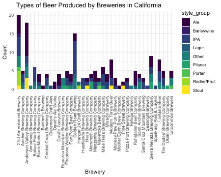<!-- --> ] --- class: custom-slide <style> .custom-slide .remark-code, .custom-slide .remark-inline-code { font-size: 10px; } </style> # ggplot - plotly interaction ### ggplotly(): Transforming a ggplot graph into an interactive plotly graph! Let's see: Here, when you hover over the graph, you will be able to see the top 3 more alchoolic ALE style produced in every US state. -- .pull-left[ ```r california_beers_percentage <- california_beers %>% group_by(brewery, style_group) %>% tally() %>% group_by(brewery) %>% mutate(percentage = round(n / sum(n) * 100, 2)) ggplot_ca_breweries_percentage <- ggplot(california_beers_percentage, aes(x = brewery, fill = style_group, text = paste(style_group, ":", percentage, "%"))) + geom_bar(aes(y = n), stat = "identity", position = "stack") + scale_fill_viridis_d() + theme_minimal() + labs(title = "Types of Beer Produced by Breweries in California", x = "Brewery", y = "Count") + theme(axis.text.x = element_text(angle = 90, hjust = 1, vjust = 0.5)) p_plotly_ca_breweries <- ggplotly(ggplot_ca_breweries_percentage, tooltip = "text") ``` ] .pull-right[ <div class="plotly html-widget html-fill-item-overflow-hidden html-fill-item" id="htmlwidget-4876969a10c7c690e393" style="width:522px;height:432px;"></div> <script type="application/json" data-for="htmlwidget-4876969a10c7c690e393">{"x":{"data":[{"orientation":"v","width":[0.89999999999999991,0.90000000000000013,0.90000000000000036,0.90000000000000036,0.90000000000000036,0.89999999999999947,0.89999999999999858,0.89999999999999858,0.89999999999999858,0.89999999999999858,0.89999999999999858,0.89999999999999858,0.89999999999999858,0.89999999999999858,0.89999999999999858,0.89999999999999858,0.89999999999999858,0.89999999999999858,0.89999999999999858,0.89999999999999858,0.89999999999999858,0.89999999999999858,0.89999999999999858,0.89999999999999858,0.90000000000000213,0.90000000000000568,0.90000000000000568,0.90000000000000568,0.90000000000000568],"base":[15,4,9,2,0,3,0,1,3,2,13,2,3,2,2,4,2,3,1,0,1,2,1,3,2,6,5,3,3],"x":[1,2,3,6,7,8,10,11,13,14,15,18,19,20,21,22,23,24,25,26,27,28,30,31,32,34,36,37,39],"y":[5,1,9,2,1,1,2,3,2,2,2,1,1,3,1,2,2,5,2,1,1,1,4,1,1,3,3,2,2],"text":["Ale : 25 %","Ale : 20 %","Ale : 50 %","Ale : 50 %","Ale : 100 %","Ale : 25 %","Ale : 100 %","Ale : 75 %","Ale : 40 %","Ale : 50 %","Ale : 13.33 %","Ale : 33.33 %","Ale : 25 %","Ale : 60 %","Ale : 33.33 %","Ale : 33.33 %","Ale : 50 %","Ale : 62.5 %","Ale : 66.67 %","Ale : 100 %","Ale : 50 %","Ale : 33.33 %","Ale : 80 %","Ale : 25 %","Ale : 33.33 %","Ale : 33.33 %","Ale : 37.5 %","Ale : 40 %","Ale : 40 %"],"type":"bar","textposition":"none","marker":{"autocolorscale":false,"color":"rgba(68,1,84,1)","line":{"width":1.8897637795275593,"color":"transparent"}},"name":"Ale","legendgroup":"Ale","showlegend":true,"xaxis":"x","yaxis":"y","hoverinfo":"text","frame":null},{"orientation":"v","width":0.89999999999999991,"base":14,"x":[1],"y":[1],"text":"Barleywine : 5 %","type":"bar","textposition":"none","marker":{"autocolorscale":false,"color":"rgba(71,45,123,1)","line":{"width":1.8897637795275593,"color":"transparent"}},"name":"Barleywine","legendgroup":"Barleywine","showlegend":true,"xaxis":"x","yaxis":"y","hoverinfo":"text","frame":null},{"orientation":"v","width":[0.89999999999999991,0.90000000000000013,0.90000000000000036,0.90000000000000036,0.90000000000000036,0.89999999999999947,0.89999999999999858,0.89999999999999858,0.89999999999999858,0.89999999999999858,0.89999999999999858,0.89999999999999858,0.89999999999999858,0.89999999999999858,0.89999999999999858,0.89999999999999858,0.89999999999999858,0.89999999999999858,0.89999999999999858,0.89999999999999858,0.89999999999999858,0.90000000000000213,0.90000000000000568,0.90000000000000568,0.90000000000000568,0.90000000000000568,0.90000000000000568],"base":[9,2,7,2,1,1,0,0,1,1,4,1,1,2,0,1,0,1,0,0,2,0,0,4,0,2,1],"x":[1,2,3,5,6,8,9,11,13,14,15,17,18,19,20,22,23,24,25,28,31,32,33,34,35,36,37],"y":[5,2,2,4,1,2,1,1,2,1,9,2,1,1,2,3,2,2,1,2,1,2,1,2,1,3,2],"text":["IPA : 25 %","IPA : 40 %","IPA : 11.11 %","IPA : 66.67 %","IPA : 25 %","IPA : 50 %","IPA : 100 %","IPA : 25 %","IPA : 40 %","IPA : 25 %","IPA : 60 %","IPA : 66.67 %","IPA : 33.33 %","IPA : 25 %","IPA : 40 %","IPA : 50 %","IPA : 50 %","IPA : 25 %","IPA : 33.33 %","IPA : 66.67 %","IPA : 25 %","IPA : 66.67 %","IPA : 100 %","IPA : 22.22 %","IPA : 100 %","IPA : 37.5 %","IPA : 40 %"],"type":"bar","textposition":"none","marker":{"autocolorscale":false,"color":"rgba(59,82,139,1)","line":{"width":1.8897637795275593,"color":"transparent"}},"name":"IPA","legendgroup":"IPA","showlegend":true,"xaxis":"x","yaxis":"y","hoverinfo":"text","frame":null},{"orientation":"v","width":[0.90000000000000013,0.90000000000000036,0.90000000000000036,0.89999999999999858,0.89999999999999858,0.89999999999999858,0.89999999999999858],"base":[1,6,1,3,1,0,0],"x":[2,3,5,15,16,17,30],"y":[1,1,1,1,1,1,1],"text":["Lager : 20 %","Lager : 5.56 %","Lager : 16.67 %","Lager : 6.67 %","Lager : 50 %","Lager : 33.33 %","Lager : 20 %"],"type":"bar","textposition":"none","marker":{"autocolorscale":false,"color":"rgba(44,114,142,1)","line":{"width":1.8897637795275593,"color":"transparent"}},"name":"Lager","legendgroup":"Lager","showlegend":true,"xaxis":"x","yaxis":"y","hoverinfo":"text","frame":null},{"orientation":"v","width":[0.89999999999999991,0.90000000000000013,0.90000000000000036,0.90000000000000036,0.90000000000000036,0.90000000000000036,0.89999999999999947,0.89999999999999858,0.89999999999999858,0.89999999999999858,0.89999999999999858,0.89999999999999858,0.89999999999999858,0.89999999999999858,0.90000000000000568,0.90000000000000568,0.90000000000000568,0.90000000000000568],"base":[6,0,3,0,0,0,0,1,0,0,1,0,0,0,2,0,0,1],"x":[1,2,3,4,5,6,8,12,14,15,21,22,29,31,34,36,37,39],"y":[3,1,3,1,1,1,1,2,1,3,1,1,1,2,2,2,1,2],"text":["Other : 15 %","Other : 20 %","Other : 16.67 %","Other : 100 %","Other : 16.67 %","Other : 25 %","Other : 25 %","Other : 66.67 %","Other : 25 %","Other : 20 %","Other : 33.33 %","Other : 16.67 %","Other : 100 %","Other : 50 %","Other : 22.22 %","Other : 25 %","Other : 20 %","Other : 40 %"],"type":"bar","textposition":"none","marker":{"autocolorscale":false,"color":"rgba(33,144,140,1)","line":{"width":1.8897637795275593,"color":"transparent"}},"name":"Other","legendgroup":"Other","showlegend":true,"xaxis":"x","yaxis":"y","hoverinfo":"text","frame":null},{"orientation":"v","width":[0.89999999999999858,0.89999999999999858,0.89999999999999858,0.90000000000000568,0.90000000000000568],"base":[0,0,0,0,0],"x":[12,13,19,34,38],"y":[1,1,2,2,1],"text":["Pilsner : 33.33 %","Pilsner : 20 %","Pilsner : 50 %","Pilsner : 22.22 %","Pilsner : 100 %"],"type":"bar","textposition":"none","marker":{"autocolorscale":false,"color":"rgba(39,173,129,1)","line":{"width":1.8897637795275593,"color":"transparent"}},"name":"Pilsner","legendgroup":"Pilsner","showlegend":true,"xaxis":"x","yaxis":"y","hoverinfo":"text","frame":null},{"orientation":"v","width":[0.89999999999999991,0.89999999999999858,0.90000000000000568],"base":[5,0,0],"x":[1,21,39],"y":[1,1,1],"text":["Porter : 5 %","Porter : 33.33 %","Porter : 20 %"],"type":"bar","textposition":"none","marker":{"autocolorscale":false,"color":"rgba(93,200,99,1)","line":{"width":1.8897637795275593,"color":"transparent"}},"name":"Porter","legendgroup":"Porter","showlegend":true,"xaxis":"x","yaxis":"y","hoverinfo":"text","frame":null},{"orientation":"v","width":[0.89999999999999991,0.89999999999999858],"base":[1,0],"x":[1,16],"y":[4,1],"text":["Radler/Fruit : 20 %","Radler/Fruit : 50 %"],"type":"bar","textposition":"none","marker":{"autocolorscale":false,"color":"rgba(170,220,50,1)","line":{"width":1.8897637795275593,"color":"transparent"}},"name":"Radler/Fruit","legendgroup":"Radler/Fruit","showlegend":true,"xaxis":"x","yaxis":"y","hoverinfo":"text","frame":null},{"orientation":"v","width":[0.89999999999999991,0.90000000000000036,0.89999999999999858,0.89999999999999858,0.89999999999999858],"base":[0,0,0,0,0],"x":[1,3,18,24,27],"y":[1,3,1,1,1],"text":["Stout : 5 %","Stout : 16.67 %","Stout : 33.33 %","Stout : 12.5 %","Stout : 50 %"],"type":"bar","textposition":"none","marker":{"autocolorscale":false,"color":"rgba(253,231,37,1)","line":{"width":1.8897637795275593,"color":"transparent"}},"name":"Stout","legendgroup":"Stout","showlegend":true,"xaxis":"x","yaxis":"y","hoverinfo":"text","frame":null}],"layout":{"margin":{"t":40.840182648401829,"r":7.3059360730593621,"b":218.44748858447494,"l":37.260273972602747},"font":{"color":"rgba(0,0,0,1)","family":"","size":14.611872146118724},"title":{"text":"Types of Beer Produced by Breweries in California","font":{"color":"rgba(0,0,0,1)","family":"","size":17.534246575342468},"x":0,"xref":"paper"},"xaxis":{"domain":[0,1],"automargin":true,"type":"linear","autorange":false,"range":[0.40000000000000002,39.600000000000001],"tickmode":"array","ticktext":["21st Amendment Brewery","Anchor Brewing Company","Anderson Valley Brewing Company","Armstrong Brewing Company","Ballast Point Brewing Company","Black Market Brewing Company","Butcher's Brewing","Central Coast Brewing Company","Claremont Craft Ales","David's Ale Works","Devil's Canyon Brewery","Figueroa Mountain Brewing Company","Firestone Walker Brewing Company","Fort Point Beer Company","Golden Road Brewing","Hangar 24 Craft Brewery","Headlands Brewing Company","Hess Brewing Company","Mammoth Brewing Company","Manzanita Brewing Company","Mavericks Beer Company","Mike Hess Brewing Company","Mission Brewery","Modern Times Beer","Monkey Paw Pub & Brewery","Mother Earth Brew Company","Pine Street Brewery","Pizza Port Brewing Company","Refuge Brewery","Ruhstaller Beer Company","Saint Archer Brewery","Santa Cruz Mountain Brewing","Seabright Brewery","Sierra Nevada Brewing Company","Speakasy Ales & Lagers","TailGate Beer","The Dudes' Brewing Company","Ukiah Brewing Company","Uncommon Brewers"],"tickvals":[1,2,3.0000000000000004,4,5,6.0000000000000009,6.9999999999999991,7.9999999999999991,9,10,11,12.000000000000002,13,13.999999999999998,15,16,17,18,19,20,21,21.999999999999996,23,24,25,26,27,28,29,30,31.000000000000004,32,33,34,35,36,37,38,39],"categoryorder":"array","categoryarray":["21st Amendment Brewery","Anchor Brewing Company","Anderson Valley Brewing Company","Armstrong Brewing Company","Ballast Point Brewing Company","Black Market Brewing Company","Butcher's Brewing","Central Coast Brewing Company","Claremont Craft Ales","David's Ale Works","Devil's Canyon Brewery","Figueroa Mountain Brewing Company","Firestone Walker Brewing Company","Fort Point Beer Company","Golden Road Brewing","Hangar 24 Craft Brewery","Headlands Brewing Company","Hess Brewing Company","Mammoth Brewing Company","Manzanita Brewing Company","Mavericks Beer Company","Mike Hess Brewing Company","Mission Brewery","Modern Times Beer","Monkey Paw Pub & Brewery","Mother Earth Brew Company","Pine Street Brewery","Pizza Port Brewing Company","Refuge Brewery","Ruhstaller Beer Company","Saint Archer Brewery","Santa Cruz Mountain Brewing","Seabright Brewery","Sierra Nevada Brewing Company","Speakasy Ales & Lagers","TailGate Beer","The Dudes' Brewing Company","Ukiah Brewing Company","Uncommon Brewers"],"nticks":null,"ticks":"","tickcolor":null,"ticklen":3.6529680365296811,"tickwidth":0,"showticklabels":true,"tickfont":{"color":"rgba(77,77,77,1)","family":"","size":11.68949771689498},"tickangle":-90,"showline":false,"linecolor":null,"linewidth":0,"showgrid":true,"gridcolor":"rgba(235,235,235,1)","gridwidth":0.66417600664176002,"zeroline":false,"anchor":"y","title":{"text":"Brewery","font":{"color":"rgba(0,0,0,1)","family":"","size":14.611872146118724}},"hoverformat":".2f"},"yaxis":{"domain":[0,1],"automargin":true,"type":"linear","autorange":false,"range":[-1,21],"tickmode":"array","ticktext":["0","5","10","15","20"],"tickvals":[0,5,10,15,20],"categoryorder":"array","categoryarray":["0","5","10","15","20"],"nticks":null,"ticks":"","tickcolor":null,"ticklen":3.6529680365296811,"tickwidth":0,"showticklabels":true,"tickfont":{"color":"rgba(77,77,77,1)","family":"","size":11.68949771689498},"tickangle":-0,"showline":false,"linecolor":null,"linewidth":0,"showgrid":true,"gridcolor":"rgba(235,235,235,1)","gridwidth":0.66417600664176002,"zeroline":false,"anchor":"x","title":{"text":"Count","font":{"color":"rgba(0,0,0,1)","family":"","size":14.611872146118724}},"hoverformat":".2f"},"shapes":[{"type":"rect","fillcolor":null,"line":{"color":null,"width":0,"linetype":[]},"yref":"paper","xref":"paper","x0":0,"x1":1,"y0":0,"y1":1}],"showlegend":true,"legend":{"bgcolor":null,"bordercolor":null,"borderwidth":0,"font":{"color":"rgba(0,0,0,1)","family":"","size":11.68949771689498},"title":{"text":"style_group","font":{"color":"rgba(0,0,0,1)","family":"","size":14.611872146118724}}},"hovermode":"closest","barmode":"relative"},"config":{"doubleClick":"reset","modeBarButtonsToAdd":["hoverclosest","hovercompare"],"showSendToCloud":false},"source":"A","attrs":{"179e9adede66":{"x":{},"fill":{},"text":{},"y":{},"type":"bar"}},"cur_data":"179e9adede66","visdat":{"179e9adede66":["function (y) ","x"]},"highlight":{"on":"plotly_click","persistent":false,"dynamic":false,"selectize":false,"opacityDim":0.20000000000000001,"selected":{"opacity":1},"debounce":0},"shinyEvents":["plotly_hover","plotly_click","plotly_selected","plotly_relayout","plotly_brushed","plotly_brushing","plotly_clickannotation","plotly_doubleclick","plotly_deselect","plotly_afterplot","plotly_sunburstclick"],"base_url":"https://plot.ly"},"evals":[],"jsHooks":[]}</script> ] --- # Finally, Dash! <br> <div style="text-align:center;"> <img src="https://raw.githack.com/intro-to-data-science-23-workshop/10-plotlydash-coppola-shejwal-chen/main/others/plotly-dash-meme.jpg", width="600" height="500"/> </div> --- # Finally, Dash! ### What is Dash? A web application framework for R (and Python and other programming languages) that allows creating interactive, web-based data dashboards (indeed), turning your interactive plots into full-blown web applications. -- ### Key features -- - **HTML layout**: Design your dashboard layout using simple HTML components, without having to write any actual HTML. Indeed, it structure dashboard components using a set of pre-defined HTML tags within R. -- - Interactivity through **callbacks**: callbacks define interactive behavior by specifying how input changes should modify output components. Essentially, when changing a dropdown or move a slider, a callback updates a chart, text, or any other component in real-time. -- - **Integration with Plotly** visualizations: Plotly charts can be easily included in Dash, making them part of an interactive dashboard where each component can talk to others. --- # Plotly-Dash! ### Some visualization examples. A cool, non-trivial, yet not too complex, visualization that encapsulate the power of Dash: <br> Let's create a dash with a map of the public toilets in Berlin using the [Berlin Public Toilet Data](https://www.kaggle.com/datasets/ryanjt/berlin-public-toilets-location/) 🚽. Each included toilet has data for its: * Location: `Latitude`, `Longitude`, `PostalCode` mutated to `District` * Cost: mutated to "Free" or "Paid" * Services available: handicap accessible, changing table, etc. We will: 1. "Plot" the toilets to a location-based Plotly **Scatter Map** 2. Add **input component** to filter by cost and services and an *output component* 3. Use **callbacks** to connect the inputs to the map (as output) 4. Design the **layout** and run the Dash App! --- class: custom-slide <style> .custom-slide .remark-code, .custom-slide .remark-inline-code { font-size: 12px; } </style> # Plotly-Dash ### Step 1: Scatter Map We will first create a Plotly [`scattermapbox`](https://plotly.com/r/scattermapbox/) using the location variables of the Toilets dataset. Important to note: * In the `mapbox` layout options, specify `style = 'open-street-map'` to use the free [OpenStreetMap](https://www.openstreetmap.org/) map layer, instead of the pay-for-tokens [Mapbox](https://www.mapbox.com/). .pull-left[ ```r map = toilets |> filter(District != "NA") |> plot_ly(lat = ~Latitude, lon = ~Longitude, type = "scattermapbox", split = ~District, size = 5, hoverinfo = "text+name", hovertext = ~Street) |> layout( title = "Berlin public toilets", mapbox = list( style = 'open-street-map', zoom = 9, center = list(lat = ~median(Latitude), lon = ~median(Longitude))) ) ``` ] .pull-right[ <div align="center"> <br> <div class="plotly html-widget html-fill-item-overflow-hidden html-fill-item" id="htmlwidget-cf76a2594faac80a0aad" style="width:522px;height:432px;"></div> <script type="application/json" data-for="htmlwidget-cf76a2594faac80a0aad">{"x":{"visdat":{"179e91a17a1b1":["function () ","plotlyVisDat"]},"cur_data":"179e91a17a1b1","attrs":{"179e91a17a1b1":{"lat":{},"lon":{},"hoverinfo":"text+name","hovertext":{},"size":5,"split":{},"alpha_stroke":1,"sizes":[10,100],"spans":[1,20],"type":"scattermapbox"}},"layout":{"margin":{"b":40,"l":60,"t":25,"r":10},"title":"Berlin public toilets","mapbox":{"style":"open-street-map","zoom":9,"center":{"lat":52.501111000000002,"lon":13.389212795000001}},"hovermode":"closest","showlegend":true},"source":"A","config":{"modeBarButtonsToAdd":["hoverclosest","hovercompare"],"showSendToCloud":false},"data":[{"lat":[52.507880499999999,52.516147840000002,52.495297970000003,52.472562809999999,52.486476949999997,52.525505000000003,52.457269510000003,52.56813889,52.494013819999999,52.501480690000001,52.505251999999999,52.47900696,52.497141310000004,52.512951360000002,52.515597450000001,52.512195650000002,52.510622849999997,52.465685299999997,52.488485109999999,52.49690682,52.530201580000004,52.505142669999998,52.496747229999997,52.512991,52.515619999999998,52.512180100000002,52.510646180000002,52.51746,52.525527779999997,52.503333329999997,52.514222220000001,52.513611109999999,52.509678999999998,52.537847220000003,52.493104000000002,52.482880000000002,52.510166669999997,52.514882499999999,52.498240000000003,52.487212,52.475975550000001],"lon":[13.306683,13.260150429999999,13.299396639999999,13.327931769999999,13.32748453,13.240857,13.32143252,13.256555560000001,13.325056379999999,13.31733472,13.322725,13.32828671,13.322390009999999,13.24342558,13.244353719999999,13.24082699,13.23682913,13.32615964,13.33795722,13.34515858,13.30119545,13.30150375,13.32997355,13.2435201,13.244590000000001,13.240781,13.23694025,13.24938,13.30438889,13.330861110000001,13.24402778,13.23063889,13.272577,13.269888890000001,13.310916000000001,13.326416999999999,13.306736109999999,13.24907803,13.285584,13.310067999999999,13.335153699999999],"hoverinfo":["text+name","text+name","text+name","text+name","text+name","text+name","text+name","text+name","text+name","text+name","text+name","text+name","text+name","text+name","text+name","text+name","text+name","text+name","text+name","text+name","text+name","text+name","text+name","text+name","text+name","text+name","text+name","text+name","text+name","text+name","text+name","text+name","text+name","text+name","text+name","text+name","text+name","text+name","text+name","text+name","text+name"],"hovertext":["Pestalozzistr. 77 (0-24 Uhr)","Preußenallee (0-24 Uhr)","Hochmeisterplatz, Westfälische Str. ggü. 70 (0-24 Uhr)","Bundesallee, Friedrich-Wilhelm-Platz 4 (0-24 Uhr)","Badensche Str. 29 (0-24 Uhr)","Hempelsteig hinter 1A (0-24 Uhr)","Schloßstr. ggü. 33-35 (0-24 Uhr)","Zufahrt Insel Reiswerder (0-24 Uhr)","Hohenzollernplatz, Hohenzollerndamm 199 (0-24 Uhr)","George-Grosz-Platz, Kurfürstendamm 50 (0-24 Uhr)","Savignyplatz 1 (0-24 Uhr)","Bundesallee, Bundesplatz 6 (0-24 Uhr)","Ludwigkirchplatz 12 (0-24 Uhr)","Trakehner Allee vor ggü. 3 (0-24 Uhr)","Olympischer Platz 6 (0-24 Uhr)","Trakehner Allee hinter ggü. 7 (0-24 Uhr)","Jesse-Owens-Allee vor ggü. 2 (0-24 Uhr)","Büsingstr. ggü. 2 (0-24 Uhr)","Stübbenstr. (0-24 Uhr)","Motzstr. ggü. 41 (0-24 Uhr)","Bhf. Jungfernheide, Lambertstr. (0-24 Uhr)","Stuttgarter Platz ggü. 15 (0-24 Uhr)","Meierottostr. ggü. 8 (0-24 Uhr)","Trakehner Allee vor ggü. 3 (bei Veranst.)","Olympischer Platz 6 (bei Veranst.)","Trakehner Allee hinter ggü. 7 (bei Veranst.)","Jesse-Owens-Allee vor ggü. 2 (bei Veranst.)","Rossitter Platz (bei Veranst.)","Mierendorffplatz (7-22 Uhr)","Joachimsthaler Platz, Kurfürstendamm 226 (7-22 Uhr)","Olympiastadion, Gutsmuthsweg (bei Veranst.)","Waldbühne/Maifeld, Passenheimer Str. (bei Veranst.)","Theodor-Heuss-Platz ggü. 4-6 (7-22 Uhr)","Jugendplatz , Jugendweg (0-24 Uhr)","Preußenpark , Brandenburgische Str. (7-22 Uhr)","Volkspark Wilmersdorf , Am Volkspark (7-22 Uhr)","Schillerstr. (0-24 Uhr)","Friedhof Heerstraße (an der Friedhofskapelle)","Friedhof Grunewald","Friedhof Wilmersdorf","Pächter der Gewerbeeinheit - (Perelsplatz 1, 12159 Berlin) während der Öffnungszeiten"],"type":"scattermapbox","mode":"markers","name":"Charlottenburg-Wilmersdorf","marker":{"color":"rgba(31,119,180,1)","size":[55,55,55,55,55,55,55,55,55,55,55,55,55,55,55,55,55,55,55,55,55,55,55,55,55,55,55,55,55,55,55,55,55,55,55,55,55,55,55,55,55],"sizemode":"area","line":{"color":"rgba(31,119,180,1)"}},"textfont":{"size":55},"line":{"color":"rgba(31,119,180,1)","width":55},"frame":null},{"lat":[52.516093499999997,52.504581109999997,52.504114289999997,52.527115649999999,52.519955349999996,52.51314661,52.492744049999999,52.495670259999997,52.490533999999997,52.495058069999999,52.523508569999997,52.511477370000001,52.507619740000003,52.507900040000003,52.501269000000001,52.510697159999999,52.487631499999999,52.511446169999999,52.511231539999997,52.49996024,52.497951280000002,52.502683070000003,52.498992770000001,52.502596410000002,52.503070000000001,52.492845989999999,52.497389839999997,52.492037920000001,52.529263710000002,52.495200769999997,52.489356819999998,52.502595939999999,52.506666080000002,52.497195179999999,52.499099289999997,52.522068699999998,52.503376590000002,52.494913670000003,52.49176611,52.496718549999997,52.496669769999997,52.490020960000003,52.515673530000001,52.489493590000002,52.500842059999997,52.484454409999998,52.487499999999997,52.488527779999998,52.479300000000002,52.482570379999999,52.486669229999997,52.480362759999998,52.527729999999998,52.502630000000003,52.498269999999998,52.503100000000003,52.496290000000002,52.495019999999997,52.479399999999998,52.481699999999996],"lon":[13.442779310000001,13.465584160000001,13.391282800000001,13.427393370000001,13.461089940000001,13.476976179999999,13.408565899999999,13.41983203,13.398054,13.43915689,13.432985629999999,13.434557290000001,13.450631570000001,13.46391551,13.391234000000001,13.46065563,13.425297990000001,13.447336160000001,13.469024279999999,13.43031102,13.391325699999999,13.4568589,13.44302543,13.41511058,13.424531,13.43181837,13.393030380000001,13.478488410000001,13.443544259999999,13.441503239999999,13.37759975,13.377877549999999,13.402625280000001,13.437705490000001,13.43216788,13.44995016,13.446962490000001,13.41512985,13.4206793,13.40675338,13.449498180000001,13.480901490000001,13.472649349999999,13.40735842,13.443493670000001,13.41713616,13.37786111,13.390902779999999,13.40874,13.41657562,13.408313700000001,13.40845809,13.43486,13.415139999999999,13.44417,13.42465,13.373060000000001,13.376899999999999,13.40995,13.40423],"hoverinfo":["text+name","text+name","text+name","text+name","text+name","text+name","text+name","text+name","text+name","text+name","text+name","text+name","text+name","text+name","text+name","text+name","text+name","text+name","text+name","text+name","text+name","text+name","text+name","text+name","text+name","text+name","text+name","text+name","text+name","text+name","text+name","text+name","text+name","text+name","text+name","text+name","text+name","text+name","text+name","text+name","text+name","text+name","text+name","text+name","text+name","text+name","text+name","text+name","text+name","text+name","text+name","text+name","text+name","text+name","text+name","text+name","text+name","text+name","text+name","text+name"],"hovertext":["Weberwiese, Marchlewskistr. ggü. 16 (0-24 Uhr)","Simplonstr. (0-24 Uhr)","Besselpark, Besselstr. (0-24 Uhr)","Am Märchenbrunnen, Friedenstr. ggü. 4 (0-24 Uhr)","Forckenbeckplatz, Eldenaer Str. ggü. 44-45 (0-24 Uhr)","Gürtelstr. (0-24 Uhr)","Urbanstr. 21 (0-24 Uhr)","Planufer (0-24 Uhr)","Gneisenaustr. 39 (0-24 Uhr)","Görlitzer Park, Wiener Str. 59A (0-24 Uhr)","Platz der Vereinten Nationen, Landsberger Allee (0-24 Uhr)","Erich-Steinfurth-Str. (0-24 Uhr)","Warschauer Str. ggü. 33 (0-24 Uhr)","Wühlischplatz, Wühlischstr. ggü. 11 (0-24 Uhr)","Friedrichstr. ggü. 10-11 (0-24 Uhr)","Boxhagener Platz, Gärtnerstr. ggü. 12-13 (0-24 Uhr)","Hermannplatz 9 (0-24 Uhr)","Comeniusplatz, Torellstr. ggü. 1 (0-24 Uhr)","Traveplatz, Weichselstr. ggü. 13-14 (0-24 Uhr)","Skalitzer Str. ggü. 6 (0-24 Uhr)","Hallesches Ufer (0-24 Uhr)","Rudolfplatz, Modersohnstr. ggü. 53-55 (0-24 Uhr)","Falckensteinstr. hinter 38 (0-24 Uhr)","Oranienplatz ggü. 1 (0-24 Uhr)","Mariannenplatz 2-3 (0-24 Uhr)","Paul-Lincke-Ufer ggü. 16 (0-24 Uhr)","Waterloo-Ufer (0-24 Uhr)","Alt-Stralau, Tunnelstr. ggü. 48-48C (0-24 Uhr)","Volkspark Friedrichshain, Neuer Hain (0-24 Uhr)","Görlitzer Park (0-24 Uhr)","Viktoriapark, Kreuzbergstr. ggü. 31 (0-24 Uhr)","Schöneberger Str. ggü. 21A-22 (0-24 Uhr)","Waldeckpark, Alte Jakobstr. ggü. 110 (0-24 Uhr)","Görlitzer Park, Zugang (0-24 Uhr)","Görlitzer Park, Zugang (0-24 Uhr)","Petersburger Platz, Straßmannstr. ggü. 21 (0-24 Uhr)","Warschauer Str. hinter 47-48 (0-24 Uhr)","Admiralbrücke, Planufer (0-24 Uhr)","Schönleinstr. ggü. 8 (0-24 Uhr)","Böcklerpark, Prinzenstr. 1 (0-24 Uhr)","Lohmühleninsel, Lohmühlenstr. (0-24 Uhr)","Alt-Stralau, Tunnelstr. hinter 12 (0-24 Uhr)","Schleidenplatz, Waldeyerstr. ggü. 5 (0-24 Uhr)","Südstern (0-24 Uhr)","Oberbaumstr. vor 11 (0-24 Uhr)","Volkspark Hasenheide (0-24 Uhr)","Viktoriapark (0-24 Uhr)","Chamissoplatz 1 (0-24 Uhr)","Tempelhofer Feld","Hasenheide - Hasenschänke","Friedhof Lilienthalstraße - Lilienthalstraße 7","Friedhof Columbiadamm - Columbiadamm 122","Volkspark Friedrichshain | Neuer Hain","Oranienplatz","Cuvrystraße","Mariannenplatz","Park am Gleisdreieck","Park am Gleisdreieck","Tempelhofer Feld","Tempelhofer Feld"],"type":"scattermapbox","mode":"markers","name":"Friedrichshain-Kreuzberg","marker":{"color":"rgba(255,127,14,1)","size":[55,55,55,55,55,55,55,55,55,55,55,55,55,55,55,55,55,55,55,55,55,55,55,55,55,55,55,55,55,55,55,55,55,55,55,55,55,55,55,55,55,55,55,55,55,55,55,55,55,55,55,55,55,55,55,55,55,55,55,55],"sizemode":"area","line":{"color":"rgba(255,127,14,1)"}},"textfont":{"size":55},"line":{"color":"rgba(255,127,14,1)","width":55},"frame":null},{"lat":[52.531008210000003,52.481325150000004,52.533595290000001,52.524394989999998,52.497458389999998,52.483268950000003,52.518999600000001,52.52733508,52.492378559999999,52.529491190000002],"lon":[13.470695020000001,13.52601743,13.437107989999999,13.465529439999999,13.52272917,13.52979487,13.47958581,13.480592850000001,13.507572740000001,13.477011859999999],"hoverinfo":["text+name","text+name","text+name","text+name","text+name","text+name","text+name","text+name","text+name","text+name"],"hovertext":["Landsberger Allee (0-24 Uhr)","S-Bhf. Karlshorst, Stolzenfelsstr. (0-24 Uhr)","Arnswalder Platz, Bötzowstr. ggü. 51 (0-24 Uhr)","Storkower Str. 207A (0-24 Uhr)","Am Tierpark 72 (0-24 Uhr)","Rheinsteinpark, Königswinterstr. ggü. 7 (0-24 Uhr)","Möllendorffstr. (0-24 Uhr)","Roederplatz (0-24 Uhr)","Dolgenseestr. ggü. 9 E (0-24 Uhr)","Fennpfuhlpark"],"type":"scattermapbox","mode":"markers","name":"Lichtenberg","marker":{"color":"rgba(44,160,44,1)","size":[55,55,55,55,55,55,55,55,55,55],"sizemode":"area","line":{"color":"rgba(44,160,44,1)"}},"textfont":{"size":55},"line":{"color":"rgba(44,160,44,1)","width":55},"frame":null},{"lat":[52.570099370000001,52.544367000000001,52.51342021,52.505939480000002,52.527968389999998,52.500953000000003,52.479300719999998,52.54851987,52.530617919999997],"lon":[13.56583554,13.549245000000001,13.554917809999999,13.560908319999999,13.538030129999999,13.54735,13.55957132,13.570166990000001,13.58944035],"hoverinfo":["text+name","text+name","text+name","text+name","text+name","text+name","text+name","text+name","text+name"],"hovertext":["Ahrensfelder Platz (0-24 Uhr)","Marzahner Promenade (Fußgängerzone) 30-33 (0-24 Uhr)","S-Bhf. Biesdorf, Wuhlgartenweg (0-24 Uhr)","Elsterwerdaer Platz 1-3 (0-24 Uhr)","Helene-Weigel-Platz 4 (0-24 Uhr)","Debenzer Str. ggü. 36 (0-24 Uhr)","Köpenicker Str. 259 A (0-24 Uhr)","Schönagelstr. (0-24 Uhr)","Kienbergpark"],"type":"scattermapbox","mode":"markers","name":"Marzahn-Hellersdorf","marker":{"color":"rgba(214,39,40,1)","size":[55,55,55,55,55,55,55,55,55],"sizemode":"area","line":{"color":"rgba(214,39,40,1)"}},"textfont":{"size":55},"line":{"color":"rgba(214,39,40,1)","width":55},"frame":null},{"lat":[52.560541720000003,52.544748370000001,52.514166670000002,52.541611140000001,52.556048650000001,52.512707710000001,52.511666900000002,52.550382849999998,52.531947709999997,52.526093090000003,52.528957570000003,52.52199959,52.519467329999998,52.547004299999998,52.555436999999998,52.55703982,52.539777780000001,52.556111289999997,52.541423950000002,52.544878160000003,52.533029669999998,52.508265819999998,52.537156770000003,52.55932318,52.546270900000003,52.552640879999998,52.556372539999998,52.516609189999997,52.521462999999997,52.51847222,52.539902779999998,52.546722219999999,52.532444439999999,52.513759999999998,52.51849,52.552720000000001,52.547890000000002,52.544010620000002,52.548920000000003],"lon":[13.34675975,13.390513410000001,13.391500000000001,13.3699105,13.38398658,13.413572569999999,13.4007839,13.35159522,13.403088690000001,13.34809497,13.37816284,13.40042936,13.39989808,13.3586066,13.355936460000001,13.3722522,13.395277780000001,13.3483289,13.399024649999999,13.3685794,13.40105178,13.413904329999999,13.365743500000001,13.38363977,13.35229855,13.336537209999999,13.393609809999999,13.38126945,13.412953999999999,13.40641667,13.353249999999999,13.32997222,13.41288889,13.38045,13.40631,13.33705,13.36125,13.401141040000001,13.35924],"hoverinfo":["text+name","text+name","text+name","text+name","text+name","text+name","text+name","text+name","text+name","text+name","text+name","text+name","text+name","text+name","text+name","text+name","text+name","text+name","text+name","text+name","text+name","text+name","text+name","text+name","text+name","text+name","text+name","text+name","text+name","text+name","text+name","text+name","text+name","text+name","text+name","text+name","text+name","text+name","text+name"],"hovertext":["Dubliner Str. (0-24 Uhr)","Humboldthain, Gustav-Meyer-Allee (0-24 Uhr)","Charlottenstr. ggü. 53-54 (0-24 Uhr)","Reinickendorfer Str. 9 (0-24 Uhr)","Osloer Str. 18 (0-24 Uhr)","Köllnischer Park, Rungestr. 31 (0-24 Uhr)","Leipziger Straße Spittelmarkt (0-24 Uhr)","Seestr. 94 (0-24 Uhr)","Park am Weinbergsweg, Weinbergsweg (0-24 Uhr)","Turmstr. ggü. 20a-21 (0-24 Uhr)","Invalidenstr. ggü. 44 (0-24 Uhr)","Burgstr. (James-Simon-Park) ggü. 28 (0-24 Uhr)","Museumsinsel, Am Lustgarten (0-24 Uhr)","Leopoldplatz, Müllerstr. ggü. 150 (0-24 Uhr)","Ungarnstr. ggü. 58 (0-24 Uhr)","Osloer Str. (0-24 Uhr)","Stralsunder Str. (Fußgängerzone) 61 (0-24 Uhr)","Edinburger Str. 38 (0-24 Uhr)","Swinemünder Str. 34 (0-24 Uhr)","Nettelbeckplatz, Gerichtstr. 31 (0-24 Uhr)","Weinbergspark, Veteranenstr. ggü. 22 (0-24 Uhr)","Heinrich-Heine-Str. 16 (0-24 Uhr)","Sellerpark, Sellerstr. (0-24 Uhr)","Soldiner Str. 77 (0-24 Uhr)","Ostender Str. ggü. 12 (0-24 Uhr)","Afrikanische Str. ggü. 92 (0-24 Uhr)","Grüntaler Str. 41 (0-24 Uhr)","Unter den Linden 76 (0-24 Uhr)","Alexanderplatz 1 (7-22 Uhr)","Rathausstr. ggü. 17 (10-18 Uhr)","Pekinger Platz , Nordufer (0-24 Uhr)","Dohnagestell (0-24 Uhr)","Senefelderplatz , Metzer Str. (0-24 Uhr)","Am Denkmal für die ermordeten Juden Europas (Hannah-Arendt-Straße | Ecke Cora-Berliner-Straße) ","Rotes Rathaus","Volkspark Rehberge, Eingang Afrikanische Straße | Ottawi Straße I Dohnagestell","Leopoldplatz (Schulstraße | Turiner Straße)","Mauerpark(Erweiterung)","Ehemaliger Garnisonfriedhof | Müllerstraße "],"type":"scattermapbox","mode":"markers","name":"Mitte-Wedding","marker":{"color":"rgba(148,103,189,1)","size":[55,55,55,55,55,55,55,55,55,55,55,55,55,55,55,55,55,55,55,55,55,55,55,55,55,55,55,55,55,55,55,55,55,55,55,55,55,55,55],"sizemode":"area","line":{"color":"rgba(148,103,189,1)"}},"textfont":{"size":55},"line":{"color":"rgba(148,103,189,1)","width":55},"frame":null},{"lat":[52.615670610000002,52.535583350000003,52.550676750000001,52.553755250000002,52.541483220000003,52.607144529999999,52.617635,52.548166000000002,52.635655579999998,52.552614849999998,52.543052670000002,52.548641279999998,52.54586698,52.542899740000003,52.546765030000003,52.555574389999997,52.557196949999998],"lon":[13.47119826,13.417025000000001,13.413432289999999,13.41329416,13.438222680000001,13.42056481,13.48851,13.45123671,13.494606449999999,13.46625556,13.411940570000001,13.42089017,13.427324949999999,13.418659760000001,13.40542608,13.458743849999999,13.465894369999999],"hoverinfo":["text+name","text+name","text+name","text+name","text+name","text+name","text+name","text+name","text+name","text+name","text+name","text+name","text+name","text+name","text+name","text+name","text+name"],"hovertext":["Hubertusdamm ggü. 7 (0-24 Uhr)","Kollwitzplatz, Kollwitzstr. ggü. 56A (0-24 Uhr)","Schivelbeiner Str. 1 (0-24 Uhr)","Bornholmer Str. 94 (0-24 Uhr)","Grellstr. 39 (0-24 Uhr)","Hugenottenplatz, Schweizer Tal ggü. 48 (0-24 Uhr)","Achillesstr. ggü. 59 (0-24 Uhr)","Antonplatz, Berliner Allee 34 (0-24 Uhr)","Wiltbergstr. 19 (0-24 Uhr)","Berliner Allee ggü. 160 (0-24 Uhr)","Schönhauser Allee hinter 137 (0-24 Uhr)","Wichertstr. 21 (0-24 Uhr)","Wichertstr. 43 (0-24 Uhr)","Helmholtzplatz, Raumerstr. ggü. 9 (0-24 Uhr)","Am Falkplatz ggü. 5 (0-24 Uhr)","Am Weißen See, Parkstr. ggü. 80 (0-24 Uhr)","Rennbahnstr. ggü. 1-2 (0-24 Uhr)"],"type":"scattermapbox","mode":"markers","name":"Pankow","marker":{"color":"rgba(140,86,75,1)","size":[55,55,55,55,55,55,55,55,55,55,55,55,55,55,55,55,55],"sizemode":"area","line":{"color":"rgba(140,86,75,1)"}},"textfont":{"size":55},"line":{"color":"rgba(140,86,75,1)","width":55},"frame":null},{"lat":[52.58809291,52.597545080000003,52.58985277,52.589097559999999,52.563298160000002,52.563453019999997,52.599665180000002,52.592675249999999,52.563630420000003,52.564166669999999,52.590696999999999,52.57077778,52.576000000000001,52.585388889999997,52.569609999999997,52.563092079999997],"lon":[13.28855267,13.332336229999999,13.282788460000001,13.27259722,13.37090504,13.358622820000001,13.353790070000001,13.26915398,13.36483612,13.363805559999999,13.283026,13.285527780000001,13.24322222,13.25380556,13.283609999999999,13.364982769999999],"hoverinfo":["text+name","text+name","text+name","text+name","text+name","text+name","text+name","text+name","text+name","text+name","text+name","text+name","text+name","text+name","text+name","text+name"],"hovertext":["Buddeplatz (S-Bhf. Tegel), Buddestr. ggü. 12 (0-24 Uhr)","Göschenplatz, Oranienburger Str. 184-185 (0-24 Uhr)","Alt-Tegel 1-3 (0-24 Uhr)","Greenwichpromenade (0-24 Uhr)","Letteplatz, Letteallee ggü. 46 (0-24 Uhr)","Schäfersee, Am Schäfersee (0-24 Uhr)","Senftenberger Ring (0-24 Uhr)","Freizeitpark Tegel an der Malche, Campestr. hinter 11 (0-24 Uhr)","Franz-Neumann-Platz, Pankower Allee ggü. 1 (0-24 Uhr)","Schäfersee , Am Schäfersee ggü. 1 (7-22 Uhr)","Berliner Str. 105-106 (0-24 Uhr)","Flughafensee Tegel , Schwarzer Weg (0-24 Uhr)","Schwarzer Weg (0-24 Uhr)","Schwarzer Weg 71 (0-24 Uhr)","Flughafensee Tegel (Bernauer/Sterkraderstr.)","Franz-Neumann-Platz"],"type":"scattermapbox","mode":"markers","name":"Reinickendorf","marker":{"color":"rgba(227,119,194,1)","size":[55,55,55,55,55,55,55,55,55,55,55,55,55,55,55,55],"sizemode":"area","line":{"color":"rgba(227,119,194,1)"}},"textfont":{"size":55},"line":{"color":"rgba(227,119,194,1)","width":55},"frame":null},{"lat":[52.536254190000001,52.544472220000003,52.561666670000001],"lon":[13.294020339999999,13.238277780000001,13.246527779999999],"hoverinfo":["text+name","text+name","text+name"],"hovertext":["Kurt-Schumacher-Damm (0-24 Uhr)","Haselhorster Damm 23 (0-24 Uhr)","Im Saatwinkel (0-24 Uhr)"],"type":"scattermapbox","mode":"markers","name":"Spandau","marker":{"color":"rgba(127,127,127,1)","size":[55,55,55],"sizemode":"area","line":{"color":"rgba(127,127,127,1)"}},"textfont":{"size":55},"line":{"color":"rgba(127,127,127,1)","width":55},"frame":null},{"lat":[52.45358117,52.442342869999997,52.430962000000001,52.427695999999997,52.451008510000001,52.438957639999998,52.430901890000001,52.45855306,52.41756857,52.450683589999997,52.432159730000002,52.435233670000002,52.448933400000001,52.450907180000002,52.442666670000001,52.421472219999998,52.454583329999998,52.434805560000001,52.429388889999998,52.432416670000002,52.440440000000002,52.413632929999999,52.423442510000001,52.458623230000001],"lon":[13.24057481,13.24017109,13.259629,13.326157,13.33620516,13.343115239999999,13.30931569,13.349105720000001,13.30486876,13.34281826,13.347763130000001,13.274649650000001,13.25176639,13.269614779999999,13.31208333,13.17622222,13.189888890000001,13.165055560000001,13.129416669999999,13.14322222,13.21491,13.14164789,13.29633709,13.34214946],"hoverinfo":["text+name","text+name","text+name","text+name","text+name","text+name","text+name","text+name","text+name","text+name","text+name","text+name","text+name","text+name","text+name","text+name","text+name","text+name","text+name","text+name","text+name","text+name","text+name","text+name"],"hovertext":["Krumme Lanke, Quermatenweg (0-24 Uhr)","Argentinische Allee (0-24 Uhr)","S-Bhf. Zehlendorf, Teltower Damm 37-39 (0-24 Uhr)","Brauerstr. ggü. 1 (0-24 Uhr)","Steglitzer Damm ggü. 3 (0-24 Uhr)","Leonorenstr. ggü. 67 (0-24 Uhr)","Goerzallee 1-3 (0-24 Uhr)","Munsterdamm (0-24 Uhr)","Ostpreußendamm 83 (0-24 Uhr)","Steglitzer Damm vor 39/39a (0-24 Uhr)","Mühlenstr. ggü. 65 (0-24 Uhr)","Sundgauer Str. 109 (0-24 Uhr)","Onkel-Tom-Str. 95 (0-24 Uhr)","Argentinische Allee hinter 253 (0-24 Uhr)","Moltkestr. (0-24 Uhr)","Wannsee , Rönnebypromenade (07-22 Uhr)","Havelchaussee (0-24 Uhr)","Heckeshorn , Uferweg (0-24 Uhr)","Uferpromenade (0-24 Uhr)","Uferpromenade (0-24 Uhr)","Pfaueninselchaussee Rettungsstation Jagen 97","Friedenstr. 8-10, 14109 Berlin","Thuner Platz 2-4 (Friedhof), 12205 Berlin","Bergstr. 38 (Friedhof), 12169 Berlin"],"type":"scattermapbox","mode":"markers","name":"Steglitz-Zehlendorf","marker":{"color":"rgba(188,189,34,1)","size":[55,55,55,55,55,55,55,55,55,55,55,55,55,55,55,55,55,55,55,55,55,55,55,55],"sizemode":"area","line":{"color":"rgba(188,189,34,1)"}},"textfont":{"size":55},"line":{"color":"rgba(188,189,34,1)","width":55},"frame":null},{"lat":[52.459607640000002,52.481146000000003,52.44015873,52.484325159999997,52.484240319999998,52.49385169,52.413498439999998,52.387778779999998,52.439752310000003,52.455911389999997,52.42251984,52.478675580000001,52.494878,52.386517849999997,52.444383190000003,52.470272999999999,52.480497,52.492757949999998,52.449873599999997,52.49715432,52.462518719999998,52.487954260000002,52.396914510000002,52.482408190000001,52.463965000000002,52.496170999999997,52.491318919999998,52.438695000000003,52.484798900000001,52.463987979999999,52.466001470000002,52.46244695,52.394338449999999,52.471299999999999],"lon":[13.366474159999999,13.363288000000001,13.387912180000001,13.352811880000001,13.386832419999999,13.366914120000001,13.36315439,13.41016173,13.39209928,13.37599736,13.371097750000001,13.343471279999999,13.353622189999999,13.39849866,13.385666390000001,13.385392,13.336930000000001,13.3690377,13.36653677,13.36693678,13.41822526,13.3453017,13.396124609999999,13.34670603,13.377623,13.355022999999999,13.36586194,13.386907000000001,13.3440247,13.378241340000001,13.385260990000001,13.38600654,13.405554110000001,13.38677],"hoverinfo":["text+name","text+name","text+name","text+name","text+name","text+name","text+name","text+name","text+name","text+name","text+name","text+name","text+name","text+name","text+name","text+name","text+name","text+name","text+name","text+name","text+name","text+name","text+name","text+name","text+name","text+name","text+name","text+name","text+name","text+name","text+name","text+name","text+name","text+name"],"hovertext":["Friedhof Eythstr., Eythst. 1-25 (7-19 Uhr)","Leuthener Platz , Naumannstr. (0-24 Uhr)","Alt-Mariendorf 33 (0-24 Uhr)","Hauptstr. 128 (0-24 Uhr)","Platz der Luftbrücke, Tempelhofer Damm (0-24 Uhr)","Bülowstr. ggü. 49 (0-24 Uhr)","Marienfelder Allee 144-146 (0-24 Uhr)","Im Domstift (0-24 Uhr)","Am Heidefriedhof, Reißeckstr. 14 (0-24 Uhr)","Attilaplatz, Attilastr. ggü. 176 (0-24 Uhr)","Hranitzkistr. (0-24 Uhr)","Innsbrucker Platz (0-24 Uhr)","Winterfeldtplatz, Hohenstaufenstr. 1 (0-24 Uhr)","Briesingstr. ggü. 1 (0-24 Uhr)","Mariendorfer Damm 90 (0-24 Uhr)","S-u. U-Bhf. Tempelhof, Tempelhofer Damm 108 (0-24 Uhr)","Hans-Rosenthal-Platz , Kufsteiner Str. (0-24 Uhr)","Max.-Kraft-Platz, Katzlerstr. ggü. 20 (0-24 Uhr)","Röblingstr. 161 (0-24 Uhr)","Dennewitzplatz, Dennewitzstr. ggü. 22 (0-24 Uhr)","Holzmannstr. ggü. 23 (0-24 Uhr)","Wartburgplatz, Martin-Luther-Str. (0-24 Uhr)","Barnetstr. ggü. 54 (0-24 Uhr)","Dominicusstr. 16-18 (0-24 Uhr)","Bosepark, Manteuffelstr. ggü. 9 (0-24 Uhr)","Winterfeldtplatz, Gleditschstr. vor 5 (0-24 Uhr)","Crellemarkt, Großgörschenstr. ggü. 31 (0-24 Uhr)","Friedenstr. (0-24 Uhr)","Rathaus Schöneberg, John-F.-Kennedy-Platz","BDG Manteuffelstraße 63 12103 Berlin","Pächter der Gewerbeeinheit - (Alt-Tempelhof 21, 12103 Berlin) während der Öffnungszeiten","Rathaus Tempelhof, Tempelhofer Damm 165","Gemeinschaftshaus Lichtenrade Barnetstraße 11, 12305 Berlin","Tempelhofer Feld"],"type":"scattermapbox","mode":"markers","name":"Tempelhof-Schöneberg","marker":{"color":"rgba(23,190,207,1)","size":[55,55,55,55,55,55,55,55,55,55,55,55,55,55,55,55,55,55,55,55,55,55,55,55,55,55,55,55,55,55,55,55,55,55],"sizemode":"area","line":{"color":"rgba(23,190,207,1)"}},"textfont":{"size":55},"line":{"color":"rgba(23,190,207,1)","width":55},"frame":null},{"lat":[52.474071899999998,52.453691169999999,52.458846870000002,52.434429999999999,52.47758451,52.470312499999999,52.479913349999997,52.478802000000002,52.467862109999999,52.473989179999997,52.446494970000003,52.473714139999998,52.48886023,52.466167660000004,52.433990199999997,52.445326180000002,52.482874000000002,52.471555559999999,52.443179999999998,52.445753420000003,52.444095830000002,52.446696969999998,52.406628949999998,52.47681,52.470190000000002],"lon":[13.445384880000001,13.509342719999999,13.580219120000001,13.539260000000001,13.421999250000001,13.46431748,13.428412099999999,13.438141,13.431458320000001,13.44937242,13.562840080000001,13.438905760000001,13.43904128,13.43685584,13.52014861,13.57381067,13.438238999999999,13.441388890000001,13.54731,13.5748506,13.57494932,13.584514909999999,13.675072350000001,13.41755,13.41766],"hoverinfo":["text+name","text+name","text+name","text+name","text+name","text+name","text+name","text+name","text+name","text+name","text+name","text+name","text+name","text+name","text+name","text+name","text+name","text+name","text+name","text+name","text+name","text+name","text+name","text+name","text+name"],"hovertext":["Richardplatz 17 (0-24 Uhr)","Sterndamm 8-10 (0-24 Uhr)","S-Bhf. Köpenick, Stellingdamm ggü. 1 (0-24 Uhr)","Rudower Chaussee 1-3 (0-24 Uhr)","Schillerpromenade 37 (0-24 Uhr)","Sonnenallee 262 (0-24 Uhr)","Boddinplatz, Mainzer Str. (0-24 Uhr)","Alfred-Scholz-Platz, Richardstr. 1 (0-24 Uhr)","Siegfriedstr. ggü. 23 (0-24 Uhr)","Böhmischer Platz, Böhmische Str. ggü. 45 (0-24 Uhr)","Ottomar-Geschke-Str. ggü. 49 (0-24 Uhr)","Thomashöhe, Thomasstr. ggü. 11-15 (0-24 Uhr)","Weichselstr. ggü. 34 (0-24 Uhr)","Kranoldplatz, Bendastr. (0-24 Uhr)","Hermann-Dorner-Allee (0-24 Uhr)","Alt-Köpenick vor 32 (0-24 Uhr)","Elbestr. 39 (7-22 Uhr)","Kirchhofstr. (0-24 Uhr)","Friedhof Adlershof, Friedlander Straße 156, 12489 Berlin","Rathaus Alt - Köpenick 21,12555 Berlin","Müggelheimer Str. 1, 12555 Berlin","Mittelpunktsbibliothek Alter Markt 2, 12555 Berlin","Friedhof Müggelheim, Gosener Landstraße 1 / Im Jagen 127, 12559 Berlin","Tempelhofer Feld","Tempelhofer Feld"],"type":"scattermapbox","mode":"markers","name":"Treptow-Köpenick","marker":{"color":"rgba(31,119,180,1)","size":[55,55,55,55,55,55,55,55,55,55,55,55,55,55,55,55,55,55,55,55,55,55,55,55,55],"sizemode":"area","line":{"color":"rgba(31,119,180,1)"}},"textfont":{"size":55},"line":{"color":"rgba(31,119,180,1)","width":55},"frame":null}],"highlight":{"on":"plotly_click","persistent":false,"dynamic":false,"selectize":false,"opacityDim":0.20000000000000001,"selected":{"opacity":1},"debounce":0},"shinyEvents":["plotly_hover","plotly_click","plotly_selected","plotly_relayout","plotly_brushed","plotly_brushing","plotly_clickannotation","plotly_doubleclick","plotly_deselect","plotly_afterplot","plotly_sunburstclick"],"base_url":"https://plot.ly"},"evals":[],"jsHooks":[]}</script> </div> ] --- class: custom-slide <style> .custom-slide .remark-code, .custom-slide .remark-inline-code { font-size: 14px; } </style> # Plotly-Dash ### Step 2: Input and Output Components Let's create our first [Dash Core Components](https://dash.plotly.com/r/dash-core-components) to interact with our Plotly scatter map! * Input: a `dccChecklist` to filter among free and paid toilets * Output: just a placeholder `dccGraph` that can hold any Plotly figure .pull-left[ ```r #Input: dccChecklist (interactive) price_options <- c(unique(toilets$Free)) price_filter <- dccChecklist( id = 'price-filter', options = price_options, value = price_options #default, choose all ) ``` ] .pull-right[ ```r #Output: dccGraph (Plotly figures) toilets_map <- dccGraph(id = 'toilets-map') ``` ] --- class: custom-slide <style> .custom-slide .remark-code, .custom-slide .remark-inline-code { font-size: 12px; } </style> # Plotly-Dash ### Step 3: Callbacks Dash interaction is driven by [callbacks](https://dash.plotly.com/r/basic-callbacks) which require input and output component(s), and a callback function that links them. .pull-left[ ```r app |> add_callback( output('toilets-map', 'figure'), input('price-filter', 'value'), function(price_input) { toilets_filtered <- toilets |> filter(Free %in% price_input) fig = toilets_filtered |> filter(District != "NA") |> plot_ly(lat = ~Latitude, lon = ~Longitude, type = "scattermapbox", split = ~District, size = 5, hoverinfo = "text+name", hovertext = ~Street) |> layout( title = "Berlin public toilets", mapbox = list( style = 'open-street-map', zoom = 9, center = list(lat = ~median(Latitude), lon = ~median(Longitude))) ) return(fig) #not needed but just to be explicit } ) ``` ] .pull-right[ <br> ◀️ 1. Specify the interactive `input`, `output` components<br> ◀️ 2. Write a function that triggers on any `input` change<br> ◀️ 3. Filter the dataset based on `price_input`<br><br><br> ◀️ 4. Call the same Plotly `scattermapbox`<br> <br><br><br><br><br><br> ◀️ 5. Return the output figure to fill in the placeholder `dccGraph` from step #2 ] --- class: custom-slide <style> .custom-slide .remark-code, .custom-slide .remark-inline-code { font-size: 14px; } </style> # Plotly-Dash ### Step 4: Layout and Run Now we put it alll together for the App display [layout](https://dash.plotly.com/r/layout) using standard HTML components, and finally run the App to your browser. .pull-left[ ```r layout_elements <- list( h1("IDS Workshop - Plotly-Dash presentation"), div("Using the Berlin Public Toilets dataset to learn Scatter Map functionality."), br(), div("Cost filter:"), price_filter, br(), toilets_map ) #4 Main app app |> set_layout(layout_elements) app |> run_app() ``` ] .pull-right[ 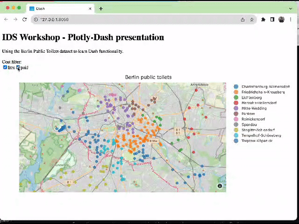 ] --- class: inverse, center, middle, custom-hr name: thank you # Thank you! <style type="text/css"> .custom-hr hr { border-color: #EB811B; width: 1000px; margin: auto; border-width: 1px 0 0 0; } </style> p.s. this is how public toilets in Berlin look like... <img src="https://raw.githack.com/intro-to-data-science-23-workshop/10-plotlydash-coppola-shejwal-chen/main/others/toilet.png" alt="How actually public toilet looks like in Berlin" width="500" style="display:block; margin:auto;"> <br> Now... interactive tutorial! You find the .Rmd file in the repository. Download it and open it in your R Studio, so that you can follow us directly and complete the exercises we prepared for you directly there! <br>