---
title: "Plotting in .mono[R]"
subtitle: "EC 425/525, Lab 5"
author: "Edward Rubin"
date: "`r format(Sys.time(), '%d %B %Y')`"
output:
xaringan::moon_reader:
css: ['default', 'metropolis', 'metropolis-fonts', 'my-css.css']
# self_contained: true
nature:
highlightStyle: github
highlightLines: true
countIncrementalSlides: false
---
class: inverse, middle
```{R, setup, include = F}
# devtools::install_github("dill/emoGG")
library(pacman)
p_load(
broom, tidyverse,
latex2exp, ggplot2, ggthemes, ggforce, viridis, extrafont, gridExtra,
kableExtra, snakecase, janitor,
data.table, dplyr, estimatr,
lubridate, knitr, parallel,
lfe,
here, magrittr
)
# Define pink color
red_pink <- "#e64173"
turquoise <- "#20B2AA"
orange <- "#FFA500"
red <- "#fb6107"
blue <- "#3b3b9a"
green <- "#8bb174"
grey_light <- "grey70"
grey_mid <- "grey50"
grey_dark <- "grey20"
purple <- "#6A5ACD"
slate <- "#314f4f"
# Dark slate grey: #314f4f
# Knitr options
opts_chunk$set(
comment = "#>",
fig.align = "center",
fig.height = 7,
fig.width = 10.5,
warning = F,
message = F
)
opts_chunk$set(dev = "svg")
options(device = function(file, width, height) {
svg(tempfile(), width = width, height = height)
})
options(knitr.table.format = "html")
```
# Prologue
---
name: schedule
# Schedule
## Last time
Regession
## Today
Plotting in .mono[R] (especially `ggplot2`)
---
layout: true
# Plotting
---
name: plotting
class: inverse, middle
---
name: plot
## The default option: `plot()`
While we'll quickly move on to other options, .mono[R]'s `plot()` function (in the default `graphics` package) is a great tool for basic data exploration—it's fast, simple, and flexible.
--
In fact, `plot()` is a generic function, that works for many classes.
--
.hi-slate[General arguments] for `plot()`:
- `x` and `y` for coordinates
- `type =` {`"p"`oints, `"l"`ines, *etc.*} .it[.grey-light[(optional)]]
- `xlab`, `ylab`, `main`, and `sub` for axis labels and (sub)title .it[.grey-light[(optional)]]
- `col` and `pch` for color and plot character .it[.grey-light[(optional)]]
- `lty` and `lwd` for line type, and line width .it[.grey-light[(optional)]]
---
layout: false
class: clear, middle
Let's see `plot()` in action.
```{R, ex-plot0}
# Define two vectors
a <- seq(from = 0, to = 2*pi, by = 0.2)
b <- sin(a)
```
---
layout: true
class: clear, middle
---
name: ex-plot
```{R, ex-plot1}
plot(x = a, y = b)
```
---
```{R, ex-plot2}
plot(x = a, y = b, xlab = "x", ylab = "sin(x)")
```
---
```{R, ex-plot3}
plot(x = a, y = b, xlab = "x", ylab = "sin(x)", col = "blue")
```
---
```{R, ex-plot4}
plot(x = a, y = b, xlab = "x", ylab = "sin(x)", col = "blue", type = "l")
```
---
```{R, ex-plot5}
plot(x = a, y = b, xlab = "x", ylab = "sin(x)", col = "blue", type = "b")
```
---
```{R, ex-plot6}
plot(x = a, y = b, xlab = "x", ylab = "sin(x)", col = "blue", type = "s")
```
---
name: multiple
`plot()` is essentially calling `points()` or `lines()`.
You can layer plots by using these individual functions.
---
```{R, ex-plot7}
plot(x = a, y = b, col = "blue")
```
---
```{R, ex-plot8}
plot(x = a, y = b, col = "blue"); points(x = a, y = -b, col = "orange")
```
---
`graphics` also offers a nice histogram function in `hist()`.
---
name: hist
```{R, ex-hist}
hist(x = b, breaks = 10, col = "purple", xlab = "sin(x)", main = "Wow.")
```
---
That said/done, further customization/manipulation of your graphics using `graphics` plotting functions can become quite difficult.
.note[Enter] `ggplot2`
---
layout: true
# ggplot2
---
name: ggplot2
class: inverse, middle
---
name: gg-intro
## The grammar
The `ggplot2` package offers an incredibly flexible, diverse, and powerful set of functions for creating graphics in .mono[R].
--
The `gg` stands for the *grammar of graphics*.
--
`ggplot2`
1. centers on a .hi-slate[data frame] (the `data` argument)
1. maps variables to .hi-slate[aesthetics] (the `aes` argument)
1. .hi-slate[layers geometries] to *build up* your graphic
.note[Note] The package is called `ggplot2`, but the main function is `ggplot()`.
---
name: ggplot
## `ggplot()`
Main arguments
1. .hi-pink[`data`] Your dataset. As a data frame (or `tibble`).
--
2. .hi-purple[`aes()`] Maps variables in `data` to "aesthetics" like `x`, `color`, `shape`.
--
.ex[Example] A time series of problems, `color` defined by money
```{R, gg-fake, eval = F}
library(ggplot2)
ggplot(
data = pretend_df,
aes(x = time, y = problems, color = money)
)
```
---
name: layers
## Layers
The `ggplot()` function doesn't plot anything—it *sets up* the plot.
To create the actual figure, you layer .hi-slate[geometries] (*e.g.*, `geom_point()`),
--
.hi-slate[scales] (*e.g.*, `scale_color_manual()`),
--
and other .hi-slate[options] (*e.g.*, `xlab()`).
--
You .hi-slate[add layers] using the addition sign (`+`).
--
.ex[Example] A time series of problems, `color` defined by money
```{R, gg-fake2, eval = F}
library(ggplot2)
ggplot(
data = pretend_df,
aes(x = time, y = problems, color = money)
*) +
*geom_point() + geom_line()
```
---
layout: true
class: clear, middle
---
Alright, let's build a plot.
We'll use the `economics` dataset that comes with `ggplot2`
(because economics).
---
```{R, view-economics, echo = F, eval = T}
DT::datatable(
economics,
fillContainer = FALSE,
options = list(pageLength = 8)
)
```
---
name: ex-gg
.smaller[Set up the plot.
```{R, gg0, fig.height = 5}
ggplot(data = economics, aes(x = date, y = unemploy/pop))
```
]
---
.smaller[Label the axes.
```{R, gg1, fig.height = 5}
ggplot(data = economics, aes(x = date, y = unemploy/pop)) +
ylab("Unemployment rate") + xlab("Date")
```
]
---
.smaller[Draw some points.
```{R, gg2, fig.height = 5}
ggplot(data = economics, aes(x = date, y = unemploy/pop)) +
ylab("Unemployment rate") + xlab("Date") +
geom_point()
```
]
---
.smaller[Map the `size` to the median duration of unemployment.
```{R, gg3, fig.height = 5}
ggplot(data = economics, aes(x = date, y = unemploy/pop, size = uempmed)) +
ylab("Unemployment rate") + xlab("Date") +
geom_point()
```
]
---
.smaller[Change the `shape` of the points.
```{R, gg4, fig.height = 5}
ggplot(data = economics, aes(x = date, y = unemploy/pop, size = uempmed)) +
ylab("Unemployment rate") + xlab("Date") +
geom_point(shape = 1)
```
]
---
.smaller[Map points' `color` to the median duration of unemployment.
```{R, gg5, fig.height = 5}
ggplot(data = economics, aes(x = date, y = unemploy/pop, size = uempmed)) +
ylab("Unemployment rate") + xlab("Date") +
geom_point(aes(color = uempmed))
```
]
---
.smaller[Add some transparency (`alpha`) to our points.
```{R, gg6, fig.height = 5}
ggplot(data = economics, aes(x = date, y = unemploy/pop, size = uempmed)) +
ylab("Unemployment rate") + xlab("Date") +
geom_point(aes(color = uempmed), alpha = 0.5)
```
]
---
.smaller[Same size points; all bigger.
```{R, gg7, fig.height = 5}
ggplot(data = economics, aes(x = date, y = unemploy/pop)) +
ylab("Unemployment rate") + xlab("Date") +
geom_point(aes(color = uempmed), alpha = 0.5, size = 3)
```
]
---
.smaller[Change our theme—maybe you're a minimalist (but want slightly larger fonts)?
```{R, gg8, fig.height = 5}
ggplot(data = economics, aes(x = date, y = unemploy/pop)) +
ylab("Unemployment rate") + xlab("Date") +
geom_point(aes(color = uempmed), alpha = 0.5, size = 3) +
theme_minimal(base_size = 14)
```
]
---
.smaller[Want your figure to look like Stata made it?
```{R, gg9, fig.height = 5}
ggplot(data = economics, aes(x = date, y = unemploy/pop)) +
ylab("Unemployment rate") + xlab("Date") +
geom_point(aes(color = uempmed), alpha = 0.5, size = 3) +
ggthemes::theme_stata(base_size = 14)
```
]
---
.smaller[The "pander" theme from the `ggthemes` package.
```{R, gg10, fig.height = 5}
ggplot(data = economics, aes(x = date, y = unemploy/pop)) +
ylab("Unemployment rate") + xlab("Date") +
geom_point(aes(color = uempmed), alpha = 0.5, size = 3) +
ggthemes::theme_pander(base_size = 14)
```
]
---
.smaller[Change (and label) our color scale. .note[Note] `viridis` [is the best](https://cran.r-project.org/web/packages/viridis/vignettes/intro-to-viridis.html).
```{R, gg11, fig.height = 5}
ggplot(data = economics, aes(x = date, y = unemploy/pop)) +
ylab("Unemployment rate") + xlab("Date") +
geom_point(aes(color = uempmed), alpha = 0.5, size = 3) +
ggthemes::theme_pander(base_size = 14) +
scale_color_viridis_c("Dur. unemp.")
```
]
---
.smaller[Connect the dots.
```{R, gg12, fig.height = 5}
ggplot(data = economics, aes(x = date, y = unemploy/pop)) +
ylab("Unemployment rate") + xlab("Date") +
geom_line(color = "grey80") +
geom_point(aes(color = uempmed), alpha = 0.5, size = 3) +
ggthemes::theme_pander(base_size = 14) +
scale_color_viridis_c("Dur. unemp.")
```
]
---
.smaller[How about a smoother?
```{R, gg13, fig.height = 5}
ggplot(data = economics, aes(x = date, y = unemploy/pop)) +
ylab("Unemployment rate") + xlab("Date") +
geom_point(aes(color = uempmed), alpha = 0.5, size = 3) +
geom_smooth(se = F) +
ggthemes::theme_pander(base_size = 14) +
scale_color_viridis_c("Dur. unemp.")
```
]
---
.smaller[The `group` aesthetic separates groups.
```{R, gg14, fig.height = 5}
ggplot(data = economics, aes(x = date, y = unemploy/pop, group = date < ymd(19900101))) +
ylab("Unemployment rate") + xlab("Date") +
geom_point(aes(color = uempmed), alpha = 0.5, size = 3) +
geom_smooth(se = F) +
ggthemes::theme_pander(base_size = 14) +
scale_color_viridis_c("Dur. unemp.")
```
]
---
.note[Note] The `ymd()` function comes from the `lubridate` package.
---
`ggplot2` knows histogams.
---
name: gg-hist
A histogram.
.smaller[
```{R, gg-hist1, fig.height = 5}
ggplot(data = economics, aes(x = unemploy/pop)) +
xlab("Unemployment rate") +
geom_histogram(color = "white", fill = "#e64173") +
ggthemes::theme_pander(base_size = 14)
```
]
---
Add a horizontal line where count = 0.
.smaller[
```{R, gg-hist2, fig.height = 5}
ggplot(data = economics, aes(x = unemploy/pop)) +
xlab("Unemployment rate") +
geom_histogram(color = "white", fill = "#e64173") +
geom_hline(yintercept = 0) +
ggthemes::theme_pander(base_size = 14)
```
]
---
`ggplot2` knows densities.
---
name: gg-density
A density plot.
.smaller[
```{R, gg-density1, fig.height = 5}
ggplot(data = economics, aes(x = unemploy/pop)) +
xlab("Unemployment rate") +
geom_density(color = NA, fill = "#e64173") +
geom_hline(yintercept = 0) +
ggthemes::theme_pander(base_size = 14)
```
]
---
Now with Epanechnikov kernel!
.smaller[
```{R, gg-density2, fig.height = 5}
ggplot(data = economics, aes(x = unemploy/pop)) +
xlab("Unemployment rate") +
geom_density(kernel = "epanechnikov", color = NA, fill = "#e64173") +
geom_hline(yintercept = 0) +
ggthemes::theme_pander(base_size = 14)
```
]
---
`ggplot2` itself is incredibly flexible/powerful.
But there are [even more packages](https://www.ggplot2-exts.org/gallery/) that extend its power—_e.g._, `ggthemes`, `gganimate`, `cowplot`, `ggmap`, `ggExtra`, and (of course) `viridis`.
---
name: gg-more
Gapminder meets `gganimate`
```{R, ex-gganimate, include = F, cache = T, dev = "png", eval = F}
# The package for animating ggplot2
p_load(gganimate, gapminder)
# As before
gg <- ggplot(
data = gapminder %>% filter(continent != "Oceania"),
aes(gdpPercap, lifeExp, size = pop, color = country)
) +
geom_point(alpha = 0.7, show.legend = FALSE) +
scale_colour_manual(values = country_colors) +
scale_size(range = c(2, 12)) +
scale_x_log10("GDP per capita", label = scales::comma) +
facet_wrap(~continent) +
theme_pander(base_size = 16) +
theme(panel.border = element_rect(color = "grey90", fill = NA)) +
# Here comes the gganimate-specific bits
labs(title = "Year: {frame_time}") +
ylab("Life Expectancy") +
transition_time(year) +
ease_aes("linear")
# Save the animation
anim_save(
animation = gg,
filename = "ex_gganimate.gif",
path = here(),
width = 10.5,
height = 7,
# units = "in",
# res = 150,
nframes = 56
)
```
.center[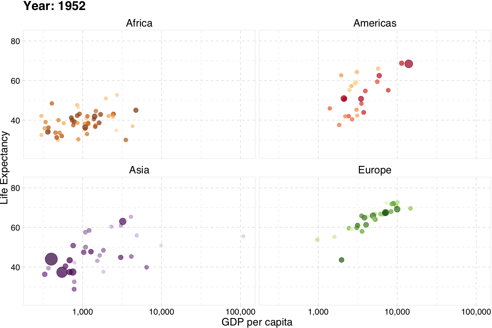]
---
US births by month since 1933
```{R, ex-new-ts, echo = F, eval = T}
# Load births data; drop totals; create time variable
birth_df <- read_csv("usa_birth_1933_2015.csv") %>%
janitor::clean_names() %>%
filter(month != "TOT") %>%
mutate(
month = as.numeric(month),
time = year + (month-1)/12
)
# Load days of months data
days_df <- read_csv("days_of_month.csv")
# Clean up days
days_lon <- gather(days_df, year, n_days, -Month)
days_lon <- janitor::clean_names(days_lon)
days_lon$year <- as.integer(days_lon$year)
# Join
birth_df <- left_join(
x = birth_df,
y = days_lon,
by = c("year", "month")
)
# Calculate 30-day equivalent births by month
birth_df %<>% mutate(
births_30day = births / n_days * 30
)
lo <- min(c(birth_df$births, birth_df$births_30day))
hi <- max(c(birth_df$births, birth_df$births_30day))
# Plot new-ish time-series graph of birth rates
# Plot newfangled time-series graph of birth rates
ggplot(data = birth_df %>% filter(year < 2050),
aes(
x = year, y = factor(month, labels = month.abb),
fill = births/1e5, color = births/1e5
)
) +
geom_tile() +
xlab("Year") +
ylab("Month") +
theme_pander(base_family = "Fira Sans Book", base_size = 20) +
scale_fill_viridis("Births (100K)", option = "magma", limits = c(lo, hi)/1e5) +
scale_color_viridis("Births (100K)", option = "magma", limits = c(lo, hi)/1e5) +
theme(
legend.position = "bottom",
legend.key.width = unit(1.5, units = "in"),
legend.key.height = unit(0.2, units = "in"),
panel.grid.major = element_blank(),
panel.grid.minor = element_blank(),
line = element_blank(),
rect = element_blank(),
axis.ticks = element_blank()
)
```
---
layout: true
# ggplot2
---
name: ggsave
## Saving plots
You can save your `ggplot2`-based figures using `ggsave()`.
---
## `ggsave()` Option 1
By default, `ggsave()` saves the last plot printed to the screen.
```{R, ex-ggsave-1, eval = F}
# Create a simple scatter plot
ggplot(data = fun_df, aes(x = x, y = y)) +
geom_point()
# Save our simple scatter plot
ggsave(filename = "simple_scatter.pdf")
```
--
.note[Notes]
- This example creates a PDF. Change to `".png"` for PNG, *etc.*
- There several helpful, optional arguments: `path`, `width`, `height`, `dpi`.
---
## `ggsave()` Option 2
You can assign your `ggplot()` objects to memory
```{R, ex-gg-assign, eval = F}
# Create a simple scatter plot named 'gg_points'
gg_points <- ggplot(data = fun_df, aes(x = x, y = y)) +
geom_point()
```
--
We can then save this figure with the name `gg_points` using `ggsave()`
```{R, ex-ggsave-2, eval = F}
# Save our simple scatter plot name 'ggsave'
ggsave(
filename = "simple_scatter.pdf",
plot = gg_points
)
```
---
layout: false
# Resources
## There's always more
`ggplot2`
1. .mono[RStudio]'s [cheat sheet for `ggplot2`](https://github.com/rstudio/cheatsheets/blob/master/data-visualization-2.1.pdf).
1. `ggplot2` [reference index](https://ggplot2.tidyverse.org/reference/index.html)
1. The `tidyverse` [page](https://ggplot2.tidyverse.org) on `ggplot2`.
1. Hadley Wickham's on [*Data visualization*](https://r4ds.had.co.nz/data-visualisation.html) in his data science book.
---
# Table of contents
.pull-left[
### Default options
.smaller[
1. [`plot()`](#plot)
- [Description](#plot)
- [Examples](#ex-plot)
- [Layering plots](#add)
1. [`hist()`](#hist)
]]
.pull-right[
### ggplot2
.smaller[
1. [`ggplot2`](#ggplot2)
- [Intro](#gg-intro)
- [`ggplot()`](#ggplot)
- [Layers](#layers)
- [Building a plot](#gg-ex)
- [Histogram](#gg-hist)
- [Density](#gg-density)
- [More](#gg-more)
- [Saving](#ggsave)
1. [More resources](#resources)
]]
---
exclude: true
```{R, generate pdfs, include = F, eval = T}
source("../../ScriptsR/unpause.R")
unpause("05RPlot.Rmd", ".", T, T)
```