Data Visualization

MKT 566 · Fall 2026

Davide Proserpio

USC Marshall School of Business

Before We Start

Recap: your toolkit

Everything in this course runs on three pieces from Tuesday’s setup guides:

  1. VS Code: the editor where everything happens
  2. An AI assistant inside it: Claude Code, Codex, Copilot, or Cursor
  3. R + the R extension: open a script, run it one line at a time with Cmd+Enter (Mac) / Ctrl+Enter (Windows); charts appear in a VS Code tab

Ready check: open a course script, press Cmd+Enter on a chart line, and a chart appears in a tab. Not there yet? Follow the VS Code + AI setup guide and Running R Code in VS Code, or bring your laptop to office hours.

Vibecoding: how you will actually write code

  • Vibecoding (Karpathy, 2025): describe what you want in plain English, let the AI write the code, run it, look at what comes out, refine, repeat
  • Most code in this class (and, increasingly, in industry) gets written this way. That changes which skills are scarce:
    • Asking precisely: “a histogram of weekly sales, 30 bins” beats “make a chart”
    • Reading results: does the chart answer the question? Is the number plausible?
    • Debugging by conversation: paste the error, ask why, ask for the fix
  • What it does not change: you own everything you submit, including the AI’s mistakes

Today builds the vocabulary this workflow needs: once you know the chart types by name and what each is for, you can ask for the right one and judge what you get back.

Reminder: every assignment includes a log of your AI use. How? Next slide.

The AI log: let the AI do the bookkeeping

  • Every assignment is submitted with an ai-log.md: a short record of how you used AI
  • You do not write it. The assistant does. Before closing each chat session, paste this as your last message:
Append a short log of this session to a file called ai-log.md in this folder:
each request I made, one line each, in order, plus anything you got wrong
that we fixed.
  • Sessions accumulate into one log per assignment; submit the file with your work
  • Timing matters: do it before the chat closes. A new chat cannot see the old conversation

Pro move: save this prompt as a reusable command in your tool (Claude Code: a skill; Codex: a custom prompt; Copilot: a prompt file), so ending a session with a log takes one keystroke. Ask your assistant how: “create a skill that appends a session log to ai-log.md when I ask for it.”

Why Visualize?

Why visualize?

“The simple graph has brought more information to the data analyst’s mind than any other device.” — John Tukey

  • Summary statistics hide as much as they reveal
  • A figure is usually the fastest way to communicate a result to a stakeholder
  • In marketing analytics, most deliverables end life as a chart in someone’s deck

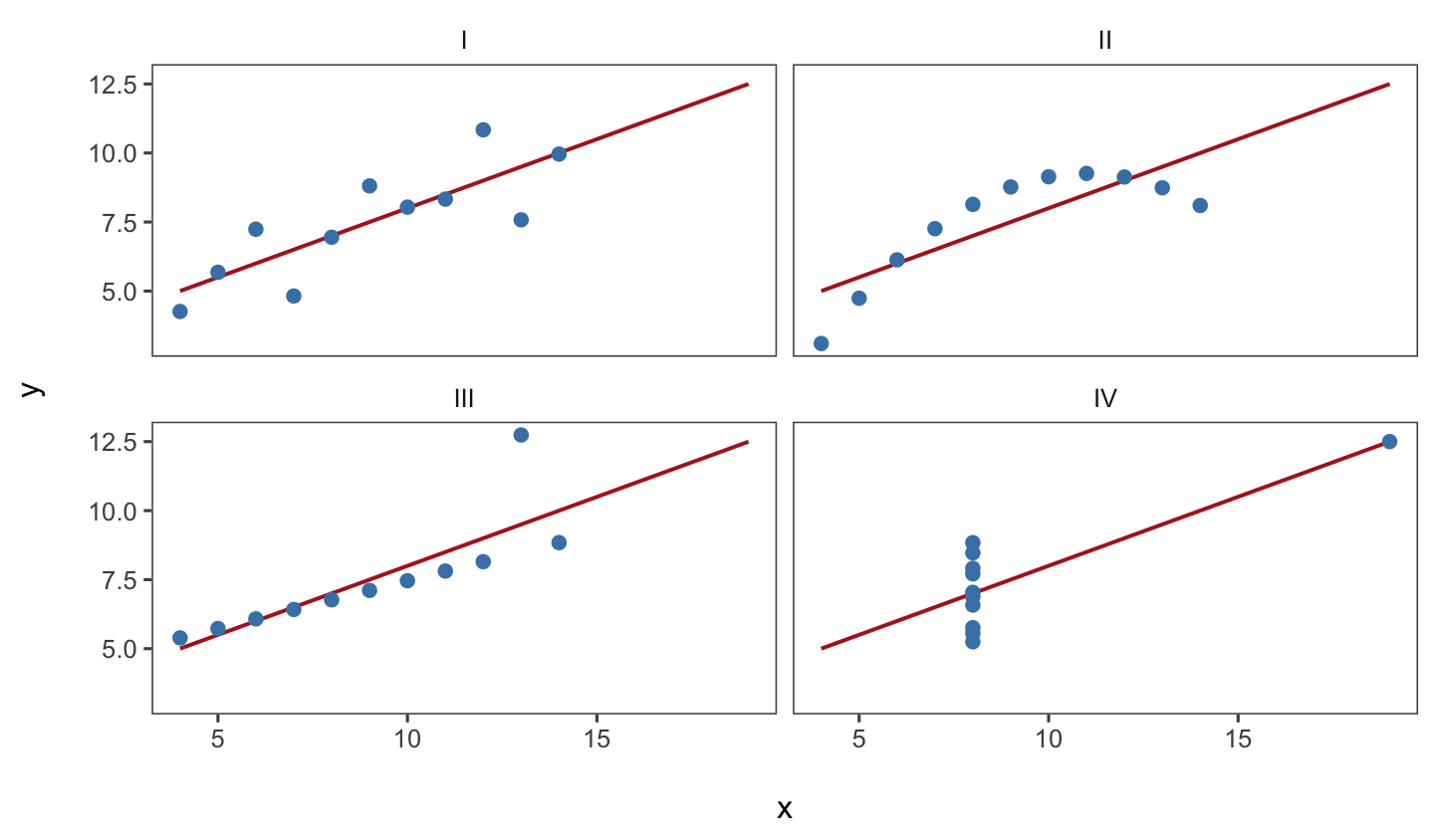
Same numbers, four different stories

All four datasets share the same means, variances, correlation (r = 0.82), and regression line (y = 3 + 0.5x). Always plot your data first.

An (almost) perfect example
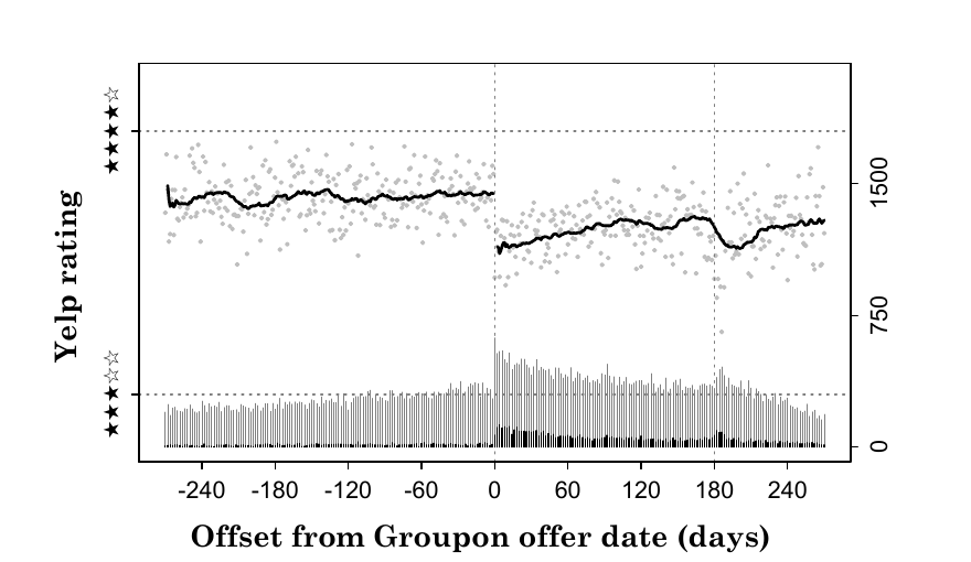
Source: The Groupon Effect on Yelp Ratings: A Root Cause Analysis (Byers, Mitzenmacher, and Zervas 2012), Figure 1a.

What we will learn

  • What types of charts exist and what they are used for
  • How to pick the best visual for different types of data
  • How to create compelling figures

We will use ggplot2, an R library for data visualization (intro to ggplot2).

Content partially based on Chapter 3 of R for Data Science.

R scripts for today

Two R scripts on the course website, in the code/ folder:

  1. w1-2-chart-types-class.R: reproduces every chart type we discuss today
  2. w1-2-data-viz-beautify.R: a simple figure beautification process

Download the whole code/ folder as a zip: w1-code.zip (it includes the datasets in data/), open the scripts in VS Code, and (try to) install the required libraries.

Chart Types

A taxonomy

Family Question it answers Charts
Category comparison & composition How do groups stack up? What makes up the total? Bar, Pareto, treemap, pie, waterfall
Trends over time How do values evolve or accumulate? Line, area, bar + line combo
Distribution & density What is the shape, spread, outliers? Histogram, density, box, violin
Relationships How do variables move together? Scatter, bubble
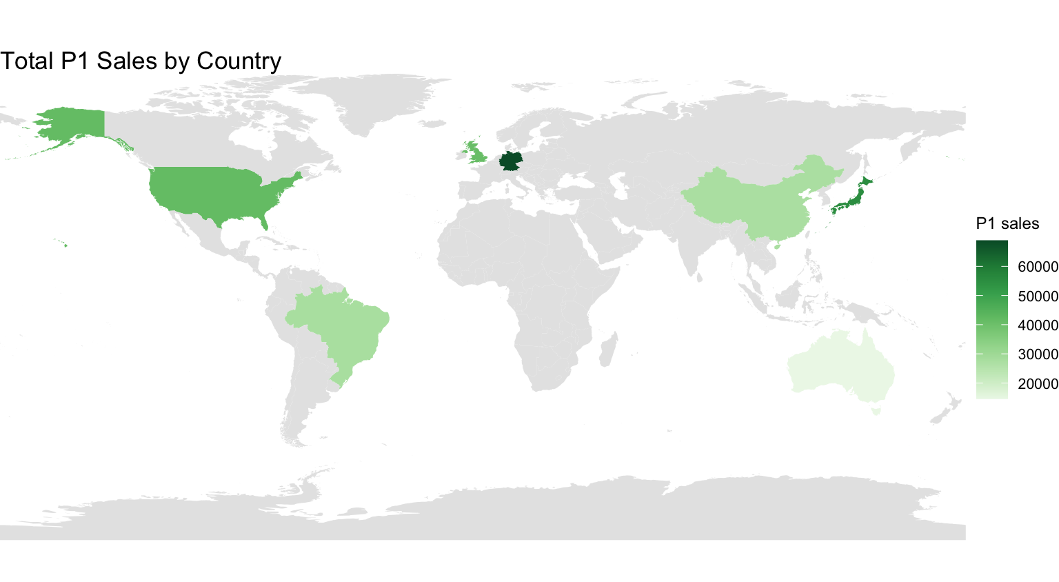
Geospatial & matrix How do values vary over space or grids? Choropleth map, heatmap

Category comparisons

Show how discrete groups or items stack up against one another.

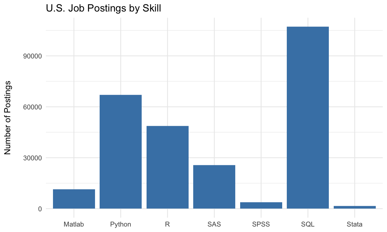
Running example: number of U.S. job postings mentioning each coding skill (data/skills-postings.csv).

  • Bar chart
  • Pareto chart (sorted bars + cumulative line)
  • Treemap
  • Pie chart
  • Waterfall chart

Bar chart

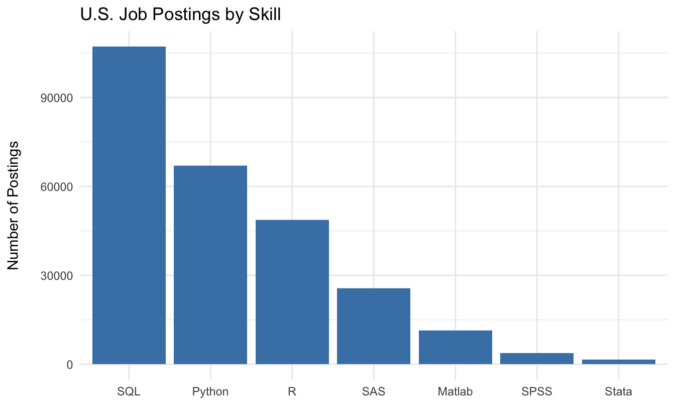
Bar chart: order your bars

Alphabetical order is by default; sorted order requires fct_reorder() in R.

Pareto chart
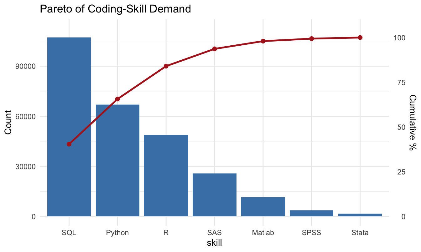
Sorted bars + cumulative share: identifies the “vital few” driving most of the total.

The 80/20 rule in marketing
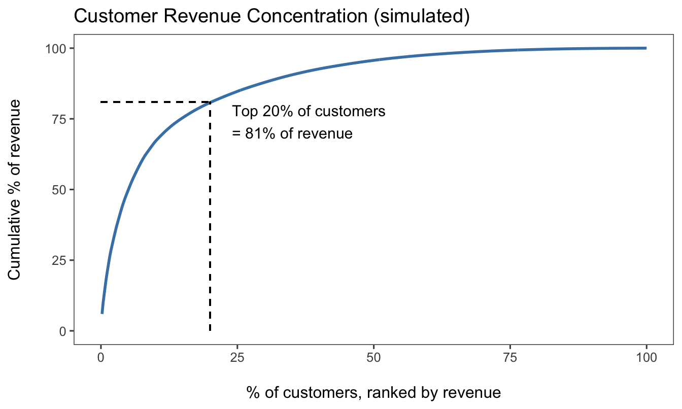
Revenue is almost always concentrated in a small share of customers. This motivates segmentation, loyalty programs, and CLV analysis (all later in this course).

Treemap
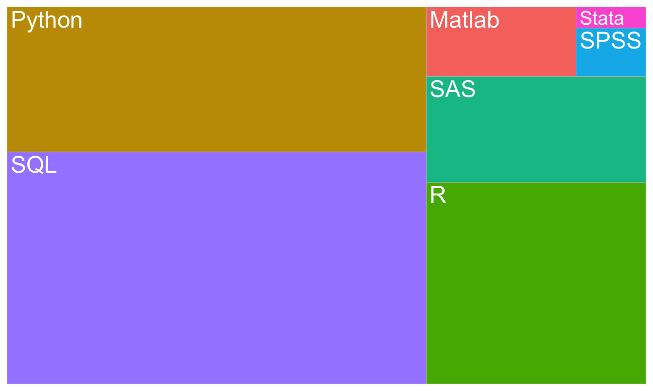
Space-filling overview: area ∝ count. Good for hierarchies (category → brand → SKU).

Pie chart
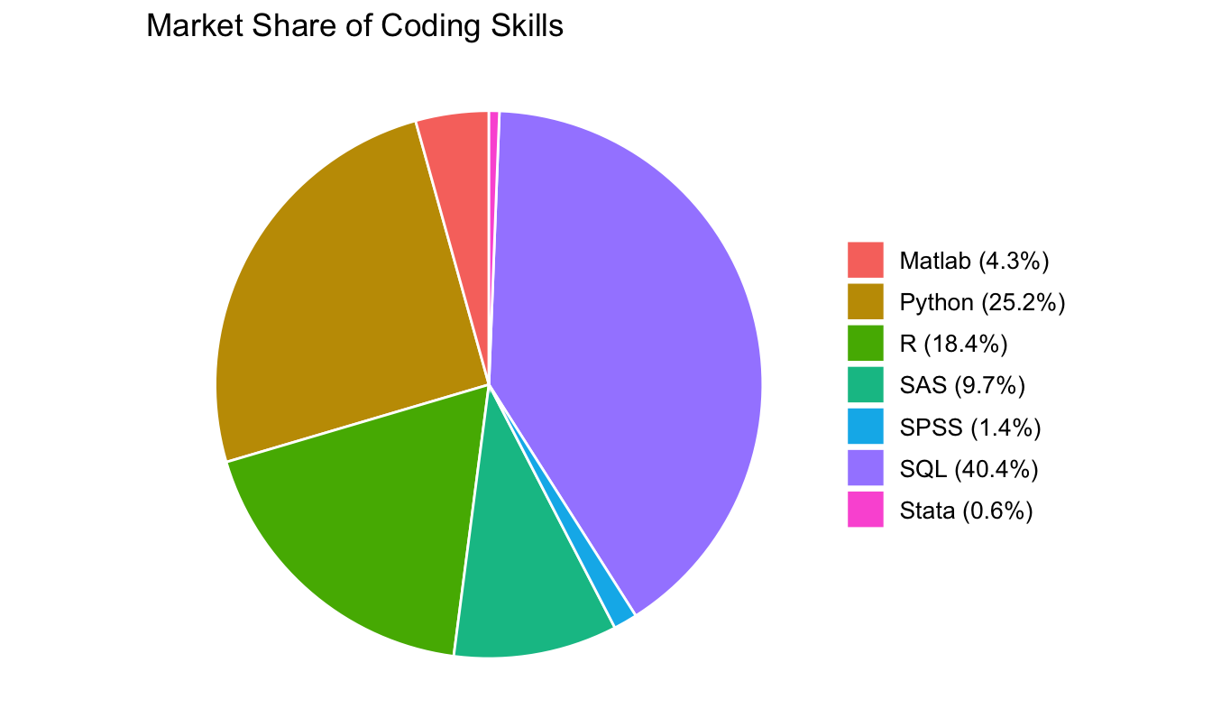
Use sparingly: humans compare lengths far better than angles. With more than 3–4 slices, a sorted bar chart is almost always clearer.

Waterfall chart
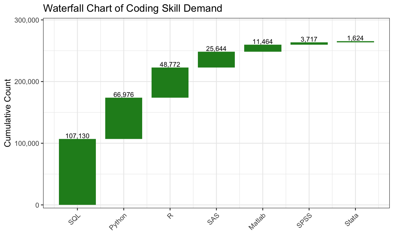
Each bar starts where the previous ended: shows incremental contributions to a total (common in revenue-bridge and budget decks).

New dataset: store sales

store.df <- read.csv("data/store-sales.csv")
head(store.df)
  storeNum Year Week p1sales p2sales p1price p2price p1prom p2prom country
1      101    1    1     127     106    2.29    2.29      0      0      US
2      101    1    2     137     105    2.49    2.49      0      0      US
3      101    1    3     156      97    2.99    2.99      1      0      US
4      101    1    4     117     106    2.99    3.19      0      0      US
5      101    1    5     138     100    2.49    2.59      0      1      US
6      101    1    6     115     127    2.79    2.49      0      0      US

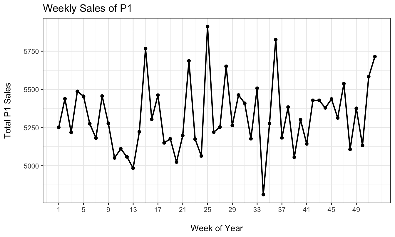
Two years of weekly sales of two products (P1, P2) across 20 stores in 7 countries, with prices and promotion flags. Sales are in unit counts. From Chapman & Feit, R for Marketing Research and Analytics.

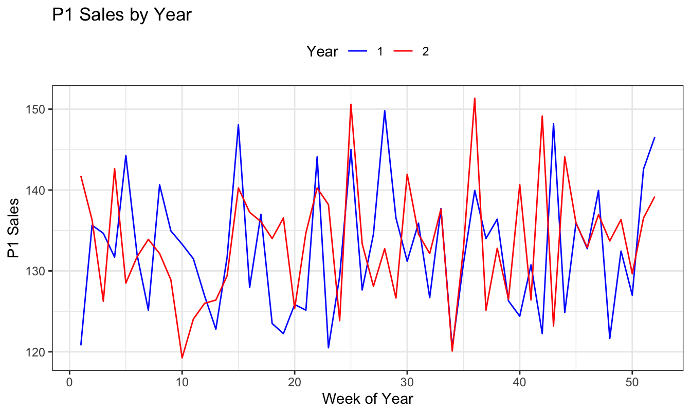
Line chart

Area chart

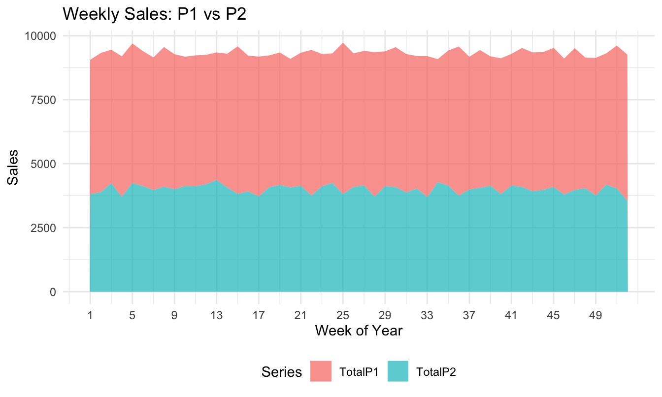
Stacked areas show composition over time, but only the bottom series sits on a flat baseline, so read the others with care.

Bar + line combo
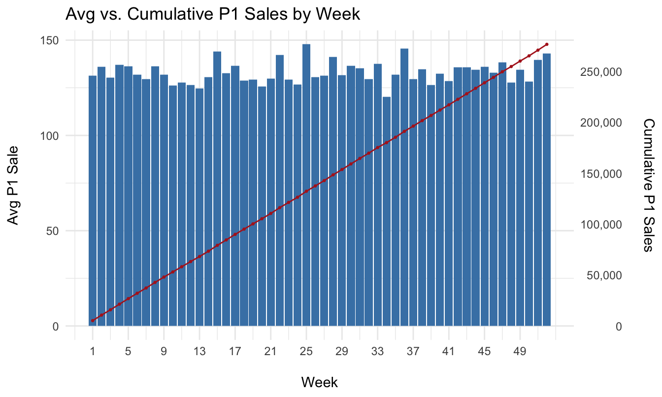
Two scales on one chart: level (bars, left axis) vs. running total (line, right axis).

Distribution & density

Understand the shape, spread, and outliers of a variable.

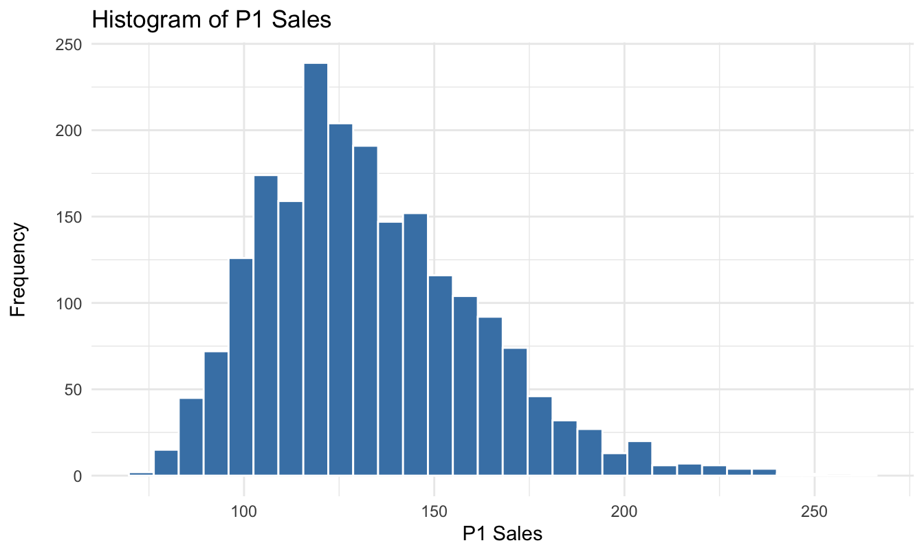
  • Histogram
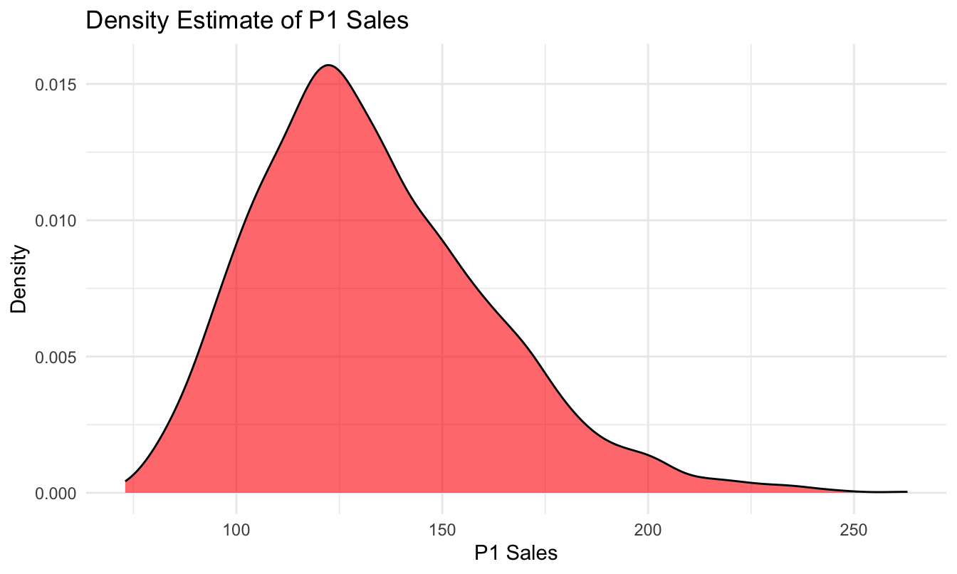
  • Density plot
  • Box plot
  • Violin plot

Histogram

Density plot

A smoothed histogram: highlights modes, hides bin-choice artifacts.

Box plot
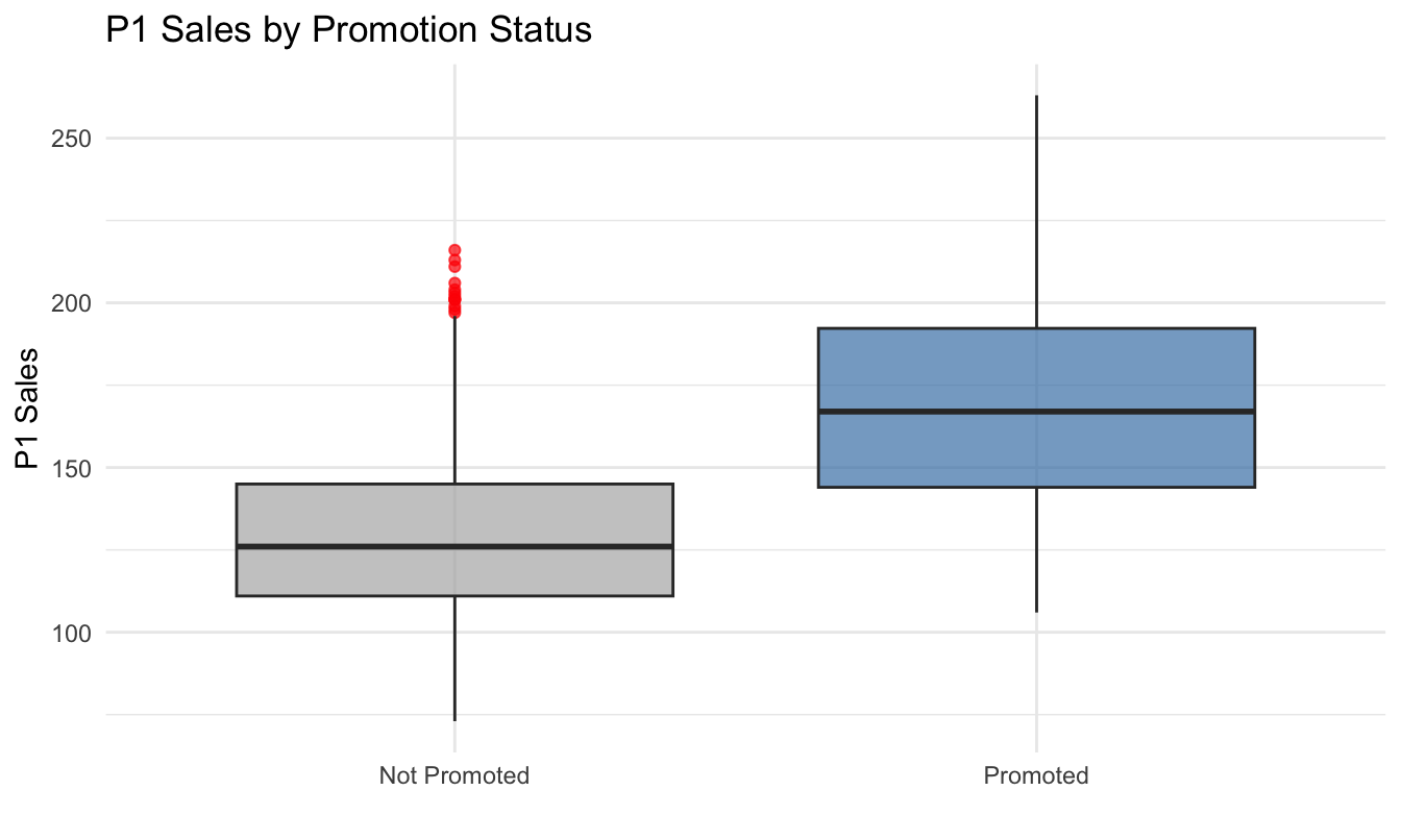
Median, quartiles, whiskers, outliers: a five-number summary per group.

Violin plot
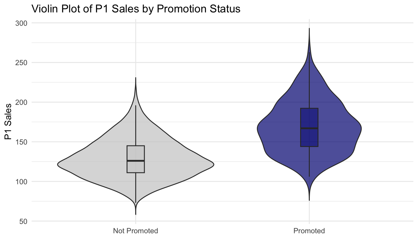
Box plot vs violin plot

Aspect Boxplot Violin plot
What it shows Five-number summary (Q1, median, Q3; whiskers; outliers) Distribution shape (smoothed density)
Outliers Explicit points beyond whiskers (1.5×IQR rule) Not shown by default
Multimodality Hard to see Easy to see (multiple “bulges”)
Robustness Robust: based on quantiles Depends on bandwidth and smoothing
Small samples Reliable Can be misleading (noisy density)
When to use Compare medians/spread cleanly Understand shape beyond the median

Distributions in the wild: online ratings
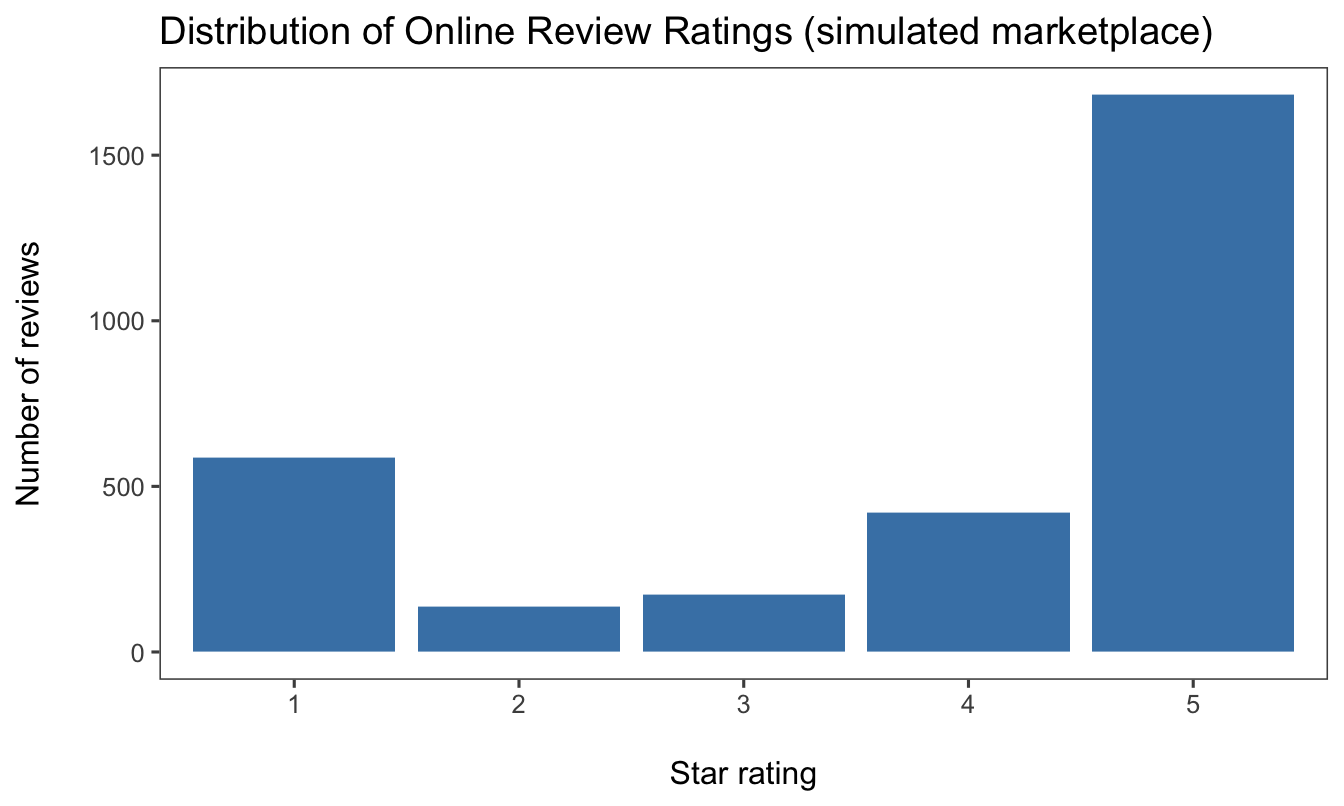
Review ratings are typically J-shaped: delighted and furious customers review, the indifferent middle stays silent. The mean rating hides this: plot the distribution. Much more on reviews and reputation later in the course.

Relationships & correlation

Explore how two (or more) variables move together.

  • Scatter plot
  • Bubble chart (scatter + size)

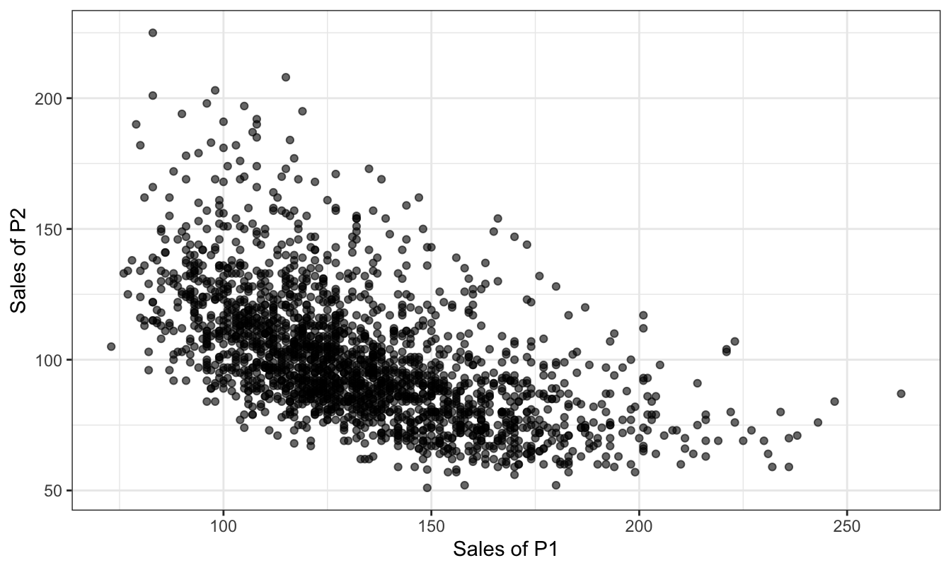
Scatter plot

P1 and P2 sales are negatively associated. What marketing story could explain that?

Bubble chart
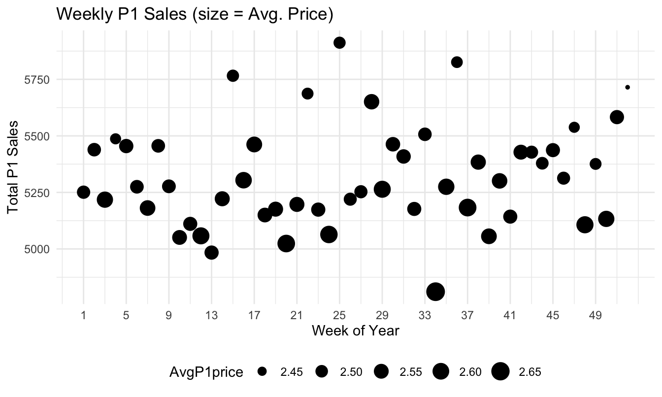
A third variable mapped to point size: do high-sales weeks coincide with low prices?

Ad spend and diminishing returns
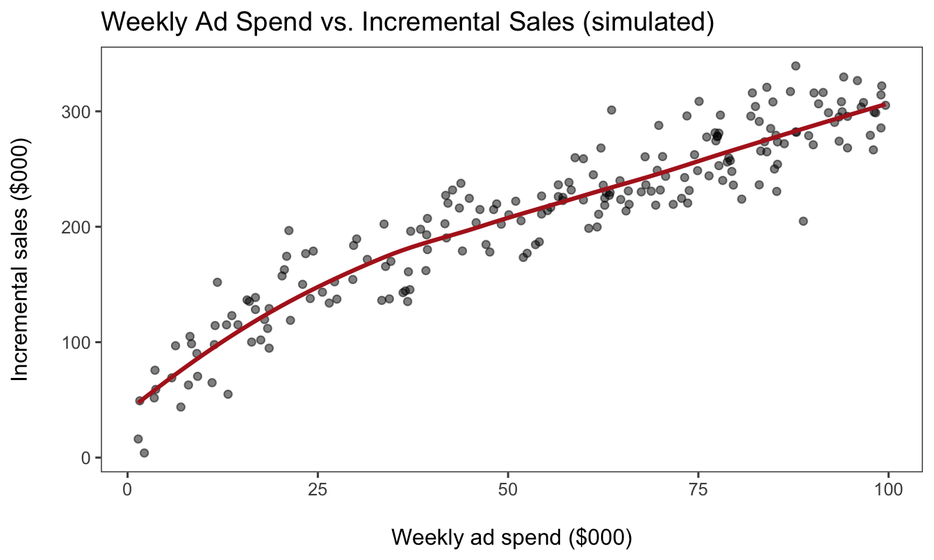
The response curve is concave: doubling spend does not double sales. A scatter plus a smoother is often the first diagnostic for budget-allocation questions.

Geospatial & matrix data

Map values over space or grid layouts.

  • Geospatial map (choropleth, points)
  • Heatmap (matrix of values)

Choropleth map

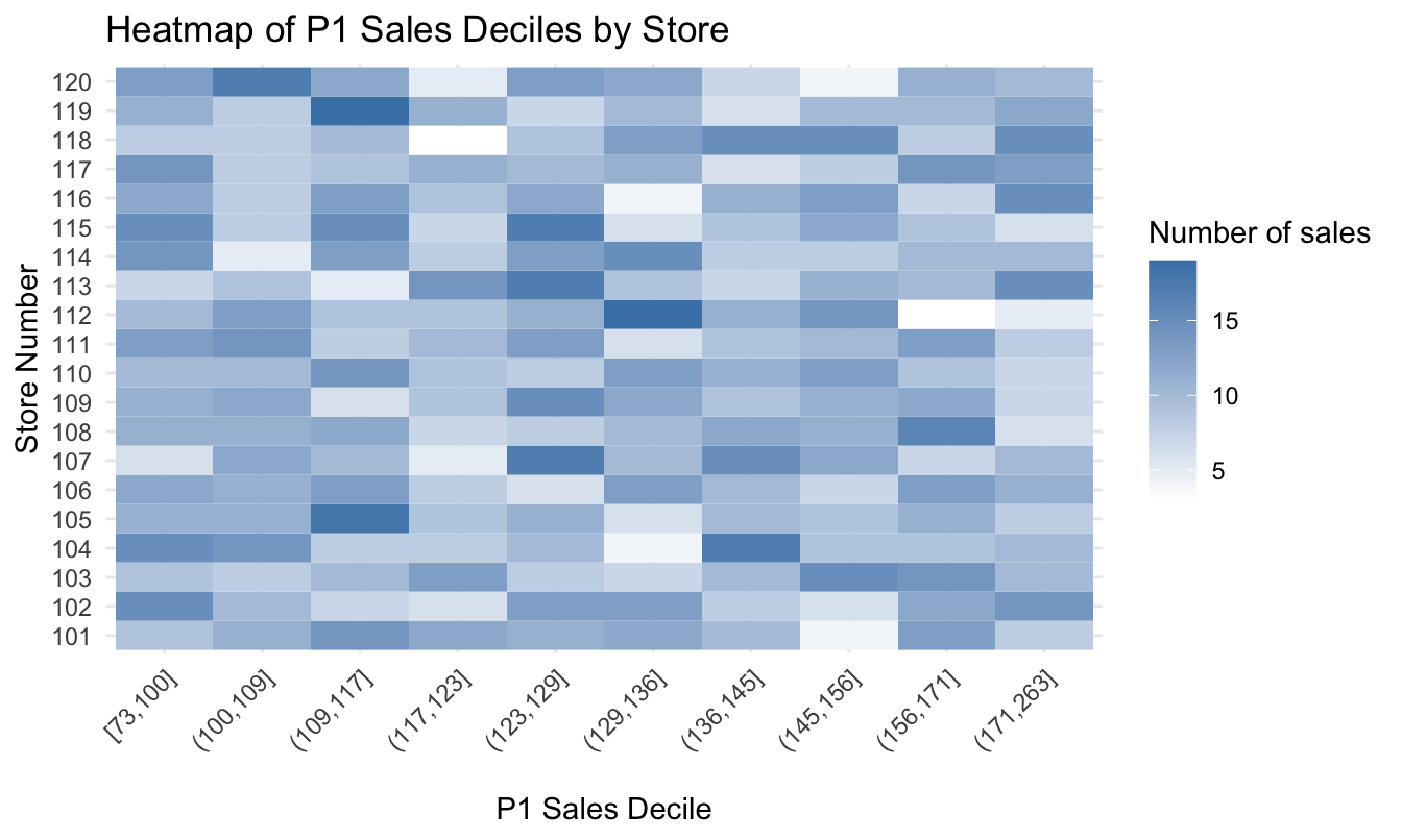
Heatmap

Two categorical axes + a color-encoded value: spot which stores skew high or low.

The marketing classic: cohort retention
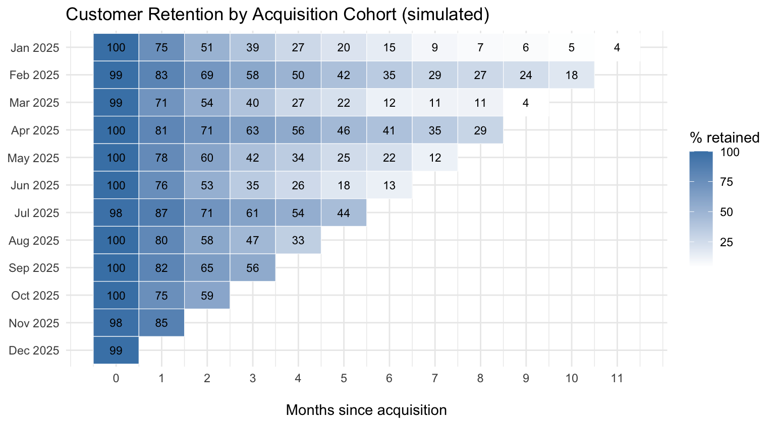
Rows are acquisition cohorts, columns are months since signup: the standard view for subscription businesses. Are newer cohorts retaining better or worse?

Choosing the Best Chart

Choosing the best chart

  1. Define your question: Comparison? Trend? Distribution? Relationship?
  2. Inspect your variables: categorical vs. numeric; panel vs. cross-section; time vs. location vs. hierarchy

For example:

  • Price trends over time → line chart
  • Compare current job-post counts across languages → bar chart
  • Explore salary distributions by city → box or violin plot

Best Practices

1. Simplify and declutter

  • Reduce “chart junk”: eliminate unnecessary gridlines, backgrounds, and 3D effects
    • I often use theme_few() in R
  • Legends only when needed: if you label directly on the plot, drop the legend; don’t be redundant

2. Readable scales and labels

  • Descriptive titles and subtitles: tell viewers what they’re looking at and why it matters
  • Clear axis labels: include units (e.g., “Sales (USD Millions)”) and avoid abbreviations when possible
  • Consistent breaks: choose nice, round numbers or evenly spaced dates
  • Always add figure notes at the bottom of the figure in documents and reports

3. Accessible color and style

  • Color-blind-friendly palettes: in R, RColorBrewer (“Set2”, “Dark2”) or viridis
  • Limit colors: no more than 4–6 distinct colors in a single plot; for many categories, consider facets or small multiples instead
  • Transparency to manage overplotting in dense scatter or area charts (the alpha parameter in R)

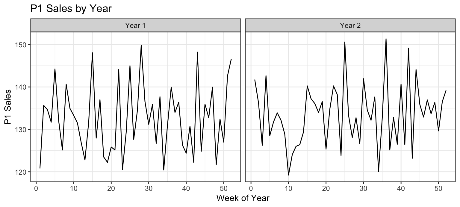
4. Leverage facets

  • facet_wrap() / facet_grid() split the data by a categorical variable rather than cramming everything into one panel
  • Ensures consistent scales and easy side-by-side comparisons

Grouping: everything in one panel

Faceting: one panel per group
5. Annotate and highlight key insights

  • Direct labels with geom_text() or ggrepel for calling out peaks, thresholds, or outliers
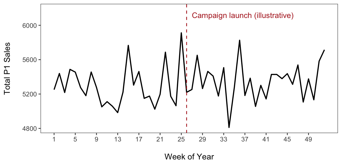
  • Annotations (annotate(), geom_vline()/geom_hline()) to mark events: product launches, policy changes, seasonal holidays
6. Consistency across plots

  • Define a custom theme and apply it to every chart so colors, fonts, and margins are consistent
  • Use the same color mapping for the same variables across multiple plots

7. Validate and iterate

  • Peer review: show rough drafts to classmates. Do they “get” the story without explanation?
  • Test in grayscale: verify that patterns and contrasts remain readable when printed without color

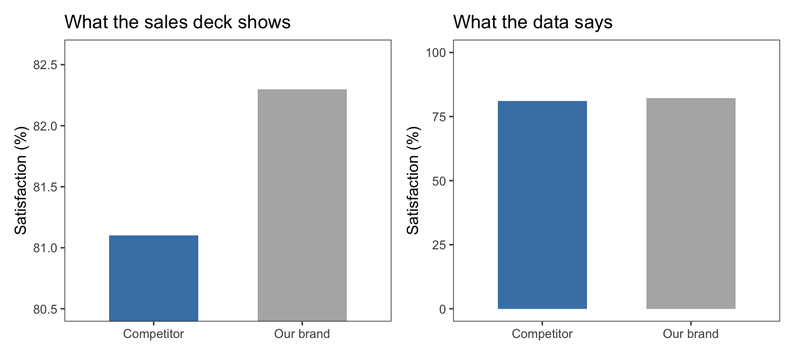
How to mislead with a chart

Same data, different y-axis. Truncated axes exaggerate differences, a favorite trick of dashboards and ad claims. When you see a bar chart, check where the axis starts.

Rules are made to be broken

Break the rules only when doing so tells a clearer story. Good visualization is as much art as science!

Hands-On: Beautifying a Figure

Our example: price and sales

  • A scatterplot is the natural tool to understand the relationship between two variables
  • Let’s use it on the most fundamental relationship in marketing, the demand curve: price (p1price) vs. weekly unit sales (p1sales) of product 1 in the store data

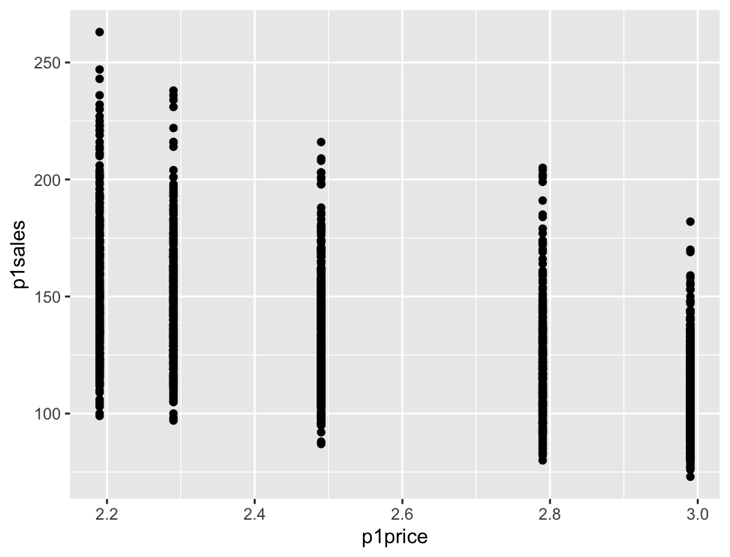
Step 0: the default plot

ggplot(data = store.df) +
  geom_point(
    mapping = aes(x = p1price, y = p1sales)
  )

What is wrong with it?

  • Axis labels are not easy to interpret (what is p1price?)
  • The units in which the variables are measured are unclear
  • Overplotting: prices take a few discrete values, so points pile up on top of each other and hide the density
  • Axis font is very small, with little space between labels and axis names

Let’s fix these issues…

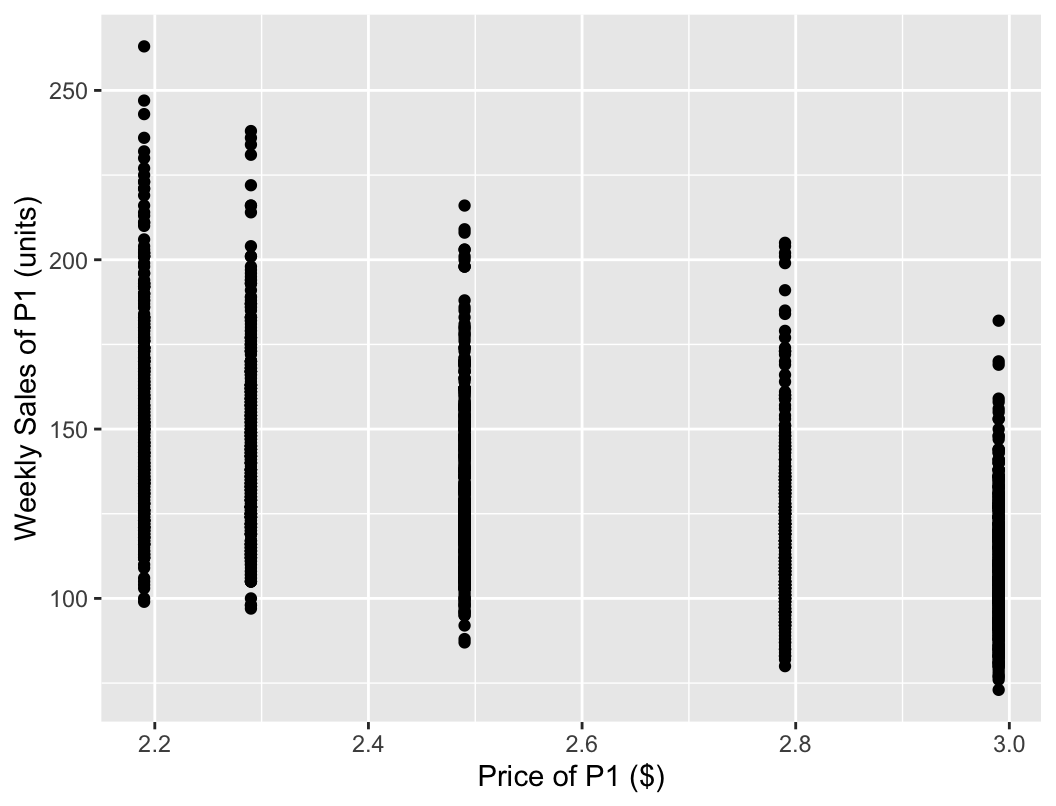
Step 1: label the axes

ggplot(data = store.df) +
  geom_point(
    mapping = aes(x = p1price, y = p1sales)
  ) +
  labs(
    x = "Price of P1 ($)",
    y = "Weekly Sales of P1 (units)"
  )

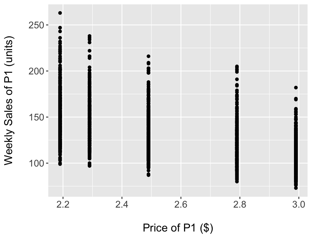
Step 2: larger fonts, more breathing room

ggplot(data = store.df) +
  geom_point(
    mapping = aes(x = p1price, y = p1sales)
  ) +
  labs(
    x = "\nPrice of P1 ($)",
    y = "Weekly Sales of P1 (units)\n"
  ) +
  theme(
    axis.title.x = element_text(size = 14),
    axis.title.y = element_text(size = 14),
    axis.text.x  = element_text(size = 12),
    axis.text.y  = element_text(size = 12)
  )
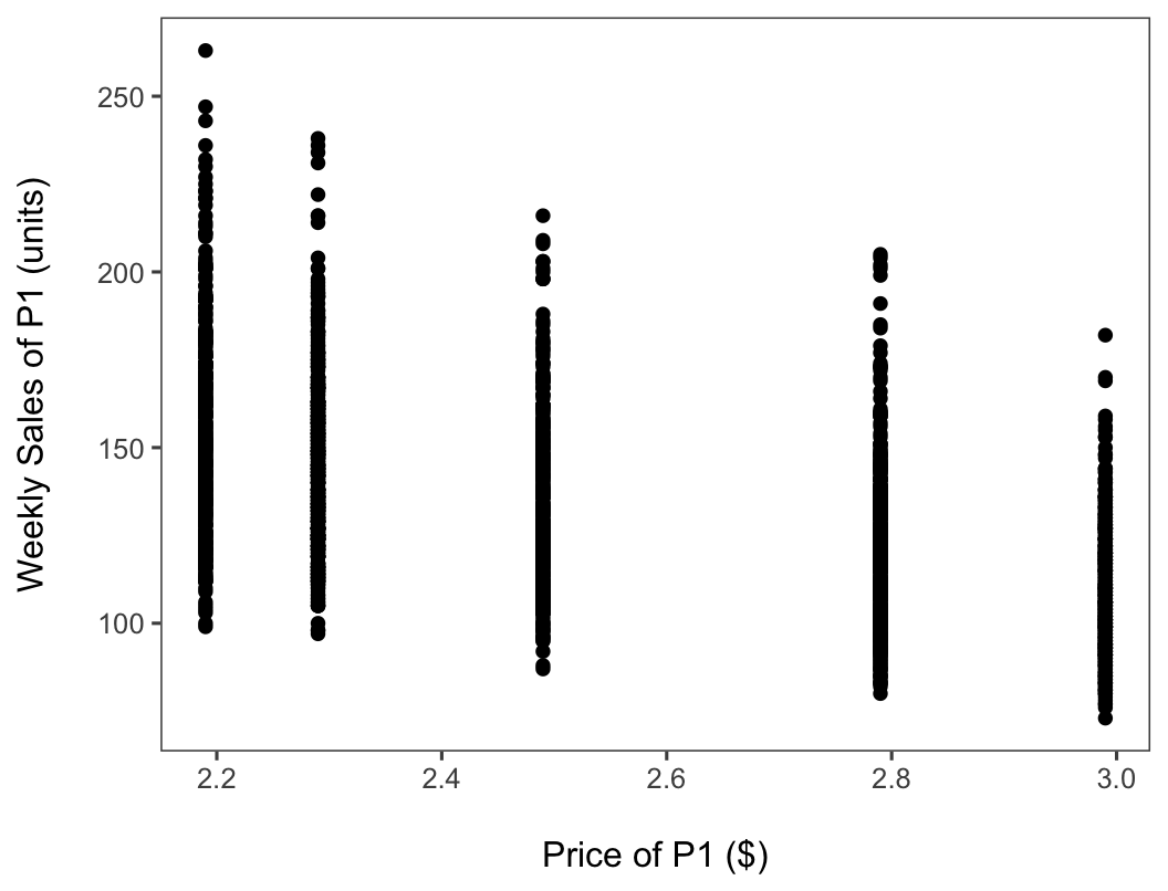
Step 3: a cleaner theme

ggplot(data = store.df) +
  geom_point(
    mapping = aes(x = p1price, y = p1sales)
  ) +
  labs(
    x = "\nPrice of P1 ($)",
    y = "Weekly Sales of P1 (units)\n"
  ) +
  theme(
    axis.title.x = element_text(size = 14),
    axis.title.y = element_text(size = 14),
    axis.text.x  = element_text(size = 12),
    axis.text.y  = element_text(size = 12)
  ) +
  theme_few()
Step 4: fix the overplotting

ggplot(data = store.df) +
  geom_jitter(
    mapping = aes(x = p1price, y = p1sales),
    width = 0.02, alpha = 0.4
  ) +
  labs(
    x = "\nPrice of P1 ($)",
    y = "Weekly Sales of P1 (units)\n"
  ) +
  theme(
    axis.title.x = element_text(size = 14),
    axis.title.y = element_text(size = 14),
    axis.text.x  = element_text(size = 12),
    axis.text.y  = element_text(size = 12)
  ) +
  theme_few()
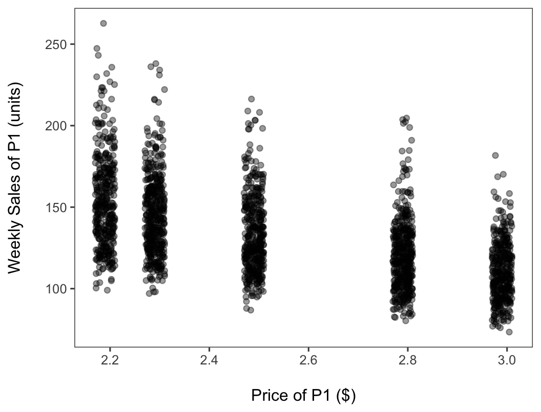
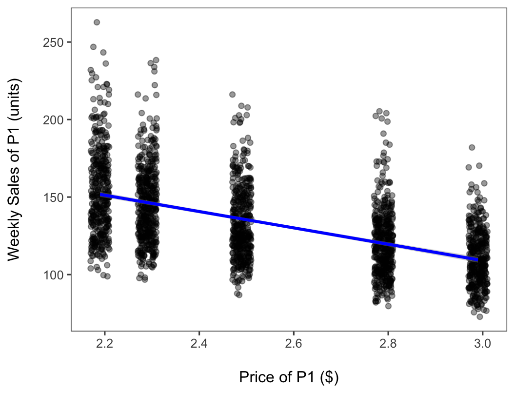
geom_jitter() adds a little horizontal noise; alpha makes overlaps visible.

Step 5: add the trend

ggplot(data = store.df) +
  geom_jitter(
    mapping = aes(x = p1price, y = p1sales),
    width = 0.02, alpha = 0.4
  ) +
  labs(
    x = "\nPrice of P1 ($)",
    y = "Weekly Sales of P1 (units)\n"
  ) +
  theme(
    axis.title.x = element_text(size = 14),
    axis.title.y = element_text(size = 14),
    axis.text.x  = element_text(size = 12),
    axis.text.y  = element_text(size = 12)
  ) +
  geom_smooth(
    mapping = aes(x = p1price, y = p1sales),
    method = "lm", color = "blue"
  ) +
  theme_few()
Step 6: add a title

ggplot(data = store.df) +
  geom_jitter(
    mapping = aes(x = p1price, y = p1sales),
    width = 0.02, alpha = 0.4
  ) +
  labs(
    x = "\nPrice of P1 ($)",
    y = "Weekly Sales of P1 (units)\n",
    title = "Weekly P1 Sales Decline with Price"
  ) +
  theme(
    axis.title.x = element_text(size = 14),
    axis.title.y = element_text(size = 14),
    axis.text.x  = element_text(size = 12),
    axis.text.y  = element_text(size = 12)
  ) +
  geom_smooth(
    mapping = aes(x = p1price, y = p1sales),
    method = "lm", color = "blue"
  ) +
  theme_few()
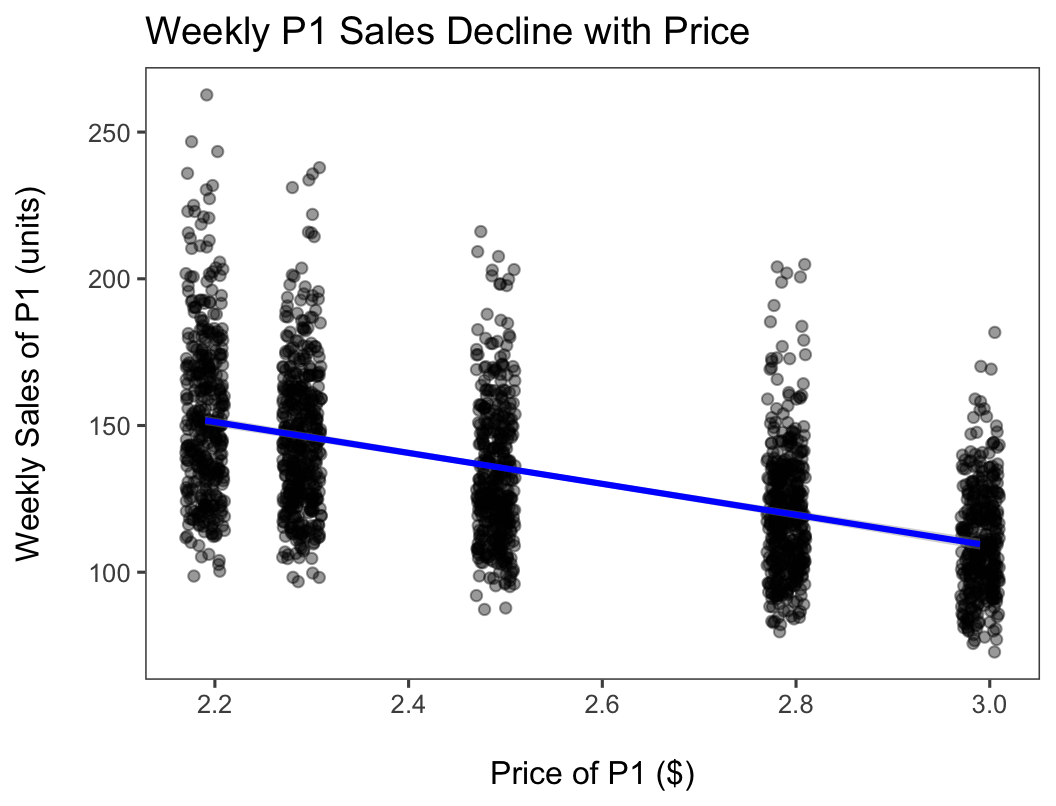
A downward-sloping demand curve. How much sales fall when price rises is the price elasticity; we will estimate it with regression in week 4.

Wrap-up

Code and data to reproduce today’s charts, all on the course website:

Questions?