Methods
Methods are SUBs or FUNCTIONs that alter how controls behave or complement their functionality.
Methods/Functions
LoadImage
The LoadImage method is employed to load a valid image file into a control's helper canvas. It serves the purpose of assigning icons to buttons or menu items, as well as assigning an image file to a PictureBox control.
Usage:
LoadImage Control(ControlID), ImageFile$If the specified ImageFile$ cannot be found or is not a valid image, one of the following scenarios will occur:
- For Button and Menu item controls, the method will ignore the failed load attempt.
- For PictureBox controls, a warning stating "image not found" or "invalid image file" will be displayed in the control's canvas.
To reset a control's canvas, simply pass an empty ImageFile$ to the LoadImage method:
LoadImage Control(ControlID), ""
SetCaption
The SetCaption method modifies a control's caption and parses for hot-key indicators.
Syntax:
SetCaption ControlID, "Caption"
Example:
SetCaption Button1, "&OK"
The ampersand symbol (&) is utilized to indicate that the subsequent letter will serve as a hot-key, allowing the user to hold Alt and press the letter to activate the control.
Moreover, you can use \n to insert a line break in a caption, which will be replaced with CHR$(10). Note that line breaks only function with Label controls that have the WordWrap property set to True.
Notes:
The SetCaption method can be bypassed altogether by manipulating the Caption array directly. However, it's important to note that by doing so, the hot-key indicators won't be parsed.
Caption(Button1) = "Your caption"SetFocus
The SetFocus method directs focus to a specified control.
Syntax:
SetFocus ControlIDExample:
SetFocus Button1SetFont
The Font property contains the handle of the loaded font associated with a control. It must be established using the SetFont method and cannot be directly manipulated using QB64's built-in font commands.
SetFont method:
Control(ControlID).Font = SetFont(FontName$, FontSize%)
- FontName$ must reference a font file. Both TTF and OTF fonts are accepted.
- Multiple fonts can be specified as alternatives in case one fails to load. Indicate the desired fonts, separated by a question mark.
- If you don't specify a path, the current path is used.
- In Windows, if a path isn't specified, the default font location, C:\Windows\Font, is searched.
- FontSize% is in pixels, not points.
Additionally, you can utilize QB64's built-in fonts (_FONT 16 or _FONT 8). To do so, specify only the FontSize% parameter:
Control(Label1).Font = SetFont("", 8)
Control(Label2).Font = SetFont("", 16)
To designate a font at design time, either select it from the list or specify the font file, and separate the desired size with a comma. If you wish to type a font file name that's not listed, right-click the "Font" label and deselect "Show system fonts list":
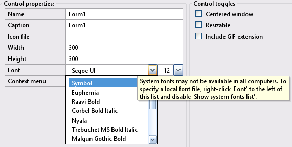
Use a question mark (?) to specify multiple fonts. This is useful when you wish to specify replacement fonts in case the desired font isn't found or can't be loaded.
Control(ControlID).Font = SetFont("font1.ttf?relative/path/font2.ttf?c:\absolutpath\font3.ttf", FontSize%)The default font for new controls in Windows is segoeui.ttf If this font cannot be loaded, it falls back to arial.ttf The next font attempted is also Arial, but on macOS, InForm attempts to load it from the default fonts folder. If all attempts fail, it likely means the system is running on Linux, and then either Arial or Liberation fonts are loaded. If all else fails, the font shipped with InForm, located at InForm/resources/NotoMono-Regular.ttf, is loaded. All of these fonts are attempted at size 12.
If you don't set a control's font property, it will inherit its container's font, either the main form or a frame if present.
SetRadioButtonValue
To modify the value of a RadioButton control to True during runtime, employ the SetRadioButtonValue method. This ensures that the other RadioButton controls within the same container are correctly set to False first:
SetRadioButtonValue ControlID
Listbox and Dropdown List summary
Lists and dropdown lists provide users with selectable items. Dropdown lists function similarly to lists, but when they don't have focus, they only display the selected item, requiring users to click the down arrow button to view the rest of the list.
The items of List and Dropdown list controls are stored in the control's Text property. However, they must be manipulated using the following methods because they also update crucial internal variables used to display the control:
AddItem
Adds a new item to the end of the list.
AddItem ControlID, "Item"
GetItem
Returns the contents of an item.
DesiredItem$ = GetItem$(ControlID, ItemIndexToRead%)
RemoveItem
Removes the specified item.
RemoveItem ControlID, ItemIndexToRemove%
ReplaceItem
Replaces the text of the specified item with the new one provided.
ReplaceItem ControlID, ItemIndexToReplace%, "New item"
ResetList
Erases all list items.
ResetList ControlID
Helper functions
The following are general helper functions:
Darken
The specified background is darkened:
  Control(FontLB).BackColor = Darken(__UI_DefaultColor(__UI_Type_Form, 2), 90)
  Control(FontListLB).BackColor = Darken(__UI_DefaultColor(__UI_Type_Form, 2), 90)
MessageBox - (Inform)
The INFORM MESSAGEBOX has been superseded by the new QB64pe _MESSAGEBOX function (see below). This has been introduced as a core element since QB64-PE v3.4.0 and later versions. Older INFORM code that utilizes the old message box will still function as it is automatically detected and translated to the new message box format.
_MessageBox - Function (QB64pe core)
The _MESSAGEBOX function displays a message dialog box, presenting a message, and returns the button ID clicked by the user. Syntax:
result& = _MESSAGEBOX([title$][, message$][, dialogType$][, iconType$][, defaultButton&])- title$ is the dialog box title
- message$ is the dialog box message
- dialogType$ Shows different buttons. Buttons can be:
"ok", "okcancel", "yesno", or "yesnocancel" - iconType$ Icon type that is displayed inside the dialog box. Icons can be:
"info", "warning", "error", or "question" - defaultButton& Default button selected can be:
0 for "cancel"/"no", 1 for "ok"/"yes", 2 for "no" in "yesnocancel" - result& The possible return values are:
 0 for "cancel"/"no",
 1 for "ok"/"yes"
 2 for "no" in "yesnocancel".
Notes:
- "ok", "okcancel", "yesno", "yesnocancel", "info", "warning", "error", or "question" can be in any case
- All parameters accept nothing or an empty string (""). In both cases, system defaults are used.
- The dialog box automatically becomes a modal window if the application window is visible
Example:
Answer = _MessageBox("Test", "Do you love QB64?", "YesNo", "Question", 1)
If Answer = 1 Then
    Print "We do too!"
Else
    Print "I'll give you some more time to fall in love."
End If
See Wki for full details.
_MessageBox - sub (QB64pe core)
The _MESSAGEBOX statement displays a message dialog box, presenting a message to the user. Syntax:
_MESSAGEBOX [title$][, message$][, iconType$]Parameters:
- title$: The title of the dialog box.
- message$: The message displayed inside the dialog box.
- iconType$: The type of icon displayed inside the dialog box, which can be "info", "warning", or "error".
Description:
- All parameters are optional.
- If no parameters are used, a blank dialog box with an OK button will be shown.
- When specifying an icon type, "info", "warning", or "error" should be in lower case.
- The dialog box automatically becomes a modal window if the application window is visible.
For further details, please refer to the Wki documentation.